
Analysis of front cover 2
10
ANALYSIS OF A MUSIC MAGAZINE
-
Upload
smiley2014 -
Category
Art & Photos
-
view
60 -
download
0
Transcript of Analysis of front cover 2
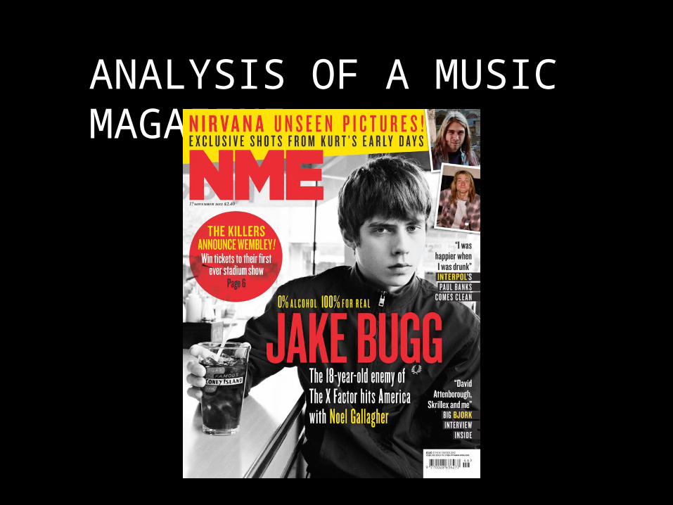
ANALYSIS OF A MUSIC MAGAZINE
INTRODUCTION TO THE MAGAZINE
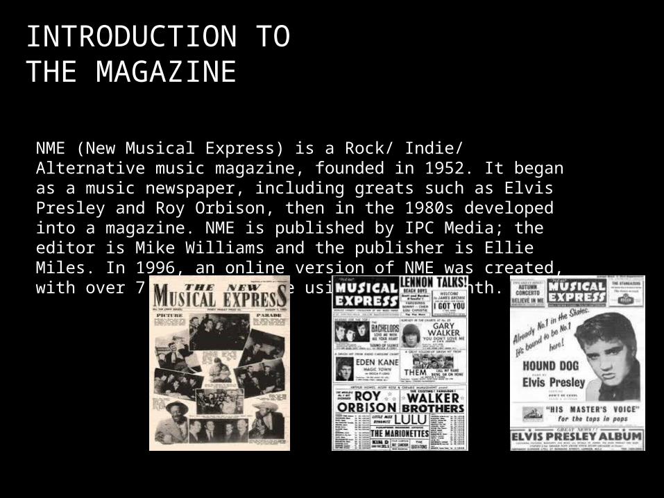
NME (New Musical Express) is a Rock/ Indie/ Alternative music magazine, founded in 1952. It began as a music newspaper, including greats such as Elvis Presley and Roy Orbison, then in the 1980s developed into a magazine. NME is published by IPC Media; the editor is Mike Williams and the publisher is Ellie Miles. In 1996, an online version of NME was created, with over 7 million people using it each month.

TARGET AUDIENCE
NME’s target audience consists of well educated fans of current music artists and bands. The average age an NME reader is 25, however the magazine targets mostly those from 17- 30. Most of the audience are predominantly male at figures around 73%. The target audience of NME magazine is young, modern and trendy; and like to engage in popular rock/ indie and alternative music of 21st century. The audience are enthusiasts of new entertainment, therefore this magazine fits to their lifestyle.
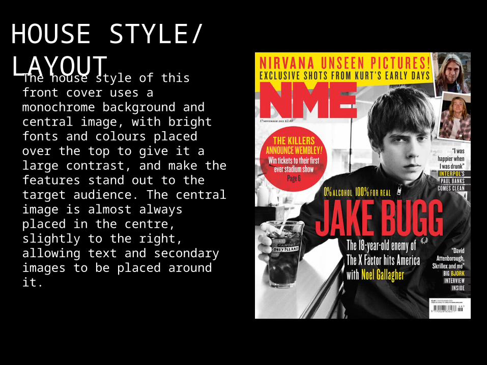
HOUSE STYLE/ LAYOUTThe house style of this front cover uses a
monochrome background and central image, with bright fonts and colours placed over the top to give it a large contrast, and make the features stand out to the target audience. The central image is almost always placed in the centre, slightly to the right, allowing text and secondary images to be placed around it.

MASTHEAD
NME uses a dominant masthead, always placed in the top left corner of the magazine. The bold, formal letters connote a modern sense, attracting the target audience of modern, youthful readers. The bold font also helps to allow the magazine to stand out, making it easily recognisable in shops. The Masthead is almost always in red font, following the brand identity that has reoccurred through the issues.
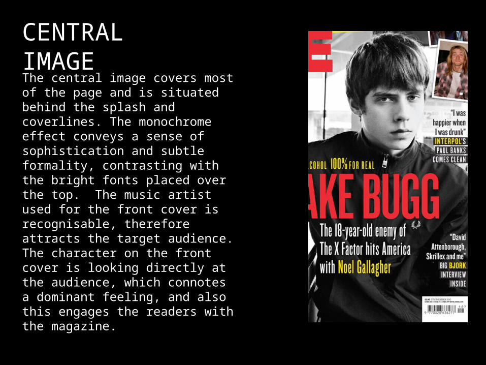
CENTRAL IMAGEThe central image covers most of the page and is situated behind the splash and coverlines. The monochrome effect conveys a sense of sophistication and subtle formality, contrasting with the bright fonts placed over the top. The music artist used for the front cover is recognisable, therefore attracts the target audience. The character on the front cover is looking directly at the audience, which connotes a dominant feeling, and also this engages the readers with the magazine.

COVERLINES
The coverlines of the magazine are placed to the right of the central image. These are quotes from well known artists who interest the target audience, therefore including these on the front cover may want to make the readers read as it enables them to know their favourite musicians on a more personal level.

SPLASH
The splash is situated in the middle of the front cover, placed over the central image. This shows the target audience the main story featured in the magazine. The name of the artist uses a different colour, therefore the contrast between the rest of the text attracts the target audience more.
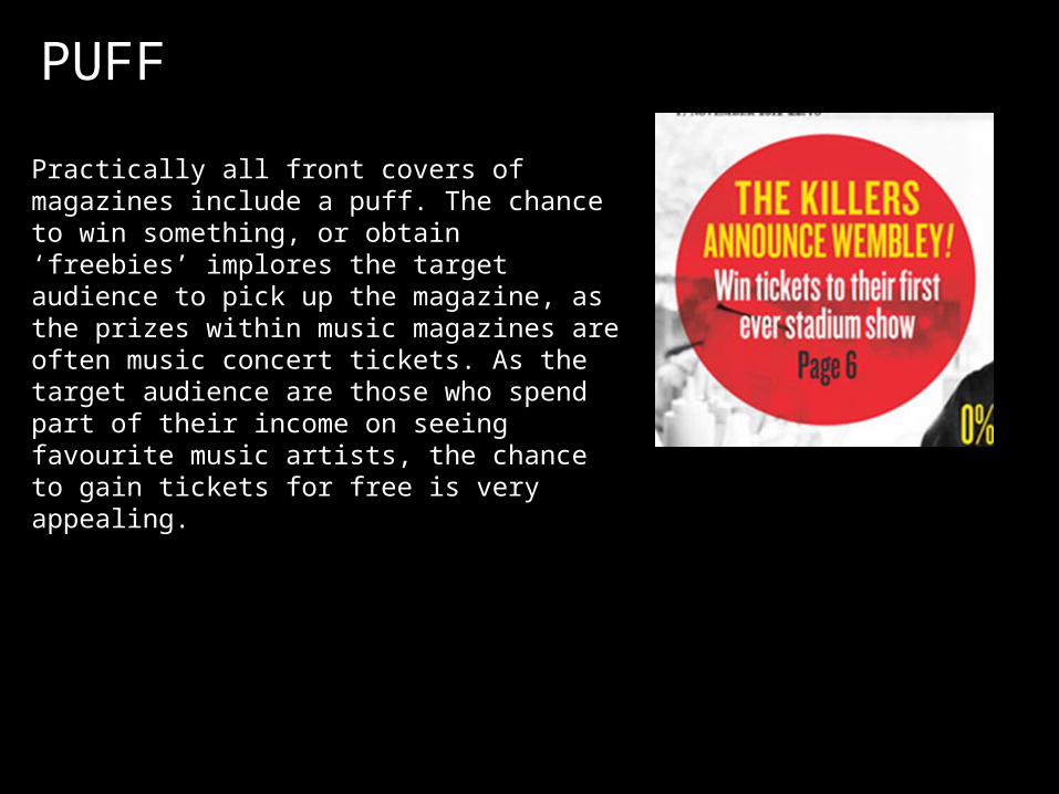
PUFF
Practically all front covers of magazines include a puff. The chance to win something, or obtain ‘freebies’ implores the target audience to pick up the magazine, as the prizes within music magazines are often music concert tickets. As the target audience are those who spend part of their income on seeing favourite music artists, the chance to gain tickets for free is very appealing.
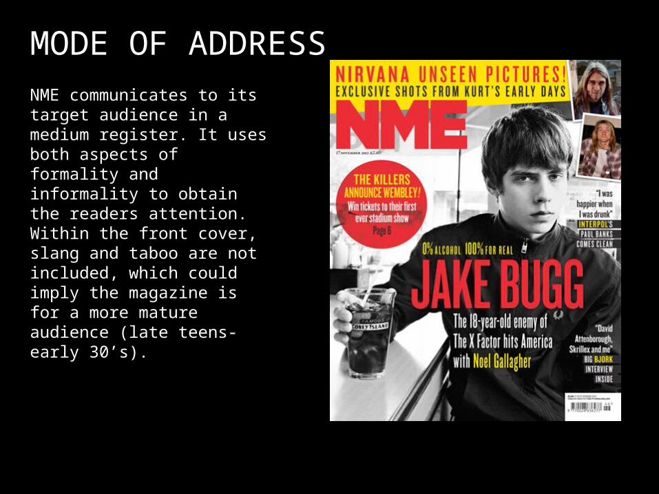
MODE OF ADDRESSNME communicates to its target audience in a medium register. It uses both aspects of formality and informality to obtain the readers attention. Within the front cover, slang and taboo are not included, which could imply the magazine is for a more mature audience (late teens- early 30’s).
