Analysis of double page's graphic elements
1
Title: The title is a statement which Justin Bieber has said. Through personal speech of the featured artist it attracts the audience’s attention as it immediately causes the audience to want to know who he is talking about. The bold red and black writing also reinforces this as well as continues the house Gutter: The distance between each column. Main image: The main image is of the feature of the article- Justin Bieber, who is looking straight at the camera, therefore directly addressing the audience. This is a long camera shot that depicts the young artist posing on a chair as if he is dancing or almost ‘teasing’ his target Page number: Tells the reader what page they are on. House style: The house style is how publishing or printing companies like to present and layout their graphic material, giving the magazine its unique consistent identity. In this magazine the house style portrays Justin Bieber as ‘sexy’ and ‘powerful’ as red has connotations of success and passion. The colour scheme of red and black is constantly used which not only complements the colour of the font but Justin’s dressing style in the main image. By having the image on the right and the writing on the left it is making the magazine easier to read and much neater. This is a conventional way to lay out writing as that is the reading order we follow. The font of the title is quite playful compared to the body text which is written in sans serif and the question in serif. This font is used as it easier to read. Body text: The main text of a magazine article which in this case is the exclusive interview with Justin Bieber. It is dividd into columns; readers are likely to be put off by a huge block of text as it would be a lot of information to take in. The typography is black and serif Image: The image of Selena Gomez and Justin Bieber is used to indicate to the audience who the title is aimed at as well as who texts is written about. As Selena is Justin’s ex girlfriend, the audience will immediately be hooked and they would
-
Upload
sofiamazmanidou -
Category
Social Media
-
view
55 -
download
0
Transcript of Analysis of double page's graphic elements
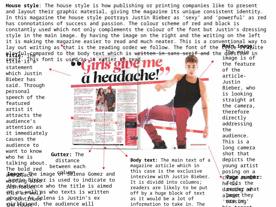
Title: The title is a statement which Justin Bieber has said. Through personal speech of the featured artist it attracts the audience’s attention as it immediately causes the audience to want to know who he is talking about. The bold red and black writing also reinforces this as well as continues the house style of this music magazine.
Gutter: The distance between
each column.
Main image: The main image is of the feature of the article-Justin Bieber, who is looking straight at the camera, therefore directly addressing the audience. This is a long camera shot that depicts the young artist posing on a chair as if he is dancing or almost ‘teasing’ his target audience which is young girls.
Page number: Tells the reader what page they are on.
House style: The house style is how publishing or printing companies like to present and layout their graphic material, giving the magazine its unique consistent identity. In this magazine the house style portrays Justin Bieber as ‘sexy’ and ‘powerful’ as red has connotations of success and passion. The colour scheme of red and black is constantly used which not only complements the colour of the font but Justin’s dressing style in the main image. By having the image on the right and the writing on the left it is making the magazine easier to read and much neater. This is a conventional way to lay out writing as that is the reading order we follow. The font of the title is quite playful compared to the body text which is written in sans serif and the question in serif. This font is used as it easier to read.
Body text: The main text of a magazine article which in this case is the exclusive interview with Justin Bieber. It is dividd into columns; readers are likely to be put off by a huge block of text as it would be a lot of information to take in. The typography is black and serif which goes well on a white background.
Image: The image of Selena Gomez and Justin Bieber is used to indicate to the audience who the title is aimed at as well as who texts is written about. As Selena is Justin’s ex girlfriend, the audience will immediately be hooked and they would want to read the interview.