
Analysis of Categorical Data - SAGE Publications Inc | Analysis of Categorical Data P eople like to...
38
5 Analysis of Categorical Data P eople like to clump things into categories. Virtually every research project categorizes some of its observations into neat, little distinct bins: male or female; marital status; broken or not broken; small, medium, or large; race of patient; with or without a tonsillectomy; and so on. When we collect data by categories, we record counts—how many observations fall into a particular bin. Categorical variables are usually classified as being of two basic types: nominal and ordinal. Nominal variables involve categories that have no particular order such as hair color, race, or clinic site, while the categories associated with an ordinal variable have some inherent ordering (categories of socioeconomic status, etc.). Unless otherwise stated, the pro- cedures discussed here can be used on any type of categorical data. There are some specific procedures for ordinal data, and they will be briefly discussed later in the chapter. Statisticians have devised a number of ways to analyze and explain categorical data. This chapter presents explanations of each of the following methods: • A contingency table analysis is used to examine the relationship between two categorical variables. • McNemar’s test is designed for the analysis of paired dichotomous, categori- cal variables to detect disagreement or change. • The Mantel-Haenszel test is used to determine whether there is a relationship between two dichotomous variables controlling for or within levels of a third variable. 113 05-Elliott-4987.qxd 7/18/2006 5:26 PM Page 113
Transcript of Analysis of Categorical Data - SAGE Publications Inc | Analysis of Categorical Data P eople like to...
5Analysis of Categorical Data
P eople like to clump things into categories. Virtually every researchproject categorizes some of its observations into neat, little distinct bins:
male or female; marital status; broken or not broken; small, medium, orlarge; race of patient; with or without a tonsillectomy; and so on. When wecollect data by categories, we record counts—how many observations fallinto a particular bin. Categorical variables are usually classified as being oftwo basic types: nominal and ordinal. Nominal variables involve categoriesthat have no particular order such as hair color, race, or clinic site, while thecategories associated with an ordinal variable have some inherent ordering(categories of socioeconomic status, etc.). Unless otherwise stated, the pro-cedures discussed here can be used on any type of categorical data. There aresome specific procedures for ordinal data, and they will be briefly discussedlater in the chapter.
Statisticians have devised a number of ways to analyze and explaincategorical data. This chapter presents explanations of each of the followingmethods:
• A contingency table analysis is used to examine the relationship between twocategorical variables.
• McNemar’s test is designed for the analysis of paired dichotomous, categori-cal variables to detect disagreement or change.
• The Mantel-Haenszel test is used to determine whether there is a relationshipbetween two dichotomous variables controlling for or within levels of a thirdvariable.
113
05-Elliott-4987.qxd 7/18/2006 5:26 PM Page 113
• Interrater reliability (kappa) tests whether two raters looking at the sameoccurrence (or condition) give consistent ratings.
• A goodness-of-fit test measures whether an observed group of counts matchesa theoretical pattern.
• A number of other categorical data measures are also briefly discussed.
To get the most out of this chapter, you should first verify that yourvariables are categorical and then try to match the hypotheses you are test-ing with the ones described in this chapter. If it is not clear that the hypothe-ses you are testing match any of these given here, we recommend that youconsult a statistician.
Contingency Table Analysis (r ×× c)
Contingency table analysis is a common method of analyzing the associa-tion between two categorical variables. Consider a categorical variable thathas r possible response categories and another categorical variable withc possible categories. In this case, there are r × c possible combinations ofresponses for these two variables. The r × c crosstabulation or contingencytable has r rows and c columns consisting of r × c cells containing theobserved counts (frequencies) for each of the r × c combinations. This typeof analysis is called a contingency table analysis and is usually accomplishedusing a chi-square statistic that compares the observed counts with thosethat would be expected if there were no association between the twovariables.
Appropriate Applications of Contingency Table Analysis
The following are examples of situations in which a chi-square contin-gency table analysis would be appropriate.
• A study compares types of crime and whether the criminal is a drinker orabstainer.
• An analysis is undertaken to determine whether there is a gender preferencebetween candidates running for state governor.
• Reviewers want to know whether worker dropout rates are different for par-ticipants in two different job-training programs.
• A marketing research company wants to know whether there is a differencein response rates among small, medium, and large companies that were senta questionnaire.
114——Statistical Analysis Quick Reference Guidebook
05-Elliott-4987.qxd 7/18/2006 5:26 PM Page 114
Design Considerations for a Contingency Table Analysis
Two Sampling Strategies
Two separate sampling strategies lead to the chi-square contingency tableanalysis discussed here.
1. Test of Independence. A single random sample of observations is selectedfrom the population of interest, and the data are categorized on the basis ofthe two variables of interest. For example, in the marketing research exampleabove, this sampling strategy would indicate that a single random sampleof companies is selected, and each selected company is categorized by size(small, medium, or large) and whether that company returned the survey.
2. Test for Homogeneity. Separate random samples are taken from each oftwo or more populations to determine whether the responses related to asingle categorical variable are consistent across populations. In the marketingresearch example above, this sampling strategy would consider there to bethree populations of companies (based on size), and you would select a sam-ple from each of these populations. You then test to determine whether theresponse rates differ among the three company types.
The two-way table is set up the same way regardless of the samplingstrategy, and the chi-square test is conducted in exactly the same way. Theonly real difference in the analysis is in the statement of the hypotheses andconclusions.
Expected Cell Size Considerations
The validity of the chi-square test depends on both the sample size andthe number of cells. Several rules of thumb have been suggested to indicatewhether the chi-square approximation is satisfactory. One such rule sug-gested by Cochran (1954) says that the approximation is adequate if noexpected cell frequencies are less than one and no more than 20% are lessthan five.
Combining Categories
Because of the expected cell frequency criterion in the second samplingstrategy, it may be necessary to combine similar categories to lessen thenumber of categories in your table or to examine the data by subcategories.See the section that follows later in this chapter on Mantel-Haenszel compar-isons for information on one way to examine information within categories.
Analysis of Categorical Data——115
05-Elliott-4987.qxd 7/18/2006 5:26 PM Page 115
Hypotheses for a Contingency Table Analysis
The statement of the hypotheses depends on whether you used a test ofindependence or a test for homogeneity.
Test of Independence
In this case, you have two variables and are interested in testing whetherthere is an association between the two variables. Specifically, the hypothe-ses to be tested are the following:
H0: There is no association between the two variables.
Ha: The two variables are associated.
Test for Homogeneity
In this setting, you have a categorical variable collected separately fromtwo or more populations. The hypotheses are as follows:
H0: The distribution of the categorical variable is the same across the populations.
Ha: The distribution of the categorical variable differs across the populations.
Tips and Caveats for a Contingency Table Analysis
Use Counts—Do Not Use Percentages
It may be tempting to use percentages in the table and calculate the chi-square test from these percentages instead of the raw observed frequencies.This is incorrect—don’t do it!
No One-Sided Tests
Notice that the alternative hypotheses above do not assume any “direc-tion.” Thus, there are no one- and two-sided versions of these tests. Chi-square tests are inherently nondirectional (“sort of two-sided”) in the sensethat the chi-square test is simply testing whether the observed frequencies andexpected frequencies agree without regard to whether particular observedfrequencies are above or below the corresponding expected frequencies.
Each Subject Is Counted Only Once
If you have n total observations (i.e., the total of the counts is n), thenthese n observations should be independent. For example, suppose you havea categorical variable Travel in which subjects are asked by what means they
116——Statistical Analysis Quick Reference Guidebook
05-Elliott-4987.qxd 7/18/2006 5:26 PM Page 116
commute to work. It would not be correct to allow a subject to checkmultiple responses (e.g., car and commuter train) and then include all ofthese responses for this subject in the table (i.e., count the subject more thanonce). On such a variable, it is usually better to allow only one response pervariable. If you want to allow for multiple responses such as this, then as youare tallying your results, you would need to come up with a new category,“car and commuter train.” This procedure can lead to a large number ofcells and small expected cell frequencies.
Explain Significant Findings
Unlike many other tests, the simple finding of a significant result in a con-tingency table analysis does not explain why the results are significant. It isimportant for you to examine the observed and expected frequencies andexplain your findings in terms of which of the differences between observedand expected counts are the most striking.
Contingency Table Examples
The following two examples of contingency table analysis illustrate avariety of the issues involved in this type of analysis.
EXAMPLE 5.1: r ×× c Contingency Table Analysis
Describing the Problem
In 1909, Karl Pearson conducted a now classic study involving the rela-tionship between criminal behavior and the drinking of alcoholic beverages.He studied 1,426 criminals, and the data in Table 5.1 show the drinkingpatterns in various crime categories. (The term coining in the table is a termfor counterfeiting that is no longer in common usage.) This table is made upof counts in 6 × 2 cells, and, for example, 300 subjects studied were abstain-ers who had been convicted of stealing.
The hypotheses of interest are as follows:
H0: There is no association between type of crime and drinking status.
Ha: There is an association between type of crime and drinking status.
In Table 5.2, we show output for these data where we see not only the cellfrequencies shown in Table 5.1 but also the expected cell frequencies andthe row percentages. That is, for each cell, the table gives the percentageof the row total that this cell count represents. For example, there were
Analysis of Categorical Data——117
05-Elliott-4987.qxd 7/18/2006 5:26 PM Page 117
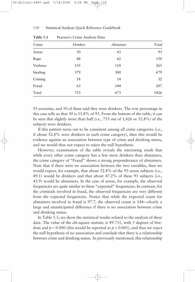
93 arsonists, and 50 of these said they were drinkers. The row percentage inthis case tells us that 50 is 53.8% of 93. From the bottom of the table, it canbe seen that slightly more than half (i.e., 753 out of 1,426 or 52.8%) of thesubjects were drinkers.
If this pattern turns out to be consistent among all crime categories (i.e.,if about 52.8% were drinkers in each crime category), then this would beevidence against an association between type of crime and drinking status,and we would thus not expect to reject the null hypothesis.
However, examination of the table reveals the interesting result thatwhile every other crime category has a few more drinkers than abstainers,the crime category of “Fraud” shows a strong preponderance of abstainers.Note that if there were no association between the two variables, then wewould expect, for example, that about 52.8% of the 93 arson subjects (i.e.,49.1) would be drinkers and that about 47.2% of these 93 subjects (i.e.,43.9) would be abstainers. In the case of arson, for example, the observedfrequencies are quite similar to these “expected” frequencies. In contrast, forthe criminals involved in fraud, the observed frequencies are very differentfrom the expected frequencies. Notice that while the expected count forabstainers involved in fraud is 97.7, the observed count is 144—clearly alarge and unanticipated difference if there is no association between crimeand drinking status.
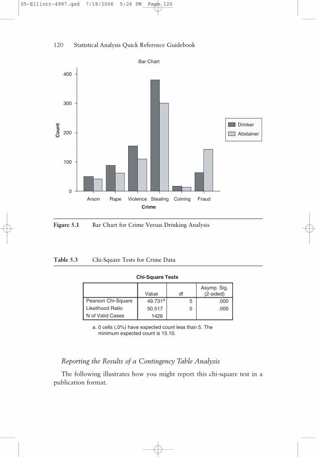
In Table 5.3, we show the statistical results related to the analysis of thesedata. The value of the chi-square statistic is 49.731, with 5 degrees of free-dom and p = 0.000 (this would be reported as p < 0.001), and thus we rejectthe null hypothesis of no association and conclude that there is a relationshipbetween crime and drinking status. As previously mentioned, this relationship
118——Statistical Analysis Quick Reference Guidebook
Table 5.1 Pearson’s Crime Analysis Data
Crime Drinker Abstainer Total
Arson 50 43 93
Rape 88 62 150
Violence 155 110 265
Stealing 379 300 679
Coining 18 14 32
Fraud 63 144 207
Total 753 673 1426
05-Elliott-4987.qxd 7/18/2006 5:26 PM Page 118
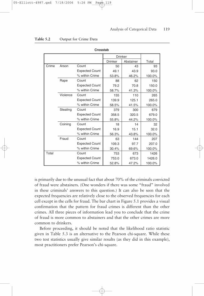
is primarily due to the unusual fact that about 70% of the criminals convictedof fraud were abstainers. (One wonders if there was some “fraud” involvedin these criminals’ answers to this question.) It can also be seen that theexpected frequencies are relatively close to the observed frequencies for eachcell except in the cells for fraud. The bar chart in Figure 5.1 provides a visualconfirmation that the pattern for fraud crimes is different than the othercrimes. All three pieces of information lead you to conclude that the crimeof fraud is more common to abstainers and that the other crimes are morecommon to drinkers.
Before proceeding, it should be noted that the likelihood ratio statisticgiven in Table 5.3 is an alternative to the Pearson chi-square. While thesetwo test statistics usually give similar results (as they did in this example),most practitioners prefer Pearson’s chi-square.
Analysis of Categorical Data——119
Table 5.2 Output for Crime Data
Crosstab
50 43 93
49.1 43.9 93.0
53.8% 46.2% 100.0%
88 62 150
79.2 70.8 150.0
58.7% 41.3% 100.0%
155 110 265
139.9 125.1 265.0
58.5% 41.5% 100.0%
379 300 679
358.5 320.5 679.0
55.8% 44.2% 100.0%
18 14 32
16.9 15.1 32.0
56.3% 43.8% 100.0%
63 144 207
109.3 97.7 207.0
30.4% 69.6% 100.0%
753 673 1426
753.0 673.0 1426.0
52.8% 47.2% 100.0%
Count
Expected Count
% within Crime
Count
Expected Count
% within Crime
Count
Expected Count
% within Crime
Count
Expected Count
% within Crime
Count
Expected Count
% within Crime
Count
Expected Count
% within Crime
Count
Expected Count
% within Crime
Arson
Rape
Violence
Stealing
Coining
Fraud
Crime
Total
Drinker Abstainer
Drinker
Total
05-Elliott-4987.qxd 7/18/2006 5:26 PM Page 119
Reporting the Results of a Contingency Table Analysis
The following illustrates how you might report this chi-square test in apublication format.
120——Statistical Analysis Quick Reference Guidebook
FraudCoiningStealingViolenceRapeArson
Crime
400
300
200
100
0
Co
un
tBar Chart
Abstainer
Drinker
Figure 5.1 Bar Chart for Crime Versus Drinking Analysis
Table 5.3 Chi-Square Tests for Crime Data
Chi-Square Tests
49.731a 5 .000
50.517 5 .000
1426
Pearson Chi-Square
Likelihood Ratio
N of Valid Cases
Value dfAsymp. Sig.
(2-sided)
a. 0 cells (.0%) have expected count less than 5. The minimum expected count is 15.10.
05-Elliott-4987.qxd 7/18/2006 5:26 PM Page 120
Narrative for the Methods Section
“A chi-square test was performed to test the null hypothesis of no associationbetween type of crime and incidence of drinking.”
Narrative for the Results Section
“An association between drinking preference and type of crime committed wasfound, χ2 (5, N = 1,426) = 49.7, p < 0.001.”
Or, to be more complete,
“An association between drinking preference and type of crime committedwas found, χ2 (5, N = 1,426) = 49.7, p < 0.001. Examination of the cell fre-quencies showed that about 70% (144 out of 207) of the criminals convictedof fraud were abstainers while the percentage of abstainers in all of the othercrime categories was less than 50%.”
SPSS Step-by-Step. EXAMPLE 5.1: r × c ContingencyTable Analysis
While most data sets in SPSS are stored casewise, you can store count datasuch as that shown in Table 5.1. These data are available (in count form) infile CRIME.SAV. To create this data set, follow these steps:
1. Select File/New/Data. . . .
2. This new data set will have three numeric variables: Crime, Drinker, andCount. In the first column (i.e., for the Crime variable), enter the numbers 1for arson, 2 for rape, 3 for violence, 4 for stealing, 5 for coining, and 6 forfraud. These labels are specified using value labels (see Appendix A: A BriefTutorial for Using SPSS for Windows if you do not know how to do this).The second column corresponds to the variable Drinker, where 1 indicatesdrinker and 2 indicates abstainer. The third column corresponds to thevariable Count. For example, the observation 43 for the variable Count inthe second row of the table is the number of subjects who were arsonists(Crime = 1) and abstainers (Drinker = 2).
3. Select Data/Weight Cases . . . and select the “weight case by” option withCount as the Frequency variable.
The contents of CRIME.SAV are shown in Figure 5.2.
Analysis of Categorical Data——121
05-Elliott-4987.qxd 7/18/2006 5:26 PM Page 121

Once you have specified this information, you are ready to perform theanalysis. Follow these steps:
4. Select Analyze/Descriptives/Crosstabs.
5. Choose Crime as the row variable and Drinker as the column variable.
6. Select the checkbox labeled “Display Clustered Bar Charts.”
7. Click the Statistics button and select Chi-Square and Continue.
8. Click the Cells button and select Expected in the Counts box and select Rowin the Percentages section and Continue.
9. Click OK, and SPSS creates the output shown in Tables 5.2 and 5.3 alongwith Figure 5.1.
Program Comments
In this example, we instructed SPSS to print out the table showing theobserved and expected frequencies under the Cells option. We can also askfor the row, column, and total percentages. For example, if total percentages
122——Statistical Analysis Quick Reference Guidebook
Figure 5.2 CRIME.SAV Count Form Data Set
05-Elliott-4987.qxd 7/18/2006 5:26 PM Page 122
were selected, then the percentage that each observed frequency is of thetotal sample size would be printed in each cell.
EXAMPLE 5.2: 2 ×× 2 Contingency Table Analysis
A number of experiments involve binary outcomes (i.e., 1 and 0, yes and no).Typically, these occur when you are observing the presence or absence of acharacteristic such as a disease, flaw, mechanical breakdown, death, failure,and so on. The analysis of the relationship between two bivariate categori-cal variables results in a 2 × 2 crosstabulation table of counts. Although the2 × 2 table is simply a special case of the general r × c table, the SPSS outputfor the 2 × 2 tables is more extensive.
Consider an experiment in which the relationship between exposure toa particular reagent (a substance present in a commercial floor cleanser)and the occurrence of a type of reaction (mild skin rash) was studied. Twogroups of subjects were studied: One group of 20 patients was exposedto the reagent, and the other group was not. The 40 subjects were exam-ined for the presence of the reaction. The summarized data are shown inTable 5.4.
13 7
4 16
Analysis of Categorical Data——123
Table 5.4 Exposure/Reaction Data
Reaction No Reaction
Exposed
Not Exposed
20
20
4017 23
Table 5.5 shows computer output where the observed and expectedfrequencies are shown along with row percentages, and Table 5.6 showstypical statistical output for a 2 × 2 table.
These results report a Pearson chi-square of 8.286 with 1 degree offreedom and p = 0.004. It should be noted that in the 2 × 2 setting, use ofthe rule of thumb that no more than 20% of the expected values are lessthan 5 requires that none of the four expected values should be less than 5.Footnote b reports this fact for these data.
The continuity correction statistic (Yates’s correction) is an adjustment ofthe chi-square test for 2 × 2 tables used by some statisticians to improve the
05-Elliott-4987.qxd 7/18/2006 5:26 PM Page 123
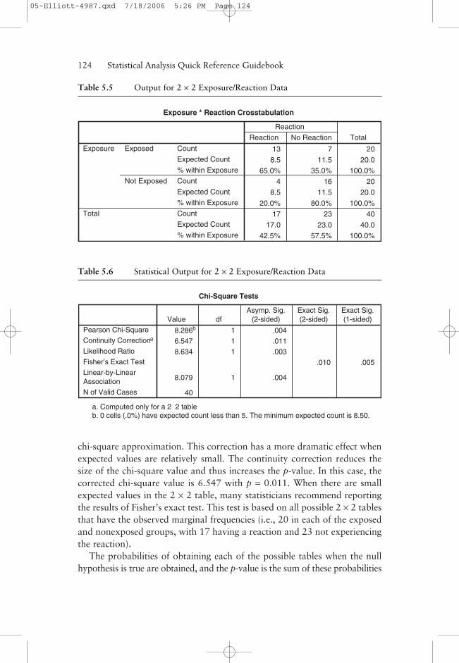
chi-square approximation. This correction has a more dramatic effect whenexpected values are relatively small. The continuity correction reduces thesize of the chi-square value and thus increases the p-value. In this case, thecorrected chi-square value is 6.547 with p = 0.011. When there are smallexpected values in the 2 × 2 table, many statisticians recommend reportingthe results of Fisher’s exact test. This test is based on all possible 2 × 2 tablesthat have the observed marginal frequencies (i.e., 20 in each of the exposedand nonexposed groups, with 17 having a reaction and 23 not experiencingthe reaction).
The probabilities of obtaining each of the possible tables when the nullhypothesis is true are obtained, and the p-value is the sum of these probabilities
124——Statistical Analysis Quick Reference Guidebook
Exposure * Reaction Crosstabulation
13 7 20
8.5 11.5 20.0
65.0% 35.0% 100.0%
4 16 20
8.5 11.5 20.0
20.0% 80.0% 100.0%
17 23 40
17.0 23.0 40.0
42.5% 57.5% 100.0%
Count
Expected Count
% within Exposure
Count
Expected Count
% within Exposure
Count
Expected Count
% within Exposure
Exposed
Not Exposed
Exposure
Total
Reaction No Reaction
Reaction
Total
Table 5.5 Output for 2 × 2 Exposure/Reaction Data
Table 5.6 Statistical Output for 2 × 2 Exposure/Reaction Data
Chi-Square Tests
8.286b 1 .004
6.547 1 .011
8.634 1 .003
.010 .005
8.079 1 .004
40
Pearson Chi-Square
Continuity Correctiona
Likelihood Ratio
Fisher’s Exact Test
Linear-by-LinearAssociation
N of Valid Cases
Value dfAsymp. Sig.
(2-sided)Exact Sig.(2-sided)
Exact Sig.(1-sided)
a. Computed only for a 2×2 tableb. 0 cells (.0%) have expected count less than 5. The minimum expected count is 8.50.
05-Elliott-4987.qxd 7/18/2006 5:26 PM Page 124
from all tables as rare, or rarer than, the one observed. For these data, theresulting p-value for Fisher’s two-sided test is p = 0.010. There is no actualtest statistic to quote when using Fisher’s exact test, and there is a one-sidedversion if that is desired. All of the results are consistent in leading to rejec-tion of the null hypothesis at the α = 0.05 level and thus to the conclusionthat there is a relationship between the reagent and reaction. In this case, theexposed subjects had a significantly higher rate of response to the reagent(65% or 13 of 20) than did nonexposed subjects (20% or 4 of 20).
When there are small expected values in the 2 × 2 table, many statisticiansrecommend reporting the results of Fisher’s exact test.
Reporting the Results of a 2 × 2 Contingency Table Analysis
The following illustrates how you might report this chi-square test in apublication format.
Narrative for the Methods Section
“A chi-square test was performed to test the hypothesis of no associationbetween exposure and reaction.”
Narrative for the Results Section
“A higher proportion of the exposed group showed a reaction to the reagent,χ2 (1, N = 40) = 8.29, p = 0.004.”
Or, to be more complete,
“A higher proportion of the exposed group (65% or 13 of 20) showed areaction to the reagent than did the nonexposed group (20% or 4 of 20), χ2
(1, N = 40) = 8.29, p = 0.004.”
SPSS Step-by-Step. EXAMPLE 5.2: 2 × 2 ContingencyTable Analysis
The data in this example are in file EXPOSURE22.SAV as 40 casewiseobservations on the two variables, Exposure (0 = exposed, 1 = not exposed)and Reaction (0 = reaction, 1 = no reaction). This data file was created usingExposure and Reaction as numeric variables with the labels given above. Aportion of the data is shown in Figure 5.3.
Analysis of Categorical Data——125
05-Elliott-4987.qxd 7/18/2006 5:26 PM Page 125

To obtain the chi-square results in Table 5.6, open the data set EXPO-SURE22.SAV and do the following:
1. Select Analyze/Descriptives/Crosstabs.
2. Choose Exposure as the row variable and Reaction as the column variable.
3. Click the Statistics button and select Chi Square and Continue.
4. Click the Cells button and select Expected in the Counts box and select Rowin the Percentages section and Continue.
5. Click OK.
Analyzing Risk Ratios in a 2 ×× 2 Table
Another way to analyze a 2 × 2 table is by examining measures of risk. In amedical setting, for example, a 2 × 2 table is often constructed where onevariable represents exposure (to some risk factor) and the other represents
126——Statistical Analysis Quick Reference Guidebook
Figure 5.3 First 14 Cases of EXPOSURE22.SAV
05-Elliott-4987.qxd 7/18/2006 5:26 PM Page 126
an outcome (presence or absence of disease). In this case, the researcher isinterested in calculating measures of risk. The odds ratio (OR) is used as ameasure of risk in a retrospective (case control) study. A case control studyis one in which the researcher takes a sample of subjects based on their out-come and looks back in history to see whether they had been exposed. If thestudy is a prospective (cohort) study, where subjects are selected by presenceor absence of exposure and observed over time to see if they come downwith the disease, the appropriate measure of risk is the relative risk (RR).
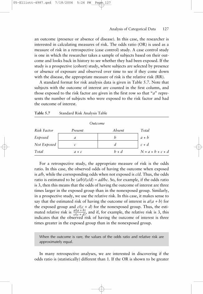
A standard format for risk analysis data is given in Table 5.7. Note thatsubjects with the outcome of interest are counted in the first column, andthose exposed to the risk factor are given in the first row so that “a” repre-sents the number of subjects who were exposed to the risk factor and hadthe outcome of interest.
Analysis of Categorical Data——127
Table 5.7 Standard Risk Analysis Table
Outcome
Risk Factor Present Absent Total
Exposed a b a + b
Not Exposed c d c + d
Total a + c b + d N = a + b + c + d
For a retrospective study, the appropriate measure of risk is the oddsratio. In this case, the observed odds of having the outcome when exposedis a/b, while the corresponding odds when not exposed is c/d. Thus, the oddsratio is estimated to be (a/b)/(c/d) = ad/bc. So, for example, if the odds ratiois 3, then this means that the odds of having the outcome of interest are threetimes larger in the exposed group than in the nonexposed group. Similarly,in a prospective study, we use the relative risk. In this case, it makes sense tosay that the estimated risk of having the outcome of interest is a/(a + b) forthe exposed group and c/(c + d) for the nonexposed group. Thus, the esti-mated relative risk is , and if, for example, the relative risk is 3, thisindicates that the observed risk of having the outcome of interest is threetimes greater in the exposed group than in the nonexposed group.
When the outcome is rare, the values of the odds ratio and relative risk areapproximately equal.
In many retrospective analyses, we are interested in discovering if theodds ratio is (statistically) different than 1. If the OR is shown to be greater
a/(a + b)c/(c + d)
05-Elliott-4987.qxd 7/18/2006 5:26 PM Page 127
than 1, for example, it provides evidence that a risk (measured by the size ofOR) exists. An OR that is not different from 1 provides no evidence that arisk exists. If the OR is significantly less than 1, it implies that exposure tothe factor provides a benefit.
Appropriate Applications forRetrospective (Case Control) Studies
The following are examples of retrospective (case control) studies inwhich the odds ratio is the appropriate measure of risk.
• In order to investigate smoking and lung cancer, a group of patients whohave lung cancer (cases) are compared to a control group without lung can-cer. Each of the subjects in these two groups is then classified as being asmoker (i.e., the exposure) or a nonsmoker.
• In order to assess whether having received the measles, mumps, and rubellavaccine increases the risk of developing autism, a group of autistic childrenand a control group of nonautistic children are compared on the basis ofwhether they have previously received the vaccine.
Appropriate Applications for Prospective (Cohort) Studies
• A group of football players with a history of concussion is compared over a2-year period with a control group of football players with no history of con-cussion to see whether those with such history are more likely to experienceanother concussion during that period.
• Samples of 500 subjects with high cholesterol and 500 subjects without highcholesterol are followed for the next 10 years to determine whether subjectsin the high-cholesterol group were more likely to have a heart attack duringthat period.
In the following example, we reexamine the data analyzed in EXAMPLE 5.2from the perspective of a risk analysis.
EXAMPLE 5.3: Analyzing Risk Ratiosfor the Exposure/Reaction Data
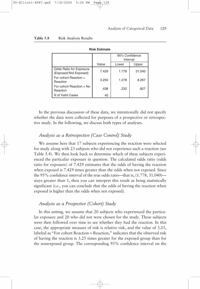
Consider again the data in Tables 5.4 and 5.5 related to the exposure to areagent and the occurrence of a particular reaction. Risk analysis output isshown in Table 5.8.
128——Statistical Analysis Quick Reference Guidebook
05-Elliott-4987.qxd 7/18/2006 5:26 PM Page 128
In the previous discussion of these data, we intentionally did not specifywhether the data were collected for purposes of a prospective or retrospec-tive study. In the following, we discuss both types of analyses.
Analysis as a Retrospective (Case Control) Study
We assume here that 17 subjects experiencing the reaction were selectedfor study along with 23 subjects who did not experience such a reaction (seeTable 5.4). We then look back to determine which of these subjects experi-enced the particular exposure in question. The calculated odds ratio (oddsratio for exposure) of 7.429 estimates that the odds of having the reactionwhen exposed is 7.429 times greater than the odds when not exposed. Sincethe 95% confidence interval of the true odds ratio—that is, (1.778, 31.040)—stays greater than 1, then you can interpret this result as being statisticallysignificant (i.e., you can conclude that the odds of having the reaction whenexposed is higher than the odds when not exposed).
Analysis as a Prospective (Cohort) Study
In this setting, we assume that 20 subjects who experienced the particu-lar exposure and 20 who did not were chosen for the study. These subjectswere then followed over time to see whether they had the reaction. In thiscase, the appropriate measure of risk is relative risk, and the value of 3.25,labeled as “For cohort Reaction = Reaction,” indicates that the observed riskof having the reaction is 3.25 times greater for the exposed group than forthe nonexposed group. The corresponding 95% confidence interval on the
Analysis of Categorical Data——129
Risk Estimate
7.429 1.778 31.040
3.250 1.278 8.267
.438 .232 .827
40
Odds Ratio for Exposure(Exposed/Not Exposed)
For cohort Reaction =Reaction
For cohort Reaction = NoReaction
N of Valid Cases
Value Lower Upper
95% ConfidenceInterval
Table 5.8 Risk Analysis Results
05-Elliott-4987.qxd 7/18/2006 5:26 PM Page 129
true relative risk is (1.278, 8.267), which again stays greater than 1 and thusindicates a significant result.
A savvy researcher will use the confidence interval not only to assess signifi-cance but to also determine what practical meaning this risk would entail if thetrue value were at the lower or upper end of the interval. Also, it is helpful tointerpret confidence intervals in context with other published studies.
Reporting the Results of a Risk Analysis
The following illustrates how you might report risk analysis results in apublication format.
Narrative for the Methods Section of a Retrospective (Case Control) Study
“To examine the relative risk of having the reaction when exposed, we calcu-lated an odds ratio.”
Narrative for the Results Section of a Retrospective (Case Control) Study
“The odds of having the reaction were 7.43 times greater for subjects in theexposed group than for subjects not exposed to the reagent (OR = 7.4, 95%CI = 1.8, 31.0). Thus, the odds ratio is significantly greater than 1, suggestingthat the true odds of having the reaction are greater for the exposed group.”
Narrative for the Methods Section of a Prospective (Cohort) Study
“To examine the relative risk of having the reaction when exposed, we calcu-lated relative risk.”
Narrative for the Results Section of a Prospective (Cohort) Study
“Subjects exposed to the reagent were 3.25 times more likely to have areaction as measured by relative risk (RR = 3.25, 95% CI = 1.3, 8.3). Thus,the relative risk is significantly greater than 1, indicating that the risk ofhaving the reaction is greater for the exposed group.”
SPSS Step-by-Step. EXAMPLE 5.3:Analyzing Risk Ratios for the Exposure/Reaction Data
In this example, we use the exposure data in EXPOSURE22.SAV. Toobtain the risk analysis results, open the data set EXPOSURE22.SAV and dothe following:
130——Statistical Analysis Quick Reference Guidebook
05-Elliott-4987.qxd 7/18/2006 5:26 PM Page 130
1. Select Analyze/Descriptives/Crosstabs.
2. Choose Exposure as the row variable and Reaction as the column variable.
3. Click the Statistics button and select the Risk checkbox and Continue.
4. Click OK.
The resulting output is displayed in Table 5.8.
Program Comments
For SPSS to calculate the correct values for the odds ratio, you will needto set up your SPSS data set in a specific way so that the resulting 2 × 2 out-put table appears in the standard display format shown in Table 5.7. In thistable, notice that subjects at risk are in the first row and subjects not at riskare in the second row of the table. Similarly, those who experience the out-come of interest are placed in column 1. For SPSS to produce this table, youmust designate row and column positions alphabetically or in numeric order.That is, in the current example, the risk factor is coded so that 0 = exposedand 1 = not exposed. You could also code them as 1 = exposed and 2 = notexposed. Both of these coding strategies put the exposed subjects in the firstrow of the table. If, for example, you used the opposite strategy where 0 =not exposed and 1 = exposed, that would place those having the exposure inthe second row. This would cause the OR to be calculated as 0.135 (whichis the inverse of the actual value OR = 7.429). This coding conundrum isunfortunate since most people intuitively code their data with 1 meaningexposure and 0 meaning no exposure. However, to make the results comeout correctly in SPSS, you should use the guidelines listed above.
McNemar’s Test
In the section on contingency table analysis, we saw that a test for indepen-dence is used to test whether there is a relationship between dichotomouscategorical variables such as political party preference (Republican orDemocrat) and voting intention (plan to vote or do not plan to vote). Also,in EXAMPLE 5.2, researchers were interested in determining whether there wasa relationship between exposure to a risk factor and occurrence of a reac-tion. While in these cases, it is of interest to determine whether the variablesare independent, in some cases, the categorical variables are paired in such away that a test for independence is meaningless. McNemar’s test is designedfor the analysis of paired dichotomous, categorical variables in much thesame way that the paired t-test is designed for paired quantitative data.
Analysis of Categorical Data——131
05-Elliott-4987.qxd 7/18/2006 5:26 PM Page 131
Appropriate Applications of McNemar’s Test
The following are examples of dichotomous categorical data that arepaired and for which McNemar’s test is appropriate.
• An electrocardiogram (ECG) and a new scanning procedure are used to detectwhether heart disease is present in a sample of patients with known heart dis-ease. Researchers want to analyze the disagreement between the two measures.
• A sample of possible voters is polled to determine how their preferences forthe two major political party candidates for president changed before andafter a televised debate.
• Consumers are selected for a study designed to determine how their impres-sions of a particular product (favorable or unfavorable) changed before andafter viewing an advertisement.
In each case above, the pairing occurs because the two variables representtwo readings of the same characteristic (e.g., detection of heart disease, pres-idential preference, etc.). You already know that the readings will agree tosome extent, and thus testing for independence using a contingency tableapproach is not really appropriate. What you want to measure is disagree-ment or change. That is, in what way do the two heart scan proceduresdiffer, how has the debate or the advertisement changed the opinions of thesubjects, and so forth?
Hypotheses for McNemar’s Test
In situations for which McNemar’s test is appropriate, the interest focuseson the subjects for which change occurred. Following up on the thirdbulleted example above, suppose an advertiser wants to know whether anadvertisement has an effect on the impression consumers have of a product.A group of people is selected, and their feelings about the product before andafter viewing the advertisement are recorded as favorable or unfavorable.Thus, there are four categories of “before versus after” responses:
(i) Favorable both before and after viewing the advertisement
(ii) Favorable before and unfavorable after viewing the advertisement
(iii) Unfavorable before and favorable after viewing the advertisement
(iv) Unfavorable both before and after viewing the advertisement
We are interested in determining whether the advertisement changed attitudestoward the product. That is, we concentrate on the subjects in categories
132——Statistical Analysis Quick Reference Guidebook
05-Elliott-4987.qxd 7/18/2006 5:26 PM Page 132
(ii) and (iii). Was it more common for a subject to be in category (ii) thanin category (iii) or vice versa? The hypotheses of interest would be thefollowing:
H0: The probability of a subject having a favorable response to the productbefore viewing the advertisement and an unfavorable response afterward isequal to the probability of having an unfavorable response to the productbefore viewing the advertisement and a favorable response afterward.
Ha: The probability of a subject having a favorable response to the productbefore viewing the advertisement and an unfavorable response afterward isnot equal to the probability of having an unfavorable response to the prod-uct before viewing the advertisement and a favorable response afterward.
Clearly, the goal of the advertisement would be to improve people’sattitudes toward the product; that is, there should be more people in cate-gory (iii) than category (ii). The corresponding one-sided hypotheses reflect-ing this goal are as follows:
H0: The probability of a subject having a favorable response to the productbefore viewing the advertisement and an unfavorable response afterward isequal to the probability of having an unfavorable response to the productbefore viewing the advertisement and a favorable response afterward.
Ha: The probability of a subject having a favorable response to the productbefore viewing the advertisement and an unfavorable response afterward isless than the probability of having an unfavorable response to the productbefore viewing the advertisement and a favorable response afterward.
EXAMPLE 5.4: McNemar’s Test
Continuing with the advertising effectiveness illustration, suppose 20 sub-jects were asked to express their opinions before and after viewing the adver-tisement. A crosstabulation of the responses is shown in Table 5.9, where itcan be seen that 13 of the 20 subjects did not change their opinions of theproduct after viewing the advertisement. The important issue concerns howthe other 7 subjects responded. That is, did those who changed their mindstend to change from favorable before to unfavorable after or from unfavor-able before to favorable after (clearly the advertiser’s preference)? In thetable, we see that 2 subjects changed from a favorable opinion before theadvertisement to an unfavorable opinion afterward, while 5 improved theiropinion after the advertisement.
Analysis of Categorical Data——133
05-Elliott-4987.qxd 7/18/2006 5:26 PM Page 133

Suppose for the moment that the advertiser is simply interested in know-ing whether the advertisement changes the perception of the viewer in eitherdirection. In this case, we would test the first set of hypotheses given previ-ously. The results for this analysis are shown in Table 5.10.
134——Statistical Analysis Quick Reference Guidebook
Table 5.9 2 × 2 Table for Advertising Effectiveness Data
before * after Crosstabulation
Count
4 5 9
2 9 11
6 14 20
Unfavorable
Favorable
before
Total
Unfavorable Favorable
after
Total
Chi-Square Tests
.453a
20
McNemar Test
N of Valid Cases
ValueExact Sig.(2-sided)
a. Binomial distribution used.
Table 5.10 McNemar’s Test Results for Advertising Effectiveness Data
For this analysis, the test yields a p-value of 0.453. Since this p-value islarge, the null hypothesis of equal probabilities is not rejected. That is, thereis not enough evidence to say that those who will change their reactions afterthe advertisement will do so in one direction more than the other.
As mentioned earlier, it is probably the case that the advertiser wants toshow that there is a stronger tendency for subjects to improve their opinionafter the advertisement; that is, it is more likely to be in category (iii) thancategory (ii). In this case, you would want to test the second set of hypothe-ses given previously (i.e., the one-sided hypotheses). The data support thealternative of interest since 5 people who changed were in category (iii) andonly 2 were in category (ii). Thus, for this one-sided hypothesis, the p-valuein the table should be cut in half, but even with this reduction, the results arestill not significant. (This negative result could have resulted from a samplesize too small to detect a meaningful difference. See the discussion of thepower of a test in Chapter 1.)
05-Elliott-4987.qxd 7/18/2006 5:26 PM Page 134

Reporting the Results of McNemar’s Test
The following illustrates how you might report these McNemar testresults in a publication format in the setting in which the alternative speci-fies an improved impression after viewing the advertisement.
Narrative for the Methods Section
“McNemar’s test was used to test the null hypothesis that the probability ofchanging from favorable before to unfavorable after viewing the advertisementis equal to the probability of changing from unfavorable before to favorableafter viewing the advertisement.”
Narrative for the Results Section
“Using McNemar’s test, no significant tendency was found for subjects whochanged their opinion to be more likely to have a favorable opinion of theproduct after viewing the advertisement (p = 0.23).”
SPSS Step-by-Step. EXAMPLE 5.4:McNemar’s Test
The data set MCNEMAR.SAV contains two variables, labeled Beforeand After, in casewise form. The data are all dichotomous, where 0 indicatesnonfavorable and 1 indicates favorable. To perform a McNemar’s test onthese data, open the data set MCNEMAR.SAV and follow these steps:
1. Select Analyze/Descriptives Statistics/Crosstabs.
2. Select Before as the row variable and After as the column variable.
3. Click on the Statistics button and select McNemar and Continue.
4. Click OK, and the results in Table 5.10 are shown.
Mantel-Haenszel Comparison
The Mantel-Haenszel method is often used (particularly in meta-analysis) topool the results from several 2 × 2 contingency tables. It is also useful for theanalysis of two dichotomous variables while adjusting for a third variableto determine whether there is a relationship between the two variables,controlling for levels of the third variable.
Analysis of Categorical Data——135
05-Elliott-4987.qxd 7/18/2006 5:26 PM Page 135
Appropriate Applications of the Mantel-Haenszel Procedure
• Disease Incidence. Case control data for a disease are collected in severalcities, forming a 2 × 2 table for each city. You could use a Mantel-Haenszelanalysis to obtain a pooled estimate of the odds ratio across cities.
• Pooling Results From Previous Studies. Several published studies have analyzedthe same categorical variables summarized in 2 × 2 tables. In meta-analysis,the information from the studies is pooled to provide more definitive findingsthan could be obtained from a single study. Mantel-Haenszel analysis can beused to pool this type of information. For more on meta-analysis, see Hunt(1997) and Lipsey and Wilson (2000).
Hypotheses Tests Used in Mantel-Haenszel Analysis
The hypotheses tested in the Mantel-Haenszel test are as follows:
H0: There is no relationship between the two variables of interest when con-trolling for a third variable.
Ha: There is a relationship between the two variables of interest when control-ling for a third variable.
Design Considerations for a Mantel-Haenszel Test
A Mantel-Haenszel analysis looks at several 2 × 2 tables from the samebivariate variables, each representing some strata or group (e.g., informationfrom different departments at a university, etc.) or from different results ofsimilar analyses (as in a meta-analysis). The test also assumes that the tablesare independent (subjects or entities are in one and only one table).
EXAMPLE 5.5: Mantel-Haenszel Analysis
A classic data set illustrating the use of the Mantel-Haenszel test is data col-lected at the University of California at Berkeley concerning gender patternsin graduate admissions (Bickel & O’Connell, 1975). The crosstabulated datafor acceptance (no or yes) versus gender is given in Table 5.11 for five sepa-rate departments along with row percentages, showing the percentage ofeach gender that was admitted within each program. From this table, it canbe seen that while Department 1 seems to have higher admission rates thanthe other departments, the comparative acceptance rates for males andfemales are about the same within departments, with there being a slighttendency for females to be admitted at a higher rate.
136——Statistical Analysis Quick Reference Guidebook
05-Elliott-4987.qxd 7/18/2006 5:26 PM Page 136
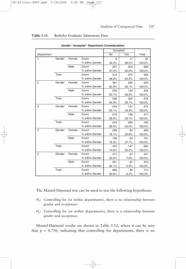
The Mantel-Haenszel test can be used to test the following hypotheses:
H0: Controlling for (or within departments), there is no relationship betweengender and acceptance.
Ha: Controlling for (or within departments), there is a relationship betweengender and acceptance.
Mantel-Haenszel results are shown in Table 5.12, where it can be seenthat p = 0.756, indicating that controlling for departments, there is no
Analysis of Categorical Data——137
Gender * Accepted * Department Crosstabulation
8 17 25
32.0% 68.0% 100.0%
207 353 560
37.0% 63.0% 100.0%
215 370 585
36.8% 63.2% 100.0%
391 202 593
65.9% 34.1% 100.0%
205 120 325
63.1% 36.9% 100.0%
596 322 918
64.9% 35.1% 100.0%
244 131 375
65.1% 34.9% 100.0%
279 138 417
66.9% 33.1% 100.0%
523 269 792
66.0% 34.0% 100.0%
299 94 393
76.1% 23.9% 100.0%
138 53 191
72.3% 27.7% 100.0%
437 147 584
74.8% 25.2% 100.0%
317 24 341
93.0% 7.0% 100.0%
351 22 373
94.1% 5.9% 100.0%
668 46 714
93.6% 6.4% 100.0%
Count
% within Gender
Count
% within Gender
Count
% within Gender
Count
% within Gender
Count
% within Gender
Count
% within Gender
Count
% within Gender
Count
% within Gender
Count
% within Gender
Count
% within Gender
Count
% within Gender
Count
% within Gender
Count
% within Gender
Count
% within Gender
Count
% within Gender
Female
Male
Gender
Total
Female
Male
Gender
Total
Female
Male
Gender
Total
Female
Male
Gender
Total
Female
Male
Gender
Total
Department
1
2
3
4
5
No Yes
Accepted
Total
Table 5.11 Berkeley Graduate Admissions Data
05-Elliott-4987.qxd 7/18/2006 5:26 PM Page 137
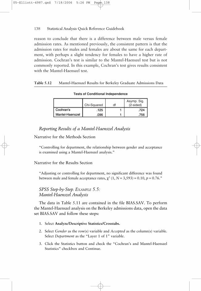
reason to conclude that there is a difference between male versus femaleadmission rates. As mentioned previously, the consistent pattern is that theadmission rates for males and females are about the same for each depart-ment, with perhaps a slight tendency for females to have a higher rate ofadmission. Cochran’s test is similar to the Mantel-Haenszel test but is notcommonly reported. In this example, Cochran’s test gives results consistentwith the Mantel-Haenszel test.
138——Statistical Analysis Quick Reference Guidebook
Table 5.12 Mantel-Haenszel Results for Berkeley Graduate Admissions Data
.125 1 .724
.096 1 .756
Cochran's
Mantel-Haenszel
Tests of Conditional Independence
.125 1 .724
.096 1 .756
Cochran’s
Mantel-Haenszel
Chi-Squared dfAsymp. Sig.
(2-sided)
Reporting Results of a Mantel-Haenszel Analysis
Narrative for the Methods Section
“Controlling for department, the relationship between gender and acceptanceis examined using a Mantel-Haenszel analysis.”
Narrative for the Results Section
“Adjusting or controlling for department, no significant difference was foundbetween male and female acceptance rates, χ2 (1, N = 3,593) = 0.10, p = 0.76.”
SPSS Step-by-Step. EXAMPLE 5.5:Mantel-Haenszel Analysis
The data in Table 5.11 are contained in the file BIAS.SAV. To performthe Mantel-Haenszel analysis on the Berkeley admissions data, open the dataset BIAS.SAV and follow these steps:
1. Select Analyze/Descriptive Statistics/Crosstabs.
2. Select Gender as the row(s) variable and Accepted as the column(s) variable.Select Department as the “Layer 1 of 1” variable.
3. Click the Statistics button and check the “Cochran’s and Mantel-HaenszelStatistics” checkbox and Continue.
05-Elliott-4987.qxd 7/18/2006 5:26 PM Page 138

4. Click the Cells button and select Row in the Percentages section andContinue. Click OK, and the output includes the information in Tables 5.11and 5.12.
5. To produce Table 5.13, leave off the Department variable in Step 2. To pro-duce the percentages, select the Cells button and check the Row percentagesoption.
Tips and Caveats for Mantel-Haenszel Analysis
Simpson’s Paradox
Historically, the real interest in the Berkeley admissions data set (and thereason for Bickel and O’Connell’s [1975] article in Science) is the apparentinconsistency between the conclusions based on evidence of a possible biasagainst females using the combined data (see Table 5.13) and the conclu-sions obtained previously based on the departmental data in Table 5.11 (i.e.,within departments, the acceptance rates for men and women were not sig-nificantly different). In Table 5.13, we show an overall comparison betweengender and admission combined over the five departments. Interestingly, inTable 5.13, the overall admission rates for males is 37% (686/1,866), whilefor females, it is only 27% (468/1,727). In addition, for this 2 × 2 table, thechi-square test for independence (computer output not shown here) givesp < 0.001, indicating a relationship between gender and admission. On thesurface, these data seem to indicate a sex bias against women.
Analysis of Categorical Data——139
Table 5.13 Berkeley Graduate Admissions DataCombined Across Departments
Gender * Accepted Crosstabulation
1259 468 172772.9% 27.1% 100.0%
1180 686 186663.2% 36.8% 100.0%
2439 1154 359367.9% 32.1% 100.0%
Count% within GenderCount% within GenderCount% within Gender
Female
Male
Gender
Total
No Yes
Accepted
Total
To explain the reasons for these seeming contradictions, note that admis-sions rates into Department 1 were substantially higher than were those forthe other four majors. Further examination of the data in Table 5.11 indi-cates that males applied in greater numbers to Department 1, while females
05-Elliott-4987.qxd 7/18/2006 5:26 PM Page 139

applied in greater numbers to departments into which admission was moredifficult. The important point is that relationships between variables withinsubgroups can be entirely reversed when the data are combined across sub-groups. This is called Simpson’s paradox. Clearly, analysis of these data bydepartment, as shown in Table 5.11, provides a better picture of the rela-tionship between gender and admission than does use of the combined datain Table 5.13.
Tests of Interrater Reliability
Interrater reliability is a measure used to examine the agreement betweentwo people (raters/observers) on the assignment of categories of a categori-cal variable. It is an important measure in determining how well an imple-mentation of some coding or measurement system works.
Appropriate Applications of Interrater Reliability
• Different people read and rate the severity (from 0 to 4) of a tumor based ona magnetic resonance imaging (MRI) scan.
• Several judges score competitors at an ice-skating competition on an integerscale of 1 to 5.
• Researchers want to compare the responses to a measure of happiness (scaled1 to 5) experienced by husbands and wives.
A statistical measure of interrater reliability is Cohen’s kappa, whichranges from –1.0 to 1.0, where large numbers mean better reliability, valuesnear zero suggest that agreement is attributable to chance, and values lessthan zero signify that agreement is even less than that which could be attrib-uted to chance.
EXAMPLE 5.6: Interrater Reliability Analysis
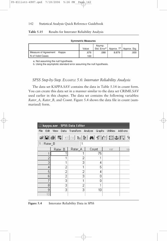
Using an example from Fleiss (2000, p. 213), suppose you have 100 subjectswhose diagnosis is rated by two raters on a scale that rates each subject’s dis-order as being psychological, neurological, or organic. The data are given inTable 5.14.
The results of the interrater analysis are given in Table 5.15, wherekappa = 0.676 with p < 0.001. This measure of agreement, while statisticallysignificant, is only marginally convincing. Most statisticians prefer kappa
140——Statistical Analysis Quick Reference Guidebook
05-Elliott-4987.qxd 7/18/2006 5:26 PM Page 140

values to be at least 0.6 and most often higher than 0.7 before claiming agood level of agreement. Although not displayed in the output, you can finda 95% confidence interval using the generic formula for 95% confidenceintervals:
Estimate ± 1.96 SE
Using this formula and the results in Table 5.15, an approximate 95%confidence interval on kappa is (0.504, 0.848). Some statisticians preferthe use of a weighted kappa, particularly if the categories are ordered. Theweighted kappa allows “close” ratings to not simply be counted as “misses.”However, SPSS does not calculate weighted kappas.
Reporting the Results of an Interrater Reliability Analysis
The following illustrates how you might report this interrater analysis ina publication format.
Narrative for the Methods Section
“An interrater reliability analysis using the kappa statistic was performed todetermine consistency among raters.”
Narrative for the Results Section
“The interrater reliability for the raters was found to be kappa = 0.68 (p <.0.001), 95% CI (0.504, 0.848).”
Analysis of Categorical Data——141
Table 5.14 Data for Interrater Reliability Analysis
Rater A
Psychological Neurological Organic
Psychological 75 1 4
Rater B Neurological 5 4 1
Organic 0 0 10
SOURCE: Statistical Methods for Rates & Proportions, Second Edition, copyright © 2000, byJoseph L. Fleiss. Reprinted with permission of Wiley-Liss, Inc., a subsidiary of John Wiley &Sons, Inc.
05-Elliott-4987.qxd 7/18/2006 5:26 PM Page 141
SPSS Step-by-Step. EXAMPLE 5.6: Interrater Reliability Analysis
The data set KAPPA.SAV contains the data in Table 5.14 in count form.You can create this data set in a manner similar to the data set CRIME.SAVused earlier in this chapter. The data set contains the following variables:Rater_A, Rater_B, and Count. Figure 5.4 shows the data file in count (sum-marized) form.
142——Statistical Analysis Quick Reference Guidebook
Table 5.15 Results for Interrater Reliability Analysis
Symmetric Measures
.676 .088 8.879 .000
100
KappaMeasure of Agreement
N of Valid Cases
ValueAsymp.
Std. Errora Approx. Tb Approx. Sig.
a. Not assuming the null hypothesis.b. Using the asymptotic standard error assuming the null hypothesis.
Figure 5.4 Interrater Reliability Data in SPSS
05-Elliott-4987.qxd 7/18/2006 5:26 PM Page 142
To analyze these data, follow these steps:
1. Open the file KAPPA.SAV. Before performing the analysis on these summa-rized data, you must tell SPSS that the Count variable is a “weighted” vari-able. Select Data/Weight Cases . . . and select the “weight cases by” optionwith Count as the Frequency variable.
2. Select Analyze/Descriptive Statistics/Crosstabs.
3. Select Rater A as the row and Rater B as the column.
4. Click on the Statistics button and select Kappa and Continue.
5. Click OK to display the results for the kappa test in Table 5.15.
Goodness-of-Fit Test
A goodness-of-fit test is used to ascertain whether the distribution ofobserved counts in the various categories of a categorical variable matchesthe expected distribution of counts under a hypothetical model for the data.
Appropriate Applications of the Goodness-of-Fit Test
The following are examples of situations in which a chi-square goodness-of-fit test would be appropriate.
• Genetic theory indicates that the result of crossing two flowering plants tocreate a number of progeny should result in flowers that are 50% red, 25%yellow, and 25% white. When the cross-bred flowers bloom, the observednumber of each color is compared with the numbers expected under thetheory to see whether the genetic theory seems to apply in this case.
• A zoologist wants to know whether there is a directional preference in thepositioning of nests for a particular species of birds. A sample of 300 nests isobserved, and each nest is categorized as facing north, northeast, and so on.The counts for each of the eight directions are compared with the countsexpected if there is no directional preference.
• The U.S. Bureau of Labor Statistics provides the percentages of U.S. full-timeworkers in 1996 who fell into the following five categories: less than highschool, high school degree—no college, some college, bachelor’s degree, andadvanced degree. A sample of 1,000 full-time workers is selected this year todetermine whether the distribution of educational attainment has changedsince 1996.
Analysis of Categorical Data——143
05-Elliott-4987.qxd 7/18/2006 5:26 PM Page 143

Design Considerations fora Goodness-of-Fit Test
1. The test assumes that a random sample of observations is taken from thepopulation of interest.
2. The appropriate use of the chi-square to approximate the distribution of thegoodness-of-fit test statistic depends on both the sample size and the numberof cells. A widely used rule of thumb suggested by Cochran (1954) is that theapproximation is adequate if no expected cell frequencies are less than 1 andno more than 20% are less than 5.
Hypotheses for a Goodness-of-Fit Test
The hypotheses being tested in this setting are as follows:
H0: The population (from which the sample is selected) follows the hypothe-sized distribution.
Ha: The population does not follow the hypothesized distribution.
To test these hypotheses, a chi-squared test statistic is used that com-pares the observed frequencies with what is expected if the hypothesizedmodel under the null is correct. Large values of the test statistic suggestthat the alternative is true, while small values are supportive of the null.A low p-value suggests rejection of the null hypothesis and leads to theconclusion that the data do not follow the hypothesized, or theoretical,distribution.
Tips and Caveats for a Goodness-of-Fit Test
No One-Sided Tests
There are no one-sided/two-sided decisions to be made regarding thesetests. The tests are inherently nondirectional (“sort of two-sided”) in thesense that the chi-square test is simply testing whether the observedfrequencies and expected frequencies agree without regard to whetherparticular observed frequencies are above or below the correspondingexpected frequencies. If the null hypothesis is rejected, then a good inter-pretation of the results will involve a discussion of differences that werefound.
144——Statistical Analysis Quick Reference Guidebook
05-Elliott-4987.qxd 7/18/2006 5:26 PM Page 144

EXAMPLE 5.7: Goodness-of-Fit Test
As an illustration of the goodness-of-fit test, we consider a classicexperiment in genetics. Gregor Mendel, a Czechoslovakian monk in the19th century, identified some basic principles that control heredity. Forexample, Mendel’s theory suggests that the phenotypic frequencies resultingfrom a dihybrid cross of two independent genes, where each gene showssimple dominant/recessive inheritance, will be expected to be in a 9:3:3:1ratio. In Mendel’s classic experiment using the garden pea, he predicted thatthe frequencies of smooth yellow peas, smooth green peas, wrinkled yellowpeas, and wrinkled green peas would be in a 9:3:3:1 ratio. The hypothesesbeing tested in this setting are the following:
H0: The population frequencies of smooth yellow, smooth green, wrinkledyellow, and wrinkled green peas will be in a 9:3:3:1 ratio.
Ha: The population frequencies will not follow this pattern.
Mendel’s experiment yielded 556 offspring, so the expected frequencieswould be (9/16)556 = 312.75, (3/16)556 = 104.25, (3/16)556 = 104.25, and(1/16)556 = 34.75 for smooth yellow, smooth green, wrinkled yellow, andwrinkled green peas, respectively. The frequencies that Mendel actually
Analysis of Categorical Data——145
Table 5.16 Goodness-of-Fit Analysis for Mendel’s Data
Phenotype
315 312.8 2.3
108 104.3 3.8
101 104.3 -3.3
32 34.8 -2.8
556
Smooth Yellow
Smooth Green
Wrinkled Yellow
Wrinkled Green
Total
Observed N Expected N Residual
Test Statistics
.470
3
.925
Chi-Squarea
df
Asymp. Sig.
Phenotype
a. 0 cells (.0%) have expected frequencies less than 5. The minimum expected cell frequency is 34.8.
05-Elliott-4987.qxd 7/18/2006 5:26 PM Page 145
observed were 315, 108, 101, and 32, respectively (i.e., quite close to thoseexpected).
In Table 5.16, we show the results for this analysis where you can seethe observed and expected frequencies. The chi-square statistic is .470 with3 degrees of freedom and p = .925. That is, the observed phenotypic ratiosfollowed the expected pattern quite well, and you would not reject thenull hypothesis. There is no evidence to suggest that the theory is not cor-rect. In general, if the p-value for this test is significant, it means that thereis evidence that the observed data do not fit the theorized ratios.
Reporting the Results of a Chi-Square Goodness-of-Fit Analysis
The following examples illustrate how you might report this goodness-of-fit test in a publication format.
Narrative for the Methods Section
“A chi-square goodness-of-fit test was performed to test the null hypothesisthat the population frequencies of smooth yellow, smooth green, wrinkledyellow, and wrinkled green peas will be in a 9:3:3:1 ratio.”
Narrative for the Results Section
“The results were not statistically significant, and there is no reason to rejectthe claim that Mendel’s theory applies to this dihybrid cross, χ2 (3, N = 556)= 0.470, p = 0.925.”
SPSS Step-by-Step. EXAMPLE 5.7:Goodness-of-Fit Test
To perform a goodness-of-fit test in SPSS, you must have a data setconsisting of counts. This data set can be set up in two ways. If you knowthe counts in each category, you can set up a data set consisting specificallyof these counts. If you have a standard casewise data set, then you can alsorun a goodness-of-fit test using that file directly.
The file MENDELCNT.SAV contains the actual counts Mendel obtained.To create a data set consisting of the counts and perform the goodness-of-fittest in SPSS, follow these steps:
1. Select File/New/Data. . . .
2. This new data set will have two numeric variables: Phenotype and Count. Inthe first column (i.e., for the Phenotype variable), enter the numbers 1 for
146——Statistical Analysis Quick Reference Guidebook
05-Elliott-4987.qxd 7/18/2006 5:26 PM Page 146
smooth yellow, 2 for smooth green, 3 for wrinkled yellow, and 4 for wrinkledgreen, and in the second column, enter the corresponding counts (i.e., 315,108, 101, and 32). Click on the variable View and enter the variable namesPhenotype and Count. In the values column, specify value labels associatedwith the phenotype codes (i.e., 1 = smooth yellow, etc.). (See Appendix A: ABrief Tutorial for Using SPSS for Windows if you do not know how to do this.)
3. Select Data/Weight Cases . . . and select the “weight case by” option withCount as the Frequency variable.
4. Select Analyze/Nonparametric Tests/Chi Square . . . and select Phenotype asthe test variable.
5. In Expected Values, click on the Values radio button. Enter the theorizedproportions in the order you entered the data. Thus, enter a 9 and click Add,enter 3 and click Add, enter another 3 and click Add, and finally add 1 andclick Add. This specifies the theoretical 9:3:3:1 ratio.
6. Click OK to display the output shown in Table 5.16.
Program Comments
• In this example, notice that we entered 9, 3, 3, and 1 as the expectedfrequencies. You can enter any set of frequencies as long as they are multiplesof the expected proportions—in this case, 9/16, 3/16, 3/16, and 1/16. So, forexample, you could enter 18, 6, 6, and 2 and still obtain the same results. Anatural set of expected frequencies to use is 312.75, 104.25, 104.25, and34.75, which are the expected frequencies out of 556. However, SPSS doesnot allow an entry as long as 312.75. SPSS will accept 312.8 and so forth, anduse of these rounded expected frequencies results in very minor differencesfrom the results in Table 5.16.
• If you have a data set (such as the example described earlier involvingthe directional preference in the positioning of nests for a certain speciesof bird), you would select “All categories equal” in the “Expected Values”section.
• The chi-square procedure in SPSS does not recognize string (text) variables.This is the reason we assigned Phenotype to be a numeric variable andassigned the associated value labels rather than simply specifying Phenotypeas a string variable and using the four phenotypes as observed values.
Other Measures of Association for Categorical Data
Several other statistical tests can be performed on categorical data. The testperformed depends on the type of categorical variables and the intent of theanalysis. The following list describes several of these briefly.
Analysis of Categorical Data——147
05-Elliott-4987.qxd 7/18/2006 5:26 PM Page 147
Correlation. If both the rows and columns of your table contain orderednumeric values, you can produce a Spearman’s rho or other nonparametriccorrelations. See Chapter 7: Nonparametric Analysis Procedures for adiscussion of nonparametric procedures.
Nominal Measures. A number of other specialty measures can be calcu-lated for crosstabulation tables in which both variables are nominal. Theseinclude the following:
• Contingency Coefficient. This is a measure designed for larger tables. Somestatisticians recommend that the table be at least 5 by 5. The values of thecontingency coefficient range from 0 to 1, with 1 indicating high association.For smaller tables, this statistic is not recommended.
• Phi. The phi coefficient is a measure of association that is adjusted accord-ing to sample size. Specifically, it is the square root of chi-square divided byn, the sample size. Phi ranges from –1 to 1 for 2 × 2 tables and, for largertables, from 0 to the square root of the minimum of r – 1 or c – 1, where rand c denote the number of rows and columns, respectively. Phi is mostoften used in a 2 × 2 table where the variable forms true dichotomies. In thecase of 2 × 2 tables, the phi coefficient is equal to Pearson’s correlationcoefficient.
• Cramer’s V. This is a measure of association based on chi-square, where theupper limit is always 1. In a 2 × 2 table, Cramer’s V is equal to the absolutevalue of the phi coefficient.
• Lambda. Also called the Goodman-Kruskal index, lambda is a measure ofassociation where a high value of lambda (up to 1) indicates that the inde-pendent variable perfectly predicts the dependent variable and where a lowvalue of lambda (down to 0) indicates that it is of no help in predicting thedependent variable.
• Uncertainty Coefficient. Sometimes called the entropy coefficient, this is ameasure of association that indicates the proportional reduction in error (oruncertainty) when predicting the dependent variable. SPSS calculates sym-metric and asymmetric versions of the uncertainty coefficient.
Ordinal Measures. Ordinal measures of association are appropriate whenthe two variables in the contingency table both have order.
• Gamma. This statistic ranges between –1 and 1 and is interpreted similarlyto a Pearson’s correlation. For two-way tables, zero-order gammas are dis-played. For three-way to n-way tables, conditional gammas are displayed.
• Somer’s d. This measure of association ranges between –1 and 1. It is anasymmetric extension of gamma. Asymmetric values are generated accordingto which variable is considered to be the dependent variable.
148——Statistical Analysis Quick Reference Guidebook
05-Elliott-4987.qxd 7/18/2006 5:26 PM Page 148
• Kendall’s tau-b. A measure of correlation for ordinal or ranked measureswhere ties are taken into account. It is most appropriate when the number ofcolumns and rows is equal. Values range from –1 to 1.
• Kendall’s tau-c. This is similar to tau-b, except this measure ignores ties.
Eta. This is a measure of association that is appropriate when the depen-dent variable is a quantitative measure (such as age or income) and the inde-pendent variable is categorical (nominal or ordinal). Eta ranges from 0 to1, with low values indicating less association and high values indicating ahigh degree of association. SPSS calculates two eta values, one that treatsthe row variable as the quantitative variable and one that treats the columnvariable as the quantitative variable.
Summary
This chapter explains how to analyze categorical data using a variety of tech-niques for measuring association and goodness-of-fit. The following chapterexamines a comparison of three or more means.
References
Bickel, P. J., & O’Connell, J. W. (1975). Is there a sex bias in graduate admissions?Science, 187, 398–404.
Cochran, W. G. (1954). Some methods for strengthening the common chi-squaretest. Biometrics, 10, 417–451.
Fleiss, J. L. (2000). Statistical methods for rates & proportions (2nd ed.).New York: John Wiley.
Hunt, M. (1997). How science takes stock: The story of meta-analysis. New York:Russell Sage Foundation.
Lipsey, M. W., & Wilson, D. (2000). Practical meta-analysis. Thousand Oaks, CA:Sage.
Analysis of Categorical Data——149
05-Elliott-4987.qxd 7/18/2006 5:26 PM Page 149

05-Elliott-4987.qxd 7/18/2006 5:26 PM Page 150


![Exploring Categorical Structuralismcase.edu/artsci/phil/PMExploring.pdfExploring Categorical Structuralism COLIN MCLARTY* Hellman [2003] raises interesting challenges to categorical](https://static.fdocuments.in/doc/165x107/5b04a7507f8b9a4e538e151c/exploring-categorical-categorical-structuralism-colin-mclarty-hellman-2003-raises.jpg)


