
Analysing Movie Poster
2
Main image - the main image is of a man running, the man is wearing dirty cloths that look very old fashioned so this tells us that the movie could have been set near the early 1800’s this tells us the movie may be a historic. The man is running and by his facial expression we can see that he’s tired this tells us that the movie is going to be a adventure/action movie, this can make people who look at the poster wonder why the mans running and this could encourage them to watch the movie. Realise date - there is no real release date wrote on the poster all it says is ‘coming soon’ this may have been done to build suspense Title - the title has 12 wrote in a gold font this emphasizes the word and is right in the center of the poster, this could have been done to show that the number 12 is going to play a big part in the movie. Sub header - The sub title says that this is a true story, this can make people curious and this may lead them to watching the movie, the fact that this is a true story this tells us that this movie may have a deeper meaning to it. The poster has the names of the main actors written this could have been done because the poster only shows the main actor but there other people 12 Years A Slave
Transcript of Analysing Movie Poster
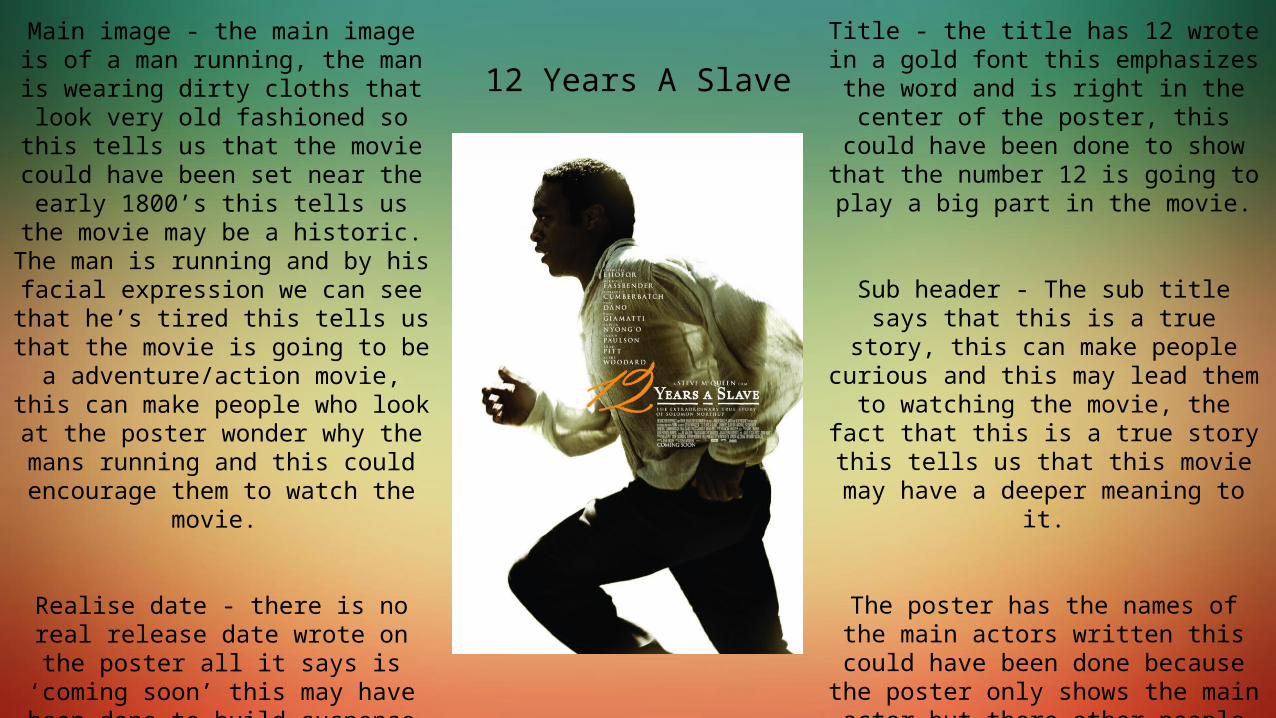
Main image - the main image is of a man running, the man is wearing dirty cloths that look very old fashioned so this tells us that the movie could have
been set near the early 1800’s this tells us the movie may be a historic. The
man is running and by his facial expression we can see that he’s tired
this tells us that the movie is going to be a adventure/action movie, this can
make people who look at the poster wonder why the mans running and this
could encourage them to watch the movie.
Realise date - there is no real release date wrote on the poster all it says is
‘coming soon’ this may have been done to build suspense or could have been done so people look into the movie
online for more information which can lead them to watching the movie.
Title - the title has 12 wrote in a gold font this emphasizes the word and is right in the center of the poster, this could have
been done to show that the number 12 is going to play a big part in the movie.
Sub header - The sub title says that this is a true story, this can make people curious and this may lead them to
watching the movie, the fact that this is a true story this tells us that this movie
may have a deeper meaning to it.
The poster has the names of the main actors written this could have been done because the poster only shows the main actor but there other people in the movie like brad pitt who attract a lot of people but aren’t featured on the poster so by having their name written on the poster
this will tell people that their in the movie as well.
12 Years A Slave
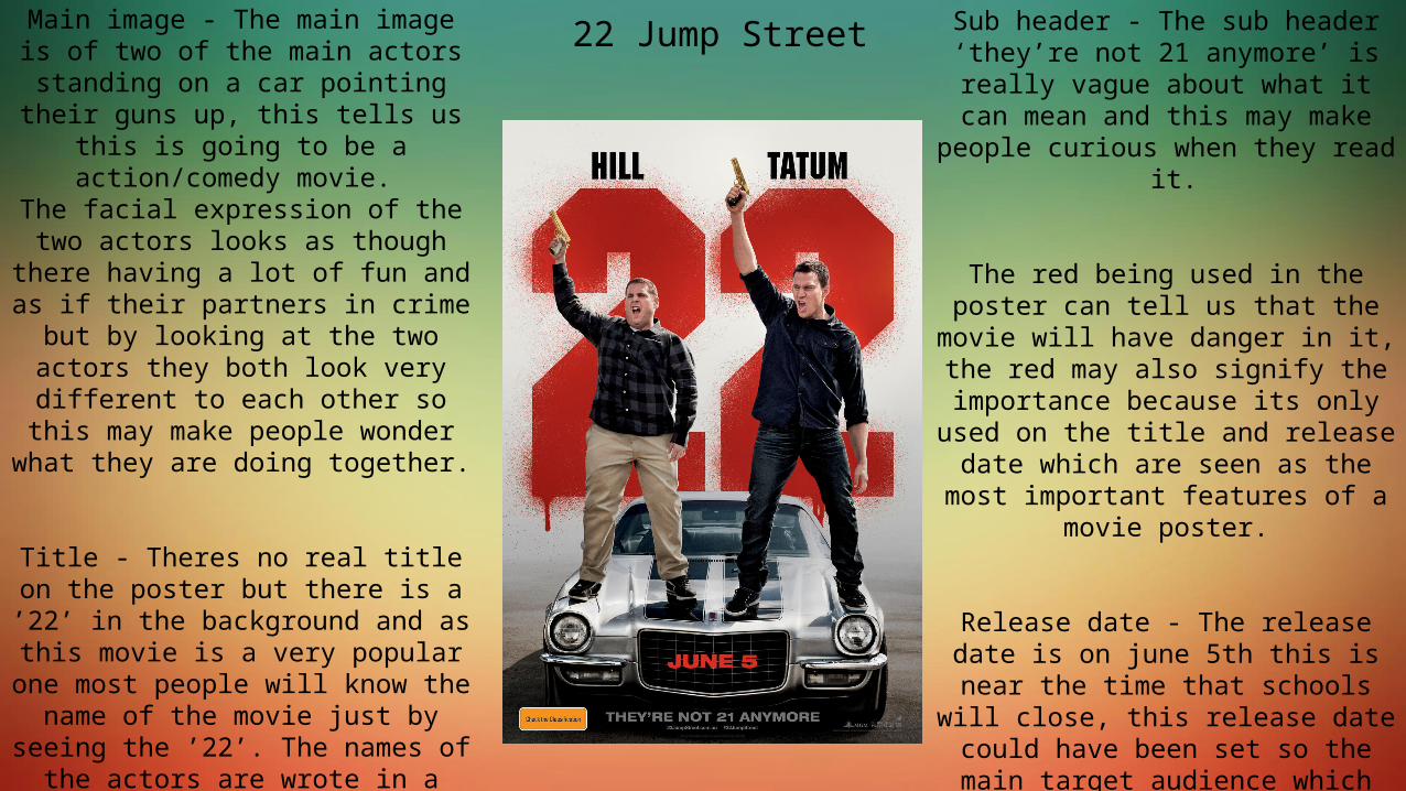
Main image - The main image is of two of the main actors standing on a car
pointing their guns up, this tells us this is going to be a action/comedy movie. The facial expression of the two actors
looks as though there having a lot of fun and as if their partners in crime but by
looking at the two actors they both look very different to each other so this may
make people wonder what they are doing together.
Title - Theres no real title on the poster but there is a ’22’ in the background and
as this movie is a very popular one most people will know the name of the
movie just by seeing the ’22’. The names of the actors are wrote in a bold
font directly on top of the 22 this has been done so people can clearly see the names of the two main characters and as their both popular actors they will attract their fans to the movie.
Sub header - The sub header ‘they’re not 21 anymore’ is really vague about what it can mean and this may make
people curious when they read it.
The red being used in the poster can tell us that the movie will have danger
in it, the red may also signify the importance because its only used on the title and release date which are
seen as the most important features of a movie poster.
Release date - The release date is on june 5th this is near the time that
schools will close, this release date could have been set so the main target
audience which are teenagers will watch the movie because they will have spare time as they wont have school.
22 Jump Street