Cascading Style Sheets (CSS) 1. What is CSS? Why CSS? How to write a CSS? 2.
Upload
rachel-andrewCategory
view
1.029download
0
CSS Grid Layout
Rachel Andrew
An Event Apart Nashville, March 2016

Rachel Andrew
http://rachelandrew.co.uk
@rachelandrew
http://grabaperch.com

CSS in 2016 is amazing.

The trouble with CSS layout
• Floats and clearfix hacks
• Absolute positioning means elements are taken out of document flow and risk overlaps
• Redundant markup and positioning oddities with display: table
• White space issues with inline-block

https://www.flickr.com/photos/zervas/2810241612
Flexbox?

Seeing Flexbox as the silver bullet for layout issues is likely to lead us down
another path of layout hacks.

The cost of taming layout methods
• Developer hours spent learning non-obvious concepts.
• Compromises in terms of document semantics in order to achieve responsive layouts.
• Needing to lean on frameworks to help with complex math.
• Adding markup to create grids
• Using preprocessors to abstract layout hacks

We need a designed for purpose layout system for the sites and applications we develop today.

CSS Grid Layout

Our HTML consists of a div with a class of wrapper and two child elements, a and b.
<div class="wrapper"> <div class="a">A</div> <div class="b">B</div> </div>

To create a grid we use a new value of the display property.
display: grid
.wrapper { display: grid;
}

We describe the grid using the new properties:
grid-template-columns
grid-template-rows
.wrapper { display: grid; grid-template-columns: 100px 100px 100px; grid-template-rows: auto auto; }

We position items using the new properties:
grid-column-startgrid-column-endgrid-row-startgrid-row-end
.a { grid-column-start: 1; grid-column-end: 2; grid-row-start: 1; grid-row-end: 2; }
To position an item bottom centre, I start at column line 2 and end at column line 3.
.b { grid-column-start: 2; grid-column-end: 3; grid-row-start: 2; grid-row-end: 3; }

To span more tracks we just change the end row or column line.
.b { grid-column-start: 2; grid-column-end: 4; grid-row-start: 2; grid-row-end: 3; }
bit.ly/aeanv-simple

The longhand for line-based placement means up to 4 properties to position each element. .a {
grid-column-start: 1; grid-column-end: 2; grid-row-start: 1; grid-row-end: 2; }
.b { grid-column-start: 2; grid-column-end: 4; grid-row-start: 2; grid-row-end: 3; }

Declare start and end values with grid-column and grid-row.
Values are separated by a / symbol.
.a { grid-column: 1 / 2; grid-row: 1 / 2; }
.b { grid-column: 2 / 4; grid-row: 2 / 3; }

Declare all 4 values using the grid-area property.
Order of properties: - grid-row-start - grid-column-start - grid-row-end - grid-column-end
.a { grid-area: 1 / 1 / 2 / 2; }
.b { grid-area: 2 / 2 / 3 / 4; }

Grid lines relate to writing mode. In a right to left language such as
Arabic the first column line is the right-hand line.

Grid Terminology

Grid Lines
Lines can be horizontal or vertical. They are referred to by number and can be
named.
Highlighted is Column Line 2.

Grid Track
A Grid Track is the space between two Grid Lines. Tracks can be horizontal or
vertical (rows or columns).
The highlighted Grid Track is between Row Lines 2 and 3.

Grid Cell
The smallest unit on our grid, a Grid Cell is the space between four Grid Lines. It’s
just like a table cell.
The highlighted Grid Cell is between row lines 2 and 3 and column lines 2 and 3.

Grid Area
Any area of the Grid bound by 4 Grid Lines. It can contain many Grid Cells.
The highlighted Grid Area is between row lines 1 and 3, column lines 2 and 4.

Line-based placement


The HTML around my page content.
The various areas of my page are child elements of a div with a class of wrapper.
<div class="wrapper">
<header class="mainheader"></header>
<div class="panel"></div>
<div class="content"></div>
</div>


Declaring a grid on wrapper.
The grid has two columns making 3 column lines.
I have specified a column and row gap. This creates a gutter between our tracks.
.wrapper { width: 100%; max-width: 960px; margin: 0 auto; display: grid; grid-template-columns: 2fr 4fr; grid-column-gap: 2em; grid-row-gap: 20px; }

The fr unit
• Assigns to the track a fraction of the available space in the container.
• Before fractions are calculated the space assigned to any fixed width tracks and gaps is removed.
• Acts in a similar way to flex-grow in Flexbox.

Grid Layout
I am creating three grid column tracks, all 1fr in width.
This gives me three equally sized column tracks.
.wrapper { display: grid; grid-template-columns: 1fr 1fr 1fr; }

Grid Layout
If I create the first column as 600 pixels and then have two 1fr columns the 600 pixel track is removed from the available space and the remainder is distributed equally between the two columns.
.wrapper { display: grid; grid-template-columns: 600px 1fr 1fr; }

Grid Layout
With a 600 pixel column, a 1fr and a 3fr column. The 600 pixels is removed from the available space then the remaining space is divided by 4.
The 1fr column gets 25% and the 3fr column 75%.
.wrapper { display: grid; grid-template-columns: 600px 1fr 3fr; }

http://alistapart.com/article/holygrail
Three columns. One fixed-width sidebar for your navigation, another for, say, your Google Ads or your Flickr photos—and, as in a fancy truffle, a liquid center for the real substance.

Grid Layout
CSS Grid “Holy Grail”. //css
.wrapper { display: grid; grid-template-columns: 300px 1fr 300px; grid-template-rows: auto; grid-column-gap: 20px; }
.header { grid-column: 1 / 4; }
.content { grid-column: 2 / 3; grid-row: 2 / 3; }
.side1 { grid-column: 1 / 2; grid-row: 2 / 3; }
.side2 { grid-column: 3 / 4; grid-row: 2 / 3; }
.footer { grid-column: 1 / 4; grid-row: 3 / 4; }
//html <div class="wrapper"> <header class="header">This is the header</header> <article class="content"></article> <div class="side1"></div> <div class="side2"></div> <footer class="footer"></div> </div>


Declaring a grid on wrapper.
The grid has two columns and two rows, making 3 column lines and 3 row lines.
.wrapper { width: 100%; max-width: 960px; margin: 0 auto; display: grid; grid-template-columns: 2fr 4fr; grid-template-rows: auto auto; grid-column-gap: 2em; grid-row-gap: 20px; }


Positioning our elements using the grid-column and grid-row shorthand.
We can omit the -end value if only spanning 1 track.
This is all we need to do to create our layout.
.mainheader { grid-column: 1 / 3; grid-row: 1 ; }
.panel { grid-column: 1 ; grid-row: 2 ; }
.content { grid-column: 2 ; grid-row: 2 ; }


I can add a footer to this layout.
<div class="wrapper">
<header class="mainheader"></header>
<div class="panel"></div>
<div class="content"></div>
<footer class="mainfooter"></footer>
</div>

Positioning the footer after row line 3.
.mainfooter { grid-column: 1 / 3; grid-row: 3 ; }

We didn’t actually specify any row tracks.
Grid creates implicit grid lines for us.
.wrapper { display: grid; grid-template-columns: 2fr 4fr; grid-column-gap: 2em; grid-row-gap: 20px; }
.mainfooter { grid-column: 1 / 3; grid-row: 3 ; }

Grid lines can be explicit or implicit
• Explicit grid lines are those specified using grid-template-rows or grid-template-columns.
• Implicit lines are created when you place something into a row or column track outside of the explicit grid.
• Default behaviour is those tracks are auto sized. You can specify a size with the grid-auto-columns and grid-auto-rows properties.

Typically rows in our layouts are sized to fit their contents, meaning that you can avoid specifying rows and grid will create them as items are positioned into them. .wrapper {
display: grid; grid-template-columns: 2fr 4fr; grid-column-gap: 2em; grid-row-gap: 20px; }

Grid is “table like” however …
• Unlike a table for layout Grid does not rely on your content being a particular order in the source.
• Being entirely described in CSS we can move things around the Grid at different breakpoints, introduce or redefine a Grid for any breakpoint.

Using Grid to order the page elements in a single column for narrow screen widths.
.wrapper { display: grid; grid-row-gap: 10px; } .mainheader { grid-row: 1 ; }
.content { grid-row: 2 ; }
.panel { grid-row: 3 ; }
.mainfooter { grid-row: 4 ; }

Redefine the Grid at min-width 550 pixels.
Position items as in the earlier example.
@media (min-width: 550px) { .wrapper { grid-template-columns: 2fr 4fr; grid-column-gap: 2em; grid-row-gap: 20px; } .mainheader { grid-column: 1 / 3; grid-row: 1 ; } .panel { grid-column: 1 ; grid-row: 2 ; } .content { grid-column: 2 ; grid-row: 2 ; } .mainfooter { grid-column: 1 / 3; grid-row: 3 ; } }

Named Grid Lines

Name lines with the name in square brackets.
Remember we are naming grid lines and not grid tracks. .wrapper {
display: grid; grid-row-gap: 10px; grid-template-rows: [row-header-start] auto [row-content-start] auto [row-panel-start] auto [row-footer-start] auto [row-footer-end]; }

Here we are positioning based on line numbers.
.mainheader { grid-row: 1 ; }
.content { grid-row: 2 ; }
.panel { grid-row: 3 ; }
.mainfooter { grid-row: 4 ; }

Here we are positioning by named lines.
.mainheader { grid-row: row-header-start; }
.content { grid-row: row-content-start; }
.panel { grid-row: row-panel-start; }
.mainfooter { grid-row: row-footer-start; }

Named Areas

We assign a name to the elements on our page.
I am doing this outside of any Media Queries.
.mainheader { grid-area: header; }
.content { grid-area: content; }
.panel { grid-area: sidebar; }
.mainfooter { grid-area: footer; }

Describe the layout on the parent element using the grid-template-areas property.
.wrapper { display: grid; grid-row-gap: 10px; grid-template-areas: "header" "content" "sidebar" "footer"; }


Redefining the template areas for the wider layout. @media (min-width: 550px) {
.wrapper { grid-column-gap: 2em; grid-row-gap: 20px; grid-template-columns: 2fr 4fr; grid-template-areas: "header header" "sidebar content" "footer footer" }
}


Repeating the name of an area causes the area to span across those grid cells.
This can be seen in the header and footer of this layout.
@media (min-width: 550px) {
.wrapper { grid-column-gap: 2em; grid-row-gap: 20px; grid-template-columns: 2fr 4fr; grid-template-areas: "header header" "sidebar content" "footer footer" }
}

Repeating the name of an area causes the area to span across those grid cells.
This can be seen in the header and footer of this layout.
@media (min-width: 550px) {
.wrapper { grid-column-gap: 2em; grid-row-gap: 20px; grid-template-columns: 2fr 4fr; grid-template-areas: "header header" "sidebar content" " . footer" }
}


Implicit Named Grid Lines

Named grid areas create four implicit named lines. You can use these in the same way as lines you have explicitly named.
.wrapper { .wrapper { grid-column-gap: 2em; grid-row-gap: 20px; grid-template-columns: 2fr 4fr; grid-template-areas: "header header" "sidebar content" "footer footer" } }
.test { z-index: 100; background-color: red; grid-column: content-start; grid-row: content-start / footer-end; }


Items on the Grid can be layered using the z-index property.

A 12 column, flexible grid

The Bootstrap grid, and those in other frameworks relies on our describing the layout in the markup.
<!-- Stack the columns on mobile by making one full-width and the other half-width --> <div class="row"> <div class="col-xs-12 col-md-8">.col-xs-12 .col-md-8</div> <div class="col-xs-6 col-md-4">.col-xs-6 .col-md-4</div> </div>
<!-- Columns start at 50% wide on mobile and bump up to 33.3% wide on desktop --> <div class="row"> <div class="col-xs-6 col-md-4">.col-xs-6 .col-md-4</div> <div class="col-xs-6 col-md-4">.col-xs-6 .col-md-4</div> <div class="col-xs-6 col-md-4">.col-xs-6 .col-md-4</div> </div>
<!-- Columns are always 50% wide, on mobile and desktop --> <div class="row"> <div class="col-xs-6">.col-xs-6</div> <div class="col-xs-6">.col-xs-6</div> </div>

With CSS Grid Layout we describe the layout in the CSS and can redefine that description at any breakpoint.
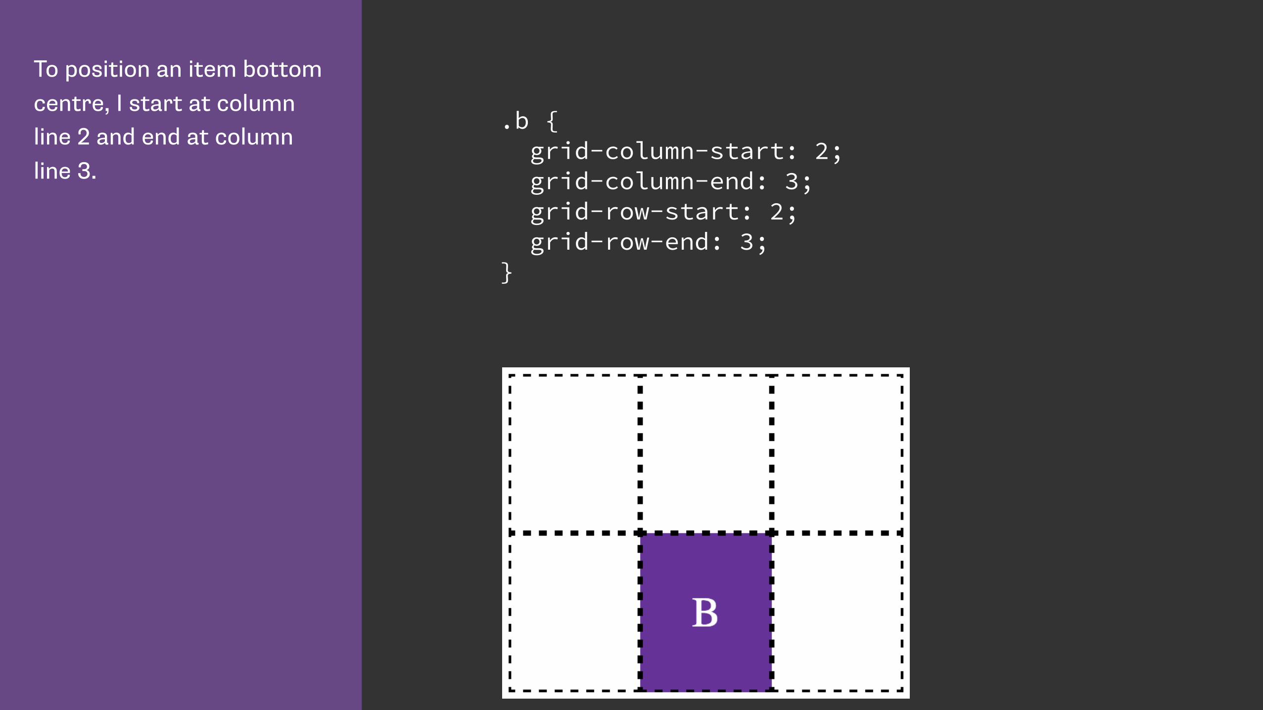
You can use the repeat keyword to repeat all or part of the grid definition.
This would create 4 200 pixel wide tracks, separated by a 100 pixel wide track.
grid-template-columns: repeat(4, 200px 100px);

We can give multiple grid lines the same name.
This means we can use the span keyword to span n number of lines, rather than specifying a specific grid line.
.wrapper { grid-template-columns: repeat(4, [col-a] 200px [col-b] 100px); }
.content { grid-column: col-a 2 / span 2; }
.aside { grid-column: col-a 2 / span col-b 2; }

The markup used to create the Grid using the Skeleton framework.
Like the Bootstrap Grid and other similar frameworks it requires classes that describe the grid to be added to the markup.
<div class="container"> <h1>Skeleton Grid</h1> <div class="example-grid"> <div class="row"> <div class="four columns">Four columns</div> <div class="four columns">Four columns</div> <div class="four columns">Four columns</div> </div> <div class="row"> <div class="eight columns">Eight columns</div> <div class="four columns">Four columns</div> </div> <div class="row"> <div class="three columns">Three columns</div> <div class="three columns">Three columns</div> <div class="three columns">Three columns</div> <div class="three columns">Three columns</div> </div> <div class="row"> <div class="six columns">Six columns</div> <div class="six columns">Six columns</div> </div> </div>


When using CSS Grid Layout we have no need to describe our grid in markup.
<div class="wrapper skeleton"> <h1 class="header">CSS Grid Layout Version</h1> <div class="box1">Four columns</div> <div class="box2">Four columns</div> <div class="box3">Four columns</div> <div class="box4">Eight columns</div> <div class="box5">Four columns</div> <div class="box6">Three columns</div> <div class="box7">Three columns</div> <div class="box8">Three columns</div> <div class="box9">Three columns</div> <div class="box10">Six columns</div> <div class="box11">Six columns</div> </div>

Defining the 12 column grid.
The repeat keyword repeats the pattern of columns or rows the number of times specified before the comma.
.wrapper { display: grid; grid-template-columns: repeat(12, [col] 1fr ); grid-template-rows: repeat(5, [row] auto) ; grid-column-gap: 1em; grid-row-gap: 15px; }

Placing box1 on the grid.
Multiple lines have the same name. This means we can use the span keyword. Here I place box1 starting at the first line named col, spanning to the 4th line.
The box is placed in the first line named row and spans 1 line - the default.
.box1 { grid-column: col / span 4; grid-row: row ; }

Placing box8 on the grid.
Starting on column line 7, spanning 3 lines.
In the 3rd row named row, spanning 1 line.
.box8 { grid-column: col 7 / span 3; grid-row: row 3 ; }


With Grid Layout we can easily span rows just like columns.
.box1b { grid-column: col / span 4; grid-row: row / span 2; }
.box2b { grid-column: col 5 / span 4; grid-row: row / span 3; }

The header and footer span the full grid.
The content and panel display side by side.
.mainheader { grid-column: col / span 12; grid-row: row ; }
.mainfooter { grid-column: col / span 12; grid-row: row 3 ; }
.content { grid-column: col 5 / span 8; grid-row: row 2 ; }
.panel { grid-column: col / span 4; grid-row: row 2 ; }

I change three values to make our panel extend to the foot of the page.
.mainheader { grid-column: col / span 12; grid-row: row ; }
.mainfooter { grid-column: col 5 / span 8; grid-row: row 3 ; }
.content { grid-column: col 5 / span 8; grid-row: row 2 ; }
.panel { grid-column: col / span 4; grid-row: row 2 / span 2 ; }


Grid Item Placement Algorithm

http://dev.w3.org/csswg/css-grid/#grid-item-placement-algorithm
“The following grid item placement algorithm resolves automatic positions of grid items into definite positions, ensuring that every grid item has a well-defined grid area to lay out into.”


A list containing images. The landscape images are inside a list item with a class of ‘landscape’.
<ul class="wrapper"> <li><h3>1.</h3> <img src="gallery1.jpg" alt="Balloons"></li> <li class="landscape"><h3>2.</h3> <img src="gallery2.jpg" alt="Balloons"></li> <li class="landscape"><h3>3.</h3> <img src="gallery8.jpg" alt="Balloons"></li> <li><h3>4.</h3> <img src="gallery4.jpg" alt="Balloons"></li> <li><h3>7.</h3> <img src="gallery5.jpg" alt="Balloons"></li> <li class="landscape"><h3>6.</h3> <img src="gallery6.jpg" alt="Balloons"></li> <li><h3>7.</h3> <img src="gallery9.jpg" alt="Balloons"></li> </ul>

I have created a grid of four equal columns.
.wrapper { display: grid; grid-template-columns: 1fr 1fr 1fr 1fr; }


When using automatic placement we can create rules for items in our document - for example displaying portrait and landscape images differently.
.wrapper { display: grid; grid-template-columns: 1fr 1fr 1fr 1fr; grid-template-rows: auto; }
.landscape { grid-column-end: span 2; }

grid-auto-flow
The default value of grid-auto-flow is sparse. Grid will move forward placing items skipping cells if items do not fit .

With a dense packing mode grid will move items out of source order to backfill spaces.
.wrapper { display: grid; grid-template-columns: 1fr 1fr 1fr 1fr; grid-template-rows: auto; grid-auto-flow: dense; }
.landscape { grid-column-end: span 2; }

grid-auto-flow
With grid-auto-flow dense items are displayed out of source order. Grid
backfills any suitable gaps.
http://bit.ly/aeanv-autoflow-dense

Is Grid a competing specification to Flexbox?

Grid and the Box Alignment Module

CSS Box Alignment Module Level 3
“This module contains the features of CSS relating to the alignment of boxes within their containers in the various CSS box layout models: block layout, table layout, flex layout, and grid layout.” - https://drafts.csswg.org/css-align/

I can create this same layout with flexbox or Grid.
With flexbox the items are laid out in a row.
.wrapper { display: flex; }
.wrapper li { flex: 1 0 25%; }

I can create this same layout with flexbox or Grid.
For Grid I use a single row, 4 column Grid.
.wrapper { display: grid; grid-template-columns: 1fr 1fr 1fr 1fr; }

Flexbox alignment properties for the three landscape images.
http://bit.ly/aeanv-flex-align
.wrapper li:nth-child(2) { align-self: center; }
.wrapper li:nth-child(3) { align-self: flex-start; }
.wrapper li:nth-child(4) { align-self: flex-end; }

Grid alignment properties for the three landscape images.
http://bit.ly/aeanv-grid-align
.wrapper li:nth-child(2) { align-self: center; }
.wrapper li:nth-child(3) { align-self: start; }
.wrapper li:nth-child(4) { align-self: end; }

When should we use Grid instead of Flexbox then?

Flexbox is for 1 dimensional layout - a column OR a row.
Grid is for 2 dimensional layout - both columns AND rows.

Wrapping list items using flexbox.
.flex { display: flex; flex-wrap: wrap; margin: 0 -10px; }
.flex li { flex: 1 1 200px; margin: 10px; }


Wrapping list items with Grid Layout.
.grid { display: grid; grid-template-columns: repeat(auto-fill, minmax(200px 1fr)); grid-gap: 20px; }


Grid and Accessibility

Power and responsibility
• Good = creating the most accessible source order and using Grid or Flexbox to get the optimal display for each device.
• Bad = using Grid or Flexbox as an excuse to forget about the source.
• Terrible - stripping out semantic elements to make everything a grid or flex item.
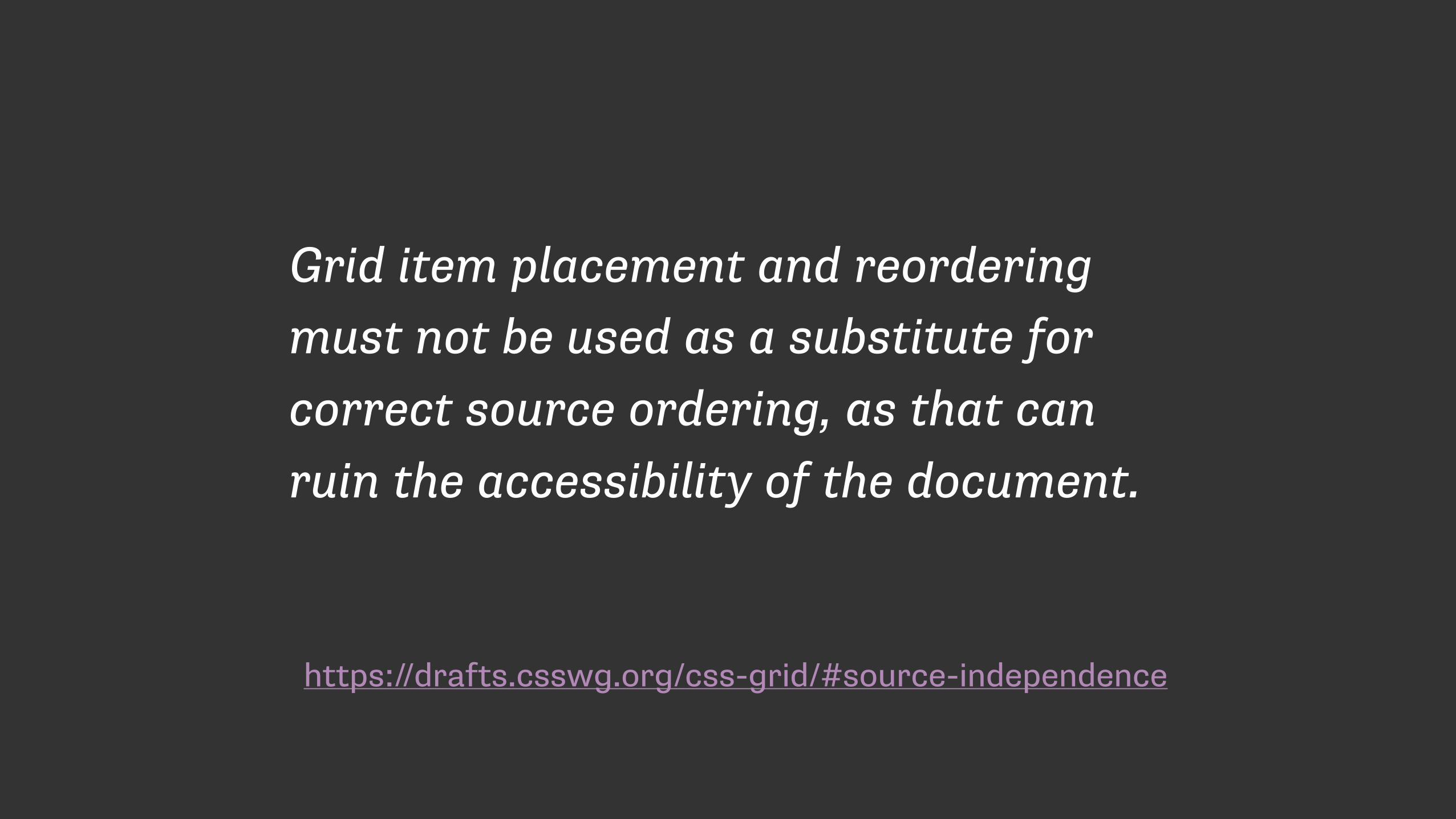
https://drafts.csswg.org/css-grid/#source-independence
Grid item placement and reordering must not be used as a substitute for correct source ordering, as that can ruin the accessibility of the document.

http://adrianroselli.com/2015/10/html-source-order-vs-css-display-order.html

https://rachelandrew.co.uk/archives/2015/07/28/modern-css-layout-power-and-responsibility/

Nested Grids and Subgrids

In this markup the boxes e, f and g are children of the element with a class of d.
<div class="wrapper"> <div class="box a">A</div> <div class="box b">B</div> <div class="box c">C</div> <div class="box d"> <div class="box e">E</div> <div class="box f">F</div> <div class="box g">G</div> </div> </div>

I have declared a grid on the wrapper div, and positioned the immediate children - the elements with classes a to d.
.wrapper { display: grid; grid-gap: 10px; grid-template-columns: repeat(4, [col] 150px); repeat(2, [row] auto); } .a { grid-column: col / span 2; grid-row: row; } .b { grid-column: col 3 / span 2; grid-row: row; } .c { grid-column: col / span 2; grid-row: row 2; } .d{ grid-column: col 3 / span 2; grid-row: row 2; }


To make box d a grid itself I declare a grid as normal then position the children of this element.
They take their grid lines from the grid declared on box d.
.d{ grid-column: col 3 / span gutter 2; grid-row: row 2; display: grid; grid-gap: 10px; grid-template-columns: 1fr 1fr; }
.e { grid-column: 1 / 3; grid-row: 1; }
.f { grid-column: 1; grid-row: 2; }
.g { grid-column: 2; grid-row: 2; }


Declaring a subgrid

In our existing layout we are creating a completely new grid on box d.
.d{ grid-column: col 3 / span 2; grid-row: row 2; display: grid; grid-gap: 10px; grid-template-columns: 1fr 1fr; }

If we declare that this grid is a subgrid, we can then position the children of this element on the same grid their parent is placed on. .d{
grid-column: col 3 / span 2; grid-row: row 2; display: grid; grid-template-columns: subgrid; grid-template-rows: subgrid; }

http://dev.w3.org/csswg/css-grid/
“The following features are at-risk, and may be dropped during the CR period:
the subgrid value of grid-template-columns and grid-template-rows, and its component parts individually”

Without subgrid we create the potential for accessibility problems. Authors may remove semantic markup in order to use grid layout.

Eric Meyer, http://meyerweb.com/eric/thoughts/
“Subgrids are essential to the adoption of grids. I hope they’ll be implemented as soon as possible, and before grids are pushed into public release channels.”

Grid needs your feedback!
Enable Experimental Web Platform Features in Chrome.
Play with my examples and think up ways you would use Grid.
Follow the CSS Grid conversation on www-style by searching for [css-grid].
See the current issues in the Editor’s Draft http://dev.w3.org/csswg/css-grid/#issues-index


Browser SupportAll my examples work in Chrome unprefixed - you need to enable the Experimental Web Platform Features flag.
You can also use Webkit nightlies, with the -webkit prefix.
The work in Blink and Webkit is being done by Igalia, sponsored by Bloomberg.
IE10 and up has support for the old syntax, with an -ms prefix.
Grid is on the Edge backlog, marked as High Priority.
Mozilla are currently implementing Grid in Firefox. Some examples work in Firefox Nightlies.
There is a Polyfill under active development: https://github.com/FremyCompany/css-grid-polyfill/

More code!
I am creating a list of examples and information at:
http://gridbyexample.com

Thank you!
@rachelandrew


![The Features of Highly Effective Forms [An Event Apart Nashville 2016]](https://static.fdocuments.in/doc/165x107/58728c0b1a28ab36118b534d/the-features-of-highly-effective-forms-an-event-apart-nashville-2016.jpg)


![CSS & eCSStender [CSS Summit 2011]](https://static.fdocuments.in/doc/165x107/54c70c6e4a79593f288b4656/css-ecsstender-css-summit-2011.jpg)