All 3 deconstructions
12
3 deconstructed music magazine front covers…
-
Upload
daniellepurnell -
Category
Education
-
view
65 -
download
2
Transcript of All 3 deconstructions
3 deconstructed musicmagazine front covers…
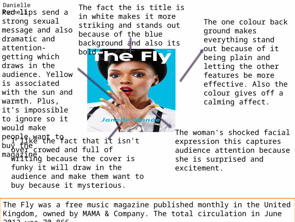
The one colour back ground makes everything stand out because of it being plain and letting the other features be more effective. Also the colour gives off a calming affect.
Red lips send a strong sexual message and also dramatic and attention-getting which draws in the audience. Yellow is associated with the sun and warmth. Plus, it’s impossible to ignore so it would make people want to buy the magazine.
The woman's shocked facial expression this captures audience attention because she is surprised and excitement.
The fact the is title is in white makes it more striking and stands out because of the blue background and also its bold.
I like the fact that it isn't over crowed and full of writing because the cover is funky it will draw in the audience and make them want to buy because it mysterious.
Danielle Purnell
The Fly was a free music magazine published monthly in the United Kingdom, owned by MAMA & Company. The total circulation in June 2013 was 70,866.
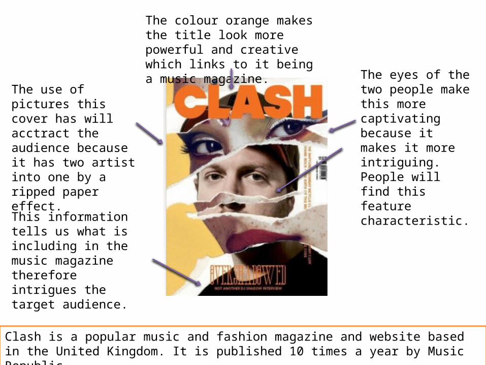
The use of pictures this cover has will acctract the audience because it has two artist into one by a ripped paper effect.
The eyes of the two people make this more captivating because it makes it more intriguing. People will find this feature characteristic.
The colour orange makes the title look more powerful and creative which links to it being a music magazine.
This information tells us what is including in the music magazine therefore intrigues the target audience.
Clash is a popular music and fashion magazine and website based in the United Kingdom. It is published 10 times a year by Music Republic.
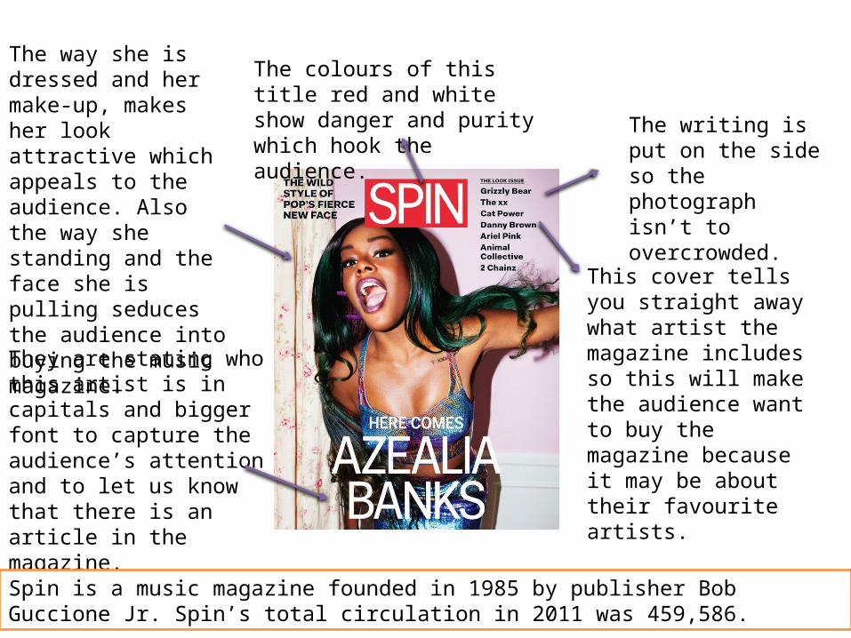
This cover tells you straight away what artist the magazine includes so this will make the audience want to buy the magazine because it may be about their favourite artists.
The way she is dressed and her make-up, makes her look attractive which appeals to the audience. Also the way she standing and the face she is pulling seduces the audience into buying the music magazine.
The colours of this title red and white show danger and purity which hook the audience.
The writing is put on the side so the photograph isn’t to overcrowded.
They are stating who this artist is in capitals and bigger font to capture the audience’s attention and to let us know that there is an article in the magazine.
Spin is a music magazine founded in 1985 by publisher Bob Guccione Jr. Spin’s total circulation in 2011 was 459,586.
3 deconstructed musicmagazine contents pages…
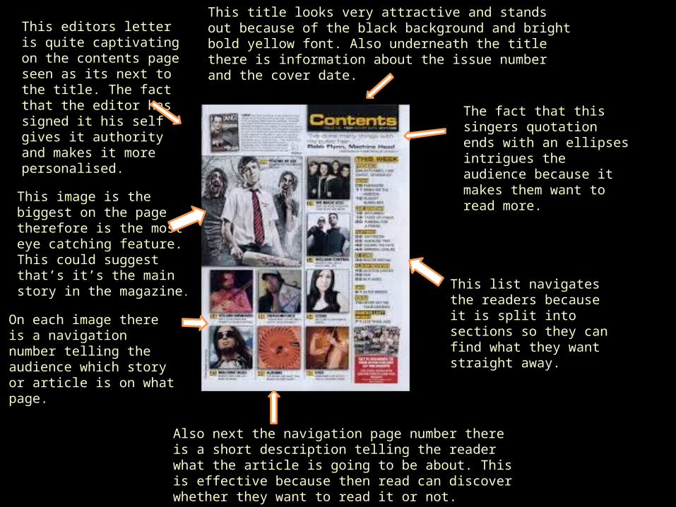
This editors letter is quite captivating on the contents page seen as its next to the title. The fact that the editor has signed it his self gives it authority and makes it more personalised.
This image is the biggest on the page therefore is the most eye catching feature. This could suggest that’s it’s the main story in the magazine.
On each image there is a navigation number telling the audience which story or article is on what page.
Also next the navigation page number there is a short description telling the reader what the article is going to be about. This is effective because then read can discover whether they want to read it or not.
This title looks very attractive and stands out because of the black background and bright bold yellow font. Also underneath the title there is information about the issue number and the cover date.
The fact that this singers quotation ends with an ellipses intrigues the audience because it makes them want to read more.
This list navigates the readers because it is split into sections so they can find what they want straight away.
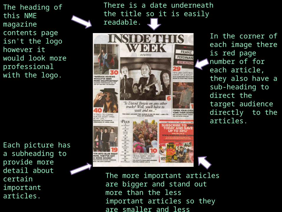
The heading of this NME magazine contents page isn't the logo however it would look more professional with the logo.
There is a date underneath the title so it is easily readable.
In the corner of each image there is red page number of for each article, they also have a sub-heading to direct the target audience directly to the articles.
Each picture has a subheading to provide more detail about certain important articles. The more important articles are
bigger and stand out more than the less important articles so they are smaller and less information.
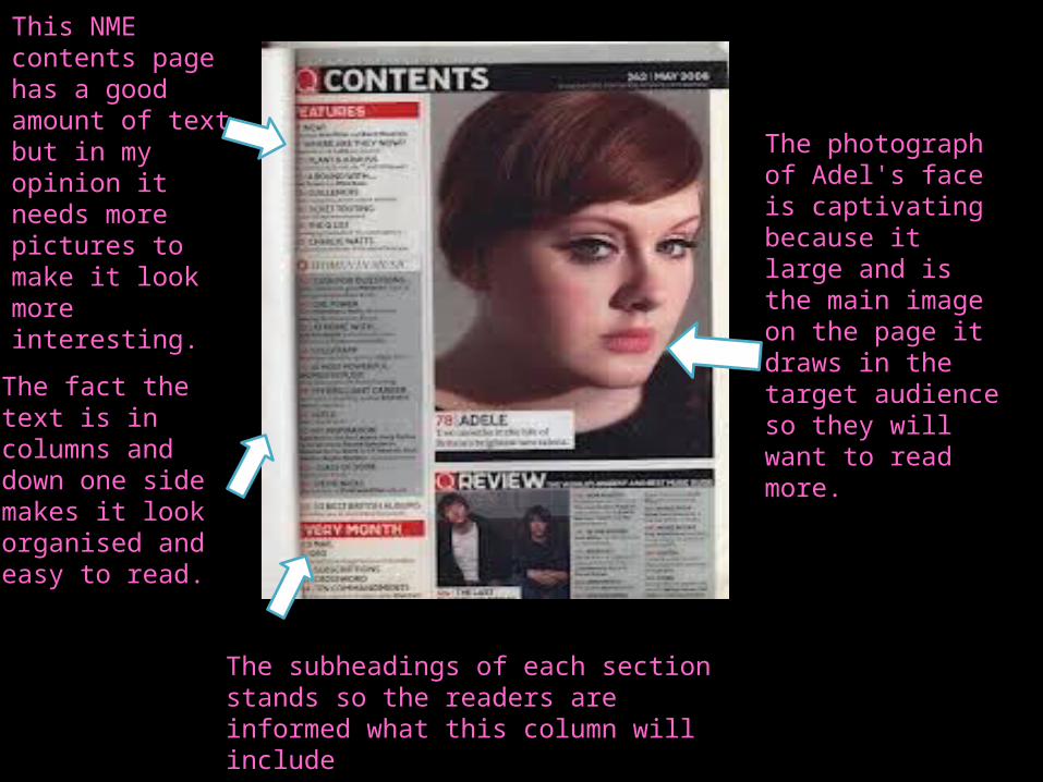
This NME contents page has a good amount of text but in my opinion it needs more pictures to make it look more interesting.
The fact the text is in columns and down one side makes it look organised and easy to read.
The photograph of Adel's face is captivating because it large and is the main image on the page it draws in the target audience so they will want to read more.
The subheadings of each section stands so the readers are informed what this column will include
3 deconstructed musicmagazine double page
spreads…
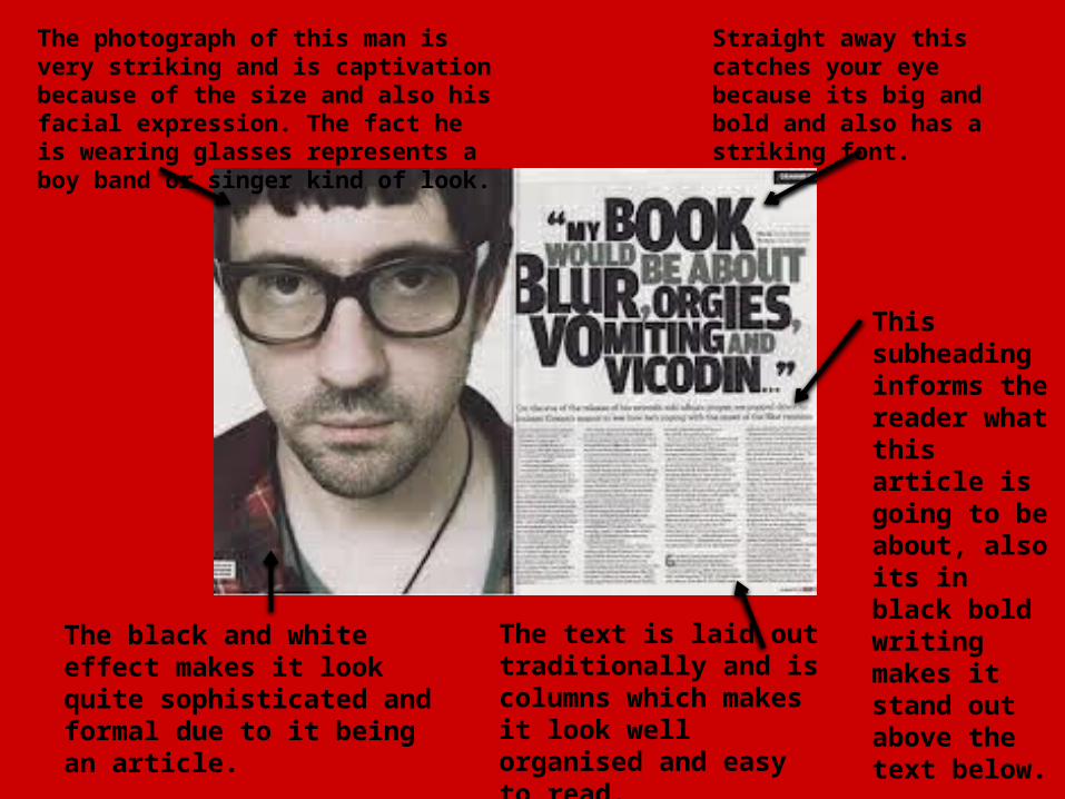
Straight away this catches your eye because its big and bold and also has a striking font.
The photograph of this man is very striking and is captivation because of the size and also his facial expression. The fact he is wearing glasses represents a boy band or singer kind of look.
The black and white effect makes it look quite sophisticated and formal due to it being an article.
The text is laid out traditionally and is columns which makes it look well organised and easy to read.
This subheading informs the reader what this article is going to be about, also its in black bold writing makes it stand out above the text below.
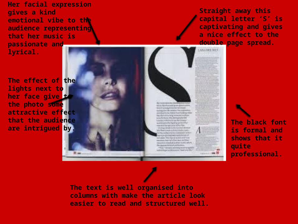
Straight away this capital letter ‘S’ is captivating and gives a nice effect to the double page spread.
Her facial expression gives a kind emotional vibe to the audience representing that her music is passionate and lyrical.
The effect of the lights next to her face give to the photo some attractive effectthat the audience are intrigued by.
The text is well organised into columns with make the article look easier to read and structured well.
The black font is formal and shows that it quite professional.
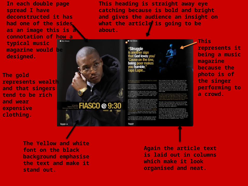
In each double page spread I have deconstructed it has had one of the sides as an image this is a connotation of how a typical music magazine would be designed.
The gold represents wealth and that singers tend to be rich and wear expensive clothing.
This represents it being a music magazine because the photo is of the singer performing to a crowd.
The Yellow and white font on the black background emphasise the text and make it stand out.
Again the article text is laid out in columns which make it look organised and neat.
This heading is straight away eye catching because is bold and bright and gives the audience an insight on what the article is going to be about.