Airline Economic Analysis 2015 - oliverwyman.com · In last year’s Airline Economic Analysis, we...
68
AIRLINE ECONOMIC ANALYSIS FOR THE RAYMOND JAMES GLOBAL AIRLINE BOOK 2015–2016 AUTHORS Tom Stalnaker, Partner Khalid Usman, Vice President Aaron Taylor, Senior Manager
Transcript of Airline Economic Analysis 2015 - oliverwyman.com · In last year’s Airline Economic Analysis, we...
AIRLINE ECONOMIC ANALYSIS FOR THE RAYMOND JAMES GLOBAL AIRLINE BOOK
2015–2016
AUTHORS
Tom Stalnaker, Partner Khalid Usman, Vice President Aaron Taylor, Senior Manager

CONTENTS
US CARRIERS INCLUDED AND METHODOLOGY 4
INTRODUCTION AND EXECUTIVE SUMMARY 6
PROFIT/MARGIN 9
1. Margin Growth 9
2. Unit Profitability 10
3. Individual Airline Profitability 12
4. Operating Profit Trend; Break‑even Load Factors 14
REVENUE 19
5. Airline Revenue vs. GDP 19
6. Change in Operating Revenue 20
7. Revenue Driver: US Carrier Capacity 22
8. Revenue Driver: Load Factor 24
9. Revenue Driver: Passenger Yield 27
10. Revenue Driver: Cargo 29
11. Revenue Driver: Ancillary Revenue 30
12. Unit Revenue Changes 31
13. Comparison of Domestic RASM 32
Copyright © 2015‑2016 Oliver Wyman 2
COST 35
14. Decline in Airline Costs 35
15. Cost Driver: Labor 38
16. Cost Driver: Fuel 39
17. Fuel Cost Variance Analysis 40
18. Other Cost Drivers 41
19. Unit Cost Trend and Gap 42
20. Domestic Airline Cost Performance 43
21. US Narrow‑body Aircraft Direct Casms 47
WORLD CAPACITY 51
22. World Capacity Trends 51
23. World Air Travel Growth Indicators 53
24. Capacity Analysis: Asia/Oceania 54
25. Capacity Analysis: North America 56
26. Capacity Analysis: Europe 58
27. Capacity Analysis: Africa/Middle East 60
28. Capacity Analysis: Latin America/Caribbean 62
29. US Carrier International Revenue 64
30. Stage‑length Adjusted RASK/CASK for International Carriers 66
Copyright © 2015‑2016 Oliver Wyman 3
US CARRIERS INCLUDED AND METHODOLOGY
All US value carriers and network carriers are included in this analysis.1
Our set of value carriers (low‑cost):
1. Allegiant
2. Frontier
3. JetBlue
4. Southwest (including AirTran)
5. Spirit
6. Virgin America
Our set of network carriers:
7. Alaska
8. American (including US Airways and America West)
9. Delta (including Northwest)
10. Hawaiian
11. United (including Continental)
We have divided airlines into two broad groups – network carriers and value
carriers – recognizing that each group includes airlines with a range of business models.
Especially within the value carrier grouping, there is a divide between more traditional
value carriers and those with lower revenue and costs that are increasingly referred to
as ultra‑low‑cost carriers.
However, over the past several years, the ability to divide US airlines into these categories
has become more difficult. The lines that once divided the carriers continue to blur with
structural changes to both groups.
This year, both the domestic cost gap and revenue gap narrowed between the two groups.
Value carriers continue to expand their networks by adding domestic services and growing
their international operations.
1 The primary category excluded is regional carriers, which provide most of their capacity under capacity purchase agreements (CPAs). Regional carriers operated about 12% of domestic ASMs in 2014 and have different expense payment arrangements in the CPAs with their mainline partners. The number of expense categories paid directly by mainlines and not appearing in the regional carriers’ costs has increased over time. Fuel and aircraft ownership were among the first to be directly paid in some CPAs; more recently, some mainlines have taken over payment for ground handling and engine maintenance. As a result, comparing total CASM across regional carriers and aircraft may be misleading.
Copyright © 2015‑2016 Oliver Wyman 4
Recognizing that many historical structural differences between carrier groupings
have converged, we still believe our traditional groupings remain valid. If recent trends
continue, however, the industry will be redefined, with carriers switching groups or new
groupings altogether.
Additionally, as in past years, this report focuses largely on US carriers based on the
regulatory data that is available. In the World Capacity section, we have expanded sections
by geographic region as well as analyses around US carrier international share and a
revenue/cost by available seat kilometer (RASK/CASK) analysis for non‑US carriers.
Throughout the report, annual GDP estimates from the International Monetary Fund are
a proxy for full‑year values, and our analysis uses nominal GDP references.
Copyright © 2015‑2016 Oliver Wyman 5
INTRODUCTION AND EXECUTIVE SUMMARY
Thanks to cost reductions led by the decline of energy prices, industry consolidation,
and capacity discipline, the US airline industry is enjoying a 15‑year high in operating
margins – a healthy margin for most industries, but particularly for airlines, which have
struggled in years past to turn a profit at all.
Even more impressive, margins remained strong despite recent revenue challenges.
During second quarter 2015, margins for network and value carriers increased 6.8 points
and 6.2 points, respectively, compared with the same period in 2014. These margin increases
came at a time of declining revenue and yields, reflecting a combination of a favorable cost
environment and skilled airline management.
In last year’s Airline Economic Analysis, we wondered about clouds on the horizon, and the
discussion of industry capacity growth compared with economic expansion (gross domestic
product growth) was, and remains, top of mind for most industry observers.
Unsurprisingly, the recent yield declines appear to coincide with creeping capacity growth
for US carriers systemwide, but particularly in the domestic market. Recent capacity growth
in the domestic markets, once significantly slower than economic growth forecasts, is now
closer to growth estimates for gross domestic product (GDP).
The recent decline in airline yields, from a peak in second quarter 2014, coincides with a
slight relaxation of recent capacity restraint in the industry. Historically, the industry has seen
a high correlation between industry demand and nominal GDP growth, and recent years has
seen strong industry focus on constraining capacity at or below the growth of GDP.
However, in the last 12 months, capacity growth in ASMs (available seat miles) has exceeded
GDP growth on a system and US domestic basis. The IMF estimates North American GDP
growth for 2015 at 2.9 percent. In 2015, US domestic capacity has increased 6.2 percent for
value carriers and 2.1 percent for network carriers, with overall ASM growth for the domestic
market at 3.3 percent.
The increased capacity, combined with significant fare competition in the US domestic
market, has resulted in softening yields.
Systemwide passenger yield declined 5.1 percent during second quarter 2015, compared
with the same period a year earlier. The drop continues a trend emerging after a five‑year
period of yield growth, from mid‑2009 to mid‑2014. Revenue also peaked in mid‑2014
before turning down. Network carrier systemwide revenue per available seat mile declined
5.6 percent during second quarter 2015. Value carriers dropped 4.9 percent during the
same period.
Copyright © 2015‑2016 Oliver Wyman 6
Ancillary revenue continues to be an important revenue stream for the airlines, led by
miscellaneous revenue including priority boarding and in‑flight entertainment. Bag fees,
now charged by all carriers except for Southwest, are a close second.
Despite revenue challenges, the airlines have sustained and even grown profit margins,
aided by unit cost declines outpacing unit revenue declines. The cost declines are driven not
only by lower fuel prices, but also by non‑fuel unit cost decreases.
US airline costs declined 12.6 percent year‑over‑year to 11.5 cents per available seat mile
in second quarter 2015, marking the largest overall cost decline since 2009. Fuel prices,
of course, drove the decline, but other costs also dropped, such as aircraft ownership and
maintenance costs.
Labor, rather than fuel, is now the largest cost for airlines, increasing for all carriers except
Delta. This represents a return to the days before fuel spikes, as labor costs have historically
been the highest cost category for airlines.
Finally – and a significant continuing trend from last year’s report – an increase in ASMs,
driven by greater seat density in airplanes, has contributed to the reduction in unit costs.
Airlines have become better at matching capacity to consumer demand during the past
decade, maintaining high load factors in both peak and off‑peak times. Record load factors
in the past two years are largely the result of airlines stimulating off‑peak demand and
maintaining or reducing unnecessary off‑peak capacity. For network carriers’ domestic
operations, the seasonal high load factors have remained virtually unchanged since 2009,
while off‑peak lows have increased by nearly 6 points.
Around the world, airline capacity is growing faster than the economy. Capacity, measured in
available seat miles, increased 6.3 percent worldwide; every major world region experienced
ASM growth at or above 4.6 percent. All regions exceeded their respective GDP forecasts.
The highest growth regions were Africa/Middle East at 10.3 percent ASM growth and Asia/
Oceania at 8.4 percent growth. North America and Latin America had the lowest ASM growth
yet exceeded GDP estimates. Whether the world’s economies can sustain these growth
levels is certainly debatable.
In closing, the airline industry’s ability to maintain healthy profits despite competition is
encouraging. But questions remain: Will the profits outlast the low fuel cycle? Will a renewed
focus on customers affect the industry’s costs? Will carriers succumb to the temptation to
flood the market with capacity that is unsustainable, given economic growth estimates?
Will weakness currently masked by low energy prices be exposed?
Copyright © 2015‑2016 Oliver Wyman 7

PR
OFI
T/M
AR
GIN
PROFIT/MARGIN
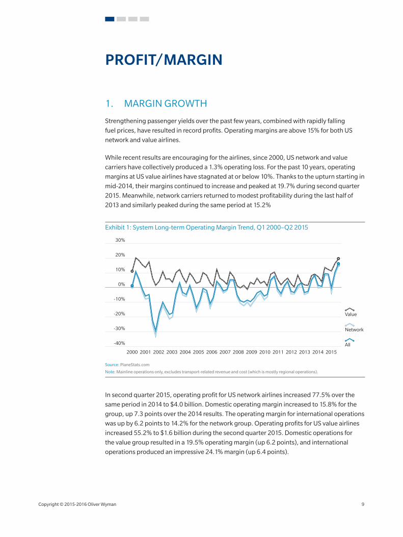
1. MARGIN GROWTH
Strengthening passenger yields over the past few years, combined with rapidly falling
fuel prices, have resulted in record profits. Operating margins are above 15% for both US
network and value airlines.
While recent results are encouraging for the airlines, since 2000, US network and value
carriers have collectively produced a 1.3% operating loss. For the past 10 years, operating
margins at US value airlines have stagnated at or below 10%. Thanks to the upturn starting in
mid‑2014, their margins continued to increase and peaked at 19.7% during second quarter
2015. Meanwhile, network carriers returned to modest profitability during the last half of
2013 and similarly peaked during the same period at 15.2%
Exhibit 1: System Long‑term Operating Margin Trend, Q1 2000–Q2 2015
2000 20092004200320022001 20102005 20112006 20122008
-40%
30%
20%
10%
0%
-10%
-20%
-30%
2014 201520132007
All
Value
Network
Source: PlaneStats.com
Note: Mainline operations only, excludes transport‑related revenue and cost (which is mostly regional operations).
In second quarter 2015, operating profit for US network airlines increased 77.5% over the
same period in 2014 to $4.0 billion. Domestic operating margin increased to 15.8% for the
group, up 7.3 points over the 2014 results. The operating margin for international operations
was up by 6.2 points to 14.2% for the network group. Operating profits for US value airlines
increased 55.2% to $1.6 billion during the second quarter 2015. Domestic operations for
the value group resulted in a 19.5% operating margin (up 6.2 points), and international
operations produced an impressive 24.1% margin (up 6.4 points).
Copyright © 2015‑2016 Oliver Wyman 9
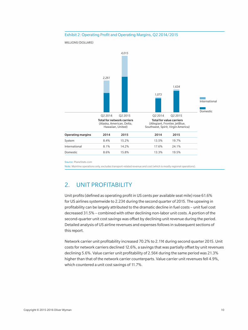
Exhibit 2: Operating Profit and Operating Margins, Q2 2014/2015
Domestic
International
Total for value carriers(Allegiant, Frontier, JetBlue,
Southwest, Spirit, Virgin America)
Total for network carriers(Alaska, American, Delta,
Hawaiian, United)
Q2 2014 Q2 2015 Q2 2014 Q2 2015
2,261
4,015
1,073
1,634
MILLIONS (DOLLARS)
2014 2015 2014 2015
8.4% 15.2% 13.5% 19.7%
8.1% 14.2% 17.6% 24.1%
8.6%
Operating margins
System
International
Domestic 15.8% 13.3% 19.5%
Source: PlaneStats.com
Note: Mainline operations only, excludes transport‑related revenue and cost (which is mostly regional operations).
2. UNIT PROFITABILITY
Unit profits (defined as operating profit in US cents per available seat mile) rose 61.6%
for US airlines systemwide to 2.23¢ during the second quarter of 2015. The upswing in
profitability can be largely attributed to the dramatic decline in fuel costs – unit fuel cost
decreased 31.5% – combined with other declining non‑labor unit costs. A portion of the
second‑quarter unit cost savings was offset by declining unit revenue during the period.
Detailed analysis of US airline revenues and expenses follows in subsequent sections of
this report.
Network carrier unit profitability increased 70.2% to 2.11¢ during second quarter 2015. Unit
costs for network carriers declined 12.6%, a savings that was partially offset by unit revenues
declining 5.6%. Value carrier unit profitability of 2.56¢ during the same period was 21.3%
higher than that of the network carrier counterparts. Value carrier unit revenues fell 4.9%,
which countered a unit cost savings of 11.7%.
Copyright © 2015‑2016 Oliver Wyman 10
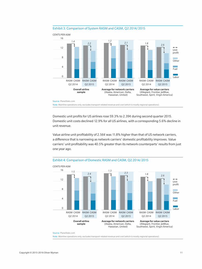
Exhibit 3: Comparison of System RASM and CASM, Q2 2014/2015
8
4
12
16
CENTS PER ASM
RASM CASM RASM CASM RASM CASM RASM CASM RASM CASM RASM CASM
Overall airlinesample
Average for network carriers(Alaska, American, Delta,
Hawaiian, United)
Average for value carriers(Allegiant, Frontier, JetBlue,
Southwest, Spirit, Virgin America)
Q2 2014 Q2 2015 Q2 2014 Q2 2015 Q2 2014 Q2 2015
Labor
Fuel
Other
0
1.42.2
1.22.1 1.8
2.6
Unit profit
Source: PlaneStats.com
Note: Mainline operations only, excludes transport‑related revenue and cost (which is mostly regional operations).
Domestic unit profits for US airlines rose 59.3% to 2.39¢ during second quarter 2015.
Domestic unit costs declined 12.9% for all US airlines, with a corresponding 5.6% decline in
unit revenue.
Value airline unit profitability of 2.56¢ was 11.8% higher than that of US network carriers,
a difference that is narrowing as network carriers’ domestic profitability improves. Value
carriers’ unit profitability was 40.5% greater than its network counterparts’ results from just
one year ago.
Exhibit 4: Comparison of Domestic RASM and CASM, Q2 2014/2015
8
4
12
16
RASM CASM RASM CASM RASM CASM RASM CASM RASM CASM RASM CASM
Q2 2014 Q2 2015 Q2 2014 Q2 2015 Q2 2014 Q2 2015
Labor
Fuel
Other
0
1.52.4
1.32.3 1.8
2.6
CENTS PER ASM
Overall airlinesample
Average for network carriers(Alaska, American, Delta,
Hawaiian, United)
Average for value carriers(Allegiant, Frontier, JetBlue,
Southwest, Spirit, Virgin America)
Unit profit
Source: PlaneStats.com
Note: Mainline operations only, excludes transport‑related revenue and cost (which is mostly regional operations).
Copyright © 2015‑2016 Oliver Wyman 11
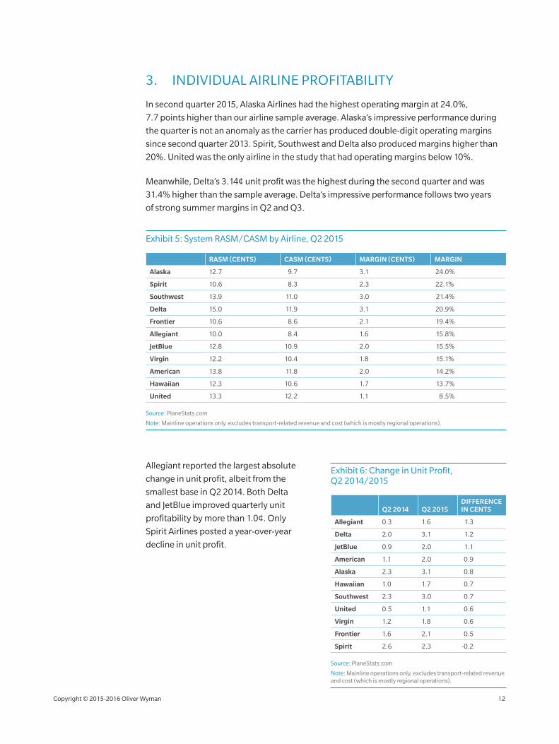
3. INDIVIDUAL AIRLINE PROFITABILITY
In second quarter 2015, Alaska Airlines had the highest operating margin at 24.0%,
7.7 points higher than our airline sample average. Alaska’s impressive performance during
the quarter is not an anomaly as the carrier has produced double‑digit operating margins
since second quarter 2013. Spirit, Southwest and Delta also produced margins higher than
20%. United was the only airline in the study that had operating margins below 10%.
Meanwhile, Delta’s 3.14¢ unit profit was the highest during the second quarter and was
31.4% higher than the sample average. Delta’s impressive performance follows two years
of strong summer margins in Q2 and Q3.
Exhibit 5: System RASM/CASM by Airline, Q2 2015
RASM (CENTS) CASM (CENTS) MARGIN (CENTS) MARGIN
Alaska 12.7 9.7 3.1 24.0%
Spirit 10.6 8.3 2.3 22.1%
Southwest 13.9 11.0 3.0 21.4%
Delta 15.0 11.9 3.1 20.9%
Frontier 10.6 8.6 2.1 19.4%
Allegiant 10.0 8.4 1.6 15.8%
JetBlue 12.8 10.9 2.0 15.5%
Virgin 12.2 10.4 1.8 15.1%
American 13.8 11.8 2.0 14.2%
Hawaiian 12.3 10.6 1.7 13.7%
United 13.3 12.2 1.1 8.5%
Source: PlaneStats.com
Note: Mainline operations only, excludes transport‑related revenue and cost (which is mostly regional operations).
Allegiant reported the largest absolute
change in unit profit, albeit from the
smallest base in Q2 2014. Both Delta
and JetBlue improved quarterly unit
profitability by more than 1.0¢. Only
Spirit Airlines posted a year‑over‑year
decline in unit profit.
Exhibit 6: Change in Unit Profit, Q2 2014/2015
Q2 2014 Q2 2015DIFFERENCE IN CENTS
Allegiant 0.3 1.6 1.3
Delta 2.0 3.1 1.2
JetBlue 0.9 2.0 1.1
American 1.1 2.0 0.9
Alaska 2.3 3.1 0.8
Hawaiian 1.0 1.7 0.7
Southwest 2.3 3.0 0.7
United 0.5 1.1 0.6
Virgin 1.2 1.8 0.6
Frontier 1.6 2.1 0.5
Spirit 2.6 2.3 ‑0.2
Source: PlaneStats.com
Note: Mainline operations only, excludes transport‑related revenue and cost (which is mostly regional operations).
Copyright © 2015‑2016 Oliver Wyman 12
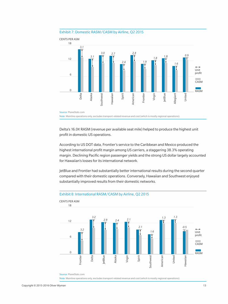
Exhibit 7: Domestic RASM/CASM by Airline, Q2 2015
12
6
18
Del
ta
Ala
ska
Sou
thw
est
Haw
aiia
n
Un
ited
CENTS PER ASM
RASM
CASM
Spir
it
Am
eric
an
Fron
tier
Vir
gin
JetB
lue
Alle
gia
nt
3.1
3.12.7
1.91.8
1.8 0.9
1.62.4
3.0 2.4
0
Unit profit
Source: PlaneStats.com
Note: Mainline operations only, excludes transport‑related revenue and cost (which is mostly regional operations).
Delta’s 16.0¢ RASM (revenue per available seat mile) helped to produce the highest unit
profit in domestic US operations.
According to US DOT data, Frontier’s service to the Caribbean and Mexico produced the
highest international profit margin among US carriers, a staggering 38.3% operating
margin. Declining Pacific region passenger yields and the strong US dollar largely accounted
for Hawaiian’s losses for its international network.
JetBlue and Frontier had substantially better international results during the second quarter
compared with their domestic operations. Conversely, Hawaiian and Southwest enjoyed
substantially improved results from their domestic networks.
Exhibit 8: International RASM/CASM by Airline, Q2 2015
12
6
18
Del
ta
Ala
ska
Sou
thw
est
Haw
aiia
n
Un
ited
CENTS PER ASM
RASM
CASM
Spir
it
Am
eric
an
Fron
tier
Vir
gin
JetB
lue
3.2
3.22.4 2.1
2.1
1.6
-0.5
1.32.9
1.3
0
Unit profit
Source: PlaneStats.com
Note: Mainline operations only, excludes transport‑related revenue and cost (which is mostly regional operations).
Copyright © 2015‑2016 Oliver Wyman 13
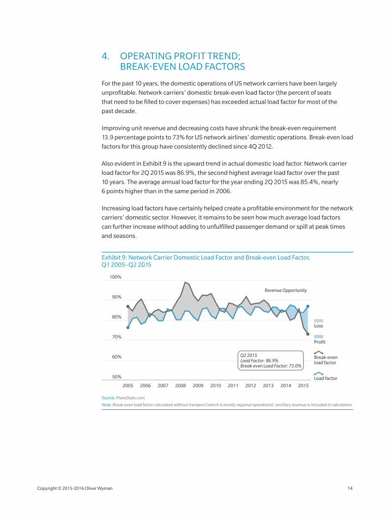
4. OPERATING PROFIT TREND; BREAK‑EVEN LOAD FACTORS
For the past 10 years, the domestic operations of US network carriers have been largely
unprofitable. Network carriers’ domestic break‑even load factor (the percent of seats
that need to be filled to cover expenses) has exceeded actual load factor for most of the
past decade.
Improving unit revenue and decreasing costs have shrunk the break‑even requirement
13.9 percentage points to 73% for US network airlines’ domestic operations. Break‑even load
factors for this group have consistently declined since 4Q 2012.
Also evident in Exhibit 9 is the upward trend in actual domestic load factor. Network carrier
load factor for 2Q 2015 was 86.9%, the second highest average load factor over the past
10 years. The average annual load factor for the year ending 2Q 2015 was 85.4%, nearly
6 points higher than in the same period in 2006.
Increasing load factors have certainly helped create a profitable environment for the network
carriers’ domestic sector. However, it remains to be seen how much average load factors
can further increase without adding to unfulfilled passenger demand or spill at peak times
and seasons.
Exhibit 9: Network Carrier Domestic Load Factor and Break‑even Load Factor, Q1 2005–Q2 2015
Load factor
Profit
Loss
Break-even load factor
80%
90%
70%
60%
50%
100%
20152005 2006 20092007 2010 2011 2012 2013 20142008
Revenue Opportunity
Q2 2015Load Factor: 86.9%Break-even Load Factor: 73.0%
Source: PlaneStats.com
Note: Break‑even load factor calculated without transport (which is mostly regional operations); ancillary revenue is included in calculation.
Copyright © 2015‑2016 Oliver Wyman 14
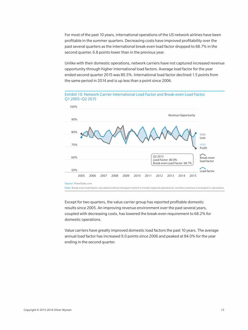
For most of the past 10 years, international operations of the US network airlines have been
profitable in the summer quarters. Decreasing costs have improved profitability over the
past several quarters as the international break‑even load factor dropped to 68.7% in the
second quarter, 6.8 points lower than in the previous year.
Unlike with their domestic operations, network carriers have not captured increased revenue
opportunity through higher international load factors. Average load factor for the year
ended second quarter 2015 was 80.5%. International load factor declined 1.5 points from
the same period in 2014 and is up less than a point since 2006.
Exhibit 10: Network Carrier International Load Factor and Break‑even Load Factor, Q1 2005–Q2 2015
Load factor
Profit
Loss
Break-even load factor
80%
90%
70%
60%
50%
100%
20152005 2006 20092007 2010 2011 2012 2013 20142008
Revenue Opportunity
Q2 2015Load Factor: 80.8%Break-even Load Factor: 68.7%
Source: PlaneStats.com
Note: Break‑even load factor calculated without transport (which is mostly regional operations); ancillary revenue is included in calculation.
Except for two quarters, the value carrier group has reported profitable domestic
results since 2005. An improving revenue environment over the past several years,
coupled with decreasing costs, has lowered the break‑even requirement to 68.2% for
domestic operations.
Value carriers have greatly improved domestic load factors the past 10 years. The average
annual load factor has increased 9.0 points since 2006 and peaked at 84.0% for the year
ending in the second quarter.
Copyright © 2015‑2016 Oliver Wyman 15
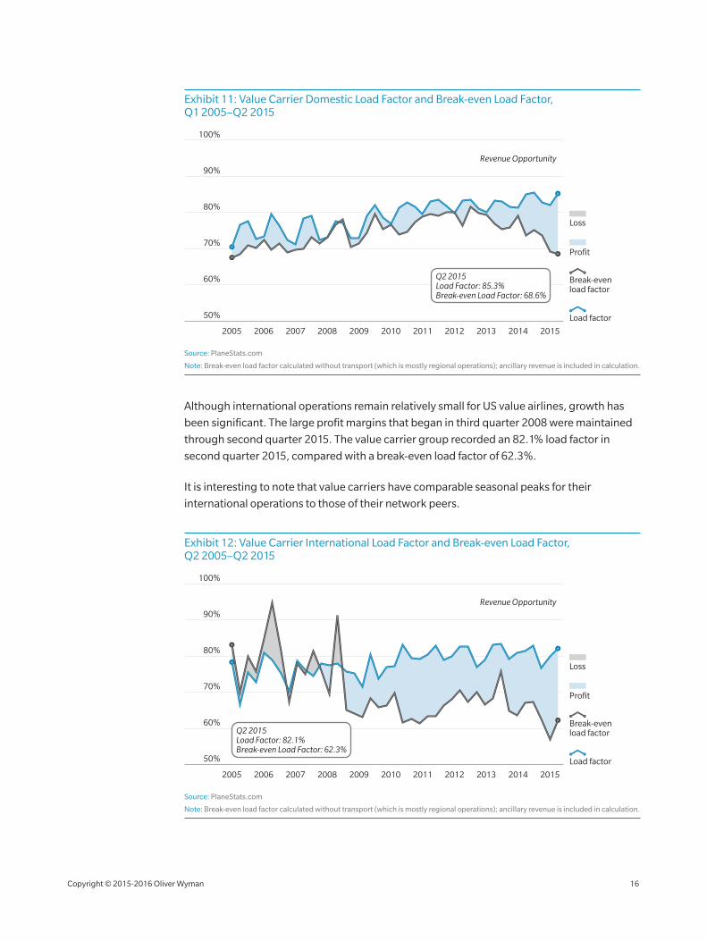
Exhibit 11: Value Carrier Domestic Load Factor and Break‑even Load Factor, Q1 2005–Q2 2015
Load factor
Profit
Loss
Break-even load factor
80%
90%
70%
60%
50%
100%
20152005 2006 20092007 2010 2011 2012 2013 20142008
Revenue Opportunity
Q2 2015Load Factor: 85.3%Break-even Load Factor: 68.6%
Source: PlaneStats.com
Note: Break‑even load factor calculated without transport (which is mostly regional operations); ancillary revenue is included in calculation.
Although international operations remain relatively small for US value airlines, growth has
been significant. The large profit margins that began in third quarter 2008 were maintained
through second quarter 2015. The value carrier group recorded an 82.1% load factor in
second quarter 2015, compared with a break‑even load factor of 62.3%.
It is interesting to note that value carriers have comparable seasonal peaks for their
international operations to those of their network peers.
Exhibit 12: Value Carrier International Load Factor and Break‑even Load Factor, Q2 2005–Q2 2015
Load factor
Profit
Loss
Break-even load factor
80%
90%
70%
60%
100%
2005 2006 20092007 2010 2011 2012 2013 20142008
Revenue Opportunity
50%
2015
Q2 2015Load Factor: 82.1%Break-even Load Factor: 62.3%
Source: PlaneStats.com
Note: Break‑even load factor calculated without transport (which is mostly regional operations); ancillary revenue is included in calculation.
Copyright © 2015‑2016 Oliver Wyman 16

The record profits detailed here are the result of several favorable market conditions the past
several years that have helped both the cost and revenue sides of the industry. The following
sections will detail recent changes in revenue, cost and capacity.
Copyright © 2015‑2016 Oliver Wyman 17
RE
VE
NU
E
REVENUE
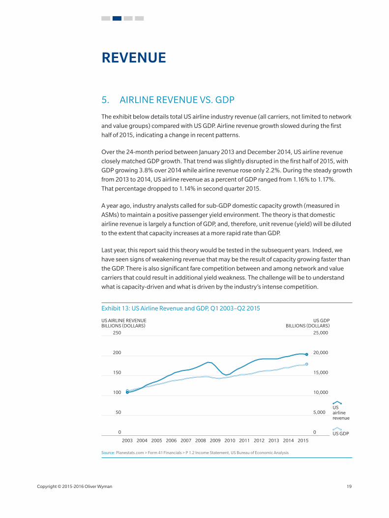
5. AIRLINE REVENUE VS. GDP
The exhibit below details total US airline industry revenue (all carriers, not limited to network
and value groups) compared with US GDP. Airline revenue growth slowed during the first
half of 2015, indicating a change in recent patterns.
Over the 24‑month period between January 2013 and December 2014, US airline revenue
closely matched GDP growth. That trend was slightly disrupted in the first half of 2015, with
GDP growing 3.8% over 2014 while airline revenue rose only 2.2%. During the steady growth
from 2013 to 2014, US airline revenue as a percent of GDP ranged from 1.16% to 1.17%.
That percentage dropped to 1.14% in second quarter 2015.
A year ago, industry analysts called for sub‑GDP domestic capacity growth (measured in
ASMs) to maintain a positive passenger yield environment. The theory is that domestic
airline revenue is largely a function of GDP, and, therefore, unit revenue (yield) will be diluted
to the extent that capacity increases at a more rapid rate than GDP.
Last year, this report said this theory would be tested in the subsequent years. Indeed, we
have seen signs of weakening revenue that may be the result of capacity growing faster than
the GDP. There is also significant fare competition between and among network and value
carriers that could result in additional yield weakness. The challenge will be to understand
what is capacity‑driven and what is driven by the industry’s intense competition.
Exhibit 13: US Airline Revenue and GDP, Q1 2003–Q2 2015
100 10,000
50 5,000
150 15,000
200 20,000
00
250 25,000
US AIRLINE REVENUEBILLIONS (DOLLARS)
US GDPBILLIONS (DOLLARS)
US GDP
US airline revenue
2003 2004 2005 2006 2007 2008 2009 2010 2011 2012 2013 2014 2015
Source: Planestats.com > Form 41 Financials > P 1.2 Income Statement, US Bureau of Economic Analysis
Copyright © 2015‑2016 Oliver Wyman 19
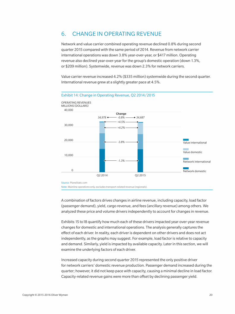
6. CHANGE IN OPERATING REVENUE
Network and value carrier combined operating revenue declined 0.8% during second
quarter 2015 compared with the same period of 2014. Revenue from network carrier
international operations was down 3.8% year‑over‑year, or $417 million. Operating
revenue also declined year‑over‑year for the group’s domestic operation (down 1.3%,
or $209 million). Systemwide, revenue was down 2.3% for network carriers.
Value carrier revenue increased 4.2% ($335 million) systemwide during the second quarter.
International revenue grew at a slightly greater pace at 4.5%.
Exhibit 14: Change in Operating Revenue, Q2 2014/2015
20,000
30,000
10,000
40,000
0
Q2 2014 Q2 2015
Network domestic
Network international
Value domestic
Value international
OPERATING REVENUESMILLIONS (DOLLARS)
34,978 34,687
-1.3%
-0.8%Change
-3.8%
+4.2%
+4.5%
Source: PlaneStats.com
Note: Mainline operations only, excludes transport‑related revenue (regionals).
A combination of factors drives changes in airline revenue, including capacity, load factor
(passenger demand), yield, cargo revenue, and fees (ancillary revenue) among others. We
analyzed these price and volume drivers independently to account for changes in revenue.
Exhibits 15 to18 quantify how much each of these drivers impacted year‑over‑year revenue
changes for domestic and international operations. The analysis generally captures the
effect of each driver. In reality, each driver is dependent on other drivers and does not act
independently, as the graphs may suggest. For example, load factor is relative to capacity
and demand. Similarly, yield is impacted by available capacity. Later in this section, we will
examine the underlying factors of each driver.
Increased capacity during second quarter 2015 represented the only positive driver
for network carriers’ domestic revenue production. Passenger demand increased during the
quarter; however, it did not keep pace with capacity, causing a minimal decline in load factor.
Capacity‑related revenue gains were more than offset by declining passenger yield.
Copyright © 2015‑2016 Oliver Wyman 20
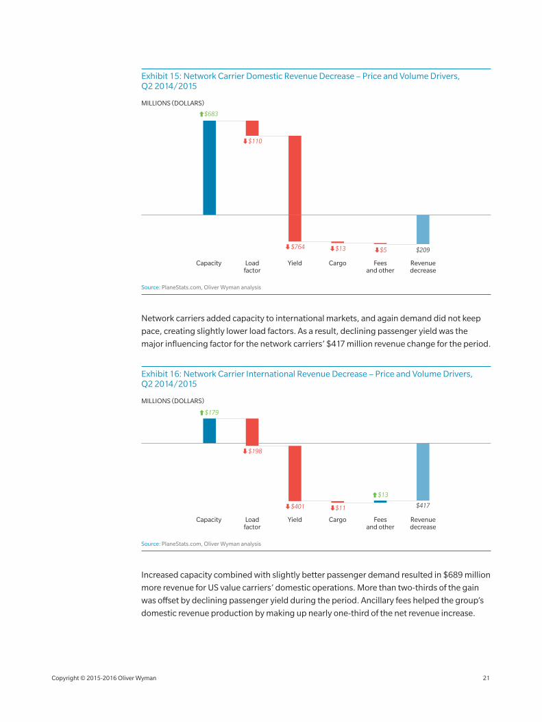
Exhibit 15: Network Carrier Domestic Revenue Decrease – Price and Volume Drivers, Q2 2014/2015
Capacity Loadfactor
Yield Cargo Feesand other
Revenuedecrease
$683
$110
$764 $13 $5 $209
MILLIONS (DOLLARS)
Source: PlaneStats.com, Oliver Wyman analysis
Network carriers added capacity to international markets, and again demand did not keep
pace, creating slightly lower load factors. As a result, declining passenger yield was the
major influencing factor for the network carriers’ $417 million revenue change for the period.
Exhibit 16: Network Carrier International Revenue Decrease – Price and Volume Drivers, Q2 2014/2015
Capacity Loadfactor
Yield Cargo Feesand other
Revenuedecrease
$179
$198
$401 $11
$13
$417
MILLIONS (DOLLARS)
Source: PlaneStats.com, Oliver Wyman analysis
Increased capacity combined with slightly better passenger demand resulted in $689 million
more revenue for US value carriers’ domestic operations. More than two‑thirds of the gain
was offset by declining passenger yield during the period. Ancillary fees helped the group’s
domestic revenue production by making up nearly one‑third of the net revenue increase.
Copyright © 2015‑2016 Oliver Wyman 21
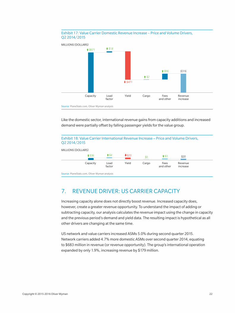
Exhibit 17: Value Carrier Domestic Revenue Increase – Price and Volume Drivers, Q2 2014/2015
Capacity Loadfactor
Yield Cargo Feesand other
Revenueincrease
$316
MILLIONS (DOLLARS)
$671 $18
$471
$2
$96
Source: PlaneStats.com, Oliver Wyman analysis
Like the domestic sector, international revenue gains from capacity additions and increased
demand were partially offset by falling passenger yields for the value group.
Exhibit 18: Value Carrier International Revenue Increase – Price and Volume Drivers, Q2 2014/2015
Capacity Loadfactor
Yield Cargo Feesand other
Revenueincrease
$20
MILLIONS (DOLLARS)
$36 $4 $23$0 $3
Source: PlaneStats.com, Oliver Wyman analysis
7. REVENUE DRIVER: US CARRIER CAPACITY
Increasing capacity alone does not directly boost revenue. Increased capacity does,
however, create a greater revenue opportunity. To understand the impact of adding or
subtracting capacity, our analysis calculates the revenue impact using the change in capacity
and the previous period’s demand and yield data. The resulting impact is hypothetical as all
other drivers are changing at the same time.
US network and value carriers increased ASMs 5.0% during second quarter 2015.
Network carriers added 4.7% more domestic ASMs over second quarter 2014, equating
to $683 million in revenue (or revenue opportunity). The group’s international operation
expanded by only 1.9%, increasing revenue by $179 million.
Copyright © 2015‑2016 Oliver Wyman 22
Value carriers were significantly more aggressive in capacity growth in second quarter 2015.
Domestic ASMs for value carriers increased 9.6%, for a revenue impact of $671 million.
The smaller international operation grew 9.0%, yet the revenue impact was only $36 million.
Exhibit 19: Percent Change in Capacity, Q2 2014/2015
% CHANGE
Network domestic 4.7%
Network international 1.9%
Value domestic 9.6%
Value international 9.0%
Source: PlaneStats.com > Form 41 T2 Traffic
Note: Mainline operations only.
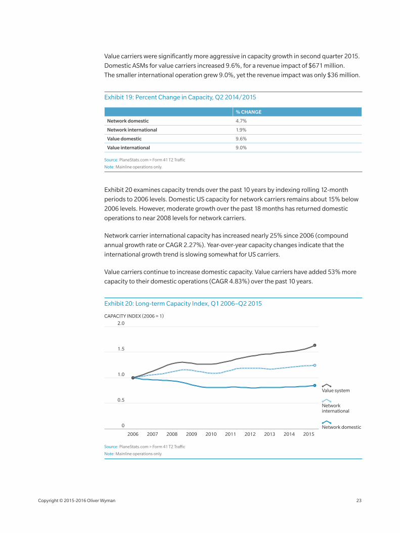
Exhibit 20 examines capacity trends over the past 10 years by indexing rolling 12‑month
periods to 2006 levels. Domestic US capacity for network carriers remains about 15% below
2006 levels. However, moderate growth over the past 18 months has returned domestic
operations to near 2008 levels for network carriers.
Network carrier international capacity has increased nearly 25% since 2006 (compound
annual growth rate or CAGR 2.27%). Year‑over‑year capacity changes indicate that the
international growth trend is slowing somewhat for US carriers.
Value carriers continue to increase domestic capacity. Value carriers have added 53% more
capacity to their domestic operations (CAGR 4.83%) over the past 10 years.
Exhibit 20: Long‑term Capacity Index, Q1 2006–Q2 2015
1.5
1.0
0.5
0
2.0
2006 2007 2008 2009 20112010 2012 2013 2014 2015
CAPACITY INDEX (2006 = 1)
Network international
Network domestic
Value system
Source: PlaneStats.com > Form 41 T2 Traffic
Note: Mainline operations only.
Copyright © 2015‑2016 Oliver Wyman 23
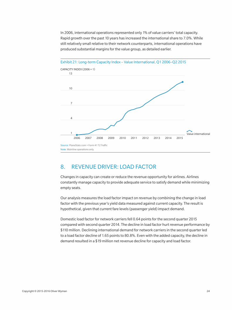
In 2006, international operations represented only 1% of value carriers’ total capacity.
Rapid growth over the past 10 years has increased the international share to 7.0%. While
still relatively small relative to their network counterparts, international operations have
produced substantial margins for the value group, as detailed earlier.
Exhibit 21: Long‑term Capacity Index – Value International, Q1 2006–Q2 2015
10
7
4
1
13
2006 2007 2008 2009 20112010 2012 2013 2014 2015
CAPACITY INDEX (2006 = 1)
Value international
Source: PlaneStats.com > Form 41 T2 Traffic
Note: Mainline operations only.
8. REVENUE DRIVER: LOAD FACTOR
Changes in capacity can create or reduce the revenue opportunity for airlines. Airlines
constantly manage capacity to provide adequate service to satisfy demand while minimizing
empty seats.
Our analysis measures the load factor impact on revenue by combining the change in load
factor with the previous year’s yield data measured against current capacity. The result is
hypothetical, given that current fare levels (passenger yield) impact demand.
Domestic load factor for network carriers fell 0.64 points for the second quarter 2015
compared with second quarter 2014. The decline in load factor hurt revenue performance by
$110 million. Declining international demand for network carriers in the second quarter led
to a load factor decline of 1.65 points to 80.8%. Even with the added capacity, the decline in
demand resulted in a $19 million net revenue decline for capacity and load factor.
Copyright © 2015‑2016 Oliver Wyman 24
Value carriers more effectively matched capacity growth with demand during the second
quarter. The group increased both domestic and international load factors, capturing
$18 million in additional revenue for each region.
Exhibit 22: Change in Load Factor, Q2 2014/2015
Q2 2014 Q2 2015 PTS CHANGE
Network domestic 87.6% 86.9% ‑0.64
Network international 82.4% 80.8% ‑1.65
Value domestic 85.1% 85.3% 0.20
Value international 81.5% 82.1% 0.63
Source: PlaneStats.com > Form 41 T2 Traffic
Note: Mainline operations only.
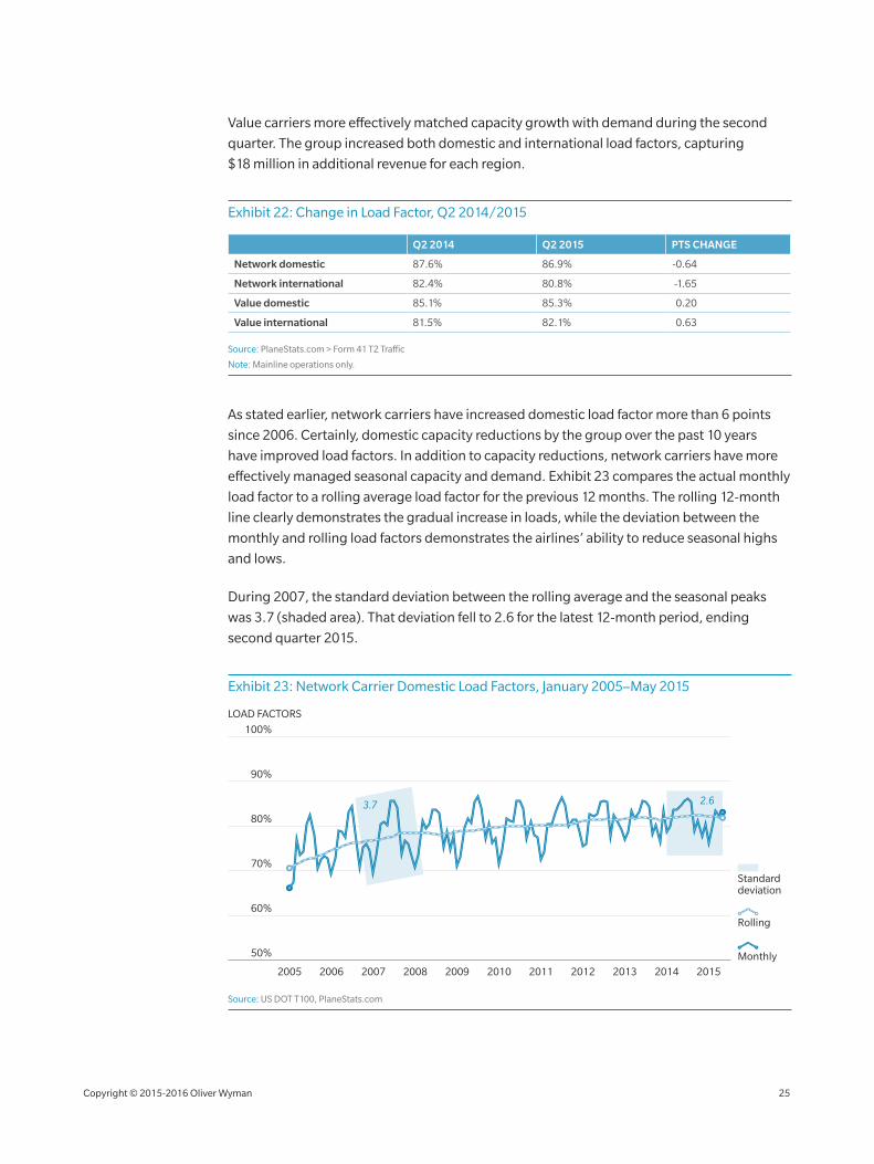
As stated earlier, network carriers have increased domestic load factor more than 6 points
since 2006. Certainly, domestic capacity reductions by the group over the past 10 years
have improved load factors. In addition to capacity reductions, network carriers have more
effectively managed seasonal capacity and demand. Exhibit 23 compares the actual monthly
load factor to a rolling average load factor for the previous 12 months. The rolling 12‑month
line clearly demonstrates the gradual increase in loads, while the deviation between the
monthly and rolling load factors demonstrates the airlines’ ability to reduce seasonal highs
and lows.
During 2007, the standard deviation between the rolling average and the seasonal peaks
was 3.7 (shaded area). That deviation fell to 2.6 for the latest 12‑month period, ending
second quarter 2015.
Exhibit 23: Network Carrier Domestic Load Factors, January 2005–May 2015
90%
80%
70%
60%
50%
100%
20062005 2007 2008 2009 20112010 2012 2013 2014 2015
LOAD FACTORS
Monthly
Rolling
Standard deviation
3.7 2.6
Source: US DOT T100, PlaneStats.com
Copyright © 2015‑2016 Oliver Wyman 25
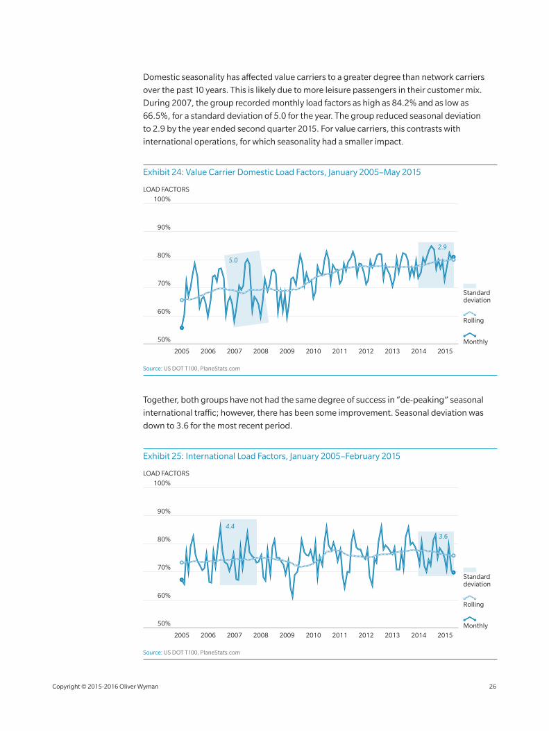
Domestic seasonality has affected value carriers to a greater degree than network carriers
over the past 10 years. This is likely due to more leisure passengers in their customer mix.
During 2007, the group recorded monthly load factors as high as 84.2% and as low as
66.5%, for a standard deviation of 5.0 for the year. The group reduced seasonal deviation
to 2.9 by the year ended second quarter 2015. For value carriers, this contrasts with
international operations, for which seasonality had a smaller impact.
Exhibit 24: Value Carrier Domestic Load Factors, January 2005–May 2015
90%
80%
70%
60%
50%
100%
20062005 2007 2008 2009 20112010 2012 2013 2014 2015
LOAD FACTORS
Monthly
Rolling
Standard deviation
5.0
2.9
Source: US DOT T100, PlaneStats.com
Together, both groups have not had the same degree of success in “de‑peaking” seasonal
international traffic; however, there has been some improvement. Seasonal deviation was
down to 3.6 for the most recent period.
Exhibit 25: International Load Factors, January 2005–February 2015
90%
80%
70%
60%
50%
100%
20062005 2007 2008 2009 20112010 2012 2013 2014 2015
LOAD FACTORS
Monthly
Rolling
Standard deviation
3.6
4.4
Source: US DOT T100, PlaneStats.com
Copyright © 2015‑2016 Oliver Wyman 26
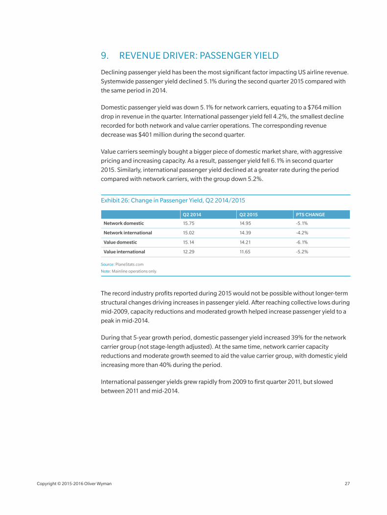
9. REVENUE DRIVER: PASSENGER YIELD
Declining passenger yield has been the most significant factor impacting US airline revenue.
Systemwide passenger yield declined 5.1% during the second quarter 2015 compared with
the same period in 2014.
Domestic passenger yield was down 5.1% for network carriers, equating to a $764 million
drop in revenue in the quarter. International passenger yield fell 4.2%, the smallest decline
recorded for both network and value carrier operations. The corresponding revenue
decrease was $401 million during the second quarter.
Value carriers seemingly bought a bigger piece of domestic market share, with aggressive
pricing and increasing capacity. As a result, passenger yield fell 6.1% in second quarter
2015. Similarly, international passenger yield declined at a greater rate during the period
compared with network carriers, with the group down 5.2%.
Exhibit 26: Change in Passenger Yield, Q2 2014/2015
Q2 2014 Q2 2015 PTS CHANGE
Network domestic 15.75 14.95 ‑5.1%
Network international 15.02 14.39 ‑4.2%
Value domestic 15.14 14.21 ‑6.1%
Value international 12.29 11.65 ‑5.2%
Source: PlaneStats.com
Note: Mainline operations only.
The record industry profits reported during 2015 would not be possible without longer‑term
structural changes driving increases in passenger yield. After reaching collective lows during
mid‑2009, capacity reductions and moderated growth helped increase passenger yield to a
peak in mid‑2014.
During that 5‑year growth period, domestic passenger yield increased 39% for the network
carrier group (not stage‑length adjusted). At the same time, network carrier capacity
reductions and moderate growth seemed to aid the value carrier group, with domestic yield
increasing more than 40% during the period.
International passenger yields grew rapidly from 2009 to first quarter 2011, but slowed
between 2011 and mid‑2014.
Copyright © 2015‑2016 Oliver Wyman 27
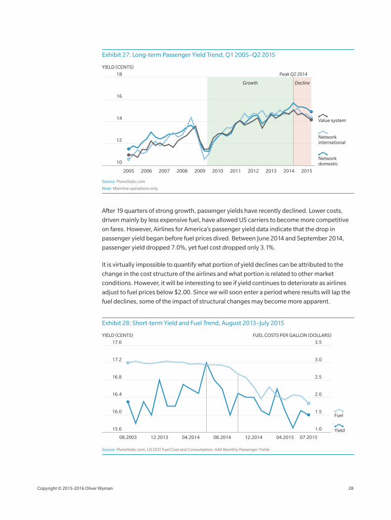
Exhibit 27: Long‑term Passenger Yield Trend, Q1 2005–Q2 2015
14
12
10
16
18
2005 2006 2007 2008 2009 2010 2011 2012 2013 2014 2015
Network international
Network domestic
Value system
YIELD (CENTS)
Growth
Peak Q2 2014
Decline
Source: PlaneStats.com
Note: Mainline operations only.
After 19 quarters of strong growth, passenger yields have recently declined. Lower costs,
driven mainly by less expensive fuel, have allowed US carriers to become more competitive
on fares. However, Airlines for America’s passenger yield data indicate that the drop in
passenger yield began before fuel prices dived. Between June 2014 and September 2014,
passenger yield dropped 7.0%, yet fuel cost dropped only 3.1%.
It is virtually impossible to quantify what portion of yield declines can be attributed to the
change in the cost structure of the airlines and what portion is related to other market
conditions. However, it will be interesting to see if yield continues to deteriorate as airlines
adjust to fuel prices below $2.00. Since we will soon enter a period where results will lap the
fuel declines, some of the impact of structural changes may become more apparent.
Exhibit 28: Short‑term Yield and Fuel Trend, August 2013–July 2015
16.4 2.0
16.0 1.5
16.8 2.5
17.2 3.0
1.015.6
17.6 3.5
YIELD (CENTS) FUEL COSTS PER GALLON (DOLLARS)
Yield
Fuel
08.2003 07.201504.201512.201408.201404.201412.2013
Source: PlaneStats.com, US DOT Fuel Cost and Consumption, A4A Monthly Passenger Yields
COST
Copyright © 2015‑2016 Oliver Wyman 28
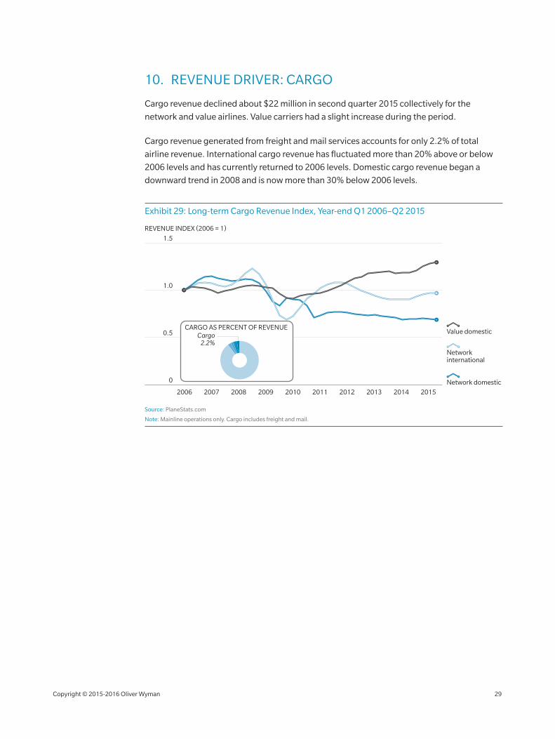
10. REVENUE DRIVER: CARGO
Cargo revenue declined about $22 million in second quarter 2015 collectively for the
network and value airlines. Value carriers had a slight increase during the period.
Cargo revenue generated from freight and mail services accounts for only 2.2% of total
airline revenue. International cargo revenue has fluctuated more than 20% above or below
2006 levels and has currently returned to 2006 levels. Domestic cargo revenue began a
downward trend in 2008 and is now more than 30% below 2006 levels.
Exhibit 29: Long‑term Cargo Revenue Index, Year‑end Q1 2006–Q2 2015
1.0
0.5
0
1.5
2006 2007 2008 2009 20112010 2012 2013 2014 2015
REVENUE INDEX (2006 = 1)
Network international
Network domestic
Value domesticCARGO AS PERCENT OF REVENUE
Cargo2.2%
Source: PlaneStats.com
Note: Mainline operations only. Cargo includes freight and mail.
Copyright © 2015‑2016 Oliver Wyman 29
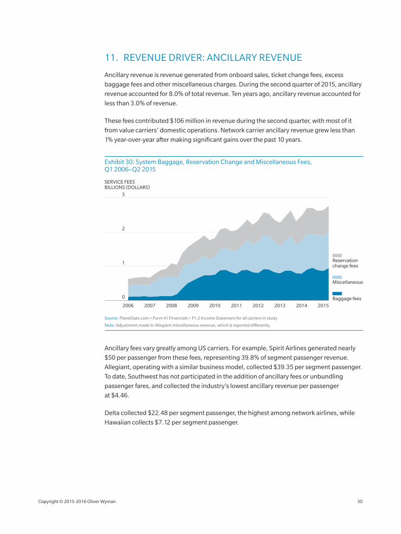
11. REVENUE DRIVER: ANCILLARY REVENUE
Ancillary revenue is revenue generated from onboard sales, ticket change fees, excess
baggage fees and other miscellaneous charges. During the second quarter of 2015, ancillary
revenue accounted for 8.0% of total revenue. Ten years ago, ancillary revenue accounted for
less than 3.0% of revenue.
These fees contributed $106 million in revenue during the second quarter, with most of it
from value carriers’ domestic operations. Network carrier ancillary revenue grew less than
1% year‑over‑year after making significant gains over the past 10 years.
Exhibit 30: System Baggage, Reservation Change and Miscellaneous Fees, Q1 2006–Q2 2015
2
1
2006 2007 2008 2009 2010 2011 2014 20152012 2013
3
Baggage fees
Reservation change fees
Miscellaneous
SERVICE FEESBILLIONS (DOLLARS)
0
Source: PlaneStats.com > Form 41 Financials > P1.2 Income Statement for all carriers in study
Note: Adjustment made to Allegiant miscellaneous revenue, which is reported differently.
Ancillary fees vary greatly among US carriers. For example, Spirit Airlines generated nearly
$50 per passenger from these fees, representing 39.8% of segment passenger revenue.
Allegiant, operating with a similar business model, collected $39.35 per segment passenger.
To date, Southwest has not participated in the addition of ancillary fees or unbundling
passenger fares, and collected the industry’s lowest ancillary revenue per passenger
at $4.46.
Delta collected $22.48 per segment passenger, the highest among network airlines, while
Hawaiian collects $7.12 per segment passenger.
Copyright © 2015‑2016 Oliver Wyman 30
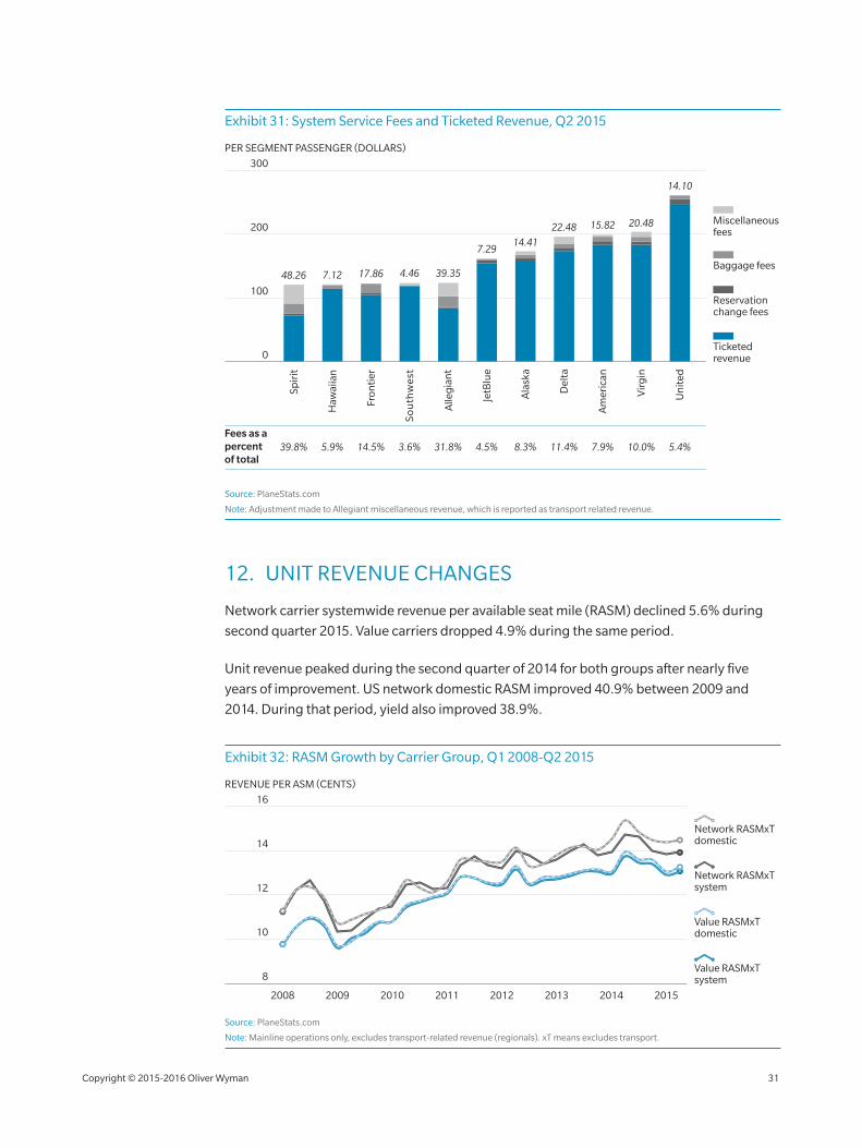
Exhibit 31: System Service Fees and Ticketed Revenue, Q2 2015
Fees as a percent of total
39.8% 5.9% 14.5% 3.6% 31.8% 4.5% 8.3% 11.4% 7.9% 10.0% 5.4%
100
200
300
So
uth
wes
t
Fron
tier
Haw
aiia
n
Alle
gia
nt
PER SEGMENT PASSENGER (DOLLARS)
Ticketed revenue
Reservation change fees
Baggage fees
Miscellaneous fees
Spir
it
0
JetB
lue
Ala
ska
Vir
gin
Del
ta
Am
eric
an
Un
ited
48.26 7.12 17.86 4.46 39.35
7.2914.41
22.48 15.82 20.48
14.10
Source: PlaneStats.com
Note: Adjustment made to Allegiant miscellaneous revenue, which is reported as transport related revenue.
12. UNIT REVENUE CHANGES
Network carrier systemwide revenue per available seat mile (RASM) declined 5.6% during
second quarter 2015. Value carriers dropped 4.9% during the same period.
Unit revenue peaked during the second quarter of 2014 for both groups after nearly five
years of improvement. US network domestic RASM improved 40.9% between 2009 and
2014. During that period, yield also improved 38.9%.
Exhibit 32: RASM Growth by Carrier Group, Q1 2008‑Q2 2015
12
10
8
14
16
2008 2009 2010 2011 2012 2013 2014 2015
Value RASMxT domestic
Value RASMxT system
Network RASMxT domestic
Network RASMxT system
REVENUE PER ASM (CENTS)
Source: PlaneStats.com
Note: Mainline operations only, excludes transport‑related revenue (regionals). xT means excludes transport.
Copyright © 2015‑2016 Oliver Wyman 31
13. COMPARISON OF DOMESTIC RASM
After losing ground in 2014, this year value carriers reduced the domestic RASM advantage
held by their network counterparts. During second quarter 2015, value carrier RASM was
13.3¢, only 1.2¢ below network carriers’ 14.5¢ RASM. Over the past eight years, the network
carrier RASM premium has been as high as 1.7¢ and as low as 0.8¢ compared with value
carrier RASM.
Exhibit 33: Comparison of Domestic RASM Between Network and Value Carriers, Q2 2008–Q2 2015
8
4
16
12
Q2 2008 Q2 2010 Q2 2012Q2 2011Q2 2009 Q2 2014Q2 2013
REVENUE PER ASM (CENTS)
0
Q2 2015
14.012.9
1.214.113.3
0.814.1
12.80.813.6
1.112.6
9.91.010.99.9
1.712.2
Valuecarriers
Networkcarriers
Difference
13.3
1.214.51.415.4
11.5
Source: PlaneStats.com
Note: Mainline operations only, excludes transport‑related revenue (regionals).
To accurately compare individual airline RASM performance, an adjustment should
be made for average stage‑length. Our study adjusts individual RASM results to a standard
1,000‑mile stage‑length using a slope of 0.5. Stage‑length adjusting provides a benchmark.
We recognize that there are other differences that also affect unit revenue, such as
seating density.
Spirit’s ultra‑low fare model resulted in the carrier having the lowest domestic RASM (both
stage‑length adjusted and unadjusted). Delta’s industry‑leading unit revenue resulted from
the carrier’s ability to generate a significant revenue premium over other domestic carriers.
Overall, plotting stage‑length adjusted RASM supports the division of our network and value
carrier groups with the exception of Hawaiian and Virgin America. Hawaiian had the third
lowest stage‑length adjusted RASM at 11.01¢. Its unique combination of extremely short,
intra‑island service combined with extremely long hauls to the mainland makes comparisons
difficult. Virgin America had the third highest adjusted RASM, resulting largely from an
average stage‑length 10% longer than any other domestic US airline.
Copyright © 2015‑2016 Oliver Wyman 32
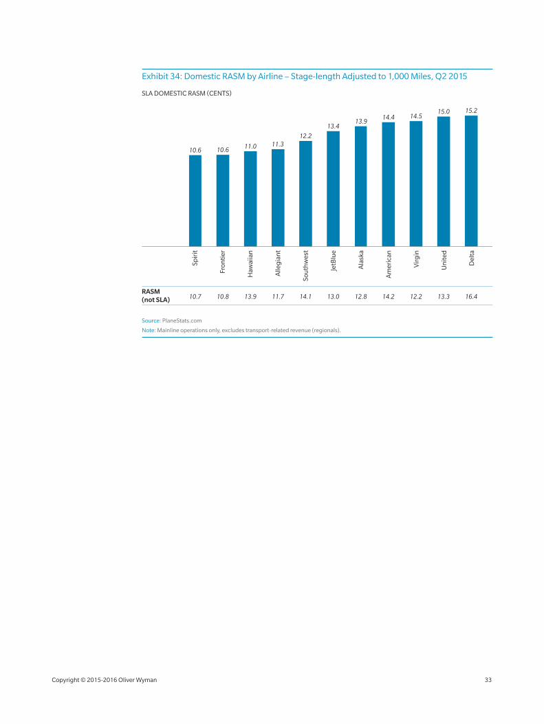
Exhibit 34: Domestic RASM by Airline – Stage‑length Adjusted to 1,000 Miles, Q2 2015
SLA DOMESTIC RASM (CENTS)
Am
eric
an
Ala
ska
JetB
lue
Sou
thw
est
Spir
it
Haw
aiia
n
Fron
tier
Un
ited
Vir
gin
Alle
gia
nt
Del
ta
10.6 10.6 11.0 11.312.2
14.4 14.515.0 15.2
RASM (not SLA) 10.7 10.8 13.9 11.7 14.1 13.0 12.8 14.2 12.2 13.3 16.4
13.413.9
Source: PlaneStats.com
Note: Mainline operations only, excludes transport‑related revenue (regionals).
Copyright © 2015‑2016 Oliver Wyman 33
CO
ST
COST
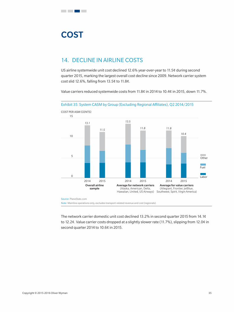
14. DECLINE IN AIRLINE COSTS
US airline systemwide unit cost declined 12.6% year‑over‑year to 11.5¢ during second
quarter 2015, marking the largest overall cost decline since 2009. Network carrier system
cost slid 12.6%, falling from 13.5¢ to 11.8¢.
Value carriers reduced systemwide costs from 11.8¢ in 2014 to 10.4¢ in 2015, down 11.7%.
Exhibit 35: System CASM by Group (Excluding Regional Affiliates), Q2 2014/2015
5
10
2014 2015 2014 2015 2014 2015
0
15
COST PER ASM (CENTS)
Labor
Fuel
Other
Overall airlinesample
Average for network carriers(Alaska, American, Delta,
Hawaiian, United, US Airways)
Average for value carriers(Allegiant, Frontier, JetBlue,
Southwest, Spirit, Virgin America)
13.1
11.5
13.5
11.8 11.8
10.4
Source: PlaneStats.com
Note: Mainline operations only, excludes transport‑related revenue and cost (regionals).
The network carrier domestic unit cost declined 13.2% in second quarter 2015 from 14.1¢
to 12.2¢. Value carrier costs dropped at a slightly slower rate (11.7%), slipping from 12.0¢ in
second quarter 2014 to 10.6¢ in 2015.
Copyright © 2015‑2016 Oliver Wyman 35
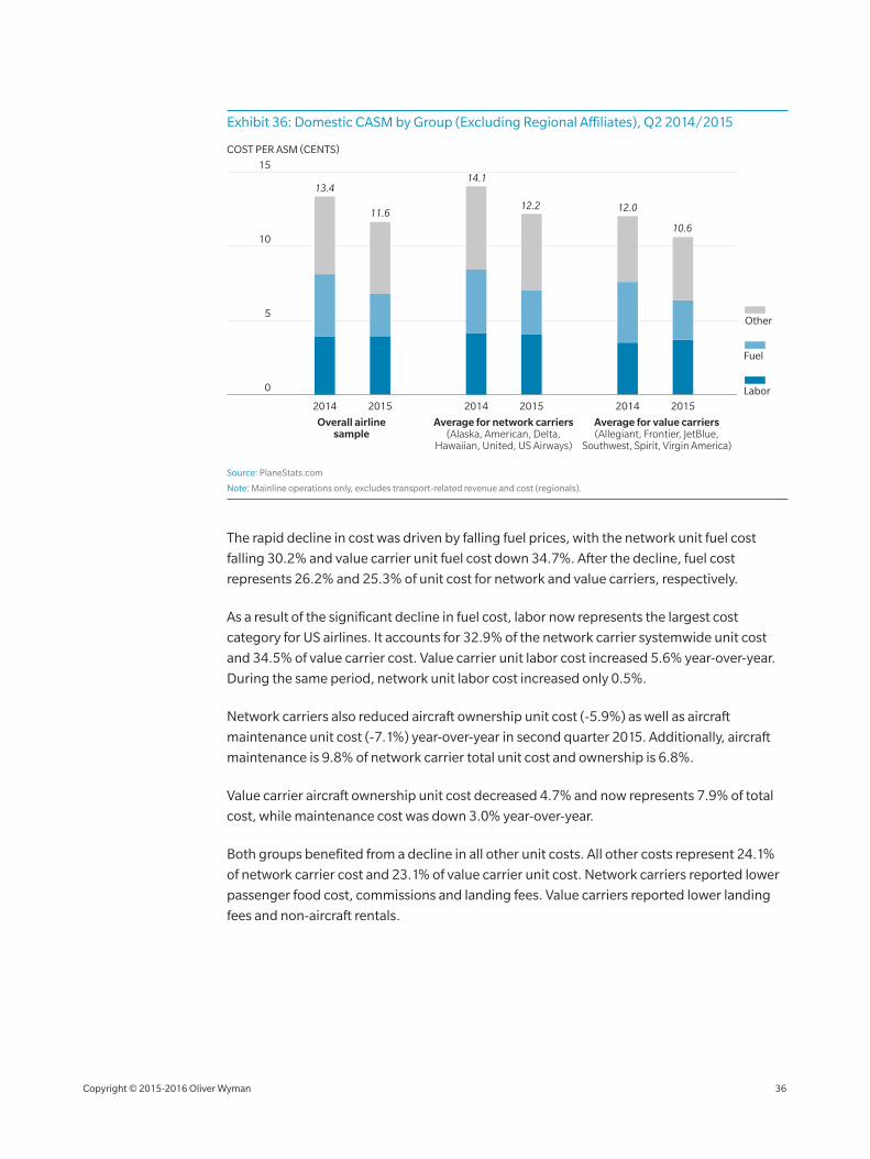
Exhibit 36: Domestic CASM by Group (Excluding Regional Affiliates), Q2 2014/2015
5
10
2014 2015 2014 2015 2014 2015
0
15
COST PER ASM (CENTS)
Labor
Fuel
Other
Overall airlinesample
Average for network carriers(Alaska, American, Delta,
Hawaiian, United, US Airways)
Average for value carriers(Allegiant, Frontier, JetBlue,
Southwest, Spirit, Virgin America)
13.4
11.6
14.1
12.2 12.0
10.6
Source: PlaneStats.com
Note: Mainline operations only, excludes transport‑related revenue and cost (regionals).
The rapid decline in cost was driven by falling fuel prices, with the network unit fuel cost
falling 30.2% and value carrier unit fuel cost down 34.7%. After the decline, fuel cost
represents 26.2% and 25.3% of unit cost for network and value carriers, respectively.
As a result of the significant decline in fuel cost, labor now represents the largest cost
category for US airlines. It accounts for 32.9% of the network carrier systemwide unit cost
and 34.5% of value carrier cost. Value carrier unit labor cost increased 5.6% year‑over‑year.
During the same period, network unit labor cost increased only 0.5%.
Network carriers also reduced aircraft ownership unit cost (‑5.9%) as well as aircraft
maintenance unit cost (‑7.1%) year‑over‑year in second quarter 2015. Additionally, aircraft
maintenance is 9.8% of network carrier total unit cost and ownership is 6.8%.
Value carrier aircraft ownership unit cost decreased 4.7% and now represents 7.9% of total
cost, while maintenance cost was down 3.0% year‑over‑year.
Both groups benefited from a decline in all other unit costs. All other costs represent 24.1%
of network carrier cost and 23.1% of value carrier unit cost. Network carriers reported lower
passenger food cost, commissions and landing fees. Value carriers reported lower landing
fees and non‑aircraft rentals.
Copyright © 2015‑2016 Oliver Wyman 36
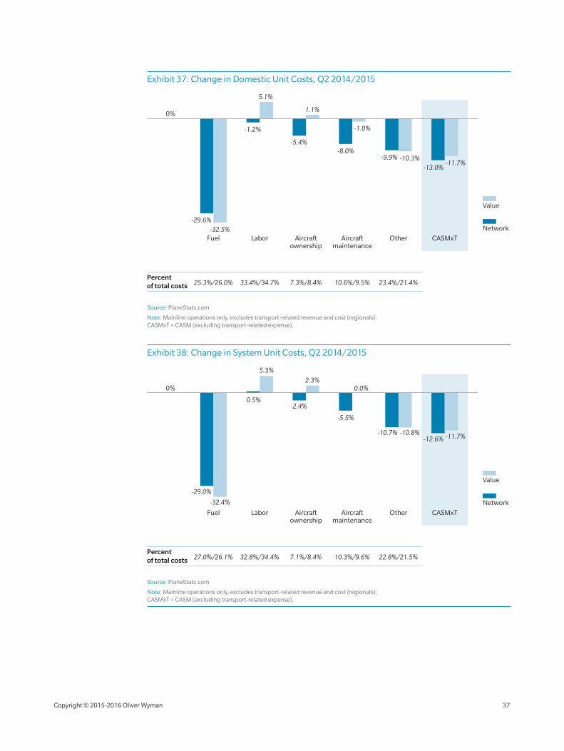
Exhibit 37: Change in Domestic Unit Costs, Q2 2014/2015
Network
Value
0%
Fuel Labor Aircraftownership
Aircraftmaintenance
Other CASMxT
Percentof total costs 25.3%/26.0% 33.4%/34.7%
-1.2%
5.1%
1.1%
-29.6%-32.5%
-5.4%-8.0%
-9.9%
-13.0%
-1.0%
-10.3%-11.7%
7.3%/8.4% 10.6%/9.5% 23.4%/21.4%
Source: PlaneStats.com
Note: Mainline operations only, excludes transport‑related revenue and cost (regionals); CASMxT = CASM (excluding transport‑related expense).
Exhibit 38: Change in System Unit Costs, Q2 2014/2015
Network
Value
0%
Fuel Labor Aircraftownership
Aircraftmaintenance
Other CASMxT
Percentof total costs 27.0%/26.1% 32.8%/34.4%
0.5%
5.3%
2.3%
-29.0%
-32.4%
-2.4%
-5.5%
-10.7%-12.6%
0.0%
-10.8% -11.7%
7.1%/8.4% 10.3%/9.6% 22.8%/21.5%
Source: PlaneStats.com
Note: Mainline operations only, excludes transport‑related revenue and cost (regionals); CASMxT = CASM (excluding transport‑related expense).
Copyright © 2015‑2016 Oliver Wyman 37
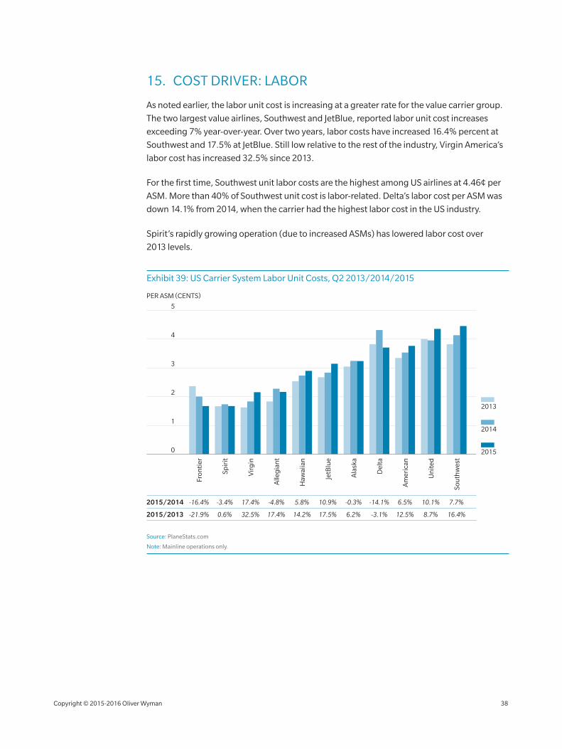
15. COST DRIVER: LABOR
As noted earlier, the labor unit cost is increasing at a greater rate for the value carrier group.
The two largest value airlines, Southwest and JetBlue, reported labor unit cost increases
exceeding 7% year‑over‑year. Over two years, labor costs have increased 16.4% percent at
Southwest and 17.5% at JetBlue. Still low relative to the rest of the industry, Virgin America’s
labor cost has increased 32.5% since 2013.
For the first time, Southwest unit labor costs are the highest among US airlines at 4.46¢ per
ASM. More than 40% of Southwest unit cost is labor‑related. Delta’s labor cost per ASM was
down 14.1% from 2014, when the carrier had the highest labor cost in the US industry.
Spirit’s rapidly growing operation (due to increased ASMs) has lowered labor cost over
2013 levels.
Exhibit 39: US Carrier System Labor Unit Costs, Q2 2013/2014/2015
PER ASM (CENTS)
Am
eric
an
Ala
ska
JetB
lue
Sou
thw
est
Spir
it
Haw
aiia
n
Fron
tier
Un
ited
Vir
gin
Alle
gia
nt
Del
ta
2
1
3
4
5
2015/2014 -16.4% -3.4% 17.4% -4.8% 5.8% 10.9% -0.3% -14.1% 6.5% 10.1% 7.7%
2015
2014
2013
0
2015/2013 -21.9% 0.6% 32.5% 17.4% 14.2% 17.5% 6.2% -3.1% 12.5% 8.7% 16.4%
Source: PlaneStats.com
Note: Mainline operations only.
Copyright © 2015‑2016 Oliver Wyman 38
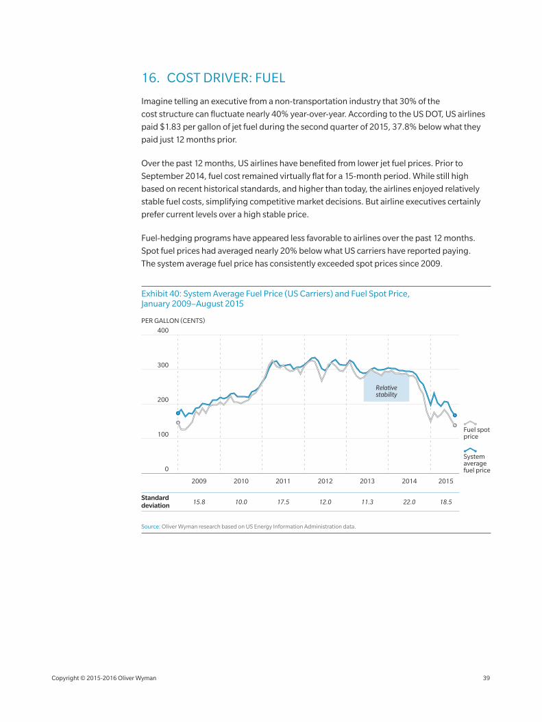
16. COST DRIVER: FUEL
Imagine telling an executive from a non‑transportation industry that 30% of the
cost structure can fluctuate nearly 40% year‑over‑year. According to the US DOT, US airlines
paid $1.83 per gallon of jet fuel during the second quarter of 2015, 37.8% below what they
paid just 12 months prior.
Over the past 12 months, US airlines have benefited from lower jet fuel prices. Prior to
September 2014, fuel cost remained virtually flat for a 15‑month period. While still high
based on recent historical standards, and higher than today, the airlines enjoyed relatively
stable fuel costs, simplifying competitive market decisions. But airline executives certainly
prefer current levels over a high stable price.
Fuel‑hedging programs have appeared less favorable to airlines over the past 12 months.
Spot fuel prices had averaged nearly 20% below what US carriers have reported paying.
The system average fuel price has consistently exceeded spot prices since 2009.
Exhibit 40: System Average Fuel Price (US Carriers) and Fuel Spot Price, January 2009–August 2015
200
100
300
0
400
PER GALLON (CENTS)
Fuel spotprice
Systemaveragefuel price
20102009 2011 2012 2013 2014 2015
10.015.8 17.5 12.0 11.3 22.0 18.5Standard deviation
Relativestability
Source: Oliver Wyman research based on US Energy Information Administration data.
Copyright © 2015‑2016 Oliver Wyman 39
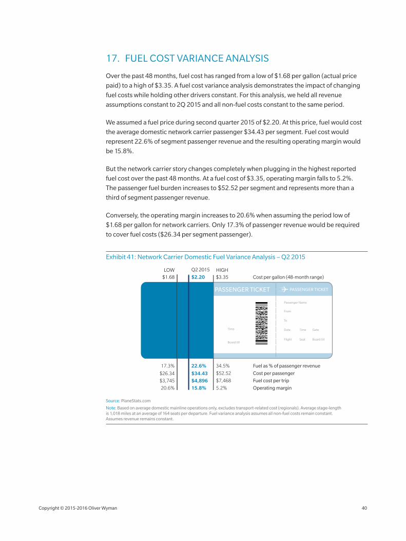
17. FUEL COST VARIANCE ANALYSIS
Over the past 48 months, fuel cost has ranged from a low of $1.68 per gallon (actual price
paid) to a high of $3.35. A fuel cost variance analysis demonstrates the impact of changing
fuel costs while holding other drivers constant. For this analysis, we held all revenue
assumptions constant to 2Q 2015 and all non‑fuel costs constant to the same period.
We assumed a fuel price during second quarter 2015 of $2.20. At this price, fuel would cost
the average domestic network carrier passenger $34.43 per segment. Fuel cost would
represent 22.6% of segment passenger revenue and the resulting operating margin would
be 15.8%.
But the network carrier story changes completely when plugging in the highest reported
fuel cost over the past 48 months. At a fuel cost of $3.35, operating margin falls to 5.2%.
The passenger fuel burden increases to $52.52 per segment and represents more than a
third of segment passenger revenue.
Conversely, the operating margin increases to 20.6% when assuming the period low of
$1.68 per gallon for network carriers. Only 17.3% of passenger revenue would be required
to cover fuel costs ($26.34 per segment passenger).
Exhibit 41: Network Carrier Domestic Fuel Variance Analysis – Q2 2015
Fuel as % of passenger revenue
Cost per passenger
Fuel cost per trip
Operating margin
$52.52$26.34 $34.43
34.5%17.3% 22.6%
$7,468$3,745 $4,896
5.2%20.6% 15.8%
$3.35$1.68 $2.20 Cost per gallon (48-month range)
Q2 2015LOW HIGH
PASSENGER TICKET PASSENGER TICKET
Passenger Name Passenger Name
From
To
Date Time Gate
Flight Seat Board till
DateTo
Flight Seat Gate Board till
From Carrier
Time
Source: PlaneStats.com
Note: Based on average domestic mainline operations only, excludes transport‑related cost (regionals). Average stage‑length is 1,018 miles at an average of 164 seats per departure. Fuel variance analysis assumes all non‑fuel costs remain constant. Assumes revenue remains constant.
Copyright © 2015‑2016 Oliver Wyman 40
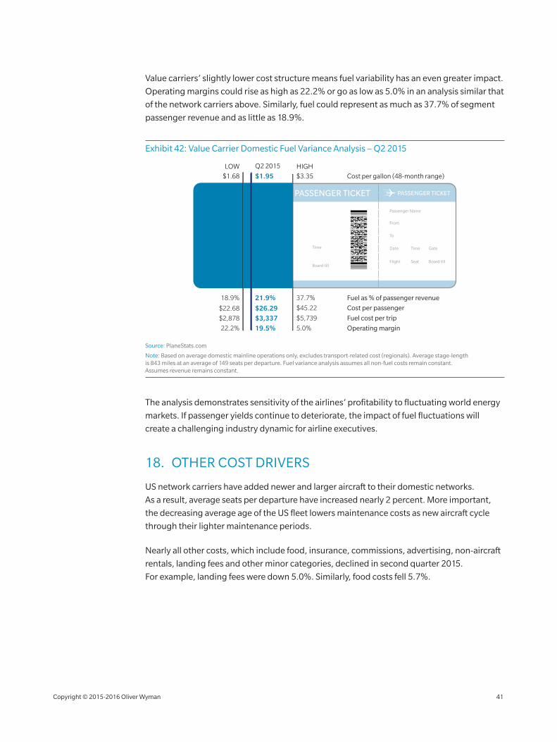
Value carriers’ slightly lower cost structure means fuel variability has an even greater impact.
Operating margins could rise as high as 22.2% or go as low as 5.0% in an analysis similar that
of the network carriers above. Similarly, fuel could represent as much as 37.7% of segment
passenger revenue and as little as 18.9%.
Exhibit 42: Value Carrier Domestic Fuel Variance Analysis – Q2 2015
Fuel as % of passenger revenue
Cost per passenger
Fuel cost per trip
Operating margin
$45.22$22.68 $26.29
37.7%18.9% 21.9%
$5,739$2,878 $3,337
5.0%22.2% 19.5%
$3.35$1.68 $1.95 Cost per gallon (48-month range)
Q2 2015LOW HIGH
PASSENGER TICKET PASSENGER TICKET
Passenger Name Passenger Name
From
To
Date Time Gate
Flight Seat Board till
DateTo
Flight Seat Gate Board till
From Carrier
Time
Source: PlaneStats.com
Note: Based on average domestic mainline operations only, excludes transport‑related cost (regionals). Average stage‑length is 843 miles at an average of 149 seats per departure. Fuel variance analysis assumes all non‑fuel costs remain constant. Assumes revenue remains constant.
The analysis demonstrates sensitivity of the airlines’ profitability to fluctuating world energy
markets. If passenger yields continue to deteriorate, the impact of fuel fluctuations will
create a challenging industry dynamic for airline executives.
18. OTHER COST DRIVERS
US network carriers have added newer and larger aircraft to their domestic networks.
As a result, average seats per departure have increased nearly 2 percent. More important,
the decreasing average age of the US fleet lowers maintenance costs as new aircraft cycle
through their lighter maintenance periods.
Nearly all other costs, which include food, insurance, commissions, advertising, non‑aircraft
rentals, landing fees and other minor categories, declined in second quarter 2015.
For example, landing fees were down 5.0%. Similarly, food costs fell 5.7%.
Copyright © 2015‑2016 Oliver Wyman 41
19. UNIT COST TREND AND GAP
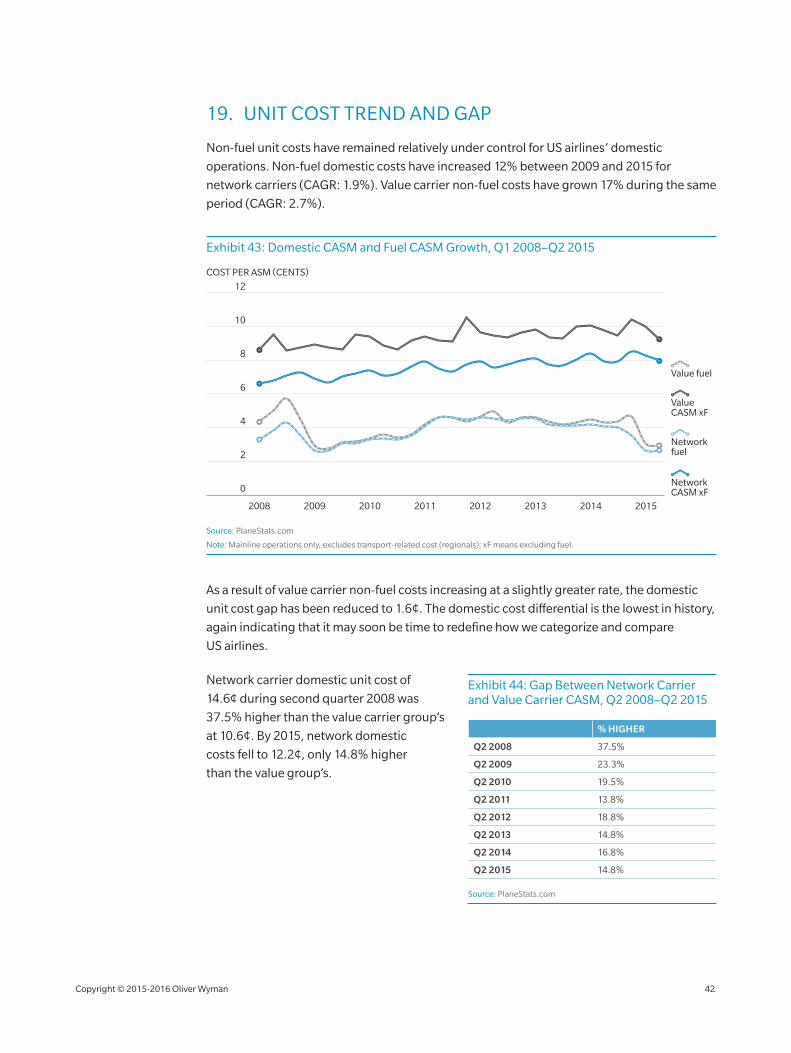
Non‑fuel unit costs have remained relatively under control for US airlines’ domestic
operations. Non‑fuel domestic costs have increased 12% between 2009 and 2015 for
network carriers (CAGR: 1.9%). Value carrier non‑fuel costs have grown 17% during the same
period (CAGR: 2.7%).
Exhibit 43: Domestic CASM and Fuel CASM Growth, Q1 2008–Q2 2015
2008 2009 2010 2011 2012
0
12
10
8
6
4
2
2014 20152013
Network CASM xF
Value CASM xF
COST PER ASM (CENTS)
Value fuel
Network fuel
Source: PlaneStats.com
Note: Mainline operations only, excludes transport‑related cost (regionals); xF means excluding fuel.
As a result of value carrier non‑fuel costs increasing at a slightly greater rate, the domestic
unit cost gap has been reduced to 1.6¢. The domestic cost differential is the lowest in history,
again indicating that it may soon be time to redefine how we categorize and compare
US airlines.
Network carrier domestic unit cost of
14.6¢ during second quarter 2008 was
37.5% higher than the value carrier group’s
at 10.6¢. By 2015, network domestic
costs fell to 12.2¢, only 14.8% higher
than the value group’s.
Exhibit 44: Gap Between Network Carrier and Value Carrier CASM, Q2 2008–Q2 2015
% HIGHER
Q2 2008 37.5%
Q2 2009 23.3%
Q2 2010 19.5%
Q2 2011 13.8%
Q2 2012 18.8%
Q2 2013 14.8%
Q2 2014 16.8%
Q2 2015 14.8%
Source: PlaneStats.com
Copyright © 2015‑2016 Oliver Wyman 42
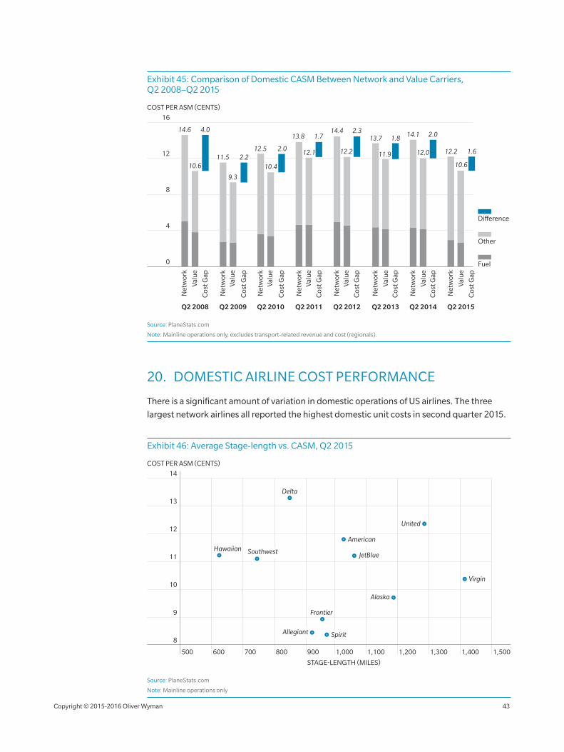
Exhibit 45: Comparison of Domestic CASM Between Network and Value Carriers, Q2 2008–Q2 2015
8
4
16
12
COST PER ASM (CENTS)
Net
wor
k
Valu
e
Cos
t Gap
Q2 2008
Fuel
Other
Difference
0
Q2 2009
Net
wor
kVa
lue
Cos
t Gap
Q2 2010
Net
wor
kVa
lue
Cos
t Gap
Valu
eQ2 2011
Net
wor
k
Cos
t Gap
Q2 2012
Net
wor
kVa
lue
Cos
t Gap
Q2 2013
Net
wor
k
Valu
eC
ost G
ap
Q2 2014
Net
wor
k
Valu
eC
ost G
ap
Q2 2015
Net
wor
k
Valu
e
Cos
t Gap
4.0
2.22.0
1.72.3
1.8 2.0
1.6
14.6
10.611.5
9.3
12.5
10.4
13.8
12.1
14.413.7
11.9
14.1
12.0 12.2
10.6
12.2
Source: PlaneStats.com
Note: Mainline operations only, excludes transport‑related revenue and cost (regionals).
20. DOMESTIC AIRLINE COST PERFORMANCE
There is a significant amount of variation in domestic operations of US airlines. The three
largest network airlines all reported the highest domestic unit costs in second quarter 2015.
Exhibit 46: Average Stage‑length vs. CASM, Q2 2015
11
10
9
12
13
8
14
1,5001,000 1,100 1,200 1,300 1,400700 800 900600500
STAGE-LENGTH (MILES)
COST PER ASM (CENTS)
Delta
American
United
Alaska
JetBlue
Allegiant Spirit
Hawaiian Southwest
Frontier
Virgin
Source: PlaneStats.com
Note: Mainline operations only
Copyright © 2015‑2016 Oliver Wyman 43
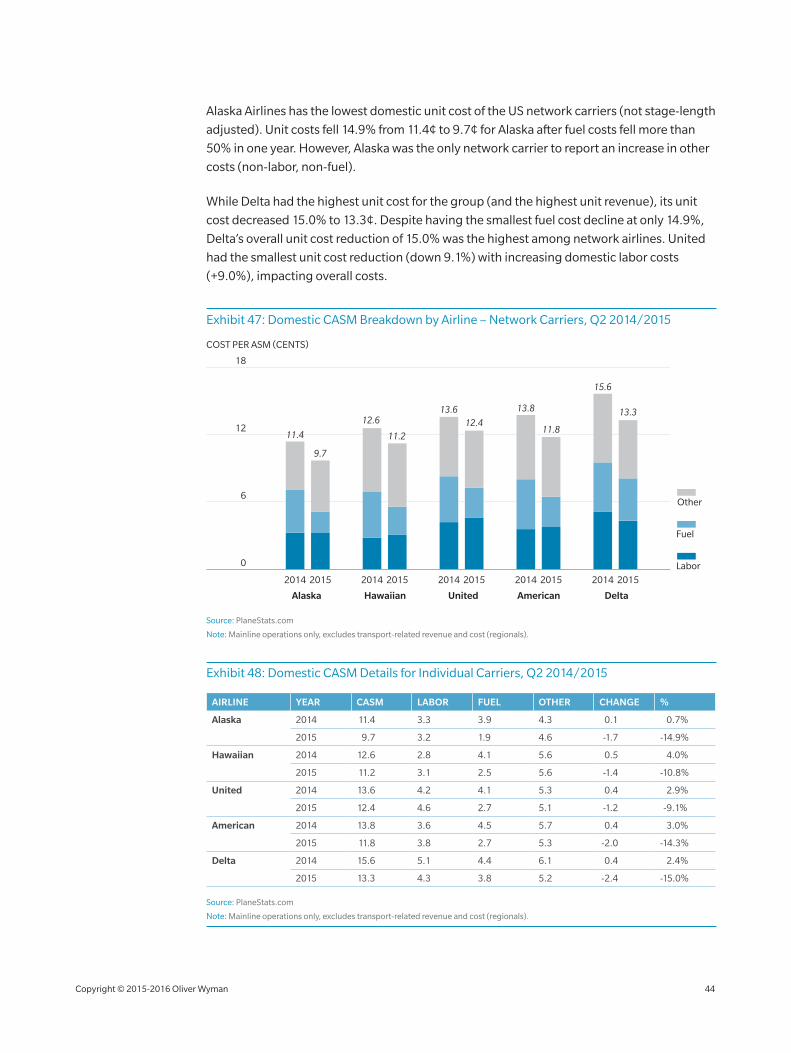
Alaska Airlines has the lowest domestic unit cost of the US network carriers (not stage‑length
adjusted). Unit costs fell 14.9% from 11.4¢ to 9.7¢ for Alaska after fuel costs fell more than
50% in one year. However, Alaska was the only network carrier to report an increase in other
costs (non‑labor, non‑fuel).
While Delta had the highest unit cost for the group (and the highest unit revenue), its unit
cost decreased 15.0% to 13.3¢. Despite having the smallest fuel cost decline at only 14.9%,
Delta’s overall unit cost reduction of 15.0% was the highest among network airlines. United
had the smallest unit cost reduction (down 9.1%) with increasing domestic labor costs
(+9.0%), impacting overall costs.
Exhibit 47: Domestic CASM Breakdown by Airline – Network Carriers, Q2 2014/2015
12
6
18
COST PER ASM (CENTS)
Labor
Fuel
Other
13.8
11.8
2014 2015
American
11.2
12.6
2014 2015
Hawaiian
13.612.4
2014 2015
United
15.6
13.3
2014 2015
Delta
2014 2015
11.4
9.7
Alaska
0
Source: PlaneStats.com
Note: Mainline operations only, excludes transport‑related revenue and cost (regionals).
Exhibit 48: Domestic CASM Details for Individual Carriers, Q2 2014/2015
AIRLINE YEAR CASM LABOR FUEL OTHER CHANGE %
Alaska 2014 11.4 3.3 3.9 4.3 0.1 0.7%
2015 9.7 3.2 1.9 4.6 ‑1.7 ‑14.9%
Hawaiian 2014 12.6 2.8 4.1 5.6 0.5 4.0%
2015 11.2 3.1 2.5 5.6 ‑1.4 ‑10.8%
United 2014 13.6 4.2 4.1 5.3 0.4 2.9%
2015 12.4 4.6 2.7 5.1 ‑1.2 ‑9.1%
American 2014 13.8 3.6 4.5 5.7 0.4 3.0%
2015 11.8 3.8 2.7 5.3 ‑2.0 ‑14.3%
Delta 2014 15.6 5.1 4.4 6.1 0.4 2.4%
2015 13.3 4.3 3.8 5.2 ‑2.4 ‑15.0%
Source: PlaneStats.com
Note: Mainline operations only, excludes transport‑related revenue and cost (regionals).
Copyright © 2015‑2016 Oliver Wyman 44
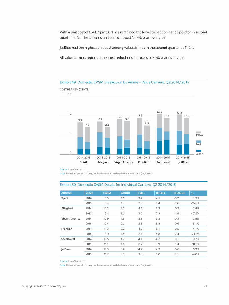
With a unit cost of 8.4¢, Spirit Airlines remained the lowest‑cost domestic operator in second
quarter 2015. The carrier’s unit cost dropped 15.9% year‑over‑year.
JetBlue had the highest unit cost among value airlines in the second quarter at 11.2¢.
All value carriers reported fuel cost reductions in excess of 30% year‑over‑year.
Exhibit 49: Domestic CASM Breakdown by Airline – Value Carriers, Q2 2014/2015
12
6
18
COST PER ASM (CENTS)
Labor
Fuel
Other
2014 2015
9.9
8.4
10.910.4
11.3
8.9
12.5
11.112.3
11.2
8.4
10.2
2014 2015 2014 2015 2014 2015 2014 20152014 2015
Frontier SouthwestAllegiant Virgin America JetBlueSpirit
0
Source: PlaneStats.com
Note: Mainline operations only, excludes transport‑related revenue and cost (regionals).
Exhibit 50: Domestic CASM Details for Individual Carriers, Q2 2014/2015
AIRLINE YEAR CASM LABOR FUEL OTHER CHANGE %
Spirit 2014 9.9 1.6 3.7 4.5 ‑0.2 ‑1.9%
2015 8.4 1.7 2.3 4.4 ‑1.6 ‑15.8%
Allegiant 2014 10.2 2.3 4.6 3.3 0.2 2.4%
2015 8.4 2.2 3.0 3.3 ‑1.8 ‑17.2%
Virgin America 2014 10.9 1.9 3.8 5.3 0.3 2.5%
2015 10.4 2.2 2.5 5.8 ‑0.6 ‑5.1%
Frontier 2014 11.3 2.2 4.0 5.1 ‑0.5 ‑4.1%
2015 8.9 1.8 2.4 4.8 ‑2.4 ‑21.3%
Southwest 2014 12.5 4.2 4.1 4.2 0.1 0.7%
2015 11.1 4.5 2.7 3.9 ‑1.4 ‑10.9%
JetBlue 2014 12.3 3.0 4.4 4.9 0.6 5.3%
2015 11.2 3.3 3.0 5.0 ‑1.1 ‑9.0%
Source: PlaneStats.com
Note: Mainline operations only, excludes transport‑related revenue and cost (regionals).
Copyright © 2015‑2016 Oliver Wyman 45
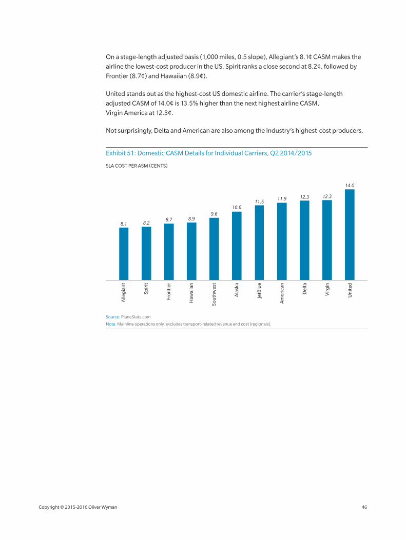
On a stage‑length adjusted basis (1,000 miles, 0.5 slope), Allegiant’s 8.1¢ CASM makes the
airline the lowest‑cost producer in the US. Spirit ranks a close second at 8.2¢, followed by
Frontier (8.7¢) and Hawaiian (8.9¢).
United stands out as the highest‑cost US domestic airline. The carrier’s stage‑length
adjusted CASM of 14.0¢ is 13.5% higher than the next highest airline CASM,
Virgin America at 12.3¢.
Not surprisingly, Delta and American are also among the industry’s highest‑cost producers.
Exhibit 51: Domestic CASM Details for Individual Carriers, Q2 2014/2015
SLA COST PER ASM (CENTS)
Am
eric
an
Ala
ska
JetB
lue
Sou
thw
est
Spir
it
Haw
aiia
n
Fron
tier
Un
ited
Vir
gin
Alle
gia
nt
Del
ta
8.1 8.28.7 8.9
9.6
11.9 12.3 12.3
14.0
10.611.5
Source: PlaneStats.com
Note: Mainline operations only, excludes transport‑related revenue and cost (regionals).
WORLD CAPACITY
Copyright © 2015‑2016 Oliver Wyman 46
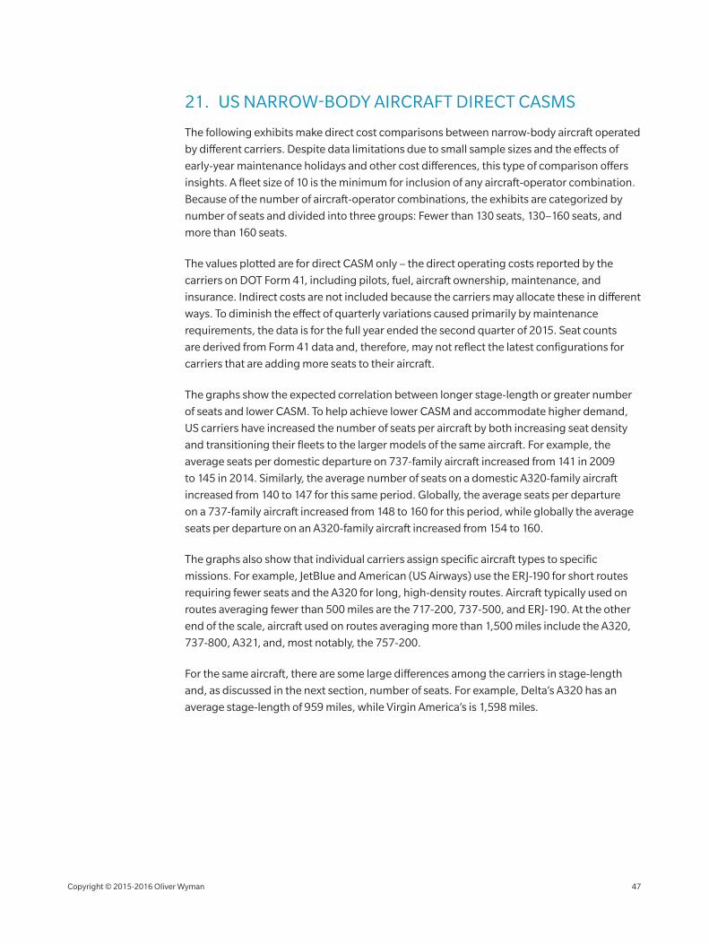
21. US NARROW‑BODY AIRCRAFT DIRECT CASMS
The following exhibits make direct cost comparisons between narrow‑body aircraft operated
by different carriers. Despite data limitations due to small sample sizes and the effects of
early‑year maintenance holidays and other cost differences, this type of comparison offers
insights. A fleet size of 10 is the minimum for inclusion of any aircraft‑operator combination.
Because of the number of aircraft‑operator combinations, the exhibits are categorized by
number of seats and divided into three groups: Fewer than 130 seats, 130–160 seats, and
more than 160 seats.
The values plotted are for direct CASM only – the direct operating costs reported by the
carriers on DOT Form 41, including pilots, fuel, aircraft ownership, maintenance, and
insurance. Indirect costs are not included because the carriers may allocate these in different
ways. To diminish the effect of quarterly variations caused primarily by maintenance
requirements, the data is for the full year ended the second quarter of 2015. Seat counts
are derived from Form 41 data and, therefore, may not reflect the latest configurations for
carriers that are adding more seats to their aircraft.
The graphs show the expected correlation between longer stage‑length or greater number
of seats and lower CASM. To help achieve lower CASM and accommodate higher demand,
US carriers have increased the number of seats per aircraft by both increasing seat density
and transitioning their fleets to the larger models of the same aircraft. For example, the
average seats per domestic departure on 737‑family aircraft increased from 141 in 2009
to 145 in 2014. Similarly, the average number of seats on a domestic A320‑family aircraft
increased from 140 to 147 for this same period. Globally, the average seats per departure
on a 737‑family aircraft increased from 148 to 160 for this period, while globally the average
seats per departure on an A320‑family aircraft increased from 154 to 160.
The graphs also show that individual carriers assign specific aircraft types to specific
missions. For example, JetBlue and American (US Airways) use the ERJ‑190 for short routes
requiring fewer seats and the A320 for long, high‑density routes. Aircraft typically used on
routes averaging fewer than 500 miles are the 717‑200, 737‑500, and ERJ‑190. At the other
end of the scale, aircraft used on routes averaging more than 1,500 miles include the A320,
737‑800, A321, and, most notably, the 757‑200.
For the same aircraft, there are some large differences among the carriers in stage‑length
and, as discussed in the next section, number of seats. For example, Delta’s A320 has an
average stage‑length of 959 miles, while Virgin America’s is 1,598 miles.
Copyright © 2015‑2016 Oliver Wyman 47
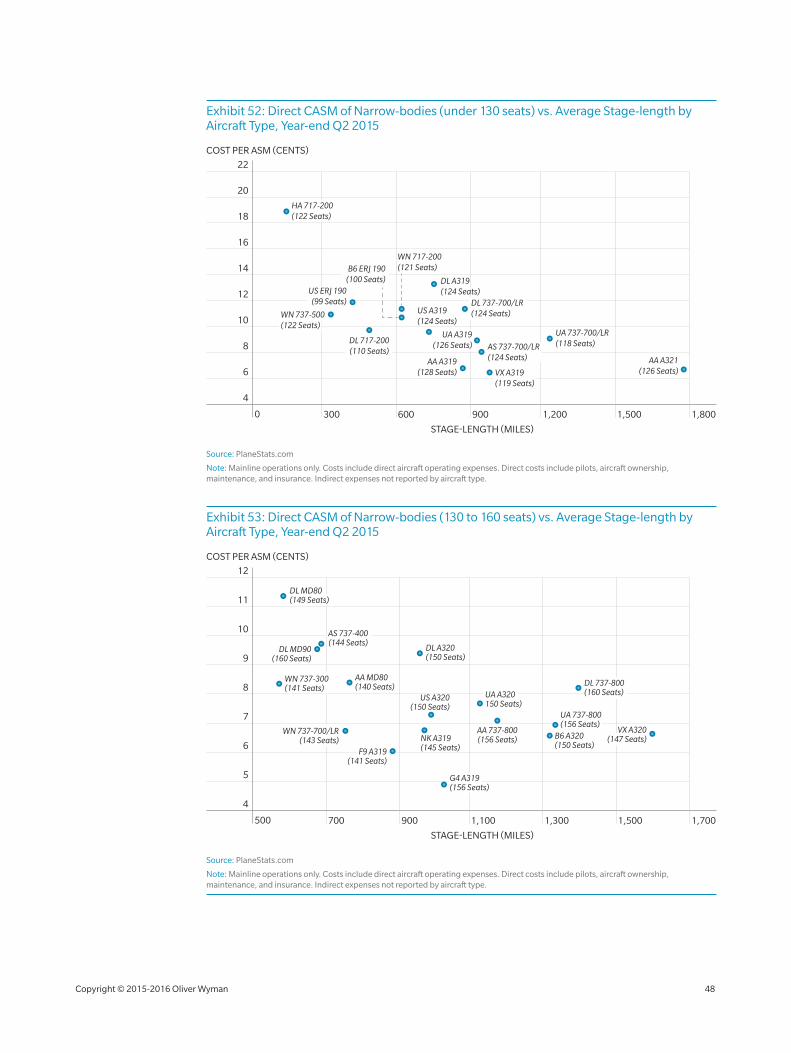
Exhibit 52: Direct CASM of Narrow‑bodies (under 130 seats) vs. Average Stage‑length by Aircraft Type, Year‑end Q2 2015
STAGE-LENGTH (MILES)
COST PER ASM (CENTS)
300
10
8
6
12
14
18
20
16
4
22
1,800600 900 1,200 1,5000
DL 737-700/LR(124 Seats)
AA A319(128 Seats)
HA 717-200(122 Seats)
WN 717-200(121 Seats)B6 ERJ 190
(100 Seats)
UA A319(126 Seats)
UA 737-700/LR(118 Seats)
DL A319(124 Seats)US ERJ 190
(99 Seats)
WN 737-500 (122 Seats)
AA A321(126 Seats)VX A319
(119 Seats)
AS 737-700/LR(124 Seats)
DL 717-200(110 Seats)
US A319(124 Seats)
Source: PlaneStats.com
Note: Mainline operations only. Costs include direct aircraft operating expenses. Direct costs include pilots, aircraft ownership, maintenance, and insurance. Indirect expenses not reported by aircraft type.
Exhibit 53: Direct CASM of Narrow‑bodies (130 to 160 seats) vs. Average Stage‑length by Aircraft Type, Year‑end Q2 2015
700
6
5
7
8
10
11
9
12
1,700900 1,100 1,5001,300500
STAGE-LENGTH (MILES)
COST PER ASM (CENTS)
4
AS 737-400(144 Seats)
AA MD80(140 Seats)
DL MD90(160 Seats)
WN 737-300(141 Seats)
F9 A319(141 Seats)
US A320(150 Seats)
UA A320150 Seats)
AA 737-800(156 Seats) B6 A320
(150 Seats)
DL A320(150 Seats)
DL MD80(149 Seats)
WN 737-700/LR(143 Seats) NK A319
(145 Seats)
DL 737-800(160 Seats)
VX A320(147 Seats)
UA 737-800(156 Seats)
G4 A319(156 Seats)
Source: PlaneStats.com
Note: Mainline operations only. Costs include direct aircraft operating expenses. Direct costs include pilots, aircraft ownership, maintenance, and insurance. Indirect expenses not reported by aircraft type.
Copyright © 2015‑2016 Oliver Wyman 48
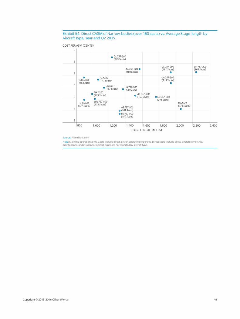
Exhibit 54: Direct CASM of Narrow‑bodies (over 160 seats) vs. Average Stage‑length by Aircraft Type, Year‑end Q2 2015
STAGE-LENGTH (MILES)
COST PER ASM (CENTS)
1,000
6
5
4
7
8
3
9
2,4002,2001,200 1,400 1,800 2,0001,600800
NK A320(179 Seats)
WN 737-800(175 Seats)
AS 737-900(181 Seats)DL 737-900 (180 Seats)
UA 757-200(168 Seats)
US 757-200(181 Seats)
UA 757-300(213 Seats)
AA 757-200(180 Seats)
DL 757-200(179 Seats)
UA 737-900(170 Seats)
B6 A321(176 Seats)
G4 757-200(215 Seats)
F9 A320 (171 Seats)
US A321(187 Seats)
AS 737-800(162 Seats)
G4 MD80(166 Seats)
G4 A320(177 Seats)
Source: PlaneStats.com
Note: Mainline operations only. Costs include direct aircraft operating expenses. Direct costs include pilots, aircraft ownership, maintenance, and insurance. Indirect expenses not reported by aircraft type.
Copyright © 2015‑2016 Oliver Wyman 49

WO
RLD
CA
PAC
ITY

WORLD CAPACITY
The world aviation market is vast and complex. Economic, social, and operational
conditions impact airline growth and profitability differently throughout the world. While
capacity discipline in the US airline industry over the past 10 years has largely improved
the passenger yield environment and profitability, we still need to examine how much
capacity discipline, or lack thereof, exists in the international markets.
The following section examines capacity deployment by world region paired with
GDP growth, regional population and firm aircraft orders. Using consistent indicators,
we can assess the growth potential by region and evaluate emerging trends.
22. WORLD CAPACITY TRENDS
Industry capacity, measured in available seat miles (ASMs), increased 6.3% year ended
October 2015 versus year ended October 2014 worldwide, and every major world region
experienced ASM growth at or above 4.6%. Available seats grew 5.5% for the year ended
October 2015 and departures increased only 3.1%.
Analysis of these three metrics provides immediate insight into the industry’s prevailing
capacity trend: larger/more dense aircraft flying longer distances. Average seats per
departure increased 3 seats to 138 (up 2.2%), accounting for the difference between annual
departures and seat growth. Similarly, the industry’s average stage‑length increased
10 miles to 813 (up 1.2%). The combined increased seat count and stage‑length explain
the differences in capacity growth measures. A 3‑seat average capacity increase combined
with a 10‑mile stage‑length increase may not seem significant, but they add up quickly,
considering there are 33 million scheduled departures and 4.5 billion scheduled seats
per year.
Ten years ago, the average scheduled flight had 114 seats and flew only 685 miles. If similar
growth rates continue over the next 10 years, the average aircraft will depart with 167 seats
and fly 964 miles. Certainly, a massive change.
Copyright © 2015‑2016 Oliver Wyman 51
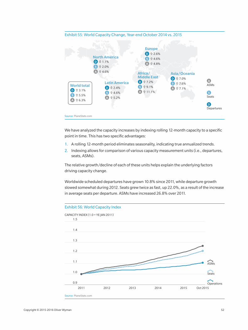
Exhibit 55: World Capacity Change, Year‑end October 2014 vs. 2015
Asia/Oceania
North America
World totalLatin America
Europe
Africa/Middle East
Departures
Seats
ASMs
D
S
A
D
S
A
3.1%
5.5%
6.3%
D
S
A
7.0%
7.6%
7.1%
D
S
A
7.2%
9.1%
11.1%
D
S
A
1.1%
2.0%
4.6%
D
S
A
2.4%
4.6%
5.2%
D
S
A
2.6%
4.6%
4.8%
Source: PlaneStats.com
We have analyzed the capacity increases by indexing rolling 12‑month capacity to a specific
point in time. This has two specific advantages:
1. A rolling 12‑month period eliminates seasonality, indicating true annualized trends.
2. Indexing allows for comparison of various capacity measurement units (i.e., departures, seats, ASMs).
The relative growth/decline of each of these units helps explain the underlying factors
driving capacity change.
Worldwide scheduled departures have grown 10.8% since 2011, while departure growth
slowed somewhat during 2012. Seats grew twice as fast, up 22.0%, as a result of the increase
in average seats per departure. ASMs have increased 26.8% over 2011.
Exhibit 56: World Capacity Index
1.4
1.3
1.2
1.1
1.0
0.9
1.5
2011 2012 2013 2014 2015 Oct 2015
CAPACITY INDEX (1.0 = YE JAN 2011)
Seats
Operations
ASMs
Source: PlaneStats.com
Copyright © 2015‑2016 Oliver Wyman 52
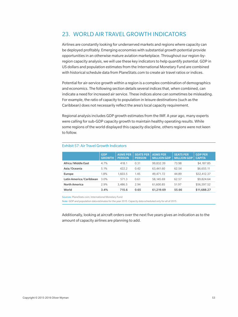
23. WORLD AIR TRAVEL GROWTH INDICATORS
Airlines are constantly looking for underserved markets and regions where capacity can
be deployed profitably. Emerging economies with substantial growth potential provide
opportunities in an otherwise mature aviation marketplace. Throughout our region‑by‑
region capacity analysis, we will use these key indicators to help quantify potential. GDP in
US dollars and population estimates from the International Monetary Fund are combined
with historical schedule data from PlaneStats.com to create air travel ratios or indices.
Potential for air‑service growth within a region is a complex combination of demographics
and economics. The following section details several indices that, when combined, can
indicate a need for increased air service. These indices alone can sometimes be misleading.
For example, the ratio of capacity to population in leisure destinations (such as the
Caribbean) does not necessarily reflect the area’s local capacity requirement.
Regional analysis includes GDP growth estimates from the IMF. A year ago, many experts
were calling for sub‑GDP capacity growth to maintain healthy operating results. While
some regions of the world displayed this capacity discipline, others regions were not keen
to follow.
Exhibit 57: Air Travel Growth Indicators
GDP GROWTH
ASMS PER PERSON
SEATS PER PERSON
ASMS PER MILLION GDP
SEATS PER MILLION GDP
GDP PER CAPITA
Africa/Middle East 4.7% 418.1 0.31 99,832.39 73.98 $4,187.85
Asia/Oceania 5.1% 422.2 0.42 63,441.60 62.54 $6,655.11
Europe 1.8% 1,603.5 1.45 49,471.72 44.89 $32,412.37
Latin America/Caribbean 3.0% 571.3 0.61 58,145.69 62.57 $9,824.64
North America 2.9% 3,486.5 2.94 61,600.85 51.97 $56,597.52
World 3.4% 715.6 0.65 61,219.69 55.66 $11,688.27
Sources: PlaneStats.com; International Monetary Fund
Note: GDP and population data estimates for the year 2015. Capacity data scheduled only for all of 2015.
Additionally, looking at aircraft orders over the next five years gives an indication as to the
amount of capacity airlines are planning to add.
Copyright © 2015‑2016 Oliver Wyman 53
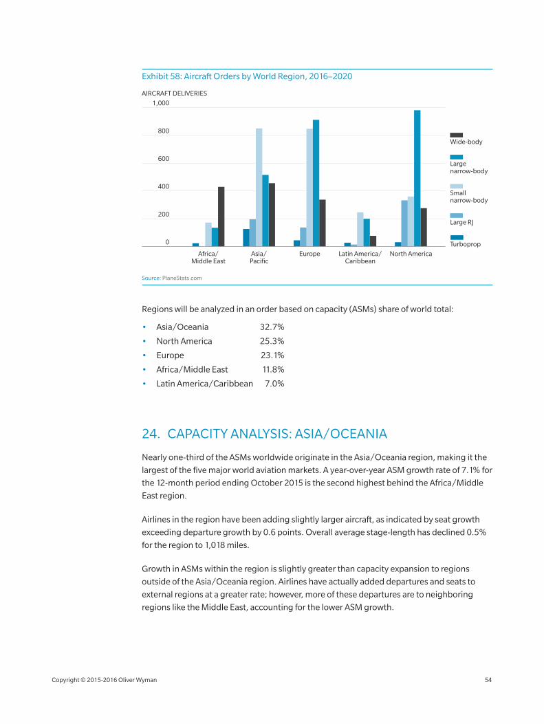
Exhibit 58: Aircraft Orders by World Region, 2016–2020
800
600
400
200
1,000
Africa/Middle East
Asia/Pacific
Europe Latin America/Caribbean
North America
0
AIRCRAFT DELIVERIES
Turboprop
Large RJ
Small narrow-body
Large narrow-body
Wide-body
Source: PlaneStats.com
Regions will be analyzed in an order based on capacity (ASMs) share of world total:
• Asia/Oceania 32.7%
• North America 25.3%
• Europe 23.1%
• Africa/Middle East 11.8%
• Latin America/Caribbean 7.0%
24. CAPACITY ANALYSIS: ASIA/OCEANIA
Nearly one‑third of the ASMs worldwide originate in the Asia/Oceania region, making it the
largest of the five major world aviation markets. A year‑over‑year ASM growth rate of 7.1% for
the 12‑month period ending October 2015 is the second highest behind the Africa/Middle
East region.
Airlines in the region have been adding slightly larger aircraft, as indicated by seat growth
exceeding departure growth by 0.6 points. Overall average stage‑length has declined 0.5%
for the region to 1,018 miles.
Growth in ASMs within the region is slightly greater than capacity expansion to regions
outside of the Asia/Oceania region. Airlines have actually added departures and seats to
external regions at a greater rate; however, more of these departures are to neighboring
regions like the Middle East, accounting for the lower ASM growth.
Copyright © 2015‑2016 Oliver Wyman 54
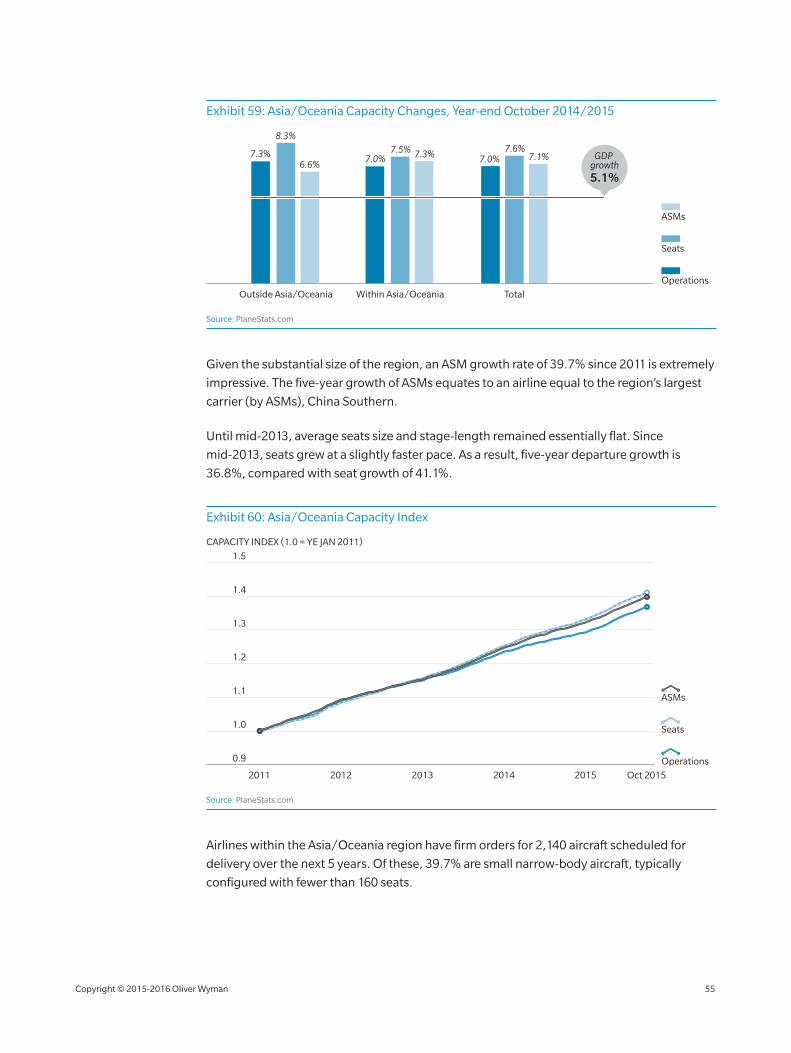
Exhibit 59: Asia/Oceania Capacity Changes, Year‑end October 2014/2015
Seats
Operations
ASMs
Outside Asia/Oceania Within Asia/Oceania Total
7.3%
8.3%
6.6%7.0%
7.5% 7.3% 7.0%7.6%
7.1% GDP growth5.1%
Source: PlaneStats.com
Given the substantial size of the region, an ASM growth rate of 39.7% since 2011 is extremely
impressive. The five‑year growth of ASMs equates to an airline equal to the region’s largest
carrier (by ASMs), China Southern.
Until mid‑2013, average seats size and stage‑length remained essentially flat. Since
mid‑2013, seats grew at a slightly faster pace. As a result, five‑year departure growth is
36.8%, compared with seat growth of 41.1%.
Exhibit 60: Asia/Oceania Capacity Index
1.4
1.3
1.2
1.1
1.0
0.9
1.5
2011 2012 2013 2014 2015 Oct 2015
CAPACITY INDEX (1.0 = YE JAN 2011)
Seats
Operations
ASMs
Source: PlaneStats.com
Airlines within the Asia/Oceania region have firm orders for 2,140 aircraft scheduled for
delivery over the next 5 years. Of these, 39.7% are small narrow‑body aircraft, typically
configured with fewer than 160 seats.
Copyright © 2015‑2016 Oliver Wyman 55

The additional aircraft added by these deliveries over the next 5 years represents an
estimated 33% of the current fleet. The considerable number of small narrow‑bodies on
order would indicate the carriers within the region see growth opportunities within Asia/
Oceania at a shorter stage‑length and smaller than current gauge.
Despite the rapid growth over the past five years, some air travel indices indicate the region
continues to be underserved. The ratio of annual ASMs to population is 40% below the world
average. (The ratio is an indicator of the availability of air travel for each person within each
region.) Only the Africa/Middle East region has a lower ratio. The ratio of annual seats per
population also indicates the region is underserved, based on population.
The number of people within a region alone does not indicate potential for air travel.
Economic factors help shape the true potential for increased demand for air travel. The ratio
of ASMs and seats per million GDP indicates the region is slightly overserved when
compared to world averages.
Per capita GDP has increased nearly 14% since 2012, indicating an increased potential for air
travel demand. The region’s growth in per capita GDP is second only to Europe’s.
Asia/Oceania region GDP growth is estimated to be about 5.1%. The GDP growth is
2.0 points lower than capacity growth for the previous year. The combination of these indices
with recent growth trends suggests that capacity in the Asia/Oceania region will continue to
grow, possibly at a greater rate than any other world region.
25. CAPACITY ANALYSIS: NORTH AMERICA
Once the largest aviation market in the world, North America (including the US and Canada)
accounts for more than 25% of the world capacity. ASMs grew 4.6% for the 12 months ended
October 2015 compared with the same period a year earlier. The growth was the slowest
among the five major world regions for the period.
The additional ASMs were the result of increasing average seats per departure and an
extended stage‑length. Scheduled departures actually declined 1.1% year over year. Seats
offered increased 2.0%. Average seats per departure increased 3.5% year‑over‑year to 106,
and average stage‑length increased 2.5% to 1,180. A major driver of these changes is the
continued reduction of small regional jets (RJs with less than 70 seats) by network carrier
commuter partners. The partner airlines are replacing these smaller gauge aircraft with
larger, more efficient regional jets.
Capacity additions to regions outside North American were significantly greater than within.
ASMs growth within North America was only 2.7%, again the result of larger aircraft flying
longer stage‑lengths within the region. Departures within North America were down 1.5%.
Copyright © 2015‑2016 Oliver Wyman 56
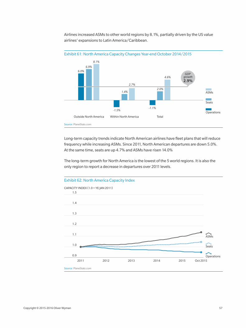
Airlines increased ASMs to other world regions by 8.1%, partially driven by the US value
airlines’ expansions to Latin America/Caribbean.
Exhibit 61: North America Capacity Changes Year‑end October 2014/2015
Seats
Operations
ASMs
Outside North America Within North America Total
6.0%
6.9%
8.1%
-1.5%
1.4%
2.7%
-1.1%
2.0%
4.6%GDP
growth2.9%
Source: PlaneStats.com
Long‑term capacity trends indicate North American airlines have fleet plans that will reduce
frequency while increasing ASMs. Since 2011, North American departures are down 5.0%.
At the same time, seats are up 4.7% and ASMs have risen 14.0%
The long‑term growth for North America is the lowest of the 5 world regions. It is also the
only region to report a decrease in departures over 2011 levels.
Exhibit 62: North America Capacity Index
1.4
1.3
1.2
1.1
1.0
0.9
1.5
2011 2012 2013 2014 2015 Oct 2015
CAPACITY INDEX (1.0 = YE JAN 2011)
Seats
Operations
ASMs
Source: PlaneStats.com
Copyright © 2015‑2016 Oliver Wyman 57
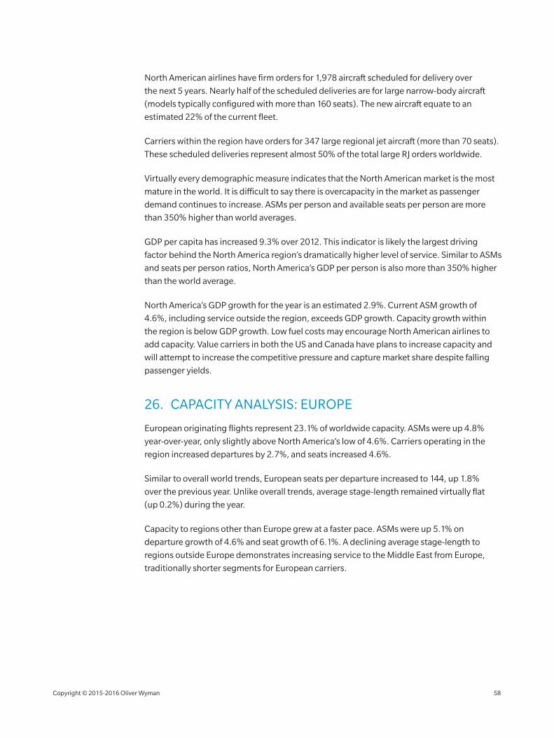
North American airlines have firm orders for 1,978 aircraft scheduled for delivery over
the next 5 years. Nearly half of the scheduled deliveries are for large narrow‑body aircraft
(models typically configured with more than 160 seats). The new aircraft equate to an
estimated 22% of the current fleet.
Carriers within the region have orders for 347 large regional jet aircraft (more than 70 seats).
These scheduled deliveries represent almost 50% of the total large RJ orders worldwide.
Virtually every demographic measure indicates that the North American market is the most
mature in the world. It is difficult to say there is overcapacity in the market as passenger
demand continues to increase. ASMs per person and available seats per person are more
than 350% higher than world averages.
GDP per capita has increased 9.3% over 2012. This indicator is likely the largest driving
factor behind the North America region’s dramatically higher level of service. Similar to ASMs
and seats per person ratios, North America’s GDP per person is also more than 350% higher
than the world average.
North America’s GDP growth for the year is an estimated 2.9%. Current ASM growth of
4.6%, including service outside the region, exceeds GDP growth. Capacity growth within
the region is below GDP growth. Low fuel costs may encourage North American airlines to
add capacity. Value carriers in both the US and Canada have plans to increase capacity and
will attempt to increase the competitive pressure and capture market share despite falling
passenger yields.
26. CAPACITY ANALYSIS: EUROPE
European originating flights represent 23.1% of worldwide capacity. ASMs were up 4.8%
year‑over‑year, only slightly above North America’s low of 4.6%. Carriers operating in the
region increased departures by 2.7%, and seats increased 4.6%.
Similar to overall world trends, European seats per departure increased to 144, up 1.8%
over the previous year. Unlike overall trends, average stage‑length remained virtually flat
(up 0.2%) during the year.
Capacity to regions other than Europe grew at a faster pace. ASMs were up 5.1% on
departure growth of 4.6% and seat growth of 6.1%. A declining average stage‑length to
regions outside Europe demonstrates increasing service to the Middle East from Europe,
traditionally shorter segments for European carriers.
Copyright © 2015‑2016 Oliver Wyman 58
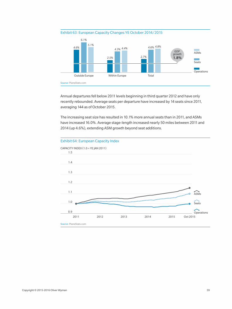
Exhibit 63: European Capacity Changes YE October 2014/2015
Seats
Operations
ASMs
Outside Europe Within Europe Total
4.6%
6.1%
5.1%
2.5%
4.3% 4.4%
2.7%
4.6% 4.8%
GDP growth1.8%
Source: PlaneStats.com
Annual departures fell below 2011 levels beginning in third quarter 2012 and have only
recently rebounded. Average seats per departure have increased by 14 seats since 2011,
averaging 144 as of October 2015.
The increasing seat size has resulted in 10.1% more annual seats than in 2011, and ASMs
have increased 16.0%. Average stage‑length increased nearly 50 miles between 2011 and
2014 (up 4.6%), extending ASM growth beyond seat additions.
Exhibit 64: European Capacity Index
1.4
1.3
1.2
1.1
1.0
0.9
1.5
2011 2012 2013 2014 2015 Oct 2015
CAPACITY INDEX (1.0 = YE JAN 2011)
Seats
Operations
ASMs
Source: PlaneStats.com
Copyright © 2015‑2016 Oliver Wyman 59
European airlines have firm orders for 2,277 aircraft scheduled for delivery over the next
5 years, more than any other major world region. These orders represent about 43% of total
current fleet. Of these orders, 77% are for narrow‑body aircraft (37% small narrow‑body,
40% large narrow‑body).
Europe’s demographic and economic indicators depict a relatively mature aviation market.
ASMs per person and seats per person indicate a high level of service availability, second
only to North America.
GDP per capita grew 14.2% over 2012 to $32,412. Europe’s per capita GDP is 178% higher
than the world average and seems to have the strongest correlation with ASMs and seats
per person.
Current GDP growth for Europe is estimated to be 1.8%. ASM growth of 4.8% is 3 points
higher than GDP growth. Only the Africa/Middle East region has a greater differential
between the two growth figures. Like North America, aggressive growth from emerging
value carriers in the region will continue to drive domestic European capacity growth.
27. CAPACITY ANALYSIS: AFRICA/MIDDLE EAST
The rapidly expanding Africa/Middle East region represents 11.8% of world ASMs during
2015. ASM growth of 11.1% for the 12 months ended October 2015 is the highest of 5 major
world regions.
The Middle East now represents more than 72% of the capacity from the combined Africa/
Middle East region and ASMs have grown 15.5%. Middle East departures increased 9.8%
over 2014, and seats are up 12.8%.
Results from the Africa subregion are not quite so spectacular. ASMs grew 3.9%, with
departure growth of 4.9% and a decrease in seats per departure.
Capacity growth from the Africa/Middle East region to other major world regions grew at a
faster pace (ASMs up 11.7%) than capacity within the region (up 10.1%). Aircraft on long‑haul
flights to other regions increased an average of 5 seats per departure in just one year, while
stage‑length remained unchanged.
Copyright © 2015‑2016 Oliver Wyman 60
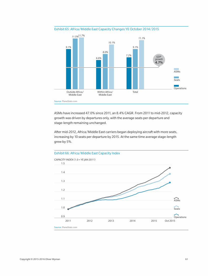
Exhibit 65: Africa/Middle East Capacity Changes YE October 2014/2015
Seats
Operations
ASMs
Outside Africa/Middle East
Within Africa/Middle East
Total
9.1%
11.5%11.7%
6.6%
8.0%
10.1%
7.2%
9.1%
11.1%
GDP growth4.7%
Source: PlaneStats.com
ASMs have increased 47.0% since 2011, an 8.4% CAGR. From 2011 to mid‑2012, capacity
growth was driven by departures only, with the average seats per departure and
stage‑length remaining unchanged.
After mid‑2012, Africa/Middle East carriers began deploying aircraft with more seats,
increasing by 10 seats per departure by 2015. At the same time average stage‑length
grew by 5%.
Exhibit 66: Africa/Middle East Capacity Index
1.4
1.3
1.2
1.1
1.0
0.9
1.5
2011 2012 2013 2014 2015 Oct 2015
CAPACITY INDEX (1.0 = YE JAN 2011)
Seats
Operations
ASMs
Source: PlaneStats.com
Copyright © 2015‑2016 Oliver Wyman 61
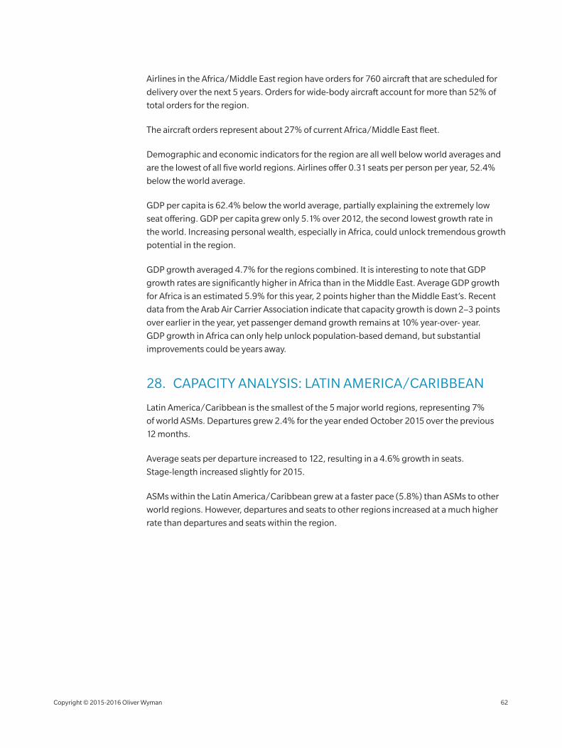
Airlines in the Africa/Middle East region have orders for 760 aircraft that are scheduled for
delivery over the next 5 years. Orders for wide‑body aircraft account for more than 52% of
total orders for the region.
The aircraft orders represent about 27% of current Africa/Middle East fleet.
Demographic and economic indicators for the region are all well below world averages and
are the lowest of all five world regions. Airlines offer 0.31 seats per person per year, 52.4%
below the world average.
GDP per capita is 62.4% below the world average, partially explaining the extremely low
seat offering. GDP per capita grew only 5.1% over 2012, the second lowest growth rate in
the world. Increasing personal wealth, especially in Africa, could unlock tremendous growth
potential in the region.
GDP growth averaged 4.7% for the regions combined. It is interesting to note that GDP
growth rates are significantly higher in Africa than in the Middle East. Average GDP growth
for Africa is an estimated 5.9% for this year, 2 points higher than the Middle East’s. Recent
data from the Arab Air Carrier Association indicate that capacity growth is down 2–3 points
over earlier in the year, yet passenger demand growth remains at 10% year‑over‑ year.
GDP growth in Africa can only help unlock population‑based demand, but substantial
improvements could be years away.
28. CAPACITY ANALYSIS: LATIN AMERICA/CARIBBEAN
Latin America/Caribbean is the smallest of the 5 major world regions, representing 7%
of world ASMs. Departures grew 2.4% for the year ended October 2015 over the previous
12 months.
Average seats per departure increased to 122, resulting in a 4.6% growth in seats.
Stage‑length increased slightly for 2015.
ASMs within the Latin America/Caribbean grew at a faster pace (5.8%) than ASMs to other
world regions. However, departures and seats to other regions increased at a much higher
rate than departures and seats within the region.
Copyright © 2015‑2016 Oliver Wyman 62
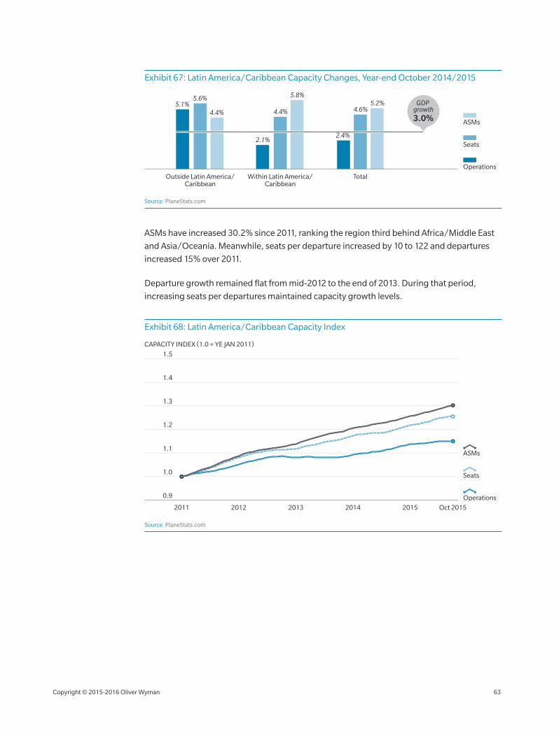
Exhibit 67: Latin America/Caribbean Capacity Changes, Year‑end October 2014/2015
Seats
Operations
ASMs
Outside Latin America/Caribbean
Within Latin America/Caribbean
Total
5.1%5.6%
4.4%
2.1%
4.4%
5.8%
2.4%
4.6%5.2% GDP
growth3.0%
Source: PlaneStats.com
ASMs have increased 30.2% since 2011, ranking the region third behind Africa/Middle East
and Asia/Oceania. Meanwhile, seats per departure increased by 10 to 122 and departures
increased 15% over 2011.
Departure growth remained flat from mid‑2012 to the end of 2013. During that period,
increasing seats per departures maintained capacity growth levels.
Exhibit 68: Latin America/Caribbean Capacity Index
1.4
1.3
1.2
1.1
1.0
0.9
1.5
2011 2012 2013 2014 2015 Oct 2015
CAPACITY INDEX (1.0 = YE JAN 2011)
Seats
Operations
ASMs
Source: PlaneStats.com
Copyright © 2015‑2016 Oliver Wyman 63
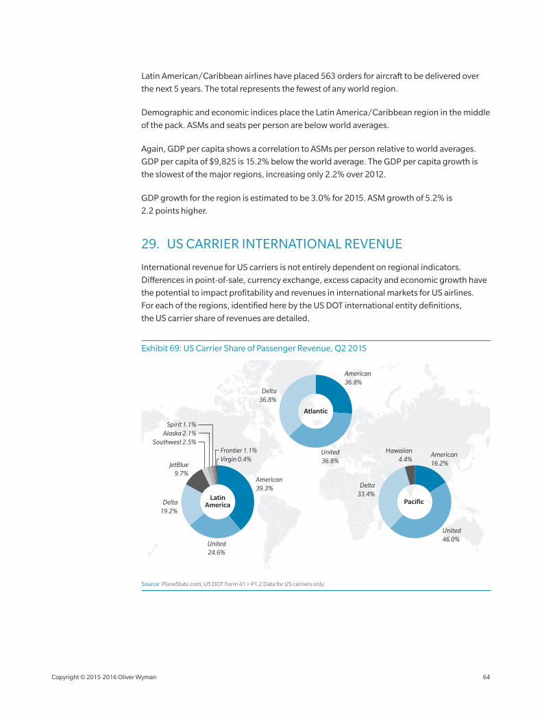
Latin American/Caribbean airlines have placed 563 orders for aircraft to be delivered over
the next 5 years. The total represents the fewest of any world region.
Demographic and economic indices place the Latin America/Caribbean region in the middle
of the pack. ASMs and seats per person are below world averages.
Again, GDP per capita shows a correlation to ASMs per person relative to world averages.
GDP per capita of $9,825 is 15.2% below the world average. The GDP per capita growth is
the slowest of the major regions, increasing only 2.2% over 2012.
GDP growth for the region is estimated to be 3.0% for 2015. ASM growth of 5.2% is
2.2 points higher.
29. US CARRIER INTERNATIONAL REVENUE
International revenue for US carriers is not entirely dependent on regional indicators.
Differences in point‑of‑sale, currency exchange, excess capacity and economic growth have
the potential to impact profitability and revenues in international markets for US airlines.
For each of the regions, identified here by the US DOT international entity definitions,
the US carrier share of revenues are detailed.
Exhibit 69: US Carrier Share of Passenger Revenue, Q2 2015
Pacific
Atlantic
Delta36.8%
American39.3%
United24.6%
Frontier 1.1%Virgin 0.4%
Spirit 1.1%Alaska 2.1%
Southwest 2.5%
LatinAmericaDelta
19.2%
JetBlue9.7%
United36.8%
American36.8%
American16.2%
United46.0%
Delta33.4%
Hawaiian4.4%
Source: PlaneStats.com; US DOT Form 41 > P1.2 Data for US carriers only.
Copyright © 2015‑2016 Oliver Wyman 64
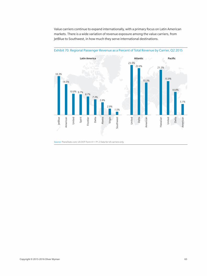
Value carriers continue to expand internationally, with a primary focus on Latin American
markets. There is a wide variation of revenue exposure among the value carriers, from
JetBlue to Southwest, in how much they serve international destinations.
Exhibit 70: Regional Passenger Revenue as a Percent of Total Revenue by Carrier, Q2 2015
JetB
lue
Am
eric
an
Sou
thw
est
Ala
ska
Vir
gin
Del
ta
Fron
tier
Spir
it
Un
ited
18.3%
14.5%
23.5%22.0%
15.3%15.9%
10.8%
5.1%
21.3%
10.0% 9.7%8.7%
7.3%5.9%
2.9%1.5%
Del
ta
Haw
aiia
n
Del
ta
Am
eric
an
Un
ited
Am
eric
an
Un
ited
Latin America Atlantic Pacific
Source: PlaneStats.com; US DOT Form 41 > P1.2 Data for US carriers only.
Copyright © 2015‑2016 Oliver Wyman 65
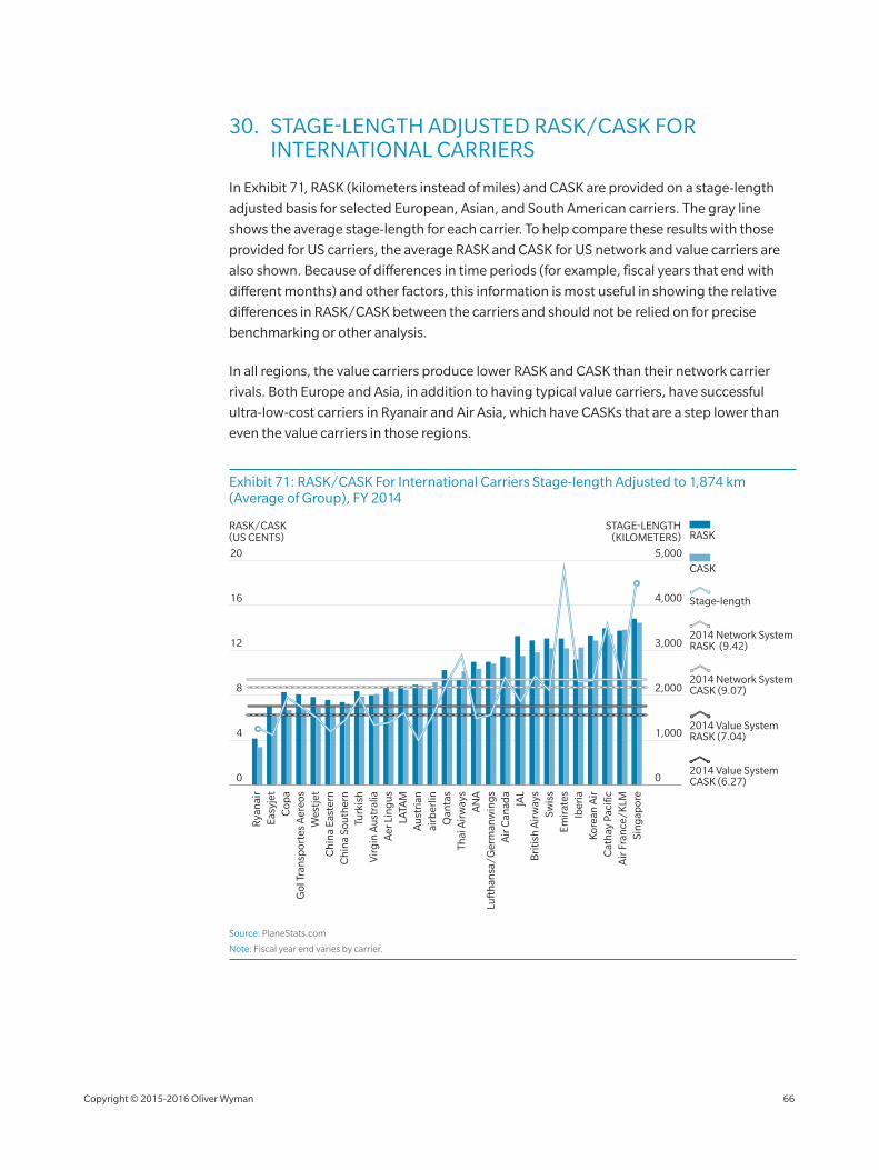
30. STAGE‑LENGTH ADJUSTED RASK/CASK FOR INTERNATIONAL CARRIERS
In Exhibit 71, RASK (kilometers instead of miles) and CASK are provided on a stage‑length
adjusted basis for selected European, Asian, and South American carriers. The gray line
shows the average stage‑length for each carrier. To help compare these results with those
provided for US carriers, the average RASK and CASK for US network and value carriers are
also shown. Because of differences in time periods (for example, fiscal years that end with
different months) and other factors, this information is most useful in showing the relative
differences in RASK/CASK between the carriers and should not be relied on for precise
benchmarking or other analysis.
In all regions, the value carriers produce lower RASK and CASK than their network carrier
rivals. Both Europe and Asia, in addition to having typical value carriers, have successful
ultra‑low‑cost carriers in Ryanair and Air Asia, which have CASKs that are a step lower than
even the value carriers in those regions.
Exhibit 71: RASK/CASK For International Carriers Stage‑length Adjusted to 1,874 km (Average of Group), FY 2014
Gol
Tra
nsp
orte
s A
ereo
s
LATA
M
Easy
jet
Turk
ish
Cop
a
Ch
ina
Sou
ther
n
Au
stri
an
Wes
tjet
Ch
ina
East
ern
Vir
gin
Au
stra
liaA
er L
ing
us
Air
Can
ada
airb
erlin
Qan
tas
Thai
Air
way
s
Emir
ates
Luft
han
sa/G
erm
anw
ing
s
Bri
tish
Air
way
s
Air
Fra
nce
/KLM
Sin
gap
ore
AN
A
Swis
s
Iber
ia
JAL
Kor
ean
Air
Cat
hay
Pac
ific
RASK/CASK(US CENTS) RASK
CASK
STAGE-LENGTH(KILOMETERS)
2014 Network System RASK (9.42)
2014 Value System RASK (7.04)
Stage-length
2014 Value System CASK (6.27)
2014 Network System CASK (9.07)
Rya
nai
r
1,000
3,000
4,000
2,000
0
5,000
4
12
16
8
0
20
Source: PlaneStats.com
Note: Fiscal year end varies by carrier.
Copyright © 2015‑2016 Oliver Wyman 66
RECENT PUBLICATIONS FROM OLIVER WYMAN
For these publications and other inquiries, please visit www.oliverwyman.com.
MRO SURVEY 2015 – TURNING THE TIDE
By 2020, most companies in the aviation maintenance, repair, and overhaul (MRO) sector will use new technology in fundamentally new ways. Read this year’s survey findings to learn more.
IN COMMERCIAL DRONES, THE RACE IS ON
By 2035, the number of unmanned aerial vehicle, or UAV, operations each year will surpass that of manned aircraft operations, according to the Volpe Center. With reasonable and globally competitive regulations, the US could still become a leader in the commercial drone industry.
PERSPECTIVES ON MANUFACTURING INDUSTRIES
A collection of viewpoints on challenges for industrial companies, as well as opportunities and potential courses of action.
GLOBAL RISKS 2015
Global Risks 2015 examines the new risks that will arise from emerging technologies, interstate conflicts, extreme weather events, and other interconnected risks such as water crises.
MRO GLOBAL FLEET AND MARKET FORECAST 2015
The annual MRO forecast includes data analysis on the size and makeup of the market for aviation and services. This report was published by TeamSAI prior to its acquisition by Oliver Wyman and integration into the CAVOK business. Detailed forecasts are available for purchase at www.planestats.com.
ENERGY JOURNAL 2014
This inaugural issue of the Oliver Wyman Energy Journal reflects the latest thinking across Oliver Wyman’s energy practice on how shifts underway will create new risks and opportunities not just for the energy sector, but also for every company and person that depends on it.
NOW ARRIVING
Oliver Wyman’s PlaneStats.com publishes an in‑depth data chart each day. Subscribe to daily email delivery at www.planestats.com/ arrival_subscribe.
Copyright © 2015‑2016 Oliver Wyman 67
Elizabeth Souder, Grant Alport and Birgit Andersen also contributed to this report.
Designed by Adam Krawczuk.
www.oliverwyman.com
Oliver Wyman is a global leader in management consulting that combines deep industry knowledge with specialized expertise in strategy, operations, risk management and organization transformation.
Oliver Wyman’s global Aviation, Aerospace & Defense practice helps passenger and cargo carriers, OEM and parts manufacturers, aerospace/defense companies, airports and MRO/other service providers develop value growth strategies, improve operations and maximize organizational effectiveness. Our deep industry expertise and our specialized capabilities make us a leader in serving the needs of the industry. Also, Oliver Wyman offers a powerful suite of industry data and analytical tools to drive key business insights through www.planestats.com.
For more information on Oliver Wyman, please visit www.oliverwyman.com.
For more information on this report, please contact:
ROGER LEHMAN JONATHAN KEANE TOM STALNAKER
Transportation Practice Leader [email protected]
Aviation Sector Leader [email protected]
Aviation Partner [email protected]
Copyright © 2015‑2016 Oliver Wyman
All rights reserved. This report may not be reproduced or redistributed, in whole or in part, without the written permission of Oliver Wyman and Oliver Wyman accepts no liability whatsoever for the actions of third parties in this respect.
The information and opinions in this report were prepared by Oliver Wyman. This report is not investment advice and should not be relied on for such advice or as a substitute for consultation with professional accountants, tax, legal or financial advisors. Oliver Wyman has made every effort to use reliable, up‑to‑date and comprehensive information and analysis, but all information is provided without warranty of any kind, express or implied. Oliver Wyman disclaims any responsibility to update the information or conclusions in this report. Oliver Wyman accepts no liability for any loss arising from any action taken or refrained from as a result of information contained in this report or any reports or sources of information referred to herein, or for any consequential, special or similar damages even if advised of the possibility of such damages. The report is not an offer to buy or sell securities or a solicitation of an offer to buy or sell securities. This report may not be sold without the written consent of Oliver Wyman.


![Fear of flying?--economic analyses of airline safety - [email protected]](https://static.fdocuments.in/doc/165x107/62039481da24ad121e4b0fe8/fear-of-flying-economic-analyses-of-airline-safety-emailprotected.jpg)