Air pollution and emissions trends in London · PDF file · 2010-03-01Air pollution...
47
Air pollution and emissions trends in London Sean Beevers, David Carslaw, Emily Westmoreland and Hrishi Mittal King’s College London, Environmental Research Group Leeds University, Institute for Transport studies April 2009
Transcript of Air pollution and emissions trends in London · PDF file · 2010-03-01Air pollution...

Air pollution and emissions trends in London
Sean Beevers, David Carslaw, Emily Westmoreland and
Hrishi Mittal
King’s College London, Environmental Research Group Leeds University, Institute for Transport studies
April 2009

Comparison of air pollution and emissions trends in London
King’s College London and the Institute for Transport Studies 2
Authors Sean Beevers, David Carslaw, Emily Westmoreland and Hrishi Mittal
Approved by David Dajnak Date April 2009 Version V1.0

Comparison of air pollution and emissions trends
King’s College London and the Institute for Transport Studies 3
Table of Contents
1 Summary key points........................................................................................................... 5
2 Recommended further work ............................................................................................. 7
3 Context ............................................................................................................................... 9
4 Aims of the research .......................................................................................................... 9
5 Methods ............................................................................................................................. 9
5.1 Part 1 - Meteorological Normalisation of London’s air pollution data ....................... 9
5.1.1 Accounting for meteorology in pollutant trends ................................................. 9
5.1.2 Approach used for meteorological-averaging ................................................... 10
5.2 Part 2 - The development of an hourly emissions inventory for road traffic in London ................................................................................................................................. 12
5.2.1 Introduction ....................................................................................................... 12
5.2.2 Approach used for creating hourly traffic data ................................................. 13
5.2.3 Creating hourly emissions data ......................................................................... 14
5.2.4 Traffic trends between 2003 and 2007 ............................................................. 17
6 Results and Discussion ..................................................................................................... 19
6.1 Trends in meteorologically-averaged of PM10 measurements ................................. 19
6.2 Trends in PM10 hourly emissions ............................................................................... 23
6.3 Trends in meteorologically-averaged for NOX measurements ................................. 32
6.4 Trends in hourly NOX emissions ................................................................................ 35
7 Marylebone Road ............................................................................................................. 39
8 Conclusions ...................................................................................................................... 45
9 Recommended further work ........................................................................................... 46
10 References ....................................................................................................................... 47

Comparison of air pollution and emissions trends in London
King’s College London and the Institute for Transport Studies 4

Comparison of air pollution and emissions trends
King’s College London and the Institute for Transport Studies 5
1 SUMMARY KEY POINTS 1. This report summarises a detailed and comprehensive assessment of trends in emissions
and concentrations of NOX and PM in London.
2. We have developed methods to create hourly road traffic and emissions estimates between 2003 and 2007. This has used a comprehensive set of traffic data in London combined with new vehicle data based upon Automatic Number Plate Recognition (ANPR) cameras. The use of both traffic and emissions data as hourly values has proved to be invaluable in helping interpret the air pollution measurement trends.
3. Statistical methods have been developed to account for meteorological variation for assessing trends in the concentrations of pollutants. Meteorological variation can falsely mask or emphasise trends. The focus of these assessments has been to develop a better understanding of the traffic-related component of trends by considering roadside concentrations with background values removed.
4. The statistical models have been used to calculate trends, weekday and diurnal variations in roadside increments of NOX, PM10 and PM2.5 under average meteorological conditions. This approach has the benefit that trends calculated in this way will more closely relate to emissions changes rather than changes due to meteorological effects. The focus is on determining trends in roadside increments above local background values.
5. The emissions modelling results have been summarised into monthly trends between 2003 and 2007 as well as diurnal profiles by day of the week to compare with the measurement data. Furthermore the emissions and traffic data can provide a breakdown of the most important vehicle types.
6. We find there is evidence that NOX concentrations have not decreased over the period 2003-2008. In fact, in central/inner London the mean of 10 roadside sites suggests that concentrations have increased by around 7 % from 2003-2008 (Table 1). In outer London, concentrations of NOX have decreased by about 8-9 %. The corresponding changes in emissions are reductions of 20 and 29 % respectively. These results therefore show there seems to be a considerable disparity between the expected change in emissions and the actual change in concentrations. The results also suggest that there is a difference in how central/inner London sites have responded compared with outer London sites.
7. For PM10 the average of 7 central/inner London sites shows that concentrations have decreased by 4-5 % compared with an estimated 25 % from detailed emission calculations (2003-2008) (Table 1). Similarly, in outer London the analysis of PM10
concentrations indicates a reduction of 13-14 % compared with a 25 % reduction estimated for the emissions. It should be noted that given the complexity of PM emissions/concentrations that these results will be less certain than those for NOX. Nevertheless, there does seem to be a consistent difference in the way that central/inner London sites respond compared with outer London site, which is similar to the findings for NOX.

Comparison of air pollution and emissions trends in London
King’s College London and the Institute for Transport Studies 6
Table 1. The percentage change in emissions between 2003 and 20071
Zone Pollutant All
vehicles Light
vehicles2 HGV
3 Taxis Cars Bus LGV Rigid Artic
Central NOX -20 -32 -10 -25 -41 -17 -15 -4 3
Measured NOX +7.3
Outer NOX -29 -35 -25 -17 -41 -20 -21 -32 -30
Measured NOX -8.5
Central Total PM10 -25 -25 -27 -43 -23 -50 -14 -17 0
Measured PM10 -4.6
Exhaust PM10 -37 -36 -38 -47 -39 -73 -23 -25 -5
Tyre brake PM10 -3 -7 14 -18 -10 7 15 17 30
Outer Total PM10 -25 -20 -38 -35 -20 -48 -18 -38 -17
Measured PM10 -13.5
Exhaust PM10 -37 -30 -49 -40 -35 -73 -24 -45 -22
Tyre brake PM10 -4 -5 0 -9 -8 7 8 -13 9 1 Measurements from 2003-2008, 2 Car + Taxi + LGV, 3 Bus + rigid HGV + articulated HGV
8. While there does appear to be a clear difference in the trends in PM10 and NOX in central/inner London and outer London, it remains difficult to identify a specific cause(s). However, one of the major differences between these two areas is the proportion of diesel vehicles. Diesel vehicles are known to be significant emitters of both NOX and PM10. The detailed analysis of traffic data suggests that flows of large diesel vehicles (particularly Bus, HGVs and LGVs) have increased in central/inner London between 2003 and 2007 and that there has been a more mixed response at outer sites. Interestingly, total traffic has reduced for both groups of sites between 2003 and 2007.
9. We have also shown that considering how emissions and concentrations vary by day of the week and hour of the day is an effective way in which to compare emissions variation with that for concentrations. In particular, removing the meteorological signal can in some cases significantly affect the diurnal profile of concentrations and provide a more robust means of comparing trends with emissions estimates.
10. An approach using multiple regression analysis on a combination of traffic data and meteorologically averaged measurements by day of the week has demonstrated that it can provide the relative emission rates for different vehicle categories. The example given showed that an average emissions ratio of 11:1 for HGV (bus + rigid + articulated) to Light vehicles (car + taxi + LGV) would result in closer agreement between the emissions and air pollution daily profiles of PM10. By comparison the ratio using the emissions calculation is 3.9. Further refinement of this method to consider larger number of vehicle types and across a number of years would provide a vital step in identifying the vehicles which may be the cause of the disparity between emissions trends and measurements.
11. The overriding conclusion of this work is, however, the clear disparity between the estimated trends in emissions and the observed trends in concentrations. This disparity has important implications for the management of air pollution and raises question about the adequacy of emission factors and projected concentrations of NOX (and NO2), and PM.
Comparison of air pollution and emissions trends
King’s College London and the Institute for Transport Studies 7
12. A useful side-effect of the meteorological averaging is that step-changes in the concentration of pollutants can be revealed. For example, there is evidence from this work that at Marylebone Road a distinct reduction in NOX occurred in 2001 coinciding with the introduction of the bus lane. Such information could provide useful information concerning the effect that traffic management has in London (and elsewhere) that would normally be masked by meteorological variation.
2 RECOMMENDED FURTHER WORK The analysis described in this document is the beginning of an important process of evaluation of emissions inventories that will enable greater understanding of emissions trends, air pollution model performance and better policy making. However, having created a large and unique dataset as well as important methods of analysis a number of additional work packages are recommended:
1. While there are many roadside air pollution sites in London, there are very few sites that
have coincident traffic measurements. A more concerted effort to link quality road traffic measurements with air pollution sites would yield considerably more insight into these issues.
2. Important understanding of the inadequacies of emissions inventories can be made through the development of the multiple regression approaches, described in #10, to include additional vehicle types over a number of years.
3. In this study use was made of the currently available UK emissions factors, i.e. those based on results from Barlow et al., 2001. These have since been superseded via a consultation process undertaken by DfT during 2009. Initial results show that differences between the two emission factor datasets can be substantial for specific vehicles types. It would therefore be worth considering undertaking a recalculation of emissions using the new factors.
4. A separate research effort is being undertaken by ERG in order to monitor the effect of the LEZ in London. Part of this research is to establish a chemical speciation PM10 model and will include identifying road traffic emissions of PM and estimating trends over time. This provides a unique opportunity to build on the analysis presented here.

Comparison of air pollution and emissions trends in London
King’s College London and the Institute for Transport Studies 8
This page has been left blank intentionally

Comparison of air pollution and emissions trends
King’s College London and the Institute for Transport Studies 9
3 CONTEXT There is increasing evidence available to suggest that particulate matter (PM), and to some extent nitrogen oxides (NOX) concentrations have not decreased with expectations at many locations where road traffic is important. Emissions inventory calculations suggest that concentrations of these pollutants should have decreased during the last decade, but long-term trends at traffic-influenced sites suggest that NOX and PM concentrations have remained static or have increased. PM in particular is a multiscale problem and is influenced by long range transport of secondary PM requiring mesoscale model predictions to improve understanding. However, for PM10 there is growing evidence that local emissions are increasing (Fuller and Green, 2006) and for NOX the majority is locally derived. Hence it is important to establish the magnitude of any difference between emissions and air pollution trends and to understand whether data analysis can identify a vehicle type that plays an important role in this problem.
4 AIMS OF THE RESEARCH There are a number of aims to the research, which include:
The analysis of air pollution trends, at roadside sites, for NOX, PM10 and PM2.5 using methods to remove the influence of meteorology.
To develop a method for the prediction of hourly emissions from road traffic and to establish the trend in emissions over periods coincident with the air quality trends.
To summarise the data by hour of day and day of week by location (outer and central London) to establish differences between zones as well as a differences between the air pollution and emissions results.
Finally, identify the areas where the emissions inventory and air pollution data show poor agreement and to establish a possible link between these periods and individual vehicle types.
5 METHODS
5.1 Part 1 - Meteorological Normalisation of London’s air pollution data
5.1.1 ACCOUNTING FOR METEOROLOGY IN POLLUTANT TRENDS
It can be very challenging to analyse air pollution data due to the often strong influence that meteorology has. If one is interested in trends or how concentrations vary by hour of the day, then often meteorology can strongly influence observations. This is a problem if the interest is in knowing whether concentrations have decreased (or increased) over time because trends can be falsely masked or emphasised depending on the prevailing meteorology. Furthermore, if there is interest in knowing whether changes in concentration are in keeping with emissions estimates, it can be challenging to reconcile the two. Often, it is said that a particular year was ‘good’ or ‘bad’ with respect to concentrations. However,

Comparison of air pollution and emissions trends in London
King’s College London and the Institute for Transport Studies 10
rarely are such assertions based on an analysis of the causes of high or low concentrations. For this reason, an approach that is sometimes used is meteorological normalisation. The idea here is to ‘account’ for meteorological variation by building explanatory models for pollutant concentrations. If good models are developed i.e. they explain most of the variation in concentrations, it is then possible to use the model to predict concentrations over a fixed assumptions for meteorology – concentrations are normalised. The term used here is meteorologically-averaged because the predictions most closely relate to mean meteorological conditions. The principal reason for accounting for meteorology in the current work is to allow for a better comparison with estimated emissions. This comparison focuses on several aspects of the temporal variation in concentrations, including the trend, diurnal and day of week effect. These periods have been chosen because they are able to highlight various aspects of the variation in emissions and concentrations. The long-term trend is a key consideration because it is important to know whether observed trends in concentration reflect that expected from an assessment of emissions. By considering variations by day of the week and hour of the day, it is possible to relate these variations to a more specific analysis of road traffic emissions. This is because vehicle emissions can have a strong day of the week and hour of day effect. In particular, different classes of vehicles show different behaviour over these time periods. HGVs, for example, tend to have much lower flows on Saturdays and in particular Sundays. Similarly, the variation in HGV flows often differs from that of cars by hour of the day. A wide range of approaches have been adopted over the years to account for meteorology in trends. These include the use of linear models, neural networks (e.g. Gardner and Dorling (2000)) and non-parametric smoothing (e.g. Libiseller et al. (2005), Carslaw et al., (2007)). More recently an approach based on regression trees has been used to analyse air pollution at a location of high source complexity (Carslaw and Taylor, 2009). The regression tree approach has several advantages when applied to meteorological normalisation. 5.1.2 APPROACH USED FOR METEOROLOGICAL-AVERAGING The selection of sites was primarily based on the availability of data for both NOX and PM10 concentration measurements; both in terms of the number of years a site has been operating and its data capture. The focus in this work has been to consider the increment in concentration above background. For this reason all sites analysed were roadside or kerbside. Background concentrations (used for subtraction) were used from the North Kensington (KC1) site for central and inner London sites and the Bexley 2 (BX2) site for outer London sites. Several tests were made of different background site choices and the selection of these two sites was based upon data capture, location and appropriateness. In many situations there could be a legitimate choice of several sites. Tests were undertaken during model development to choose the site leading to the best model predictions. This was achieved by leaving a random selection of 50 % of the data out for model testing, where statistics such as the R2 and residual sum of squares (RSS) could be calculated. In general it was found that KC1 and BX2 produced the best estimates. BX2 also has the advantage of having measurements of PM2.5 – used in the analysis of Marylebone Road.

Comparison of air pollution and emissions trends
King’s College London and the Institute for Transport Studies 11
For modelling purposes hourly mean concentrations were used throughout; although the results were often averaged in some way to improve interpretation. Meteorological data were used from the Met Office Heathrow site. A wide range of variables were assessed for modelling purposes including, for example: wind speed, wind direction, temperature, relative humidity and cloud amount. We also assessed many other variables such as precipitation amount and many measures of cloud type and amount. In general we found very little model improvement with the addition of variables beyond the 5 noted above. Our preference, therefore, was to develop the simplest good model rather than using many with little effect on model performance. For model development a range of other variables were used including a trend term, seasonal and diurnal variation. The modelling was conducted as follows. Data were processed to provide an hourly data set containing all variables of interest. Hourly background concentrations were subtracted from the corresponding roadside concentrations, yielding a data set of ‘roadside increments’. The models developed related the roadside increment to a wide range of meteorological and other variable types in the form:
JDhourweekdaytrendincrementX ttttTuNO
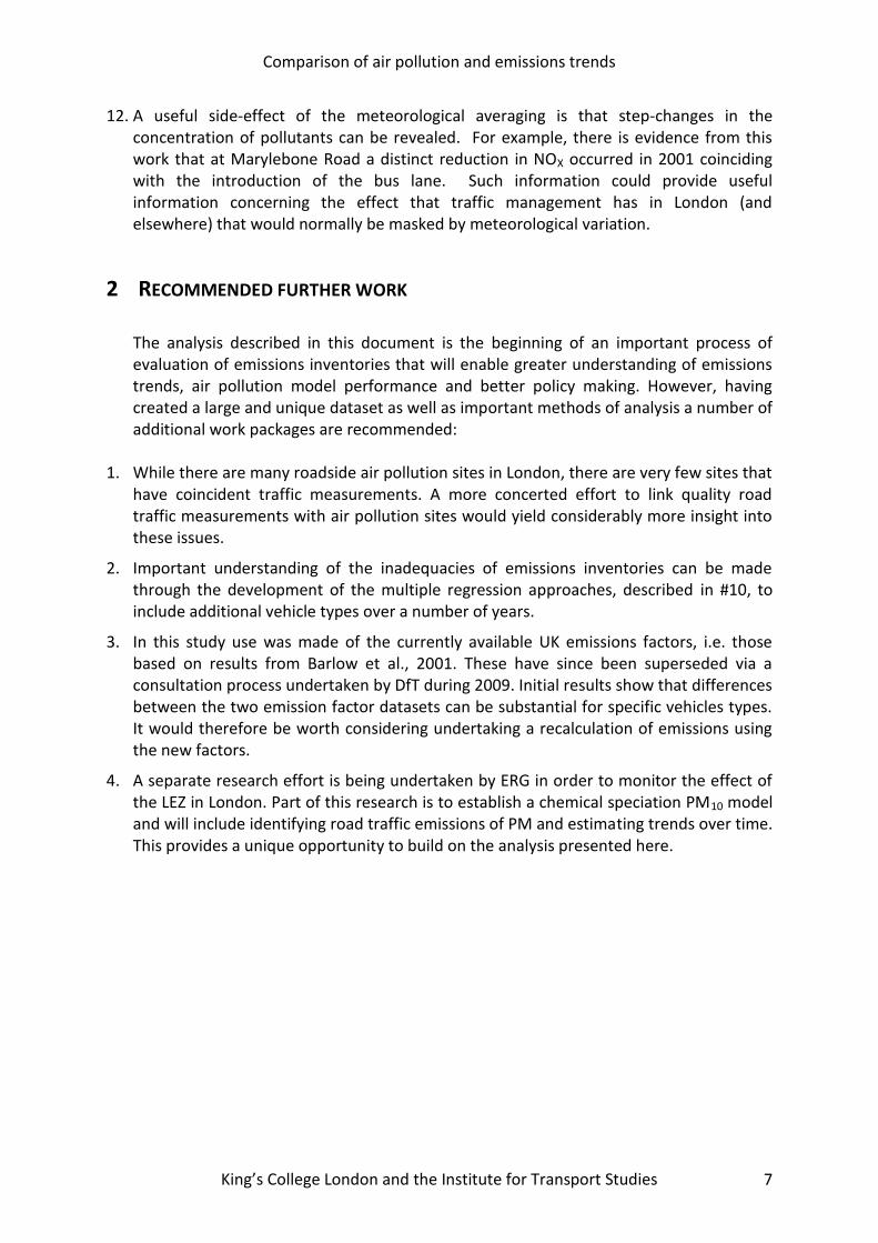
where the increment in NOX is related to mean wind speed (u bar), wind direction (phi), temperature (T), and temporal terms. The models were then used to predict mean concentrations assuming a fixed set of conditions for meteorology. Generally, mean or median (in the case of wind direction) values were used to derive a new time series with constant meteorology. Similar methods were used to show meteorologically-normalised diurnal and weekday effects. To illustrate the principles of meteorological normalisation it is worth considering the diurnal variation in the concentration of a pollutant dominated by diffuse sources and strongly affected by the change in atmospheric mixing throughout each day. A good example of such a pollutant is ethane, whose emissions are dominated by natural gas leakage. Because of the nature of this source, the emissions tend not to vary (as far as we know) by hour of the day, except from a contribution due to vehicular and possibly some other minor sources. This means that the diurnal variation of ethane concentrations tend to relate strongly to atmospheric mixing: concentrations are highest when the boundary layer height is lowest (just before sunrise) and lowest when the boundary layer height, and the strength of atmospheric mixing, is highest i.e. typically mid-afternoon. This behaviour is shown very clearly in Figure 1. Figure 1 also shows what the meteorologically-adjusted variation in ethane concentration, which differs in several ways, compared with the ‘raw’ data. First, there is a shift in the peaks (4am to 8-9am and midnight to 7-8pm). In this particular case it can be shown that
Comparison of air pollution and emissions trends in London
King’s College London and the Institute for Transport Studies 12
much of the remaining variation is due to variations in the boundary layer height, which are not captured using these techniques.1 The other characteristic to note is that the amplitude of the variation decreases. Again, this is expected because much of the peak to trough variation is driven by meteorology. The focus of the current work is accounting for local meteorological variation using increments in roadside concentrations and thus `bulk’ properties such as boundary layer height become much less important and local mixing and thermal turbulence more so.
Figure 1. Diurnal variation in ethane concentrations at Marylebone Road. The ‘raw’ (unadjusted) data is shown by the magenta line and the meteorologically adjusted data by the cyan line.
The results shown for ethane also demonstrate the value when applied to other, more vehicle-related pollutants. The diurnal variation in NOX, for example, will be affected by the same processes as that shown for ethane. If we want to know whether the diurnal variation is most affected by a particular class of vehicle (with a known variation) it is not easy to compare directly the concentration measurements with the emissions. If, however, the effect of meteorology is first accounted for, then the comparisons become more meaningful, which is the essence of this work.
5.2 Part 2 - The development of an hourly emissions inventory for road traffic in London
5.2.1 INTRODUCTION
To date emissions inventories in the UK have provided annual emissions using vehicle flow data which is based upon an typical day during each year, an estimate of vehicle stock, which is based upon UK vehicle licensing results at the year end and average vehicle speed by location. Enhancements to the models in London have included calculations of emissions for each hour of an average day using speed that also varies by hour, the use of ‘on-road’ vehicle stock based upon Automatic Number Plate Recognition (ANPR) cameras and specific fleet information for certain London fleets. Whilst emissions models have played an important role in understanding and developing policy to tackle air pollution this has been
1 More comprehensive meteorological measurements would be required to capture these effects in a model.
hour
eth
ane (
ppb)
10
11
12
13
14
15
16
0 5 10 15 20
adjusted unadjusted
Comparison of air pollution and emissions trends
King’s College London and the Institute for Transport Studies 13
via the use of dispersion models, which are themselves highly uncertain. Despite this they have remained the link between emissions and air pollution concentrations, with only a small number of researchers having compared air pollution measurement data directly with emissions calculations (Parrish, 2006). Therefore, to make emissions estimates and meteorologically-averaged air quality data compatible an important next step is to increase the time resolution to hourly results. This is limited due to the lack of traffic count data associated with air pollution measurement sites and as a consequence we have developed methods to create modelled hourly traffic flows using surrogate datasets. 5.2.2 APPROACH USED FOR CREATING HOURLY TRAFFIC DATA
The approach to develop an hourly emissions estimate for road traffic used a combination of data, represented in Figure 2. The basis of the calculation was a ‘London averaged’ hourly traffic file based upon an average of Automatic Traffic Count (ATC) sites in central London, running between March 2003 and the end of 2007. The London average ATC data was assessed using a Generalised Additive Modelling (GAM) technique to estimate whether a long term trend existed in the data. GAMs are an extension of linear regression models and are useful when the relationships between variables are non-linear - as is the case here. It has been used extensively and in Carslaw et al., (2007) was used to assess trends in traffic related emissions. The GAM modelling established that total hourly traffic counts could be described using smooth functions of hour of day, day of week, season and trend and that on average these factors could account for R2 values ~ 0.9. Furthermore, there was no significant long-term trend, thus avoiding any problems associated with introducing an artificial trend into the data between 2003 and 2007. To calculate total traffic flows along individual roads the ‘London averaged’ data was scaled using manual classified count (MCC) data taken during weekday periods (7am to 7pm). Unlike the ATC data, manual counts are widespread and cover all of the major roads in London. This means that where a MCC count exists a specific hourly traffic file can be calculated. Since the manual count data is taken infrequently a number of tests were undertaken to compare MCC and ATC data taken over the same 12 hour period as well as for longer periods of the year. Furthermore, since manual count measurements may be highly variable due to specific local events the time series of these data was smoothed using a local regression (LOESS) smoothing function or where few measurements were taken an average of the data was used. For a detailed description of LOESS see Jacoby (2000). Finally, when rescaling the ATC data care was taken to maintain daytime and night time differences in vehicle flow as well as weekend totals. The MCC data are classified into 11 vehicle types and these were used to split the total vehicle count for each hour of the day. Less data were available during weekday overnight periods, Saturdays and Sundays. Here a combination of datasets were used, including a set of MCC counts taken over a complete 24 hour period and Automatic Number Plate Recognition (ANPR) camera data. The former provided average proportions by vehicle type
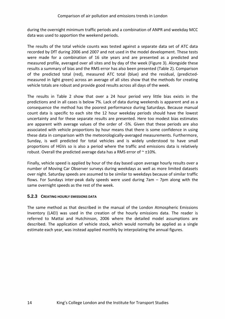
Comparison of air pollution and emissions trends in London
King’s College London and the Institute for Transport Studies 14
during the overnight minimum traffic periods and a combination of ANPR and weekday MCC data was used to apportion the weekend periods. The results of the total vehicle counts was tested against a separate data set of ATC data recorded by DfT during 2006 and 2007 and not used in the model development. These tests were made for a combination of 16 site years and are presented as a predicted and measured profile, averaged over all sites and by day of the week (Figure 3). Alongside these results a summary of bias and the RMS error has also been presented (Table 2). Comparison of the predicted total (red), measured ATC total (blue) and the residual, (predicted-measured in light green) across an average of all sites show that the methods for creating vehicle totals are robust and provide good results across all days of the week. The results in Table 2 show that over a 24 hour period very little bias exists in the predictions and in all cases is below 7%. Lack of data during weekends is apparent and as a consequence the method has the poorest performance during Saturdays. Because manual count data is specific to each site the 12 hour weekday periods should have the lowest uncertainty and for these separate results are presented. Here too modest bias estimates are apparent with average values of the order of -5%. Given that these periods are also associated with vehicle proportions by hour means that there is some confidence in using these data in comparison with the meteorologically-averaged measurements. Furthermore, Sunday, is well predicted for total vehicles and is widely understood to have small proportions of HGVs so is also a period where the traffic and emissions data is relatively robust. Overall the predicted average data has a RMS error of ~ ±10%. Finally, vehicle speed is applied by hour of the day based upon average hourly results over a number of Moving Car Observer surveys during weekdays as well as more limited datasets over night. Saturday speeds are assumed to be similar to weekdays because of similar traffic flows. For Sundays inter-peak daily speeds were used during 7am – 7pm along with the same overnight speeds as the rest of the week. 5.2.3 CREATING HOURLY EMISSIONS DATA The same method as that described in the manual of the London Atmospheric Emissions Inventory (LAEI) was used in the creation of the hourly emissions data. The reader is referred to Mattai and Hutchinson, 2006 where the detailed model assumptions are described. The application of vehicle stock, which would normally be applied as a single estimate each year, was instead applied monthly by interpolating the annual figures.
Comparison of air pollution and emissions trends
King’s College London and the Institute for Transport Studies
15
Figure 2. Application of the data in developing the 5 year hourly traffic file
01/0
1/20
03
01/0
1/20
04
01/0
1/20
05
01/0
1/20
06
0
2000
4000
6000
8000
10000
12000
14000
16000
18000
20000
To
tal ve
hic
le flo
w (
12
ho
ur
we
ekd
ay)
Smoothed MCC 12 hour data Gives: Proportions by vehicle type. Overnight counts
ATC dummy file
ANPR data Gives: Proportions by vehicle type on Sundays.
Moving Car Observer speed Applied by hour of the week

Comparison of air pollution and emissions trends
King’s College London and the Institute for Transport Studies
16
Figure 3. Comparison of predicted (red), measured (blue) and predicted-measured (light green) hourly total traffic flows. 16 site and year combinations for 2006 and 2007.
Table 2. Summary statistics from Figure 3
Monday Tuesday Wednesday Thursday Friday Saturday Sunday All days (RMS error)
Predicted 1659 1741 1753 1770 1753 1466 1419 10.7%
(% of mean (measured))
Measured 1657 1740 1773 1792 1820 1569 1461
Bias (%) (pred-measured/meas) 0.1% 0.1% -1.1% -1.2% -3.6% -6.6% -2.9%
Predicted (12 hrs) 2339 2455 2472 2495 2471 2066 2023 6.7%
(% of mean (measured))
Measured (12 hrs) 2438 2553 2588 2597 2625 2243 2036
Bias (%)(pred-measured/meas) -4.1% -3.9% -4.5% -3.9% -5.8% -7.9% -0.6%
Comparison of air pollution and emissions trends
King’s College London and the Institute for Transport Studies
17
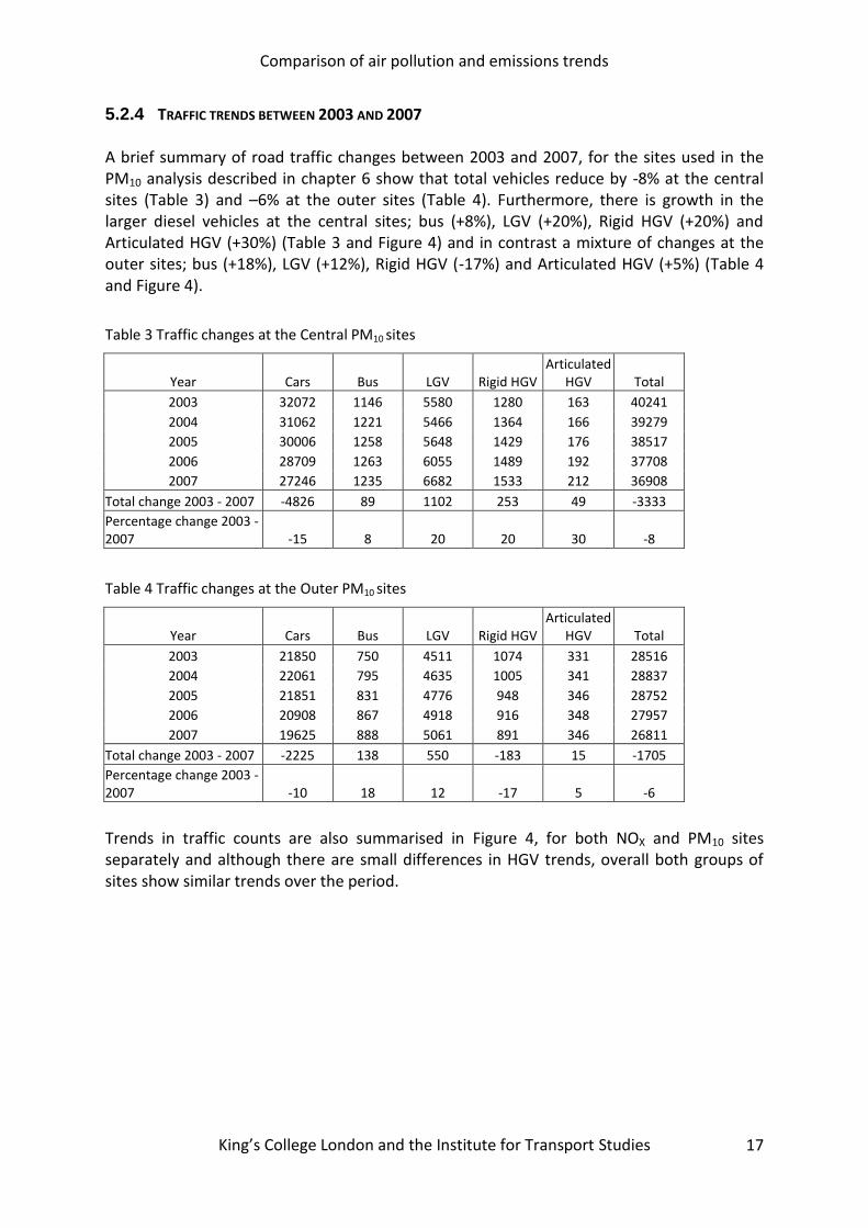
5.2.4 TRAFFIC TRENDS BETWEEN 2003 AND 2007 A brief summary of road traffic changes between 2003 and 2007, for the sites used in the PM10 analysis described in chapter 6 show that total vehicles reduce by -8% at the central sites (Table 3) and –6% at the outer sites (Table 4). Furthermore, there is growth in the larger diesel vehicles at the central sites; bus (+8%), LGV (+20%), Rigid HGV (+20%) and Articulated HGV (+30%) (Table 3 and Figure 4) and in contrast a mixture of changes at the outer sites; bus (+18%), LGV (+12%), Rigid HGV (-17%) and Articulated HGV (+5%) (Table 4 and Figure 4).
Table 3 Traffic changes at the Central PM10 sites
Year Cars Bus LGV Rigid HGV Articulated
HGV Total
2003 32072 1146 5580 1280 163 40241
2004 31062 1221 5466 1364 166 39279
2005 30006 1258 5648 1429 176 38517
2006 28709 1263 6055 1489 192 37708
2007 27246 1235 6682 1533 212 36908
Total change 2003 - 2007 -4826 89 1102 253 49 -3333
Percentage change 2003 - 2007 -15 8 20 20 30 -8
Table 4 Traffic changes at the Outer PM10 sites
Year Cars Bus LGV Rigid HGV Articulated
HGV Total
2003 21850 750 4511 1074 331 28516
2004 22061 795 4635 1005 341 28837
2005 21851 831 4776 948 346 28752
2006 20908 867 4918 916 348 27957
2007 19625 888 5061 891 346 26811
Total change 2003 - 2007 -2225 138 550 -183 15 -1705
Percentage change 2003 - 2007 -10 18 12 -17 5 -6
Trends in traffic counts are also summarised in Figure 4, for both NOX and PM10 sites separately and although there are small differences in HGV trends, overall both groups of sites show similar trends over the period.

Comparison of air pollution and emissions trends
King’s College London and the Institute for Transport Studies 18
Figure 4. Vehicle flow trends (1999 – 2007) for all central/inner and outer sites. Note the number of sites used in the analysis of PM10 and NOX is different. Total = HGV + LV, LV = Cars + LGV, HGV= Bus + Rigid + Articulated HGV. Note taxis are included in the car category.
Comparison of air pollution and emissions trends
King’s College London and the Institute for Transport Studies 19
6 RESULTS AND DISCUSSION
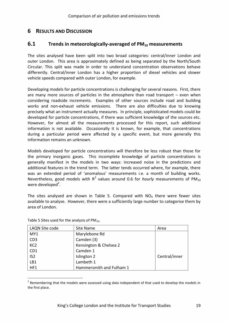
6.1 Trends in meteorologically-averaged of PM10 measurements The sites analysed have been split into two broad categories: central/inner London and outer London. This area is approximately defined as being separated by the North/South Circular. This split was made in order to understand concentration observations behave differently. Central/inner London has a higher proportion of diesel vehicles and slower vehicle speeds compared with outer London, for example. Developing models for particle concentrations is challenging for several reasons. First, there are many more sources of particles in the atmosphere than road transport – even when considering roadside increments. Examples of other sources include road and building works and non-exhaust vehicle emissions. There are also difficulties due to knowing precisely what an instrument actually measures. In principle, sophisticated models could be developed for particle concentrations, if there was sufficient knowledge of the sources etc. However, for almost all the measurements processed for this report, such additional information is not available. Occasionally it is known, for example, that concentrations during a particular period were affected by a specific event, but more generally this information remains an unknown. Models developed for particle concentrations will therefore be less robust than those for the primary inorganic gases. This incomplete knowledge of particle concentrations is generally manifest in the models in two ways: increased noise in the predictions and additional features in the trend term. The latter tends occurred where, for example, there was an extended period of ‘anomalous’ measurements i.e. a month of building works. Nevertheless, good models with R2 values around 0.6 for hourly measurements of PM10 were developed2. The sites analysed are shown in Table 5. Compared with NOX there were fewer sites available to analyse. However, there were a sufficiently large number to categorise them by area of London.
Table 5 Sites used for the analysis of PM10.
LAQN Site code Site Name Area
MY1 CD3 KC2 CD1 IS2 LB1 HF1
Marylebone Rd Camden (3) Kensington & Chelsea 2 Camden 1 Islington 2 Lambeth 1 Hammersmith and Fulham 1
Central/inner
2 Remembering that the models were assessed using data independent of that used to develop the models in
the first place.

Comparison of air pollution and emissions trends
King’s College London and the Institute for Transport Studies 20
RI1 HS4 EN2 CR4 HG1 A30 BY7 EA2 GR5 GB6
Richmond 1 Hounslow 4 Enfield 2 Croydon 4 Haringey 1 A3 roadside Bromley 7 Ealing 2 Greenwich 5 Greenwich-Bexley 6
Outer London
For sites in central and inner London (Figure 5) there is some evidence that traffic related PM10 concentrations have increased since 1998. Compared with the NOX results (see next section), there is less certainty in the trend for the reasons already mentioned. Nevertheless, it is also clear from Figure 5 that that concentrations of PM10 have not decreased over this period. The situation in outer London is more mixed (Figure 6), but there is more evidence of a decrease since 1998. Even in outer London though, there has been no clear trend in PM10 concentrations since around 2000.
Figure 5. Meteorologically-averaged trend in the roadside PM10 increment, averaged for central and inner London. The red line shows a smooth fit to the data and the uncertainty (95 % confidence interval) is shown by the shading.
central and inner London
year
PM
10 (
g m
3)
8
10
12
14
16
1998 2000 2002 2004 2006 2008

Comparison of air pollution and emissions trends
King’s College London and the Institute for Transport Studies 21
Figure 6. Meteorologically-averaged trend in the roadside PM10 increment, averaged for outer London. The red line shows a smooth fit to the data and the uncertainty (95 % confidence interval) is shown by the shading.
The diurnal variation in meteorologically-averaged PM10 reveals a different behaviour in central/inner London cf. outer London. In Figure 7 it is clear that PM10 concentrations tend to peak in late morning/midday in central/inner London, but later in the day in outer London (Figure 8). Another important difference is the timing of peaks on Saturdays and Sundays: in inner/central London PM10 concentrations tend to peak earlier in the day than in outer London. This contrast in the timing (and shape) of the diurnal/day of week PM10 concentration pattern between the two areas of London should provide clues as to the types of vehicle that dominate the concentrations.
Figure 7. Diurnal and day of the week variation of meteorologically-averaged roadside increment PM10 concentrations averaged across the central/inner London sites.
outer London
year
PM
10 (
g m
3)
1
2
3
4
5
6
7
1998 2000 2002 2004 2006 2008
hour
PM
10 (
g m
3)
5
10
15
0 5 10 15 20
Monday
0 5 10 15 20
Tuesday
0 5 10 15 20
Wednesday
0 5 10 15 20
Thursday
0 5 10 15 20
Friday
0 5 10 15 20
Saturday
0 5 10 15 20
Sunday

Comparison of air pollution and emissions trends
King’s College London and the Institute for Transport Studies 22
Figure 8. Diurnal and day of the week variation of meteorologically-averaged roadside increment PM10 concentrations averaged across the outer London sites.
The results for central/inner London suggest that PM10 concentrations may have increased in recent years and hence it is worth considering whether the trends differ by day of the week. Because there are far fewer HGVs on Sundays, for example, if there was an important effect by vehicle type it may be seen by plotting the trends in this way. Figure 9 shows the trends by day of the week for central/inner London sites. These results do not seem to suggest that the trends differ in overall shape by day of the week. It may tentatively be concluded that there does not seem to be a strong vehicle type effect that influences these trends. These results are discussed further in the section considering NOX concentrations.
Figure 9. Trends in meteorologically-averaged roadside increment PM10 concentration averaged across the central/inner London sites by day of the week.
hour
PM
10 (
g m
3)
1
2
3
4
5
0 5 10 15 20
Monday
0 5 10 15 20
Tuesday
0 5 10 15 20
Wednesday
0 5 10 15 20
Thursday
0 5 10 15 20
Friday
0 5 10 15 20
Saturday
0 5 10 15 20
Sunday

Comparison of air pollution and emissions trends
King’s College London and the Institute for Transport Studies 23
6.2 Trends in PM10 hourly emissions Because of the limited availability of traffic data, hourly emissions estimates were calculated over a shorter period than for the air pollution measurements. Emissions were calculated for NOX, Total PM10, PM10 exhaust and PM10 tyre and brake wear, separately between early 2003 to the end of 2007 and for the collection of central and outer sites used in the measurement analysis3. The emissions were then summarised into monthly totals to provide trends over the period and into hourly average values summarised by day of the week and as diurnal profiles. The average emissions across central and outer sites for 2003 and 2007 show that for total PM10 light vehicles dominate and at the central sites cars, taxis and LGV’s make up 75% of emissions with HGV’s making up ~ 25% (Table 6). At the outer sites taxis are much less important but light vehicles still represent 69% and 74% of the emissions in 2003 and 2007, respectively. Furthermore, by 2007 exhaust PM10 makes up approximately half (53%) of total PM10 (see Table 7).
Table 6. The percentage contribution to average emissions, by vehicle type, for 2003 and 2007
Zone Pollutant Year Light
vehicles HGV Taxis Cars Bus LGV Rigid Artic
Central Total PM10* 2003 74 26 16 38 9 21 13 3
2007 75 25 12 39 6 24 15 5
Exhaust PM10 2003 69 31 20 25 10 24 16 5
2007 70 30 17 24 4 29 19 7
Tyre brake PM10 2003 83 17 7 63 8 14 7 1
2007 81 19 6 58 9 17 9 2
Outer Total PM10 2003 69 31 4 39 12 26 12 7
2007 74 26 4 42 8 28 10 7
Exhaust PM10 2003 63 37 6 26 13 31 16 9
2007 70 30 6 27 5 38 14 11
Tyre brake PM10 2003 80 20 2 63 11 15 7 3
2007 79 21 2 60 12 17 6 3
* Total PM10 = Exhaust PM10 + Tyre Brake PM10
Table 7. The percentage of total PM10 emissions by source type
Year Exhaust Tyre and brake
2003 64 36
2004 61 39
2005 58 42
2006 56 44
2007 53 47
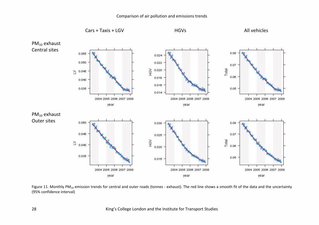
Comparisons between the trends in monthly emissions between 2003 and 2007 (Figure 10), and the meteorologically-averaged trends of Figure 5 and Figure 6, are in poor agreement and over comparable periods the emissions trends show a decline of 25%. The emissions of
3 The emission factors used were based upon Barlow et al., 2001
Comparison of air pollution and emissions trends
King’s College London and the Institute for Transport Studies 24
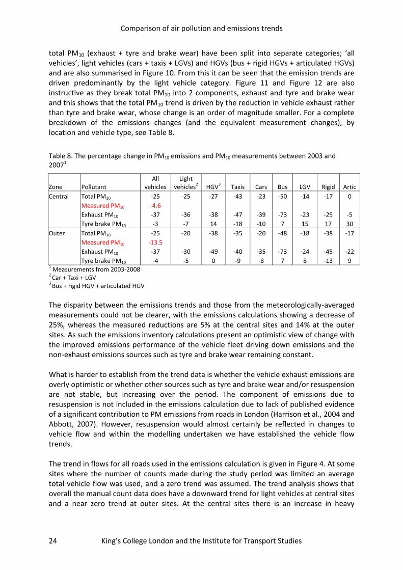
total PM10 (exhaust + tyre and brake wear) have been split into separate categories; ‘all vehicles’, light vehicles (cars + taxis + LGVs) and HGVs (bus + rigid HGVs + articulated HGVs) and are also summarised in Figure 10. From this it can be seen that the emission trends are driven predominantly by the light vehicle category. Figure 11 and Figure 12 are also instructive as they break total PM10 into 2 components, exhaust and tyre and brake wear and this shows that the total PM10 trend is driven by the reduction in vehicle exhaust rather than tyre and brake wear, whose change is an order of magnitude smaller. For a complete breakdown of the emissions changes (and the equivalent measurement changes), by location and vehicle type, see Table 8.
Table 8. The percentage change in PM10 emissions and PM10 measurements between 2003 and 20071
Zone Pollutant All
vehicles Light
vehicles2 HGV
3 Taxis Cars Bus LGV Rigid Artic
Central Total PM10 -25 -25 -27 -43 -23 -50 -14 -17 0
Measured PM10 -4.6
Exhaust PM10 -37 -36 -38 -47 -39 -73 -23 -25 -5
Tyre brake PM10 -3 -7 14 -18 -10 7 15 17 30
Outer Total PM10 -25 -20 -38 -35 -20 -48 -18 -38 -17
Measured PM10 -13.5
Exhaust PM10 -37 -30 -49 -40 -35 -73 -24 -45 -22
Tyre brake PM10 -4 -5 0 -9 -8 7 8 -13 9 1 Measurements from 2003-2008
2 Car + Taxi + LGV
3 Bus + rigid HGV + articulated HGV
The disparity between the emissions trends and those from the meteorologically-averaged measurements could not be clearer, with the emissions calculations showing a decrease of 25%, whereas the measured reductions are 5% at the central sites and 14% at the outer sites. As such the emissions inventory calculations present an optimistic view of change with the improved emissions performance of the vehicle fleet driving down emissions and the non-exhaust emissions sources such as tyre and brake wear remaining constant. What is harder to establish from the trend data is whether the vehicle exhaust emissions are overly optimistic or whether other sources such as tyre and brake wear and/or resuspension are not stable, but increasing over the period. The component of emissions due to resuspension is not included in the emissions calculation due to lack of published evidence of a significant contribution to PM emissions from roads in London (Harrison et al., 2004 and Abbott, 2007). However, resuspension would almost certainly be reflected in changes to vehicle flow and within the modelling undertaken we have established the vehicle flow trends. The trend in flows for all roads used in the emissions calculation is given in Figure 4. At some sites where the number of counts made during the study period was limited an average total vehicle flow was used, and a zero trend was assumed. The trend analysis shows that overall the manual count data does have a downward trend for light vehicles at central sites and a near zero trend at outer sites. At the central sites there is an increase in heavy

Comparison of air pollution and emissions trends
King’s College London and the Institute for Transport Studies 25
vehicles after 2002 and at outer sites again there is a near zero trend. In combination the vehicle km assumed in the emissions calculations would have fallen –6% to -8% (Table 3 and Table 4). Hence the fact that PM10 meteorologically-averaged concentrations are stable or increasing means that resuspension could only play an important role through a change in vehicle type, for example more LGV/heavy vehicles at the central sites. Alternatively, the influence of meteorological conditions could have played a role, however 2007 was exceptionally wet yet there is little evidence that PM10 measurements reduced during that year and in fact at the central sites they continued to increase. All of this points to their being a minor role for emissions associated with resuspension and although it cannot be ignored the focus of our initial analysis has remained elsewhere. Comparison between the diurnal profiles of PM10 emissions summarised in Figure 13 with the meteorologically averaged equivalent graphs in Figure 7 and Figure 8 reveal very different results. What is most striking is the shape of the emissions curves. The emissions results rise to an early peak period (from 6am) and are then reasonably constant throughout the day. This is in contrast to Figure 7 and Figure 8, which is much more rounded and has no distinct morning or evening peak periods and a maximum at around 10am. There is also a difference between central and outer sites with the latter peaking approximately 1 hour later. The emissions results are also divided into contributions from light and heavy vehicles. Weekday heavy vehicle numbers peak at ~10am and fall steadily towards the evening. In addition, heavy vehicles make a small contribution to emissions on Sunday and so comparison of trends by day has the potential to establish the change in emissions by vehicle type. By comparing the average PM10 concentrations for Sunday’s and weekends in Figure 9 with their equivalent light and heavy vehicle flows it has been possible to establish the relative emission rates of the two vehicle categories, Light vehicles and HGVs. These data have been summarised into two simultaneous equations and solved to give relative emission rates for each vehicle category. This gives an emissions ratio of approximately 11:1 for HGVs:Light vehicles and does not agree well with the equivalent ratio from vehicle emissions inventories of ~ 4:1. Using the alternative 11:1 ratio to recreate the diurnal profile of emissions (Figure 14) begins to show closer agreement with the meteorologically-averaged PM10 concentrations in Figure 9. It also demonstrates that either the HGV emissions rates should be higher or that light vehicle emissions rates should be lower, or a combination of the two. This method has the potential to establish more clearly the limitations of emissions inventories for road transport, but only after further development of the technique to encompass different vehicle types and different years within the time series.

Comparison of air pollution and emissions trends
King’s College London and the Institute for Transport Studies 26
This page has been left blank intentionally

Comparison of air pollution and emissions trends
King’s College London and the Institute for Transport Studies
27
Cars + Taxis + LGV HGVs All vehicles PM10 Central sites
PM10 Outer sites
Figure 10. Monthly PM10 emission trends for central and outer roads (tonnes - exhaust + tyre and brake wear). The red line shows a smooth fit of the data and the uncertainty (95% confidence interval)
Comparison of air pollution and emissions trends
King’s College London and the Institute for Transport Studies 28
Cars + Taxis + LGV HGVs All vehicles
PM10 exhaust Central sites
PM10 exhaust Outer sites
Figure 11. Monthly PM10 emission trends for central and outer roads (tonnes - exhaust). The red line shows a smooth fit of the data and the uncertainty (95% confidence interval)

Comparison of air pollution and emissions trends
King’s College London and the Institute for Transport Studies 29
Cars + Taxis + LGV HGVs All vehicles PM10 tyre and brake wear Central sites
PM10 tyre and brake wear Outer sites
Figure 12. Monthly PM10 emission trends for central and outer roads (tonnes - tyre and brake wear). The red line shows a smooth fit of the data and the uncertainty (95% confidence interval)

Comparison of air pollution and emissions trends
King’s College London and the Institute for Transport Studies 30
PM10 central
PM10 Outer
Figure 13. Diurnal PM10 emissions (exhaust + tyre and brake wear) for central and outer sites (tonnes/hr). The blue line shows the total PM10 emissions, the red line emissions from light vehicles (cars+taxis+LGVs) and the green line emissions from Heavy vehicles (HGVs + Buses).

Comparison of air pollution and emissions trends
King’s College London and the Institute for Transport Studies 31
PM10 central
Figure 14. Diurnal PM10 emissions (exhaust + tyre and brake wear) for central/inner sites (tonnes/hr). The blue line shows the total PM10 emissions, the red line emissions from light vehicles (cars+taxis+LGVs) and the green line emissions from Heavy vehicles (HGVs + Buses). The figure uses a HGV/LV PM emissions ratio of 11 calculated using a comparison between weekday and Sunday average meteorologically averaged PM10 concentrations and traffic counts. The resulting plot is in closer agreement with Figure 7. By comparison the actual ratio in the emissions inventory is 3.9.
Comparison of air pollution and emissions trends
King’s College London and the Institute for Transport Studies
32
6.3 Trends in meteorologically-averaged for NOX measurements
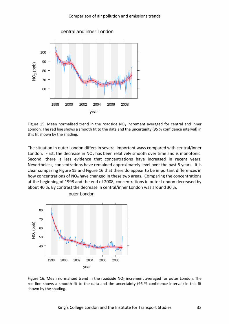
The mean trend in NOX calculated across all central/inner London sites is shown in Figure 15. It is clear that concentrations decreased markedly from 1998-2002. However, concentrations have changed little since 2002 and in fact since around 2006 there is some indication that they are increasing.
Table 9. Sites used for the analysis of NOX.
LAQN Site code
Site Name Area
MY1 CD3 KC2 KC3 CD1 KC4 IS2 LB1 HF1 WA4
Marylebone Rd Camden (3) Kensington & Chelsea 2 Kensington & Chelsea 3 Camden 1 Kensington & Chelsea 4 Islington 2 Lambeth 1 Hammersmith and Fulham 1 Wandsworth 4
Central/inner
RB3 RI1 HS4 HV1 EN2 CR2 CR5 HG1 A30 BY7 CR4 EA2 GR5
Redbridge 3 Richmond 1 Hounslow 4 Havering 1 Enfield 2 Croydon 2 Croydon 5 Haringey 1 A3 roadside Bromley 7 Croydon 4 Ealing 2 Greenwich 5
Outer London
Comparison of air pollution and emissions trends
King’s College London and the Institute for Transport Studies 33
Figure 15. Mean normalised trend in the roadside NOX increment averaged for central and inner London. The red line shows a smooth fit to the data and the uncertainty (95 % confidence interval) in this fit shown by the shading.
The situation in outer London differs in several important ways compared with central/inner London. First, the decrease in NOX has been relatively smooth over time and is monotonic. Second, there is less evidence that concentrations have increased in recent years. Nevertheless, concentrations have remained approximately level over the past 5 years. It is clear comparing Figure 15 and Figure 16 that there do appear to be important differences in how concentrations of NOX have changed in these two areas. Comparing the concentrations at the beginning of 1998 and the end of 2008, concentrations in outer London decreased by about 40 %. By contrast the decrease in central/inner London was around 30 %.
Figure 16. Mean normalised trend in the roadside NOX increment averaged for outer London. The red line shows a smooth fit to the data and the uncertainty (95 % confidence interval) in this fit shown by the shading.
central and inner London
year
NO
X (
ppb)
60
70
80
90
100
1998 2000 2002 2004 2006 2008
outer London
year
NO
X (
ppb)
40
50
60
70
80
1998 2000 2002 2004 2006 2008
Comparison of air pollution and emissions trends
King’s College London and the Institute for Transport Studies 34
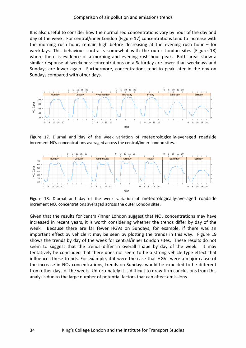
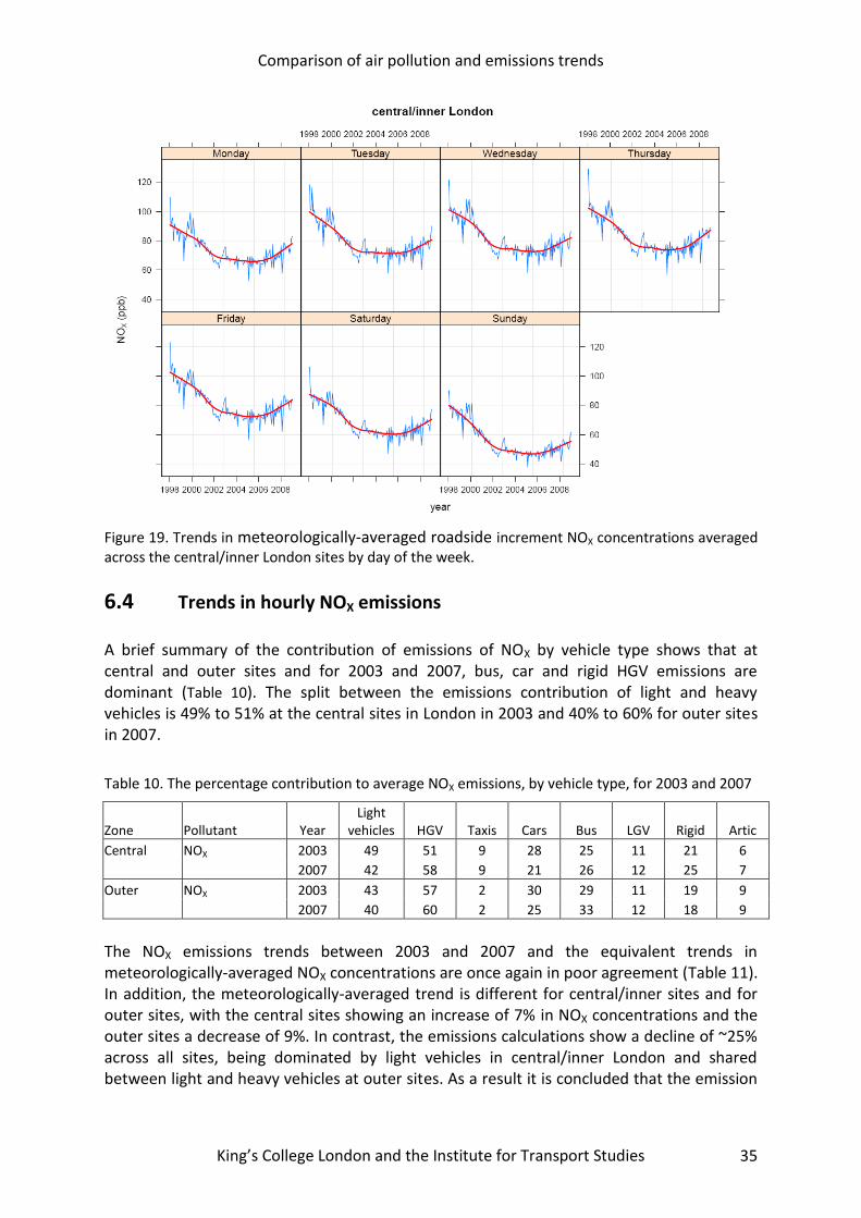
It is also useful to consider how the normalised concentrations vary by hour of the day and day of the week. For central/inner London (Figure 17) concentrations tend to increase with the morning rush hour, remain high before decreasing at the evening rush hour – for weekdays. This behaviour contrasts somewhat with the outer London sites (Figure 18) where there is evidence of a morning and evening rush hour peak. Both areas show a similar response at weekends: concentrations on a Saturday are lower than weekdays and Sundays are lower again. Furthermore, concentrations tend to peak later in the day on Sundays compared with other days.
Figure 17. Diurnal and day of the week variation of meteorologically-averaged roadside increment NOX concentrations averaged across the central/inner London sites.
Figure 18. Diurnal and day of the week variation of meteorologically-averaged roadside increment NOX concentrations averaged across the outer London sites.
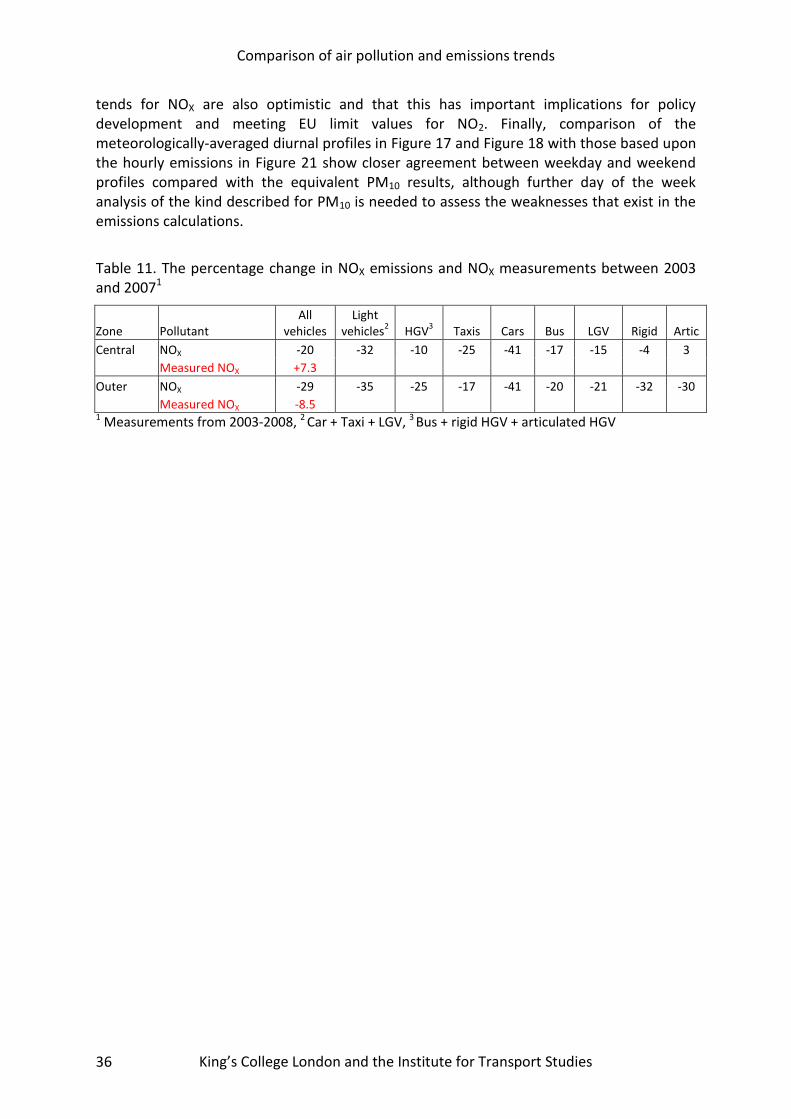
Given that the results for central/inner London suggest that NOX concentrations may have increased in recent years, it is worth considering whether the trends differ by day of the week. Because there are far fewer HGVs on Sundays, for example, if there was an important effect by vehicle it may be seen by plotting the trends in this way. Figure 19 shows the trends by day of the week for central/inner London sites. These results do not seem to suggest that the trends differ in overall shape by day of the week. It may tentatively be concluded that there does not seem to be a strong vehicle type effect that influences these trends. For example, if it were the case that HGVs were a major cause of the increase in NOX concentrations, trends on Sundays would be expected to be different from other days of the week. Unfortunately it is difficult to draw firm conclusions from this analysis due to the large number of potential factors that can affect emissions.
hour
NO
X (
ppb)
20
40
60
80
100
0 5 10 15 20
Monday
0 5 10 15 20
Tuesday
0 5 10 15 20
Wednesday
0 5 10 15 20
Thursday
0 5 10 15 20
Friday
0 5 10 15 20
Saturday
0 5 10 15 20
Sunday
hour
NO
X (
ppb)
10
20
30
40
50
60
70
0 5 10 15 20
Monday
0 5 10 15 20
Tuesday
0 5 10 15 20
Wednesday
0 5 10 15 20
Thursday
0 5 10 15 20
Friday
0 5 10 15 20
Saturday
0 5 10 15 20
Sunday
Comparison of air pollution and emissions trends
King’s College London and the Institute for Transport Studies 35
Figure 19. Trends in meteorologically-averaged roadside increment NOX concentrations averaged across the central/inner London sites by day of the week.
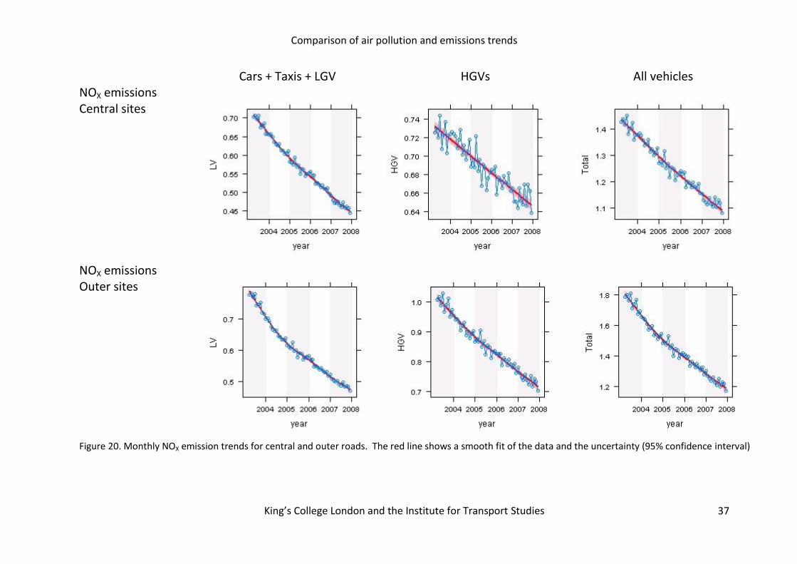
6.4 Trends in hourly NOX emissions A brief summary of the contribution of emissions of NOX by vehicle type shows that at central and outer sites and for 2003 and 2007, bus, car and rigid HGV emissions are dominant (Table 10). The split between the emissions contribution of light and heavy vehicles is 49% to 51% at the central sites in London in 2003 and 40% to 60% for outer sites in 2007.
Table 10. The percentage contribution to average NOX emissions, by vehicle type, for 2003 and 2007
Zone Pollutant Year Light
vehicles HGV Taxis Cars Bus LGV Rigid Artic
Central NOX 2003 49 51 9 28 25 11 21 6
2007 42 58 9 21 26 12 25 7
Outer NOX 2003 43 57 2 30 29 11 19 9
2007 40 60 2 25 33 12 18 9
The NOX emissions trends between 2003 and 2007 and the equivalent trends in meteorologically-averaged NOX concentrations are once again in poor agreement (Table 11). In addition, the meteorologically-averaged trend is different for central/inner sites and for outer sites, with the central sites showing an increase of 7% in NOX concentrations and the outer sites a decrease of 9%. In contrast, the emissions calculations show a decline of ~25% across all sites, being dominated by light vehicles in central/inner London and shared between light and heavy vehicles at outer sites. As a result it is concluded that the emission
Comparison of air pollution and emissions trends
King’s College London and the Institute for Transport Studies 36
tends for NOX are also optimistic and that this has important implications for policy development and meeting EU limit values for NO2. Finally, comparison of the meteorologically-averaged diurnal profiles in Figure 17 and Figure 18 with those based upon the hourly emissions in Figure 21 show closer agreement between weekday and weekend profiles compared with the equivalent PM10 results, although further day of the week analysis of the kind described for PM10 is needed to assess the weaknesses that exist in the emissions calculations.
Table 11. The percentage change in NOX emissions and NOX measurements between 2003 and 20071
Zone Pollutant All
vehicles Light
vehicles2 HGV
3 Taxis Cars Bus LGV Rigid Artic
Central NOX -20 -32 -10 -25 -41 -17 -15 -4 3
Measured NOX +7.3
Outer NOX -29 -35 -25 -17 -41 -20 -21 -32 -30
Measured NOX -8.5 1 Measurements from 2003-2008, 2 Car + Taxi + LGV, 3 Bus + rigid HGV + articulated HGV
Comparison of air pollution and emissions trends
King’s College London and the Institute for Transport Studies
37
Cars + Taxis + LGV HGVs All vehicles NOX emissions Central sites
NOX emissions Outer sites
Figure 20. Monthly NOX emission trends for central and outer roads. The red line shows a smooth fit of the data and the uncertainty (95% confidence interval)
Comparison of air pollution and emissions trends
King’s College London and the Institute for Transport Studies 38
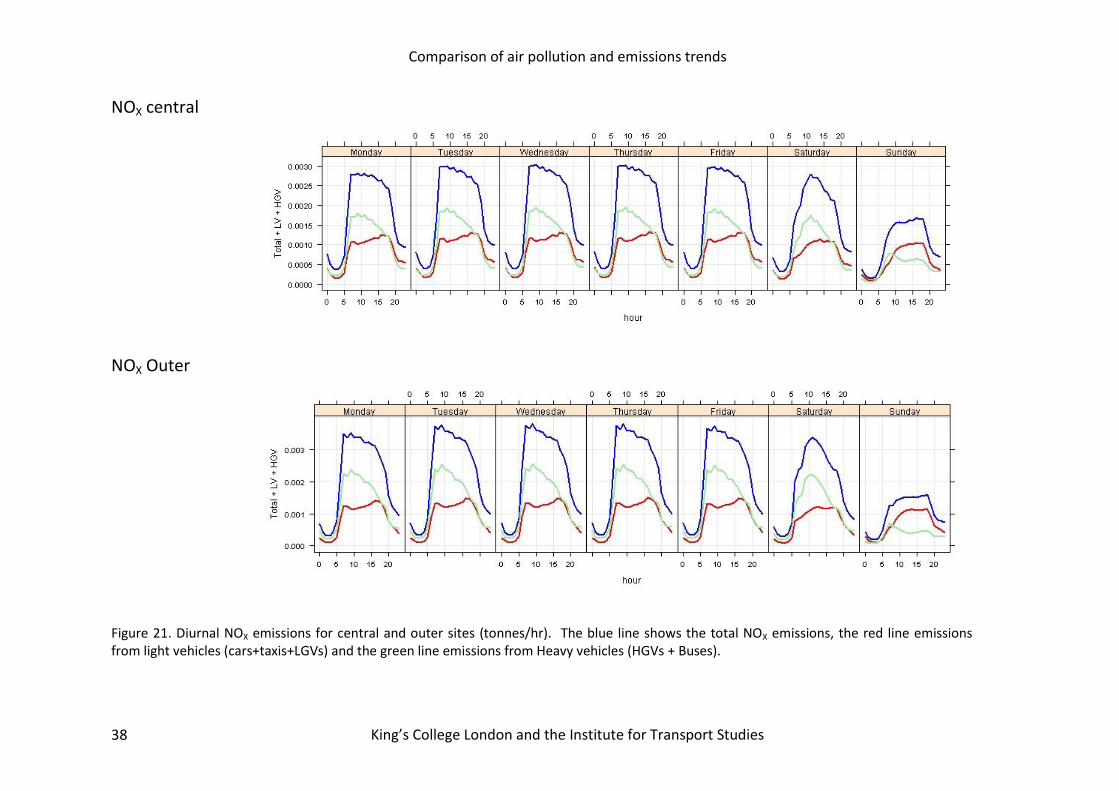
NOX central
NOX Outer
Figure 21. Diurnal NOX emissions for central and outer sites (tonnes/hr). The blue line shows the total NOX emissions, the red line emissions from light vehicles (cars+taxis+LGVs) and the green line emissions from Heavy vehicles (HGVs + Buses).

Comparison of air pollution and emissions trends
King’s College London and the Institute for Transport Studies
39
7 MARYLEBONE ROAD The analysis in the previous sections focussed on providing an aggregated view of the likely change in emissions over time by central/inner London and outer London. The long time series of data available at Marylebone Road enables a more specific analysis to be undertaken. Figure 22 shows the meteorologically-averaged trend in PM10 concentrations at Marylebone Road. It is evident from this plot that there has been a tendency for the local component to increase over time since 1998; or at best, there is very little evidence to support the view that emissions have decreased. The large, short duration peaks in 1999 are known to be related to building works close to the site.
Figure 22. The trend in meteorologically-averaged roadside increment PM10 concentrations at Marylebone Road.
Because Marylebone Road has a long time series it is useful to consider in which ways PM10 concentrations may have changed over time. This has been considered by splitting the data set into an “early” period (1998-1999) and a “late” period (2007-2008). Figure 23 shows that the principal difference between the 1998-1999 and 2007-2008 is that concentrations have tended to increase during the early and late parts of the day. On average there has been little change or no change during the middle part of the day. Also apparent is that there has become less of a difference between Saturdays and Sundays cf. weekdays for 2007-2008 data. There could be several explanations for this behaviour, but one interpretation is that cars/LGVs have become relatively more important for PM10 emissions over time. This is because flows of these vehicles tend to be higher than HGVs early/late in the day and there is little difference in the flows of light vehicles by day of the week. However, this is only one possibility and some caution is needed in interpreting these data.
year
PM
10 (
g m
3)
10
12
14
16
18
20
1998 2000 2002 2004 2006 2008

Comparison of air pollution and emissions trends
King’s College London and the Institute for Transport Studies 40
Figure 23. Meteorologically-averaged diurnal/day of week trends in roadside increment PM10 concentrations at Marylebone Road for two periods: (1998-1999) and (2007-2008).
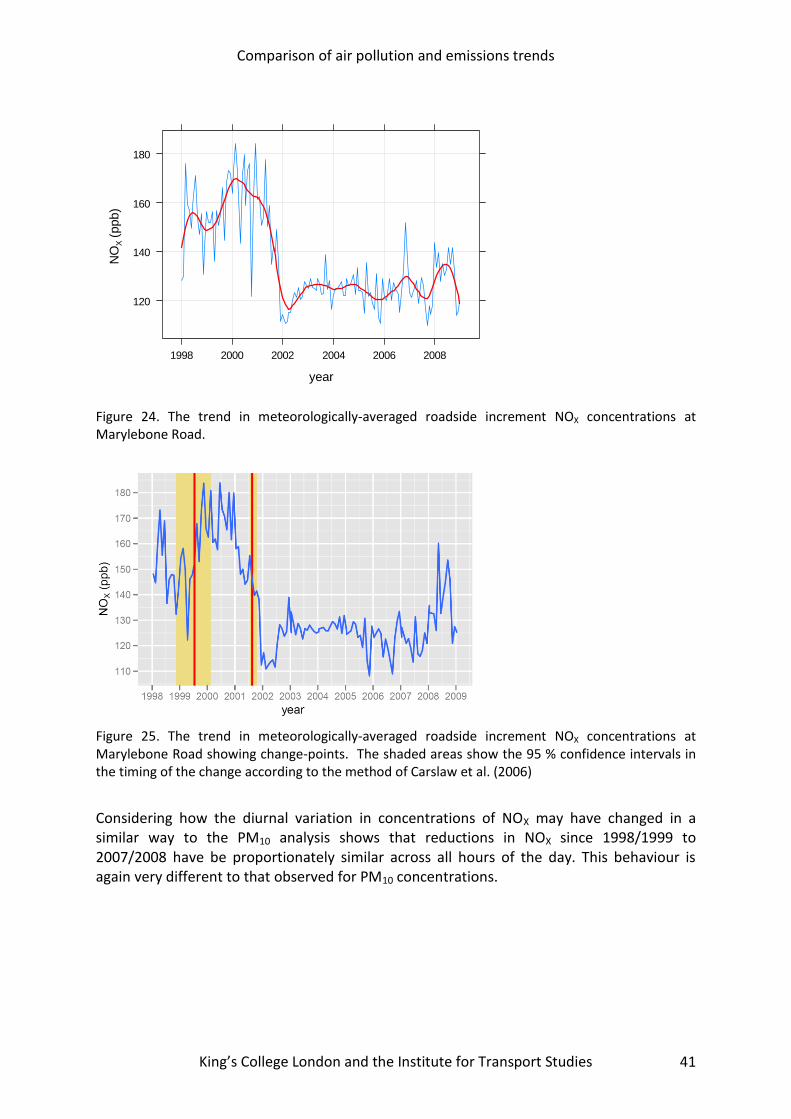
The trend in NOX at Marylebone Road is notably different to that for PM10, as shown in Figure 24. One of the most striking features of Figure 24 is the sharp decrease in concentration towards the end of 2001. In this respect, sometime around 2001 looks to be a ‘change-point’ where concentrations shifted from one level to another. The only known change at this time was the introduction of the bus lane in August 2001 (Carslaw et al., 2006). Indeed, one of the benefits of accounting for meteorology in trends is that interventions such as this are more clearly shown.4 The change points are better shown in Figure 25.
4 We have not analysed the change in NOX in detail, but clearly such an analysis could reveal the importance of
an intervention such as a bus lane as well as providing information on the relative importance of vehicle emissions.
hour
PM
10 (
g m
3)
0
5
10
15
20
25
30Monday
0 5 10 15 20
Tuesday Wednesday
0 5 10 15 20
Thursday
0 5 10 15 20
Friday Saturday
0 5 10 15 20
0
5
10
15
20
25
30
Sunday
1998-1999 2007-2008
Comparison of air pollution and emissions trends
King’s College London and the Institute for Transport Studies 41
Figure 24. The trend in meteorologically-averaged roadside increment NOX concentrations at Marylebone Road.
Figure 25. The trend in meteorologically-averaged roadside increment NOX concentrations at Marylebone Road showing change-points. The shaded areas show the 95 % confidence intervals in the timing of the change according to the method of Carslaw et al. (2006)
Considering how the diurnal variation in concentrations of NOX may have changed in a similar way to the PM10 analysis shows that reductions in NOX since 1998/1999 to 2007/2008 have be proportionately similar across all hours of the day. This behaviour is again very different to that observed for PM10 concentrations.
year
NO
X (
ppb)
120
140
160
180
1998 2000 2002 2004 2006 2008

Comparison of air pollution and emissions trends
King’s College London and the Institute for Transport Studies 42
Figure 26. Meteorologically-averaged diurnal/day of week trends roadside increment NOX concentrations at Marylebone Road for two periods: (1998-1999) and (2007-2008).
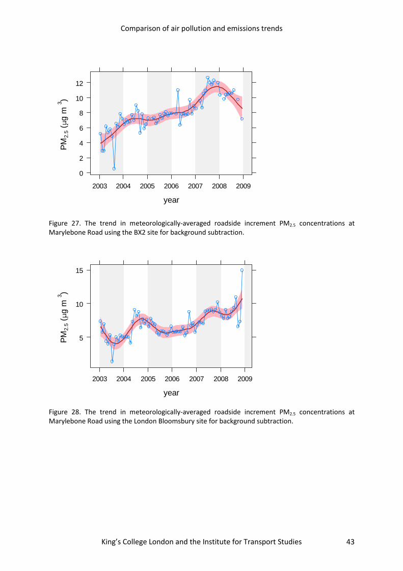
We have also considered PM2.5 concentrations at Marylebone Road. For this time series the suburban BX2 sites was used for background subtraction; a decision based on data capture rate and a desire to have a representative urban background site. PM2.5 TEOM measurements at Marylebone Road were not part of national QA/QC procedures prior to 2003 and some doubts concerning the validity of the measurements have been expressed for data before this date (AQEG, 2007). For this reason we only consider data from 2003-2008. The meteorologically-averaged trend is shown in Figure 27 and indicates that the increment in PM2.5 concentrations has increased since 2003. Less clear increases are observed if the London Bloomsbury site is used for background subtraction, shown Figure 28. However, the Bloomsbury site is itself in close proximity of busy roads with high flows of buses and may not be the most appropriate site for background subtraction; hence the general preference from North Kensington. Nevertheless, both sites show that the PM2.5 increment has increased at Marylebone Road since 2003.
hour
NO
X (
ppb)
50
100
150
200
250
Monday
0 5 10 15 20
Tuesday Wednesday
0 5 10 15 20
Thursday
0 5 10 15 20
Friday Saturday
0 5 10 15 20
50
100
150
200
250
Sunday
1998-1999 2007-2008
Comparison of air pollution and emissions trends
King’s College London and the Institute for Transport Studies 43
Figure 27. The trend in meteorologically-averaged roadside increment PM2.5 concentrations at Marylebone Road using the BX2 site for background subtraction.
Figure 28. The trend in meteorologically-averaged roadside increment PM2.5 concentrations at Marylebone Road using the London Bloomsbury site for background subtraction.
year
PM
2.5 (
g m
3)
0
2
4
6
8
10
12
2003 2004 2005 2006 2007 2008 2009
year
PM
2.5 (
g m
3)
5
10
15
2003 2004 2005 2006 2007 2008 2009

Comparison of air pollution and emissions trends
King’s College London and the Institute for Transport Studies 44
This page has been left blank intentionally
Comparison of air pollution and emissions trends
King’s College London and the Institute for Transport Studies 45
8 CONCLUSIONS This report summarises a detailed and comprehensive assessment of trends in emissions and concentrations of NOX and PM in London. We have developed methods to create hourly road traffic and emissions estimates between 2003 and 2007 using comprehensive traffic data in London combined with new vehicle data based upon Automatic Number Plate Recognition (ANPR) cameras. The use of both traffic and emissions data as hourly values has proved to be invaluable in helping interpret the air pollution measurement trends.
The statistical models were used to calculate trends, weekday and diurnal variations in roadside increments of NOX, PM10 and PM2.5 under average meteorological conditions. This approach has the benefit that trends calculated in this way will more closely relate to emissions changes rather than changes due to local meteorological effects; thus allowing for a more robust comparison between the two.
The overriding conclusion of this work is that there is a clear disparity between the estimated trends in emissions and the observed trends in concentrations. This disparity has important implications for the management of air pollution and raises question about the adequacy of emission factors and projected concentrations of NOX (and NO2), and PM.
From the analysis of the measurements, we find there is evidence that NOX concentrations have not decreased over the period 2003-2008. In fact, in central/inner London the mean of 10 roadside sites suggests that concentrations have increased by around 7 % from 2003-2008. In outer London, concentrations of NOX have decreased by about 8-9 %. The corresponding changes in emissions are reductions of 20 and 29 % respectively. These results therefore show there seems to be a considerable disparity between the expected change in emissions and the actual change in concentrations. The results also suggest that there is a difference in how central/inner London sites have responded compared with outer London sites.
For PM10 the average of 7 central/inner London sites shows that concentrations have decreased by 4-5 % compared with an estimated 25 % from detailed emission calculations (2003-2008). Similarly, in outer London the analysis of PM10 concentrations indicates a reduction of 13-14 % compared with a 25 % reduction estimated for the emissions. It should be noted that given the complexity of PM emissions/concentrations that these results will be less certain than those for NOX. Nevertheless, there does seem to be a consistent difference in the way that central/inner London sites respond compared with outer London site, which is similar to the findings for NOX.
While there does appear to be a clear difference in the trends in PM10 and NOX in central/inner London and outer London, it remains difficult to identify a specific cause(s). However, one of the major differences between these two areas is the proportion of diesel vehicles. Diesel vehicles are known to be significant emitters of both NOX and PM10. The detailed analysis of traffic data suggests that flows of large diesel vehicles (particularly Bus, HGVs and LGVs) have increased in central/inner London between 2003 and 2007 and that there has been a more mixed response at outer sites. Interestingly, total traffic has reduced for both groups of sites between 2003 and 2007.

Comparison of air pollution and emissions trends
King’s College London and the Institute for Transport Studies 46
We have also shown that considering how emissions and concentrations vary by day of the week and hour of the day is an effective way in which to compare emissions variation with that for measured concentrations. In particular, removing the meteorological signal can in some cases significantly affect the diurnal profile of concentrations and provide a more robust means of comparing trends with emissions estimates.
Using multiple regression analysis on a combination of traffic data and meteorologically averaged measurements by day of the week has demonstrated that it can provide the relative emission rates for different vehicle categories. It is shown that an average emissions ratio of 11:1 for HGV (bus + rigid + articulated) to Light vehicles (car + taxi + LGV) would result in closer agreement between the emissions and air pollution daily profiles. By comparison the ratio using the emissions calculation is 3.9. Further refinement of this method to consider larger number of vehicle types and across a number of years would provide an important step in identifying the vehicles which may be the cause of the disparity between emissions trends and measurements.
A useful side-effect of the meteorological averaging is that step-changes in the concentration of pollutants can be revealed. For example, there is evidence from this work that at Marylebone Road a distinct reduction in NOX occurred in 2001 coinciding with the introduction of the bus lane. Such information could provide useful information concerning the effect that traffic management has in London (and elsewhere) that would normally be masked by meteorological variation.
9 RECOMMENDED FURTHER WORK
The analysis described in this document is the beginning of an important process of evaluation of emissions inventories that will enable greater understanding of emissions trends, air pollution model performance and better policy making. However, having created a large and unique dataset as well as important methods of analysis a number of additional work packages are recommended: While there are many roadside air pollution sites in London, there are very few sites that have coincident traffic measurements. A more concerted effort to link quality road traffic measurements with air pollution sites would yield considerably more insight into these issues.
Important understanding of the inadequacies of emissions inventories can be made through the development of the multiple regression approaches to include additional vehicle types over a number of years.
In this study use was made of the currently available UK emissions factors, i.e. those based on results from Barlow et al., 2001. These have since been superseded via a consultation process undertaken by DfT during 2009. Initial results show that differences between the two emission factor datasets can be substantial for specific vehicles types. It would therefore be worth considering undertaking a recalculation of emissions using the new factors.
Comparison of air pollution and emissions trends
King’s College London and the Institute for Transport Studies 47
A separate research effort is being undertaken by ERG in order to monitor the effect of the LEZ in London. Part of this research is to establish a chemical speciation PM10 model and will include identifying road traffic emissions of PM and estimating trends over time. This provides a unique opportunity to build on the analysis presented here.
10 REFERENCES Abbott J, 2007. PM10 resuspension by road vehicles. AEA report produced for Department for the Environment, Food and Rural Affairs (DEFRA). Reference Number ED-48209/R2388. Barlow T J, Hickman A J and Boulter P G. 2001. Exhaust Emission Factors 2001: Database and Emission Factors, Transport Research Laboratory, Crowthorne TRL report PR/SE/230/200. Carslaw, D.C., Ropkins, K and M.C. Bell. (2006) Change-Point Detection of Gaseous and Particulate Traffic-Related Pollutants at a Roadside Location. Environmental Science and Technology. Vol. 40. Issue 22. 6912-6918. Carslaw, D.C., Beevers, S.D. and J.E. Tate (2007). Modelling and assessing trends in traffic-related emissions using a generalized additive modelling approach. Atmospheric Environment. 41 pp. 5289-5299. D.C. Carslaw and P.J. Taylor. Analysis of air pollution data at a mixed source location using boosted regression trees. Atmospheric Environment, In press, 2009. Gardner, M.W., Dorling, S.R., 2000. Statistical surface ozone models: an improved methodology to account for non-linear behaviour. Atmospheric Environment 34 (1), 21–34.
Harrison RM, Jones AM, Lawrence RG. 2004. Major component composition of PM10 and PM2.5 from roadside and urban background sites. Atmospheric Environment 38, 4531 - 4538. Jacoby, WG. 2000. Loess: a nonparametric, graphical tool for depicting relationships between variables. Electoral Studies 19 (2000) 577–613. Libiseller, C., Grimvall, A., Walden, J., Saari, H., 2005. Meteorological normalisation and non-parametric smoothing for quality assessment and trend analysis of tropospheric ozone data. Environmental Monitoring and Assessment 100 (1–3), 33–52. D.D. Parrish. 2006. Critical evaluation of US on-road vehicle emission inventories. Atmospheric Environment 40 (2006) 2288–2300.