A2 media studies evaluation
7
A2 Media Studies Evaluation Thierry Preston
-
Upload
thierrypreston -
Category
Education
-
view
122 -
download
0
Transcript of A2 media studies evaluation
A2 Media Studies Evaluation
Thierry Preston

• In what ways does your media product use, develop or challenge forms and conventions of real media products?
• How effective is the combination of your main product and ancillary texts?
• What have you learned from your audience feedback?
• How did you use media technologies in the construction and research, planning and evaluation stages?

In what ways does your media product use, develop or challenge forms and conventions of real media products?
Having completed extensive research into the codes and conventions of existing media products I was able to determine certain qualities and characteristics that are consistent throughout. This mean but using the conventions from current successful media pieces I was able to make my production as appealing as possible. I found that almost all used a plain white masthead with easily legible font so it didn’t detract from the product itself, maintaining a formal look whilst still being aesthetically pleasing. The title is used to make the audience familiar with the product they're reading so it needs to be simple, I’ve applied this convection in my product. Typically placed under the title is the date of issue and issue number, this is there both to serve a purpose of information as well as an underline for the masthead, whilst avoiding distracting from the image or title. I've placed the mast head centrally at the top so that is assertive and commanding and helps as sell point with its modestly, stand out nature.
The research into existing regional magazines that I was able to conduct highlighted certain aspects of text on the cover that, if employed in mine, make it attractive to possible buyers. By including the title of the featured article in the issue customers may be encourage to read it as it may be relevant to them. It also the reader to be interested but not informed enough not the need to read the article itself. This ‘teaser’ may also be a subject of which the customer is unbeknownst to. Something else found commonly on the covers of magazine of the same type are ‘flashes’. These eye-catching bubbles often include buzzwords like exclusive, plus or in this case special edition. If the potential audience thinks that they are getting something not available to them in other magazines this could be a commanding sell point, as many feel like they cold miss out on something otherwise.
Across all magazines that I have researched, not just regional examples, the bar code has been located at the bottom along with a price plainly visible to the consumer. By placing it the bottom corner it is both discreet and ordered so it does not hinder the aesthetics of the magazine image, as the bar code gives to attractive quality. The bottom of the page often included a website link in my research so I have applied that here whilst still being discreet in the whole cover. The bottom of my page also includes a final sell line or plug. This may be the last ting as customer reads before deciding whether or not to purchase the issue so it is often attractively styled and ambiguous as to the nature of the article.
The actual image itself is an important feature of the magazine as it is the first thing the target audience sees and, according to my research, part of what decides the purchase. Most regional magazines, especially those similar to mine like Kent life, use a picturesque image of a rural or coastal areas. The image I have used is simple and colourful, yet not so harsh that the audience find it garish and unattractive.
I have found that It is an important feature of the cover to includes articles featured in the magazine. Those that are not only interesting but useful and informative. Covers often included quotes from articles, often from familiar names like celebrities. I have applied that convention in my cover with a quote from Attenborough.
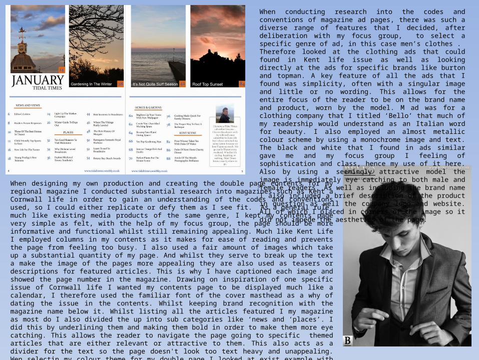
When designing my own production and creating the double page contents for my regional magazine I conducted substantial research into magazines such as Kent a Cornwall life in order to gain an understanding of the codes and conventions used, so I could either replicate or defy them as I see fit. As a general rule, much like existing media products of the same genre, I kept my contents page very simple as felt, with the help of my focus group, the page should be more informative and functional whilst still remaining appealing. Much like Kent Life I employed columns in my contents as it makes for ease of reading and prevents the page from feeling too busy. I also used a fair amount of images which take up a substantial quantity of my page. And whilst they serve to break up the text a make the image of the pages more appealing they are also used as teasers or descriptions for featured articles. This is why I have captioned each image and showed the page number in the magazine. Drawing on inspiration of one specific issue of Cornwall life I wanted my contents page to be displayed much like a calendar, I therefore used the familiar font of the cover masthead as a why of dating the issue in the contents. Whilst keeping brand recognition with the magazine name below it. Whilst listing all the articles featured I my magazine as most do I also divided the up into sub categories like ‘news and ‘places’. I did this by underlining them and making them bold in order to make them more eye catching. This allows the reader to navigate the page going to specific themed articles that are either relevant or attractive to them. This also acts as a divider for the text so the page doesn't look too text heavy and unappealing. Wen selectin my colour theme for my double page I looked at exist example with my focus group and found that many of them were dull and colourless and there for not enticing to read. This persuaded me to use colours that are prominent in the images of the featured articles at the top of the page. Against the white background the colours stood out but were not too brash and unpleasant that they detracted fro the content , but were enough to juxtapose the simplicity of the font to create an over all more attractive page. Many of the existing pages I studied in my research included either a reader’s or a writer’s comment or letter on the magazine or issue specifically. I employed a readers letter here as I felt it gave the consumer an alternative viewpoint should the open the magazine to the second page.
When conducting research into the codes and conventions of magazine ad pages, there was such a diverse range of features that I decided, after deliberation with my focus group, to select a specific genre of ad, in this case men’s clothes . Therefore looked at the clothing ads that could found in Kent life issue as well as looking directly at the ads for specific brands like burton and topman. A key feature of all the ads that I found was simplicity, often with a singular image and little or no wording. This allows for the entire focus of the reader to be on the brand name and product, worn by the model. M ad was for a clothing company that I titled ‘Bello’ that much of my readership would understand as an Italian word for beauty. I also employed an almost metallic colour scheme by using a monochrome image and text. The black and white that I found in ads similar gave me and my focus group I feeling of sophistication and class, hence my use of it here. Also by using a seemingly attractive model the image is immediately eye catching to both male and female readers. As well as including the brand name I also included a brief description of the product in question as well the company logo and website. All of which I placed in corners of the image so it did not impede the aesthetics of the page.

When attempting to research the codes and conventions of billboard advertising of magazines I was made apparent to me that there is very little example material and that it is extremely rare for magazine in general lets alone y specific genre to have them. In the few examples I was able to find I discovered that a feature consistent with all of them was simplicity. I therefore aimed to replicate this in my production. My colour theme much like that of my contents page involved the use of colours that can be fond in the image used, in this case and example of the magazine cover. This makes the bill board look colourful without the combination of contrasting colours, maintaining uniformity. Against the blue have used the formal plain white text in the font familiar to readers as it is consistent throughout the magazine, this also serves as branding. Beneath the magazine name I have included a slogan or sell line, a feature consistent with the small sample example productions. Its simple easily legible and attracts the consumer on a personal level as it is about ‘their coast’. I had see in one of y research models the use of a laptop showing the magazines website, I therefore decided to put in a tablet, IPhone and a copy of the magazine cover, showing the array of platforms this magazine is available for as many people don’t have time to read directly in print. I have also included well known app and social media icons that consumers can visit for access to the magazine. As well as a direct link to the website itself.
Having completed extensive research into the normal features and conventions of the websites of existing regional magazines, I determined, with the help of my focus group, to defy the norm and create a website that was far ore unique for a magazine of this genre. I found that the websites for Kent life and Cornwall life, although they had useful features, were not very user friendly, with a busy layout, text heavy and dull. I therefore made my website as simple as possible with four easily navigable pages. The home screen consist of a vibrant colourful coastal view that is attractive to look at. I used simple, modern yet formal fonts for my title and the same for my page headings. All of which stood out from the picture but not so much as to ruin it. The home page consisted of a brief description of the magazine and summary of the features in each of the previous issues as well as changing image frame. The gallery page included the photography from each issue as well as the opportunity for readers to send it their pictures, connecting attractively with the consumer. I also included a magazine archive which consisted of online versions of previous issues of the magazine available to view. Finally the ‘contact us’ page. One that allowed for an easy user friendly email system as well as all the necessary links to editors, photographers and advertising departments.
• The use of audience feedback in the process of creating y production has proved highly valuable. Although much of what was included in the magazine was based on the decisions made by myself many of the more contentious decision or those that covered particular features of the working production were decided upon with the help of my focus group. My focus group also helped on the more detailed aspects of my production like types of font, colour schemes and featured articles, greatly easing the process of production. In order to ensure that I would be able to have audience feedback from both possible consumers as well as those already readers of magazines fro the same genre, I created a social media page that allowed volunteers to help me make production decisions. I was able to post opinion polls on specific elements of the piece as well as detailed opinions on elements had implemented. It was important that much of my focus group consisted of my target audience for this magazine so that the relevant opinions were included and that the magazine was tailored to their tastes, whilst also using my ideas.
• Before even beginning the production stage of my regional magazine I asked my target group for their views and opinions on already existing regional magazines. This would allow me to both gauge what it was that made each appealing to them as well as helping me to decide which magazine or magazines to look to for inspiration. This proved infinitely useful as it meant the examples I looked at for influence provided the necessary features so that my production was both realistically accurate. Whilst answering questions about minor details like font and text, my focus group was most useful when it came to the ore important elements of my magazine. The images. After discussing with my focus group I found that the thing that influenced each of them to first pick a copy of a regional magazine was the cover image. I therefore had several mock ups created with possible cover images and they chose unanimously for the image included in my production. It was also decided that text heavy magazines were far less appealing and imagery was a massive factor on what makes a magazine sell. As according to my focus group many of the pick up a magazine a briefly flick through only noting images and article titles. I therefore implemented these ideas into my production.
• Instead of only using my focus group as definitive decision of the final production, whether they liked it or not, it was important for me that they were both present and proactive throughout all stages of my work. I organised for them to see my production work in person as I altered elements so that they could see the progression and comment on what they individually liked and didn’t like. As opposed to me as, “this colour or this one”.
• All in all my focus group became completely invaluable to my production as it meant that the consumer, with the aid of my work and ideas, essentially built the magazine that they wanted to read. Specific to what works for them as customers and which features are more important than others.
Audience Feedback & Focus Group
Media technology
• Media technology was something that was hugely important throughout my production, from research and photography to Photoshop and evaluation. When beginning y production I firstly had to go out and take original pictures to be featured in my magazine. I used YouTube in order to find out the best way of taking the clearest and most professional looking landscape images for my cover and other images for the rest of the piece. This meant that my production would look accurate to examples I had researched. I also used YouTube to find Photoshop tutorials and techniques in order to edit my pictures to the standard required.
• The main piece of technology used for the assembly of the production itself was Photoshop. This professional photographic design editor was perfect for making my mages as aesthetically pleasing as possible. The editing tolls allowed for experimentation with regards to interchangeable elements of my work like font and colours. I was also able to create simple mock ups quickly and easily so I could gauge the final production.
• Facebook became incredibly useful for my production particularly with regards to audience feedback. The social media site allowed me to easily host a page for my focus group to answer question and opinion polls and give their opinions on my work as it progressed. This meat that, because my focus group included the target demographic, my production was made to the tastes of readers of similar existing media products. Facebook was also used for looking at the social media pages of many on the examples of regional magazines.
• Weebly was the website I used for my first ancillary task, although basic it allowed me to create a completely unique website for my magazine. Using online tutorials I was able to create a purposeful and user friendly web page easily and the vast editing and personalisation options meant my website kept perfectly uniform with y magazine. Something important n my production.
• The last piece of media technology that I used was slideshare. An online site that allows anyone to post slideshows. This was perfect for my as I could bring together all the elements of my production. With all my research tasks and focus group deliberations as well as the evaluation of the final production.