A Mountain All Can Climb - The Salvation Army · A Mountain All Can Climb A STATE OF THE NATION...
94
A Mountain All Can Climb A STATE OF THE NATION REPORT FROM THE SALVATION ARMY Alan Johnson | Social Policy Analyst The Salvation Army Social Policy and Parlimentary Unit | February 2015
Transcript of A Mountain All Can Climb - The Salvation Army · A Mountain All Can Climb A STATE OF THE NATION...
A Mountain All Can ClimbA STATE OF THE NATION REPORT FROM THE SALVATION ARMY
Alan Johnson | Social Policy Analyst
The Salvation Army Social Policy and Parlimentary Unit | February 2015

ISBN 978-0-9941055-3-0 (Paperback) ISBN 978-0-9941055-4-7 (Electronic)
Authorised by Commissioner Robert Donaldson, Territorial Commander, as an official publication of The Salvation Army New Zealand, Fiji and Tonga Territory.
‘A Mountain All Can Climb’ was produced by The Salvation Army Social Policy and Parliamentary Unit, 16B Bakerfield Place, Manukau, Auckland 2241, New Zealand. Director: Major Sue Hay
This report is available for viewing or download from: www.salvationarmy.org.nz/socialpolicy
Cover photo: www.photonewzealand.co.nz
WE WELCOME YOUR FEEDBACKPO Box 76249, Manukau, Auckland 2241
Phone (09) 261 0886
www.salvationarmy.org.nz/socialpolicy
Alan Johnson | Social Policy Analyst
The Salvation Army Social Policy and Parlimentary Unit | February 2015
A Mountain All Can ClimbA STATE OF THE NATION REPORT FROM THE SALVATION ARMY
twitter.com/SPPU
www.facebook.com/SPPUNZ

2 A Mountain All Can Climb
3Contents
Introduction 5
Foreword 7
At a Glance 10
Our Children 15
Crime & Punishment 35
Discussion Paper: Are Falling Crime Rates Real? 45
Work & Incomes 53
Social Hazards 65
Housing 73
Endnotes 86
CONTENTS

4 A Mountain All Can Climb

5Introduction
INTRODUCTION
This is the eighth State of the Nation report from The Salvation Army. Like its
predecessors it is written to encourage public debate around New Zealand’s
social progress. The Salvation Army believes such a debate is vital, in part to
balance a political agenda that can be too influenced by economic concerns,
and to advance an alternative debate around social inclusion and social justice.
The challenge with this and previous reports is being concise and precise.
Social issues are difficult to measure with simple numbers, and sometimes
the numbers do little to clarify the issues at stake. Measures around child
poverty are an example of this. Some estimates of the number of children living
in relative poverty are as high as 280,000, while the Prime Minister recently
suggested it could be between 6000 and 100,000. With such a wide range of views
on how big the problem is, and indeed, on how it can be defined, we are unlikely
to gain consensus around policies and budgets needed to address it.
Social progress is not about one indicator or number, but about the conditions
into which people are born, nurtured and live. Indicators and numbers give us
insights into what is happening, and are useful for this reason alone.
The indicators offered in this report present a mixed and at times difficult to
explain picture of what is happening in New Zealand society today. From the
data available it appears that rates of youth offending and teenage pregnancy
have fallen substantially indicating perhaps something of a cultural change —
that attitudes and behaviours are changing at a broad societal level. Indicators
around child abuse and violence to children are somewhat contradictory with
reported child abuse rates falling while recorded violence against children
rising. While infant mortality rates appear to have risen sharply this might be
explained by a lapse in reporting.
This State of the Nation report has retained the format of past years, with
the same five areas of focus: our children, crime and punishment, work and
incomes, social hazards, and housing. Under each of these focus areas are
several indicators—22 in total. These indicators are derived from 26 databases,
24 of which are public databases freely available to anyone with the time and
inclination to look. Hopefully, this report adds value in the way information is
assembled and interpreted. At times, this interpretation might be at odds with
the reader’s view of the world. Such differences of interpretation are celebrated
because they are a basis for a wider debate around how we find a balance
between the many competing interests in our society.
Please contribute to such a debate. If you disagree with some of the information
in this report or feel that some of the conclusions drawn are unfair, we invite
you to highlight them and present an alternative perspective.
Thank you for your interest in the state of our nation.
6 A Mountain All Can Climb
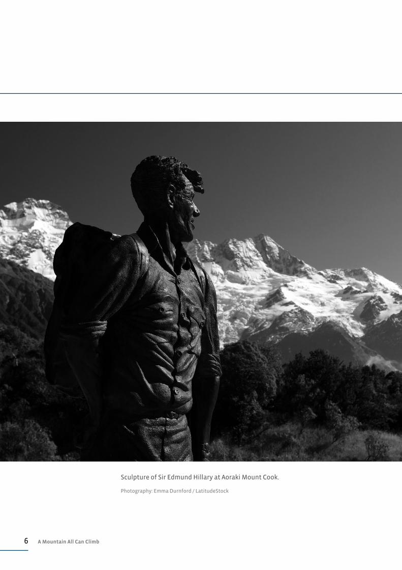
Sculpture of Sir Edmund Hillary at Aoraki Mount Cook.
Photography: Emma Durnford / LatitudeStock
7Foreword: A Mountain We Can All Climb
WHAT DO WE VALUE?New Zealand’s greatest mountaineer, Sir Edmund Hillary, once reflected, ‘In
some ways I believe I epitomise the average New Zealander: I have modest
abilities, I combine these with a good deal of determination, and I rather like to
succeed.’ Such a self-effacing self-assessment was one of the reasons Sir Ed was
so revered by so many New Zealanders. We embraced his modesty and apparent
ordinariness. He was one of us; he personified our values.
And yet he conquered mountains.
Our country is now vastly different to the one Sir Ed grew up in during the 1920s
and the Great Depression. We are different ethnically, culturally and in terms of
our lifetime experiences. Most of us live in large towns or suburbs, not in small
towns or rural communities. Many work in professional or service sector jobs,
not on farms or in factories. And we lead lives of relative ease. At least, most of
us do.
Given our broadening cultural and ethnic diversity, it is increasingly difficult to
identify unifying trends around which to create and embed a national culture.
Clearly, the Treaty of Waitangi and the relationship between Māori and the
Crown offers a uniquely New Zealand cultural identity, but outside of this what
else defines us as a national community?
We can help capture our emerging cultural values by asking: What are the things
that make us passionate as a nation? What inspires us? What brings us hope?
There are strong signs that New Zealanders care deeply about the plight of our
poorest children. The Prime Minister’s post-election pledge to address child
poverty is a reflection of this concern. To some extent, this shared concern has
become a cultural value—the idea that we collectively have a responsibility to
our nation’s children and to ensuring that they all do well. Ideally, public policy
should look to reinforce this cultural value, rather than limit it by focusing on
fiscal issues ahead of social progress and wellbeing.
DOING THE RIGHT THINGAs a nation, we appear to value fairness. We believe in people—our people—
getting a fair go. We are inspired by those who go out of their way to care for
and contribute to their communities—by those who help others scale the
mountains of adversity that sometimes block their way. And we believe in doing
the right thing.
There are emerging signs of positive change offered in this State of the Nation
report. Sometimes such positive progress arises as we collectively recognise the
need for change. These cultural shifts happen for no apparent reason except,
FOREWORD: A MOUNTAIN WE CAN ALL CLIMB

8 A Mountain All Can Climb
perhaps, some growing awareness that ‘it is the right thing to do’.
Those responsible for public policy might claim credit for these positive
changes. However, the connection between public policy and social progress
is a complex and somewhat vexed relationship. Not every social outcome is
the result of good or bad public policy, and it would be wrong to assume that
governments can change, or indeed should influence, everything in our lives.
However, public policy can shape opportunity and it can reinforce positive
cultural change. Perhaps such purposes should be seen as its raison d’être.
CLIMBING THE MOUNTAINWe New Zealanders have a great deal to be thankful for, but this State of the
Nation report also identifies a number of areas where we are losing ground or
could simply do much better.
Not everyone is getting a fair go. For example, resources are not always
allocated to the communities that need them the most. Will we simply accept
this? Or will we do the right thing as a nation and fight for everyone to receive
the opportunity to climb the mountain of improved social wellbeing?
Our national values suggest we really do care about the plight of our fellow
New Zealanders. So let’s strive for the national values we aspire to. Let’s be
vigilant when some are falling behind, ready to act on our belief that everyone
deserves to make progress. Policy makers must be clear about what we want for
our people—all people—just as they are now clearer about the urgent need to
address child poverty. We must give voice to the values we want to shape our
nation. Otherwise, it is too easy for politicians to give our concerns low priority.
Sir Ed saw every mountain as an opportunity for success. As a nation, we must
be as determined and committed as he was. Collectively, we can ensure that
everyone is supported to conquer this mountain.
MAJOR SUE HAYDirector
The Salvation Army Social Policy and Parliamentary Unit

9Foreword: A Mountain We Can All Climb

10 A Mountain All Can Climb
AT A GLANCE
A SUMMARY OF CHANGES IN KEY SOCIAL INDICATORS DURING 2014
OUR CHILDREN Child povertyPercentage of children living in benefit-dependent households
Children at riskNumber of substantiated cases of child abuse or neglect
Children & violenceNumber of offences against children for violence mistreatment or neglect
Early childhood educationGap in enrolment rates between Ma–ori and non-Ma–ori children
Educational achievementGap between students from deciles 1–3 and 8–10 schools leaving school with NCEA Level 2 or better (2013 figures)
Infant mortalityInfant deaths for every 10,000 live births (Sept 2014 figures)
19,623
17%
5,397
25.5%
46.3
–15%
–2%
+3.5%
+0.2%
+3.5
TO
TO
NOT REPORTED
TO
TO
TO

11At a Glance
–2.9% 1,021
CRIME & PUNISHMENT
Overall crimeAll recorded offences as ratio of population (offences per 100,000 popn)
Serious crimeRecorded violent or sexual offences as a proportion of the popn (per 100,000)
ImprisonmentAverage number of prisoners for every 100,000 popn
RecidivismProportion of released prisoners being re-imprisoned within 24 months of their release
7,898–3.7% TO
188
36.8%
–3.2%
–0.5%
TO
TO
TO
Teenage pregnancyRate of pregnancy amongst 15 to 19 year-olds—per 1000 popn (2013 figures)
35–6 TO
KEY Improvement Deterioration
Minimal change Impact unknown

12 A Mountain All Can Climb
–3.0%
–2.0%
AT A GLANCE
Benefits and pensionsThe total number of people receiving a benefit or pension
GamblingAdult per capita spend on gambling
Living costs and food povertyThe annual number of food parcels distributed by The Salvation Army
Drug crimeNumber of recorded drug offences
983,000
$614
55,245
+1.3% TO
TO
TO
TO
SOCIAL HAZARDS
AlcoholAvailability of pure alcohol for consumption (litres per adult)
9.5
15,727
–2.6%
–10%
TO
IncomesAverage weekly wage/salary for employees
$937TO+1.8%
WORK & INCOMES
EmploymentNumber of jobs within the economy
UnemploymentOfficial unemployment rate
2.38Mil+3.5% TO
5.7%–0.4% TO

13At a Glance
+1.1%
HOUSINGHousing availabilityAdditional population for each new dwelling in Auckland
4.9+1.2 TO
+0.9%
Housing affordabilityAverage proportion of household income spent by on housing (all NZ)
Housing debtAverage per household (all NZ)
16.3%
$128,600
TO
TO
KEY Improvement Deterioration
Minimal change Impact unknown
* inflation adjusted change in dollar values
14 A Mountain All Can Climb
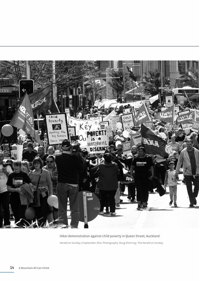
Hikoi demonstration against child poverty in Queen Street, Auckland.
Herald on Sunday, 6 September 2014. Photography: Doug Sherring / The Herald on Sunday
15Our Children
OUR CHILDREN
While most New Zealand children are materially secure and well
supported by their family as well as schools and health services,
a significant minority—perhaps 20%—face a number of social and
economic risks. Over the past two years progress for these children
has been minimal and there are some signs of things getting worse
for the most vulnerable children.
CHILD POVERTYConsistent child poverty measures remain elusive
In the absence of a commonly agreed or officially determined poverty measure
it is difficult to track changes in poverty rates and, in particular, changes in rates
of child poverty. Such ambiguity also makes it difficult to design and assess
policy initiatives that are meant to address child poverty.
An example of such ambiguity is around the distinction between ‘relative
income poverty’ and ‘material poverty’ (or ‘material hardship’). Relative income
poverty refers to someone’s economic and social status relative to the norm
for their society. One is said to be relatively poor if, for example, their income
is below a certain percentage of the median or average income. Material
poverty (or material hardship) is a measure of the material resources a person
has access to —not their financial resources. Someone is said to be living in
material poverty if they lack resources considered fundamental to leading a
reasonable life in that society. In New Zealand, this would include lack of access
to electricity, a warm and secure house, and running water. It could extend to
access to a phone and three meals a day.
The overlap between income poverty and material poverty is far from exact with
Brian Perry 1 recently suggesting that perhaps only 35%to 40% of New Zealand’s
low income households are both income poor and materially deprived.2
Nevertheless he estimates that around 20% of New Zealand children are either
income poor or living in material hardship.3 Perry suggests that around 11% of
all children are both income poor and materially deprived.4
Essentially, most estimates of child poverty and deprivation in New Zealand are
taken from the same source: the Household Economic Survey (HES) undertaken
by Statistics New Zealand in the middle of each year. Estimates of child poverty
rates from HES vary according to which definition is used. At the top end are
estimates such as those reported in the recently released Child Poverty Monitor
2014, with suggestions that the number of children living in relative income
poverty could be as high as 260,000.5 At the bottom end is the estimate of Perry
that 11% of children are both income poor and materially deprived—this 11%
equates to around 110,000 children.

16 A Mountain All Can Climb
We can see that there is therefore a wide, but well-founded range of figures for
child poverty in New Zealand. However, the Prime Minister has extended the
ambiguity by suggesting the number of children he is focusing on in his bid to
combat child poverty is between 6000 and 100,000.6
Little change seen in relative child poverty rates
The various income-based measures of relative child poverty have been
reported by Perry and are based on the 2013 HES. These measures, based on
relative incomes after housing costs are deducted, are reported in summary
in Table 1 for the period 2009 to 2013. Each of these measures has merits and
weaknesses, but they all paint a picture of relative stability—child poverty rates
changed little between 2009 and 2013 and have generally sat around 16% to 28%
depending on which measure is used.
Other child poverty rates may have improved slightly
As noted above, most measures of child poverty are based on the HES
undertaken by Statistics New Zealand and released in November each year.
Following release, further analysis of the HES data is undertaken by the Treasury
and the Ministry of Social Development (MSD) to develop the various poverty
measures reported in Perry’s work. This is then published in July the following
year, which means any published estimates of child poverty can be 12 to 18
months out of date.
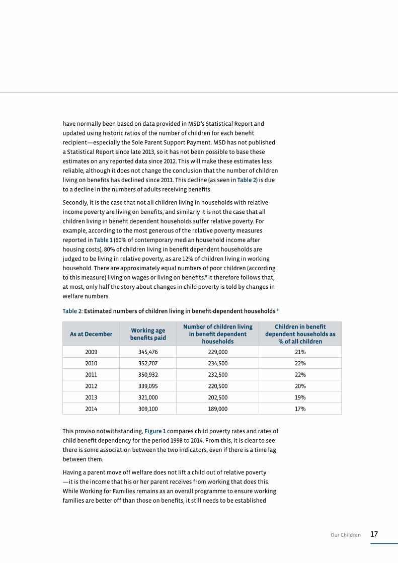
As a proxy for more recent changes in child poverty previous State of the Nation
reports have used changes in the number of children living in benefit-dependent
households (estimates for December 2014 are provided in Table 2). These
estimates suggest the number of children living on benefits dropped from 19%
at the end of 2013 to around 17% at the end of 2014.
These estimates, and the use which is being made of them here, need further
explanation and some justification. Firstly, the estimates of number of children
Table 1: Percentage of children living below selected poverty lines (after housing costs) 7
Threshold Constant Value Relative To Contemporary Median
Year60% of 1998
median income60% of 2007
median income50% of contemporary
median income60% of contemporary
median income
2009 17 22 18 25
2010 16 24 19 28
2011 19 24 20 27
2012 18 23 20 27
2013 17 17 19 24
17Our Children
have normally been based on data provided in MSD’s Statistical Report and
updated using historic ratios of the number of children for each benefit
recipient—especially the Sole Parent Support Payment. MSD has not published
a Statistical Report since late 2013, so it has not been possible to base these
estimates on any reported data since 2012. This will make these estimates less
reliable, although it does not change the conclusion that the number of children
living on benefits has declined since 2011. This decline (as seen in Table 2) is due
to a decline in the numbers of adults receiving benefits.
Secondly, it is the case that not all children living in households with relative
income poverty are living on benefits, and similarly it is not the case that all
children living in benefit dependent households suffer relative poverty. For
example, according to the most generous of the relative poverty measures
reported in Table 1 (60% of contemporary median household income after
housing costs), 80% of children living in benefit dependent households are
judged to be living in relative poverty, as are 12% of children living in working
household. There are approximately equal numbers of poor children (according
to this measure) living on wages or living on benefits.8 It therefore follows that,
at most, only half the story about changes in child poverty is told by changes in
welfare numbers.
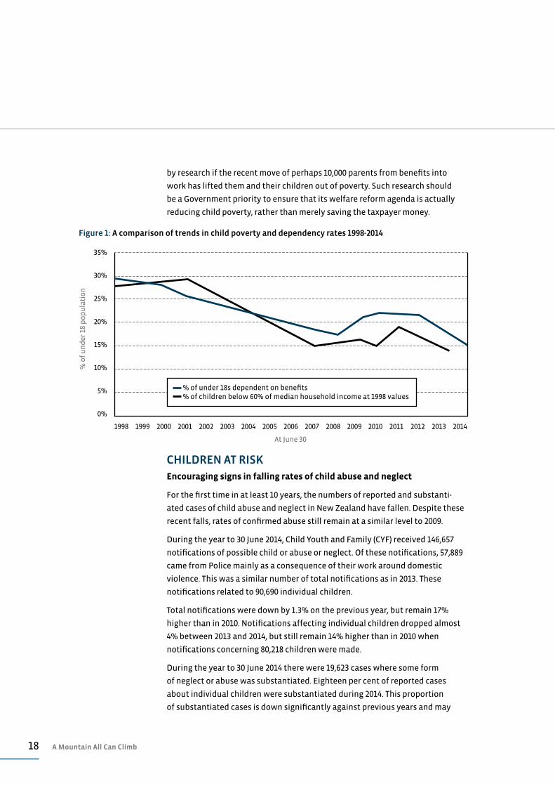
This proviso notwithstanding, Figure 1 compares child poverty rates and rates of
child benefit dependency for the period 1998 to 2014. From this, it is clear to see
there is some association between the two indicators, even if there is a time lag
between them.
Having a parent move off welfare does not lift a child out of relative poverty
—it is the income that his or her parent receives from working that does this.
While Working for Families remains as an overall programme to ensure working
families are better off than those on benefits, it still needs to be established
Table 2: Estimated numbers of children living in benefit-dependent households 9
As at DecemberWorking age benefits paid
Number of children living in benefit dependent
households
Children in benefit dependent households as
% of all children
2009 345,476 229,000 21%
2010 352,707 234,500 22%
2011 350,932 232,500 22%
2012 339,095 220,500 20%
2013 321,000 202,500 19%
2014 309,100 189,000 17%
18 A Mountain All Can Climb
by research if the recent move of perhaps 10,000 parents from benefits into
work has lifted them and their children out of poverty. Such research should
be a Government priority to ensure that its welfare reform agenda is actually
reducing child poverty, rather than merely saving the taxpayer money.
CHILDREN AT RISKEncouraging signs in falling rates of child abuse and neglect
For the first time in at least 10 years, the numbers of reported and substanti-
ated cases of child abuse and neglect in New Zealand have fallen. Despite these
recent falls, rates of confirmed abuse still remain at a similar level to 2009.
During the year to 30 June 2014, Child Youth and Family (CYF) received 146,657
notifications of possible child or abuse or neglect. Of these notifications, 57,889
came from Police mainly as a consequence of their work around domestic
violence. This was a similar number of total notifications as in 2013. These
notifications related to 90,690 individual children.
Total notifications were down by 1.3% on the previous year, but remain 17%
higher than in 2010. Notifications affecting individual children dropped almost
4% between 2013 and 2014, but still remain 14% higher than in 2010 when
notifications concerning 80,218 children were made.
During the year to 30 June 2014 there were 19,623 cases where some form
of neglect or abuse was substantiated. Eighteen per cent of reported cases
about individual children were substantiated during 2014. This proportion
of substantiated cases is down significantly against previous years and may
35%
30%
25%
20%
15%
10%
5%
0%
% o
f u
nd
er 1
8 p
op
ula
tio
n
At June 30
1998 1999 2000 2001 2002 2003 2004 2005 2006 2007 2008 2009 2010 2011 2012 2013 2014
Figure 1: A comparison of trends in child poverty and dependency rates 1998-2014
% of under 18s dependent on benefits % of children below 60% of median household income at 1998 values
19Our Children
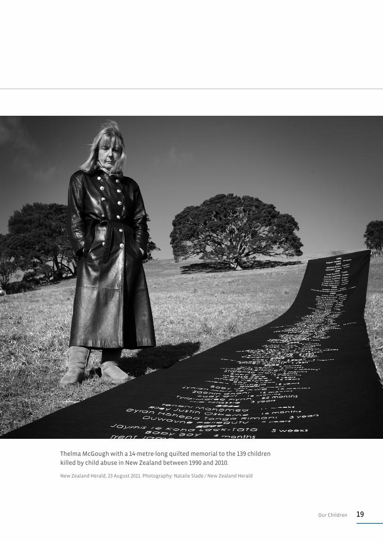
Thelma McGough with a 14-metre-long quilted memorial to the 139 children
killed by child abuse in New Zealand between 1990 and 2010.
New Zealand Herald, 23 August 2011. Photography: Natalie Slade / New Zealand Herald
20 A Mountain All Can Climb
signal a change in practice or threshold being applied by CYF. The average
proportion of notifications substantiated for the previous five years (2009 to
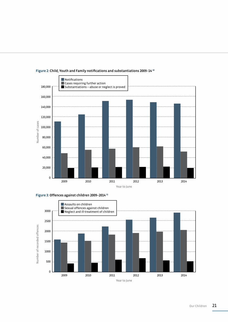
2013) was 15.8%, in comparison to 13.4% in 2014. Figure 2 reports changes in
total notifications, cases requiring further action and substantiations for the six
years—2009 to 2014.
During 2014, there was a slight shift in the nature of abuse or neglect found in
substantiated cases. While cases of emotional abuse continue to be the most
common form of harm against children (making up over 50% of all cases), the
proportion of cases where physical abuse is the most serious harm increased
slightly from 15.2% of individual cases in 2013 to 17.4% in 2014.
CHILDREN AND VIOLENCEFurther increases in recorded criminal violence against children
Despite the fall in the number of substantiated cases of child abuse or neglect,
the number of recorded offences against children rose 3.5% over the year to 30
June 2014 to a new record 5397 offences. This figure is 56% higher than in 2009.
Almost all of this increased offending was due to an increase in the number of
assaults (as illustrated in Figure 3). During 2014, there was a 7.4% increase in
recorded assaults on children, rising from 2667 recorded offences in 2013 to 2864
in 2014. Of this increase, a small majority was from injury assaults, which rose
11% from 1035 offences to 1150. Non-injury assault offences, such as disciplinary
smacking, rose 5% between 2013 and 2014 to 1713.
The number of recorded sexual offences committed against children rose 2.3%
between 2013 and 2014, totalling 2022 offences for the year to 30 June 2014. This
figure is 40% higher than the 1442 offences in 2009.
Recorded cases of child neglect remained much the same between 2013 and
2014, standing at 511 cases for the year to 30 June 2014.
YOUTH OFFENDINGSubstantial fall in youth crime
Offending by young people aged 14 to 16, declined sharply during 2014. During
the year to 30 June 2014, 20,086 14 to 16-year-olds were apprehended for
offences. This is down 14% on the previous year and 38% on 2008/09. Violent
offences committed by 14 to 16-year-olds fell even more sharply, from 3404
apprehensions in 2012/13 to 2885 in 2013/14—a 17% fall.
Around three quarters of all offending by 14 to 16-year-olds is by males,
so for this reason Table 3 focuses on male offending and specifically on
apprehension rates for Māori and non-Māori males. The overall apprehension
21Our Children
180,000
160,000
140,000
120,000
100,000
80,000
60,000
40,000
20,000
0
Figure 2: Child, Youth and Family notifications and substantiations 2009–14 10
2009 2010 2011 2012 2013 2014
Nu
mb
er o
f ca
ses
Year to June
Notifications Cases requiring further action Substantiations—abuse or neglect is proved
Figure 3: Offences against children 2009–2014 11
2009 2010 2011 2012 2013 2014
3000
2500
2000
1500
1000
500
0
Nu
mb
er o
f re
cord
ed o
ffen
ces
Year to June
Assaults on children Sexual offences against children Neglect and ill-treatment of children

22 A Mountain All Can Climb
rate for Māori males aged 14 to 16 fell 13% between 2012/13 and 2013/14,
while the apprehension rate for violent crime dropped by 18%. The decline in
apprehension rates for non-Māori males in the age group was slightly higher at
21% for violent offences and 16% for all offences.
Table 3 illustrates well the continuing and regrettable trend for much higher
apprehension rates for Māori male youth. For the year to June 2014, 14 to 16-year-
old Māori males were four times more likely than non-Māori to be apprehended
for an offence and 3.5 times more likely to be apprehended for a violent crime.
This over representation is even higher for Māori females aged 14 to 16, who are
4.4 times more likely to be apprehended for an offence than their non-Māori
counterparts and 3.8 times more likely to be apprehended for a violent offence.
Of some concern is the trend of a widening gap between Māori and non-Māori
apprehension rates. This is apparent in Table 3, which shows bigger falls in non-
Māori apprehension rates than for Māori. In 2009, 14 to 16-year-old Māori males
were 3.2 times more likely to be apprehended for an offence than non-Māori.
This over representation has risen gradually to four times in 2014. For Māori
females aged 14 to 16, this over representation has risen even more sharply,
from 3.1 times in 2009 to 4.4 times in 2014.
Table 3: Rates of apprehensions for criminal offences by 14 to 16-year-olds 2009–2014 12
Rate per 100,000 population
Year ending June 2009 2010 2011 2012 2013 2014Change
2013–2014
MĀORI MALES AGED 14–16
Acts intended to cause injury 435 479 425 381 374 294 –21%
Serious assault resulting in injury 99 105 83 69 99 55 –44%
Sexual offences 15 5 4 1 4 1 –63%
Robbery 109 118 77 90 73 79 8%
All violent crime 660 745 639 574 556 456 –18%
All crime 4934 5248 4868 4479 3918 3412 –13%
NON-MĀORI MALES AGED 14–16
Acts intended to cause injury 144 145 137 124 103 90 –13%
Serious assault resulting in injury 26 22 20 20 14 12 –12%
Sexual offences 2 3 4 1 2 1 –57%
Robbery 19 15 17 14 10 11 10%
All violent crime 226 224 214 201 166 132 –21%
All crime 1540 1580 1432 1284 1030 860 –16%
23Our Children
Māori youth still prosecuted more than non-Māori
On top of their greater likelihood of apprehension for a criminal offence, Māori
youth who are apprehended are 20% to 50% more likely to be prosecuted by
Police than non-Māori offenders. This has been a long-term practice of Police
and the most recent crime data suggests no sign of any change.
Crime data averaged over the most recent five years (2010-14) shows that Māori
males aged 14 to 16-years-old apprehended for a criminal offence are 1.3 times
more likely to be prosecuted for this offence than non-Māori male offenders
in the same age group. For Māori females in this age group, the difference is
1.4 times. For violent offences, the differences are even more troubling, with
Māori male offenders being 1.5 times more likely to be prosecuted and female
offenders 1.3 times more likely.13
EARLY CHILDHOOD EDUCATIONMinistry of Education fails to report early childhood education
enrolment statistics
No up-to-date data on rates of enrolment at early child education (ECE) centres
is available because the Ministry of Education (MoE) has yet to report these.
Attempts to gain access to this information under the Official Information Act
were unsuccessful at the time of publication.
A census of ECE enrolments is undertaken by the Ministry each July, with
data from this census normally published in the following November on the
Education Counts website. Reported changes in the way the data is being
collected and analysed have delayed the release of the 2014 data. It is therefore
not possible to report on changes in ECE enrolment rates for 2014.
The Ministry of Education will receive $1.5 billion from taxpayers during the
2014/15 financial year to operate ECE programmes on behalf of the Crown. This
funding is distributed to ECE providers for each child enrolled and only for the
time that child attends. This must mean that the Ministry has an extensive and
accurate database for making these payments. The inability of the organisation
to account for the social outcomes it is achieving in a timely manner is
regrettable given the extent of taxpayer investment into this important social
programme.
Other Ministry of Education data offers confusing picture
The Ministry of Education undertakes a survey of new entrants to determine
the extent of their participation in early childhood education prior to starting
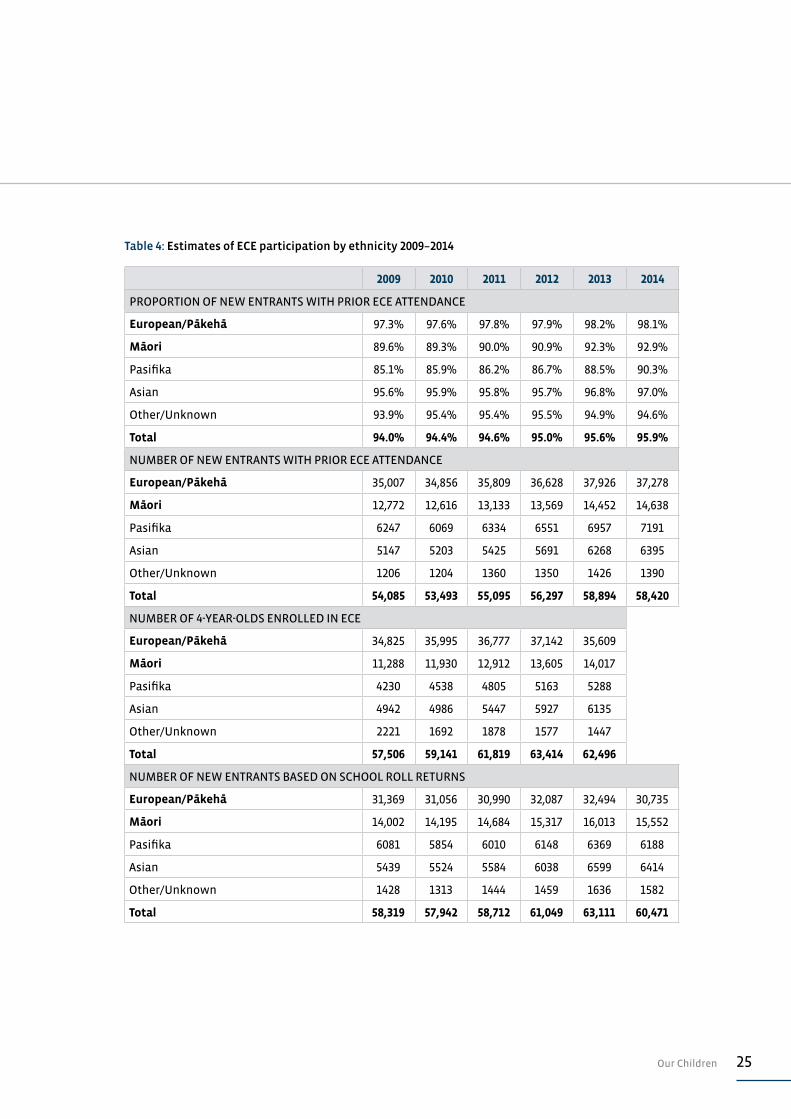
school. A summary of results from this survey is provided at the top of Table 4 14.
This data suggests much higher rates of ECE participation than reported in
24 A Mountain All Can Climb
previous State of the Nation reports. For example, the 2013 report suggested the
enrolment rate for three and four-year-old Māori children was 74.7%, yet during
2014 92.9% of five-year-old Māori children enrolling at school had attended ECE.15
The various MoE data sources offer a confusing picture, not only around ECE
participation but around enrolments in general. Some of this confusion appears
to revolve around how a child’s ethnicity is defined. This ambiguity is reflected
in previous estimates of Māori ECE enrolment undertaken in State of the Nation
reports.
The second block of data offered in Table 4 is the MoE’s estimate of the number
of children who have attended ECE prior to starting school. This data offers
such participation on an ethnicity basis, and the totals offered here are those
reported by the Ministry. It is clear there is double counting of some children
who have two or more ethnicities as the total of all the reported ethnicities in
any year is significantly higher than the total reported by MoE.
The third block of data offered in Table 4 reports ECE enrolments from prior ECE
censuses. This data is also broken down by ethnicities. The totals offered are the
sums of the ethnicities reported so that there is no double or triple counting.16
The final block of data reports estimates of new entrants into primary school by
year and by ethnicity.17
A key point to note from the figures offered in Table 4 is how variable the actual
counts around ethnicity are. For example, in 2014, 98% of European/Pākehā
children (or 37,278 children) had participated in ECE prior to attending school,
yet enrolment data reports that 30,735 European/Pākehā five-year-olds were
enrolled at school.
These discrepancies make it difficult to reliably compare alternative estimates
of social outcomes such as ECE participation. Perhaps the best approach is to
consistently measure an outcome in a certain way to gain some appreciation of
trends over time, rather than trying to reconcile alternative approaches.
The measure of prior ECE participation published by MoE might, in some cases,
overstate such participation. In part, due to the problem of multiple ethnicities
and because it is measuring any participation, however brief or intermittent this
has been. On any account, it does appear that the level of participation by Māori
and Pacific children is improving, which is encouraging.
Improving ECE access for poorer communities
Government appears to be delivering on its objective of improving low income
communities’ access to early childhood education services . This success is on
top of more targeted commitment of $41 million which has been signalled in
Government Budgets.18
25Our Children
Table 4: Estimates of ECE participation by ethnicity 2009–2014
2009 2010 2011 2012 2013 2014
PROPORTION OF NEW ENTRANTS WITH PRIOR ECE ATTENDANCE
European/Pākehā 97.3% 97.6% 97.8% 97.9% 98.2% 98.1%
Māori 89.6% 89.3% 90.0% 90.9% 92.3% 92.9%
Pasifika 85.1% 85.9% 86.2% 86.7% 88.5% 90.3%
Asian 95.6% 95.9% 95.8% 95.7% 96.8% 97.0%
Other/Unknown 93.9% 95.4% 95.4% 95.5% 94.9% 94.6%
Total 94.0% 94.4% 94.6% 95.0% 95.6% 95.9%
NUMBER OF NEW ENTRANTS WITH PRIOR ECE ATTENDANCE
European/Pākehā 35,007 34,856 35,809 36,628 37,926 37,278
Māori 12,772 12,616 13,133 13,569 14,452 14,638
Pasifika 6247 6069 6334 6551 6957 7191
Asian 5147 5203 5425 5691 6268 6395
Other/Unknown 1206 1204 1360 1350 1426 1390
Total 54,085 53,493 55,095 56,297 58,894 58,420
NUMBER OF 4-YEAR-OLDS ENROLLED IN ECE
European/Pākehā 34,825 35,995 36,777 37,142 35,609
Māori 11,288 11,930 12,912 13,605 14,017
Pasifika 4230 4538 4805 5163 5288
Asian 4942 4986 5447 5927 6135
Other/Unknown 2221 1692 1878 1577 1447
Total 57,506 59,141 61,819 63,414 62,496
NUMBER OF NEW ENTRANTS BASED ON SCHOOL ROLL RETURNS
European/Pākehā 31,369 31,056 30,990 32,087 32,494 30,735
Māori 14,002 14,195 14,684 15,317 16,013 15,552
Pasifika 6081 5854 6010 6148 6369 6188
Asian 5439 5524 5584 6038 6599 6414
Other/Unknown 1428 1313 1444 1459 1636 1582
Total 58,319 57,942 58,712 61,049 63,111 60,471
26 A Mountain All Can Climb
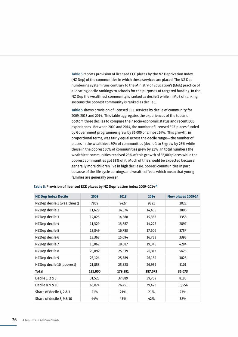
Table 5 reports provision of licensed ECE places by the NZ Deprivation Index
(NZ Dep) of the communities in which these services are placed. The NZ Dep
numbering system runs contrary to the Ministry of Education’s (MoE) practice of
allocating decile rankings to schools for the purposes of targeted funding. In the
NZ Dep the wealthiest community is ranked as decile 1 while in MoE of ranking
systems the poorest community is ranked as decile 1.
Table 5 shows provision of licensed ECE services by decile of community for
2009, 2013 and 2014. This table aggregates the experiences of the top and
bottom three deciles to compare their socio-economic status and recent ECE
experiences. Between 2009 and 2014, the number of licensed ECE places funded
by Government programmes grew by 36,000 or almost 24%. This growth, in
proportional terms, was fairly equal across the decile range—the number of
places in the wealthiest 30% of communities (decile 1 to 3) grew by 26% while
those in the poorest 30% of communities grew by 21% . In total numbers the
wealthiest communities received 23% of this growth of 36,000 places while the
poorest communities got 38% of it. Much of this should be expected because
generally more children live in high decile (ie. poorer) communities in part
because of the life cycle earnings and wealth effects which mean that young
families are generally poorer.
Table 5: Provision of licensed ECE places by NZ Deprivation index 2009–2014 20
NZ Dep Index Decile 2009 2013 2014 New places 2009-14
NZDep decile 1 (wealthiest) 7869 9427 9891 2022
NZDep decile 2 11,629 14,074 14,435 2806
NZDep decile 3 12,025 14,388 15,383 3358
NZDep decile 4 11,329 13,887 14,226 2897
NZDep decile 5 13,849 16,783 17,606 3757
NZDep decile 6 13,363 15,694 16,758 3395
NZDep decile 7 15,062 18,687 19,346 4284
NZDep decile 8 20,892 25,539 26,317 5425
NZDep decile 9 23,124 25,389 26,152 3028
NZDep decile 10 (poorest) 21,858 25,523 26,959 5101
Total 151,000 179,391 187,073 36,073
Decile 1, 2 & 3 31,523 37,889 39,709 8186
Decile 8, 9 & 10 65,874 76,451 79,428 13,554
Share of decile 1, 2 & 3 21% 21% 21% 23%
Share of decile 8, 9 & 10 44% 43% 42% 38%
27Our Children
Between 2009 and 2014, the annual per place operating subsidy for ECE service
rose from $7500 to $8100 at June 2014 dollar values.19 This real increase in
operating funding alongside the additional ECE places being offered in poor
communities has meant that additional funding has gone disproportionately to
poorer communities. Between 2009 and 2014 the annual value of ECE subsidies
into the wealthiest 30% of communities rose by $84 million (at June 2014 dollar
values) while the subsidy going into the poorest 30% of communities rose by
$147 million per year.
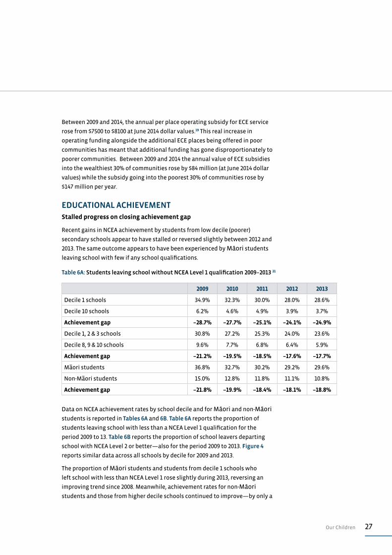
EDUCATIONAL ACHIEVEMENTStalled progress on closing achievement gap
Recent gains in NCEA achievement by students from low decile (poorer)
secondary schools appear to have stalled or reversed slightly between 2012 and
2013. The same outcome appears to have been experienced by Māori students
leaving school with few if any school qualifications.
Data on NCEA achievement rates by school decile and for Māori and non-Māori students is reported in Tables 6A and 6B. Table 6A reports the proportion of
students leaving school with less than a NCEA Level 1 qualification for the
period 2009 to 13. Table 6B reports the proportion of school leavers departing
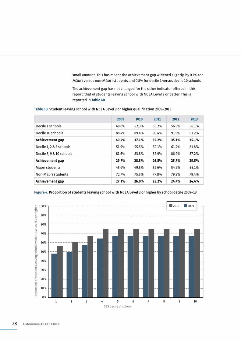
school with NCEA Level 2 or better—also for the period 2009 to 2013. Figure 4
reports similar data across all schools by decile for 2009 and 2013.
The proportion of Māori students and students from decile 1 schools who
left school with less than NCEA Level 1 rose slightly during 2013, reversing an
improving trend since 2008. Meanwhile, achievement rates for non-Māori students and those from higher decile schools continued to improve—by only a
Table 6A: Students leaving school without NCEA Level 1 qualification 2009–2013 21
2009 2010 2011 2012 2013
Decile 1 schools 34.9% 32.3% 30.0% 28.0% 28.6%
Decile 10 schools 6.2% 4.6% 4.9% 3.9% 3.7%
Achievement gap –28.7% –27.7% –25.1% –24.1% –24.9%
Decile 1, 2 & 3 schools 30.8% 27.2% 25.3% 24.0% 23.6%
Decile 8, 9 & 10 schools 9.6% 7.7% 6.8% 6.4% 5.9%
Achievement gap –21.2% –19.5% –18.5% –17.6% –17.7%
Ma–ori students 36.8% 32.7% 30.2% 29.2% 29.6%
Non-Ma–ori students 15.0% 12.8% 11.8% 11.1% 10.8%
Achievement gap –21.8% –19.9% –18.4% –18.1% –18.8%
28 A Mountain All Can Climb
100%
90%
80%
70%
60%
50%
40%
30%
20%
10%
0%Pro
po
rtio
n o
f st
ud
ents
leav
ing
sch
oo
l wit
h N
CE
A L
evel
2 o
r h
igh
er
SES decile of school
Figure 4: Proportion of students leaving school with NCEA Level 2 or higher by school decile 2009–13
2013 2009
1 2 3 4 5 6 7 8 9 10
Table 6B: Student leaving school with NCEA Level 2 or higher qualification 2009–2013
2009 2010 2011 2012 2013
Decile 1 schools 48.0% 52.3% 55.2% 56.8% 56.1%
Decile 10 schools 88.4% 89.4% 90.4% 91.9% 91.2%
Achievement gap 40.4% 37.1% 35.2% 35.1% 35.1%
Decile 1, 2 & 3 schools 51.9% 55.5% 59.1% 61.2% 61.8%
Decile 8, 9 & 10 schools 81.6% 83.8% 85.9% 86.9% 87.2%
Achievement gap 29.7% 28.3% 26.8% 25.7% 25.5%
Ma–ori students 45.6% 49.5% 52.6% 54.9% 55.1%
Non-Ma–ori students 72.7% 75.5% 77.8% 79.3% 79.4%
Achievement gap 27.1% 26.0% 25.2% 24.4% 24.4%
small amount. This has meant the achievement gap widened slightly, by 0.7% for
Māori versus non-Māori students and 0.8% for decile 1 versus decile 10 schools.
The achievement gap has not changed for the other indicator offered in this
report: that of students leaving school with NCEA Level 2 or better. This is
reported in Table 6B.
29Our Children
While these changes might only be seen as marginal, they are nonetheless
disappointing; in part, because they signal that progress on reducing
educational inequalities has faltered. The size of the achievement gaps
themselves remains a source of some concern, and the lack of any sustained and
worthwhile progress in closing these gaps is discouraging given the clear links
which exist between poor educational outcomes and poor life opportunities.
Any reform of education takes time to flow through to tangible end results
such as school leaver qualifications. There are, however, few if any emerging
signs that recent reforms are having any substantial impact on what must
now be seen as persistent educational inequality between poor and well-off
communities and between Māori and non-Māori.
INFANT MORTALITYInfant mortality rises especially for Māori.
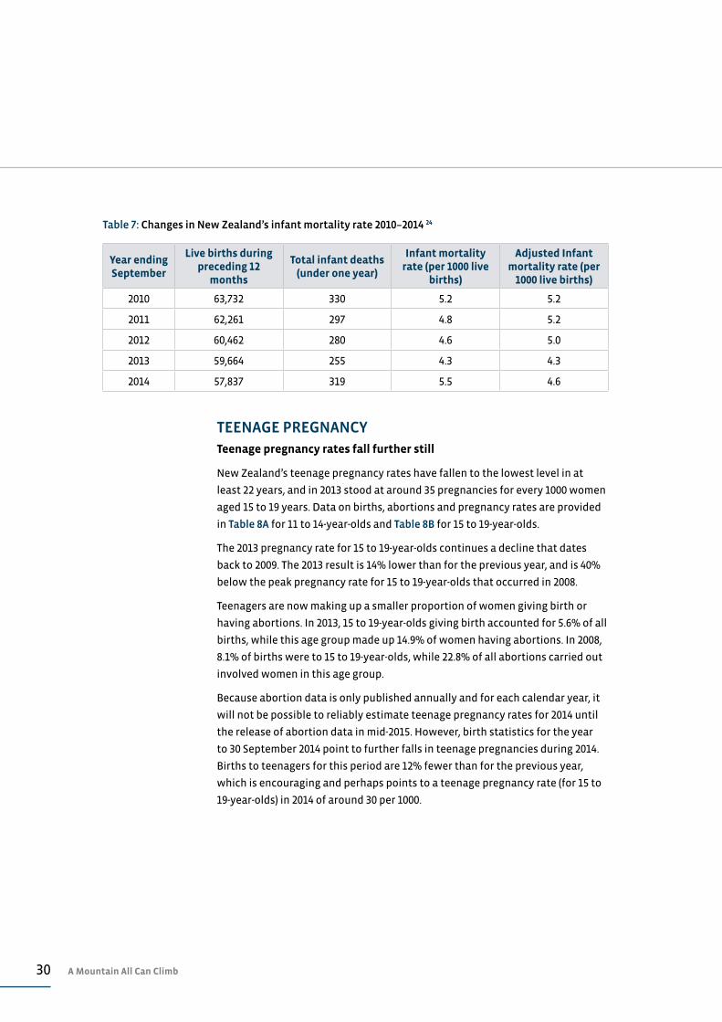
New Zealand’s reported infant mortality rate appears to have spiked between
2013 and 2014, rising from 4.3 infant deaths for every 1000 live births in the year
to 30 September 2013 to 5.5 deaths per 1000 births in the following year. This
increase, along with data on births and infant deaths for the period 2010 to 2014,
is reported in Table 7.
These results are apparently an anomaly due to the late reporting of 51 infant
deaths by an Auckland district health board. The number of recorded infant
deaths is based on the year of registration of these deaths and not on the
actual year of death, so it appears this anomaly will not be revised or corrected.
Statistics New Zealand reports that 51 infant deaths were reported in May and
June 2014, which related to deaths during 2011 and 2012. Table 7 contains an
additional column that provides estimates of adjusted infant mortality rates to
take account of this late reporting.22
Overall, it appears that infant mortality rates have fallen gradually over the
five-year period covered by Table 7, although the 2014 outcome is slightly higher
than the 2013 result.
Of the 319 recorded infant deaths during the year to 30 September 2014, 37% or
121 were of Māori infants. This means that the recorded Māori infant mortality
rate was 7.5 infant deaths for every 1000 live births, which is 1.6 times the rate
for non-Māori. This margin of 1.6 times has been a persistent gap for at least the
past decade.
Australian infant mortality rates continue to be around 85% of New Zealand
rates. In 2013, their infant mortality rate was 3.6 infant deaths for every 1000 live
births, while for indigenous Australians it was 6.5.23
30 A Mountain All Can Climb
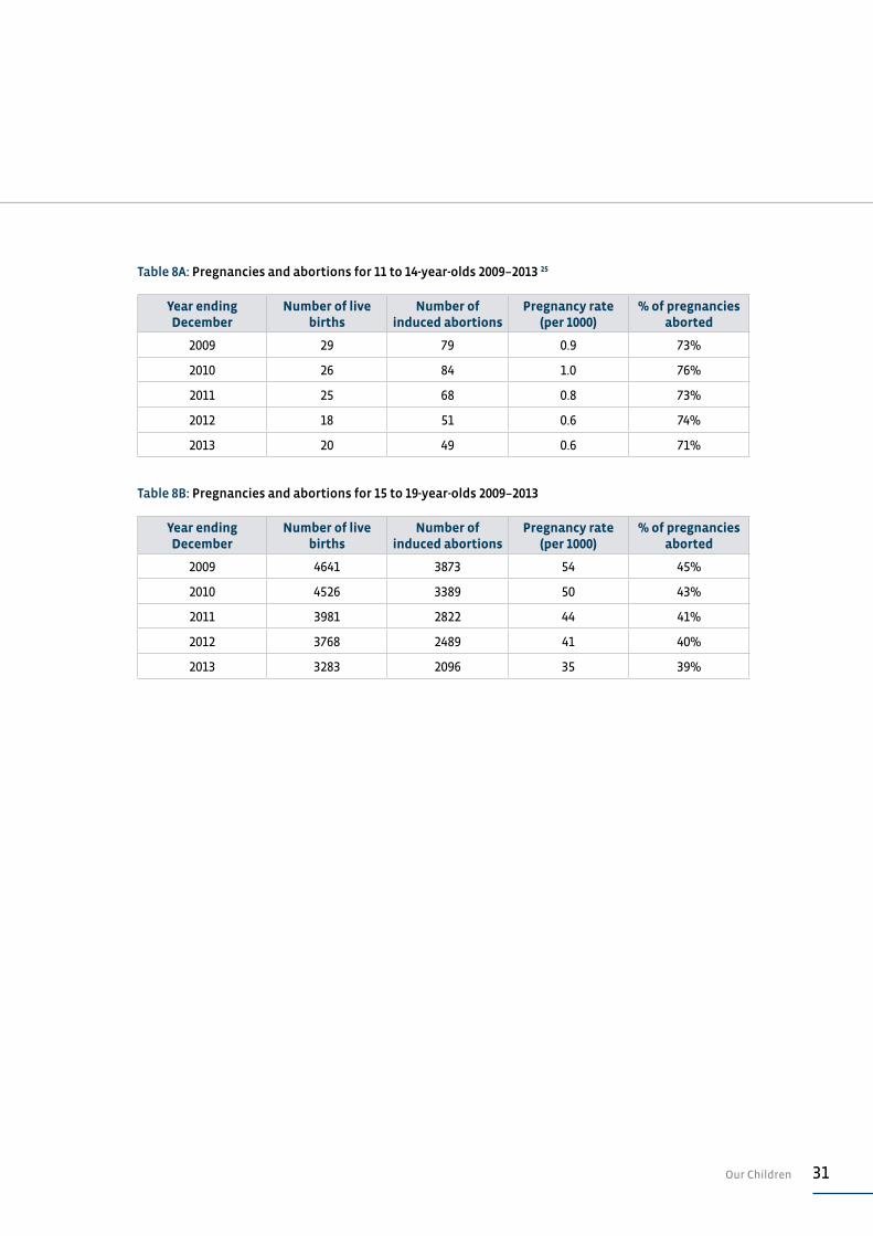
TEENAGE PREGNANCYTeenage pregnancy rates fall further still
New Zealand’s teenage pregnancy rates have fallen to the lowest level in at
least 22 years, and in 2013 stood at around 35 pregnancies for every 1000 women
aged 15 to 19 years. Data on births, abortions and pregnancy rates are provided
in Table 8A for 11 to 14-year-olds and Table 8B for 15 to 19-year-olds.
The 2013 pregnancy rate for 15 to 19-year-olds continues a decline that dates
back to 2009. The 2013 result is 14% lower than for the previous year, and is 40%
below the peak pregnancy rate for 15 to 19-year-olds that occurred in 2008.
Teenagers are now making up a smaller proportion of women giving birth or
having abortions. In 2013, 15 to 19-year-olds giving birth accounted for 5.6% of all
births, while this age group made up 14.9% of women having abortions. In 2008,
8.1% of births were to 15 to 19-year-olds, while 22.8% of all abortions carried out
involved women in this age group.
Because abortion data is only published annually and for each calendar year, it
will not be possible to reliably estimate teenage pregnancy rates for 2014 until
the release of abortion data in mid-2015. However, birth statistics for the year
to 30 September 2014 point to further falls in teenage pregnancies during 2014.
Births to teenagers for this period are 12% fewer than for the previous year,
which is encouraging and perhaps points to a teenage pregnancy rate (for 15 to
19-year-olds) in 2014 of around 30 per 1000.
Table 7: Changes in New Zealand’s infant mortality rate 2010–2014 24
Year ending September
Live births during preceding 12
months
Total infant deaths (under one year)
Infant mortality rate (per 1000 live
births)
Adjusted Infant mortality rate (per
1000 live births)
2010 63,732 330 5.2 5.2
2011 62,261 297 4.8 5.2
2012 60,462 280 4.6 5.0
2013 59,664 255 4.3 4.3
2014 57,837 319 5.5 4.6
31Our Children
Table 8A: Pregnancies and abortions for 11 to 14-year-olds 2009–2013 25
Year ending December
Number of live births
Number of induced abortions
Pregnancy rate (per 1000)
% of pregnancies aborted
2009 29 79 0.9 73%
2010 26 84 1.0 76%
2011 25 68 0.8 73%
2012 18 51 0.6 74%
2013 20 49 0.6 71%
Table 8B: Pregnancies and abortions for 15 to 19-year-olds 2009–2013
Year ending December
Number of live births
Number of induced abortions
Pregnancy rate (per 1000)
% of pregnancies aborted
2009 4641 3873 54 45%
2010 4526 3389 50 43%
2011 3981 2822 44 41%
2012 3768 2489 41 40%
2013 3283 2096 35 39%

32 A Mountain All Can Climb
ASSESSMENT: OUR CHILDREN
CHILD POVERTY RESULT
The picture around child poverty is becoming quite blurred given the emerging policy distinction between relative income poverty and material poverty (or hardship). Any forthcoming policy focus on reducing child poverty rates needs to be more precise, both about what poverty measures will be focused on, and how many children are seen to be within the priority group. Recent declines in the number of children living in benefit-dependent households is welcome news, although there is no evidence available to suggest that children no longer reliant on benefits are any better off—in monetary or material terms. Such improvements are the real measure of progress, not dropping benefit numbers.
C–
CHILDREN AT RISK
The small decline in the number of notifications of suspected child abuse or neglect is welcome news, as it appears to have been driven by fewer public reports instead of changing Police practice, as in the past. The apparent decline in the number of children actually being harmed through abuse or neglect should be taken at face value and also welcomed. The sudden decline in the proportion of reported cases that are substantiated should be explored further as this drop may simply be due to changing practice or less stringent thresholds. Either way, children’s wellbeing is at stake and greater transparency should be expected.
C+
CHILDREN AND VIOLENCE
A further increase in recorded abuse, violence and neglect of children is regrettable. The recent disproportionate increase in assaults involving injury and the 40% rise over the past five years in recorded sexual assaults of children is very disappointing. These increases may, however, be due to reduced tolerance of such offending and greater vigilance by CYF and Police. If so, these trends should be applauded.
D
EARLY CHILDHOOD EDUCATION
The failure of the Ministry of Education to account for social outcomes achieved through its $1.5 billion spend on early childhood education is regrettable. Other indicators of ECE outcomes offered by the Ministry show some improvement. Sadly, the faster growth of ECE opportunities in well-off communities points to a real disconnect between Government rhetoric around ECE provision and the realities it is paying for.
not able to assess
33Assessment: Our Children
EDUCATIONAL ACHIEVEMENT
There is a yawning gap in educational achievement between poor and well-off communities. In the past there has been steady, if only very modest, progress in closing this gap, so its size could perhaps be overlooked. However, this progress appears to have stopped, especially in the proportion of students leaving school with few, if any, qualifications. These gaps are simply inexcusable if we are to have a New Zealand that is inclusive and prosperous. It is disappointing that the education reforms of the past three years appear to have done little so far to meet the needs of New Zealand’s more vulnerable children.
C–
INFANT MORTALITY
Confusion around late reporting of infant deaths does little to enhance the reliability of official statistics, but at least the error has been acknowledged even if the statistics are not amended. Even adjusting for this late reporting, infant mortality rates have shown a slight increase, which is disappointing. This is especially so for the Māori infant mortality rate, which persistently remains at 1.6 times the non-Māori rate and is comparable to infant mortality rates for indigenous Australians.
C
TEENAGE PREGNANCY
Further declines in rates of teenage pregnancy suggest New Zealand is experiencing something of a cultural change. These changes pre-date the Government’s policy emphasis on reducing teenage pregnancies, although these initiatives have probably reinforced and consolidated the reductions. Further improvements appeared to be emerging during 2014, which is extremely encouraging.
A
KEY A: Excellent progress B: Encouraging progress C: Limited or modest progress D: No progress or going backwards F: Failing
34 A Mountain All Can Climb
Kaitaia three-year-olds Ella Lawrence-Samuels and Ryder Roy plant white
ribbons outside Kaitaia’s Hope Christian Centre for White Ribbon Day.
Northland Age, 25 November 2014. Photography: Peter de Graaf / Northern Advocate

35Crime & Punishment
CRIME & PUNISHMENT
Recent falls in recorded crime continued during 2014, although there is
no reliable way of knowing if this is due to falling rates of offending or
changes in the way crime is reported by victims and then recorded by
Police. Against this overall decline, the incidence of violent crime has
changed little, and an even greater share of this violence is occurring
in homes. Prisoner numbers have begun to drop on the back of falling
crime numbers and there appears to have been further modest
progress in reducing re-offending by released prisoners.
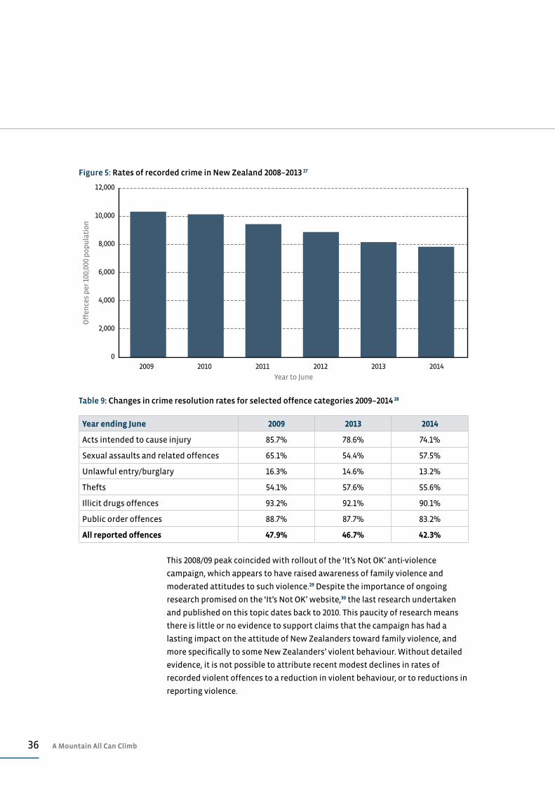
OVERALL CRIME Recorded crime falls for fifth consecutive year
Recorded crime for the year to 30 June 2014 fell a further 3% in terms of the total
number of offences to 353,564 offences. This decline follows a 7% decline the
previous year and means that recorded crime was 20% lower during 2013/14
than it was five years ago (in 2008/09), when there were 442,540 recorded
offences. The most recent crime figures are the lowest number of recorded
offences in nearly 30 years.26
In terms of offending rates, these outcomes look even better. For 2013/14, there
were 7898 recorded offences for every 100,000 population, 3.7% lower than
in 20012/13 and 23% below the 2008/09 figure of 10,310 offences per 100,000.
The trend in overall offending over the past five years is seen in Figure 5. The
offending rate hit a peak in 2002/03 when there were 11,203 recorded offences
per 100,000—almost 42% more than 2013/14.
Crime resolution at twelve-year low
The fall in rates of recorded offending has been matched by almost across-the-
board declines in rates of resolution. For the 2013/14 year, the Police resolved
42.3% of recorded crime, down 4.5% on the previous year and 5.6% lower than in
2008/09. The 2013/14 result is the lowest level of crime resolution since 2001/02,
when 40.8% of recorded offences were resolved. Resolution rates for various
categories of crime for the past five years are reported in Table 9.
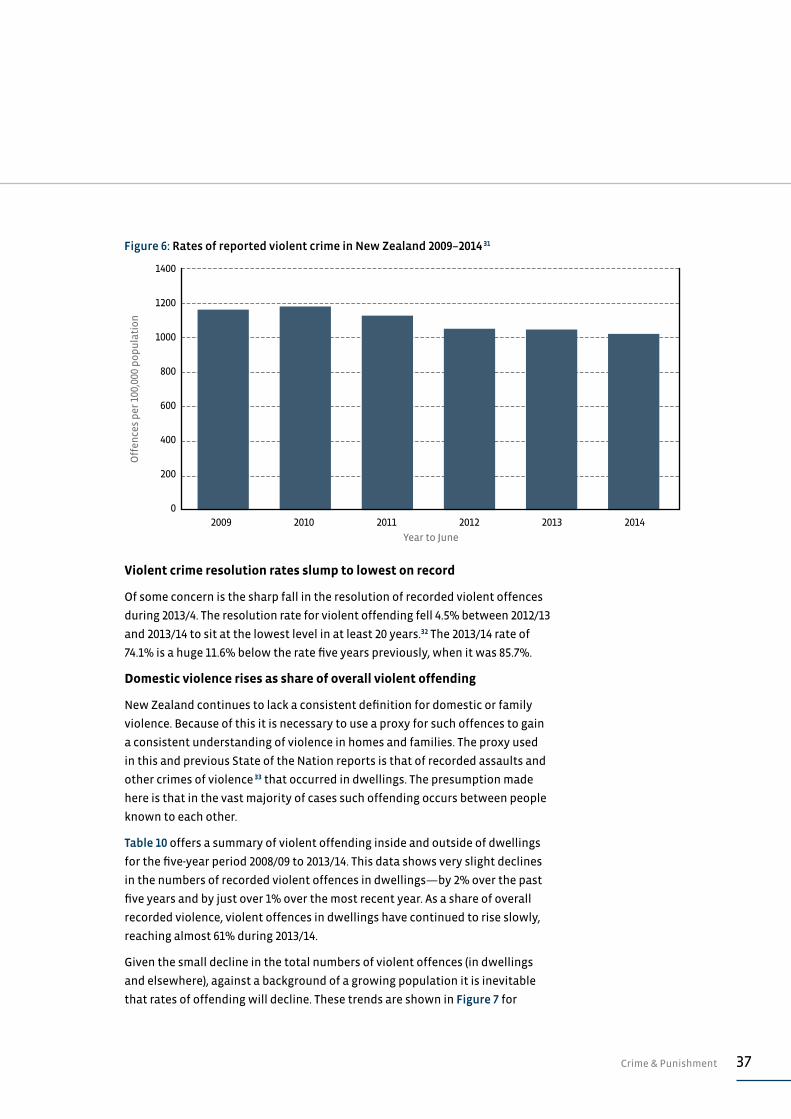
VIOLENT CRIME Recorded violent crime at six-year low
During 2012/13, the rate of recorded violent offences fell to a six-year low of
1021 recorded violent offences for every 100,000 people in the New Zealand
population. This is a modest 3% lower than the previous year, and 12% off the
peak rate of 1167 offences per 100,000 recorded offences in 2008/09. Trends in
recorded violent offending over the most recent five years are in Figure 6.
36 A Mountain All Can Climb
This 2008/09 peak coincided with rollout of the ‘It’s Not OK’ anti-violence
campaign, which appears to have raised awareness of family violence and
moderated attitudes to such violence.29 Despite the importance of ongoing
research promised on the ‘It’s Not OK’ website,30 the last research undertaken
and published on this topic dates back to 2010. This paucity of research means
there is little or no evidence to support claims that the campaign has had a
lasting impact on the attitude of New Zealanders toward family violence, and
more specifically to some New Zealanders’ violent behaviour. Without detailed
evidence, it is not possible to attribute recent modest declines in rates of
recorded violent offences to a reduction in violent behaviour, or to reductions in
reporting violence.
12,000
10,000
8,000
6,000
4,000
2,000
0
Off
ence
s p
er 1
00,0
00 p
op
ula
tio
n
Year to June
2009 2010 2011 2012 2013 2014
Figure 5: Rates of recorded crime in New Zealand 2008–2013 27
Table 9: Changes in crime resolution rates for selected offence categories 2009–2014 28
Year ending June 2009 2013 2014
Acts intended to cause injury 85.7% 78.6% 74.1%
Sexual assaults and related offences 65.1% 54.4% 57.5%
Unlawful entry/burglary 16.3% 14.6% 13.2%
Thefts 54.1% 57.6% 55.6%
Illicit drugs offences 93.2% 92.1% 90.1%
Public order offences 88.7% 87.7% 83.2%
All reported offences 47.9% 46.7% 42.3%
37Crime & Punishment
Violent crime resolution rates slump to lowest on record
Of some concern is the sharp fall in the resolution of recorded violent offences
during 2013/4. The resolution rate for violent offending fell 4.5% between 2012/13
and 2013/14 to sit at the lowest level in at least 20 years.32 The 2013/14 rate of
74.1% is a huge 11.6% below the rate five years previously, when it was 85.7%.
Domestic violence rises as share of overall violent offending
New Zealand continues to lack a consistent definition for domestic or family
violence. Because of this it is necessary to use a proxy for such offences to gain
a consistent understanding of violence in homes and families. The proxy used
in this and previous State of the Nation reports is that of recorded assaults and
other crimes of violence 33 that occurred in dwellings. The presumption made
here is that in the vast majority of cases such offending occurs between people
known to each other.
Table 10 offers a summary of violent offending inside and outside of dwellings
for the five-year period 2008/09 to 2013/14. This data shows very slight declines
in the numbers of recorded violent offences in dwellings—by 2% over the past
five years and by just over 1% over the most recent year. As a share of overall
recorded violence, violent offences in dwellings have continued to rise slowly,
reaching almost 61% during 2013/14.
Given the small decline in the total numbers of violent offences (in dwellings
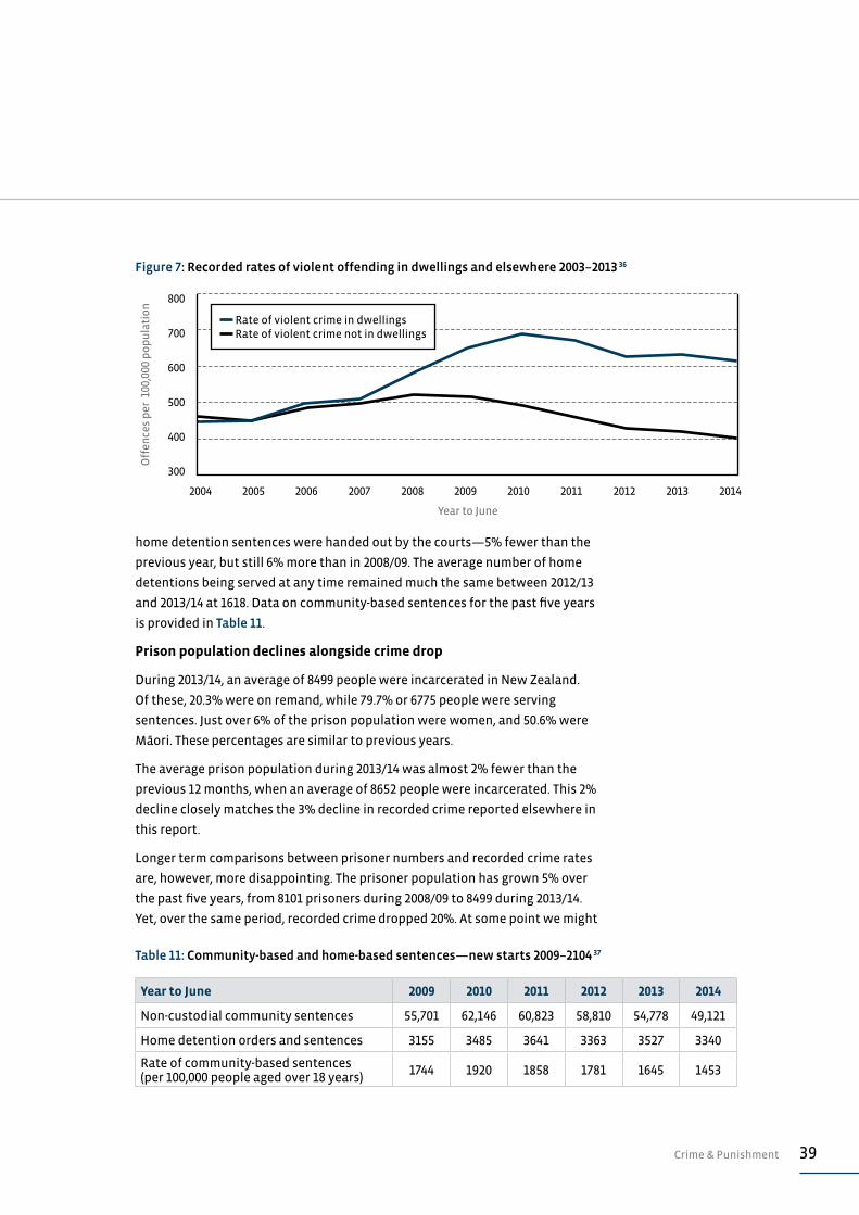
and elsewhere), against a background of a growing population it is inevitable
that rates of offending will decline. These trends are shown in Figure 7 for
1400
1200
1000
800
600
400
200
0
Off
ence
s p
er 1
00,0
00 p
op
ula
tio
n
Year to June
2009 2010 2011 2012 2013 2014
Figure 6: Rates of reported violent crime in New Zealand 2009–2014 31
38 A Mountain All Can Climb
the 10 years 2004/05 to 2013/14. This period covers the rollout of the ‘It’s Not
OK’ campaign (2007-2010), and show a sharp rise in rates of recorded violence
in dwellings, with little change in such offending elsewhere. The identifiable
trend since 2010 has been some decline in rates of recorded offences outside of
dwellings, although recorded violence within dwellings has remained more or
less unchanged since 2012.
More recently, Statistics New Zealand and New Zealand Police have begun
publishing statistics on the relationship between offenders and victims—in
cases where the offender is known.34 This data only dates back to July 2014 and
will ultimately be based on a six-month review horizon. The only data available
to date that has a reasonable review period of at least three months, is from
July 2014. The preliminary picture offered by this data is that only around 40% of
assaults are committed by people known to the victim—24% by family members
and 16% by others. Against this, 44% of offenders have not been identified.
These proportions are at odds with the 61% of recorded violent offences in
dwellings (most of which are assaults) and which are assumed here to represent
domestic violence. Clearly, a greater volume of data and some analysis of who
else is committing assaults in dwellings is required before a clearer picture can
be gained. This new source of data is an encouraging development, however.
SENTENCING AND IMPRISONMENTDecline in community based sentences continues
The number of people starting non-custodial community sentences fell by 10%
between 2012/13 and 2013/14 to 49,121. This is the lowest number of people given
community sentences since 2008. The number of people commencing a home
detention sentence fell marginally as well. During the 2013/14 fiscal year, 3340
Table 10: Estimates of domestic violence and its contribution to violent offending 35
Year ending June 2009 2010 2011 2012 2013 2014
Reported violent offences in dwellings 27,857 29,987 29,516 27,630 28,031 27,536
All reported violent offences 49,994 51,369 49,675 46,579 46,695 45,518
Reported sexual assaults in dwellings 1889 1932 2195 2221 2407 2424
All reported sexual assaults 2794 2874 3227 3312 3651 3629
Total all ‘domestic violence’ type offences in dwellings
29,746 31,919 31,711 29,851 30,438 29,960
Total all reported violence and sexual assault offences
52,788 54,243 52,902 49,891 50,346 49,147
‘Domestic violence’ as % of all reported violence and sexual assaults
56% 59% 60% 60% 60% 61%
39Crime & Punishment
home detention sentences were handed out by the courts—5% fewer than the
previous year, but still 6% more than in 2008/09. The average number of home
detentions being served at any time remained much the same between 2012/13
and 2013/14 at 1618. Data on community-based sentences for the past five years
is provided in Table 11.
Prison population declines alongside crime drop
During 2013/14, an average of 8499 people were incarcerated in New Zealand.
Of these, 20.3% were on remand, while 79.7% or 6775 people were serving
sentences. Just over 6% of the prison population were women, and 50.6% were
Māori. These percentages are similar to previous years.
The average prison population during 2013/14 was almost 2% fewer than the
previous 12 months, when an average of 8652 people were incarcerated. This 2%
decline closely matches the 3% decline in recorded crime reported elsewhere in
this report.
Longer term comparisons between prisoner numbers and recorded crime rates
are, however, more disappointing. The prisoner population has grown 5% over
the past five years, from 8101 prisoners during 2008/09 to 8499 during 2013/14.
Yet, over the same period, recorded crime dropped 20%. At some point we might
800
700
600
500
400
300
Off
ence
s p
er 1
00,0
00 p
op
ula
tio
n
Year to June
2004 2005 2006 2007 2008 2009 2010 2011 2012 2013 2014
Figure 7: Recorded rates of violent offending in dwellings and elsewhere 2003–2013 36
Rate of violent crime in dwellings Rate of violent crime not in dwellings
Table 11: Community-based and home-based sentences—new starts 2009–2104 37
Year to June 2009 2010 2011 2012 2013 2014
Non-custodial community sentences 55,701 62,146 60,823 58,810 54,778 49,121
Home detention orders and sentences 3155 3485 3641 3363 3527 3340
Rate of community-based sentences (per 100,000 people aged over 18 years)
1744 1920 1858 1781 1645 1453
40 A Mountain All Can Climb
expect a commensurate fall in the prison muster but such a trend has yet to
emerge. Figure 8 reports average prisoner numbers over the period 2009 to 2014.
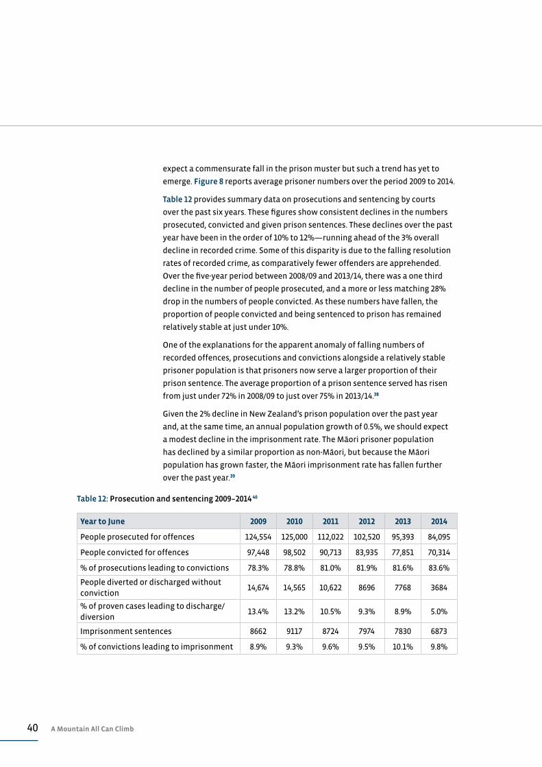
Table 12 provides summary data on prosecutions and sentencing by courts
over the past six years. These figures show consistent declines in the numbers
prosecuted, convicted and given prison sentences. These declines over the past
year have been in the order of 10% to 12%—running ahead of the 3% overall
decline in recorded crime. Some of this disparity is due to the falling resolution
rates of recorded crime, as comparatively fewer offenders are apprehended.
Over the five-year period between 2008/09 and 2013/14, there was a one third
decline in the number of people prosecuted, and a more or less matching 28%
drop in the numbers of people convicted. As these numbers have fallen, the
proportion of people convicted and being sentenced to prison has remained
relatively stable at just under 10%.
One of the explanations for the apparent anomaly of falling numbers of
recorded offences, prosecutions and convictions alongside a relatively stable
prisoner population is that prisoners now serve a larger proportion of their
prison sentence. The average proportion of a prison sentence served has risen
from just under 72% in 2008/09 to just over 75% in 2013/14.38
Given the 2% decline in New Zealand’s prison population over the past year
and, at the same time, an annual population growth of 0.5%, we should expect
a modest decline in the imprisonment rate. The Māori prisoner population
has declined by a similar proportion as non-Māori, but because the Māori
population has grown faster, the Māori imprisonment rate has fallen further
over the past year.39
Table 12: Prosecution and sentencing 2009–2014 40
Year to June 2009 2010 2011 2012 2013 2014
People prosecuted for offences 124,554 125,000 112,022 102,520 95,393 84,095
People convicted for offences 97,448 98,502 90,713 83,935 77,851 70,314
% of prosecutions leading to convictions 78.3% 78.8% 81.0% 81.9% 81.6% 83.6%
People diverted or discharged without conviction
14,674 14,565 10,622 8696 7768 3684
% of proven cases leading to discharge/diversion
13.4% 13.2% 10.5% 9.3% 8.9% 5.0%
Imprisonment sentences 8662 9117 8724 7974 7830 6873
% of convictions leading to imprisonment 8.9% 9.3% 9.6% 9.5% 10.1% 9.8%

41Crime & Punishment
In 2013/14, the imprisonment rate for the total population was 188 prisoners
per 100,000 people, more or less the same as in 2008/09. Similarly, the Māori
imprisonment rate in 2013/14, at 613 prisoners per 100,000 people, is similar to
figures in 2008/09. Imprisonment rates for the total population and for Māori
peaked in 2011 at 199 per 100,000 and 660 per 100,000 respectively. These trends
are shown in Figure 9. The Māori imprisonment rate remains at 5.6 times the
non-Māori rate.
10,000
9000
8000
7000
6000
5000
4000
3000
2000
1000
0
Ave
rage
nu
mb
er o
f in
mat
es in
pri
son
Year to June
2009 2010 2011 2012 2013 2014
Figure 8: Average prison population 2009–2014 41
Remand prisoners Sentenced prisoners
800
700
600
500
400
300
200
100
0
Inp
riso
nm
ent
rate
s p
er 1
00,0
00 p
eop
le
Year to June
2009 2010 2011 2012 2013 2014
Figure 9: Imprisonment rates 2009–2014 42
Ma–ori Total population
42 A Mountain All Can Climb
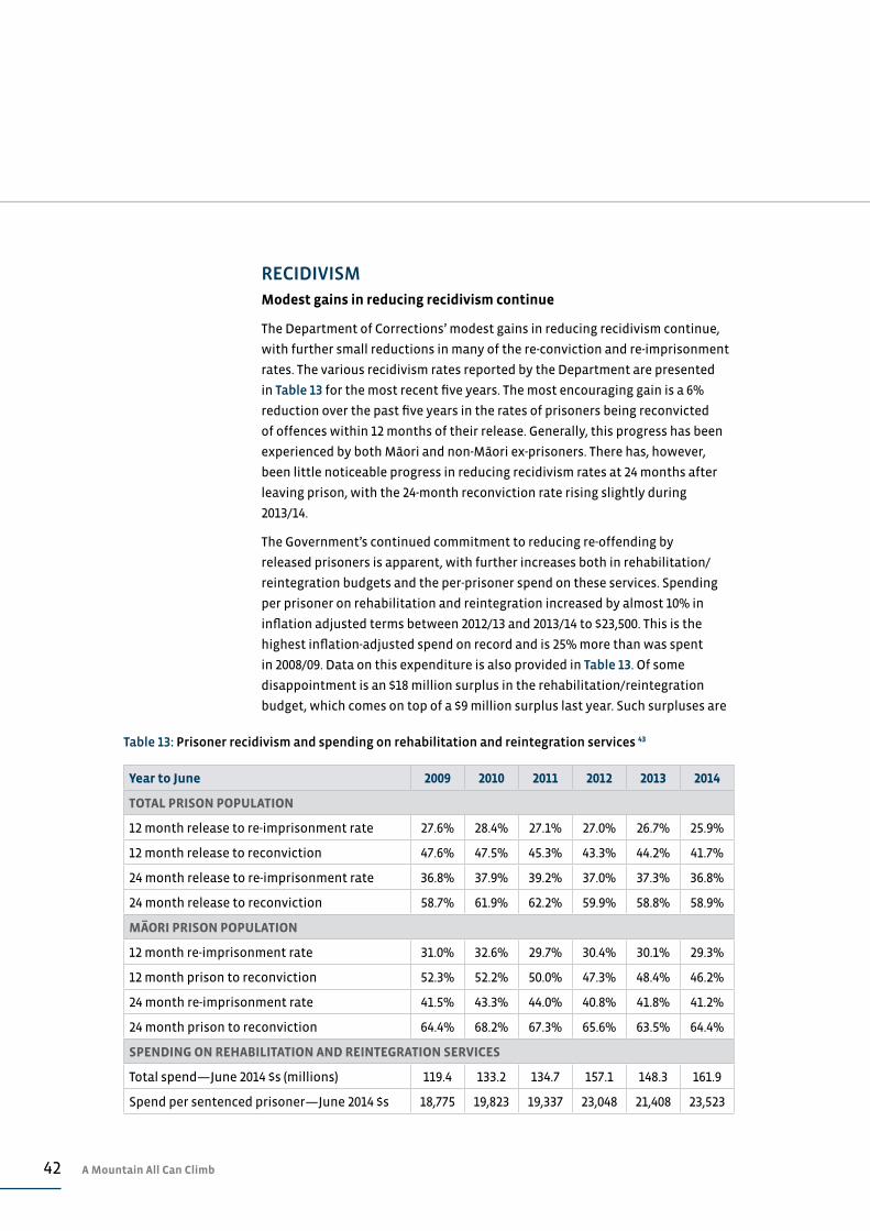
RECIDIVISMModest gains in reducing recidivism continue
The Department of Corrections’ modest gains in reducing recidivism continue,
with further small reductions in many of the re-conviction and re-imprisonment
rates. The various recidivism rates reported by the Department are presented
in Table 13 for the most recent five years. The most encouraging gain is a 6%
reduction over the past five years in the rates of prisoners being reconvicted
of offences within 12 months of their release. Generally, this progress has been
experienced by both Māori and non-Māori ex-prisoners. There has, however,
been little noticeable progress in reducing recidivism rates at 24 months after
leaving prison, with the 24-month reconviction rate rising slightly during
2013/14.
The Government’s continued commitment to reducing re-offending by
released prisoners is apparent, with further increases both in rehabilitation/
reintegration budgets and the per-prisoner spend on these services. Spending
per prisoner on rehabilitation and reintegration increased by almost 10% in
inflation adjusted terms between 2012/13 and 2013/14 to $23,500. This is the
highest inflation-adjusted spend on record and is 25% more than was spent
in 2008/09. Data on this expenditure is also provided in Table 13. Of some
disappointment is an $18 million surplus in the rehabilitation/reintegration
budget, which comes on top of a $9 million surplus last year. Such surpluses are
Table 13: Prisoner recidivism and spending on rehabilitation and reintegration services 43
Year to June 2009 2010 2011 2012 2013 2014
TOTAL PRISON POPULATION
12 month release to re-imprisonment rate 27.6% 28.4% 27.1% 27.0% 26.7% 25.9%
12 month release to reconviction 47.6% 47.5% 45.3% 43.3% 44.2% 41.7%
24 month release to re-imprisonment rate 36.8% 37.9% 39.2% 37.0% 37.3% 36.8%
24 month release to reconviction 58.7% 61.9% 62.2% 59.9% 58.8% 58.9%
MA–
ORI PRISON POPULATION
12 month re-imprisonment rate 31.0% 32.6% 29.7% 30.4% 30.1% 29.3%
12 month prison to reconviction 52.3% 52.2% 50.0% 47.3% 48.4% 46.2%
24 month re-imprisonment rate 41.5% 43.3% 44.0% 40.8% 41.8% 41.2%
24 month prison to reconviction 64.4% 68.2% 67.3% 65.6% 63.5% 64.4%
SPENDING ON REHABILITATION AND REINTEGRATION SERVICES
Total spend—June 2014 $s (millions) 119.4 133.2 134.7 157.1 148.3 161.9
Spend per sentenced prisoner—June 2014 $s 18,775 19,823 19,337 23,048 21,408 23,523
43Crime & Punishment
a false economy given the fiscal and social benefits of reducing re-offending by
released prisoners.
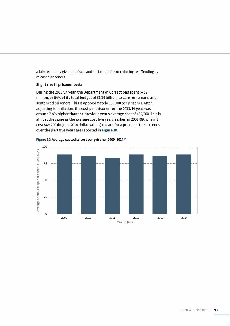
Slight rise in prisoner costs
During the 2013/14 year, the Department of Corrections spent $759
million, or 64% of its total budget of $1.19 billion, to care for remand and
sentenced prisoners. This is approximately $89,300 per prisoner. After
adjusting for inflation, the cost per prisoner for the 2013/14 year was
around 2.4% higher than the previous year’s average cost of $87,200. This is
almost the same as the average cost five years earlier, in 2008/09, when it
cost $89,200 (in June 2014 dollar values) to care for a prisoner. These trends
over the past five years are reported in Figure 10.
100
75
50
25
0
Ave
rage
an
nu
al c
ost
per
pri
son
er in
Jun
e 20
14 $
Year to June
2009 2010 2011 2012 2013 2014
Figure 10: Average custodial cost per prisoner 2009–2014 44
44 A Mountain All Can Climb
ASSESSMENT: CRIME & PUNISHMENT
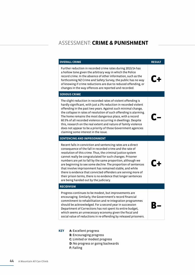
OVERALL CRIME RESULT
Further reduction in recorded crime rates during 2013/14 has a hollow tone given the arbitrary way in which the Police record crime. In the absence of other information, such as the forthcoming NZ Crime and Safety Survey, the public has no way of knowing if crime reductions are due to reduced offending, or changes in the way offences are reported and recorded.
C+
SERIOUS CRIME
The slight reduction in recorded rates of violent offending is hardly significant, with just a 3% reduction in recorded violent offending in the past two years. Against such minimal change, the collapse in rates of resolution of such offending is alarming. The home remains the most dangerous place, with a record 60.5% of all recorded violence occurring in dwellings. Despite this, research on the real extent and nature of family violence does not appear to be a priority of those Government agencies claiming some interest in the issue.
C–
SENTENCING AND IMPRISONMENT
Recent falls in conviction and sentencing rates are a direct consequence of the fall in recorded crime and the rate of resolution of this crime. Thus, the criminal justice system cannot really be congratulated for such changes. Prisoner numbers are yet to fall by the same proportion, although we are beginning to see some decline. The proportion of sentences that involve imprisonment has remained stable, and while there is evidence that convicted offenders are serving more of their prison terms, there is no evidence that longer sentences are being handed out by the judiciary.
C+
RECIDIVISM
Progress continues to be modest, but improvements are encouraging. Similarly, the Government’s record financial commitment to rehabilitation and re-integration programmes should be acknowledged. For a second year in succession Department of Corrections has not spent its entire budget, which seems an unnecessary economy given the fiscal and social value of reductions in re-offending by released prisoners.
B–
KEY A: Excellent progress B: Encouraging progress C: Limited or modest progress D: No progress or going backwards F: Failing

45Discussion Paper: Are Falling Crime Rates Real?
DISCUSSION PAPER: ARE FALLING CRIME RATES REAL?
It is difficult to know if the falling rates of recorded offences in New Zealand are
a result of falling rates of offending, changing reporting behaviours by victims of
crime, or changing recording practices of the Police. It is certainly the case that
recorded offences are the tip of the iceberg of actual crime, and because of this,
we currently have no way of knowing what is driving the apparent fall in crime.
The most recently published data on victimisation from crime is from the 2009
Crime and Safety Survey, which was undertaken by the Ministry of Justice and
published in late 2010.45 This survey of 6106 people suggests that only about 41%
of crime is reported to Police, and of this reported crime the Police choose to
record just 32%. Official crime statistics, including the data cited in this report,
are from the offences recorded by Police and perhaps represent just one in six of
the offences actually committed.46
The reporting and recording of crime is by no means uniform. Some types of
offences are more likely to be reported and recorded than others (as shown
in Table 14, which is a reproduction the 2009 Crime and Safety
Survey). This table shows that nearly all vehicle thefts are reported to and
recorded by Police, in contrast to just 12% of burglaries and 6% of assaults.
It makes sense that some types of offences are more likely to be reported to
Police and then more likely to be recorded by them. For example, victims of
vehicle thefts have a double incentive to report vehicle thefts: to subsequently
claim for insurance damage and to minimise any criminal or civil liability caused
by the offender whilst driving the vehicle.
Other offences, such as shoplifting and theft from businesses, are also more
likely to be reported; in part, for insurance claims, and because the knowledge
Table 14: New Zealand Crime & Safety Survey (NZCASS) estimates of crime and Police recorded crime in 2009 47
Police recorded
crime 2008
NZCASS 2009
Reported to Police
Estimated number
reported to Police
Recorded of
reported
Counted of all
NZCASS
000s 000s % 000s % %
Thefts of vehicles 18 19 76 15 125 95
Theft from vehicles/vehicle interference
51 86 58 50 102 59
Burglary 41 342 43 147 28 12
Robbery/theft from the person 6 72 18 13 46 8
Assaults 42 699 32 224 19 6
Total comparable subset 157 1217 41 499 32 12

46 A Mountain All Can Climb
of the offence may occur at the same time as the offender is apprehended. For
example, when a shoplifter or employee is caught. Furthermore, prosecution, or
at least reporting such offending to the Police, may act as deterrent to further
offending.
Motivation, or rather lack of motivation, for non-reporting of offences appears
to be more complex. The literature around the subject suggests victims of crime
are less motivated to report offences when they fear reprisals or retribution
from the offenders (especially in the case of violent offences), or where they
have little confidence that such reporting will make a difference. Victims’ sense
of powerlessness may be due to past interactions with the Police that were
unsatisfactory, or they may have been re-victimised by authorities, perhaps
through investigative processes which produced no tangible or worthwhile
outcomes.48
Whether or not crime victims’ attitudes toward reporting crime have changed
over time can probably best be identified through experience surveys such as
the New Zealand Crime and Safety Survey. Results from the 2009 survey and the
previous survey conducted in 2006, found no significant change in crime victim’s
reporting behaviour. This would suggest that any changes in recorded crime
rates between these surveys were due mainly to changes in offending patterns
or in Police recording procedures.
It was certainly changes in Police recording procedures that drove up
notifications of possible child neglect/abuse to Child Youth and Family between
2007 and 2012.49 Other changes in Police recording practices are not known and
appear not to have been reported by them. However, as discussed below, there
is some evidence that reporting practices vary from region to region and can
change quickly within a police district.
Fieldwork for the next Crime and Safety Survey was completed in 2014, with
the results due to be published toward the end of 2015.50 Until these results are
available, it remains difficult to identify the factors that have brought about the
apparent fall in crime rates since 2010.
There may be some value to comparing trends in the types of offences most
likely to be reported, with those unlikely to be reported, to see if the recent fall
in offending rates is due to less crime, or other factors. Such analysis follows for
three common dishonesty offences: vehicle theft, shoplifting and home burglary.
Given the availability of 20 years of consistent crime statistics from the Police
and Statistics New Zealand,51 this analysis goes back to the 1994/95 fiscal year.
The three offence categories of vehicle theft, shoplifting and home burglary
amounted to 110,900 recorded offences in 2013/14, or over 31% of all recorded
offences. This is a consistent share over the past 20 years. Due to the relatively

47Discussion Paper: Are Falling Crime Rates Real?
low success rate in resolving these crimes they only account for around 15% of
resolved crime. Figure 11 reports changes in the rates of recorded offences for
these three categories over the past twenty years. Figure 12 reports changes in
the resolution rates for these offences over the same period.
As Figures 11 and 12 indicate, our experience of these three categories is diverse.
Vehicle thefts are highly likely to be reported by victims and recorded by Police,
but show a low resolution rate of 10 to 12% over the past 20 years. Shoplifting is
also quite likely to be reported (when an offender is apprehended), and has had
a high resolution rate in such circumstances. Home burglaries are quite unlikely
to be reported and have a low resolution rate of around 12 to 15% nationally.
The other part of the historical experience reported in Figure 11 is that rates of
recorded offences for home burglaries and vehicle thefts have fallen over the
past 20 years. Home burglary rates declined sharply between 1999 and 2001,
but have remained almost constant since then, at around 90 to 100 recorded
offences per 100,000 of population. The rate of vehicle thefts has declined more
or less continuously since 1997—halving from around 240 offences per 100,000
in 1999 to 120 offences/100,000 in 2014. The rate of recorded shoplifting offences
has remained almost constant over the past 20 years, at around 50 offences per
100,000 people.
The extent and consistency of the decline in vehicle thefts, alongside the high
rates of reporting and recording, suggest that this decline is due to falling rates
of offending. Most likely, this decline is due to improved security of vehicles and
perhaps also to improved surveillance and detection, which provide additional
disincentives for would-be car thieves. While security and surveillance have
also improved in retail premises, it appears background rates of offending have
not declined—unless, of course, rates of reporting/recording have declined
by the same extent as a fall in offending, which seems unlikely. As background
levels of offending in shoplifting have remained relatively constant over the
past 20 years, it would seem unlikely that offender effort in home burglaries has
declined by much either, given the similarity of the offending. In other words,
offending, reporting and recording rates for home burglaries have probably
remained stable over the past 10 years or longer.
This likely stability in burglary rates nationally is not repeated at a local
level, however. As shown in Tables 15 and 16, both the rate of recorded home
burglaries and the rate of resolution of these recorded offences have fluctuated
wildly. For example, the rate of recorded home burglaries nationally has
changed very little since 2000 (as indicated in Table 15 and in Figure 11). Against
this background of long-term stability, offence rates have risen by 37% in
Northland and by 26% in Waikato between 2000 and 2014. Over the same period,
these rates fell 25% in Counties-Manukau and 19% in Wellington.

48 A Mountain All Can Climb
300
250
200
150
100
50
0
Off
ence
s p
er 1
00,0
00 p
op
ula
tio
n
Year to June
1995 1997 1999 2001 2003 2005 2007 2009 2011 2013
Figure 11: Recorded rates of selected dishonesty offences 1995–2014 52
Unlawful entry/burglary—dwelling Motor vehicle theft Theft from retail premises
90%
80%
70%
60%
50%
40%
30%
20%
10%
0%
Res
olu
tio
n r
ate—
% o
f al
l rec
ord
ed o
ffen
ces
reso
lved
Year to June
1995 1997 1999 2001 2003 2005 2007 2009 2011 2013
Figure 12: Resolution rates for selected dishonesty offences 1995–2014 53
Unlawful entry/burglary—dwelling Motor vehicle theft Theft from retail premises

49Discussion Paper: Are Falling Crime Rates Real?
Table 15: Rates of recorded home burglaries by Police District (offences per 100,000 population) 54
Five year averages 1995–99 2000–04 2005–09 2010–14
Northland 1105 873 1043 1199
Waitemata 1359 801 727 681
Auckland 1731 1446 1458 1346
Counties-Manukau 1832 1401 1332 1047
Waikato 1366 972 1130 1227
Bay of Plenty 1468 1142 1066 1128
Eastern 1427 991 1077 1336
Central 1283 971 922 917
Wellington 1229 865 592 699
Tasman 553 439 368 502
Canterbury 985 948 843 823
Southern 772 564 498 460
New Zealand 1296 988 938 930
Table 16: Resolution rates for home burglaries by Police District 1995–2014
Five year averages 1995–99 2000–04 2005–09 2010–14
Northland 17.0% 22.6% 21.2% 16.4%
Waitemata 6.0% 15.5% 14.8% 11.0%
Auckland 6.1% 9.8% 8.6% 7.7%
Counties-Manukau 7.4% 9.3% 9.3% 12.2%
Waikato 15.7% 25.4% 17.9% 13.8%
Bay of Plenty 12.5% 19.2% 23.7% 19.7%
Eastern 12.1% 18.2% 19.5% 17.0%
Central 12.1% 18.8% 20.1% 15.2%
Wellington 9.8% 18.7% 18.1% 12.2%
Tasman 16.1% 27.0% 31.6% 24.4%
Canterbury 12.0% 14.2% 13.6% 12.6%
Southern 18.2% 22.8% 23.5% 21.5%
New Zealand 10.5% 16.1% 15.6% 13.6%

50 A Mountain All Can Climb
It might be possible to explain such wide variations in terms of local conditions
such as rising unemployment or more effective policing. Unemployment trends
in Northland, Counties-Manukau and Waikato have, however, been broadly
similar, and presumably effective policing practice is transferable, especially
over a 10 or 15-year period, so such explanations are flimsy.
The difficulty that emerges in interpreting these shifts as little more than
administrative variations comes from the changes in resolution rates reported
in Table 16. Over the period 1995/99 to 2000/04, resolution rates across the board
improved by a worthy 4.6% from 10.5% to 16.1%. Over the same period, the rate
of recorded offences fell 24%, from 1296 recorded offence per 100,000 during
1995/99 to 988 per 100,000 over the 2000/04 period. This pattern of improving
resolution alongside declining offence rates was more or less consistent across
all Police districts between 1995/99 and 2000/04 (as indicated in Tables 15 and 16).
Given that in 2009, Police recorded just 28% of reported burglaries (see Table 14),
it is feasible to explain at least some of this apparent improvement in resolution
rates by administrative changes around how reported offences were or were
not counted.
Since 2000, most Police districts have experienced relative stability in terms of
offence rates, alongside modest falls in resolution rates. The exceptions to this
picture are in Waikato, which has seen an 11% drop in resolution rates (from
25.4% over 2000/04 to 13.8% over 2010/14); Wellington, with a 7% drop (18.7%
to 12.2%); and Northland, with a 6% fall (22.6% to 16.4%). Against these falling
resolution rates, the Counties-Manukau Police District has witnessed a 3%
improvement in the rate of resolving home burglaries between 2000/04 and
2010/14. As noted above, this improvement occurred at the same time that the
offence rate fell by 25%.
In Government-commissioned research on New Zealanders’ perceptions
of crime, respondents said they trusted the media more than official crime
statistics to give them an accurate picture of crime and punishment. This
research, published in 2013, reported that 87% of respondents said television
news shows were completely reliable or somewhat reliable as a source
of information about crime. Against this, 72% of respondents said crime
statistics were completely or somewhat reliable, and just 6% reported to using
Government websites as their main source of information on crime.55
This perceptions survey reported that the vast majority of respondents knew
very little about crime in New Zealand. Almost two thirds (64%) admitted to
knowing ‘little or nothing’ about the type of crime happening in New Zealand,
while 69% reported knowing ‘little or nothing’ about how much crime is
happening in New Zealand.56

51Discussion Paper: Are Falling Crime Rates Real?
Notwithstanding this lack of knowledge about the nature and extent of crime in
New Zealand, a significant majority of respondents expressed an opinion that
national crime levels had increased. Sixty per cent of respondents thought that
overall crime had increased a little or a lot over the previous 12 months, while
66% thought violent crime had and 54% felt that burglaries had increased.57
It seems unlikely that the verdict that a television presenter is more credible
than the Government Statistician is testimony to the poor quality of New
Zealand’s crime statistics. At best, this research probably just illustrates how
little New Zealanders know of crime statistics and the patterns of criminal
offending and victimisation they detail. These statistics do not, however, appear
to be as influential as they could be in forming New Zealanders’ knowledge of
crime, and this should be of some concern given the divisive effect that crime
reporting has on public attitudes.
There may be something of a credibility gap here. The headlines that often
surround the release of crime statistics point to falling crime rates, yet the
public perception of crime runs contrary to this. In part, this credibility gap may
have arisen because of the filtering of information on crime through the news
media, and in particular television news, which often focuses on particularly
violent crime. Additionally, it may be due to a variance between peoples’
experience of crime and official statistics around recorded crime.
Official crime statistics are simply administrative numbers generated by a
Government agency that decides what to count and what to ignore, and says
very little about how it does this. The figures offered in Tables 15 and 16 show
sharp fluctuations and disparate trends between regions, suggesting degrees of
arbitrariness or perhaps excessive randomness not common in social statistics.
The publication in late 2015 of the 2014 New Zealand Crime and Safety Survey
will offer the public some additional insights into New Zealanders’ real life
experiences of crime and we should hope that public perceptions of crime
become better informed as a result.
52 A Mountain All Can Climb
Car window washer John Henry at traffic lights in Whangarei.
The Northern Advocate, 15 January 2015. Photography: Tania Whyte / The Northern Advocate
53Work & Incomes
WORK & INCOMES
The economic recovery underway since 2012 finally appears to be
trickling down to the most disadvantaged workers and households.
Employment rates are slowly improving for young adults and for Māori and Pacific people, although they still remain a long way back from
where they were prior to the Global Financial Crisis (GFC) of 2007/08.
While the benefits of the recovery appear to be trickling down, the
improvements in incomes that this recovery might bring still appear
very limited—especially for the lowest paid workers. The cost of the
Government’s income support programme continues to rise faster
than inflation and other Government spending, due entirely to retiring
Baby Boomers and their income entitlements around New Zealand
Superannuation.
EMPLOYMENT AND UNEMPLOYMENTRecent strong job growth continues while unemployment remains steady
Relatively strong job growth over the past year has seen a record number of
people in employment, yet only very small declines in levels of unemployment
and joblessness. The reason for such mixed fortunes is that New Zealand’s
labour force participation rate has also reached an historic peak—as more jobs
are created in the economy, more people are looking for work.
In December 2014, the New Zealand economy provided a record 2.38 million
jobs, 80,000 or 3.5% more than the previous year. Over the past five years, the
number of people in full-time or part-time work grew by 10% or by almost
220,000 jobs. Of the available jobs, 530,000 or just over 22% are part-time. Over
the past five years, almost 85% of the job growth has been in full-time positions.
Figure 13 reports trends in full-time and part-time employment over the most
recent five years.
Labour force participation reached new levels toward the end of 2014. The
Household Labour Force Survey (HLFS) reports a quarterly participation rate of
69.6% in December 2014, while the annual average rate was 69.2%. The previous
record participation rate of 68.7% was reached in late 2008, immediately prior
to the impacts of the GFC reaching New Zealand. At the end of 2014, the HLFS
estimated that just over 2.5 million New Zealanders were in the labour force.
Although rising labour force participation is clearly beneficial for household
incomes, at least for those in work, the downside of rising participation is that
recent job growth has not soaked up the legacy of unemployment from the
post-GFC recession. Over the past five years, the number of jobless people has
dropped by just 19,000 and the number of people ‘officially’ unemployed has
declined by only 17,000. Over the same time, the number of ‘job ready’ people
54 A Mountain All Can Climb
receiving the Job Seeker Support Payment has fallen by just over 20,000, while
the total number of people receiving a working age welfare payment has
dropped by 36,300. All this against a background of an additional 220,000 jobs in
the economy over the past five years.
2500
2000
1500
1000
500
0
Peo
ple
000
’s
As at December
2009 2010 2011 2012 2013 2014
Figure 13: Total employment in New Zealand 2009–2014 58
Part-time jobs Full-time jobs
Dec 09 Dec 11Jun 10 Jun 12 Dec 13Dec 10 Dec 12 Jun 14Jun 11 Jun 13 Dec 14
0
50
100
150
200
250
300
350
Nu
mb
ers
of
peo
ple
(000
s)
Quarters
Officially Unemployed Total Jobless Jobseekers—ready for work
Figure 14: Measures of unemployment 2009–2014 59
55Work & Incomes
However, some progress in reducing unemployment has been made over the
past year. During 2014, the number of people reported by the HLFS as jobless fell
by just 300, although those defined as being unemployed (and actively seeking
work) fell by 3900. In addition, the number of working-age people receiving a
welfare payment in the past year fell by 12,724—with 2217 of these receiving a
Job Seeker Support Payment.
At the end of 2014, the official unemployment rate sat at 5.7%, compared with
6.1% a year earlier and 6.9% five years previously. Figure 14 reports trends in
unemployment measures over the past five years.
The unemployment gap between males and female appears to be widening. The
average male unemployment rate during 2014 was 5.0%, compared to an average
rate of 6.4% for females—a gap of 1.4%. During 2013, this gap was 1.3%—with
an average male unemployment rate of 5.6%, against a female rate of 6.9%. In
2009, the gap was a mere 0.1%, with a male unemployment rate of 6.1%, against a
female rate of 6.2%. This widening gap is due, in part, to stronger job growth for
men over the past five years as well as rising female labour force participation.60
Youth appear to be making gains in job stakes
Job growth during 2014 appears have advantaged younger workers. Against
a background job growth rate of just over 3%, employment amongst 15 to
19-year-olds lifted to slightly more than 9%. However, this recent improvement
comes on the back of several years of falling employment and participation
rates. During 2014, an average 110,000 15 to 19-year-olds were in employment,
compared with 100,000 during 2103. In 2009, 125,000 15 to 19-year-olds had jobs,
so there is still considerable ground to recover. Changes in job numbers for 15 to
19-year-olds are reported in Figure 15 for the past decade.
The HLFS reported the official unemployment rate for 15 to 19-year-olds at 21%
for the December 2014 quarter, the same as the average unemployment rate for
this age group during 2014. These rates were based on relatively low labour force
participation rates during 2014 of around 46% (annual average). Prior to the
GFC, 15 to 19-year-olds had a participation rate in excess of 56%, so it seems that
the lower participation rate in 2014 is to some extent the result of diminished
employment prospects, as shown in Figure 15. If the higher participation rate
was applied to current job and population figures, the unemployment rate
amongst 15 to 19-year-olds would be around 35%, not the 20% to 21% currently
being reported.
Over-65s job boom slows
A record number of people aged over 65 remained in employment during 2014,
continuing a job boom that dates back to 2005. At the end of 2014, there were
an estimated 138,000 people aged over 65 still in employment, compared with

56 A Mountain All Can Climb
approximately 127,000 at the end of 2013 and 84,000 at the end of 2009. The trend
for over-65s in employment over the past decade is also shown in Figure 15.
This job boom does not appear to be tapering off as the employment rate for
people aged over 65 has risen to almost 22%. In 2005, only around 12% of the
over 65s population were in employment. This participation rose to 16% by 2009
and to 21% by 2013, but the rate of increase has slowed during 2014 as the first of
the Baby Boomer cohort move toward their 70s.61
Māori and Pacific workers gain some ground
Māori and Pacific workers have been the worst hit by the post-GFC recession
and have struggled since 2007 to regain their position. Between 2007 and 2009,
Māori unemployment rose from around 8% to 13%, while their labour force
participation rate fell from 64% to 58%. Pacific workers fared even worse, with a
9% rise in unemployment—from 6% to 15%—and with participation rates falling
from 61% to 54%. By comparison, European unemployment over this period rose
2.5% to around 5%, while labour force participation fell from 68% to 66%.
By the end of 2013, employment prospects for Māori and Pacific workers had
worsened slightly, with small increases in unemployment and a further decline
in participation rates by about 1%. Effectively, Māori and Pacific workers had yet
to enjoy the benefits of the modest economic recovery which began in 2013.
0
20
40
60
80
140
100
160
180
120
Nu
mb
er o
f p
eop
le e
mp
loye
d (0
00’s
)
Quarters
Dec 04 Dec 08Dec 05 Dec 09 Dec 12Dec 06 Dec 10 Dec 13Dec 07 Dec 11 Dec 14
15 to 19 years Over 65 years
Figure 15: Employment of 15 to 19-year-olds and over 65-year-olds 2004–2014 62
57Work & Incomes
Most recent data suggests that Māori and Pacific workers are beginning to
make some progress in what remains a moderate expansion in jobs. Māori
unemployment fell during 2014 from around 13% to 12%, while participation
rates lifted by around 2% to 59%. Over the same time, Pacific unemployment
has fallen 3% to 12% and participation rates have lifted 3% to 56%. At the end
of 2014, there were 276,000 Māori people in employment, an increase of around
4% on 2013, while there were 116,000 Pacific people in jobs, an increase of 8%
during 2014.63
Clearly, there is considerable progress still to be made if Māori and Pacific
people are to share the same employment opportunities as European New
Zealanders. Paradoxically, there are now more Māori and Pacific people in jobs
than prior to the GFC and subsequent recession and, most likely, more than at
any other time in history. The continuing high rates of unemployment facing
Māori and Pacific people are due to the relative youth of these populations and
the relatively rapid growth in their working age populations.
INCOMESVery modest increases in average incomes
Weekly incomes for those in employment rose by about 1.8% in real or inflation
adjusted terms during 2014. In nominal dollar terms, the average weekly income
received by wage and salary earners during 2014 was $937, compared with $912
in 2013 and $811 in 2009. This trend is illustrated in Figure 16. Over the past five
years, and in real terms, average-income wage and salary earners have risen
by just over 5%. Employment-based incomes, including incomes to owner/
operators and other self-employed people, were about 16% higher than for wage
and salary earners alone. During 2014, the average of this overall income was
$1094, a 1% rise in real terms over 2013 and 4% more than five years previously.
Some signs of increasing income inequality
There are emerging signs that income inequality may be growing within the
New Zealand economy. The gap between the wages typically earned by workers
in the poorest paid sector (accommodation and food services) and the highest
paid sector (banking and insurance sector) widened very slightly between 2013
and 2014, consolidating the gap that had emerged previously. In 2009, a worker
in the banking and insurance sector received an average ordinary time hourly
income of $35.72—2.26 times the average hourly wage of an accommodation
and food sector worker (who at that time received $15.80 per hour). By the end
of 2013, this ratio had widened slightly to 2.29 times. It widened further to 2.37
times by the end of 2014, when a banking/insurance sector worker earned $41.88
per hour, while an accommodation sector worker earned $17.66.64
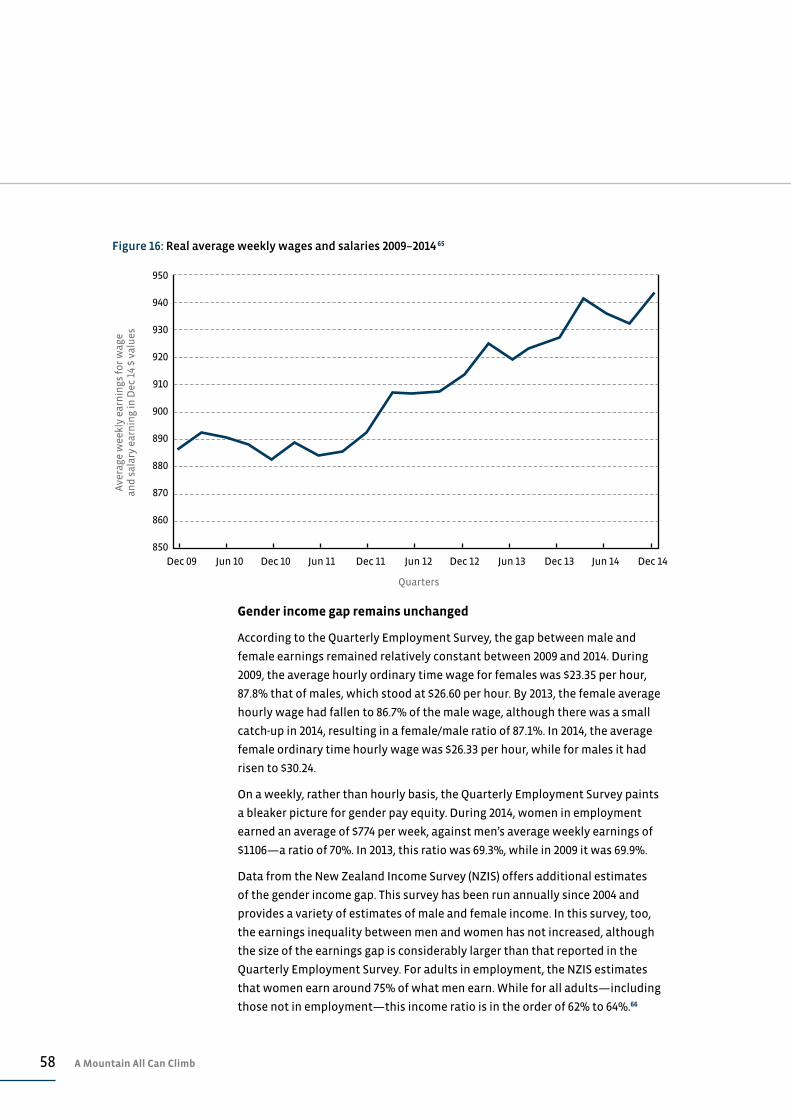
58 A Mountain All Can Climb
Gender income gap remains unchanged
According to the Quarterly Employment Survey, the gap between male and
female earnings remained relatively constant between 2009 and 2014. During
2009, the average hourly ordinary time wage for females was $23.35 per hour,
87.8% that of males, which stood at $26.60 per hour. By 2013, the female average
hourly wage had fallen to 86.7% of the male wage, although there was a small
catch-up in 2014, resulting in a female/male ratio of 87.1%. In 2014, the average
female ordinary time hourly wage was $26.33 per hour, while for males it had
risen to $30.24.
On a weekly, rather than hourly basis, the Quarterly Employment Survey paints
a bleaker picture for gender pay equity. During 2014, women in employment
earned an average of $774 per week, against men’s average weekly earnings of
$1106—a ratio of 70%. In 2013, this ratio was 69.3%, while in 2009 it was 69.9%.
Data from the New Zealand Income Survey (NZIS) offers additional estimates
of the gender income gap. This survey has been run annually since 2004 and
provides a variety of estimates of male and female income. In this survey, too,
the earnings inequality between men and women has not increased, although
the size of the earnings gap is considerably larger than that reported in the
Quarterly Employment Survey. For adults in employment, the NZIS estimates
that women earn around 75% of what men earn. While for all adults—including
those not in employment—this income ratio is in the order of 62% to 64%.66
Dec 09 Dec 11Jun 10 Jun 12 Dec 13Dec 10 Dec 12 Jun 14Jun 11 Jun 13 Dec 14
850
860
870
880
890
900
910
920
930
940
950
Ave
rage
wee
kly
earn
ings
fo
r w
age
and
sal
ary
earn
ing
in D
ec 1
4 $
valu
es
Quarters
Figure 16: Real average weekly wages and salaries 2009–2014 65
59Work & Incomes
Further increase in the number of workers earning the minimum wage
The adult minimum wage was increased from $13.75 to $14.25 per hour in
April 2014. This increase was judged to be in line with overall wage and salary
inflation, so was intended to ensure that the poorest paid workers did not slip
behind other workers in terms of work-based incomes.67 An estimated 107,000
workers would have been supported by the minimum wage safety net at the
time of the review. This figure is 20% more than the estimated 91,500 workers
covered by the minimum wage in 2013.68 On the basis of these estimates, 4.7% of
workers received the minimum wage in 2014, compared with 4.1% of workers in
2013 and 1.7% of workers in 2010.
It is disappointing that workers earning close to the minimum wage do not have
their wages adjusted to account for minimum wage movements. However, the
increasing proportion of workers affected by minimum wage legislation points
to the importance of this legislation in maintaining the incomes of the poorest
paid workers in New Zealand.
BENEFITS & PENSIONSFurther falls in working-age benefit numbers while NZ Superannuation
continues to grow
Continuing a trend dating back to 2010, 2014 saw further falls in the numbers of
people receiving a working-age benefit, while numbers of people claiming New
Zealand Superannuation continue to climb inexorably.
By the end of 2014, just over 309,100 people were receiving working age benefits.
This figure is a drop of 12,700 people from a year earlier—a decline of 4%. Five
years previously, 345,500 people were receiving one of the main working age
benefits, so the decline over the past five years is a creditable 11%.
Against these declines, the number of people receiving New Zealand
Superannuation rose 4% during 2014 to 674,000. Since the end of 2009, the
number of people receiving Superannuation has risen by 22% or by 123,000
people. The number receiving New Zealand Superannuation is growing by
around 500 people per week and will exceed 700,000 people by the end of 2015.
Figure 17 outlines trends in benefit and Superannuation numbers over the past
five years.
Spending on income support rises 17% in five years
During the 2014/15 financial year, the cost of the Government’s main income
support programmes will exceed $20 billion for the first time, with New Zealand
Superannuation accounting for 57% or $11.58 billion of this expenditure. Over
the past five years, spending on these programmes has risen by almost 17% in
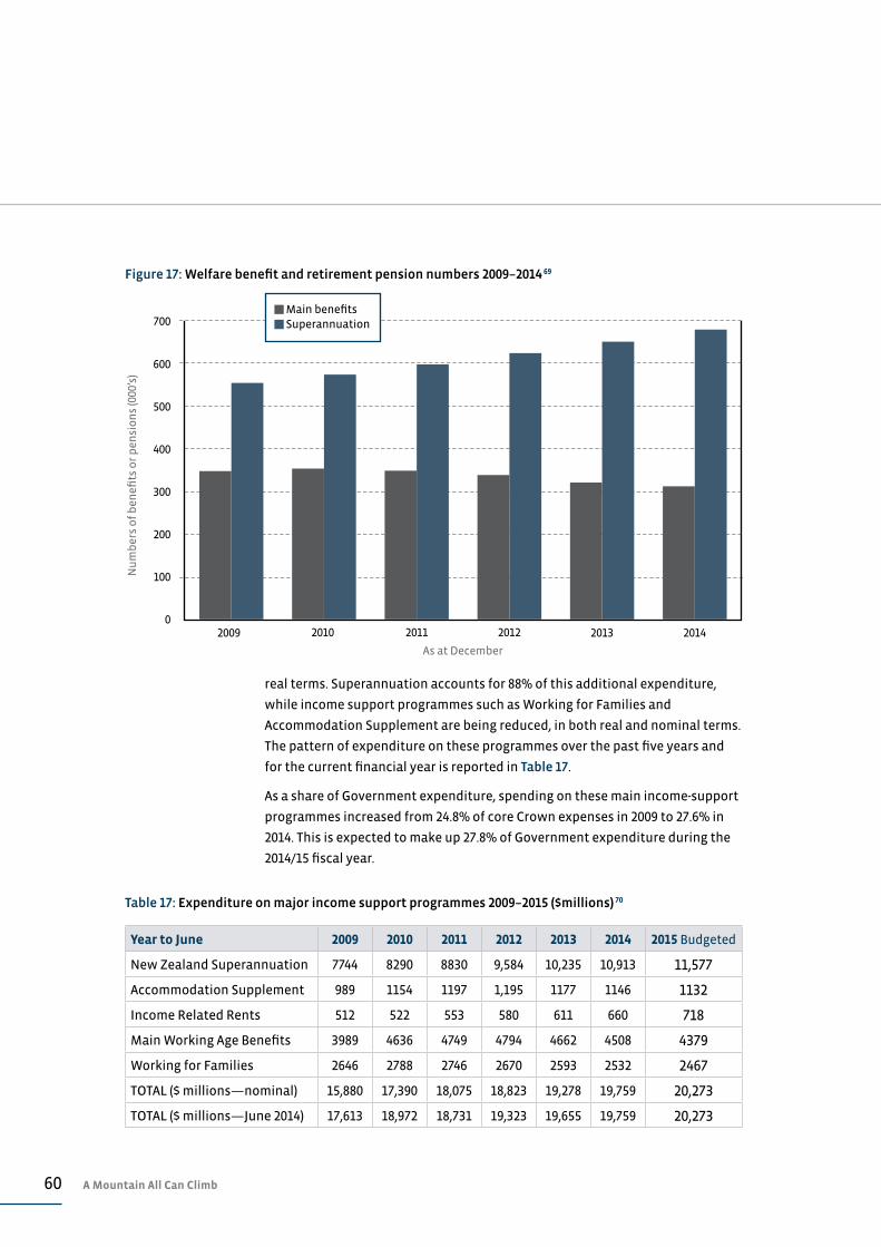
60 A Mountain All Can Climb
100
0
200
300
400
500
600
700
Nu
mb
ers
of
ben
efits
or
pen
sio
ns
(000
’s)
As at December
20102009 20122011 2013 2014
Figure 17: Welfare benefit and retirement pension numbers 2009–2014 69
Main benefits Superannuation
real terms. Superannuation accounts for 88% of this additional expenditure,
while income support programmes such as Working for Families and
Accommodation Supplement are being reduced, in both real and nominal terms.
The pattern of expenditure on these programmes over the past five years and
for the current financial year is reported in Table 17.
As a share of Government expenditure, spending on these main income-support
programmes increased from 24.8% of core Crown expenses in 2009 to 27.6% in
2014. This is expected to make up 27.8% of Government expenditure during the
2014/15 fiscal year.
Table 17: Expenditure on major income support programmes 2009–2015 ($millions) 70
Year to June 2009 2010 2011 2012 2013 2014 2015 Budgeted
New Zealand Superannuation 7744 8290 8830 9,584 10,235 10,913 11,577
Accommodation Supplement 989 1154 1197 1,195 1177 1146 1132
Income Related Rents 512 522 553 580 611 660 718
Main Working Age Benefits 3989 4636 4749 4794 4662 4508 4379
Working for Families 2646 2788 2746 2670 2593 2532 2467
TOTAL ($ millions—nominal) 15,880 17,390 18,075 18,823 19,278 19,759 20,273
TOTAL ($ millions—June 2014) 17,613 18,972 18,731 19,323 19,655 19,759 20,273
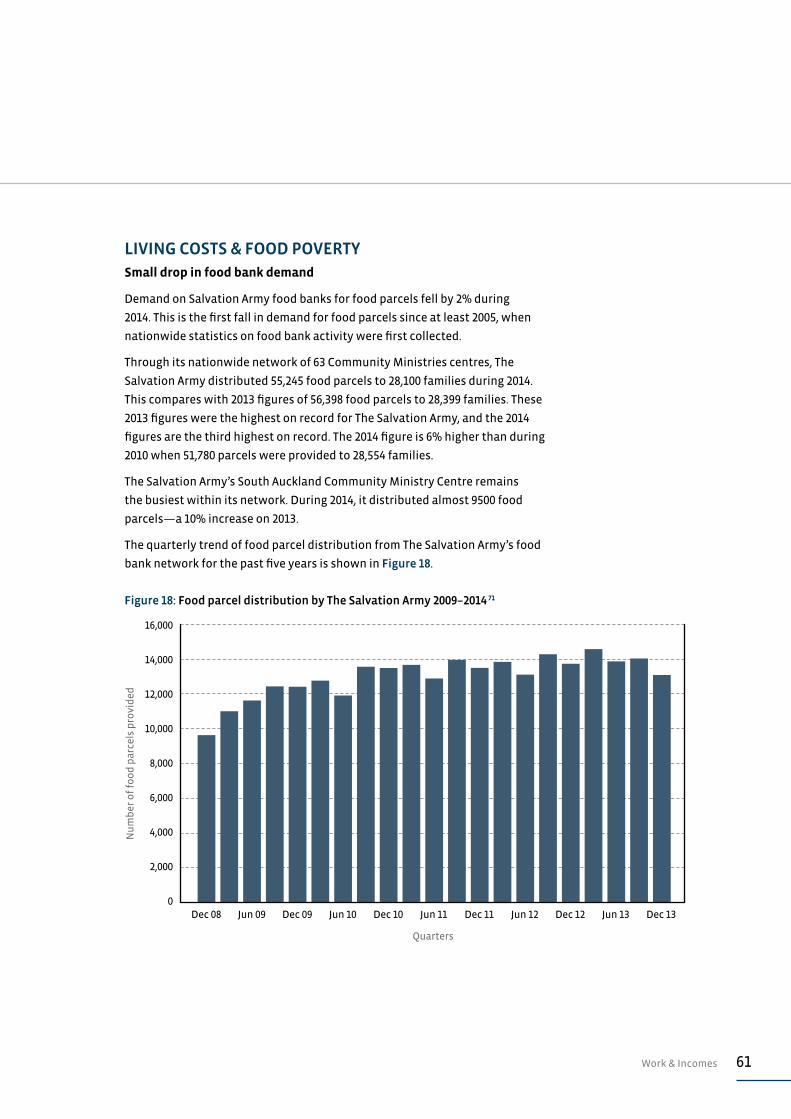
61Work & Incomes
LIVING COSTS & FOOD POVERTYSmall drop in food bank demand
Demand on Salvation Army food banks for food parcels fell by 2% during
2014. This is the first fall in demand for food parcels since at least 2005, when
nationwide statistics on food bank activity were first collected.
Through its nationwide network of 63 Community Ministries centres, The
Salvation Army distributed 55,245 food parcels to 28,100 families during 2014.
This compares with 2013 figures of 56,398 food parcels to 28,399 families. These
2013 figures were the highest on record for The Salvation Army, and the 2014
figures are the third highest on record. The 2014 figure is 6% higher than during
2010 when 51,780 parcels were provided to 28,554 families.
The Salvation Army’s South Auckland Community Ministry Centre remains
the busiest within its network. During 2014, it distributed almost 9500 food
parcels—a 10% increase on 2013.
The quarterly trend of food parcel distribution from The Salvation Army’s food
bank network for the past five years is shown in Figure 18.
Jun 10Dec 08 Dec 10 Jun 12Jun 09 Jun 11 Dec 12Dec 09 Dec 11 Dec 13Jun 13
Nu
mb
er o
f fo
od
par
cels
pro
vid
ed
Quarters
Figure 18: Food parcel distribution by The Salvation Army 2009–2014 71
0
2,000
4,000
6,000
8,000
10,000
12,000
14,000
16,000
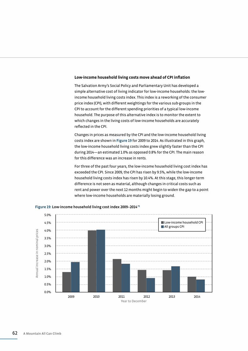
62 A Mountain All Can Climb
Low-income household living costs move ahead of CPI inflation
The Salvation Army’s Social Policy and Parliamentary Unit has developed a
simple alternative cost of living indicator for low-income households: the low-
income household living costs index. This index is a reworking of the consumer
price index (CPI), with different weightings for the various sub-groups in the
CPI to account for the different spending priorities of a typical low-income
household. The purpose of this alternative index is to monitor the extent to
which changes in the living costs of low-income households are accurately
reflected in the CPI.
Changes in prices as measured by the CPI and the low-income household living
costs index are shown in Figure 19 for 2009 to 2014. As illustrated in this graph,
the low-income household living costs index grew slightly faster than the CPI
during 2014—an estimated 1.0% as opposed 0.8% for the CPI. The main reason
for this difference was an increase in rents.
For three of the past four years, the low-income household living cost index has
exceeded the CPI. Since 2009, the CPI has risen by 9.5%, while the low-income
household living costs index has risen by 10.4%. At this stage, this longer-term
difference is not seen as material, although changes in critical costs such as
rent and power over the next 12 months might begin to widen the gap to a point
where low-income households are materially losing ground.
Figure 19: Low-income household living cost index 2009–2014 72
0.5%
0.0%
1.0%
1.5%
2.0%
2.5%
3.0%
3.5%
4.0%
4.5%
5.0%
An
nu
al in
crea
se in
no
min
al p
rice
s
Year to December2009 20112010 20132012 2014
Low-income household CPI All groups CPI
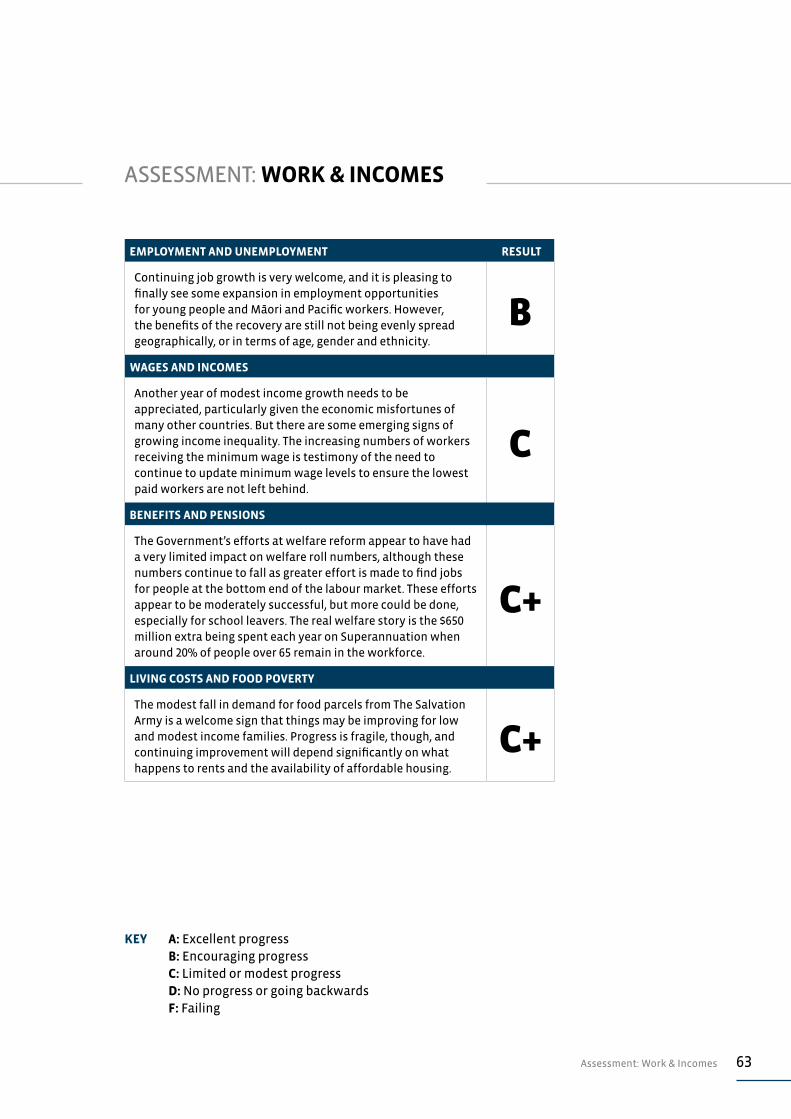
63Assessment: Work & Incomes
ASSESSMENT: WORK & INCOMES
EMPLOYMENT AND UNEMPLOYMENT RESULT
Continuing job growth is very welcome, and it is pleasing to finally see some expansion in employment opportunities for young people and Māori and Pacific workers. However, the benefits of the recovery are still not being evenly spread geographically, or in terms of age, gender and ethnicity.
BWAGES AND INCOMES
Another year of modest income growth needs to be appreciated, particularly given the economic misfortunes of many other countries. But there are some emerging signs of growing income inequality. The increasing numbers of workers receiving the minimum wage is testimony of the need to continue to update minimum wage levels to ensure the lowest paid workers are not left behind.
C
BENEFITS AND PENSIONS
The Government’s efforts at welfare reform appear to have had a very limited impact on welfare roll numbers, although these numbers continue to fall as greater effort is made to find jobs for people at the bottom end of the labour market. These efforts appear to be moderately successful, but more could be done, especially for school leavers. The real welfare story is the $650 million extra being spent each year on Superannuation when around 20% of people over 65 remain in the workforce.
C+
LIVING COSTS AND FOOD POVERTY
The modest fall in demand for food parcels from The Salvation Army is a welcome sign that things may be improving for low and modest income families. Progress is fragile, though, and continuing improvement will depend significantly on what happens to rents and the availability of affordable housing.
C+
KEY A: Excellent progress B: Encouraging progress C: Limited or modest progress D: No progress or going backwards F: Failing
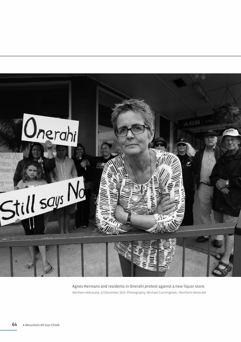
64 A Mountain All Can Climb
Agnes Hermans and residents in Onerahi protest against a new liquor store.
Northern Advocate, 12 December 2014. Photography: Michael Cunningham / Northern Advocate
65Social Hazards
SOCIAL HAZARDS
Activities that might be harmful to those who undertake them or to
their families and neighbours are sometimes known as social hazards.
The risks involved usually mean the activities are regulated or socially
controlled in some way, and even prohibited in some cases. This report
covers three common social hazards: alcohol consumption, the use of
illicit drugs, and gambling.
ALCOHOL
Per capita alcohol availability falls slightly
Alcohol availability declined slightly during 2014, both on a volume and a per
capita basis. The total volume of alcohol made available during the year to
30 September 2014 was 32.7 million litres, which is down 0.8% on the volume
available the previous year. The 2014 figure is 1.6% less than in 2010 when 33.2
million litres were available.
On a beverage volume basis, this decline in alcohol availability was just under
2% between 2013 and 2014 (September years), and a decline of just less than
4% between 2010 and 2014. Over the past five years, the volume of wine (<14%
alcohol by volume (ABV)) available for consumption rose almost 6%, from
98 million litres in 2010 to 104 million litres in 2014. Over the same period,
availability of spirit-based drinks with less than 23% ABV fell 10%, from 60
million litres to 54 million litres. Alcopops or RTDs typically fall into this category
of drink. Beer availability fell 6% between 2010 and 2014 to 285 million litres.
On a per adult basis (aged over 18), alcohol availability has fallen from 10.1 litres
of alcohol per person in 2010 to 9.7 litres per person in 2013, and to 9.5 litres per
person in 2014. This 2014 figure is the lowest level since 2003. The per capita
trend over the past six years is reported in Figure 20.
Fewer drivers are failing drink driving tests
Just 0.7% of the 3.03 million drivers tested failed a drink driving test during the
year to 30 June 2014. This ratio is down from 0.8% in 2013 and 1.0% in 2010, and
probably points to changing driver behaviour and perhaps even to changing
public attitudes toward drink driving.
Other offences relating directly to alcohol sales are also down, although these
numbers remain fairly minor in the context of other offending linked to alcohol.
Offences under the Sale and Supply of Alcohol Act fell 14% between 2013 and
2014 (years to June), to 715 recorded offences. There was a small increase in
recorded offences around supply of alcohol to minors due to tighter controls
placed on adults offering alcohol to minors (as seen in Table 18).
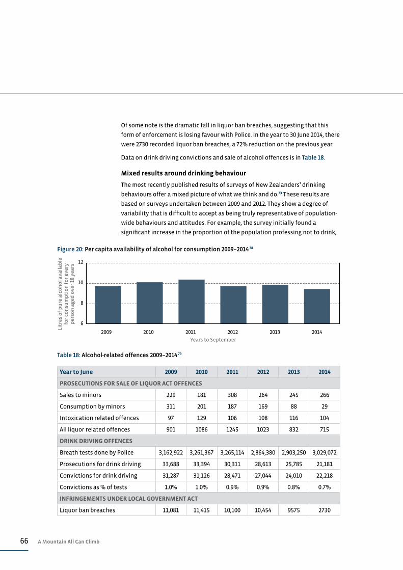
66 A Mountain All Can Climb
Of some note is the dramatic fall in liquor ban breaches, suggesting that this
form of enforcement is losing favour with Police. In the year to 30 June 2014, there
were 2730 recorded liquor ban breaches, a 72% reduction on the previous year.
Data on drink driving convictions and sale of alcohol offences is in Table 18.
Mixed results around drinking behaviour
The most recently published results of surveys of New Zealanders’ drinking
behaviours offer a mixed picture of what we think and do.73 These results are
based on surveys undertaken between 2009 and 2012. They show a degree of
variability that is difficult to accept as being truly representative of population-
wide behaviours and attitudes. For example, the survey initially found a
significant increase in the proportion of the population professing not to drink,
12
10
8
6
Litr
es o
f p
ure
alc
oh
ol a
vail
able
fo
r co
nsu
mp
tio
n f
or
ever
y p
erso
n a
ged
ove
r 18
yea
rs
Years to September
2009 2010 2011 2012 2013 2014
Figure 20: Per capita availability of alcohol for consumption 2009–2014 78
Table 18: Alcohol-related offences 2009–2014 79
Year to June 2009 2010 2011 2012 2013 2014
PROSECUTIONS FOR SALE OF LIQUOR ACT OFFENCES
Sales to minors 229 181 308 264 245 266
Consumption by minors 311 201 187 169 88 29
Intoxication related offences 97 129 106 108 116 104
All liquor related offences 901 1086 1245 1023 832 715
DRINK DRIVING OFFENCES
Breath tests done by Police 3,162,922 3,261,367 3,265,114 2,864,380 2,903,250 3,029,072
Prosecutions for drink driving 33,688 33,394 30,311 28,613 25,785 21,181
Convictions for drink driving 31,287 31,126 28,471 27,044 24,010 22,218
Convictions as % of tests 1.0% 1.0% 0.9% 0.9% 0.8% 0.7%
INFRINGEMENTS UNDER LOCAL GOVERNMENT ACT
Liquor ban breaches 11,081 11,415 10,100 10,454 9575 2730
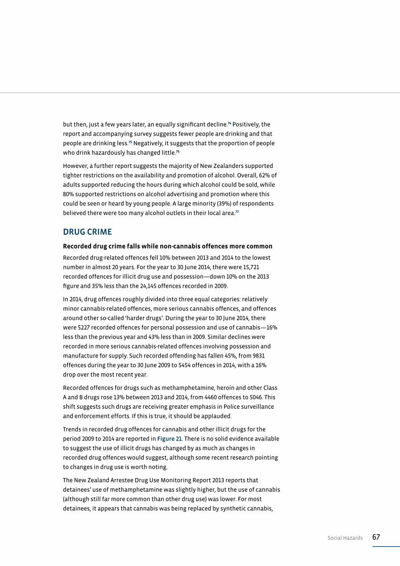
67Social Hazards
but then, just a few years later, an equally significant decline.74 Positively, the
report and accompanying survey suggests fewer people are drinking and that
people are drinking less.75 Negatively, it suggests that the proportion of people
who drink hazardously has changed little.76
However, a further report suggests the majority of New Zealanders supported
tighter restrictions on the availability and promotion of alcohol. Overall, 62% of
adults supported reducing the hours during which alcohol could be sold, while
80% supported restrictions on alcohol advertising and promotion where this
could be seen or heard by young people. A large minority (39%) of respondents
believed there were too many alcohol outlets in their local area.77
DRUG CRIME
Recorded drug crime falls while non-cannabis offences more common
Recorded drug-related offences fell 10% between 2013 and 2014 to the lowest
number in almost 20 years. For the year to 30 June 2014, there were 15,721
recorded offences for illicit drug use and possession—down 10% on the 2013
figure and 35% less than the 24,145 offences recorded in 2009.
In 2014, drug offences roughly divided into three equal categories: relatively
minor cannabis-related offences, more serious cannabis offences, and offences
around other so-called ‘harder drugs’. During the year to 30 June 2014, there
were 5227 recorded offences for personal possession and use of cannabis—16%
less than the previous year and 43% less than in 2009. Similar declines were
recorded in more serious cannabis-related offences involving possession and
manufacture for supply. Such recorded offending has fallen 45%, from 9831
offences during the year to 30 June 2009 to 5454 offences in 2014, with a 16%
drop over the most recent year.
Recorded offences for drugs such as methamphetamine, heroin and other Class
A and B drugs rose 13% between 2013 and 2014, from 4460 offences to 5046. This
shift suggests such drugs are receiving greater emphasis in Police surveillance
and enforcement efforts. If this is true, it should be applauded.
Trends in recorded drug offences for cannabis and other illicit drugs for the
period 2009 to 2014 are reported in Figure 21. There is no solid evidence available
to suggest the use of illicit drugs has changed by as much as changes in
recorded drug offences would suggest, although some recent research pointing
to changes in drug use is worth noting.
The New Zealand Arrestee Drug Use Monitoring Report 2013 reports that
detainees’ use of methamphetamine was slightly higher, but the use of cannabis
(although still far more common than other drug use) was lower. For most
detainees, it appears that cannabis was being replaced by synthetic cannabis,
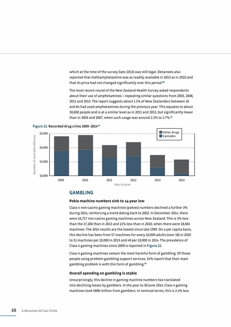
68 A Mountain All Can Climb
which at the time of the survey (late 2013) was still legal. Detainees also
reported that methamphetamine was as readily available in 2013 as in 2010 and
that its price had not changed significantly over this period.80
The most recent round of the New Zealand Health Survey asked respondents
about their use of amphetamines—repeating similar questions from 2003, 2008,
2011 and 2013. The report suggests about 1.1% of New Zealanders between 16
and 64 had used amphetamines during the previous year. This equates to about
30,600 people and is at a similar level as in 2011 and 2013, but significantly lower
than in 2003 and 2007, when such usage was around 2.2% to 2.7%.81
GAMBLING
Pokie machine numbers sink to 14-year low
Class 4 non-casino gaming machines (pokies) numbers declined a further 3%
during 2014, reinforcing a trend dating back to 2002. In December 2014, there
were 16,717 non-casino gaming machines across New Zealand. This is 3% less
than the 17,266 than in 2013 and 11% less than in 2010, when there were 18,681
machines. The 2014 results are the lowest since late 1999. On a per capita basis,
this decline has been from 57 machines for every 10,000 adults (over 18) in 2010
to 51 machines per 10,000 in 2013 and 49 per 10,000 in 2014. The prevalence of
Class 4 gaming machines since 2009 is reported in Figure 22.
Class 4 gaming machines remain the most harmful form of gambling. Of those
people using problem gambling support services, 54% report that their main
gambling problem is with this form of gambling.83
Overall spending on gambling is stable
Unsurprisingly, this decline in gaming machine numbers has translated
into declining losses by gamblers. In the year to 30 June 2014, Class 4 gaming
machines took $806 million from gamblers. In nominal terms, this is 2.4% less
25,000
20,000
15,000
10,000
Nu
mb
er o
f re
cord
ed o
ffen
ces
Year to June
2009 2010 2011 2012 2013 2014
Figure 21: Recorded drug crime 2009–2014 82
Other drugs Cannabis
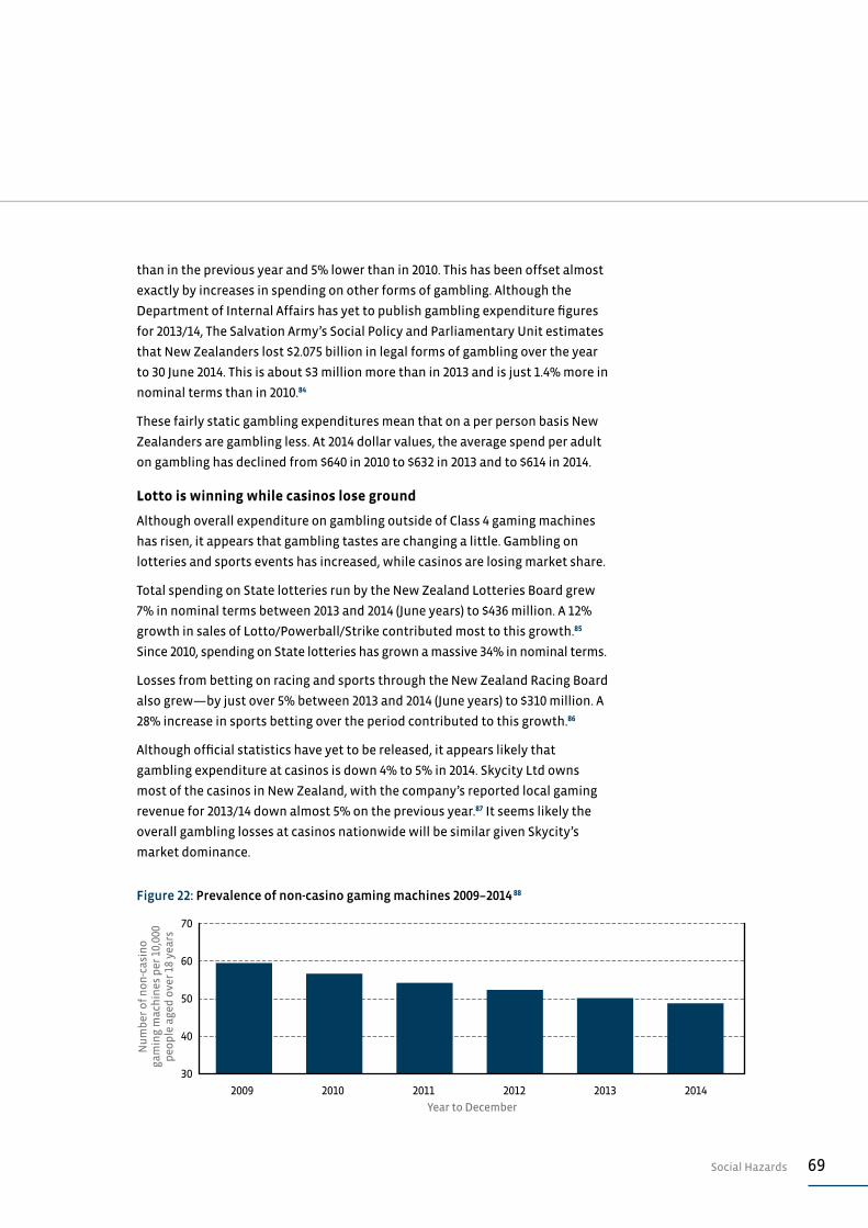
69Social Hazards
than in the previous year and 5% lower than in 2010. This has been offset almost
exactly by increases in spending on other forms of gambling. Although the
Department of Internal Affairs has yet to publish gambling expenditure figures
for 2013/14, The Salvation Army’s Social Policy and Parliamentary Unit estimates
that New Zealanders lost $2.075 billion in legal forms of gambling over the year
to 30 June 2014. This is about $3 million more than in 2013 and is just 1.4% more in
nominal terms than in 2010.84
These fairly static gambling expenditures mean that on a per person basis New
Zealanders are gambling less. At 2014 dollar values, the average spend per adult
on gambling has declined from $640 in 2010 to $632 in 2013 and to $614 in 2014.
Lotto is winning while casinos lose ground
Although overall expenditure on gambling outside of Class 4 gaming machines
has risen, it appears that gambling tastes are changing a little. Gambling on
lotteries and sports events has increased, while casinos are losing market share.
Total spending on State lotteries run by the New Zealand Lotteries Board grew
7% in nominal terms between 2013 and 2014 (June years) to $436 million. A 12%
growth in sales of Lotto/Powerball/Strike contributed most to this growth.85
Since 2010, spending on State lotteries has grown a massive 34% in nominal terms.
Losses from betting on racing and sports through the New Zealand Racing Board
also grew—by just over 5% between 2013 and 2014 (June years) to $310 million. A
28% increase in sports betting over the period contributed to this growth.86
Although official statistics have yet to be released, it appears likely that
gambling expenditure at casinos is down 4% to 5% in 2014. Skycity Ltd owns
most of the casinos in New Zealand, with the company’s reported local gaming
revenue for 2013/14 down almost 5% on the previous year.87 It seems likely the
overall gambling losses at casinos nationwide will be similar given Skycity’s
market dominance.
70
60
50
40
30
Nu
mb
er o
f n
on
-cas
ino
ga
min
g m
ach
ines
per
10,
000
peo
ple
age
d o
ver
18 y
ears
Year to December
2009 2010 2011 2012 2013 2014
Figure 22: Prevalence of non-casino gaming machines 2009–2014 88

70 A Mountain All Can Climb
From left: Simeon Brown (Manurewa Local Board member), Benjamin
Tamarua and Susan Fotunga (both from Warriors of Change), and Angela
Dalton (Manurewa Local Board chairperson). Youth group and community
group leaders oppose a new ‘High Zone’ drug store opened in Manurewa.
New Zealand Herald, 8 May 2013. Photography: Natalie Slade / New Zealand Herald
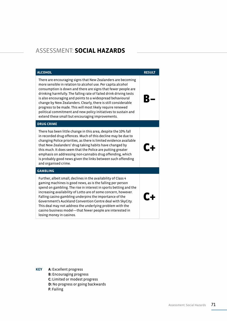
71Assessment: Social Hazards
ALCOHOL RESULT
There are encouraging signs that New Zealanders are becoming more sensible in relation to alcohol use. Per capita alcohol consumption is down and there are signs that fewer people are drinking harmfully. The falling rate of failed drink driving tests is also encouraging and points to a widespread behavioural change by New Zealanders. Clearly, there is still considerable progress to be made. This will most likely require renewed political commitment and new policy initiatives to sustain and extend these small but encouraging improvements.
B–
DRUG CRIME
There has been little change in this area, despite the 10% fall in recorded drug offences. Much of this decline may be due to changing Police priorities, as there is limited evidence available that New Zealanders’ drug-taking habits have changed by this much. It does seem that the Police are putting greater emphasis on addressing non-cannabis drug offending, which is probably good news given the links between such offending and organised crime.
C+
GAMBLING
Further, albeit small, declines in the availability of Class 4 gaming machines is good news, as is the falling per person spend on gambling. The rise in interest in sports betting and the increasing availability of Lotto are of some concern, however. Falling casino gambling underpins the importance of the Government’s Auckland Convention Centre deal with SkyCity. This deal may not address the underlying problem with the casino business model—that fewer people are interested in losing money in casinos.
C+
ASSESSMENT: SOCIAL HAZARDS
KEY A: Excellent progress B: Encouraging progress C: Limited or modest progress D: No progress or going backwards F: Failing

72 A Mountain All Can Climb
The Fonoia family at their Mangere East home; (l-r) Mareilaethanton, 4,
Nina, Ronaldo, 7, Ether, 6 and Mila. The family has moved four times in six
years. An Auckland University study suggests families move more often
due to Auckland’s housing crisis.
New Zealand Herald, 8 December 2014. Photography: Jason Oxenham / New Zealand Herald

73Housing
HOUSING
There are three versions of New Zealand’s housing story: what is
happening in Auckland, what is happening in Christchurch, and what
is happening in the rest of the country. The Auckland story is one of
mixed fortunes depending on whether you are on the property ladder
or forced to rent in a city that is becoming less and less affordable
by the week. The Christchurch story appears to be one of gradual
recovery and adjustment, although there has been no relief for
tenants and those priced out of the ownership market. Most of the
rest of New Zealand appear to be doing okay, or at least coping, and
these New Zealanders probably face greater risk and uncertainty
around incomes than they do around access to affordable housing.
HOUSING AVAILABILITYAuckland’s housing deficit widens even further
Auckland’s housing deficit grew by a further 4000 dwellings during the year to
30 September 2014—a record shortfall, mainly due to rapid population growth
matched by only modest increases in new house building.
Statistics New Zealand estimates that Auckland’s population grew by 33,700
people, or half of New Zealand’s population growth, for the year to September
2014. Against this population growth, 7366 building consents were issued for
new dwellings—meaning a new house for every 4.9 additional people added to
the population.
For the year to 31 December 2014 there were 7595 consents for new dwellings
issued in Auckland which was 31% of the 24,680 consents nation wide.
Auckland’s housing deficit is estimated by calculating the number of dwellings
that would have to be built for population growth if the prevailing average
occupancy rate was applied. At the time of the 2013 Census, there was an
average of three people in each occupied dwelling in Auckland, meaning that
11,200 new dwellings would be required for a population growth of 33,700 people.
The cumulative housing deficit in the region is estimated at between 12,000 to
13,000 dwellings over the past five years. Over this period, Auckland has received
49% of New Zealand’s population growth, yet gained only 26% of new housing
consents. This estimated deficit is lower than those offered in previous State
of the Nation reports. The reason for this decline is Statistics New Zealand’s
downwards revision of Auckland’s population growth, based on results from
the 2013 Census. This downwards revision appears to be due to higher than
estimated outward migration of people from Auckland to other regions. Over
the past five years, probably more than 30,000 Aucklanders have left the region
for other parts of New Zealand.89
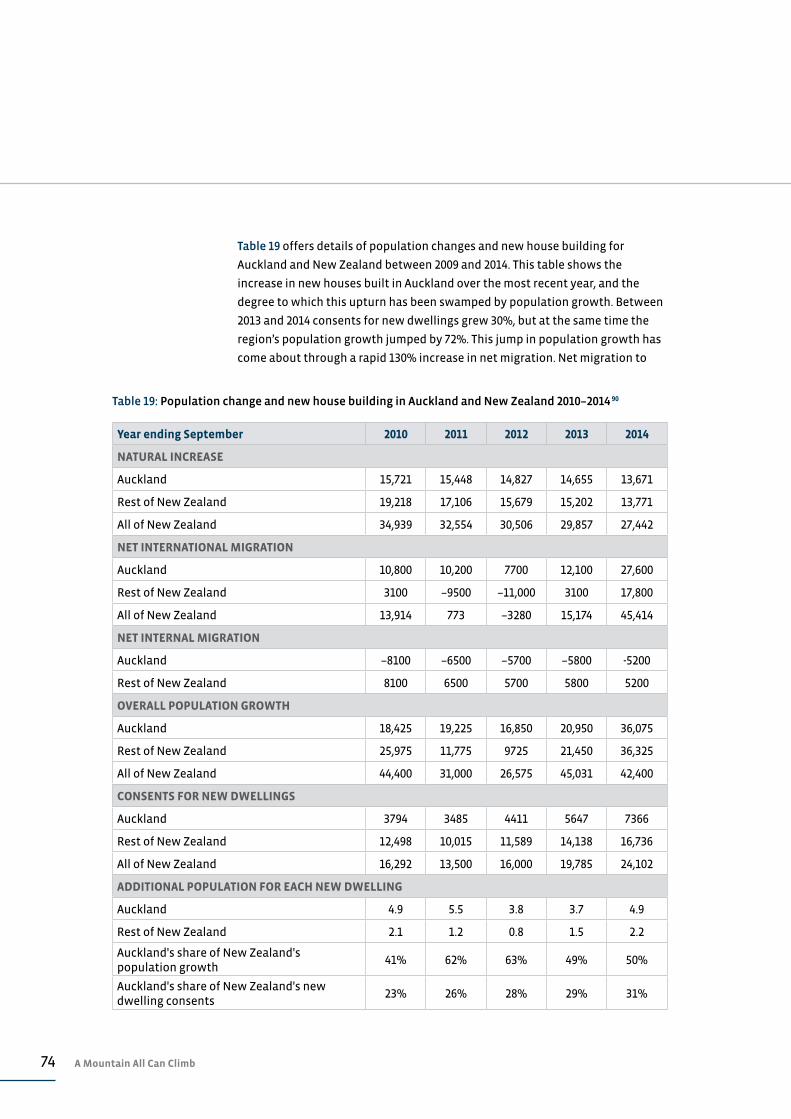
74 A Mountain All Can Climb
Table 19: Population change and new house building in Auckland and New Zealand 2010–2014 90
Year ending September 2010 2011 2012 2013 2014
NATURAL INCREASE
Auckland 15,721 15,448 14,827 14,655 13,671
Rest of New Zealand 19,218 17,106 15,679 15,202 13,771
All of New Zealand 34,939 32,554 30,506 29,857 27,442
NET INTERNATIONAL MIGRATION
Auckland 10,800 10,200 7700 12,100 27,600
Rest of New Zealand 3100 –9500 –11,000 3100 17,800
All of New Zealand 13,914 773 –3280 15,174 45,414
NET INTERNAL MIGRATION
Auckland –8100 –6500 –5700 –5800 -5200
Rest of New Zealand 8100 6500 5700 5800 5200
OVERALL POPULATION GROWTH
Auckland 18,425 19,225 16,850 20,950 36,075
Rest of New Zealand 25,975 11,775 9725 21,450 36,325
All of New Zealand 44,400 31,000 26,575 45,031 42,400
CONSENTS FOR NEW DWELLINGS
Auckland 3794 3485 4411 5647 7366
Rest of New Zealand 12,498 10,015 11,589 14,138 16,736
All of New Zealand 16,292 13,500 16,000 19,785 24,102
ADDITIONAL POPULATION FOR EACH NEW DWELLING
Auckland 4.9 5.5 3.8 3.7 4.9
Rest of New Zealand 2.1 1.2 0.8 1.5 2.2
Auckland's share of New Zealand's population growth
41% 62% 63% 49% 50%
Auckland's share of New Zealand's new dwelling consents
23% 26% 28% 29% 31%
Table 19 offers details of population changes and new house building for
Auckland and New Zealand between 2009 and 2014. This table shows the
increase in new houses built in Auckland over the most recent year, and the
degree to which this upturn has been swamped by population growth. Between
2013 and 2014 consents for new dwellings grew 30%, but at the same time the
region’s population growth jumped by 72%. This jump in population growth has
come about through a rapid 130% increase in net migration. Net migration to
75Housing
and from other countries increased Auckland’s population by between 27,000
and 28,000 people over the September 2014 year.
This high inward migration into Auckland is part of a sharp shift in migration
numbers into New Zealand overall. For the year to September 2014, almost
105,500 long-term migrants entered New Zealand, which is around 25% more
than the average of about 84,000 long-term immigrants over the previous
decade. At the same time, there was a sharp decline of almost 20% in the
number people leaving New Zealand long-term or permanently. Numbers
leaving long term dropped to just over 60,000 people, against an average over
the prior decade of almost 75,000 emigrants. As a result, net migration spiked in
2014 from around 9000 people per annum to 45,000 people. In the past, Auckland
has normally accounted for the majority of any net international migration,
and in some years has accounted for all of it, with the rest of the country
experiencing a net loss. For this reason, it is reasonable to expect that Auckland
will be experiencing the majority of this recent immigration spike and, as
discussed elsewhere in this report, this sharp increase is impacting directly on
Auckland’s housing markets.
Christchurch housing rebuild almost recovers lost housing stock
The Ministry of Business Innovation and Employment estimates that 11,500
dwellings were destroyed in the Christchurch earthquakes of 2010 and 2011.91
New house construction activity since then suggests the rebuild over the past
two years will soon replace this lost housing stock. Summary statistics on
changes in Christchurch’s population and housing stock are in Table 20. Over
the two years to September 2014, a total of 10,589 consents for new dwellings
were issued within the Greater Christchurch area of Christchurch City and the
Waimakariri and Selwyn Districts.
A net 13,500 people are estimated to have left Christchurch during the two years
following the earthquake, but these people have been replaced by a net of just
over 12,000 people arriving in the past two years.92 The population of the greater
Christchurch area is probably back to the same number as immediately prior
to the earthquakes, although a large proportion of the recent arrivals are likely
to be construction workers employed on the rebuild. The exact number of such
workers is not reliably known, but estimates of 38,000 workers being required
are certainly not borne out by migration numbers to date.93
The houses being built in Christchurch today are not the same as the houses
destroyed by the earthquakes, and this difference is likely to be the continuing
source of housing stress for many households for many years to come. The
average house built in Christchurch in 2014 was 180m2 in floor area, costing
on average $320,000 to build.94 With land costs as well, this would mean that a

76 A Mountain All Can Climb
new house in Christchurch will be priced between $450,000 and $550,000. For
comparison, the average house price in Christchurch immediately before the
earthquakes was around $310,000.95
HOUSING AFFORDABILITYRents remain steady against wages
Rents appear to be keeping pace with wages at least at a national level. Figure
23 offers a measure of the relationship between rents and wages over the
past 10 years. This particular measure compares the cost of a modest two-
bedroom house with the wages received by a typical worker working in the
accommodation/restaurant sector, which generally pays the lowest wages
overall. This data suggests that rent affordability improved between 2007 and
2012, but has remained relatively stable since then. The improvements appear to
be driven by stable rents and rising incomes.
Christchurch rents rise 20% since the earthquakes
Although data on Christchurch rents offers a wide range of results, it appears
rents in that city have risen by around 20% in nominal terms since the
earthquakes of 2010 and 2011. Relative changes in rents in New Zealand’s main
cities are offered in Table 21 for the five years between 2009 and 2014.97 This data
suggests that rent increases have been highest in Christchurch—especially
since 2010. Meanwhile, rents in Wellington have tended to increase by less
than the national average and less than the inflation rate—the change in the
headline CPI inflation over this period was around 9%.
Considerable regional variations in regional rents
It is not accurate, of course, to talk of a national rent level, as there is not one
rental housing market, but a large number of sub-markets in different regions
and for different sized or valued houses. This means it can be misleading to
talk of rents in aggregates. The experiences of various types of households
in different sub-markets can be quite different from the shifts indicated by
changes in such measures as averages or medians. The fortunes of these sub-
Table 20: Population change and new house building in Greater Christchurch area 2010–2014 96
Year to June 2010 2011 2012 2013 2014
Resident population—Year to June 463,900 457,400 454,600 455,700 465,800
Natural increase in population 2300 1890 1900 2100
Net migration –8680 –4660 4300 8000
Housing stock—Dec quarters 186,200 176,200 174,700 178,600 185,000
Consents for new dwellings—Year to Dec 2343 1950 3354 5061 6668
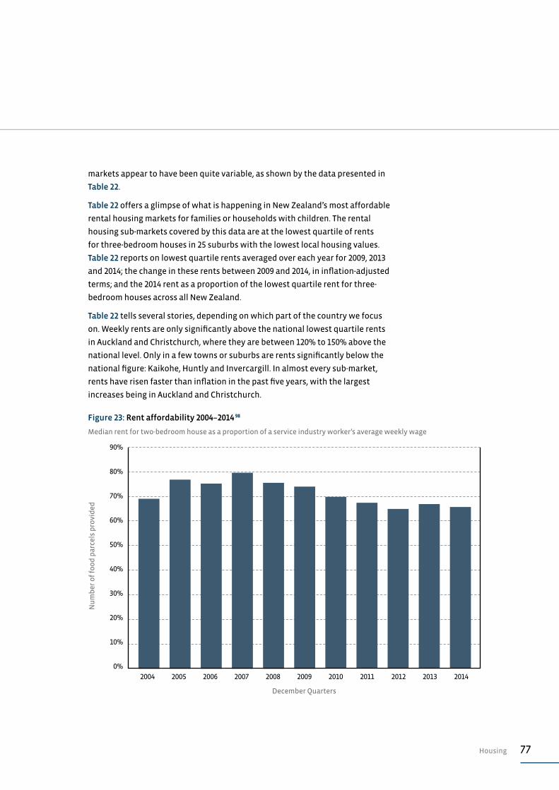
77Housing
markets appear to have been quite variable, as shown by the data presented in
Table 22.
Table 22 offers a glimpse of what is happening in New Zealand’s most affordable
rental housing markets for families or households with children. The rental
housing sub-markets covered by this data are at the lowest quartile of rents
for three-bedroom houses in 25 suburbs with the lowest local housing values.
Table 22 reports on lowest quartile rents averaged over each year for 2009, 2013
and 2014; the change in these rents between 2009 and 2014, in inflation-adjusted
terms; and the 2014 rent as a proportion of the lowest quartile rent for three-
bedroom houses across all New Zealand.
Table 22 tells several stories, depending on which part of the country we focus
on. Weekly rents are only significantly above the national lowest quartile rents
in Auckland and Christchurch, where they are between 120% to 150% above the
national level. Only in a few towns or suburbs are rents significantly below the
national figure: Kaikohe, Huntly and Invercargill. In almost every sub-market,
rents have risen faster than inflation in the past five years, with the largest
increases being in Auckland and Christchurch.
20072004 2008 20112005 2009 20122006 2010 20142013
Nu
mb
er o
f fo
od
par
cels
pro
vid
ed
December Quarters
Figure 23: Rent affordability 2004–2014 98
Median rent for two-bedroom house as a proportion of a service industry worker’s average weekly wage
10%
0%
20%
30%
40%
50%
60%
70%
80%
90%
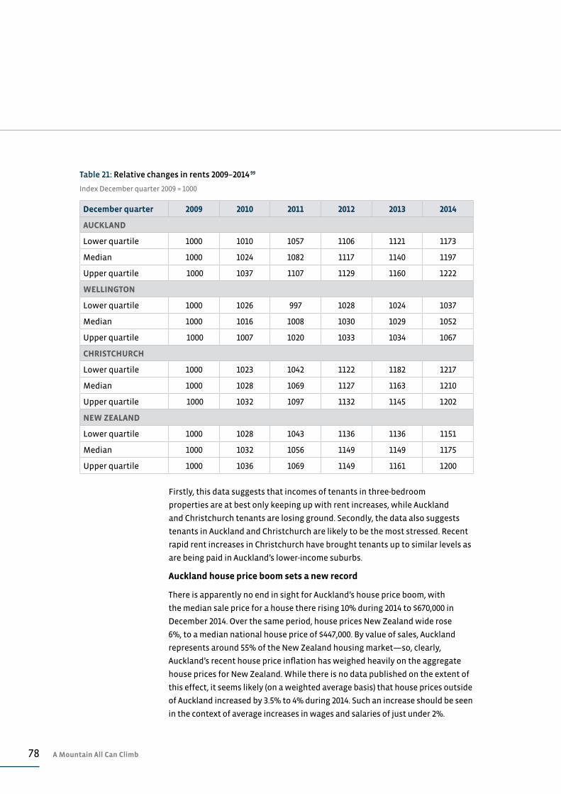
78 A Mountain All Can Climb
Table 21: Relative changes in rents 2009–2014 99
Index December quarter 2009 = 1000
December quarter 2009 2010 2011 2012 2013 2014
AUCKLAND
Lower quartile 1000 1010 1057 1106 1121 1173
Median 1000 1024 1082 1117 1140 1197
Upper quartile 1000 1037 1107 1129 1160 1222
WELLINGTON
Lower quartile 1000 1026 997 1028 1024 1037
Median 1000 1016 1008 1030 1029 1052
Upper quartile 1000 1007 1020 1033 1034 1067
CHRISTCHURCH
Lower quartile 1000 1023 1042 1122 1182 1217
Median 1000 1028 1069 1127 1163 1210
Upper quartile 1000 1032 1097 1132 1145 1202
NEW ZEALAND
Lower quartile 1000 1028 1043 1136 1136 1151
Median 1000 1032 1056 1149 1149 1175
Upper quartile 1000 1036 1069 1149 1161 1200
Firstly, this data suggests that incomes of tenants in three-bedroom
properties are at best only keeping up with rent increases, while Auckland
and Christchurch tenants are losing ground. Secondly, the data also suggests
tenants in Auckland and Christchurch are likely to be the most stressed. Recent
rapid rent increases in Christchurch have brought tenants up to similar levels as
are being paid in Auckland’s lower-income suburbs.
Auckland house price boom sets a new record
There is apparently no end in sight for Auckland’s house price boom, with
the median sale price for a house there rising 10% during 2014 to $670,000 in
December 2014. Over the same period, house prices New Zealand wide rose
6%, to a median national house price of $447,000. By value of sales, Auckland
represents around 55% of the New Zealand housing market—so, clearly,
Auckland’s recent house price inflation has weighed heavily on the aggregate
house prices for New Zealand. While there is no data published on the extent of
this effect, it seems likely (on a weighted average basis) that house prices outside
of Auckland increased by 3.5% to 4% during 2014. Such an increase should be seen
in the context of average increases in wages and salaries of just under 2%.
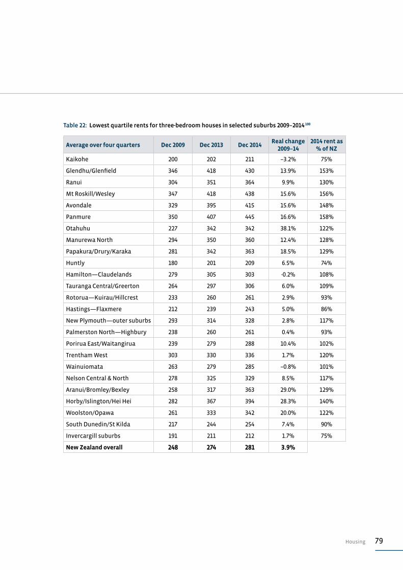
79Housing
Table 22: Lowest quartile rents for three-bedroom houses in selected suburbs 2009–2014 100
Average over four quarters Dec 2009 Dec 2013 Dec 2014Real change
2009–142014 rent as
% of NZ
Kaikohe 200 202 211 –3.2% 75%
Glendhu/Glenfield 346 418 430 13.9% 153%
Ranui 304 351 364 9.9% 130%
Mt Roskill/Wesley 347 418 438 15.6% 156%
Avondale 329 395 415 15.6% 148%
Panmure 350 407 445 16.6% 158%
Otahuhu 227 342 342 38.1% 122%
Manurewa North 294 350 360 12.4% 128%
Papakura/Drury/Karaka 281 342 363 18.5% 129%
Huntly 180 201 209 6.5% 74%
Hamilton—Claudelands 279 305 303 -0.2% 108%
Tauranga Central/Greerton 264 297 306 6.0% 109%
Rotorua—Kuirau/Hillcrest 233 260 261 2.9% 93%
Hastings—Flaxmere 212 239 243 5.0% 86%
New Plymouth—outer suburbs 293 314 328 2.8% 117%
Palmerston North—Highbury 238 260 261 0.4% 93%
Porirua East/Waitangirua 239 279 288 10.4% 102%
Trentham West 303 330 336 1.7% 120%
Wainuiomata 263 279 285 –0.8% 101%
Nelson Central & North 278 325 329 8.5% 117%
Aranui/Bromley/Bexley 258 317 363 29.0% 129%
Horby/Islington/Hei Hei 282 367 394 28.3% 140%
Woolston/Opawa 261 333 342 20.0% 122%
South Dunedin/St Kilda 217 244 254 7.4% 90%
Invercargill suburbs 191 211 212 1.7% 75%
New Zealand overall 248 274 281 3.9%
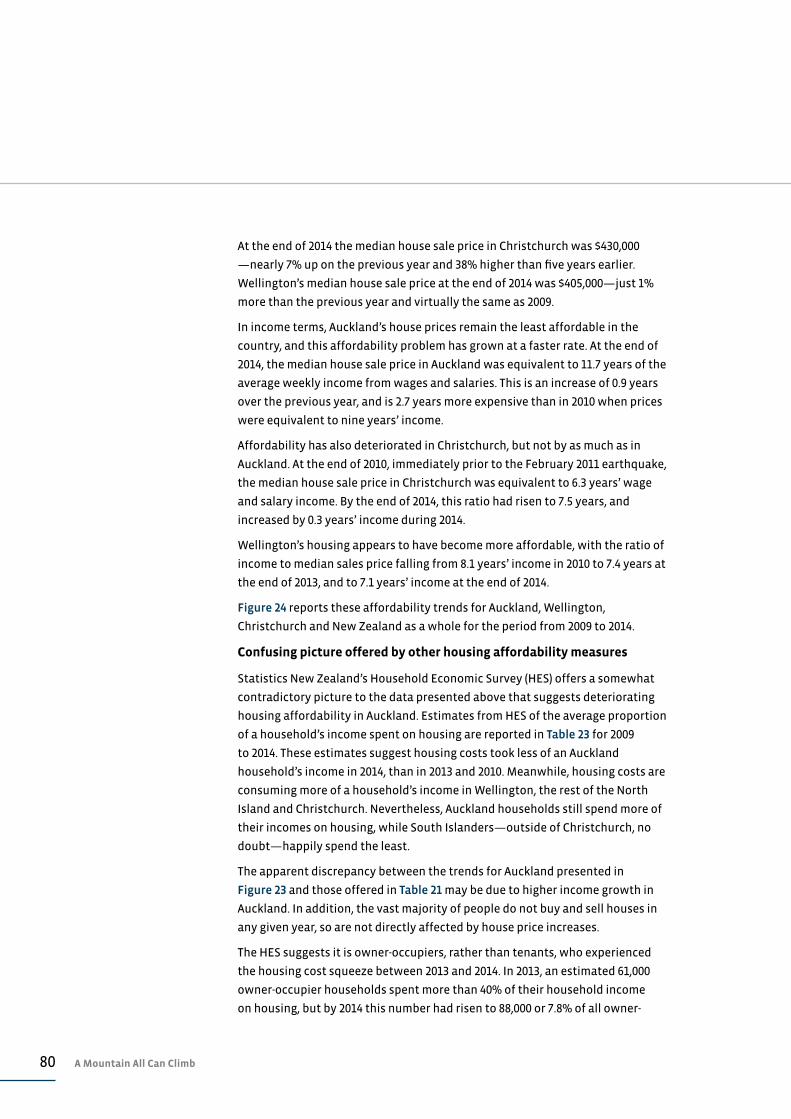
80 A Mountain All Can Climb
At the end of 2014 the median house sale price in Christchurch was $430,000
—nearly 7% up on the previous year and 38% higher than five years earlier.
Wellington’s median house sale price at the end of 2014 was $405,000—just 1%
more than the previous year and virtually the same as 2009.
In income terms, Auckland’s house prices remain the least affordable in the
country, and this affordability problem has grown at a faster rate. At the end of
2014, the median house sale price in Auckland was equivalent to 11.7 years of the
average weekly income from wages and salaries. This is an increase of 0.9 years
over the previous year, and is 2.7 years more expensive than in 2010 when prices
were equivalent to nine years’ income.
Affordability has also deteriorated in Christchurch, but not by as much as in
Auckland. At the end of 2010, immediately prior to the February 2011 earthquake,
the median house sale price in Christchurch was equivalent to 6.3 years’ wage
and salary income. By the end of 2014, this ratio had risen to 7.5 years, and
increased by 0.3 years’ income during 2014.
Wellington’s housing appears to have become more affordable, with the ratio of
income to median sales price falling from 8.1 years’ income in 2010 to 7.4 years at
the end of 2013, and to 7.1 years’ income at the end of 2014.
Figure 24 reports these affordability trends for Auckland, Wellington,
Christchurch and New Zealand as a whole for the period from 2009 to 2014.
Confusing picture offered by other housing affordability measures
Statistics New Zealand’s Household Economic Survey (HES) offers a somewhat
contradictory picture to the data presented above that suggests deteriorating
housing affordability in Auckland. Estimates from HES of the average proportion
of a household’s income spent on housing are reported in Table 23 for 2009
to 2014. These estimates suggest housing costs took less of an Auckland
household’s income in 2014, than in 2013 and 2010. Meanwhile, housing costs are
consuming more of a household’s income in Wellington, the rest of the North
Island and Christchurch. Nevertheless, Auckland households still spend more of
their incomes on housing, while South Islanders—outside of Christchurch, no
doubt—happily spend the least.
The apparent discrepancy between the trends for Auckland presented in
Figure 23 and those offered in Table 21 may be due to higher income growth in
Auckland. In addition, the vast majority of people do not buy and sell houses in
any given year, so are not directly affected by house price increases.
The HES suggests it is owner-occupiers, rather than tenants, who experienced
the housing cost squeeze between 2013 and 2014. In 2013, an estimated 61,000
owner-occupier households spent more than 40% of their household income
on housing, but by 2014 this number had risen to 88,000 or 7.8% of all owner-
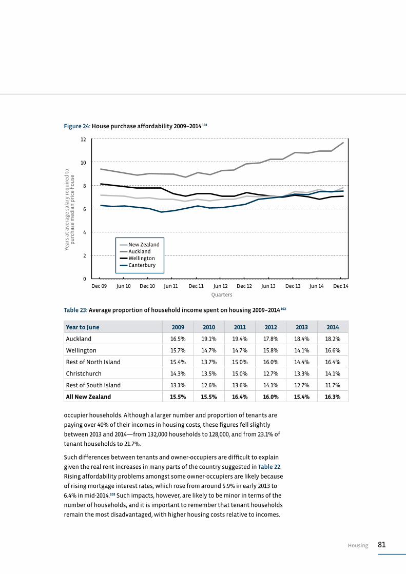
81Housing
occupier households. Although a larger number and proportion of tenants are
paying over 40% of their incomes in housing costs, these figures fell slightly
between 2013 and 2014—from 132,000 households to 128,000, and from 23.1% of
tenant households to 21.7%.
Such differences between tenants and owner-occupiers are difficult to explain
given the real rent increases in many parts of the country suggested in Table 22.
Rising affordability problems amongst some owner-occupiers are likely because
of rising mortgage interest rates, which rose from around 5.9% in early 2013 to
6.4% in mid-2014.103 Such impacts, however, are likely to be minor in terms of the
number of households, and it is important to remember that tenant households
remain the most disadvantaged, with higher housing costs relative to incomes.
Table 23: Average proportion of household income spent on housing 2009–2014 102
Year to June 2009 2010 2011 2012 2013 2014
Auckland 16.5% 19.1% 19.4% 17.8% 18.4% 18.2%
Wellington 15.7% 14.7% 14.7% 15.8% 14.1% 16.6%
Rest of North Island 15.4% 13.7% 15.0% 16.0% 14.4% 16.4%
Christchurch 14.3% 13.5% 15.0% 12.7% 13.3% 14.1%
Rest of South Island 13.1% 12.6% 13.6% 14.1% 12.7% 11.7%
All New Zealand 15.5% 15.5% 16.4% 16.0% 15.4% 16.3%
Year
s at
ave
rage
sal
ary
req
uir
ed t
o
pu
rch
ase
med
ian
pri
ce h
ou
se
0
2
4
10
6
12
8
Quarters
New Zealand Auckland Wellington Canterbury
Figure 24: House purchase affordability 2009–2014 101
Dec 09 Dec 11Jun 10 Jun 12 Dec 13Dec 10 Dec 12 Jun 14Jun 11 Jun 13 Dec 14

82 A Mountain All Can Climb
HOUSING DEBTFurther increase in household debt
Both housing debt and household debt have climbed further during 2014,
reaching new record levels. This is the third year of increases after four previous
years of decline in real terms. At the end of September 2014, average household
debt in New Zealand was $128,600, of which $116,400 was housing-related debt,
and $12,200 consumer or credit card debt.
Average per household housing-related debt is now at a historic high— 3%
higher in real terms than in 2013 and 3% more than five years previously. There
was a sharp 4% fall in average housing debt in 2010 and 2011. This has only
recently been recovered with rising house prices and greater buyer confidence
in some regions.
Average per household consumer and credit card debt rose by almost 5% in 2014,
but it is still lower than the all-time record of $13,200 (in September 14 dollar
values) in late 2007. Between 2007 and 2011, consumer and credit card debt fell
14% as unemployment rose and consumer confidence waned, so the recent
increase should be seen in this context.
The trends in housing related and consumer and credit card debt are reported in
Figure 25.
In total, New Zealand households owed $194 billion in housing-related debt at
the end of September 2014. This was a 5% increase in nominal terms over the
$185 billion owed a year previously, and 18% more than the $165 billion owed in
2009. Overall, household debt (excluding student loans) totalled $214 billion at
the end of September 2014—5% higher in nominal terms than a year previously,
and 17% more than five years previously.
Total household debt at September 2014 equalled 91% of that year’s GDP and
150% of disposable household income. These ratios are lower than five years
previously, but significantly higher than a decade before (as seen in Table 24). As
a proportion of GDP, household debt has remained stable at around 90% to 91%
since 2011, suggesting this debt is rising in line with overall economic growth.
As noted elsewhere in this report, income growth has been fairly sluggish over
the past year. This has meant household debt as a proportion of household
disposable income has risen 3% since 2011, although it remains significantly
below the 156% of income reached at the end of 2009 (immediately following
the GFC).
A recent Reserve Bank survey of household debt across 26 developed countries
suggested that New Zealand’s experience of deleveraging immediately
following the GFC and subsequent rises in the debt to income ratios is common

83Housing
across most countries surveyed. In New Zealand’s favour, between 2007 and
2013, debt and household incomes rose at similar rates, unlike most other
countries, where debt is outpacing incomes. The survey’s author concluded,
somewhat cautiously, however, that the ‘level of debt of the New Zealand
household sector appears to be on the high side internationally’, and suggested
that ‘less obvious is whether the level of New Zealand household indebtedness
is ‘sustainable’ in the long-run sense’.104 Such caution from the Reserve Bank
should temper how we view any further increases in housing-related debt
relative to incomes and GDP.
Table 24: Household debt-related indicators 2004–2014 106
September quarter 2003 2008 2014
Average per household debt in Sept 14 $s $96,700 $124,900 $128,600
Household debt as % of GDP 76% 97% 91%
Household debt as % of household disposable income 129% 156% 150%
140
120
100
80
60
40
20
0
Ave
rage
ho
use
ho
ld d
ebt
$000
’s in
201
4 va
lues
As at September
2008 2009 2010 2011 2012 2013
Figure 25: Average household debt 2009–2014 105
Consumer and credit card debt Housing debt

84 A Mountain All Can Climb
Some of the more than 60 people waiting outside a rental property in Mt
Eden for an open home.
New Zealand Herald , 12 January 2015. Photography: Jason Oxenham / New Zealand Herald

85Assessment: Housing
ASSESSMENT: HOUSING
HOUSING AVAILABILITY RESULT
Auckland’s housing shortage just gets deeper and deeper, and the Government’s response is to continue to rely on market forces and a reduction in regulatory constraints. While there has been a recent upturn in building consent numbers in Auckland and Christchurch, the Christchurch numbers are to be expected given the post-earthquake rebuild. The Auckland numbers are woefully inadequate in the face of the recent migration surge. Either way, the housing being built in both cities is not affordable for those at the bottom of the housing and labour markets. The impact of this mismatch is increasing overcrowding and leading to declining health in some communities.
D
HOUSING AFFORDABILITY
A mixed picture is emerging around housing affordability. Those New Zealanders living outside of Auckland and Christchurch probably experience improving housing affordability, while some living in Auckland and Christchurch experience deteriorating affordability. Tenants in many parts of the country have probably experienced small increases in rents relative to incomes, although rent increases in Auckland and Christchurch will have been much harder to afford. Continuing house price increases in Auckland pose a real threat to that region’s prosperity and growth—and perhaps to New Zealand’s financial stability. Government inaction, outside of some reform to resource management procedures, is appearing less and less adequate.
C–
HOUSING RELATED DEBT
Recent increases in levels of household debt are more or less commensurate with increasing GDP, although they are running ahead of household income growth. There are few, if any, reliable benchmarks to know what a sustainable or prudent level of debt is given that these numbers have taken New Zealand and much of the western world into uncharted territories. Efforts by the Reserve Bank to keep macro-prudential measures in place are painful but sensible in the current housing market. This may, however, be an Auckland problem for which the rest of the country is paying.
C–
KEY A: Excellent progress B: Encouraging progress C: Limited or modest progress D: No progress or going backwards F: Failing
86 A Mountain All Can Climb
ENDNOTES
1 Perry, B. (2014). Household incomes in New Zealand: Trends in Indicators of Inequality and Hardship
1982 to 2013. Wellington: Ministry of Social Development.
2 Ibid. p.216. This estimate of 35 to 40% of low-income households refers to all households that might
be judged to be either income poor or materially deprived. In other words, only 35 to 40% of such
households are both income poor and materially deprived.
3 Ibid. Table L.4 p.218.
4 Ibid. Figure L.6 p.221.
5 Simpson, J., Oben, G., Wicken, A., Adams, J., Reddington, A., and Duncanson, M. (2014). Child Poverty
Monitor 2014 Technical Report. Dunedin: NZ Child & Youth Epidemiology Service, University of Otago.
p.21.
6 On 2 December 2014 stuff.co.nz reported Mr Key as saying that there were ‘many ways’ of defining
poverty, and he was less interested in relative poverty, covered by the (Child Poverty Monitor)
report, than those in ‘material’ poverty. … Within the group covered in the report was a subset of
children that Mr Key said ‘most New Zealanders would think are absolutely clearly materially poor.
… My office would probably identify that group at somewhere between six [thousand] and 100,000
but we’re broadly in the same group. That’s the group I’m focusing on.’ See http://www.stuff.co.nz/
national/63722141/Child-poverty-declines-but-inequality-still-high.
7 Data is from Perry (2014). Table F.7 p.137.
8 Ibid. Table H.4 p.157.
9 Estimates based on Ministry of Social Development’s reported numbers of children in benefit
dependant households taken from Table DB.1 p.31 in the Statistical report 2012, and changes in levels
of payments of the sole parent support payment as reported by MSD in its benefit factsheets—see
https://www.msd.govt.nz/about-msd-and-our-work/publications-resources/statistics/benefit/index.
html. Children’s population figures are from Statistics New Zealand NZ Stats database.
10 Data is from Child Youth and Family website at http://www.cyf.govt.nz/about-us/key-statistics.
11 Data is from Statistics New Zealand’s crime data base available at http://www.stats.govt.nz/tools_
and_services/nzdotstat/tables-by-subject/new-zealand-recorded-crime-tables.aspx.
12 Statistics from Statistics New Zealand’s Crime Tables database at http://nzdotstat.stats.govt.nz/
wbos/Index.aspx?DataSetCode=TABLECODE7403.
13 Ibid.
14 This data on the ECE Census from 2013 is available at the Education Counts website at http://www.
educationcounts.govt.nz/statistics/ece2/participation.
15 See Johnson, A. (2013). Striking a Better Balance: A State of the Nation Report from The Salvation Army.
Wellington: The Salvation Army. p.24.
16 See above reference to Education Counts website.
17 Estimates based on school roll returns for July years, sourced from the Education Counts website. In
such a database five-year-olds’ enrolments in any one year will be slightly under-reported, perhaps
because of delays in starting school due to timing of term breaks. To avoid such an undercount these
estimates are based on enrolments of six-year-olds in the subsequent year. For example, the 2013
figures for five-year-olds are actually counts for six-years-olds in 2014. The 2014 figures for five-year-
olds are the actual reported counts from the school role returns.
18 See the Ministry of Education’s equity funding programme, which is offering $41 million over four
years to improve access to ECE services. Information at http://www.minedu.govt.nz/theMinistry/
Budget/Budget13/ECEInitiatives.aspx.
19 Financial data on ECE spends are taken from the Budget Estimates of Appropriations: Vote Education
which is available at http://www.treasury.govt.nz/budget/archive. The per ECE place is based on
Ministry of Education data on licensed ECE places, available at http://www.educationcounts.govt.nz/
statistics/ece2/services.
20 Education Counts website: Number of licensed ECE places 2014, Table PLA6 available at http://www.
educationcounts.govt.nz/statistics/ece2/services.
87Endnotes
21 This data is derived from the NECA database provided in a pivot table at the Education Counts
website. This table is available at http://www.educationcounts.govt.nz/statistics/schooling/senior-
student-attainment/school_leavers2/ncea-level-1-or-above-numbers. Results reported here differ
slightly from previous State of the Nation reports due to a change in the source of data. Previously
NCEA data was gained from the National Qualifications Authority website.
22 See Statistics New Zealand’s Infos database footnote at http://datainfoplus.stats.govt.nz/Item/
nz.govt.stats/24c7f58a-7a19-4ac5-b66f-374c563932bf.
23 See Australian Bureau of Statistics death data at http://www.abs.gov.au/AUSSTATS/[email protected]/DetailsP
age/3302.02013?OpenDocument.
24 Statistics New Zealand’s Infos database for birth and deaths.
25 Ibid.
26 Statistics New Zealand’s long-term data series reports the number of recorded offences at 347,000
in the 1984 calendar year—see http://www.stats.govt.nz/infoshare/ViewTable.aspx?pxID=223ca2c4-
9061-4d94-8568-9db63783d18e.
27 Crime data is from Statistics New Zealand’s NZStat database and is based on the number of reported
offences for the year ended 30 June. The offending rate is calculated from Statistics New Zealand’s
estimates of the mean population for the corresponding year.
28 Crime data series is from Statistics New Zealand’s NZStat database available at http://nzdotstat.stats.
govt.nz/wbos/Index.aspx?DataSetCode=TABLECODE7401.
29 See Centre for Social Research & Evaluation. (2010). Community Study Summary Report: The Campaign
for Action on Family Violence at http://areyouok.org.nz/assets/Document-files/research/Community-
study-summary-report.pdf.
30 The ‘It’s not OK’ website claims that ‘… one of the fundamental strands of the Campaign for Action on
Family Violence (It’s not OK campaign) is ongoing research and evaluation, which is used to increase
knowledge about family violence, inform campaign strategy and assess campaign impact and
effectiveness’. At http://areyouok.org.nz/resources/research-and-evaluation.
31 Crime data series is from Statistics New Zealand’s NZStat database available at http://nzdotstat.stats.
govt.nz/wbos/Index.aspx?DataSetCode=TABLECODE7401.
32 Detailed data on recorded and resolved offending only dates back to 1994/95. The 2013/14 resolution
rate of 74.1% is significantly lower than the next lowest resolution rate of 78% during 1998/99. It
seems likely that a lower rate than the 2013/14 figure might pre-date 1994/95 by a considerable period.
33 For the purpose of this analysis crimes of violence are taken to include acts intended to cause
injury, sexual assaults of any type, abduction, kidnapping and related offences, harassment and
intimidation, robbery, extortion and related offences.
34 Available at Statistics New Zealand’s website at http://nzdotstat.stats.govt.nz/wbos/Index.
aspx?DataSetCode=99992.
35 Crime data series is from Statistics New Zealand’s NZStat database available at http://nzdotstat.stats.
govt.nz/wbos/Index.aspx?DataSetCode=TABLECODE7401.
36 Ibid.
37 Department of Corrections website ‘Facts and Statistics’ available at http://www.corrections.govt.nz/
resources/facts_and_statistics/community_sentences_and_orders.html.
38 See data provided by the quarterly updates to the Justice Sector Forecasts on the Ministry of Justice
website at http://www.justice.govt.nz/justice-sector/statistics/justice-sector-forecasts.
39 The most recent population estimates of Statistics New Zealand report an annual increase in the year
to 30 June 2014 in the national population of 23,800 people to 4,476,400 people or a 0.05% increase.
Meanwhile, the Māori population is estimated to have grown by 9,400 people to 701,700 population—
an annual increase of 1.4%.
40 Prosecution and convictions data series from Statistics New Zealand’s NZStat database. Available at
http://nzdotstat.stats.govt.nz/wbos/Index.aspx?DataSetCode=TABLECODE7372.
41 These figures are derived from monthly averages reported in the Justice Sector Forecast update,
available on the Ministry of Justice website at http://www.justice.govt.nz/publications/global-
publications/j/justice-sector-forecast-forecast-update-quarter-ending-june-2014-report-summary.
88 A Mountain All Can Climb
42 Data on prison population is taken from Ministry of Justice’s Justice Sector Forecast updates (see
previous endnote) and Department of Corrections’ quarterly Prison Statistics report, available at
http://www.corrections.govt.nz/resources/facts_and_statistics/quarterly_prison_statistics.html.
Population data is from Statistics New Zealand’s quarterly national population estimates.
43 Department of Corrections Annual Reports 2009 to 2014. 2014 data from2013/14 Annual Report p.68
and pp.121-122. Available at http://www.corrections.govt.nz/resources/annual-reports5.html.
44 Average per spend costs are based on Department of Correction’s financial and operating statements
contained in its Annual Reports. These figures differ considerably from the estimates contained in the
2014 State of the Nation report. An error was made in this earlier report that did not include remand
prisoners in the denominator for calculations of the average per prisoner cost.
45 Morrison, B., Smith, M., and Gregg, L. (2010). The New Zealand Crime and Safety Survey 2009: Main
Findings Report. Ministry of Justice available at http://www.justice.govt.nz/publications/global-
publications/n/nzcass-2009/nz-crime-and-safety-survey-2009.
46 Ibid. Figure 3.3 p.37.
47 Ibid. p.35.
48 The literature on the reporting or non-reporting of crime appears to offer a variety of explanations
for peoples’ unwillingness to report crime to police. Levitt suggests that crime reporting is related
to the size of the local police force (Levitt, S. (1998) The Relationship Between Crime Reporting and
Police: Implications for the Use of Uniform Crime Reports. Journal of Quantitative Criminology v.14:1
pp 61-81). Conaway and Lohr found that reporting is more common where victims have had positive
results from reporting previous vicitimisation to police (Conaway, M. and Lohr, S. (1994) A longitudinal
analysis of factors associated with reporting violent crime to police. Journal of Quantitative
Criminology v.10:1 pp.23-39). Kochel et al. argue that ‘nonreporting is the result of three factors acting
singly or in concert: a) victim fear, b) feelings of helplessness and the perceived powerlessness of
police, and c) the threat of further victimization from authorities’ (Kochel, T. Parks,R. and Mastrofski,S.
(2013) Examining Police Effectiveness as a Precursor to Legitimacy and Cooperation with Police,
Justice Quarterly, v.30:5 p. 895). Tarling and Morris suggest that reporting is most likely for more
serious offences involving violence (Tarling, R and Morris, K. (2010) Reporting Crime to the Police.
British Journal of Criminology v.50:3 pp.474-490). MacDonald claims that non-reporting is related to
attitudes toward the police and that unemployed people are less likely to report property crimes
than employed people. (MacDonald, Z. (2001) Revisiting the Dark Figure: a Microeconometric Analysis
of the Under-Reporting of Property Crime and its Implications. British Journal of Criminology v.41:1
pp127-149).
49 Between 2007 and 2011 notifications to Child Youth and Family of possible child abuse or neglect
more than doubled from 72,000 cases to just over 151,000. In 2011 more than one third of these
notifications (57,000) were from police notifications following their attendance at family violence
incidents where children had been present. This practice of formally reporting the presence of
children at such incidents did not occur in 2007, so most of the increase in notifications was due to
Police reporting.
50 See Ministry of Justice announcement at http://www.justice.govt.nz/publications/global-
publications/c/nz-crime-and-safety-survey-q-as/nz-crime-and-safety-survey-q-as.
51 This data is based on the Australia and New Zealand Standard Offence Classification method and is
available on the Statistics New Zealand website at http://www.stats.govt.nz/tools_and_services/
nzdotstat/tables-by-subject/new-zealand-recorded-crime-tables/ASOC-offence-fiscal-year-statistics.
aspx.
52 Crime data series is from Statistics New Zealand’s NZStat database available at http://nzdotstat.stats.
govt.nz/wbos/Index.aspx?DataSetCode=TABLECODE7401.
53 Ibid.
54 Ibid. for both Table 15 and Table 16.
55 Colmar Brunton. (2013). Public Perceptions of Crime—Survey Report. Wellington: Ministry of Justice.
Available at http://www.justice.govt.nz/publications/global-publications/p/public-perceptions-of-
crime-survey-report.
56 Ibid. Figure 6 p.26.
57 Ibid. Figure 9 p.32.

89Endnotes
58 Statistics New Zealand’s Household Labour Force Survey from the Infos database.
59 Data for official unemployment and jobless rate is taken from Statistics New Zealand’s Household
Labour Force Survey from the Infos database. Data on Jobseekers is from the Ministry of Social
Development’s Benefit Factsheets.
60 Between 2009 and 2014 male jobs grew by 8.6% while female jobs grew by 7.8%—these growth
estimates are based on averages for four consecutive quarters. Over the same period, female labour
force participation rose from 62.3% to 63.8%—again based on four quarter averages—while male
participation remained stable.
61 The retiring Baby Boomer generation has swelled the number of people aged between 65 and 70, and
it is this group who have primarily remained in the workforce after 65. This is one of the reasons for
the recent expansion in the numbers of older (over 65) workers. As this cohort of people reaches 70
and as the numbers retiring each year stabilise, so too will the numbers remaining in the workforce.
It is possible the rate of labour market participation by over 65s may decline from the current rate
of 20-21% as the number of people aged over 70 and 75 grows with this aging process and increasing
longevity.
62 Statistics New Zealand’s Household Labour Force Survey from the Infos database.
63 Ibid.
64 Figures based on ordinary hourly earnings and averaged over four consecutive quarters. Data from
the Quarterly Employment Survey.
65 Statistics New Zealand’s Quarterly Employment Survey from the Infos data base. These figures are for
wage and salary earners only. It excludes business owners, whose income is normally aggregated into
wage and salary earners incomes for the headline income figures used in previous State of the Nation
reports.
66 Summary data from the New Zealand Income Survey is as follows:
MALE WEEKLY INCOME FEMALE WEEKLY INCOME
Avg wages & salaries
Avg all sources
Median all sources
Avg wages & salaries
Avg all sources
Median all sources
Avg ratio female as %
of male
People in employed aged over 15 years
2009 806 1073 900 618 765 686 75%
2014 969 1249 1000 746 888 780 75%
All people aged over 15 years
2009 562 826 681 354 541 430 64%
2014 679 955 767 426 613 464 62%
67 See Ministry of Business, Innovation & Employment. (2014). Regulatory Impact Statement
for Minimum Wage Review 2013, available at http://www.treasury.govt.nz/publications/
informationreleases/ris/pdfs/ris-mbie-mmw-feb14.pdf.
68 Ibid. Table 4 p.12.
69 Data from Ministry of Social Development’s Benefit Factsheets.
70 New Zealand Government’s Half Yearly Budget Economic & Fiscal Update 2014 table 6.2 p.124.
71 Data sourced from The Salvation Army’s SAMIS national database and is based on data retrieved on
20/01/15.
72 Statistics New Zealand Consumer Price Index series.
73 Kalafatelis, E., Magill, K. and Stirling, H. (2014). Attitudes and Behaviour Towards Alcohol Survey 2010-
2012. Report 1.1—The Alcohol Drinking Behaviour of Adults Aged 18 Years and Over. Health Promotion
Agency. Available at http://www.hpa.org.nz/research-library/research-publications.
74 Ibid. Table 19 p.27. Self-reported non-drinkers rose from 16% of respondents in 2009 to 26% in 2010 and
then fell to 22% in 2010 and to 19% in 2012.
90 A Mountain All Can Climb
75 Ibid. Table 28 p.32. In 2012, 38% of respondents reported drinking less than they did a year previously,
while 8% reported drinking more. Table 26 p.30, 34% of respondents reported thinking about drinking
less.
76 Ibid. Table 16 p.25. In 2009, 31% of respondents reported drinking seven or more drinks on at least one
occasion in the previous month, and in 2012 26% did.
77 Guiney, H., Newcombe, R., and Walton, D. (2014). Alcohol-Related Attitudes in 2010, 2012, and 2014:
Findings from the New Zealand Health Survey. Health Promotion Agency. Available at http://www.
hpa.org.nz/research-library/research-publications.
78 Data from Statistics New Zealand’s alcohol availability data series and per capita rates use SNZ’s
population estimates.
79 Data on offences from Statistics New Zealand crime data series. Figures for the numbers of breath
tests undertaken are from New Zealand Police Annual Reports.
80 Wilkins, C., Jawalkar, P., Moewaka-Barnes, H., Parker, K. and Asiasiga, L. (2014) New Zealand Arrestee
Drug Use Monitoring 2013 Report. Massey University. Available at http://www.massey.ac.nz/massey/
learning/departments/centres-research/shore/projects/nz-arrestee-drug-use-monitoring.cfm.
81 Ministry of Health. (2014). Amphetamine Use 2013/14: New Zealand Health Survey. Wellington:
Ministry of Health. Available at http://www.health.govt.nz/system/files/documents/publications/
amphetamine-use-2013-14-nzhs-dec14.pdf.
82 Data for Figure 21 and for the preceding text is from Statistics New Zealand crime data series.
83 This figure is for the 2012/13 year. See Ministry of Health data on problem gambling services
‘intervention client data’ at http://www.health.govt.nz/our-work/mental-health-and-addictions/
problem-gambling/service-user-data/intervention-client-data.
84 These estimates are based on the annual reports of the New Zealand Lotteries Commission (available
at https://mylotto.co.nz/assets/footer-pages/downloads/Annual-Reports), New Zealand Racing Board
(available at http://www.nzracingboard.co.nz/annual), Department of Internal Affairs (available
at http://www.dia.govt.nz/diawebsite.nsf/wpg_URL/Resource-material-Information-We-Provide-
Gaming-Machine-Venues-Numbers-and-Expenditure-by-Territorial-AuthorityDistrict) and SkyCity Ltd
(available at http://ir.skycityentertainmentgroup.com/phoenix.zhtml?c=162796&p=irol-irhome).
85 New Zealand Lotteries Commission Annual Reports 2012/13 and 2013/14.
86 New Zealand Racing Board Annual Reports 2012/13 and 2013/14.
87 Skycity Ltd’s reported revenue from ‘local gambling’ was $615 million in the 2011/12 financial year,
falling to $599 million in 2012/13 and $571 million in 2013/14. Source: Skycity Ltd Annual Reports—2013
p.41 and 2014 p.40.
88 Department of Internal Affairs gaming statistics.
89 Estimate based on the difference between Statistics New Zealand’s June regional population
estimates and the net contribution made to population growth through natural increase and net
international migration.
90 Data is from Statistics New Zealand’s building consent data set, and from its population estimates
series.
91 See Ministry of Business Innovation and Employment. (2013). Housing pressures in Christchurch: a
summary of the evidence. Wellington: MBIE, Table 1 p.4.
92 Statistics New Zealand’s sub-national population estimates.
93 See Ministry of Business, Innovation and Employment. (2014). Quarterly Canterbury Job Matching
Report—September 2014, which estimates a need for 38,000 construction workers for the rebuild
and that at September 2014 that there was a remaining shortage of 8,000 workers. Report is available
at http://www.dol.govt.nz/publications/research/canterbury-rebuild/canterbury-job-matching-
sep-2014.pdf. Statistics New Zealand, in their extended report on Christchurch in the Household
Labour Force Survey, estimates the construction sector workforce has grown from 32,000 workers in
September 2012 to 50,000 workers in September 2014. Clearly, most of these additional workers, as
well as most of the construction workers around in 2012, will be working on the recovery. It would,
however, be wrong to read MBIE’s estimate of 38,000 rebuild workers as workers who will need to
migrate to Christchurch.

91Endnotes
94 Statistics New Zealand’s building consent database on Infos.
95 Real Estate of New Zealand median house sale price figures.
96 Population data is from Statistics New Zealand’s sub-national population estimates and building
consent data sourced from Infos. Estimates of housing stock are taken from MBIE (2013) (see footnote
above) and for 2014 have been made by the author based on consents for new dwellings during the
respective years.
97 The cities cited in Table 21 are the former Auckland City (now the isthmus suburbs of Auckland),
Wellington City and Christchurch City.
98 Data for this figure is from the Ministry of Business, Employment and Innovation’s Tenancy Bond
Division’s database and from Statistics New Zealand’s Quarterly Employment Survey.
99 Ministry of Business Employment and Innovation Tenancy Bonds database. These indices are derived
from monthly averages over the December quarter in the respective years.
100 Data is from tenancy bond data provided by Ministry of Business Innovation and Employment and
available at http://www.dbh.govt.nz/nz-housing-and-construction-quarterly-open-data.
101 Income measures are based on average weekly earnings reported in Table 7.01 of Statistics New
Zealand’s Quarterly Employment Survey. Median house prices are based on three-month averages
reported by Real Estate of New Zealand and supplied directly to the author.
102 Statistics New Zealand’s Household Economic Survey.
103 Reserve Bank’s data series Table B3: ‘Retail interest rates on lending and deposits’, available at http://
www.rbnz.govt.nz/statistics/tables/b3.
104 Hunt, C. (2014). Household Debt: A Cross-Country Perspective. Reserve Bank of New Zealand Bulletin
Vol.77 No.4.
105 These averages are derived from household debt data from Table C.6 of the Reserve Bank’s Credit and
Finance data series and from Statistics New Zealand’s estimates of dwellings and households.
106 Housing and household debt data is sourced from the Reserve Bank of New Zealand’s credit data
series C6 Households Credit and C12 Credit card statistics. Debt to income ratios are sourced from the
RBNZ’s key statistics data series. GDP data and household numbers have been sourced from Statistics
New Zealand.

The Salvation Army Social Policy and Parliamentary Unit
New Zealand, Fiji & Tonga Territory
PO Box 76249, Manukau, Auckland 2241
Phone (09) 261 0886
www.salvationarmy.org.nz/socialpolicy
twitter.com/SPPU
www.facebook.com/SPPUNZ