A Little Stats Won't Hurt You - Sas Institute · Nate Derby A Little Stats Won’t Hurt You 24 /...
71
Introduction Data Visualization Descriptive Statistics A Little Stats Won’t Hurt You Nate Derby Statis Pro Data Analytics Seattle, WA, USA Edmonton SAS Users Group, 11/13/09 Nate Derby A Little Stats Won’t Hurt You 1 / 71
Transcript of A Little Stats Won't Hurt You - Sas Institute · Nate Derby A Little Stats Won’t Hurt You 24 /...

IntroductionData Visualization
Descriptive Statistics
A Little Stats Won’t Hurt You
Nate Derby
Statis Pro Data AnalyticsSeattle, WA, USA
Edmonton SAS Users Group, 11/13/09
Nate Derby A Little Stats Won’t Hurt You 1 / 71

IntroductionData Visualization
Descriptive Statistics
Outline
1 IntroductionWhat Can Statistical Methods Tell Us?Exploratory Data Analysis (EDA)
2 Data VisualizationScatterplots and Bubble PlotsHistogramsBox Plots
3 Descriptive StatisticsPROC UNIVARIATEDecimal PlacesHypothesis Tests
Nate Derby A Little Stats Won’t Hurt You 2 / 71

IntroductionData Visualization
Descriptive Statistics
What Can Statistical Methods Tell Us?Exploratory Data Analysis (EDA)
What Can Statistical Methods Tell Us?
Statistics can describe data, extract information from them:
Test hypotheses (“Is X correlated with Y ?”).Extrapolate trends for forecasts (“What will X be in n weeks?”).Quantify what happened (“What is effect of X on Y ?”).
First step: Look at the data, look for “interesting” features.
Meaning of “interesting” depends on context:
Preliminary steps: “Should this data point be included?”More advanced stages: “If we change the data, how does thatchange the results?”
“If it looks interesting, it’s probably wrong.”
Investigate to determine if really “interesting” or just wrong.
Nate Derby A Little Stats Won’t Hurt You 3 / 71

IntroductionData Visualization
Descriptive Statistics
What Can Statistical Methods Tell Us?Exploratory Data Analysis (EDA)
Exploratory Data Analysis (EDA)
EDA = Looking at data to see what the data are telling us.
Tells us which variables to look at, what models to use, etc.Prerequisites for more advanced methods:
ANOVA (PROC ANOVA, PROC GLM)Linear/logistic regression (PROC REG, PROC LOGISTIC)ARIMA (PROC ARIMA)
We will focus on univariate methods.
Look at one variable at a time.“How is that variable distributed (spread out) within our data set?”
Nate Derby A Little Stats Won’t Hurt You 4 / 71

IntroductionData Visualization
Descriptive Statistics
What Can Statistical Methods Tell Us?Exploratory Data Analysis (EDA)
Two Methods
Data Visualization
Graphical techniques to quickly/easily see general trends.Keep it simple! (Like/unlike a dashboard)
Descriptive Statistics
Statistical measures to summarize characteristics of distribution.Keep it short!
Nate Derby A Little Stats Won’t Hurt You 5 / 71

IntroductionData Visualization
Descriptive Statistics
What Can Statistical Methods Tell Us?Exploratory Data Analysis (EDA)
Example Data Sets
Six sets of 50 measurements of systolic blood pressure (mmHg):
113 122 106 131 130 112 132 122 114 117108 103 117 120 117 126 116 128 124 123126 143 118 110 103 119 136 109 113 116127 97 144 108 121 128 115 115 124 115120 98 115 107 131 126 112 118 121 126
Named data1 - data6.Variables bp, group (values 1-6).Difficult to discern distribution information from the raw data!
Too much information!
Nate Derby A Little Stats Won’t Hurt You 6 / 71

IntroductionData Visualization
Descriptive Statistics
Scatterplots and Bubble PlotsHistogramsBox Plots
Scatterplot I
First step: Look at one-dimensional scatterplots
Basic Scatterplot (page 2)
PROC GPLOT data=data1;PLOT group*bp;
RUN;
Nate Derby A Little Stats Won’t Hurt You 7 / 71

IntroductionData Visualization
Descriptive Statistics
Scatterplots and Bubble PlotsHistogramsBox Plots
group
1
bp
90 100 110 120 130 140 150
Nate Derby A Little Stats Won’t Hurt You 8 / 71
IntroductionData Visualization
Descriptive Statistics
Scatterplots and Bubble PlotsHistogramsBox Plots
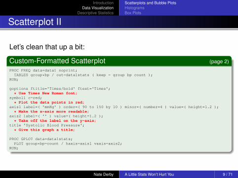
Scatterplot II
Let’s clean that up a bit:
Custom-Formatted Scatterplot (page 2)
PROC FREQ data=data1 noprint;TABLES group*bp / out=data1stats ( keep = group bp count );
RUN;
goptions ftitle='Times/bold' ftext='Times';
* Use Times New Roman font;symbol1 c=red;
* Plot the data points in red;axis1 label=( 'mmHg' ) order=( 90 to 150 by 10 ) minor=( number=4 ) value=( height=1.2 );
* Make the x-axis more readable;axis2 label=( '' ) value=( height=1.2 );
* Take off the label on the y-axis;title 'Systolic Blood Pressure';
* Give this graph a title;
PROC GPLOT data=data1stats;PLOT group*bp=count / haxis=axis1 vaxis=axis2;
RUN;
Nate Derby A Little Stats Won’t Hurt You 9 / 71

IntroductionData Visualization
Descriptive Statistics
Scatterplots and Bubble PlotsHistogramsBox Plots
Systolic Blood Pressure
Frequency Count 1 2 3 4
1
mmHg
90 100 110 120 130 140 150
Nate Derby A Little Stats Won’t Hurt You 10 / 71

IntroductionData Visualization
Descriptive Statistics
Scatterplots and Bubble PlotsHistogramsBox Plots
Bubble Plots
Let’s try one variation:
Custom-Formatted Scatterplot (page 2)
PROC FREQ data=data1 noprint;TABLES group*bp / out=data1stats ( keep = group bp count );
RUN;
goptions ftitle='Times/bold' ftext='Times';
* Use Times New Roman font;symbol1 c=red;
* Plot the data points in red;axis1 label=( 'mmHg' ) order=( 90 to 150 by 10 ) minor=( number=4 ) value=( height=1.2 );
* Make the x-axis more readable;axis2 label=( '' ) value=( height=1.2 );
* Take off the label on the y-axis;title 'Systolic Blood Pressure';
* Give this graph a title;
PROC GPLOT data=data1stats;BUBBLE group*bp=count / haxis=axis1 vaxis=axis2 bcolor=red;
RUN;
Nate Derby A Little Stats Won’t Hurt You 11 / 71

IntroductionData Visualization
Descriptive Statistics
Scatterplots and Bubble PlotsHistogramsBox Plots
Systolic Blood Pressure
1
mmHg
90 100 110 120 130 140 150
Nate Derby A Little Stats Won’t Hurt You 12 / 71

IntroductionData Visualization
Descriptive Statistics
Scatterplots and Bubble PlotsHistogramsBox Plots
Scatterplots and Bubble Plots: Conclusions
Scatterplots:
Gives us a effective look at the range, distribution, outliers.Difficult to differentiate multiple points in the same space.
Bubble Plots:
Represents multiple points in the same space by a bubble, sizerelational to # points.More effective way to look at range, distribution, outliers.Other than that, not very useful.
Nate Derby A Little Stats Won’t Hurt You 13 / 71

IntroductionData Visualization
Descriptive Statistics
Scatterplots and Bubble PlotsHistogramsBox Plots
Histogram I
Histogram: Chart of frequency/percentage counts for different ranges.
Basic Histogram (page 3)
PROC GPLOT data=data1;VBAR bp;
RUN;
Nate Derby A Little Stats Won’t Hurt You 14 / 71

IntroductionData Visualization
Descriptive Statistics
Scatterplots and Bubble PlotsHistogramsBox Plots
FREQUENCY
0
1
2
3
4
5
6
7
8
9
10
11
12
13
14
15
bp MIDPOINT
96 104 112 120 128 136 144
Nate Derby A Little Stats Won’t Hurt You 15 / 71

IntroductionData Visualization
Descriptive Statistics
Scatterplots and Bubble PlotsHistogramsBox Plots
Histogram II
Again, clean it up:
Custom-Formatted Histogram (page 3)
goptions ftitle='Times/bold' ftext='Times';axis1 label=( 'Interval Midpoint (mmHg)' height=1.2 )offset=( 4, 4 ) value=( height=1.2 );
axis2 label=( angle=90 height=1.2 'Frequency' )order=( 0 to 20 by 5 ) minor=( number=4 ) value=( height=1.2 );
title 'Systolic Blood Pressure';
PROC GCHART DATA=data1;VBAR bp / maxis=axis1 raxis=axis2 width=4 space=2;
RUN;
Nate Derby A Little Stats Won’t Hurt You 16 / 71

IntroductionData Visualization
Descriptive Statistics
Scatterplots and Bubble PlotsHistogramsBox Plots
Systolic Blood PressureFr
eque
ncy
0
5
10
15
20
Interval Midpoint (mmHg)
96 104 112 120 128 136 144
Nate Derby A Little Stats Won’t Hurt You 17 / 71

IntroductionData Visualization
Descriptive Statistics
Scatterplots and Bubble PlotsHistogramsBox Plots
Histogram III
Still not quite right – want to make explicit ranges
Custom-Formatted Histogram, Customized Ranges (page 4)
axis1 label=( 'mmHg' ) value=( height=1.2 '92 - 100' '100 - 108''108 - 116' '116 - 124' '124 - 132' '132 - 140' '140 - 148' )offset=( 4, 4 );
axis2 label=( angle=90 height=1.2 'Frequency' ) order=( 0 to 20 by 5 )minor=( number=4 ) value=( height=1.2 );
PROC GCHART DATA=data1;VBAR bp / maxis=axis1 raxis=axis2 width=4 space=2midpoints = 96 to 144 by 8;
RUN;
Nate Derby A Little Stats Won’t Hurt You 18 / 71

IntroductionData Visualization
Descriptive Statistics
Scatterplots and Bubble PlotsHistogramsBox Plots
Systolic Blood PressureFr
eque
ncy
0
5
10
15
20
mmHg
92 - 100 100 - 108 108 - 116 116 - 124 124 - 132 132 - 140 140 - 148
Nate Derby A Little Stats Won’t Hurt You 19 / 71

IntroductionData Visualization
Descriptive Statistics
Scatterplots and Bubble PlotsHistogramsBox Plots
What Can We Deduce from Our Histogram?
Data centered around 120 mmHg (easier with odd number ofintervals),“Bulk” of data within 8-10 mmHg of 120 mmHg.
Answers to questions:
What is the central value of the data?How spread out are the data?
Nate Derby A Little Stats Won’t Hurt You 20 / 71

IntroductionData Visualization
Descriptive Statistics
Scatterplots and Bubble PlotsHistogramsBox Plots
Central Value of Data
What is the central value of the data?
Mean: Arithmetic average, orx1 + x2 + · · ·+ xn
n.
Median: “Middle Value”: 50% of data below this value.
Mode: Value/category that is a maximum (“high point”) in thedistribution.
Relationship between median and mode can determine skewness:How lopsided the distribution is.
Nate Derby A Little Stats Won’t Hurt You 21 / 71

IntroductionData Visualization
Descriptive Statistics
Scatterplots and Bubble PlotsHistogramsBox Plots
Skewness
x
Distribution
left-skewed (left-tailed)mean < median
x
Distribution
right-skewed (right-tailed)mean > median
Nate Derby A Little Stats Won’t Hurt You 22 / 71

IntroductionData Visualization
Descriptive Statistics
Scatterplots and Bubble PlotsHistogramsBox Plots
Spread of Data
How spread out are the data?
Standard Deviation: Average distance from the mean.Minimum: Smallest value25th percentile: 25% of data lie below this value.75th percentile: 75% of data lie below this value.Interquartile Range: Difference between 75th and 25th
percentiles.Maximum: Largest value.
Note: Median = 50th percentile.
Nate Derby A Little Stats Won’t Hurt You 23 / 71

IntroductionData Visualization
Descriptive Statistics
Scatterplots and Bubble PlotsHistogramsBox Plots
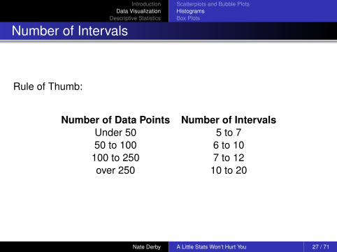
Number of Intervals
Beware of too many/few intervals!
Histogram with xx intervals (page 6)
axis1 label=( 'Interval Midpoint (mmHg)' height=1.2 ) value=( height=1.2 );axis2 label=( angle=90 'Frequency' height=1.2 ) value=( height=1.2 );title 'Systolic Blood Pressure, xx Intervals';
PROC GCHART DATA=data1;VBAR bp / maxis=axis1 raxis=axis2 levels = xx;
RUN;
Nate Derby A Little Stats Won’t Hurt You 24 / 71

IntroductionData Visualization
Descriptive Statistics
Scatterplots and Bubble PlotsHistogramsBox Plots
Systolic Blood Pressure, 2 Intervals
Freq
uenc
y
0
10
20
30
Interval Midpoint (mmHg)
105 135
Nate Derby A Little Stats Won’t Hurt You 25 / 71

IntroductionData Visualization
Descriptive Statistics
Scatterplots and Bubble PlotsHistogramsBox Plots
Systolic Blood Pressure, 15 IntervalsFr
eque
ncy
0
1
2
3
4
5
6
7
8
9
10
Interval Midpoint (mmHg)
92 96 100 104 108 112 116 120 124 128 132 136 140 144 148
Nate Derby A Little Stats Won’t Hurt You 26 / 71
IntroductionData Visualization
Descriptive Statistics
Scatterplots and Bubble PlotsHistogramsBox Plots
Number of Intervals
Rule of Thumb:
Number of Data Points Number of IntervalsUnder 50 5 to 750 to 100 6 to 10100 to 250 7 to 12over 250 10 to 20
Nate Derby A Little Stats Won’t Hurt You 27 / 71

IntroductionData Visualization
Descriptive Statistics
Scatterplots and Bubble PlotsHistogramsBox Plots
Histogram: Conclusions
Gives us a rough estimate of distribution.Can be misleading from too few/many intervals!(Can be misleading even from shifting intervals!)
Nate Derby A Little Stats Won’t Hurt You 28 / 71

IntroductionData Visualization
Descriptive Statistics
Scatterplots and Bubble PlotsHistogramsBox Plots
Box Plot I
Box Plot: Graphical representation of six summary statistics:
minimum,25th percentile,mean,75th percentile,maximum,mean.
Nate Derby A Little Stats Won’t Hurt You 29 / 71

IntroductionData Visualization
Descriptive Statistics
Scatterplots and Bubble PlotsHistogramsBox Plots
Box Plot II
Code: Similar to vertical-aligned PROC GPLOT
Vertical-Aligned Scatterplot (page 8)
goptions ftitle='Times/bold' ftext='Times';symbol1 c=red;axis1 label=( angle=90 'mmHg' height=1.2 )order=( 90 to 150 by 10 )minor=( number=3 ) value=( height=1.2 );
axis2 label=( '' ) value=( height=1.2 );title 'Systolic Blood Pressure';
PROC GPLOT data=data1;BUBBLE bp*group=count / vaxis=axis1 haxis=axis2;
RUN;
Nate Derby A Little Stats Won’t Hurt You 30 / 71

IntroductionData Visualization
Descriptive Statistics
Scatterplots and Bubble PlotsHistogramsBox Plots
Systolic Blood Pressurem
mH
g
90
100
110
120
130
140
150
1
Nate Derby A Little Stats Won’t Hurt You 31 / 71

IntroductionData Visualization
Descriptive Statistics
Scatterplots and Bubble PlotsHistogramsBox Plots
Box Plot III
Use PROC BOXPLOT instead of PROC GPLOT:
Basic Box Plot (page 9)
axis1 label=( 'mmHg' height=1.2 ) order=( 90 to 150 by 10 )minor=( number=3 ) value=( height=1.2 );
symbol1;
PROC BOXPLOT data=data1;PLOT bp*group / vaxis=axis1 haxis=axis2;
RUN;
Nate Derby A Little Stats Won’t Hurt You 32 / 71

IntroductionData Visualization
Descriptive Statistics
Scatterplots and Bubble PlotsHistogramsBox Plots
Systolic Blood Pressure
1
90
100
110
120
130
140
150
mm
Hg
Nate Derby A Little Stats Won’t Hurt You 33 / 71

IntroductionData Visualization
Descriptive Statistics
Scatterplots and Bubble PlotsHistogramsBox Plots
What Does the Box Plot Tell Us?
“Bulk” of data between 108 mmHg and 132 mmHg, as inscatterplot.Now easier to see; 25th and 75th percentiles very clear!Mean > Median, so definitely right-skewed.
Overall:
Box plots more reliable than histograms for percentiles or skewness.
Why? Because they incorporate summary statistics.
Nate Derby A Little Stats Won’t Hurt You 34 / 71

IntroductionData Visualization
Descriptive Statistics
Scatterplots and Bubble PlotsHistogramsBox Plots
Box Plot IV
Adding Summary Statistics to Box Plot (page 9)
PROC UNIVARIATE noprint data=data1;VAR bp;BY group;OUTPUT min=min mean=mean q1=q1 median=med q3=q3 max=max out=stats;
RUN;
DATA anno1;SET stats;FORMAT function $8. text $50.;RETAIN when 'a';function = 'label';text = ''||trim( left( put( min, 5 ) ) )||', '||trim( left( put( q1, 5. ) ) )||
', '||trim( left( put( med, 5. ) ) )||', '||trim( left( put( q3, 5. ) ) )||', '||trim( left( put( max, 5. ) ) )||'';
position = '2';...OUTPUT;
RUN;
PROC BOXPLOT data=data1;PLOT bp*group / vaxis=axis1 haxis=axis2 annotate=anno1;
RUN;
Nate Derby A Little Stats Won’t Hurt You 35 / 71

IntroductionData Visualization
Descriptive Statistics
Scatterplots and Bubble PlotsHistogramsBox Plots
Systolic Blood Pressure
1
90
100
110
120
130
140
150
mm
Hg
{97, 113, 118, 126, 144}
Nate Derby A Little Stats Won’t Hurt You 36 / 71

IntroductionData Visualization
Descriptive Statistics
Scatterplots and Bubble PlotsHistogramsBox Plots
Comparing Multiple Data Sets
Box plots can be used to compare multiple data sets.
Comparing Multiple Data Sets with Box Plots (page 10)
DATA data123;SET data1 data2a data3;
RUN;
PROC UNIVARIATE data=data123 noprint;VAR bp;BY group;OUTPUT min=min mean=mean q1=q1 median=med q3=q3 max = max out=stats;
RUN;
DATA anno123;SET stats;FORMAT function $8. text $50.;...
RUN;
axis1 label=( 'mmHg' ) minor=( number=4 ) value=( height=1.2 );axis2 label=( '' ) order=( 1 to 3 by 1 )
value=( height=1.2 'Group A' 'Group B' 'Group C' ) minor=none;
PROC BOXPLOT data=data123;PLOT bp*group / vaxis=axis1 haxis=axis2 annotate=anno123;
RUN;
Nate Derby A Little Stats Won’t Hurt You 37 / 71

IntroductionData Visualization
Descriptive Statistics
Scatterplots and Bubble PlotsHistogramsBox Plots
Systolic Blood Pressure
Group A Group B Group C
0
50
100
150
200
mm
Hg
{97, 113, 118, 126, 144} {0, 75, 111, 126, 153} {114, 118, 120, 121, 125}
Nate Derby A Little Stats Won’t Hurt You 38 / 71

IntroductionData Visualization
Descriptive Statistics
Scatterplots and Bubble PlotsHistogramsBox Plots
Exploratory Data Analysis
Obvious irregularity in Group B!
Minimum value is zero (?!)Data heavily skewed toward that as well(mean� median!).
Q: Does this make sense? (No!)
Data error: 11 data points of zero.Re-run code after correcting this error.
Nate Derby A Little Stats Won’t Hurt You 39 / 71
IntroductionData Visualization
Descriptive Statistics
Scatterplots and Bubble PlotsHistogramsBox Plots
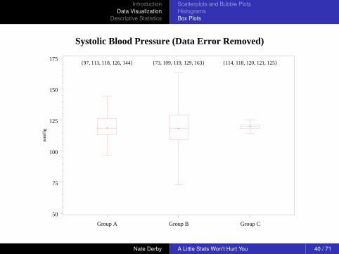
Systolic Blood Pressure (Data Error Removed)
Group A Group B Group C
50
75
100
125
150
175
mm
Hg
{97, 113, 118, 126, 144} {73, 109, 119, 129, 163} {114, 118, 120, 121, 125}
Nate Derby A Little Stats Won’t Hurt You 40 / 71
IntroductionData Visualization
Descriptive Statistics
Scatterplots and Bubble PlotsHistogramsBox Plots
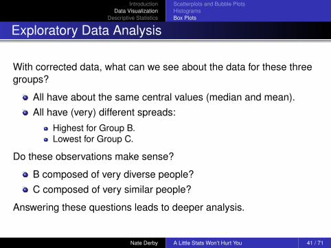
Exploratory Data Analysis
With corrected data, what can we see about the data for these threegroups?
All have about the same central values (median and mean).All have (very) different spreads:
Highest for Group B.Lowest for Group C.
Do these observations make sense?
B composed of very diverse people?C composed of very similar people?
Answering these questions leads to deeper analysis.
Nate Derby A Little Stats Won’t Hurt You 41 / 71

IntroductionData Visualization
Descriptive Statistics
Scatterplots and Bubble PlotsHistogramsBox Plots
Different Box Plots
Try boxstyle=schematic option:
Box Plots with boxstyle=schematic (page 12)
PROC BOXPLOT data=data456a;PLOT bp*group / vaxis=axis1 haxis=axis2
annotate=anno456a boxstyle=schematic;RUN;
Boxes now denote outliers:
Points below the 25th percentile - 1.5 × IQR.Points above the 75th percentile + 1.5 × IQR.
Nate Derby A Little Stats Won’t Hurt You 42 / 71

IntroductionData Visualization
Descriptive Statistics
Scatterplots and Bubble PlotsHistogramsBox Plots
Systolic Blood Pressure
Group A Group B Group C
0
50
100
150
200
mm
Hg
{97, 113, 118, 126, 144} {0, 75, 111, 126, 153} {114, 118, 120, 121, 125}
Nate Derby A Little Stats Won’t Hurt You 43 / 71
IntroductionData Visualization
Descriptive Statistics
Scatterplots and Bubble PlotsHistogramsBox Plots
Systolic Blood Pressure
Group D Group E Group F
75
100
125
150
175
200
mm
Hg
{87, 103, 107, 113, 124} {106, 122, 137, 144, 192} {132, 143, 151, 159, 171}
Nate Derby A Little Stats Won’t Hurt You 44 / 71

IntroductionData Visualization
Descriptive Statistics
Scatterplots and Bubble PlotsHistogramsBox Plots
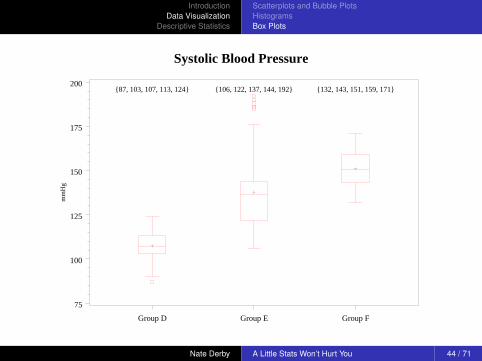
Exploratory Data Analysis
What’s happening in Group E?
Data heavily skewed upward(mean > median).
Q: Does this make sense? (Maybe)
Six values at/above 180 mmHg.Assume rational explanation for them (e.g., six people haveextreme risk of heart attack).Not data errors; they are outliers.Do we keep them or throw them out? (Open question!)
What do we get if we throw them out?
Nate Derby A Little Stats Won’t Hurt You 45 / 71
IntroductionData Visualization
Descriptive Statistics
Scatterplots and Bubble PlotsHistogramsBox Plots
Systolic Blood Pressure (Outliers Removed)
Group D Group E Group F
80
100
120
140
160
180
mm
Hg
{87, 103, 107, 113, 124} {106, 120, 132, 138, 149} {132, 143, 151, 159, 171}
Nate Derby A Little Stats Won’t Hurt You 46 / 71

IntroductionData Visualization
Descriptive Statistics
Scatterplots and Bubble PlotsHistogramsBox Plots
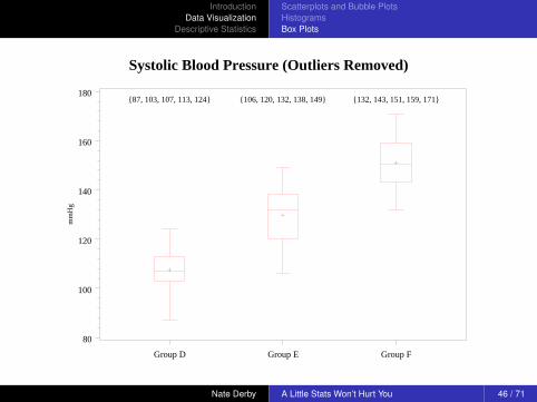
Exploratory Data Analysis (without outliers)
All three groups have about the same spreads.Three groups have different central values.
Do these observations make sense?
Outside realm of this paper.
Nate Derby A Little Stats Won’t Hurt You 47 / 71

IntroductionData Visualization
Descriptive Statistics
Scatterplots and Bubble PlotsHistogramsBox Plots
With or Without Outliers?
Do we cut outliers out of the analysis?
Yes: Including them distorts the general tendencies we arelooking for.No: They are valid data points, and thus part of those generaltendencies.
No simple answer, except that we can’t just discard them. If taken outof the analysis,
Mention them in sentence or footnote.Don’t bury them in an end note or appendix.Show them in PROC BOXPLOT as isolated points(boxstyle=schematic).
Nate Derby A Little Stats Won’t Hurt You 48 / 71

IntroductionData Visualization
Descriptive Statistics
Scatterplots and Bubble PlotsHistogramsBox Plots
Conclusions
Box Plots show tendencies more effectively/robustly thanhistograms.Can be used to easily compare data sets.
Nate Derby A Little Stats Won’t Hurt You 49 / 71

IntroductionData Visualization
Descriptive Statistics
PROC UNIVARIATEDecimal PlacesHypothesis Tests
Demystifying PROC UNIVARIATE
What do all these numbers mean?
Nate Derby A Little Stats Won’t Hurt You 50 / 71
IntroductionData Visualization
Descriptive Statistics
PROC UNIVARIATEDecimal PlacesHypothesis Tests
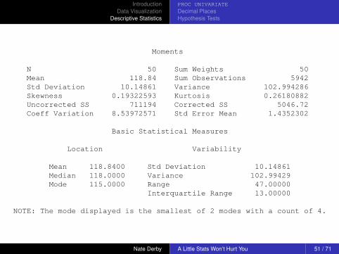
Moments
N 50 Sum Weights 50Mean 118.84 Sum Observations 5942Std Deviation 10.14861 Variance 102.994286Skewness 0.19322593 Kurtosis 0.26180882Uncorrected SS 711194 Corrected SS 5046.72Coeff Variation 8.53972571 Std Error Mean 1.4352302
Basic Statistical Measures
Location Variability
Mean 118.8400 Std Deviation 10.14861Median 118.0000 Variance 102.99429Mode 115.0000 Range 47.00000
Interquartile Range 13.00000
NOTE: The mode displayed is the smallest of 2 modes with a count of 4.
Nate Derby A Little Stats Won’t Hurt You 51 / 71

IntroductionData Visualization
Descriptive Statistics
PROC UNIVARIATEDecimal PlacesHypothesis Tests
Tests for Location: Mu0=0
Test -Statistic- -----p Value------
Student's t t 82.80205 Pr > |t| <.0001Sign M 25 Pr >= |M| <.0001Signed Rank S 637.5 Pr >= |S| <.0001
Quantiles (Definition 5)
Quantile Estimate
100% Max 144.099% 144.095% 136.090% 131.075% Q3 126.050% Median 118.025% Q1 113.010% 106.55% 103.01% 97.00% Min 97.0
Nate Derby A Little Stats Won’t Hurt You 52 / 71

IntroductionData Visualization
Descriptive Statistics
PROC UNIVARIATEDecimal PlacesHypothesis Tests
Extreme Observations
-----Lowest----- -----Highest----
Value Obs Value Obs
97 32 131 4598 42 132 7103 25 136 27103 12 143 22106 3 144 33
Nate Derby A Little Stats Won’t Hurt You 53 / 71

IntroductionData Visualization
Descriptive Statistics
PROC UNIVARIATEDecimal PlacesHypothesis Tests
Demystifying PROC UNIVARIATE
PROC UNIVARIATE provides summary statistics.Summary statistics are supposed to describe a data set with justa few numbers (data reduction).PROC UNIVARIATE is using 46 numbers to summarize 50numbers.
⇒ PROC UNIVARIATE is not an effective data summary ... but it’snot supposed to be!
Nate Derby A Little Stats Won’t Hurt You 54 / 71

IntroductionData Visualization
Descriptive Statistics
PROC UNIVARIATEDecimal PlacesHypothesis Tests
Demystifying PROC UNIVARIATE
PROC UNIVARIATE has more information than we usually need.
Not meant to be a data summary per se.Designed to be “one-stop shop” for anything we would ever want.Just because a statistic is listed does not mean we need to use it!
For completeness, we’ll go through everything here (starting from thebottom).
Nate Derby A Little Stats Won’t Hurt You 55 / 71

IntroductionData Visualization
Descriptive Statistics
PROC UNIVARIATEDecimal PlacesHypothesis Tests
Output of PROC UNIVARIATE
Extreme Observations = five lowest/highest observations,with observation numbers.Quantiles = percentiles.
Definition 5 = define percentiles a certain way (not veryimportant).
Nate Derby A Little Stats Won’t Hurt You 56 / 71

IntroductionData Visualization
Descriptive Statistics
PROC UNIVARIATEDecimal PlacesHypothesis Tests
Output of PROC UNIVARIATE
N = total number of data points.Sum Weights = sum of data weights (almost always N).Mean = sample mean.
Sum Observations = sum of data observations:N∑
i=1
xi .
Equal to N × Mean.
Std Deviation = sample standard deviation (mean distancefrom mean): √√√√ 1
N− 1
N∑i=1
(xi − x̄)2.
Nate Derby A Little Stats Won’t Hurt You 57 / 71

IntroductionData Visualization
Descriptive Statistics
PROC UNIVARIATEDecimal PlacesHypothesis Tests
Output of PROC UNIVARIATE
Variance = sample variance (mean squared distance frommean):
1N− 1
N∑i=1
(xi − x̄)2.
Equal to (Std Deviation)2.
Skewness = measure of how skewed our data distribution is(negative = left, positive = right).Kurtosis = measure of how “peaked” our data distribution is atthe mode.
Nate Derby A Little Stats Won’t Hurt You 58 / 71
IntroductionData Visualization
Descriptive Statistics
PROC UNIVARIATEDecimal PlacesHypothesis Tests
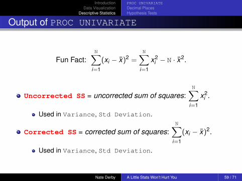
Output of PROC UNIVARIATE
Fun Fact:N∑
i=1
(xi − x̄)2 =N∑
i=1
x2i − N · x̄2.
Uncorrected SS = uncorrected sum of squares:N∑
i=1
x2i .
Used in Variance, Std Deviation.
Corrected SS = corrected sum of squares:N∑
i=1
(xi − x̄)2.
Used in Variance, Std Deviation.
Nate Derby A Little Stats Won’t Hurt You 59 / 71

IntroductionData Visualization
Descriptive Statistics
PROC UNIVARIATEDecimal PlacesHypothesis Tests
Output of PROC UNIVARIATE
Coeff Variation = coefficient of variation = scaled version ofthe spread:
100× Std Deviation
Mean.
Std Error Mean = standard error of the mean = standarddeviation of the distribution of the mean x̄ :
Std Deviation√N
.
Are we done?
Nate Derby A Little Stats Won’t Hurt You 60 / 71

IntroductionData Visualization
Descriptive Statistics
PROC UNIVARIATEDecimal PlacesHypothesis Tests
Moments
N 50 Sum Weights 50Mean 118.84 Sum Observations 5942Std Deviation 10.14861 Variance 102.994286Skewness 0.19322593 Kurtosis 0.26180882Uncorrected SS 711194 Corrected SS 5046.72Coeff Variation 8.53972571 Std Error Mean 1.4352302
Basic Statistical Measures
Location Variability
Mean 118.8400 Std Deviation 10.14861Median 118.0000 Variance 102.99429Mode 115.0000 Range 47.00000
Interquartile Range 13.00000
NOTE: The mode displayed is the smallest of 2 modes with a count of 4.
Nate Derby A Little Stats Won’t Hurt You 61 / 71

IntroductionData Visualization
Descriptive Statistics
PROC UNIVARIATEDecimal PlacesHypothesis Tests
Tests for Location: Mu0=0
Test -Statistic- -----p Value------
Student's t t 82.80205 Pr > |t| <.0001Sign M 25 Pr >= |M| <.0001Signed Rank S 637.5 Pr >= |S| <.0001
Quantiles (Definition 5)
Quantile Estimate
100% Max 144.099% 144.095% 136.090% 131.075% Q3 126.050% Median 118.025% Q1 113.010% 106.55% 103.01% 97.00% Min 97.0
Nate Derby A Little Stats Won’t Hurt You 62 / 71

IntroductionData Visualization
Descriptive Statistics
PROC UNIVARIATEDecimal PlacesHypothesis Tests
Extreme Observations
-----Lowest----- -----Highest----
Value Obs Value Obs
97 32 131 4598 42 132 7103 25 136 27103 12 143 22106 3 144 33
Nate Derby A Little Stats Won’t Hurt You 63 / 71

IntroductionData Visualization
Descriptive Statistics
PROC UNIVARIATEDecimal PlacesHypothesis Tests
Output of PROC UNIVARIATE
Are all those decimal places necessary?
Std Deviation 10.14861 Variance 102.994286Skewness 0.19322593 Kurtosis 0.26180882Coeff Variation 8.53972571 Std Error Mean 1.4352302
Yes, if used as intermediate value.No, if final value.
St Dev = 10.14861 Misleading accuracy, confusing!St Dev = 10.1 Proper accuracy, intuitive.
Nate Derby A Little Stats Won’t Hurt You 64 / 71

IntroductionData Visualization
Descriptive Statistics
PROC UNIVARIATEDecimal PlacesHypothesis Tests
Population vs Sample
Assumption:
Data is a representative sample from a much larger population.
Statistics from PROC UNIVARIATE are estimates of (unknown)population parameters.Ex: Sample mean of 118.84 = estimate of population mean.Unbiased sample⇒ good estimates.Biased sample⇒ lousy estimates (1936, 1948 election polls).
Nate Derby A Little Stats Won’t Hurt You 65 / 71

IntroductionData Visualization
Descriptive Statistics
PROC UNIVARIATEDecimal PlacesHypothesis Tests
Hypothesis Tests
A hypothesis test tests if population parameter significantly differentfrom some value (usually 0).
Ex: H0: Population mean = 0.“Significantly different” = account for spread of data.
More spread = more volatile data = less reliable estimates.Is our estimate reliable enough?
We try to reject H0.
Either reject or don’t reject H0.Do we have enough evidence to reject H0?Never accept H0.
Nate Derby A Little Stats Won’t Hurt You 66 / 71

IntroductionData Visualization
Descriptive Statistics
PROC UNIVARIATEDecimal PlacesHypothesis Tests
Hypothesis Tests
How do we reject H0?
1 Calculate a test statistic from the data.2 Compare test statistic to an assumed distribution.3 Calculate p-value ≈ probability of test statistic, assuming H0.4 Reject H0 if p-value really small (less than 0.05 = 5%).
⇒ Assuming H0, the probability of our result is really small.
⇒ We should have gotten that result less than 5% of the time.
⇒ Since we got that result, our assumption is probability wrong!
Nate Derby A Little Stats Won’t Hurt You 67 / 71

IntroductionData Visualization
Descriptive Statistics
PROC UNIVARIATEDecimal PlacesHypothesis Tests
Hypothesis Tests in PROC UNIVARIATE
H0: Population Mean = 0
Three different tests for H0, using different test statistics:
Student's t= student’s t test.Sign = sign test.Signed Rank = Wilcoxon signed rank test.
Each test has different data assumptions. Which one to use?
⇒ Often not important! Reject H0 if all three p-values < 0.05.
Nate Derby A Little Stats Won’t Hurt You 68 / 71

IntroductionData Visualization
Descriptive Statistics
PROC UNIVARIATEDecimal PlacesHypothesis Tests
Hypothesis Tests in PROC UNIVARIATE
H0: Population Mean = 0
Tests for Location: Mu0=0
Test -Statistic- -----p Value------
Student's t t 82.80205 Pr > |t| <.0001Sign M 25 Pr >= |M| <.0001Signed Rank S 637.5 Pr >= |S| <.0001
⇒ Reject H0. (Trivial, since all values are > 0)
Nate Derby A Little Stats Won’t Hurt You 69 / 71

ConclusionsConclusionsFurther Resources
Conclusions
This presentation shows most commonly used tools ofexploratory data analysis.
Methods: Data visualization and summarization.
Simple, yet effective.
They help us find data irregularities and “interesting” features.
They give us guidance for further analysis, set stage for morecomplex methods.
Nate Derby A Little Stats Won’t Hurt You 70 / 71

ConclusionsConclusionsFurther Resources
Further Resources
Robert Adams,Box Plots in SAS: UNIVARIATE, BOXPLOT or GPLOT?Proceedings of the 21st NESUG Conference, np16, 2008.
Perry Watts,Using SAS Software to Generate Textbook Style Histograms,Proceedings of the 21st NESUG Conference, np03, 2008.
Nate Derby: http://nderby.org
Nate Derby A Little Stats Won’t Hurt You 71 / 71