
9 reasons your website doesn't work on mobile
11
9 REASONS YOUR WEBSITE DOESN’T WORK ON MOBILE
-
Upload
vertical-leap -
Category
Marketing
-
view
208 -
download
0
Transcript of 9 reasons your website doesn't work on mobile

9 REASONS YOUR WEBSITE DOESN’T WORK ON MOBILE

1.YOUR SITE ISN'T MOBILE RESPONSIVE Let’s state the obvious to begin with. The number one reason why your website might be failing to work on a mobile device is that it is simply not mobile responsive. This means the website doesn’t proportionally resize to different size screens.
Google’s recent mobilegeddon update means that searches served on a mobile device will favour a mobile responsive site. QUICK TIP “Gather some quotes for a fully-responsive site; the likelihood is that it won't be as expensive as you think. See it as an essential investment in securing future business as opposed to a nice-to-have.”

2. YOU DON'T HAVE A MOBILE VERSION OF YOUR SITE
Assuming you don't have a mobile-responsive site, the next most obvious reason is that you
don't have a mobile version of your site. This acts as a parallel version of your current desktop site but serves mobile displays. Code behind the scenes detects what device is
being used and then displays the version of the site that matches that device.
QUICK TIP
“If you opt for a separate mobile version of your website, make the most of it with tailored mobile content that’s likely to engage and deliver greater results. Even with a separate
mobile website, you should look to incorporate some responsive aspects as this will positively impact usability and ultimately sales.”
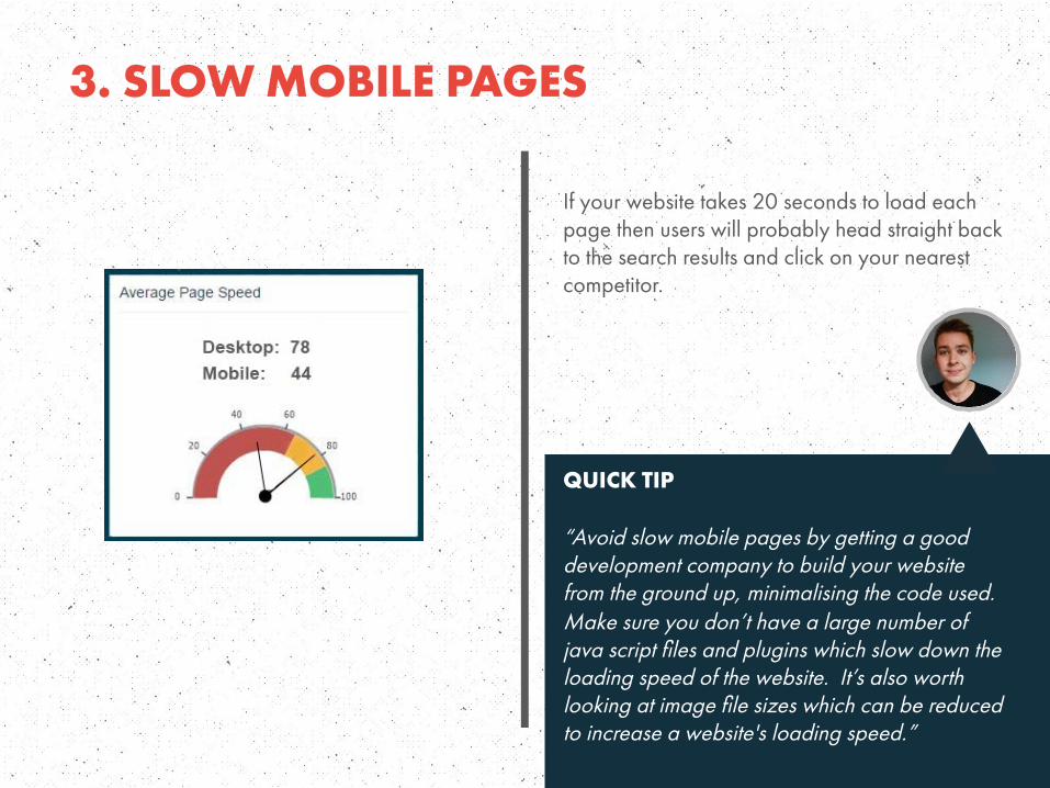
3. SLOW MOBILE PAGES
If your website takes 20 seconds to load each page then users will probably head straight back to the search results and click on your nearest competitor. QUICK TIP “Avoid slow mobile pages by getting a good development company to build your website from the ground up, minimalising the code used. Make sure you don’t have a large number of java script files and plugins which slow down the loading speed of the website. It’s also worth looking at image file sizes which can be reduced to increase a website's loading speed.”
4. UNFRIENDLY NAVIGATION
The menu is one of the most important things on a website. Small websites have quite a simple job, with the desktop menu being easily duplicated on the mobile version of the
website. Large sites however can have difficulties.
Some menus display many pages going up to third tier navigation levels. If this is transferred across to the mobile site there is the potential that the user will spend a long time scrolling
through the vertical menu trying to find the right page.
QUICK TIP “Create a menu that works on a desktop and then try other ways of integrating the lower
level pages on the main page to let users navigate to find out more if they choose to do so.”
5. CONTENT NOT IMMEDIATELY OBVIOUS
Getting your website to scale correctly whilst showing the correct information can be the difference between engaging the user and the user leaving your website.
Having a logo, menu, slider and breadcrumbs before the content can look great on a desktop. When this is scaled down, the user may need to scroll a lot before they actually get to the page
content. This has other issues as well if your pages all have the same header, with the user thinking that the page didn’t even change.
QUICK TIP
“Test, test and test again. Mobile sites should be simple for the user to use and do not require all
the flashy gimmicks of the desktop site to succeed.”

6. AVOID POP-UPS / INTERSTITIALS
Many websites use overlays or interstitials to promote the brands app, get a user to sign up to
their newsletters or give special offers. When these are displayed on a mobile device they
tend to have a negative effect on the user experience, causing frustration
QUICK TIP
“Use a banner instead to promote your content on a mobile device, as shown
in the image.”

7. CALL TO ACTION Saying your website doesn’t work on mobile doesn’t necessarily mean that the website isn’t scaling or displaying properly. The site could be perfectly viewable, but you may not have
considered your call to actions.
In-depth articles seem to be favoured by Google but when this content is scaled down to fit on a mobile screen, a user has a lot more scrolling to do to reach the end of the article. A
single call to action at the end of the article or page may not be the best method to increase your website's conversions.
QUICK TIP
“Tell people about the CTA at the beginning of the article and then remind people throughout the article as they scroll.”

8. SAUSAGE FINGERS
You may have covered all bases by making your website mobile responsive, making sure the site loads fast, displays good content, and has all the right call to actions, but you may have missed a trick by not taking into account that some users may have fat thumbs! QUICK TIP “Try increasing the size of the clickable web elements and give them enough white space in between for the user to click the correct button.”

9. FAILING AT THE FORM
Frustrating web forms can be the bane of users searching on a desktop. When this experience is switched to a mobile device it can be the difference between missing out on a
lead to a competitor, or making the sale yourself.
QUICK TIP “Make the form easy to fill out for the user; this should involve no zooming, no side-to-side
scrolling and clickable elements should be easy to click”

WEBSITE
www.vertical-leap.ukPHONE
0845 123 2753EMAIL
ADDRESS
Boathouse 6, 19 College Road, Portsmouth Historic Dockyard, Portsmouth PO1 3LJ
The Cobalt Building, 19-20 Noel Street,London, United Kingdom W1F 8GW