8 Statistical Diagrams MEP Y9 Practice Book AMEP Y9 Practice Book A 192 In the following stem and...
42
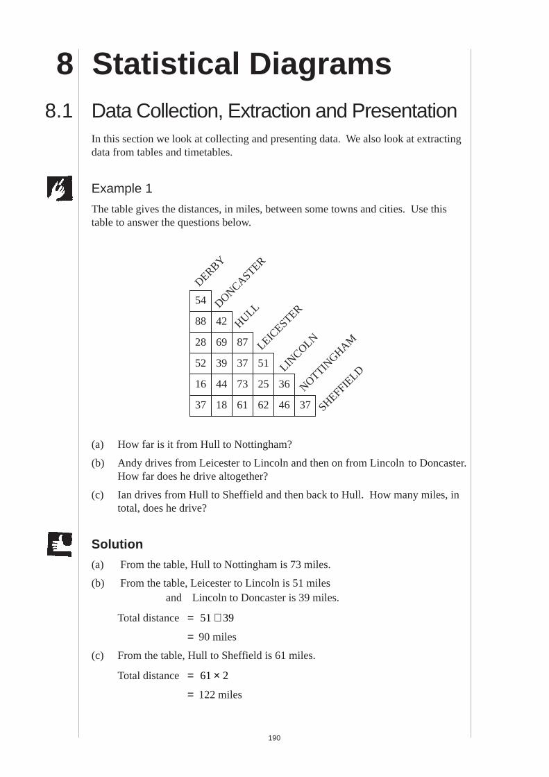
190 8 Statistical Diagrams 8.1 Data Collection, Extraction and Presentation In this section we look at collecting and presenting data. We also look at extracting data from tables and timetables. Example 1 The table gives the distances, in miles, between some towns and cities. Use this table to answer the questions below. 88 54 28 16 52 37 42 69 44 39 18 87 73 37 61 25 51 62 46 36 37 DERBY DONCASTER HULL LEICESTER LINCOLN NOTTINGHAM SHEFFIELD (a) How far is it from Hull to Nottingham? (b) Andy drives from Leicester to Lincoln and then on from Lincoln to Doncaster. How far does he drive altogether? (c) Ian drives from Hull to Sheffield and then back to Hull. How many miles, in total, does he drive? Solution (a) From the table, Hull to Nottingham is 73 miles. (b) From the table, Leicester to Lincoln is 51 miles and Lincoln to Doncaster is 39 miles. Total distance = 51 39 + = 90 miles (c) From the table, Hull to Sheffield is 61 miles. Total distance = 61 2 × = 122 miles
Transcript of 8 Statistical Diagrams MEP Y9 Practice Book AMEP Y9 Practice Book A 192 In the following stem and...
MEP Y9 Practice Book A
190
8 Statistical Diagrams8.1 Data Collection, Extraction and Presentation
In this section we look at collecting and presenting data. We also look at extractingdata from tables and timetables.
Example 1
The table gives the distances, in miles, between some towns and cities. Use thistable to answer the questions below.
88
54
28
16
52
37
42
69
44
39
18
87
73
37
61
25
51
62 46
36
37
DERBY
DONCASTER
HULL
LEIC
ESTER
LINCOLN
NOTTINGHAM
SHEFFIELD
(a) How far is it from Hull to Nottingham?
(b) Andy drives from Leicester to Lincoln and then on from Lincoln to Doncaster.How far does he drive altogether?
(c) Ian drives from Hull to Sheffield and then back to Hull. How many miles, intotal, does he drive?
Solution
(a) From the table, Hull to Nottingham is 73 miles.
(b) From the table, Leicester to Lincoln is 51 milesand Lincoln to Doncaster is 39 miles.
Total distance = 51 39+
= 90 miles
(c) From the table, Hull to Sheffield is 61 miles.
Total distance = 61 2×
= 122 miles

MEP Y9 Practice Book A
191
Example 2
Use the following timetable to answer the questions below.
(a) Alan catches the 2017 train at Cuffley. When does he arrive at Hornsey?
(b) Julie arrives at Hornsey at 2212. When did she leave Palmers Green?
Solution
(a) Alan arrives at 2042.
(b) Julie left at 2206.
Example 3
A class of pupils take a test. Their scores are listed below:
17 23 46 31 17 19 26 31 42 5
21 32 36 37 37 38 41 40 19 12
7 48 29 39 42 38 41 32 36 35
Draw a stem and leaf diagram for this data.
Solution
In this stem and leaf diagram we treat the numbers of 10s as the stem and thenumbers of units as the leaves.
dddddddddddddddddddddddddddddddddaa
.....
.....
.....
.....
.....
.....
.....
.....
.....
.....
.....
.....
.....
.....
.....
.....2058210221062108211121152117211921222125212721292132.........................
2140
203020342039.......................................................
2043204720502053..........
2059...................................
2111.........................
2118
LetchworthHitchinStevenage Watton-at-Stone Hertford North Bayford Cuffley Crews Hill Gordon Hill Enfield Chase Grange Park Winchmore Hill Palmers Green Bowes ParkKnebworthWelwyn NorthWelwyn Garden CityHatfieldWelham GreenBrookmans ParkPotters BarHadley WoodNew BarnetOakleigh ParkNew SouthgateAlexandra PalaceHornseyHarringayFinsbury ParkDrayton ParkHighbury and IslingtonEssex RoadOld StreetMoorgateLondon Kings Cross
.....
.....
.....
.....
.....
.....
.....
.....
.....
.....
.....
.....
.....
.....
.....
.....1958200220062008201120152017201920222025202720292032..............................
195520042009.......................................................
2013201720202023..........
2029...................................
2041.........................
2048
.....
.....
.....
.....
.....201320172022202520282030203220362038.......................................................
2040204220442047.........................
2055
.....
.....
.....
.....
.....
.....
.....
.....
.....
.....
.....
.....
.....
.....
.....
.....2028203220362038204120452047204920522055205720592102.........................
2110
19552004203020372043204720522055205821002102210321062108.......................................................
2110211221142117.........................
2125
205521042109.......................................................
2113211721202123..........
2129...................................
2141.........................
2148
20552104213021372143214721522155215822002202220322062208.......................................................
2210221222142217.........................
2225
.....
.....
.....
.....2113211721222125212821302132213321362138.......................................................
2140214221442147.........................
2155
.....
.....
.....
.....
.....
.....
.....
.....
.....
.....
.....
.....
.....
.....
.....
.....2128213221362138214121452147214921522155215721592202.........................
2210
213021342139.......................................................
2143214721502153..........
2159...................................
2211.........................
2218
SATURDAY

MEP Y9 Practice Book A
192
In the following stem and leaf plot the data has not been put into order;
The leaves can now be ordered as shown to produce the final diagram:
Example 4A student records the temperature in a greenhouse every 4 hours during 1 day. Theresults are listed below:
Draw a line graph and use it to estimate the temperature at 1000 and 1400.
Solution
The line graph is shown below:
02
3
4
6
8
10
12
14
16
18
20
22
24
Time0000 0400 0800 1200 1600 2000 2400
Temp° C( )
8.1
Stem Leaf
0 5 7
1 7 7 9 9 2
2 3 6 1 9
3 1 1 2 6 7 7 8 9 8 2 6 5
4 6 2 1 0 8 2 1
Time 0000 0400 0800 1200 1600 2000 2400
Temperature ( ° C) 6 5 9 21 25 12 8
Stem Leaf
0 5 7
1 2 7 7 9 9
2 1 3 6 9
3 1 1 2 2 5 6 6 7 7 8 8 9
4 0 1 1 2 2 6 8

MEP Y9 Practice Book A
193
The dotted lines show how to estimate the temperatures at 1000 and 1400. Theseestimates are:
15° C at 1000
and 23 ° C at 1400.
Example 5Throughout a 4-week period a class recorded the number of children absent eachday. Their results are listed below:
1 0 4 3 1 2 1 3 4 5
7 1 2 2 3 3 1 3 1 0
Collate this data using a tally chart and draw a vertical line graph to illustrate thedata.
Solution
The tally chart is shown below:
The vertical line graph is shown below:
1 2 3 4 5 6 700
1
2
3
4
5
6
Frequency
Number of Children Absent
Number of Children Tally FrequencyAbsent
0 I I 2
1 I I I I I 6
2 I I I 3
3 I I I I 5
4 I I 2
5 I 1
6 0
7 I 1

MEP Y9 Practice Book A
194
Example 6These pie charts show some information about the ages of people in Greece and inIreland. There are about 10 million people in Greece, and there are about 3.5million people in Ireland.
Greece
Under 15Over 59
40-59 15-39
10 million people
Ireland
Under 15Over 59
40-59
15-39
3.5 million people
(a) Roughly what percentage of people in Greece are aged 40 - 59 ?
(b) There are about 10 million people in Greece. Use your percentage from part(a) to work out roughly how many people in Greece are aged 40 - 59.
(c) Dewi says that these charts show that there are more people under 15 inIreland than in Greece.
Dewi is wrong. Explain why the charts do not show this.
(d) There are about 60 million people in the UK. The table shows roughly whatpercentage of people in the UK are of different ages.
Copy and complete the pie chart below to show the information in the table.Label each section of your pie chart clearly with the ages.
UK
60 million people
(KS3/98/Ma/Tier 5-7/P2)
8.1
Under 15 15-39 40-59 over 59
20% 35% 25% 20%

MEP Y9 Practice Book A
195
Solution
(a) The angle for 40-59 is about 90 °; the fraction of the total is 90
36014
= , or
25%.
(b) 25% of Greece's population = 14
2 5× =10 million million. .
(c) This is not true; the percentage of people under 15 is higher in Ireland thanin Greece, but Greece has a far larger population than Ireland. The actualnumbers are:
Ireland :14
0 875× ≈3.5 million million.
Greece :60
3600
16
10 1 67× = × ≈1 million million million.
(d) Since there are 10 equal sectors in the pie chart, each sector is 36010
36° = °,
and each sector represents 10% of the people in the UK.
Sectors are:
UK
Under 15Over 59
40-59 15-39
60 million people
under 15 15-39 40-59 over 59
2 sectors 312
sectors 212
sectors 2 sectors

MEP Y9 Practice Book A
196
8.1
Exercises1. Use this mileage chart to
answer the following questions:
(a) How far is it from Hitchinto Royston?
(b) Alan drives from Bedfordto Royston and then backagain. How far does hetravel in total?
(c) David cycles fromBedford to Hitchin, thenfrom Hitchin to Royston and from Royston back to Bedford. How fardoes he cycle altogether?
(d) A lorry is driven from Cambridge to Northampton, then fromNorthampton to Hitchin and from Hitchin back to Cambridge. Howfar does the lorry travel altogether?
(e) Is the journey from Cambridge to Northampton shorter than thejourney from Cambridge to Wellingborough?
2. The table gives the distances, in kilometres,between some European cities. Use thetable to answer the following questions:
(a) Jai drives from Paris to Eindhovenand then drives back to Paris. Howfar does he travel?
(b) Harry leaves Rotterdam and travels toBrussels and on to Troyes beforereturning to Rotterdam. How far doeshe travel altogether?
(c) Andrea leaves Paris, drives to Troyes and from there on to Brussels.How far does she travel?
(d) A driver has to travel from Luxembourg to Brussels, calling atEindhoven and Rotterdam on the way. Calculate the shortest length ofthis journey.
3. Use the following timetable to answer these questions:
(a) Which train should you catch at Birmingham Moor Street to arrive inWilmcote before 1700 ?
(b) Nick arrives in Yardley Wood at 1603. At what time did he leaveJewellery Quarter?
(c) Ali leaves Spring Road at 1534. At what time will he arrive atEarlswood?
16
29
20
24
21
20
27
15
13
50
44
30
14
37
36
21
43
26 10
45
44
BEDFORD
CAMBRID
GE
HITCHIN
HUNTINGDON
NORTHAMPTON
ROYSTON
WELL
INGBOROUGH
401
282
435307
212
136
113182
537
376
354
296
452
173 552
BRUSSELS
EINDHOVEN
LUXEM
BOURG
PARIS
ROTTERDAM
TROYES

MEP Y9 Practice Book A
197
(d) Michaela arrives at Hall Green station at 1445. She wants to travel toHenley-in-Arden. What is the earliest time that she could arrivethere?
(e) Denise wants to travel from Bordesley to Yardley Wood. At what timemust she leave Bordesley?
(f) Johnny wants to travel from Small Heath to Earlswood. He arrives atSmall Heath station at 1500. Describe how he can get to Earlswood.
4. Use the following timetable to answer the questions below:
(a) Jack catches the 0933 train from Manchester. At what time would hearrive in Weston-super-Mare?
(b) Josh wants to travel to Camborne. What is the latest time that hecouldleave Manchester Piccadilly?
(c) Kate catches the 1026 at Stafford. At what time will she arrive inTorquay?
(d) Hannah leaves Wolverhampton and arrives in Weston-super-Mare at1522. At what time did she leave Wolverhampton?
(e) Matthew leaves Taunton at 1405. At what time does he arrive inPenzance?
(f) Serena catches the 1641 at St Austell. At what time does she arrive inSt Erth?
Jewellery QuarterBirmingham Snow Hill
Birmingham Moor StreetBordesley
Small HeathTyseley
Spring RoadHall Green
Yardley WoodShirley
Whitlocks EndWythall
EarlswoodThe LakesWood End
DanzeyHenley-in-ArdenWootton Wawen
WilmcoteStratford-upon-Avon
135014051408
F141214141417142014231426
--------------------
142014251448
F----
14341437144014431446
------------------
144014451448
--145214541457150015031506
--------------------
145015051508
--151215141517152015231526
--------------------
152015251528
------
15341537154015431546154815511553155515581603160516111615
154015451548
--155215541557160016031606
--------------------
155016051608
--161216141617162016231626
--------------------
162016251628
----
163216351638164116441647164916521654165616591704170617141718
164016451648
--165216541657170017031706
--------------------
165017041707170917121714171717231727
----------------------
170917161718
------
17251728173117341737173917421744174617491754175618021807

MEP Y9 Practice Book A
198
AberdeenDundeeEdinburghHaymarketGlasgow CentralMotherwellLockerbieCarlislePenrithOxenholme Lake DistrictLancasterPrestonWigan North WesternWarrington Bank QuayLiverpool Lime StreetRuncornHartfordBoltonManchester PiccadillyStockportWilmslowCreweMacclesfieldCongletonStoke-on-TrentStaffordWolverhamptonBirmingham New StreetBirmingham New StreetCheltenham SpaGloucesterBristol ParkwayBristol Temple MeadsWeston-super-MareTauntonTiverton ParkwayExeter St DavidsNewton AbbotTorquayPaigntonTotnesPlymouthLiskeardBodmin ParkwayParSt AustellTruroRedruthCamborneSt ErthPenzance
dddddddddddddddddddddddddddadaaaaaaaaaaaaaaaaaaaaaa
091009270940082309170905093609551914 --093610261042110011111151122412311243131713191349134914231435144514551523155216041615162316411653170017111723
09481110111811521204125712411310130713481425143214041409143214451456150315211533154115511605
0933 --09491013 -- -- -- -- -- -- -- -- -- -- --125413201346 --14141442 -- --14551523155116031615162216401653170017101723
09491005101709361017100510361050102110301043111911351151120212421312 --132814231405 --143415111522153015111541160916221651164117001715 --17301745
08200836 --0943100010271045110911211133104911051119103611171105113611571116 --113812251244130313071355
143014451522
1152122512301310131813521404142414471500151715491616162316031632
0710 -- -- -- -- -- -- -- -- -- -- -- -- -- -- -- -- -- -- -- -- -- --
125213211330 -- -- --145115561630 --154716211707171416351645171317261740175718211830183918501903
06200815 -- -- -- -- -- -- -- -- -- -- -- -- -- -- -- -- -- -- -- -- -- -- --
5. As part of a science project, the height of a plant is measured every 3 days.The readings are listed in the following table:
(a) Draw a line graph to show how the height of the plant varies with time.
(b) Estimate the height of the plant after 14 days.
(c) Estimate the age of the plant when the height was 8 cm.
8.1
Day 0 3 6 9 12 15 18
Height (cm) 4 6 9 14 16 19 24

MEP Y9 Practice Book A
199
6. Records were kept of the mass of a baby for the first few days of its life.The information is listed in the table below:
(a) Draw a line graph to show how the mass of the baby changes.
(b) Use the line graph to estimate the mass on:
(i) day 1, (ii) day 7, (iii) day 15.
7. Jane measured the height of her son, Chris, every two years and kept arecord of the heights.
(a) Draw a line graph using this data.
(b) Estimate Chris' height when he was:
(i) 2 years old, (ii) 10 years old.
8. The results of a maths test for one class are listed below:
42 31 29 38 24 17 9 18 28 27
34 35 38 40 40 19 32 39 22 11
11 9 2 17 32 19 22 29 31 33
Illustrate this data using an ordered stem and leaf diagram using stems of0, 10, 20, 30 and 40.
9. The data collected in a survey on the number of children in each family islisted below:
2 3 1 2 1 2 3 1 2 6 1 2 3 3 4 1 5 2 3 2
1 3 1 2 4 5 2 2 2 3 1 1 3 1 1 2 2 3 4 2
(a) Draw up a tally and frequency table for this data.
(b) Illustrate this data using a pictogram.
(c) Illustrate this data using a vertical line graph.
Day 0 2 4 6 8 10 12 14 16
Mass (kg) 3.7 3.6 3.3 3.5 3.7 3.8 4.0 4.2 4.3
Chris' Age 1 3 5 7 9 11
Height (cm) 59 81 102 110 131 156

MEP Y9 Practice Book A
200
10. Data was collected on the amount, in pence, that children spent in atuckshop in one session. This data is illustrated in the following stem andleaf diagram.
Use a vertical line diagram to illustrate the data.
11. A survey into the types of cars in a car park collected data listed below:
F P F B P Re C M C Re F V
Ro Ro Fi F Fi Fi B P C Re M Re
F Fi M Ro F F F P Re Ro P C
M F F Re Ro C Ro F M
Key: F Ford, P Peugeot, B BMW, C Citroen, M MazdaFi Fiat, Ro Rover, Re Renault, V Vauxhall
Illustrate this data with a bar chart.
12. A small cafe sells sandwiches, ice creams, hot drinks and cold drinks. Thepictogram shows what they sold on Monday.
Monday
Sandwiches
Ice Creams
Hot Drinks
Cold Drinks
HOT
COLD COLDCOLDCOLDCOLDCOLD
Each symbol in the pictogram represents 10.
HOT HO
(a) How many cold drinks did they sell?
(b) How many ice creams did they sell?
(c) How many hot drinks did they sell?
8.1
Stem Leaf
20 7 7 8 8 8 9 9 9 9
30 0 0 0 0 1 2 2 2 5 5 5 6 6 8 8 9
40 0 0 1 1 1 2 3 3 3 4 4 5 5 5 7 7
50 0 0 0

MEP Y9 Practice Book A
201
The pictogram below shows how many sandwiches and ice creams the cafesold on Tuesday.
(d) The cafe also sold 40 hot drinks on Tuesday. Show this number on acopy of the pictogram below.
Tuesday
Sandwiches
Ice Creams
Hot Drinks
Cold Drinks
Each symbol in the pictogram represents 10.
(e) The cafe also sold 12 cold drinks on Tuesday. Show this number ofcold drinks on the pictogram you have drawn.
(f) Look at both the pictograms. What can you tell about the weather oneach day?
(KS3/96/Ma/Tier 3-5/P1)
13. Look at this bus timetable, from Highbury to Colton:
(a) A bus leaves Highbury at 08:30.
(i) What time does it arrive in Colton?
(ii) How much time does the bus journey take?
(b) 5 friends are going from Highbury to Colton by bus. They want toarrive by 10:30. Which is the latest bus they can catch fromHighbury?
(c) Each bus ticket costs £2.20. How much do the 5 bus tickets costaltogether?
(KS3/98/Ma/Tier 3-5/P1)
Bus Timetable: Highbury to Colton
Highbury depart: 07:45 08:30 09:30 10:45 11:30
Colton arrive: 08:30 09:15 10:15 11:30 12:15

MEP Y9 Practice Book A
202
14. (a) Lisa works in a shoe shop. She recorded the size of each pair oftrainers that she sold during a week. This is what she wrote down:
Use a tallying method to make a table showing how many pairs oftrainers of each size were sold during the whole week.
(b) Which size of trainer did Lisa sell most of?
(c) Lisa said that most of the trainers sold were bigger than size 6. Howcan you tell from the table that Lisa is wrong?
(KS3/95/Ma/Levels 4-6/P1)
15. This chart shows the distances in miles between six towns.
Example: Cardiff and London are 152 miles apart.
(a) How far apart are Cardiff and Newcastle?
(b) How far apart are London and Edinburgh?
(c) Which town is 198 miles from Cardiff?
(d) Which two towns are exactly 300 miles apart?
(e) Which town is the greatest distance from Plymouth?
(f) Which town is the smallest distance from Cardiff?
8.1
Cardiff
394 Edinburgh
198 221 Liverpool
152 380 203 London
318 107 157 280 Newcastle
166 496 300 215 410 Plymouth
Sizes of Trainers Sold
Monday 7 7 5 6
Tuesday 6 4 4 8
Wednesday 5 8 6 7 5
Thursday 7 4 5
Friday 7 4 9 5 7 8
Saturday 6 5 7 6 9 4 7

MEP Y9 Practice Book A
203
(g) Gwen is a lorry driver. She drove from London to Newcastle, thenfrom Newcastle to Edinburgh. She filled in her job sheet.
She drove back using the same route. Copy and complete her jobsheet.
(KS3/94/Ma/3-5/P1)
16. The two frequency diagrams below show the amount of rain that fell in twodifferent months.
Rainfall (mm)
Frequency(days)
0 5 10 15 20 250
2
4
6
8
10
12
Month A
Rainfall (mm)
Frequency(days)
0 5 10 15 20 250
2
4
6
8
10
12
Month B
(a) Kath says that there are 30 days in month A. Explain how you knowshe is right.
From To Distance
London Newcastle 280
Newcastle Edinburgh 107
From To Distance
Edinburgh

MEP Y9 Practice Book A
204
(b) Carl asks 5 friends how much rain fell during month A. They said:
Jon: 5 mm, Dipta: 25 mm, Ian: 30 mm, Nerys: 75 mm, Sue: 250 mm
Only one friend could have been right. You can tell who it is withouttrying to work out the total rainfall.
Which one of Carl's friends could have been right? Explain how youknow.
(c) Sudi said:
"The diagram for month B shows that it rained more atthe end of the month."
Sudi is wrong. Explain why the diagram does not show this.
(KS3/94/Ma/5-7/P1)
17. There are 50 children altogether in a playgroup.
(a) (i) How many of the children are girls?
(ii) What percentage of the children are girls?
(b) 25 of the children are 4 years old.20 of the children are 3 years old.5 of the children are 2 years old.
Show this information on a pie diagram.
(KS3/97/Ma/Tier 4-6/P2)
8.2 Statistical MeasuresIn this section we recap the statistical measures mean, median, mode and range. Themean, median and mode give an indication of the 'average' value of a set of data, i.e.some idea of a typical value. The range, however, provides information on howspread out the data is, i.e. how varied it is.
Definition Example
Mean = sum of all datanumber of values
Mode = most common value
8.1
BoysGirls
For 1, 2, 2, 3, 4
Mean = 1 + 2 + 2 + 3 + 45
= 125
= 2.4
For 1, 2, 2, 3, 4
Mode = 2
For 1, 2, 2, 3, 4, 4, 5
Mode = 2 and 4

MEP Y9 Practice Book A
205
For 1, 2, 2, 3, 4
Median = 2
For 1, 2, 2, 3, 4, 4
Median = 2 + 32
= 2.5
For 1, 2, 2, 3, 4
Range = 4 1−
= 3
Definition Example
Median = middle value when datais arranged in order
Range= largest value – smallest value
In this section, we extend these basic ideas to grouped data.
Example 1
The shoe sizes for a class are summarised in thetable shown.
Calculate:
(a) the mode, (b) the median
(c) the mean (d) the range
for this data
Solution
(a) The mode = 6 (i.e. the size with highest frequency)
(b) There are 30 values altogether. Since 30 is even, there will be two centralvalues. These will be the 15th and 16th values. From the frequency table,these are both 7. (You could list them all in order, but it is easy to see fromthe table that there are 13 values before the five '7' values are reached.)
So the median = + =7 72
7.
(c) The mean is the sum of all the data values divided by the total number ofvalues, and is better calculated from the table by adding an extra
'frequency × size'
column, as shown in the following table:
Shoe Size Frequency
4 2
5 4
6 7
7 5
8 6
9 3
10 3

MEP Y9 Practice Book A
206
The mean = ∑∑
= =f x
f
21030
7
(d) The range = highest value – lowest value
= 10 4−
= 6
Note
If a data set contains n values then the median can be obtained as the n +
12
th
value If n is odd, this formula will pick out the value that you need. For example,
if there are 157 data values then the median will be the 157 1
2+
th value, i.e. the
79th value. If n, the number of data values, is even, then the formula will pick outthe two values that you need to average to obtain the median. In Example 1, we
had n = 30 data values, so the median is the 30 1
2+
th value, i.e. the 15.5th
value. The ' .5' tells us we need to average the 15th and 16th values, which is whatwe did to get the median 7.
8.2
(x) (f) ( f x )Size Frequency Frequency × Size
4 2 2 4× = 8
5 4 4 5× = 20
6 7 7 6× = 42
7 5 5 7× = 35
8 6 6 8× = 48
9 3 3 9× = 27
10 3 3 10× = 30
Total 30 210

MEP Y9 Practice Book A
207
Example 2
The table shows the Morse code for 26 letters and how long it takes to send eachletter.
If a letter is frequent we want to be able to send it quickly. The following tableshows the 6 most frequent letters in 4 languages:
(a) Copy and complete the following table of the mean, median and modalsending times for the 6 most frequent letters in each language.
(b) Use your table in part (a) to decide which two languages are likely to sendthe quickest messages in Morse. Explain how you decided.
(c) Samuel Morse invented the code. Messages in his own language are quickto send. Look at the table of the 6 most frequent letters in each language.
Which one of these letters has a code which suggests that Samuel Morse'sown language was English? Explain how you decided.
(KS3/94/Ma/5-7/P2)
LetterJKLMNOPQR
Sending Time1399751111137
CodeLetterABCDEFGHI
Sending Time5911719973
Code LetterSTUVWXYZ
Sending Time53799111311
Code
English French Italian Spanish
1 E E E E
2 T A O A
3 A S A O
4 O I I S
5 N R N R
6 I N R I
English French Italian Spanish
Mean 5.3 5.3
Median 5 5
Mode 3 and 5 5

MEP Y9 Practice Book A
208
8.2
Solution
(a) English : mean time = 1 3 5 11 5 36
+ + + + + = 28
6
= 423
= 4.7 (to 1 decimal place)
median time: in order 1, 3, 3, 5, 5, 11
median = 3 52+
= 4
French : mean time = 1 5 5 3 7 56
+ + + + + = 26
6
= 413
= 4.3 (to 1 decimal place)
median time: in order 1, 3, 5, 5, 5, 7
median = 5 52+
= 5
Italian times are 1, 11, 5, 3, 5, 7, so modal time is 5.
Spanish times are 1, 5, 11, 5, 7, 3, so modal time is 5.
These values can now be put in the table, as below.
(b) English and French , since their mean values are significantly lower than themean values for Italian and Spanish.
(c) The letter T, which is the 2nd most frequently used letter in English, has avery short sending time, but is not in the top 6 for French, Italian or Spanish.
Note
Often data is provided in summary form, so that estimates have to be made to findthe mean value.
English French Italian Spanish
Mean 4.7 4.3 5.3 5.3
Median 4 5 5 5
Mode 3 and 5 5 5 5

MEP Y9 Practice Book A
209
Example 3
Data on the number of minutes that a particular train service was late have beensummarised in the table. (Times are given to the nearest minute.)
(a) How many journeys have been included?
(b) What is the modal group?
(c) Estimate the mean number of minutes thetrain is late for these journeys.
(d) Which of the two averages, mode and mean,would the train company like to use inadvertising its service? Why does this givea false impression of the likelihood of beinglate?
(e) Estimate the probability of a train being morethan 20 minutes late on this service.
Solution
(a) Total number of journeys = + + + + + =19 12 9 4 4 2 50
(b) 'On time'
(c) It is more convenient to use a table for this calculation; for each 'group', themidpoint is used for the calculation (this is why it is an estimate and not anexact value).
(Note that, because the times in the table are given to the nearest minute, the classdescribed as '11-20' actually means 10 5 20 5. .≤ <T . This class has width10 minutes, so half way will be 5 minutes after the start point 10.5, so themidpoint = + =10 5 5 15 5. . .)
Mean value ≈ ≈39350
7 86. minutes
(d) Clearly 'on time'; the modal average, would give a better impression, but itwould be giving a false impression as over 50% of trains were in fact late!
(e) Estimate = =650
0 12. = 12%
Minutes Late Frequency
on time 19
1-5 12
6-10 9
11-20 4
21-40 4
41-60 2
over 60 0
Minutes Late Midpoint Frequency f x(x) (f)
On time 0 19 0
1-5 3 12 36
6-10 8 9 72
11-20 15.5 4 62
21-40 30.5 4 122
41-60 50.5 2 101
Total 50 393
MEP Y9 Practice Book A
210
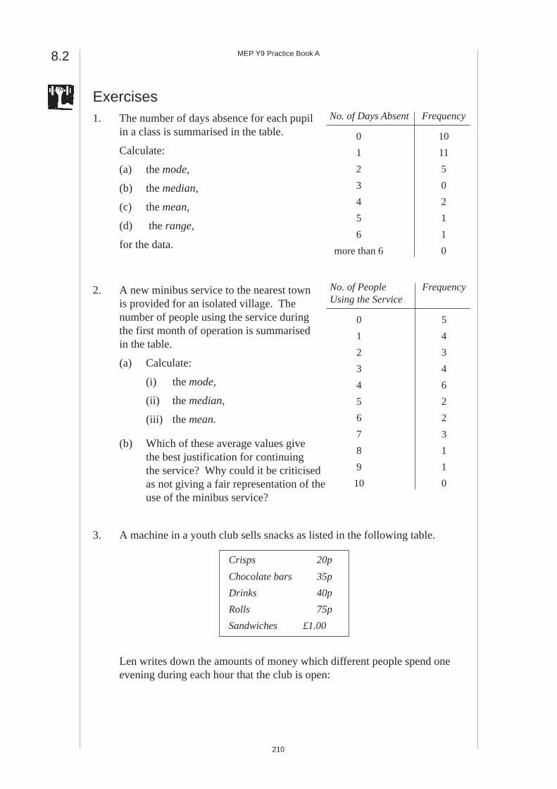
No. of People FrequencyUsing the Service
0 5
1 4
2 3
3 4
4 6
5 2
6 2
7 3
8 1
9 1
10 0
Exercises1. The number of days absence for each pupil
in a class is summarised in the table.
Calculate:
(a) the mode,
(b) the median,
(c) the mean,
(d) the range,
for the data.
2. A new minibus service to the nearest townis provided for an isolated village. Thenumber of people using the service duringthe first month of operation is summarisedin the table.
(a) Calculate:
(i) the mode,
(ii) the median,
(iii) the mean.
(b) Which of these average values givethe best justification for continuingthe service? Why could it be criticisedas not giving a fair representation of theuse of the minibus service?
3. A machine in a youth club sells snacks as listed in the following table.
Len writes down the amounts of money which different people spend oneevening during each hour that the club is open:
8.2
No. of Days Absent Frequency
0 10
1 11
2 5
3 0
4 2
5 1
6 1
more than 6 0
Crisps 20p
Chocolate bars 35p
Drinks 40p
Rolls 75p
Sandwiches £1.00

MEP Y9 Practice Book A
211
(a) Explain why Len is correct when he says that the mode of the amountsof money spent is 40p.
(b) Copy the chart below and fill in the column for 7 p.m. to 8 p.m. Thenfill in the column for the total number of people who spent eachamount.
(c) Len says: "Now 50p to 99p is the mode."
Is Len right? Explain your answer.
(d) Look at where the tally marks are on the chart. What do you noticeabout the amounts of money people spent at different times in theevening? Give a reason which could explain the difference younotice.
(KS3/96/Ma/Tier 4-6/P2)
Amounts of Money Spent During Each Hour
5 p.m. to 6 p.m. 6 p.m. to 7 p.m. 7 p.m. to 8 p.m.
40p 75p £1.75
60p 55p £1.40
55p 60p £1.60
20p 40p 75p
40p £1.15 £1.40
60p 40p £1.10
55p 75p 60p
40p 40p £1.50
Amount of 5 p.m. to 6 p.m. to 7 p.m. toMoney Spent 6 p.m. 7 p.m. 8 p.m.
Under 50p I I I I I I I 7
50p to 99p I I I I I I I I
£1.00 to £1.49 I
Over £1.49
Time Total Numberof People Who
Spent EachAmount

MEP Y9 Practice Book A
212
4. This graph shows the range oftemperature in Miami each month. Forexample, in January the temperatureranges from 17 ° C to 24 ° C.
(a) In which month does Miami havethe smallest range?
(b) In July, the range in the temperaturein Miami is 5° C. There are fiveother months in which the range inthe temperature is 5 ° C. Whichfive months are they?
(c) This graph shows the range in thetemperature in Orlando each month.In which three months is themaximum temperature in Miamigreater than the maximumtemperature in Orlando?
(KS3/99/Ma/Tier 4-6/P1)
5. The pupils in five classes did a quiz.The graphs show the scores in eachclass. Each class had a mean score of7. In three of the classes, 80% of thepupils got more than the mean score.
8.2
0
20
40
60
80
100
0 1 2 3 4 5 6 7 8 9 10 11 12Score
%of
Pupils
Class P
0
20
40
60
80
100
0 1 2 3 4 5 6 7 8 9 10 11 12Score
%of
Pupils
Class T
0
20
40
60
80
100
0 1 2 3 4 5 6 7 8 9 10 11 12Score
%of
Pupils
Class S
MarApr
MayJunJul
AugSepOct
NovDec
FebJan
Orlando
0 10 2515 20 30 35
Temperature (° C) in Orlando
MarApr
MayJunJul
AugSepOct
NovDec
FebJan
Miami
0 10 2515 20 30 35
Temperature (° C) in Miami
0
20
40
60
80
100
0 1 2 3 4 5 6 7 8 9 10 11 12Score
%of
Pupils
Class Q
0
20
40
60
80
100
0 1 2 3 4 5 6 7 8 9 10 11 12Score
%of
Pupils
Class R

MEP Y9 Practice Book A
213
(a) In which three classes did 80% of the pupils score more than 7 ?
(b) Look at the graphs which show that 80% of the pupils scored morethan 7. Some of the statements below are true when 80% of the pupilsscored more than 7.
Write down the letter for each of the statements below which is true.
A : All of the pupils scored at least 2.
B : Most of the pupils scored at least 8.
C : Most of the pupils scored at least 10.
D : Some of the pupils scored less than 6.
(c) In another quiz the mean score was 6. Copy and complete thefollowing graph to show a mean score of 6.
20
40
60
80
100
0 0 1 2 3 4 5 6 7 8 9 10 11
Score
%of
Pupils
(KS3/98/Ma/Tier 5-7/P1)
6. A school has 5 Year groups. 80 pupils from the school took part in asponsored swim. Lara and Jack drew these graphs.
Lara's graph:
Number of Lengths Swum by Each Year Group
Jack's graph:
Number of Pupils Who Swam
Different Numbers of Lengths
50
100
0
150
200
250
7 8 9 10 11
Year Group
Numberof
Lengths
150
210
230
170
70
1 to 5 6 to 10 11 to 15 21 to 25
Number of Lengths
16 to 20
Numberof
Pupils
10
20
0
30
5
15
25
35
12
33
27
62

MEP Y9 Practice Book A
214
(a) Look at Lara's graph. Did Year 10 have fewer pupils taking part in theswim than Year 7 ? Write down one of the following as your answer:
Yes, No or Cannot tell
Explain your answer.
(b) Use Lara's graph to work out the mean number of lengths swum byeach of the 80 pupils. Show your working.
(c) Use Jack's graph to work out the mean number of lengths swum byeach of the 80 pupils. Show your working.
(d) Explain why the means calculated from Lara's graph and Jack's graphare different.
(KS3/96/Ma/Tier 6-8/P2)
7. A customer at a supermarket complains to the manager about the waitingtimes at the check-outs. The manager records the waiting times of 100customers at check-out 1.
Results
(a) Use the graph to estimate the probability that a customer chosen atrandom will wait for 2 minutes or longer.
(b) Use the graph to estimate the probability that a customer chosen atrandom will wait for 2.5 minutes or longer.
(c) Calculate an estimate of the mean waiting time per customer. Showyour working. You may complete a copy of the table below to helpyou with the calculation.
8.2
Waiting Time Mid-point Number of(minutes) of bar (x) Customers (f) (fx)
0 - 0.5 6 3
1 - 1.5 14
2 - 2.5 40
3 - 3.5 30
4 - 5 4.5 10
100
10
20
0
30
40
1 2 3 4 5
Waiting Time (Minutes)
Numberof
Customers
6
14
40
30
10

MEP Y9 Practice Book A
215
Number of Raisins
23
6-10 11-15 16-20 21-25 26-300
10
20
30
40
Numberof
Packets
29
24
20
4
4-6 7-9 10-12 13-15 16-180
10
20
30
40
Numberof
Packets
Number of Nuts
26
33
20
15
6
(d) The manager wants to improve the survey. She records the waitingtimes of more customers. Give a different way the manager couldimprove the survey.
(KS3/98/Ma/Tier 6-8/P1)
8. A company makes breakfast cereal containing nuts and raisins. Theycounted the number of nuts and raisins in 100 small packets.
Results:
Chart A: Nuts Chart B: Raisins
(a) Calculate an estimate of the mean number of nuts in a packet. Show yourworking. You may complete a copy of the table below to help you with thecalculation.
(b) Calculate an estimate of the number of packets that contain 24 ormore raisins.
(c) Which of the two charts shows the greater range? Explain youranswer.
(d) A packet is chosen at random. Calculate the probability that itcontains 9 nuts or fewer.
(e) The number of raisins in a packet is independent of the number ofnuts. A packet is chosen at random. Calculate the probability that itcontains 16 to 18 nuts and 6 to 10 raisins. Show your working.
(KS3/97/Ma/Tier 6-8/P2)
Number Mid-point Number ofof Nuts of Bar (x) Packets (f) fx
4 - 6 5 26 130
7 - 9 8 33
10 -12 11 20
13 - 15 14 15
16 - 18 17 6
100

MEP Y9 Practice Book A
216
8.3 Plotting Scatter DiagramsIn this section we review plotting scatter diagrams and discuss the different typesof correlation that you can expect to see on these diagrams.
Strong positive correlation between x and y. Thepoints lie close to a straight line with
y increasing as x increases.
Weak, positive correlation between x and y. Thetrend shown is that
y increases as x increases
but the points are not close to a straight line.
No correlation between x and y; the points are
distributed randomly
on the graph.
Weak, negative correlation between x and y. Thetrend shown is that
y decreases as x increases
but the points do not lie close to a straight line.
Strong, negative correlation. The points lie close toa straight line, with
y decreasing as x increases.
If the points plotted were all on a straight line we would have perfect correlation,but it could be positive or negative as shown in the diagrams above.
y
x
x
y
y
x
y
x
y
x

MEP Y9 Practice Book A
217
Example 1
The following table lists values of x and y.
(a) Use the data to draw a scatter graph.
(b) Describe the type of correlation that you observe.
Solution
(a) The scatter graph is shown below.
0
1
2
3
4
5
6
7
8
9
10
11
0 1 2 3 4 5 6 7 8 9 10 11 12 13 14 15 x
y
(b) It shows weak, negative correlation.
Example 2
What sort of correlation would you expect to find between:
(a) a person's age and their house number,
(b) a child's age and their height,
(c) an adult's age and their height ?
Solution
(a) No correlation, because these two quantities are not linked in any way.
(b) Positive correlation, because children get taller as they get older.
(c) No correlation, because the height of adults does not change with their age.
x 2 3 5 6 9 11 12 15
y 10 7 8 5 6 2 5 2

MEP Y9 Practice Book A
218
Exercises1. Consider the following scatter graphs:
y
xB
y
xC
y
xA
(a) Which graph shows strong correlation?
(b) Which graphs show positive correlation?
(c) Which graph shows negative correlation?
(d) Which graph shows a weak, positive correlation?
2. The following table lists values of x and y.
(a) Plot a scatter graph for this data.
(b) Describe the correlation between x and y.
3. Copy and complete the table below for 10 people in your class.
(a) Plot a scatter graph for your data.
(b) Describe the type of correlation that there is between these twoquantities.
4. A driver keeps a record of the distance travelled and the amount of fuel inhis tank on a long journey.
(a) Illustrate this data with a scatter plot.
(b) Describe the type of correlation that is present.
8.3
x 2 4 6 7 8 9 10 11 12
y 3 5 8 5 9 6 9 9 11
House Number
Day of Month of Birthday
Distance Travelled (km) 0 50 100 150 200 250 300
Fuel in Tank (litres) 80 73 67 61 52 46 37

MEP Y9 Practice Book A
219
5. What type of correlation would you expect to find between each of thefollowing quantities:
(a) Age and pocket money,
(b) IQ and height,
(c) Price of house and number of bedrooms,
(d) Person's height and shoe size ?
6. In a class 10 pupils took a Science test and an English test. Their scores arelisted in the following table:
(a) Draw a scatter graph for this data.
(b) Describe the correlation between the two scores.
7. Chris carries out an experiment in which he measure the extension of aspring when he hangs different masses on it. The following table lists hisresults:
(a) Draw a scatter graph for this data.
(b) Describe the correlation between the mass and the extension.
8. Every day Peter picks the ripe tomatoes in his greenhouse. He keeps arecord of their mass and the number that he picks. His results are listed inthe following table:
(a) Draw a scatter graph for this data.
(b) Describe the correlation between the number of tomatoes picked andtheir total mass.
Pupil A B C D E F G H I J
English Score 2 10 18 4 9 7 18 19 3 10
Science Score 18 12 6 3 11 20 4 17 7 2
Mass (grams) 20 50 100 120 200
Extension (cm) 1.2 3.0 6 7.2 12
Number of Tomatoes Picked 1 3 2 5 8 6 7 4
Total Mass (grams) 40 180 60 270 390 220 420 210

MEP Y9 Practice Book A
220
8.3
9. A competition has 3 different games.
(a) Jeff plays 2 of the games.
To win, Jeff needs a mean score of 60. How many points does heneed to score in Game C? Show your working.
(b) Imran and Nia play the 3 games. Their scores have the same mean.The range of Imran's score is twice the range of Nia's scores.
Copy the following table and fill in the missing scores.
The scatter diagrams show the scores of everyone who plays all 3 games.
Game B
Game A
0
20
40
60
80
100
0 20 40 60 80 100
Game C
Game A
0
20
40
60
80
100
0 20 40 60 80 100
(c) Look at the scatter diagrams. Write down a statement from the tablebelow which most closely describes the relationship between thegames.
Game A Game B Game C
Score 62 53
Imran's Scores 40
Nia's Scores 35 40 45
Game A and Game B
perfect perfectnegative negative no positive positive
relationship relationship relationship relationship relationship
Game A and Game C
perfect perfectnegative negative no positive positive
relationship relationship relationship relationship relationship

MEP Y9 Practice Book A
221
(d) What can you tell about the relationship between the scores on GameB and the scores on Game C? Write down the statement below whichmost closely describes the relationship.
(KS3/98/Ma/Tier 6-8/P2)
8.4 Lines of Best FitWhen there reasonable correlation between two variables on a scatter plot, it ispossible to draw a line of best fit. This line represents the underlying relationshipbetween the two quantities. When drawing a line of best fit the aim is to keep thedistances of all the points from the line to a minimum. Sometimes it is helpful totry to keep the number of points above the line the same as the number of pointsbelow the line.
Lines of best fit can be used to make predictions. The accuracy and reliability ofthose predictions will depend on the strength of the correlation between the twovariables.
Example 1
(a) Draw a line of best fit for the points in the following scatter graph:
0
1
2
3
4
5
6
7
8
9
10
11
0 1 2 3 4 5 6 7 8 9 10 11 12 13 14 15 x
y
17 18 19 2016 21 22 23 24
(b) Use the line to predict the value of y when x = 12 .
Game B and Game C
perfect perfectnegative negative no positive positive
relationship relationship relationship relationship relationship

MEP Y9 Practice Book A
222
8.4
Solution
(a) The line of best fit has been drawn on the following scatter graph:
0
1
2
3
4
5
6
7
8
9
10
11
0 1 2 3 4 5 6 7 8 9 10 11 12 13 14 15 x
y
17 18 19 2016 21 22 23 24
Note that there are 3 points above the line and 3 below. The total distancesto the points above the line is similar to the total distance to the points belowthe line.
(b) Using the dotted line, we have y = 6 4. when x = 12 .
Example 2
The following data was collected from an experiment. In the experiment, objectsof different masses were placed on a horizontal surface and the force needed tomake them start to move was recorded.
Use a scatter graph to estimate the force needed for a 2.5 kg mass.
Solution
The scatter graph and line of best fit are shown below.
The graph also shows that the estimated force for a 2.5 kg mass is 10 N.
Mass (kg) 0.5 1.0 1.5 2.0 3.0 5.0
Force (N) 2.1 3.8 6.1 7.9 13.2 19.1
0 0.5 1.0 1.5 2.0 2.5 3.0 3.5 4.5 5.04.00
2
4
6
8
10
12
14
16
18
20Force (N)
Mass (kg)

MEP Y9 Practice Book A
223
Exercises
1. (a) Use the data shown to drawa scatter plot.
(b) Draw a line of best fit forthe data.
(c) Estimate the value of y when x = 0 .
2. The Maths and Science test results for 10 pupils are listed below:
(a) Draw a scatter graph for this data and then draw a line of best fit.
(b) Estimate the score on the Science test for pupils who scored:
(i) 73 (ii) 40
on the Maths test.
3. The following data was collected by a lorry driver who was interested inhow much fuel he used on different journeys.
(a) Draw a scatter graph for this data.
(b) Draw a line of best fit.
(c) Estimate how much fuel would be needed for a 200 mile journey.
4. A pupil carried out an experiment where he recorded the length of a springwhen various masses were hung from it.
Use a scatter graph and a line of best fit to estimate the length of the springwhen:
(a) no mass is hung from it,
(b) a mass of 250 grams is hung from it.
x 1 2 3 4 5 6
y 7 10 12 15 19 21
Pupil A B C D E F G H I J
Maths Score 45 83 65 62 71 52 69 72 58 64
Science Score 39 80 59 60 65 54 65 67 56 64
Length of Journey (miles) 100 250 150 180 220 300
Fuel Used (litres) 24 59 44 50 59 97
Mass (grams) 50 80 100 150 200 300
Length (cm) 6.0 6.6 6.9 8.0 9.1 11.1

MEP Y9 Practice Book A
224
5. Rafiq collected the following data on the height and shoe size of somepupils in his class:
(a) Draw a scatter plot and a line of best fit for the data.
(b) Estimate the height of a person with a shoe size of 7.5.
(c) Ian has a height of 170 cm. Estimate his shoe size.
6. A garage owner keeps a record of the age and price of the small family carsthat the garage sells. Some of these records are given in the following table:
(a) Draw a scatter graph and a line of best fit for this data.
(b) Estimate the price of a 4-year-old car and a 12-year-old car.
7. An electric heater was turned on in a cold room. The temperature wasrecorded every 2 minutes.
(a) Estimate the temperature after 15 minutes.
(b) Estimate when the temperature will reach 22 °C.
8. A biology student measured the height of a small plant at weekly intervals.The results obtained are listed in the following table:
(a) Estimate the height of the plant after 312 weeks.
(b) Estimate when the height of the plant will be 10 cm.
8.4
Shoe Size 6 4 8 5 9 10 4 5.5
Height (cm) 143 150 172 146 165 177 141 156
Age (years) 6 5 7 3 1 2 3 7 9 10
Price (£) 5700 6800 5300 7700 8500 7900 7800 5700 3700 3600
Time (minutes) 0 2 4 6 8 10 12 14 16 18 20
Temperature ( °C ) 8.0 9.3 10.4 11.5 12.7 13.9 15.0 16.0 17.0 18.2 19.4
Time (weeks) 0 1 2 3 4 5 6 7
Height (cm) 1.2 2.5 3.6 4.5 5.3 6.4 7.2 8.3

MEP Y9 Practice Book A
225
9. The scatter diagram shows the heights and masses of some horses. Thescatter diagram also shows a line of best fit.
700
600
500
400
300
Mass (kg)
Height (cm)140 150 160 170
(a) What does the scatter diagram show about the relationship betweenthe height and mass of the horses?
(b) The height of a horse is 163 cm. Use the line of best fit to estimatethe mass of the horse.
(c) A different horse has a mass of 625 kg. Use the line of best fit toestimate the height of the horse.
(d) A teacher asks his class to investigate this statement:
"The length of the back leg of a horse is always less thanthe length of the front leg of a horse."
What might a scatter graph look like if this statement is correct?
Show your answer on a copy of the axes below.
70 80 90 100 110Length of Front Leg (cm)
Length ofBack Leg
(cm)
70
80
90
100
110
(KS3/99/Ma/Tier 6-8/P1)

MEP Y9 Practice Book A
226
10. Nine students were discussing their holiday jobs working on a local farm.They decided to find out if there were any relationships between the timethey spent working, sleeping, watching television and the distance they hadto travel to work. The students plotted three scatter graphs.
WeeklyHours
WatchingTelevision
0
5
10
15
20
25
30
35
40
0 10 20 30 40 50Weekly Hours Worked
GRAPH 1
WeeklyHoursSlept
0 10 20 30 40 50Weekly Hours Worked
GRAPH 2
0
10
20
30
40
50
60
70
WeeklyTravellingDistance
(km)
0 10 20 30 40 50Weekly Hours Worked
GRAPH 3
0
20
40
60
80
100
(a) What does Graph 1 show about the relationship between the weeklyhours spent watching television and the weekly hours worked?
(b) What does Graph 2 show about the relationship between the weeklyhours slept and the weekly hours worked?
8.4

MEP Y9 Practice Book A
227
(c) What does Graph 3 show about the relationship between the weeklytravelling distance and the weekly hours worked?
(d) Another student works 30 hours per week. Use Graph 1 to estimatethe weekly hours spent watching television by this student. Explainhow you decided on your estimate.
(KS3/95/Ma/Levels 6-8/P2)
8.5 Equation of the Line of Best FitIf you draw a line of best fit, it is possible to determine the equation of the line ofbest fit. You will remember that the equation of a straight line is given by
y m x c= +
where m is the gradient and c is the intercept.
Rise
Step
y
x
c
Example 1
The points with coordinates (0, 6), (2, 7), (4, 8) and (6, 9) lie on a straight line.Draw the line and determine its equation.
Solution
The points and the line are shown on the graph.
The intercept is 6. The gradient = =24
12
, so the
equation of the line is
y x= +12
6
mRise
Step=
x
y
1 2 3 4 5 6 700
1
2
3
4
5
6
7
8
9
4
2

MEP Y9 Practice Book A
228
Example 2
The following graph shows a scatter plot and a line of best fit:
x
y
0
2
4
6
8
10
12
14
16
18
20
1 2 3 4 5 6 7 8 9 10 11 12 13 14 15 16 17 18 19 200 21 22 23 24
(a) Determine the equation of the line of best fit.
(b) Use the equation to estimate y when x = 4 .
(c) Use the equation to estimate x when y = 18.
Solution
(a) The intercept and the gradient can be found from the graph, as shown onthe following diagram. (Note that the scales on the vertical and horizontalaxes are not the same.)
x
y
0
2
4
6
8
10
12
14
16
18
20
1 2 3 4 5 6 7 8 9 10 11 12 13 14 15 16 17 18 19 200
20
10
21 22 23 24
c m= =
=
5102012
,
so the line of best fit has equation y x= +12
5.
8.5

MEP Y9 Practice Book A
229
(b) Substitute x = 4 into the equation.
y = 12
4 5× +
= 2 5+
= 7
(c) Substitute y = 18 into the equation for the line of best fit and solve theequation this gives.
18 = 12
5x +
13 = 12
x (subtracting 5 from both sides)
x = 2 13× (multiplying both sides by 2)
= 26
Note of Warning!
In (b) above, the value of x used was within the range of values of x providedby the original data. We can be confident that the estimate we obtain isreasonable. This process is called interpolation.
In (c) above, the value of x we obtain is well outside the range of values of xprovided by the original data. This process is called extrapolation and the resultsmust be treated with caution as they may be very unreliable. In some cases,extrapolation can generate bogus predictions.
Exercises
1. Each set of points below lies on a straight line. Determine the equation ofeach line.
(a) (0, 3), (5, 5), (10, 7) and (15, 9)
(b) (1, 5.3), (3, 5.5), (5, 5.7) and (7, 5.9)
(c) (0, 6), (3, 5.4), (5, 5) and (8, 4.4)
2. The relationship between twoquantities L and x is to beinvestigated using the data shown.
(a) Draw a scatter graph with x on the horizontal axis and draw a line ofbest fit.
(b) Determine the equation of the line of best fit.
x 0 100 200 300 400
L 6 6.4 6.9 7.3 7.6
MEP Y9 Practice Book A
230
8.5
(c) Use the equation to estimate L when x = 250 500 and . Commenton how reliable your estimates are.
3. In the calibration of a thermometer, the height, H cm, of the mercury isrecorded at different temperatures. The results are listed below.
(a) Draw a scatter graph and a line of best fit.
(b) Determine the equation of the line of best fit.
(c) Estimate H when the temperature is 60 C° and 120 C° .
(d) Which of your estimates is the more reliable? Explain why.
4. Refer back to the scatter graphs and lines of best fit you used each of thequestions 1 to 8 in the Exercises in section 8.4. Determine the equation ofthe line of best fit for each question.
5. A long distance lorry driver records the times it takes to make journeys ofdifferent lengths. This information is recorded below:
(a) Comment on the way that the driver records the time taken.
(b) Plot the data and draw a line of best fit.
(c) Determine the equation of the line of best fit.
6. In an experiment a flask of water is heated. The temperature of the water isrecorded at two minute intervals. The results are recorded in the followingtable:
(a) Plot the data on a graph and determine the equation of the line of bestfit.
(b) Use the equation to predict the temperature after 11 minutes.
(c) Why would it not be wise to use the line of best fit to predicttemperatures for later times than 11 minutes?
Temperature ( °C) 5 20 35 50 80
H (cm) 4.5 21.0 35.2 51.2 78.6
Length of Journey (miles) 150 229 260 290 320
Time Taken (hours) 3 14 4 1
2 6 14 6 1
2 7 34
Time (minutes) 0 2 4 6 8 10
Temperature ( °C ) 18 30 42 56 71 84

MEP Y9 Practice Book A
231
7. A driver records the petrol consumed on a number of journeys of differentlengths. The data is presented in the table below:
Plot a graph of petrol consumed (vertical axis) against journey length(horizontal axis) and determine the equation of the line of best fit. Usethis to predict the petrol needed for a journey of 280 miles.
8. The number of triplets and higher order births per 100 000 of the population,as recorded for various years between 1984 and 1994, is given in thefollowing table:
(a) Plot a graph to illustrate this data and draw a line of best fit.
(b) Determine the equation of the line of best fit.
(c) Estimate the number of triplets and higher order births per 100 000 ofthe population in the year 2020. Comment on the reliability of yourestimate.
Journey Length (miles) 100 180 250 300 320 350
Petrol Consumption (gallons) 3.5 5.6 7.9 8.4 9.3 10.9
Year 1984 1987 1988 1989 1991 1992 1994
No. of Triplets and Higher Order 13 21 20 29 32 31 40Births per 100 000 of the Population