372-2013: Analysis and Visualization of E-mail...
14
1 Paper 372-2013 Analysis and Visualization of E-mail Communication Using Graph Template Language Atul Kachare SAS Institute Inc., Pune, India ABSTRACT E-mail plays an important role in the corporate world as a means for collaboration and sharing knowledge. Analyzing e-mail information reveals useful behavioral patterns that usually carry implicit information about the sender’s common activities and interests. This paper demonstrates how you can use SAS® data processing capabilities to extract vital information based on corporate email communication data by reading e-mail data and graphically visualizing different communication patterns using SAS Graph Template Language (GTL). This analysis reveals different usage patterns: time-based e- mail volumes with milestone and response patterns; e-mail exchanges within and across groups; communication preferences such as small size e-mails, image-heavy e-mails, and the words most commonly used in communication. INTRODUCTION E-mail is widely accepted by the business community as the first broad electronic communication medium and was the first 'e-revolution' in business communication. Typically, e-mail is used for alerting, archiving, task management, collaboration, and interoperability. According to 2012 Radicati Surveys [5], 89 billion business e-mails are sent and received per day. On an average, every corporate user sends and receives 105 messages per day [6]. This e-mail archive grows over the years, and it is a challenge to efficiently browse and extract meaningful information from unstructured text. Who sent you most e-mails last year? When is the best chance to get reply to your e-mail? How many of your e-mails might actually get a reply? How do e-mail discussion topics change over a period of time? Which words stand out in one’s communication? The techniques that are described in this paper can give you all of this information and more. We are using SAS Enterprise Guide® and SAS software to process unstructured data, and GTL to identify interesting patterns. The date and time of received and sent e-mails is used as the main identification factor. READ MICROSOFT OUTLOOK INBOX These are the different ways to read Microsoft Outlook Inbox data: using SAS Enterprise Guide using SAS/ACCESS® Interface to ODBC [1] using a DATA Step as a POP3 mail client [2] using third-party libraries such as java-libpst [3] You can use any of the above methods to read e-mail data. However, in this paper, we are going to use SAS Enterprise Guide to read Outlook Inbox data and Sent Items data to convert to SAS data sets. STEPS 1. Open SAS Enterprise Guide 6.1 (32-bit) and select File -> Open -> Exchange. 2. Select the folder (Inbox or Sent Items) from which you want to read e-mails. 3. Click OK to convert e-mail data from the selected folder to a data set. 4. Save the data set on your local machine by selecting File -> Export -> Export <Folder>… DATA For this analysis, SAS data sets are created for Outlook Inbox and Sent Items folders using the steps mentioned in the above section. The following columns are used for analysis: Data Set Name Column Name Type Length Format Label Inbox Body Text 32767 Body From Text 62 From Message Size Number 8 Message Size Reporting and Information Visualization SAS Global Forum 2013
-
Upload
truongdien -
Category
Documents
-
view
214 -
download
0
Transcript of 372-2013: Analysis and Visualization of E-mail...

1
Paper 372-2013
Analysis and Visualization of E-mail Communication Using Graph Template Language
Atul Kachare SAS Institute Inc., Pune, India
ABSTRACT
E-mail plays an important role in the corporate world as a means for collaboration and sharing knowledge. Analyzing e-mail information reveals useful behavioral patterns that usually carry implicit information about the sender’s common activities and interests.
This paper demonstrates how you can use SAS® data processing capabilities to extract vital information based on corporate email communication data by reading e-mail data and graphically visualizing different communication patterns using SAS Graph Template Language (GTL). This analysis reveals different usage patterns: time-based e-mail volumes with milestone and response patterns; e-mail exchanges within and across groups; communication preferences such as small size e-mails, image-heavy e-mails, and the words most commonly used in communication.
INTRODUCTION
E-mail is widely accepted by the business community as the first broad electronic communication medium and was the first 'e-revolution' in business communication. Typically, e-mail is used for alerting, archiving, task management, collaboration, and interoperability. According to 2012 Radicati Surveys [5], 89 billion business e-mails are sent and received per day. On an average, every corporate user sends and receives 105 messages per day [6]. This e-mail archive grows over the years, and it is a challenge to efficiently browse and extract meaningful information from unstructured text.
Who sent you most e-mails last year? When is the best chance to get reply to your e-mail? How many of your e-mails might actually get a reply? How do e-mail discussion topics change over a period of time? Which words stand out in one’s communication? The techniques that are described in this paper can give you all of this information and more. We are using SAS Enterprise Guide® and SAS software to process unstructured data, and GTL to identify interesting patterns. The date and time of received and sent e-mails is used as the main identification factor.
READ MICROSOFT OUTLOOK INBOX
These are the different ways to read Microsoft Outlook Inbox data:
using SAS Enterprise Guide
using SAS/ACCESS® Interface to ODBC [1]
using a DATA Step as a POP3 mail client [2]
using third-party libraries such as java-libpst [3]
You can use any of the above methods to read e-mail data. However, in this paper, we are going to use SAS Enterprise Guide to read Outlook Inbox data and Sent Items data to convert to SAS data sets.
STEPS
1. Open SAS Enterprise Guide 6.1 (32-bit) and select File -> Open -> Exchange. 2. Select the folder (Inbox or Sent Items) from which you want to read e-mails. 3. Click OK to convert e-mail data from the selected folder to a data set. 4. Save the data set on your local machine by selecting File -> Export -> Export <Folder>…
DATA
For this analysis, SAS data sets are created for Outlook Inbox and Sent Items folders using the steps mentioned in
the above section. The following columns are used for analysis:
Data Set Name Column Name Type Length Format Label
Inbox Body Text 32767 Body
From Text 62 From
Message Size Number 8 Message Size
Reporting and Information VisualizationSAS Global Forum 2013
2
Data Set Name Column Name Type Length Format Label
Normalized Subject Text 243 Normalized Subject
Received Number 8 DATETIME20. Received
Sent_Items Sent Number 8 DATETIME20. Sent
The SAS code for preparing data is provided at the end of the paper.
VISUALIZE DATA USING GRAPH TEMPLATE LANGUAGE
GTL offers many opportunities to package simple or complex custom designed graphs into stand-alone template libraries. You can combine different layouts, plots, legend, and text elements in numerous ways to create different graphs. Each of these elements is easily controllable and gives users flexibility to create highly customized graphs.
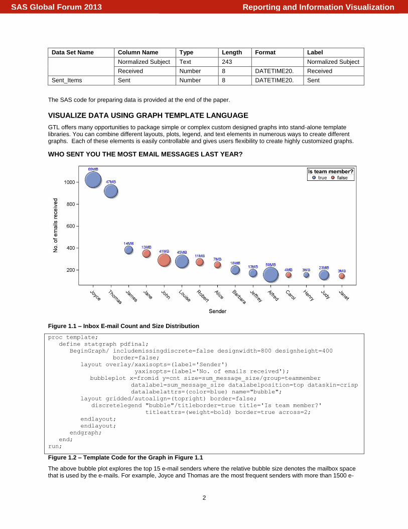
WHO SENT YOU THE MOST EMAIL MESSAGES LAST YEAR?
Figure 1.1 – Inbox E-mail Count and Size Distribution
proc template;
define statgraph pdfinal;
BeginGraph/ includemissingdiscrete=false designwidth=800 designheight=400
border=false;
layout overlay/xaxisopts=(label='Sender')
yaxisopts=(label='No. of emails received');
bubbleplot x=fromid y=cnt size=sum_message_size/group=teammember
datalabel=sum_message_size datalabelposition=top dataskin=crisp
datalabelattrs=(color=blue) name="bubble";
layout gridded/autoalign=(topright) border=false;
discretelegend "bubble"/titleborder=true title='Is team member?'
titleattrs=(weight=bold) border=true across=2;
endlayout;
endlayout;
endgraph;
end;
run;
Figure 1.2 – Template Code for the Graph in Figure 1.1
The above bubble plot explores the top 15 e-mail senders where the relative bubble size denotes the mailbox space that is used by the e-mails. For example, Joyce and Thomas are the most frequent senders with more than 1500 e-
Reporting and Information VisualizationSAS Global Forum 2013

3
mails and use more than 100 MB of mailbox space. Other senders, like Alfred, Louise, and Judy, do not make as many Inbox appearances as the top users but some of them might consume a considerable amount of space since the e-mail content might carry different forms of attachments. Bubble color distinguishes team members from other team members.
To draw this graph, the data is summarized for each sender that includes the number of of e-mails that they have sent and the sum of all e-mail sizes. Template code in Figure 1.2 defines a bubble plot with the sender on the X axis and the number of e-mails that were received on Y axis. The size variable is set to the sum of all message sizes.
WHEN IS THE BEST CHANCE TO GET A REPLY TO YOUR EMAIL?
Figure 2.1 – E-mail Response Hourly Distribution
proc template;
define statgraph mytime;
begingraph /designheight=600 designwidth=650 border=false;
layout overlay /xaxisopts=(display=none ) yaxisopts= (display=none );
/* Draw Clock */
bubbleplot x=b1 y=b2 size=eval(b1*1.2)/relativescale=false
fillattrs=(color=red) dataskin=sheen ;
bubbleplot x=b1 y=b2 size=eval(b1*0.99)/relativescale=false
fillattrs=(color=white) dataskin=sheen ;
bubbleplot x=b1 y=b2 size=eval(b1*0.6)/relativescale=false
fillattrs=(color=white) dataskin=sheen;
scatterplot x=x1 y=y1/markercharacter=slice markercharacterattrs=(size=20)
markercharacterposition=center;
/*Draw vectors */
vectorplot x=x y=y xorigin=100 yorigin=100/ ARROWHEADS=FALSE
lineattrs=(color=blue) datatransparency=0.3;
endlayout;
endgraph;
end;
run;
Figure 2.2 – Template Code for the Graph in Figure 2.1
The clock plot exhibits the daily e-mail response of an individual. It looks like the majority of the e-mails are replied to
Reporting and Information VisualizationSAS Global Forum 2013
4
between 8:30 AM and 4:30 PM, with a dip around lunch time. Perhaps the best time to get a response from this individual is within business hours. It is unlikely that a response will be received outside of work hours.
E-mail data from the Sent Items folder is used to draw the clock plot. The time part is retrieved from the sent e-mail
timestamp and is used to calculate the X and Y coordinates on the circumference of the circle. Three bubble plots are used to draw the clock dial.The vector plot is overlaid on the dial to show the hourly activity.
HOW MANY EMAILS MIGHT ACTUALLY GET A REPLY?
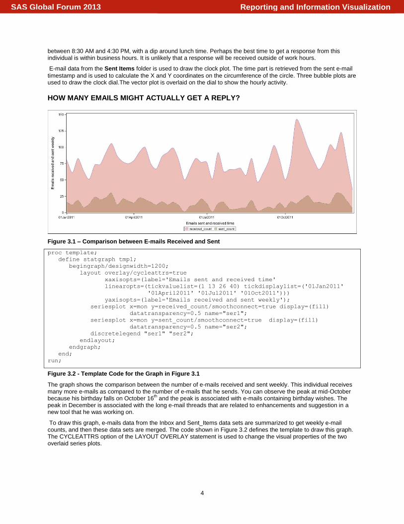
Figure 3.1 – Comparison between E-mails Received and Sent
proc template;
define statgraph tmp1;
begingraph/designwidth=1200;
layout overlay/cycleattrs=true
xaxisopts=(label='Emails sent and received time'
linearopts=(tickvaluelist=(1 13 26 40) tickdisplaylist=('01Jan2011'
'01April2011' '01Jul2011' '01Oct2011')))
yaxisopts=(label='Emails received and sent weekly');
seriesplot x=mon y=received_count/smoothconnect=true display=(fill)
datatransparency=0.5 name="ser1";
seriesplot x=mon y=sent_count/smoothconnect=true display=(fill)
datatransparency=0.5 name="ser2";
discretelegend "ser1" "ser2";
endlayout;
endgraph;
end;
run;
Figure 3.2 - Template Code for the Graph in Figure 3.1
The graph shows the comparison between the number of e-mails received and sent weekly. This individual receives many more e-mails as compared to the number of e-mails that he sends. You can observe the peak at mid-October because his birthday falls on October 16
th and the peak is associated with e-mails containing birthday wishes. The
peak in December is associated with the long e-mail threads that are related to enhancements and suggestion in a new tool that he was working on.
To draw this graph, e-mails data from the Inbox and Sent_Items data sets are summarized to get weekly e-mail counts, and then these data sets are merged. The code shown in Figure 3.2 defines the template to draw this graph. The CYCLEATTRS option of the LAYOUT OVERLAY statement is used to change the visual properties of the two overlaid series plots.
Reporting and Information VisualizationSAS Global Forum 2013
5
HOW DO DISCUSSION TOPICS CHANGE OVER A PERIOD OF TIME?
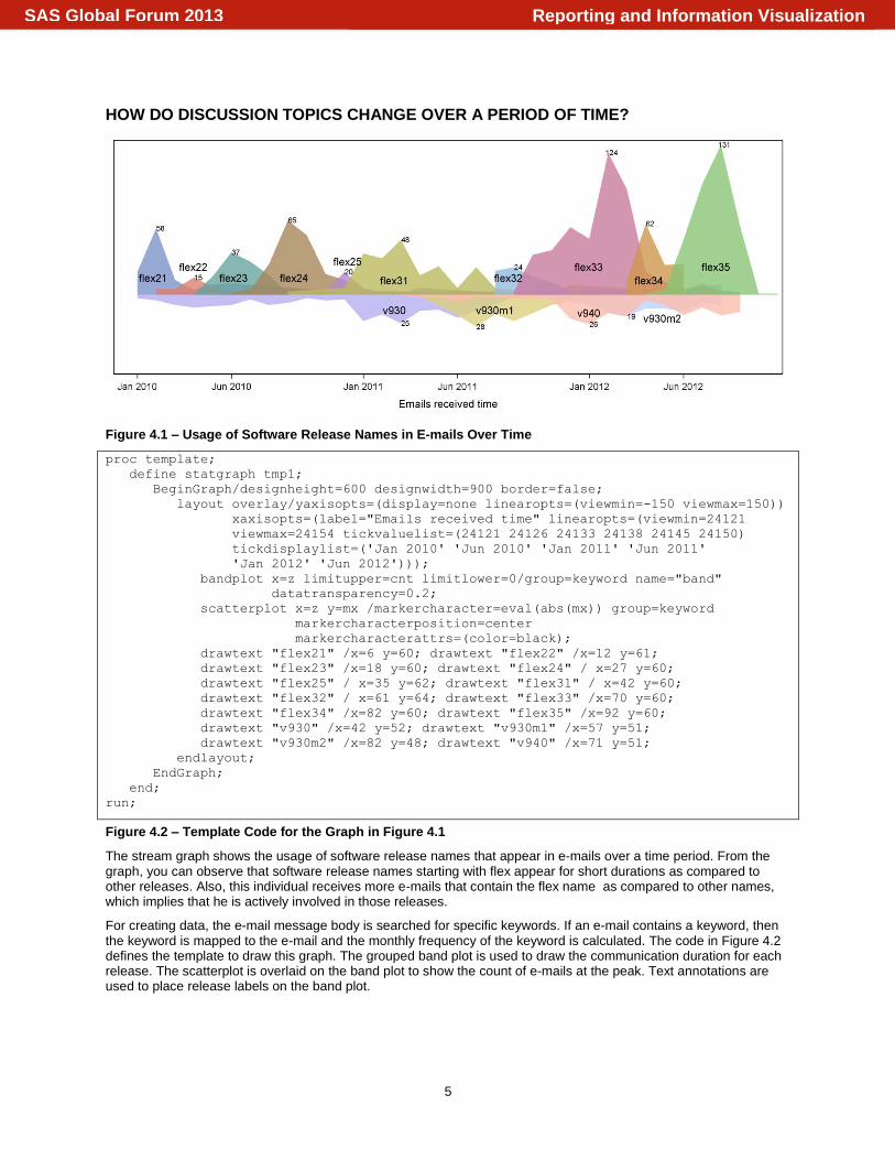
Figure 4.1 – Usage of Software Release Names in E-mails Over Time
proc template;
define statgraph tmp1;
BeginGraph/designheight=600 designwidth=900 border=false;
layout overlay/yaxisopts=(display=none linearopts=(viewmin=-150 viewmax=150))
xaxisopts=(label="Emails received time" linearopts=(viewmin=24121
viewmax=24154 tickvaluelist=(24121 24126 24133 24138 24145 24150)
tickdisplaylist=('Jan 2010' 'Jun 2010' 'Jan 2011' 'Jun 2011'
'Jan 2012' 'Jun 2012')));
bandplot x=z limitupper=cnt limitlower=0/group=keyword name="band"
datatransparency=0.2;
scatterplot x=z y=mx /markercharacter=eval(abs(mx)) group=keyword
markercharacterposition=center
markercharacterattrs=(color=black);
drawtext "flex21" /x=6 y=60; drawtext "flex22" /x=12 y=61;
drawtext "flex23" /x=18 y=60; drawtext "flex24" / x=27 y=60;
drawtext "flex25" / x=35 y=62; drawtext "flex31" / x=42 y=60;
drawtext "flex32" / x=61 y=64; drawtext "flex33" /x=70 y=60;
drawtext "flex34" /x=82 y=60; drawtext "flex35" /x=92 y=60;
drawtext "v930" /x=42 y=52; drawtext "v930m1" /x=57 y=51;
drawtext "v930m2" /x=82 y=48; drawtext "v940" /x=71 y=51;
endlayout;
EndGraph;
end;
run;
Figure 4.2 – Template Code for the Graph in Figure 4.1
The stream graph shows the usage of software release names that appear in e-mails over a time period. From the graph, you can observe that software release names starting with flex appear for short durations as compared to other releases. Also, this individual receives more e-mails that contain the flex name as compared to other names, which implies that he is actively involved in those releases.
For creating data, the e-mail message body is searched for specific keywords. If an e-mail contains a keyword, then the keyword is mapped to the e-mail and the monthly frequency of the keyword is calculated. The code in Figure 4.2 defines the template to draw this graph. The grouped band plot is used to draw the communication duration for each release. The scatterplot is overlaid on the band plot to show the count of e-mails at the peak. Text annotations are used to place release labels on the band plot.
Reporting and Information VisualizationSAS Global Forum 2013
6
WHICH WORDS STAND OUT IN ONE’S COMMUNICATION?
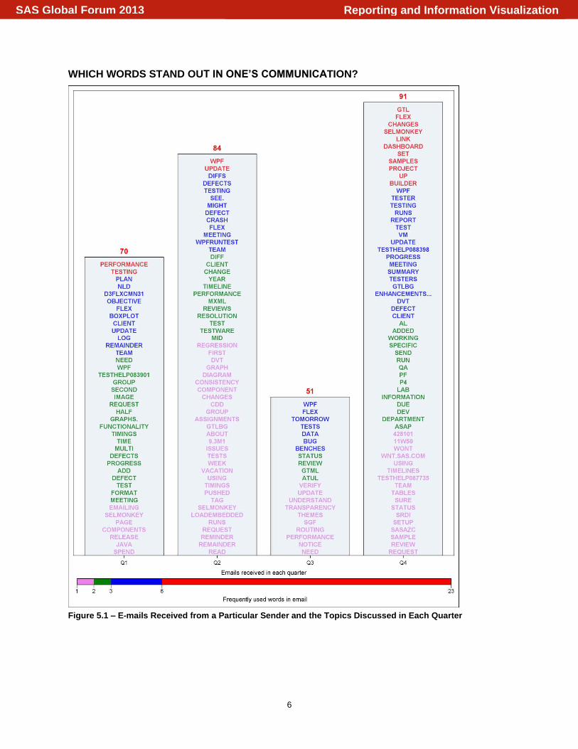
Figure 5.1 – E-mails Received from a Particular Sender and the Topics Discussed in Each Quarter
Reporting and Information VisualizationSAS Global Forum 2013
7
proc template;
define statgraph st;
begingraph/designheight=1200 designwidth=900;
rangeattrmap name="scale";
range min-2 / rangealtcolor=violet;
range 2<-3 / rangealtcolor=green;
range 3<-6 / rangealtcolor=blue;
range 6<-max / rangealtcolor=red;
endrangeattrmap;
rangeattrvar attrvar=colorvar var=cnt attrmap="scale";
layout overlay/ yaxisopts=(display=none linearopts=(viewmin=30)
label='No. of emails received') xaxisopts=(type=discrete
label='Emails received in each quarter'
discreteopts=(tickvaluelist=('1' '2' '3' '4')
tickdisplaylist=('Q1' 'Q2' 'Q3' 'Q4')));
scatterplot x=dp y=d/ markercharacter=word markercolorgradient=colorvar
name="ser" markercharacterattrs=(size=10 weight=bold);
barchart x=dp y=mx /barlabel=true stat=mean
fillattrs=(transparency=0.75)
barlabelattrs=(color=red size=12 weight=bold);
continuouslegend "ser" / title="Frequently used words in email"
orient=horizontal location=outside halign=right
valign=bottom;
endlayout;
endgraph;
end;
run;
Figure 5.2 – Template Code for the Graph in Figure 5.1
The graph shows number of e-mails that were received from the particular sender in each quarter. The words on each bar represent the topics or the subjects that were discussed in the respective quarters. The color coding of the words indicate how often the word comes up in the received e-mails. For creating data, all e-mails that were received from a particular sender during a period of one year are processed to find the quarterly e-mail count. E-mail subjects are parsed to find the frequency of words in the communication. The code in Figure 5.2 defines the template to draw this graph. The scatterplot is overlaid on the bar chart to show the words that appear in the communication. The SCATTERPLOT statement MARKERCHARACTER option is used to show words instead of markers. The GTL code for creating all of the above graphs is provided at the end of this paper.
CONCLUSION
The power of Graph Template Language can be used to visualize an e-mail archive to portray different patterns. This can be used further for a variety of different use cases by exploring and converting the data into SAS data sets and drawing powerful visuals using Graph Template Language. The same technique can be used to integrate the analytical capabilities into popular e-mail clients for users to explore and visualize the patterns on a regular basis.
REFERENCES
1. Liming, Douglas. “Data in Your Inbox? Use it!”. SAS Global Forum Online Proceedings. 2010. Available at http://support.sas.com/resources/papers/proceedings10/086-2010.pdf.
2. Tilanus, Erik. “Using the DATA step as a POP3 mail client. ” SAS Global Forum Online Proceedings. 2009. Available at http://support.sas.com/resources/papers/proceedings09/002-2009.pdf.
3. “java-libpst” A library to read PST files with java, without need for extra libraries.” Available at http://code.google.com/p/java-libpst/. Accessed on January 22, 2013.
4. Viegas, Fernanda. “Themail - a visualization of email archives”. Available at http://fernandaviegas.com/themail/. Accessed on January 22, 2013.
5. Radicati, Sara. “Email Statistics Report”. The Radicati Group, Inc. 2012-2016. Available at http://www.radicati.com/wp/wp-content/uploads/2012/04/Email-Statistics-Report-2012-2016-Executive-Summary.pdf.
Reporting and Information VisualizationSAS Global Forum 2013

8
6. Radicati, Sara. “Email Statistics Report”. The Radicati Group, Inc. 2011-2015. Available at http://www.radicati.com/wp/wp-content/uploads/2011/05/Email-Statistics-Report-2011-2015-Executive-Summary.pdf.
7. Laclavik, Michal, et al. “Email Analysis and Information Extraction for Enterprise Benefit”. October 22, 2010. Available at http://ontea.sourceforge.net/publications/laclavik_ie_cai_final.pdf.
8. Trapani,Gina. “Analyze Your Email Usage with Mail Trends”. Lifehacker. Available at http://lifehacker.com/379328/analyze-your-email-usage-with-mail-trends. Accessed on January 22, 2013.
9. Alharbi, Saad and Dimitrios Rigas. “Email Visualization – A Comparative Usability Evaluation”. Available at http://www.dr-saadalharbi.com/E-mailVisualisation.pdf. Accessed on January 22, 2013.
ACKNOWLEDGMENTS
I would like to thank Mangalmurti Badgujar and Debpriya Sarkar for their help in Graph Template Language, and Kishore Jain for his help in exploring the end-to-end use case.
CONTACT INFORMATION
Your comments and questions are valued and encouraged. Contact the author at:
Atul Kachare Level 2A & Level 3, Cybercity, Tower 5, Magarpatta city, Hadapsar SAS Institute Inc. Pune, Maharashtra India - 411013 E-mail: [email protected]
SAS and all other SAS Institute Inc. product or service names are registered trademarks or trademarks of SAS Institute Inc. in the USA and other countries. ® indicates USA registration.
Other brand and product names are trademarks of their respective companies.
Reporting and Information VisualizationSAS Global Forum 2013
9
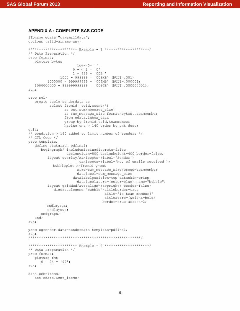
APENDIX A : COMPLETE SAS CODE
libname edata "c:\emaildata";
options validvarname=any;
/********************** Example - 1 *********************/
/* Data Preparation */
proc format;
picture bytes
low-<0='.'
0 - < 1 = '0'
1 - 999 = '009 '
1000 - 999999 = '009KB' (MULT=.001)
1000000 - 999999999 = '009MB' (MULT=.000001)
1000000000 - 999999999999 = '009GB' (MULT=.000000001);
run;
proc sql;
create table senderdata as
select fromid ,toid,count(*)
as cnt,sum(message_size)
as sum_message_size format=bytes.,teammember
from edata.inbox_data
group by fromid,toid,teammember
having cnt > 140 order by cnt desc;
quit;
/* condition > 140 added to limit number of senders */
/* GTL Code */
proc template;
define statgraph pdfinal;
begingraph/ includemissingdiscrete=false
designwidth=800 designheight=400 border=false;
layout overlay/xaxisopts=(label='Sender')
yaxisopts=(label='No. of emails received');
bubbleplot x=fromid y=cnt
size=sum_message_size/group=teammember
datalabel=sum_message_size
datalabelposition=top dataskin=crisp
datalabelattrs=(color=blue) name="bubble";
layout gridded/autoalign=(topright) border=false;
discretelegend "bubble"/titleborder=true
title='Is team member?'
titleattrs=(weight=bold)
border=true across=2;
endlayout;
endlayout;
endgraph;
end;
run;
proc sgrender data=senderdata template=pdfinal;
run;
/****************************************************/
/********************** Example - 2 *********************/
/* Data Preparation */
proc format;
picture fmt
0 - 24 = '99';
run;
data sentItems;
set edata.Sent_items;
Reporting and Information VisualizationSAS Global Forum 2013

10
if year(datepart(sent))=2011;
keep sent;
run;
data sent_Items;
set SentItems;
retain n 0;
pi=constant('pi');
mt=timepart(sent);
mtime=((TIMEPART(sent)/86400)*pi*2-pi/2)*-1;
n=n+1;
angle2=(n*2*pi/24)+pi/2;
x= 100+60 * cos(mtime);
y= 100+60 * sin(mtime);
if n < 25 then do;
x1= 100+90 * cos(angle2);
y1= 100+90 * sin(angle2);
slice=24-mod(n,24);
if slice=24 then slice=0;
end;
if n=1 then do;
b1=100;
b2=100;
end;
format slice fmt.;
run;
/* GTL Code */
proc template;
define statgraph mytime;
begingraph /designheight=600 designwidth=650 border=false;
layout overlay /xaxisopts=(display=none ) yaxisopts= (display=none );
/* Draw Clock */
bubbleplot x=b1 y=b2 size=eval(b1*1.2)/relativescale=false
fillattrs=(color=red) dataskin=sheen ;
bubbleplot x=b1 y=b2 size=eval(b1*0.99)/relativescale=false
fillattrs=(color=white) dataskin=sheen ;
bubbleplot x=b1 y=b2 size=eval(b1*0.6)/relativescale=false
fillattrs=(color=white) dataskin=sheen;
scatterplot x=x1 y=y1/markercharacter=slice
markercharacterattrs=(size=20)
markercharacterposition=center;
/*Draw vectors */
vectorplot x=x y=y xorigin=100 yorigin=100/ ARROWHEADS=FALSE
lineattrs=(color=blue) datatransparency=0.3;
endlayout;
endgraph;
end;
run;
proc sgrender data=sent_Items template="mytime";
run;
/****************************************************/
/********************** Example - 3 *********************/
/* Data Preparation */
data temp1;
set edata.inbox_items;
mon=week(datepart(received));
where year(datepart(received))=2011;
keep mon;
run;
Reporting and Information VisualizationSAS Global Forum 2013

11
data temp2;
set edata.sent_items;
mon=week(datepart(sent));
where year(datepart(sent))=2011;
keep mon;
run;
proc sql;
create table remails as select mon, count(*) as received_count from temp1
group by mon;
create table semails as select mon, count(*) as sent_count from temp2
group by mon;
create table all_emails as select a.mon,a.received_count,b.sent_count from remails
a join semails b on (a.mon=b.mon);
quit;
/* GTL Code */
proc template;
define statgraph tmp1;
begingraph/designwidth=1200;
layout overlay/cycleattrs=true xaxisopts=(label='Emails sent and received
time' linearopts=(tickvaluelist=(1 13 26 40)
tickdisplaylist=('01Jan2011' '01April2011' '01Jul2011'
'01Oct2011'))) yaxisopts=(label='Emails received and sent weekly');
seriesplot x=mon y=received_count/smoothconnect=true display=(fill)
datatransparency=0.5 name="ser1";
seriesplot x=mon y=sent_count/smoothconnect=true display=(fill)
datatransparency=0.5 name="ser2";
discretelegend "ser1" "ser2";
endlayout;
endgraph;
end;
run;
proc sgrender data=all_emails template=tmp1;
run;
/****************************************************/
/********************** Example - 4 *********************/
/* Data Preparation */
data emailtexts;
set edata.inbox_items;
mdt='Creation Time'n;
dp=datepart(mdt);
y=year(datepart(mdt))*12;
m=month(datepart(mdt));
z=y+m;
select;
when(find(body,'d2flxcmn21')>0) do; keyword='flex21'; c=1;output; end;
when(find(body,'d2flxcmn22')>0) do; keyword='flex22'; c=1;output; end;
when(find(body,'d2flxcmn23')>0) do; keyword='flex23'; c=1;output; end;
when(find(body,'d2flxcmn24')>0) do; keyword='flex24'; c=1;output; end;
when(find(body,'d2flxcmn25')>0) do; keyword='flex25'; c=1;output; end;
when(find(body,'d3flxcmn31')>0) do; keyword='flex31'; c=1;output; end;
when(find(body,'d3flxcmn32')>0) do; keyword='flex32'; c=1;output; end;
when(find(body,'d3flxcmn33')>0) do; keyword='flex33'; c=1;output; end;
when(find(body,'d3flxcmn34')>0) do; keyword='flex34'; c=1;output; end;
when(find(body,'d3flxcmn35')>0) do; keyword='flex35'; c=1;output; end;
when(find(body,'v930m1')>0) do; keyword='v930m1'; c=-1;output; end;
when(find(body,'v930m2')>0) do; keyword='v930m2'; c=-1;output; end;
Reporting and Information VisualizationSAS Global Forum 2013

12
when(find(body,'v930')>0) do; keyword='v930'; c=-1;output; end;
when(find(body,'v940')>0) do; keyword='v940'; c=-1;output; end;
otherwise;
end;
run;
proc sql;
create table mdata as select z label='time',keyword,
sum(c) as cnt from emailtexts
where y gt 2009*12 group by z,keyword order by keyword;
create table fdata as select keyword,max(abs(cnt)) as mx from mdata
group by keyword;
quit;
data pdata;
merge mdata fdata;
by keyword;
run;
data finaldata;
set pdata;
if abs(cnt)^=mx then mx=.;
else if cnt < 0 then mx=mx*-1;
run;
/* GTL Code */
proc template;
define statgraph tmp1;
begingraph/designheight=375 designwidth=900 border=false;
layout overlay/yaxisopts=(display=none offsetmin=0.2)
xaxisopts=(label="Emails received time"
linearopts=(viewmin=24121 viewmax=24154
tickvaluelist=(24121 24126 24133 24138 24145 24150)
tickdisplaylist=('Jan 2010' 'Jun 2010' 'Jan 2011' 'Jun 2011'
'Jan 2012' 'Jun 2012')));
bandplot x=z limitupper=cnt limitlower=0/group=keyword name="band"
datatransparency=0.2;
scatterplot x=z y=mx /markercharacter=eval(abs(mx)) group=keyword
markercharacterposition=center
markercharacterattrs=(color=black);
drawtext "flex21" /x=6 y=49;
drawtext "flex22" /x=12 y=53;
drawtext "flex23" /x=18 y=49;
drawtext "flex24" / x=27 y=49;
drawtext "flex25" / x=35 y=55;
drawtext "flex31" / x=42 y=48;
drawtext "flex32" / x=59 y=49;
drawtext "flex33" /x=71 y=53;
drawtext "flex34" /x=80 y=48;
drawtext "flex35" /x=90 y=53;
drawtext "v930" /x=42 y=37;
drawtext "v930m1" /x=57 y=37;
drawtext "v930m2" /x=82 y=34;
drawtext "v940" /x=71 y=36;
endlayout;
endgraph;
end;
run;
proc sgrender data=finaldata template=tmp1;
run;
/****************************************************/
Reporting and Information VisualizationSAS Global Forum 2013

13
/********************** Example - 5 *********************/
/* Data Preparation */
data d1;
set edata.inbox_items(rename='Normalized Subject'n=sub);
dp=qtr(datepart('Creation Time'n));
where year(datepart('Creation Time'n))=2011 and from='Joyce';
keep dp sub;
run;
data d2;
set d1;
sub=prxchange('s/[^A-Z a-z 0-9 \.&]/ /', -1, sub);
do cnt=1 to countw(sub,' ');
word = upcase(trim(left(scan(sub,cnt,' '))));
if word not IN('' '0' '1' '2' '3' '4' '5' '6' '7' '8' '9' 'IS' 'ARE' 'WAS'
'WERE' 'THE' 'I' 'WE' 'THEY' 'THERE'
'THESE' 'IN' 'A' 'AN' 'OF' 'TO' 'AND' 'IT' 'THAT' 'THIS' 'YOUR'
'FOR' 'BY' 'THEIR' 'IF' 'WHICH' 'WITH' 'ON' 'AT' 'OR' 'SO'
'INTO' 'ALSO' 'BE' 'FROM' 'HAS' 'AS' 'NOT' 'WILL' 'CAN' 'NEW'
'YOU' 'RE' 'FW' 'Please' 'S' 'D' 'T' 'COULDN'
'PLEASE' 'NNTO' '12' '01' '2011')
then output;
end;
drop cnt;
keep dp word sub;
run;
proc sql;
/* Number of emails received in specified time interval */
create table d3 as select dp,count(*) as cnt from d1 group by dp;
/* Number of occurences of word in specified time interval */
create table d4 as select dp,word,count(*) as cnt from d2 group by dp,word
order by dp,cnt desc;
quit;
data d5;
set d4;
retain t c;
if t^=dp then
do;
c=1;
t=dp;
end;
else c=c+1;
run;
proc sql;
create table d6 as select dp,word,c,cnt from d5 a where exists
(select 1 from d3 b where a.dp=b.dp and a.c <= b.cnt ) order by word;
create table d7 as select dp,max(c) as mx from d6 group by dp;
create table d8 as select a.dp,a.word,a.cnt,b.mx,b.mx-a.c as d from d6
a join d7 b on (a.dp=b.dp);
quit;
Reporting and Information VisualizationSAS Global Forum 2013

14
/* GTL Code */
proc template;
define statgraph st;
begingraph/designheight=1200 designwidth=900;
rangeattrmap name="scale";
range min-2 / rangealtcolor=violet;
range 2<-3 / rangealtcolor=green;
range 3<-6 / rangealtcolor=blue;
range 6<-max / rangealtcolor=red;
endrangeattrmap;
rangeattrvar attrvar=colorvar var=cnt attrmap="scale";
layout overlay/ yaxisopts=(display=none linearopts=(viewmin=30)
label='No. of emails received')
xaxisopts=(type=discrete label='Emails received in each quarter'
discreteopts=(tickvaluelist=('1' '2' '3' '4')
tickdisplaylist=('Q1' 'Q2' 'Q3' 'Q4')));
scatterplot x=dp y=d/ markercharacter=word markercolorgradient=colorvar
name="ser" markercharacterattrs=(size=10 weight=bold);
barchart x=dp y=mx /barlabel=true stat=mean fillattrs=(transparency=0.75)
barlabelattrs=(color=red size=12 weight=bold);
continuouslegend "ser" / title="Frequently used words in email"
orient=horizontal location=outside halign=right
valign=bottom;
endlayout;
endgraph;
end;
run;
proc sgrender data=d8 template=st;
run;
/****************************************************/
Reporting and Information VisualizationSAS Global Forum 2013