3. Statistical Process Controlpeople.uwplatt.edu/~shiy/courses/se373/notes/Note3-SPC.pdfComputer...
51
Computer Science and Software Engineering University of Wisconsin - Platteville 3. Statistical Process Control Yan Shi SE 3730 / CS 5730 Lecture Notes
Transcript of 3. Statistical Process Controlpeople.uwplatt.edu/~shiy/courses/se373/notes/Note3-SPC.pdfComputer...
Computer Science and Software Engineering
University of Wisconsin - Platteville
3. Statistical Process
Control
Yan Shi
SE 3730 / CS 5730 Lecture Notes
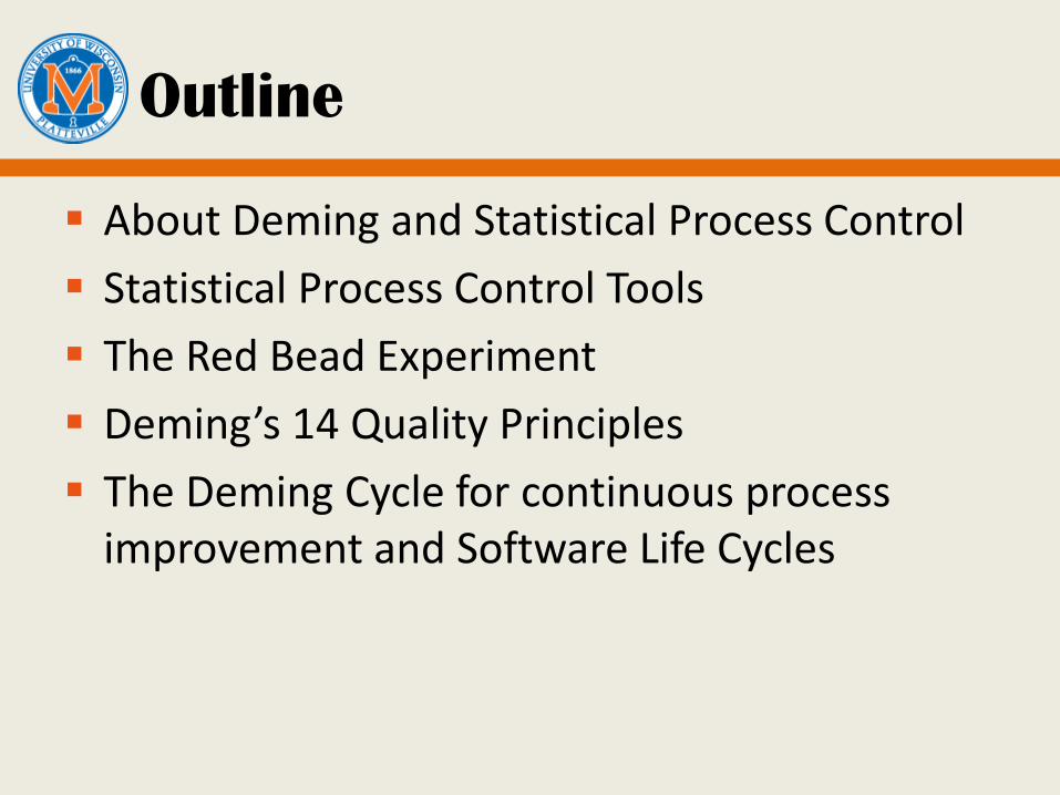
Outline
About Deming and Statistical Process Control
Statistical Process Control Tools
The Red Bead Experiment
Deming’s 14 Quality Principles
The Deming Cycle for continuous process improvement and Software Life Cycles

Who is Deming?
The W. Edwards Deming Institute
The Deming Prize
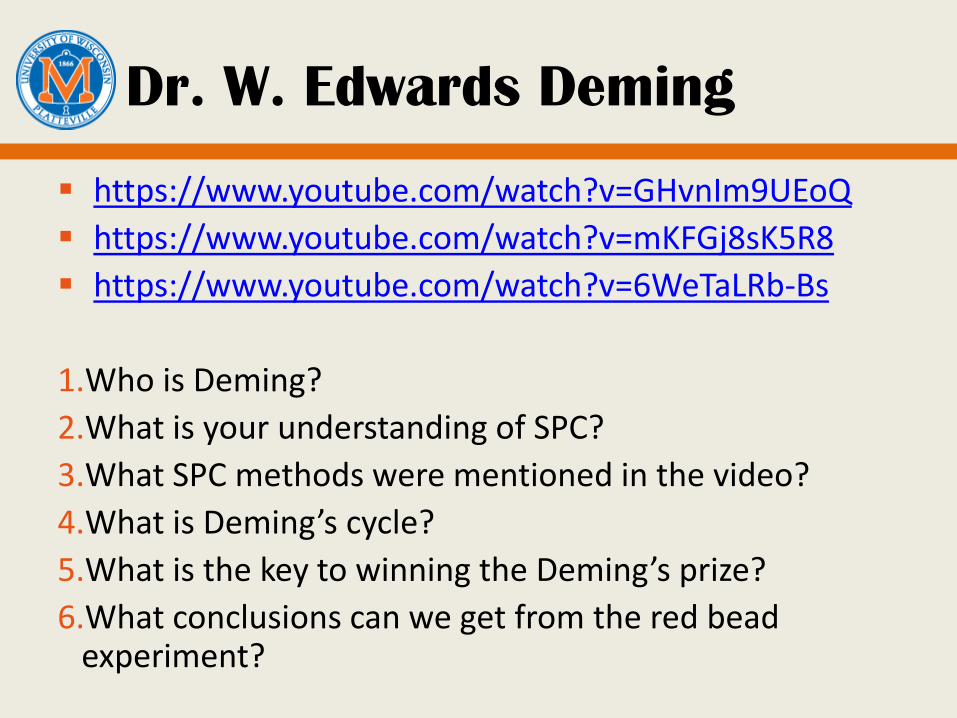
Dr. W. Edwards Deming
https://www.youtube.com/watch?v=GHvnIm9UEoQ
https://www.youtube.com/watch?v=mKFGj8sK5R8
https://www.youtube.com/watch?v=6WeTaLRb-Bs
1.Who is Deming?
2.What is your understanding of SPC?
3.What SPC methods were mentioned in the video?
4.What is Deming’s cycle?
5.What is the key to winning the Deming’s prize?
6.What conclusions can we get from the red bead experiment?
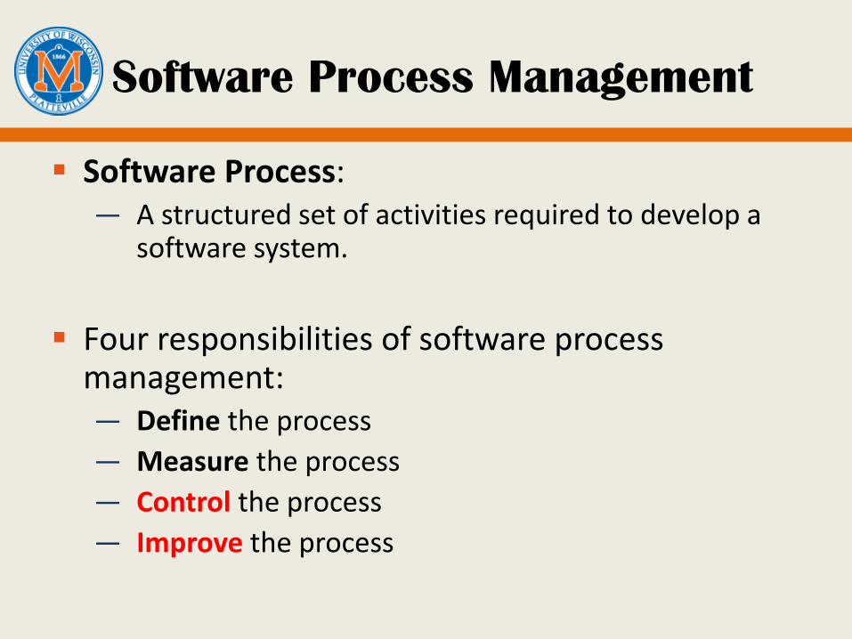
Software Process Management
Software Process: — A structured set of activities required to develop a
software system.
Four responsibilities of software process management:— Define the process
— Measure the process
— Control the process
— Improve the process
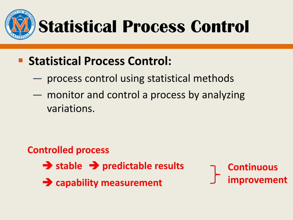
Statistical Process Control
Statistical Process Control:
— process control using statistical methods
— monitor and control a process by analyzing variations.
Controlled process
stable predictable results
capability measurement
Continuous improvement
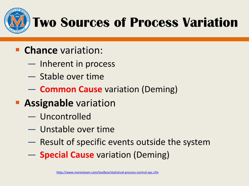
Two Sources of Process Variation
Chance variation:— Inherent in process
— Stable over time
— Common Cause variation (Deming)
Assignable variation— Uncontrolled
— Unstable over time
— Result of specific events outside the system
— Special Cause variation (Deming)
http://www.moresteam.com/toolbox/statistical-process-control-spc.cfm

Why Statistical Technique?
We need to understand the current performanceof a process.— Then we can determine if a process gets better or
worse under different conditions.
— Then we can statistically identify outliers and study what made them different from other instances. We expect process outcomes to be normally distributed
about the process mean (average).
Outliers are anomalies, either very good or very poor outcomes. We would not expect outcomes this good or bad just by chance.
Often we can learn more about a process by studying outliers than by studying normal outcomes.
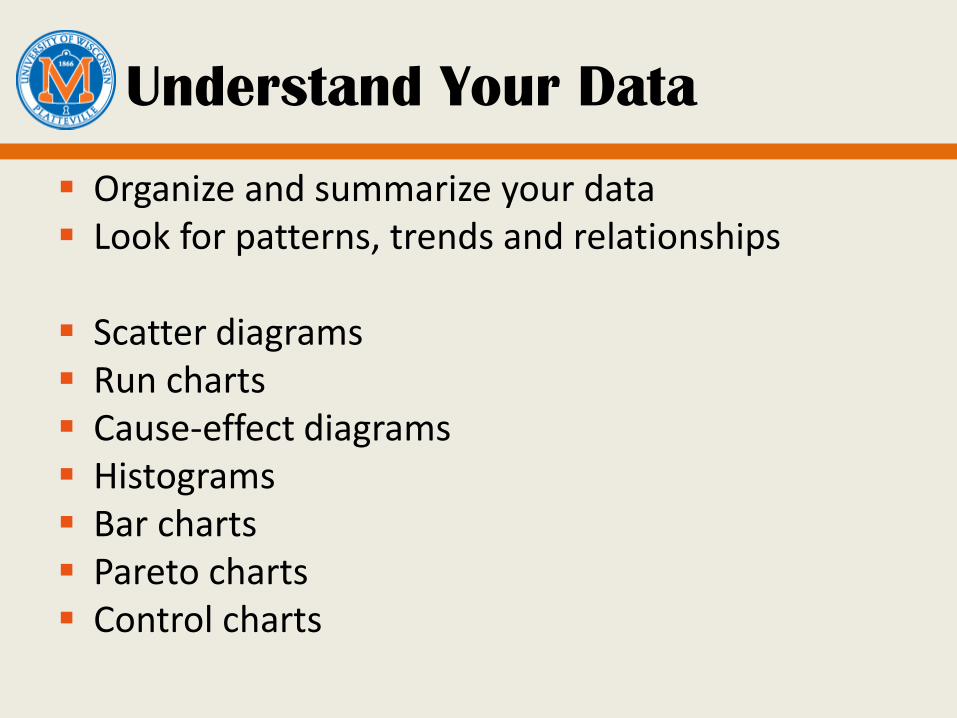
Understand Your Data
Organize and summarize your data Look for patterns, trends and relationships
Scatter diagrams Run charts Cause-effect diagrams Histograms Bar charts Pareto charts Control charts
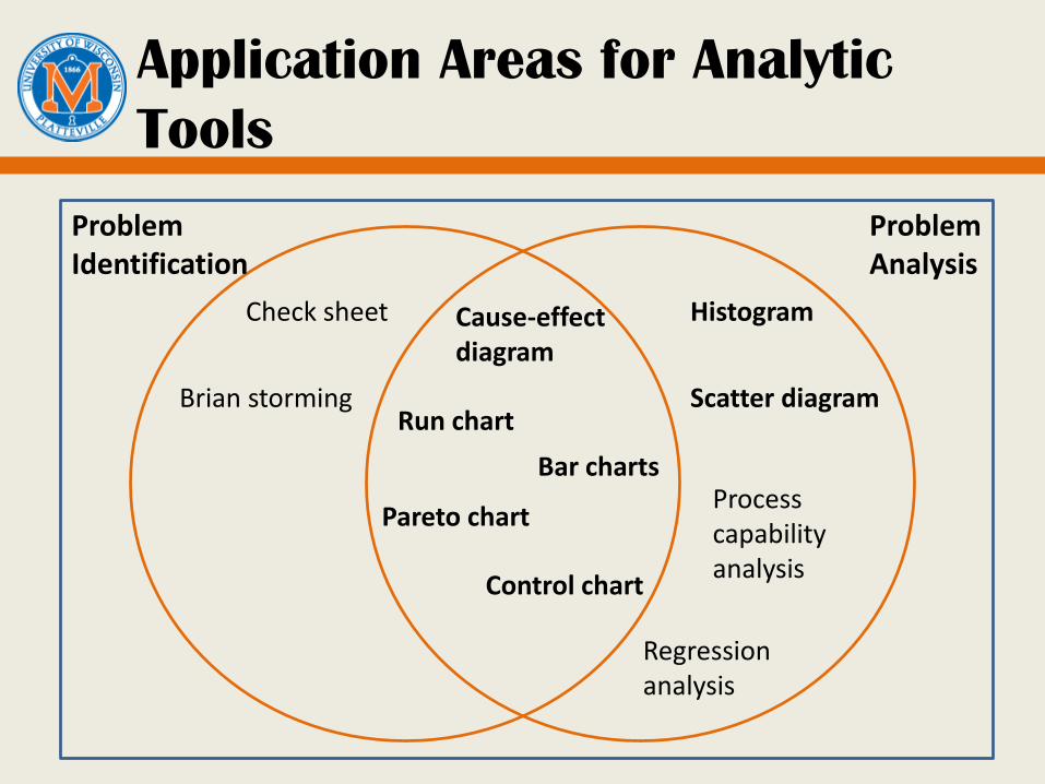
Application Areas for Analytic
Tools
ProblemIdentification
ProblemAnalysis
Check sheet
Brian storming
Histogram
Scatter diagram
Process capability analysis
Pareto chart
Cause-effectdiagram
Run chart
Bar charts
Control chart
Regression analysis

Scatter Diagram
A plot of observed values that shows how one variable has behaved relative to another.
0
2
4
6
8
10
12
14
16
18
20
0 2 4 6 8 10 12
Defe
cts
p
er
K
LO
C
Levels of Inheritance
Defects per KLOC vs. Levels of inheritance
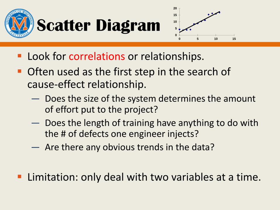
Scatter Diagram
Look for correlations or relationships.
Often used as the first step in the search of cause-effect relationship.— Does the size of the system determines the amount
of effort put to the project?
— Does the length of training have anything to do with the # of defects one engineer injects?
— Are there any obvious trends in the data?
Limitation: only deal with two variables at a time.
0
5
10
15
20
0 5 10 15

Run Chart
A plot of individual values arranged in a time sequence.
0
2
4
6
8
10
12
14
16
18
Fa
ilu
res
p
er
ho
ur
Time of day
Run Chart: Failures by time of day

Run Chart
Monitor the process: what is the trend?
Often trends become apparent in a run chart and can lead to an understanding of the cause. — Something is happening at 1:30am.
Also used for tracking the improvements to determine whether an approach is successful or not.
An average/mean line can be added to clarify movement of the data away from the average.
Precursor to control chart: not every variation is important.
0
5
10
15
20
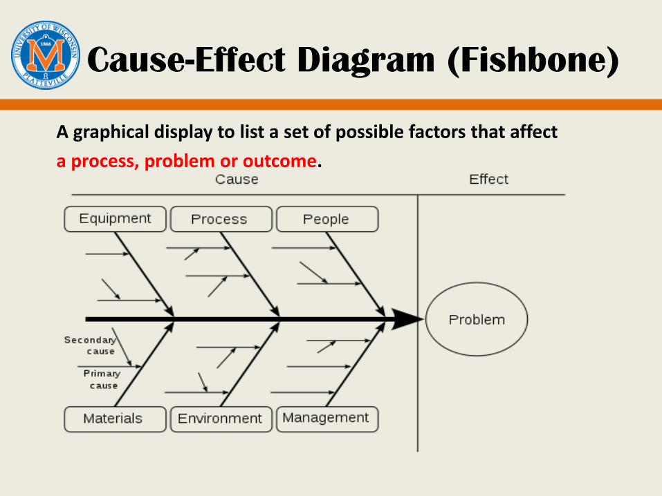
Cause-Effect Diagram (Fishbone)
A graphical display to list a set of possible factors that affect
a process, problem or outcome.

Cause-Effect Diagram
Often called Ishikawa charts or fishbone charts. Can be used for
— Exploring the behavior of a process— Locate problems— Search for root causes
When assembling CE diagrams, involve — People who actually work in the process— Experts in different parts of the process
Three types:— Dispersion analysis type— Cause enumeration type— Production process classification type
Brain storming sessions!

Dispersion Analysis CE Diagram
Constructed by repeatedly asking “Why does the dispersion/scatter occur?”
Pros: Organize and relate factors that cause variability in products and other process outcomes.
Cons: dependent on the views of people making it.
http://www.hci.com.au/hcisite3/toolkit/causeand.htm

How to Draw a Dispersion
Analysis CE Diagram
Step 1: Write down the effect to be investigated and draw the 'backbone' arrow to it.
Step 2: Identify all the broad areas in which the causes of the effect being investigated may lie.
Step 3: Write all the detailed possible causes in each of the broad areas. Each cause identified should be fully explored for further more specific causes which, in turn, contribute to them.
http://www.hci.com.au/hcisite3/toolkit/causeand.htm
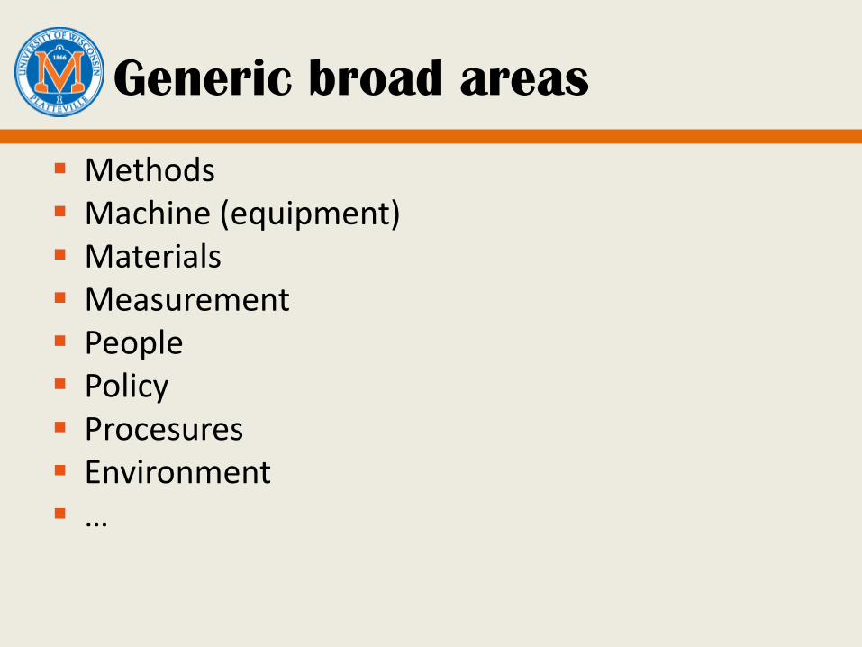
Generic broad areas
Methods Machine (equipment) Materials Measurement People Policy Procesures Environment …
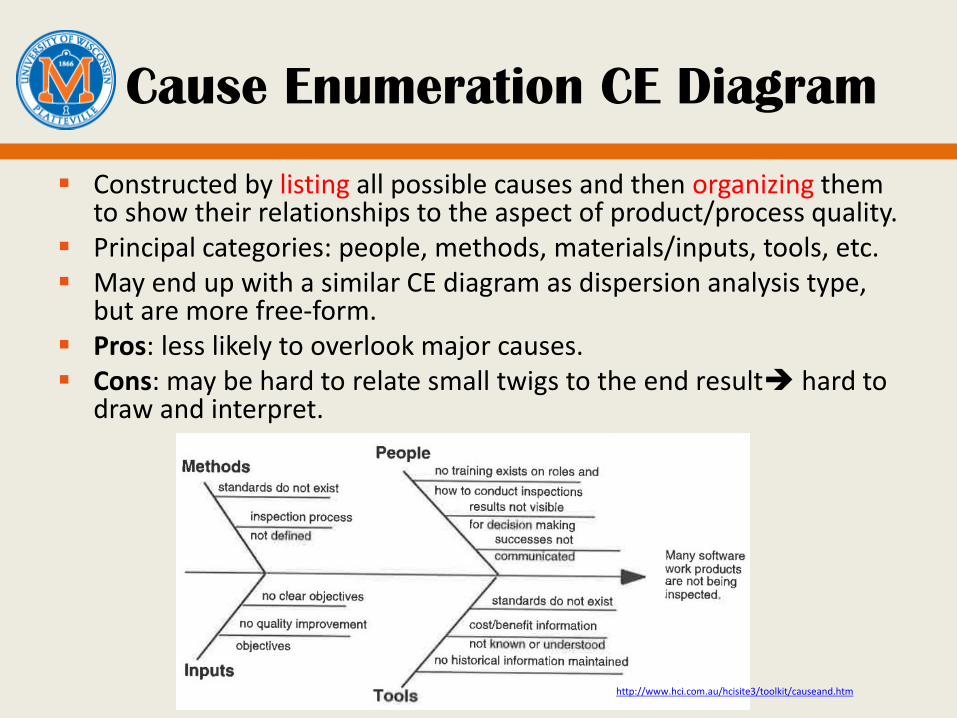
Cause Enumeration CE Diagram
Constructed by listing all possible causes and then organizing them to show their relationships to the aspect of product/process quality.
Principal categories: people, methods, materials/inputs, tools, etc. May end up with a similar CE diagram as dispersion analysis type,
but are more free-form. Pros: less likely to overlook major causes. Cons: may be hard to relate small twigs to the end result hard to
draw and interpret.
http://www.hci.com.au/hcisite3/toolkit/causeand.htm
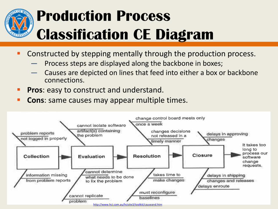
Production Process
Classification CE Diagram
Constructed by stepping mentally through the production process.— Process steps are displayed along the backbone in boxes;— Causes are depicted on lines that feed into either a box or backbone
connections.
Pros: easy to construct and understand. Cons: same causes may appear multiple times.
http://www.hci.com.au/hcisite3/toolkit/causeand.htm
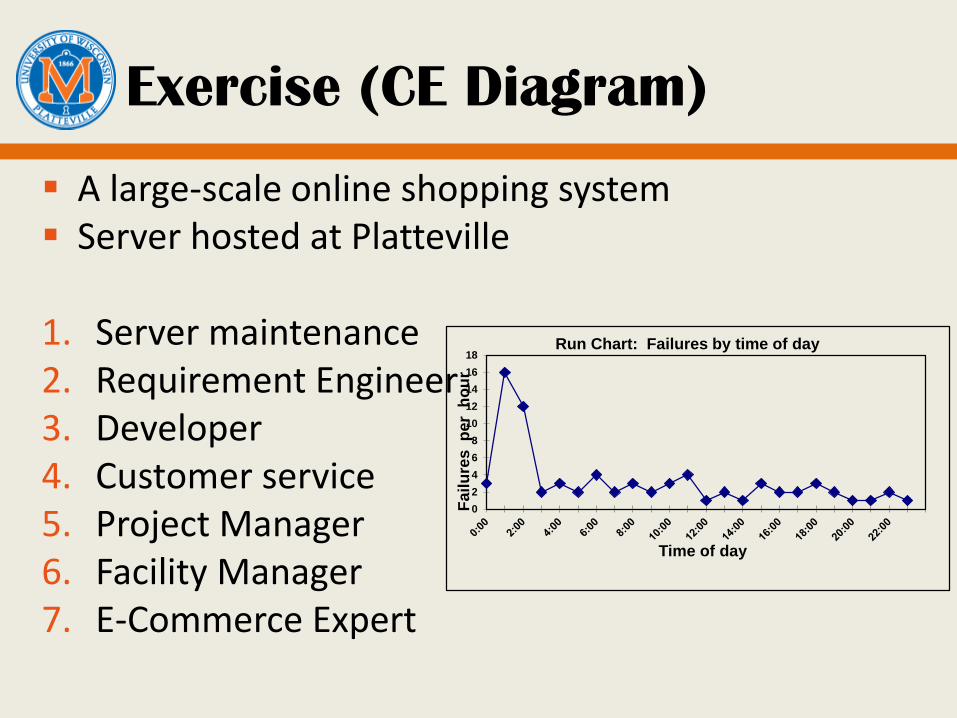
Exercise (CE Diagram)
A large-scale online shopping system Server hosted at Platteville
1. Server maintenance2. Requirement Engineer3. Developer4. Customer service5. Project Manager6. Facility Manager7. E-Commerce Expert
0
2
4
6
8
10
12
14
16
18
Fa
ilu
res
p
er
ho
ur
Time of day
Run Chart: Failures by time of day

Bar chart and histogram
Organize data based on frequency of occurrence.
Bar chart: categorical datahistogram: continuous data
Requirements review
DesignReview
Unit TestingsIntegration
TestingAlpha
TestingBeta Testing
PostDeployment
12 6 34 15 8 5 4
0
5
10
15
20
25
30
35
40
Defe
cts
Lifecycle Phase
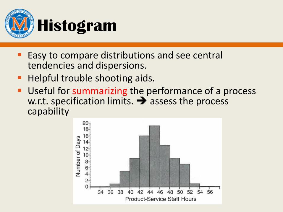
Histogram
Easy to compare distributions and see central tendencies and dispersions.
Helpful trouble shooting aids. Useful for summarizing the performance of a process
w.r.t. specification limits. assess the process capability
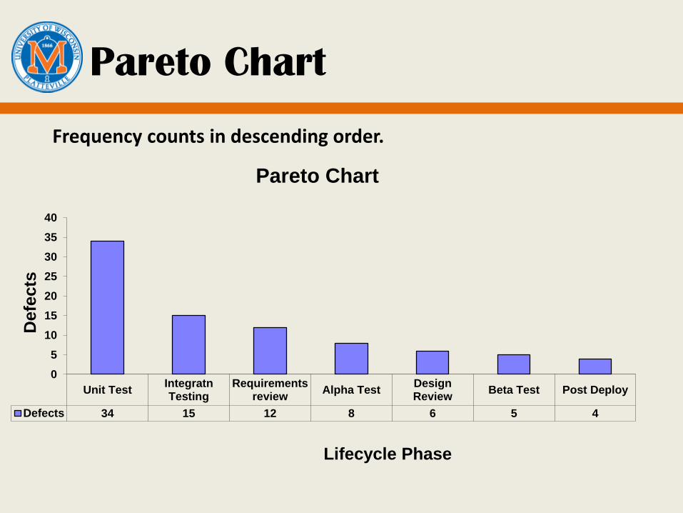
Pareto Chart
Frequency counts in descending order.
Unit TestIntegratnTesting
Requirementsreview
Alpha TestDesignReview
Beta Test Post Deploy
Defects 34 15 12 8 6 5 4
0
5
10
15
20
25
30
35
40
Defe
cts
Lifecycle Phase
Pareto Chart
Pareto Chart
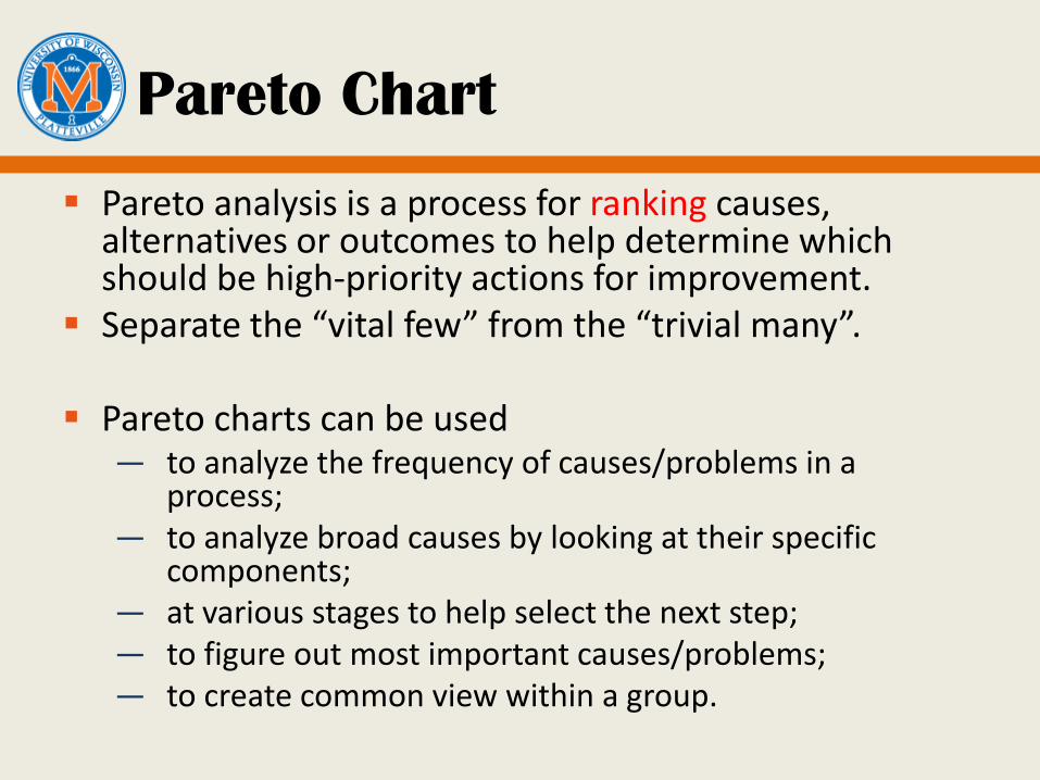
Pareto analysis is a process for ranking causes, alternatives or outcomes to help determine which should be high-priority actions for improvement.
Separate the “vital few” from the “trivial many”.
Pareto charts can be used — to analyze the frequency of causes/problems in a
process;— to analyze broad causes by looking at their specific
components;— at various stages to help select the next step;— to figure out most important causes/problems;— to create common view within a group.
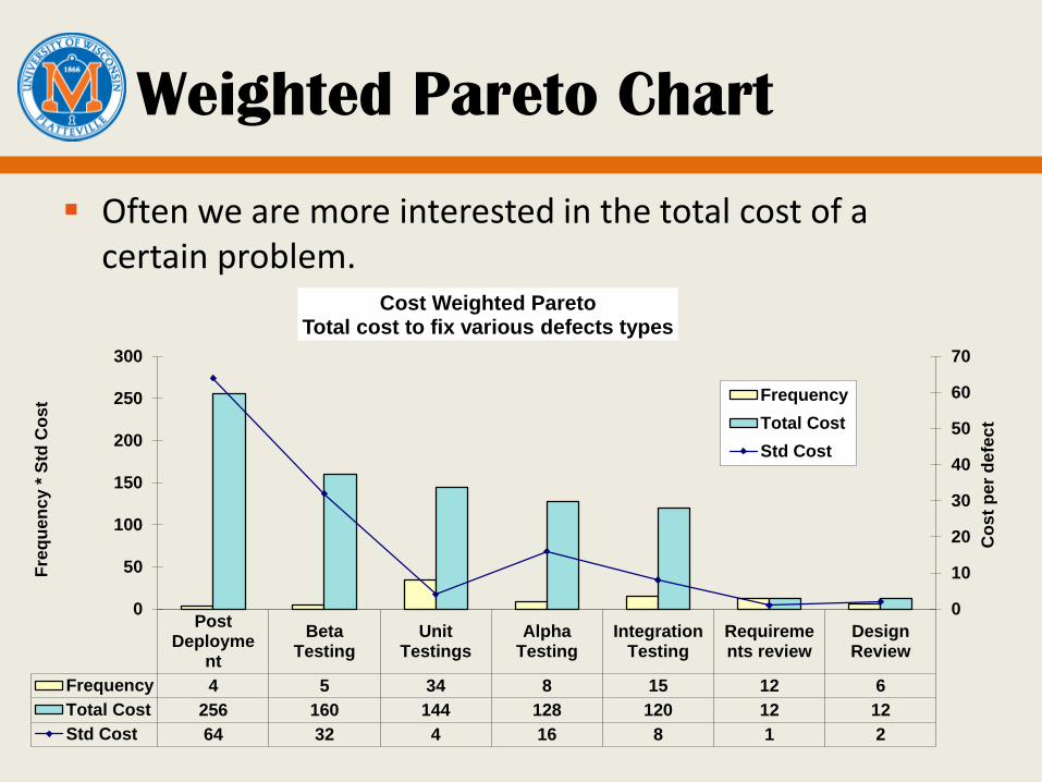
Weighted Pareto Chart
Often we are more interested in the total cost of a certain problem.
PostDeployme
nt
BetaTesting
UnitTestings
AlphaTesting
IntegrationTesting
Requirements review
DesignReview
Frequency 4 5 34 8 15 12 6
Total Cost 256 160 144 128 120 12 12
Std Cost 64 32 4 16 8 1 2
0
10
20
30
40
50
60
70
0
50
100
150
200
250
300
Co
st
per
de
fec
t
Fre
qu
en
cy *
Std
Co
st
Cost Weighted Pareto Total cost to fix various defects types
Frequency
Total Cost
Std Cost
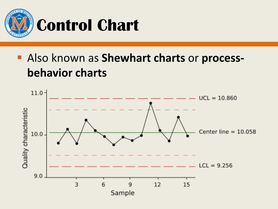
Control Chart
Also known as Shewhart charts or process-behavior charts

Types of Control Chart
X-bar chart: average chart. Show the observed variation in center tendency.
R chart: Show the observed dispersion in process performance across subgroups. Work well for sample size of 10 or less.
S chart: standard deviation chart. Work better for sample size larger than 10.
XmR chart: individuals and moving range chart
p chart: proportion non-conformance.
And more…

Controlled Process
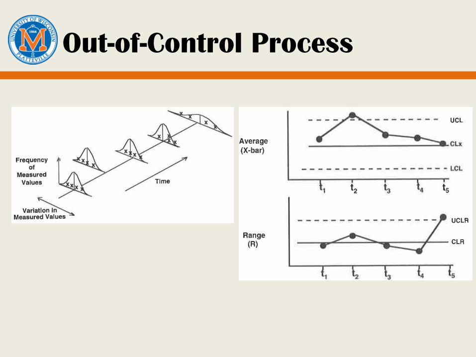
Out-of-Control Process

Control Chart: How to Draw
Time or Sequence Number
Qu
alit
y St
atis
tic
Subgroup averagesSubgroup rangesMoving averagesMoving ranges
CL Centerline (CL)
Process average
CL+3
CL-3
Upper Control Limit (UCL)
Lower Control Limit (LCL)
Traditional limits

Test 1: A single point falls outside the 3-sigma control limits.Test 2: At least 2 out of 3 successive values fall on the same side of, and more than 2 sigma units away from the centerline.Test 3: At least 4 out of 5 successive values fall on the same side of, and more than 1 sigma unit away from the centerline.Test 4: At least 8 successive values fall on the same side of the centerline.
Stability Detection Rules
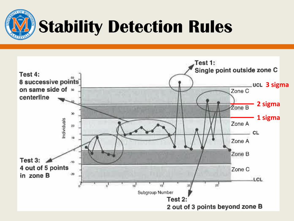
Stability Detection Rules
1 sigma
2 sigma
3 sigma

X-bar and R charts: How-To
X-bar and R charts can portray the process behavior when you can collect multiple measurements within a short period of time under basically the same condition.
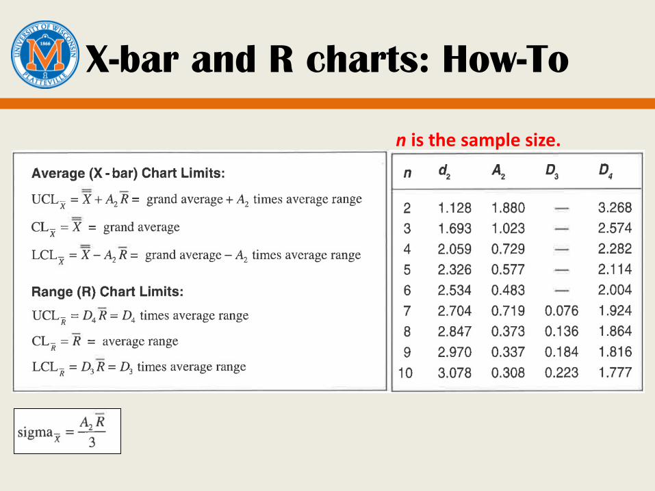
X-bar and R charts: How-To
n is the sample size.

Case study (Lab 3)
Mr. Smith is a software manager at XYZ company. He is responsible for
— A follow-up release for an existing product— Support service to users of that product:
Require 40 staff-hours per day Everyone on the development team must be available to
provide support service at any given time. If the daily effort to support service requests exceeds the
plan, it will hurt the release development schedule.
He has data from the past 16 weeks. Does he need to change the support service
procedure?

XmR Chart
If the sample size is 1, how do we calculate sigma?— We attribute the changes that occur between two successive
values to the inherent variability in the process.
X: individual values mR: moving range.

Stability Investigation Process
Control Chart in Software Engineering
Software differs from manufacturing in several aspects:— lack of well-defined specifications based on customer
requirements in terms of metrics.
— only design and development, no production.
— the assumption that data variation is from homogeneous sources is not met: multiple common causes: tools, methods, types of
software/module, skills, etc
the control limit calculated is often too wide.
— within one organization, multiple processes are often used and changes fast.
Use control chart in a relaxed manner in SE!
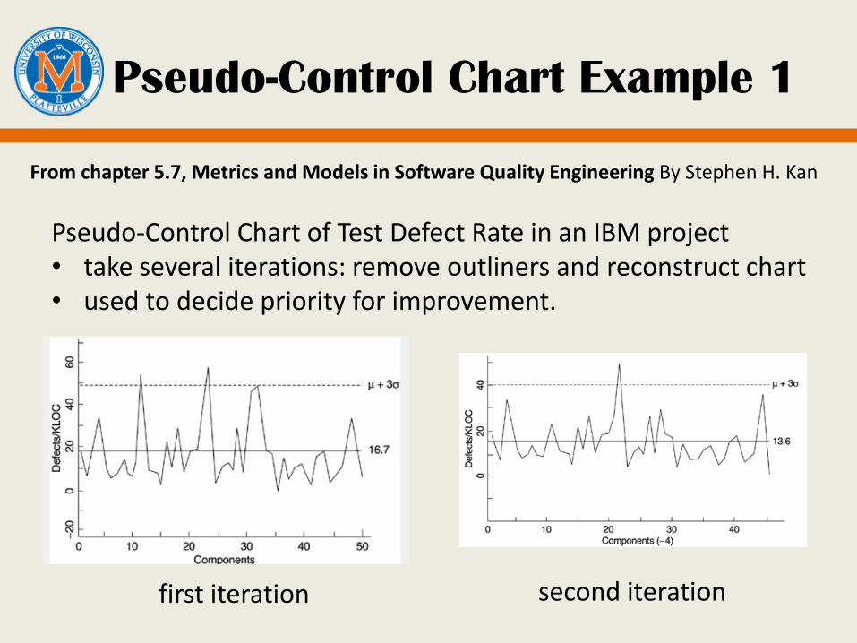
Pseudo-Control Chart Example 1
first iteration second iteration
Pseudo-Control Chart of Test Defect Rate in an IBM project• take several iterations: remove outliners and reconstruct chart• used to decide priority for improvement.
From chapter 5.7, Metrics and Models in Software Quality Engineering By Stephen H. Kan
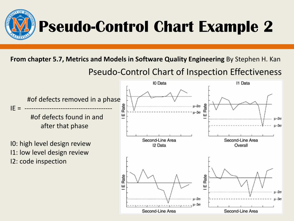
Pseudo-Control Chart Example 2
Pseudo-Control Chart of Inspection Effectiveness
From chapter 5.7, Metrics and Models in Software Quality Engineering By Stephen H. Kan
#of defects removed in a phaseIE = ---------------------------------------
#of defects found in and after that phase
I0: high level design reviewI1: low level design reviewI2: code inspection

The Red Bead Experiment
http://www.youtube.com/watch?v=JeWTD-0BRS4“The biggest enemy of the system is common sense.” -- Deming 6 willing workers 2 QA engineers 1 Inspector 1 Recorder
Take 20 beads out from the pool with minimum # of red beads! Will it help if we
— enhance rigid and precise procedure? — put motivating slogans around the room? — set numerical objectives? — reward by salary increase and punish by firing?

Lessons Learned From the Red
Bead Experiment
It’s the system, not the workers.
Management owns the system and quality is the outcome of the system quality must start with management.
Rigid and precise procedures are not sufficient to produce the desired quality.
Extrinsic motivations is not effective.
Numerical goals and production standards can be meaningless.
By using rewards and punishment, management was tampering with a stable system.
And many more…
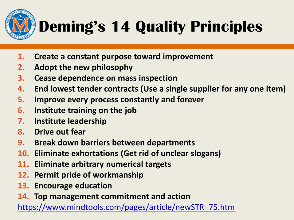
Deming’s 14 Quality Principles
1. Create a constant purpose toward improvement2. Adopt the new philosophy3. Cease dependence on mass inspection4. End lowest tender contracts (Use a single supplier for any one item)5. Improve every process constantly and forever6. Institute training on the job7. Institute leadership8. Drive out fear9. Break down barriers between departments10. Eliminate exhortations (Get rid of unclear slogans)11. Eliminate arbitrary numerical targets12. Permit pride of workmanship13. Encourage education14. Top management commitment and actionhttps://www.mindtools.com/pages/article/newSTR_75.htm

Discussion
How can we relate Deming’s 14 quality principles to the 12(13) principles behind Agile?
http://agilemanifesto.org/principles.html

The Deming Cycle
Plan: define your objectives and determine how to achieve them
Do: execute your plan and collect data
Check: evaluate results and look for deviations.
Act: identify root causes of deviations; decide what need to be improved
Continuous improvement: successive PDCA cycles – each one refining the process or product more.
The “wheel within a wheel”: the relationship between strategic management and business unit management.
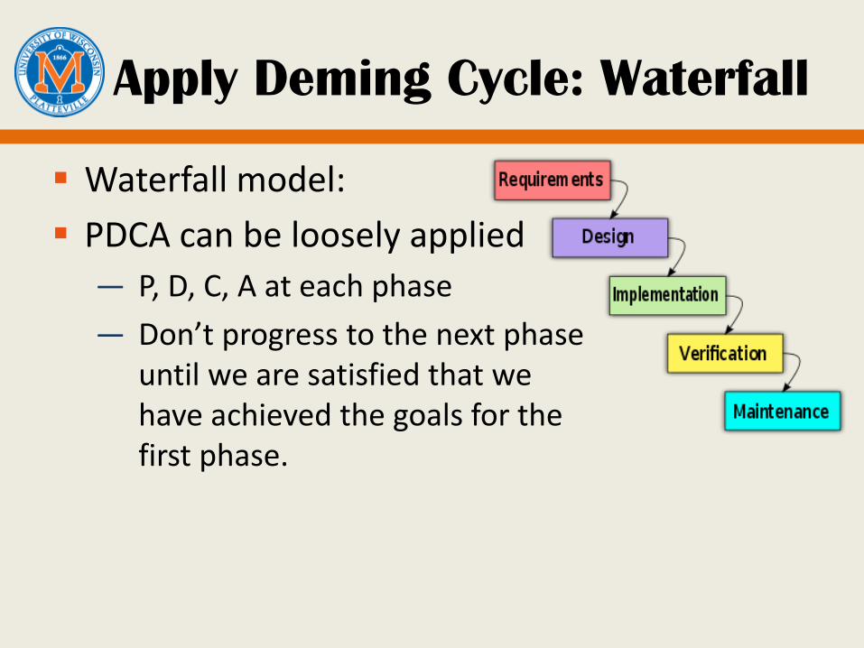
Apply Deming Cycle: Waterfall
Waterfall model:
PDCA can be loosely applied
— P, D, C, A at each phase
— Don’t progress to the next phase until we are satisfied that we have achieved the goals for the first phase.
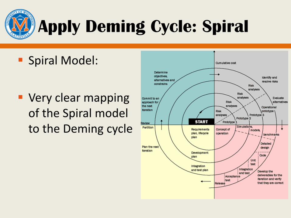
Apply Deming Cycle: Spiral
Spiral Model:
Very clear mapping of the Spiral model to the Deming cycle
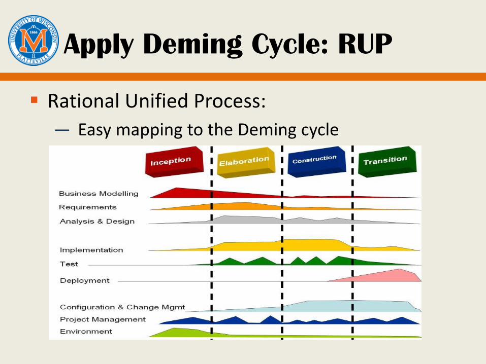
Apply Deming Cycle: RUP
Rational Unified Process:
— Easy mapping to the Deming cycle
Summary
SPC: process stability and capability 2 types of variations: common cause (chance) and special
cause (assignable) SPC tools:
— Scatter diagrams— Run charts— Cause-effect diagrams— Histograms— Pareto charts— Control charts: X-bar, R, S, XmR
Deming’s 14 quality principles Apply Deming cycle to Software process models