25 Systems for Classifying Typography: A Study in … CURSIVE HUMANIST GEOMETRIC SERIF BLACKLETTER...
22
PIIM IS A RESEARCH AND DEVELOPMENT FACILITY AT THE NEW SCHOOL © 2013 PARSONS JOURNAL FOR INFORMATION MAPPING AND PARSONS INSTITUTE FOR INFORMATION MAPPING 68 Fifth Avenue New York, NY 10011 THE PARSONS INSTITUTE FOR INFORMATION MAPPING 212 229 6825 piim.newschool.edu KEYWORDS Typeface Classification, type specimens, type systems, typeface taxonomy, typography PROJECT DATE October 2012–January 2013 ABSTRACT Varying typeforms for the Western printing process have been concurrently designed since the invention of the printing press c1450. Even though the variation of styles have expanded in number with fairly good documentation, and even though the process has been essentially evolu- tionary, the design community has yet to develop a comprehensive system of classification. Many attempts have been made to standardize but no naming system has been successful to the point of its general adaption. is paper analyses 25 typeface classification systems published in the last century, ranging from typographic greats like eodore Low De Vinne and Maximilien Vox and culmi- nating with contemporary type and design scholars such as Ellen Lupton and Robert Bringhurst. Each system (despite its original visual organization or lack thereof) is presented through a color-coded pie chart. e color codes reference three main branches of type design: Serif, Sans Serif, and Topical (Topical is the term used by Bevington/Chong to reference a subdivision of non-text faces). In our concluding demonstration we use this term “Topical,” to replace “Display.” By examining a wide cross section of naming taxonomies, we observe those names that have prevailed, those that failed, and those that deserve renewed support in the hierarchy of typeface classes. We see the useful, and the daring, as they are removed or affixed to the typographic lexicon. Each name, from all the systems, within our wider categories of Serif, Sans Serif, and Topical are collected into a series of master diagrams. From these a final, suggested master classifica- tion—our cumulative research effort is presented. We submit this master as a suggested industry standard. INTRODUCTION A taxonomy may be defined as the study classification. Without scientific classifications in biology, there would be no consistent professional jargon, and scientists would be far less effectively communicative when studying plants 25 Systems for Classifying Typography: A Study in Naming Frequency TAYLOR CHILDERS JESSICA GRISCTI LIBERTY LEBEN and animals. In the typographic world, a shared standardized system of classification is lacking. Typographers and type scholars have attempted to create proper systems of organi- zation for decades. ese systems date back to at least 1899, when eodore Low DeVinne published a typo- graphic classification system in his book, e Practice of Typography. With the invention of the printing press, photo reproduction, and post script fonts, printing became more efficient and typographic practice became more widespread. Today the typographic world is cluttered with examples along many design approaches; a logical way to name the group to which any particular design is challenging. One style can have two, even three names, all meaning essentially the same exact thing. Typographers who create systems oſten have a difficult time deciding which name to chose. Sometimes, they chose both. Major problem occurs in topical and display classifica- tions. With so many styles of topical typefaces all obtaining such specific differences, it is oſten hard to classify them into larger groups. While some create an abundance of classifications for such typefaces, others ignore the problem completely. Ignoring these “topical” designs leaves a large number of type styles unaccounted for, or relegated into the “others” category. rough the examination of the history of typographic classification, it may be possible to create a unified taxonomy using a consistent naming logic. e final visual in this paper displays such unified logic; it, in turn, is constructed from a series of seven composite displays. ese seven composites are organized according to the findings from the twenty five examples that preceed. (Note: we capitalize classes when they are specified as classes within any particular system, and do not capitalize when they are noted but not included in that particular system.) Figure: A visual overview of 25 typographic classifications DISPLAY SANS SERIF ORNAMENTAL PERIOD GOTHIC ROMAN SANS SERIF DISPLAY SERIF BLACKLETTER SLAB SCRIPT SANS SANS SERIF OLD STYLE LATIN MODERN EGYPTIAN SANS SERIF EGYPTIAN MODERN TRANSITIONAL OLD STYLE
Transcript of 25 Systems for Classifying Typography: A Study in … CURSIVE HUMANIST GEOMETRIC SERIF BLACKLETTER...
PIIM IS A RESEARCH AND DEVELOPMENT FACILITY AT THE NEW SCHOOL
© 2013 PARSONS JOURNAL FOR INFORMATION MAPPING AND PARSONS INSTITUTE FOR INFORMATION MAPPING
68 Fifth Avenue New York, NY 10011
THE PARSONS INSTITUTE FOR INFORMATION MAPPING
212 229 6825piim.newschool.edu
KEYWORDS Typeface Classification, type specimens, type systems, typeface taxonomy, typography
pROjEct DatE October 2012–January 2013
abStRact
Varying typeforms for the Western printing process have been concurrently designed since the invention of the printing press c1450. Even though the variation of styles have expanded in number with fairly good documentation, and even though the process has been essentially evolu-tionary, the design community has yet to develop a comprehensive system of classification. Many attempts have been made to standardize but no naming system has been successful to the point of its general adaption. This paper analyses 25 typeface classification systems published in the last century, ranging from typographic greats like Theodore Low De Vinne and Maximilien Vox and culmi-nating with contemporary type and design scholars such as Ellen Lupton and Robert Bringhurst. Each system (despite its original visual organization or lack thereof) is presented through a color-coded pie chart. The color codes reference three main branches of type design: Serif, Sans Serif, and Topical (Topical is the term used by Bevington/Chong to reference a subdivision of non-text faces). In our concluding demonstration we use this term
“Topical,” to replace “Display.” By examining a wide cross section of naming taxonomies, we observe those names that have prevailed, those that failed, and those that deserve renewed support in the hierarchy of typeface classes. We see the useful, and the daring, as they are removed or affixed to the typographic lexicon. Each name, from all the systems, within our wider categories of Serif, Sans Serif, and Topical are collected into a series of master diagrams. From these a final, suggested master classifica-tion—our cumulative research effort is presented. We submit this master as a suggested industry standard.
intRODuctiOn
A taxonomy may be defined as the study classification. Without scientific classifications in biology, there would be no consistent professional jargon, and scientists would be far less effectively communicative when studying plants
25 Systems for Classifying Typography: A Study in Naming FrequencytaYlOR chilDERS
jESSica gRiScti
libERtY lEbEn
and animals. In the typographic world, a shared standardized system of classification is lacking. Typographers and type scholars have attempted to create proper systems of organi-zation for decades. These systems date back to at least 1899, when Theodore Low DeVinne published a typo-graphic classification system in his book, The Practice of Typography. With the invention of the printing press, photo reproduction, and post script fonts, printing became more efficient and typographic practice became more widespread. Today the typographic world is cluttered with examples along many design approaches; a logical way to name the group to which any particular design is challenging. One style can have two, even three names, all meaning essentially the same exact thing. Typographers who create systems often have a difficult time deciding which name to chose. Sometimes, they chose both.
Major problem occurs in topical and display classifica-tions. With so many styles of topical typefaces all obtaining such specific differences, it is often hard to classify them into larger groups. While some create an abundance of classifications for such typefaces, others ignore the problem completely. Ignoring these “topical” designs leaves a large number of type styles unaccounted for, or relegated into the “others” category. Through the examination of the history of typographic classification, it may be possible to create a unified taxonomy using a consistent naming logic. The final visual in this paper displays such unified logic; it, in turn, is constructed from a series of seven composite displays. These seven composites are organized according to the findings from the twenty five examples that preceed. (Note: we capitalize classes when they are specified as classes within any particular system, and do not capitalize when they are noted but not included in that particular system.)
Figure: A visual overview of 25 typographic classifications
REALE
SCRIPT
GERALDE
LINEALE
INC
ISES
MEC
AN
ES
VEN
ETIA
N
FRA
CTU
RE
MANUAIRE
DIDONE
CLA
SSICA
L RO
MA
N
FORME
VERNACULAR
19TH CENTURY
18TH CENTURY
17TH CENTURYITALIC
BA
TAR
D
SOMME
GOTHIC / ANTIQUA
16TH
CEN
TURY
FAT FACE
DISPLAY
ROMANS
ANTIQUE/
CLARENDON
BLAC
KLET
TER
SCR
IPT
CON
DEN
SED
ITALIC
ITALIAN
MODERN
OLD
STY
LE
ORNAMENTALS
GOTHIC
RENAISSANCE
FRAKTUR
CLASSICAL
HUMANIST
GR
OTE
SK
EGYPTIA
N
PREC
LASS
ICA
L
SCH
WA
BA
CH
ER
TEXTURA
ITALIENNE
ROMAN
BLACKLETTER
LINEAL
SLAB
VENETIAN
HYBRIDA
TEXTURA
SCH
WA
BAC
HER
FRA
KTU
R
ROTU
ND
A
HANDWRITTEN
SCRIPT
ROMAN
VARIANTS
GROTESK
SLA
B SE
RIF
DID
ON
E
TRAN
SISION
AL
FRENCH
BLACKLETTER
SERIF
HU
MA
NIS
T
GRA
PHIC
SCRIPT
LINEALE
GLY
PHIC
SLAB
DIDON
ES
TRANSITIONALSGERALDS
HUMANIST
GEOMETRIC
GROTESQ.
NEO
-GRO
T.
MEC
HA
NIS
TIC D
IDO
NE
TRANSITIO
NAL
GERALDE
HUMANIST
FRAKTUR
SCHWABACHER
ROTU
ND
A
TEX
TUR
ASCR
IPTINCISED
/
GLYPH
IC
MANUAL/GRAPHIC
SERIF
BLACKLETTER
SANS SERIF
MO
DERN
DID
ON
E
GLYPHIC
SCRIPT
GRA
PHIC
GA
ELIC
HU
MA
NIS
T
HU
MA
NIST
MECHANISTIC
BLA
CKLETTER
GERALDE
HUMANIST
CALLIGRAPHICS
CLASSICALS
GEOMETRIC
NEO-
GROTE
SQUE
GRO
TESQ
UE
TRANSITIONAL
LINEALS
MODERNS
TRA
NSISTIO
NA
L
OLD
FAC
E
VENETIA
N
TEXTURA
BASTARDA
ROTUNDA
ANTIQUA
RENAISSANCE
MO
DERN
FAC
E
OLD
STYLE
20TH CENT.
ALDINE
VINCENTIO
OLD FACE
MODERNISED
MICS.
OLD FACE
STENCILCALLIG
RAPHIC
CLAR
END
ON
OU
TLIN
E
ION
IC
RE
VE
RSE
D
SAN
S SERIF
SHA
DO
WED
EGYPTIAN
FAT FACESHADED
DECORATED
GOTHIC SCRIPT
BOOK
DISPLAY
ROMAN
ITA
LIC
GO
THIC
REALIST
GEO
METRIC
MO
DERN
IST
NEO
CLA
SSIC
AL
LYRICAL MODERNIST
POST MODERN
CIT
NA
MOR
RENAISSANCE
SAM
PLED
CU
RVILINEA
R
DINGBATS
PROBLEMS
IND
UST
RIA
L/V
ER
NA
CU
LAR
TRANSITIONALS
DID
ON
E
PRO
CES
SED
MA
NIP
ULA
TED
ORN
AMEN
TAL
CALLIGRAPHIC
SLAB
WED
GE
NEO GROTES.
GRO
TESQ
UE
GEOMETRIC
HUMANIST
HUMANIST
GERALDE
BLACKLETTER
DISPLAY
SANS
SERIF
OLD STYLE
CLARENDON
TRA
NSI
TIO
NA
LS MODERNS
SLAB SERIF
GLYPHIC
SCRIPTSGRAPHIC SANS SERIF
DID
ON
E
20TH C
EN
T.
VENETIAN
ALDINE
DUTCH
REVIVAL
19TH C
ENT
NEO CLAR.
CLARENDON
GROTESQUENEO G
ROTE
SQUE
GEO
MET
RIC
HU
MA
NIS
TSQU
AR
E
ORN
AM
ENTA
L
PERIOD
GOTHIC
SCRIPT
GOTHIC
LATIN
ITALIC
EGYPTIA
N
OLD
STY
LE
TRANS.
MODERNPRIMER
FAT FACE
ROMAN
TEXT
BASTARDA
GO
THIC
A
NTI
QU
E
ROTU
ND
A
TRAN
SITION
AL
FRENC
H
ALDINE
VENETIAN
DISPLA
Y DEC
ORA
TIVE
SCRIPT CURSIVE
HUMANIST
GEOMETRIC
SERIF
BLACKLETTER
SANS SERIF
GOTHIC
SQUARE S
ERIF
MO
DER
N
SANS
SERIF
SLA
B SE
RIF
MODERN
TRANSITIONAL
TRANSITIONAL
HU
MA
NIST
GEOMETRIC
OLD
STY
LE
CONTEMPORARY
GEOMETRIC
HUMANISTO
LD STYLE
TRA
NSITIO
NA
L
MO
DERN
HUMAN
IST
CONTEMP.
GEOMETRIC
TEXTURA
ROTUNDA
CURSIVE
PLAC
E-REFREN
CIN
G
TIME
-R
EFR
EN
CIN
G
STYLE-
REFRENC
ING
CURSIVE
SCRIPT
BRUSHFA
T FA
CE
CLA
REN
DO
N
EGYPTIAN
20TH CENT.
ROMAN
MODERN
LATE
TRANSITIONAL
EARL
Y
DU
TCH
FREN
CH
ITALIC
ITALIAN
VENETIAN
DECORATED
GROTESQUE
SAN
S SE
RIF
OLD FACE
TRANSITIONAL
DECORATIVE/
DISPLAY
TITLINGBLACKL
ETTE
R
HA
ND
WRI
TIN
G
CLA
REN
DO
N
MO
DERN
TRANSITIONAL
OLD STYLE
CA
LLIGR
AP
HIC
CA
SUA
L
FORM
AL
HUMANISTIC
GEOMETRIC
20TH CENT.
GROTESQUE
19TH CENT.
GROTESQUE
GLY
PHIC
SLA
B/S
QU
AR
E
SERIF
SANS SERIF
SCRIPT
OLD STYLE
TECHNO
EXPERIMENTAL
TYPEWRITERDECORATIV
E
HIS
TORI
CA
L
HA
ND
WRI
TTEN
MO
NO
LIN
E
BRU
SH
SPENC
ERIAN
FORM
AL PEN
TEXTURA
ROTUNDA
BLACKLETTER
SERIF
SANS SERIF
SCRIPT
DISPLAY
SCHWABACHER
FRAKTURA
UNICAL
GLYPHIC
HUMAN
IST
GEO
MET
RIC
NEO
-GRO
TES.
GRO
TESQ
UE
SLAB
LATIN
MODERN
TRANSITIONAL
COMPUTERRELATED
SCRIPT
MONOSPACED
SAN
S SE
RIF
MO
DER
N
DID
ON
E
TRANSITIO
NAL
GARALDE
VENETIAN
BLACKLETTER
SWASH
CAPI
TALS
STEN
CIL
OU
TLINEIN
LINE
HAND TOOLED
SERIF
DECORATIVE & DISPLAY
SCRI
PT &
BRU
SH
SAN
S SE
RIF
SLAB SERIF
MODERN TRANSITIONAL
OLD
FA
CE
BLA
CK
LETTER/
BRO
KEN
EXOTIC/FREEFORM
DECORATIVE &
DISPLAYDISPLAY
SERIF
BLA
CKL
ETTE
R
SLA
B
SCRIPT
SAN
S
SANS SERIF
OLD STYLE
LATIN
MODERN
EGYP
TIAN
SCRIPTS
DIDOT
DISPLAY
EGYPTIEN
NE
AN
TIQ
UE
ELZE
VIR
SERIF
BOOK
DISPLAY
SAN
S SERIF
BLA
CKL
ETTE
R
TOPICAL
FREE HA
ND
SLA
B SE
RIF
SANS SERIF
EGYPTIAN
MO
DE
RN
TRANSITIONAL
OLD
STY
LE
25 systems for classifying typography:a study in naming frequencytaylor childers, jessica griscti, and liberty leben
PARSONS JOURNAL FOR INFORMATION MAPPINGvOLUME v ISSUE 1, wINTER 2013[PAGE 2]
© 2013 PARSONS JOURNAL FOR INFORMATION MAPPING AND PARSONS INSTITUTE FOR INFORMATION MAPPING
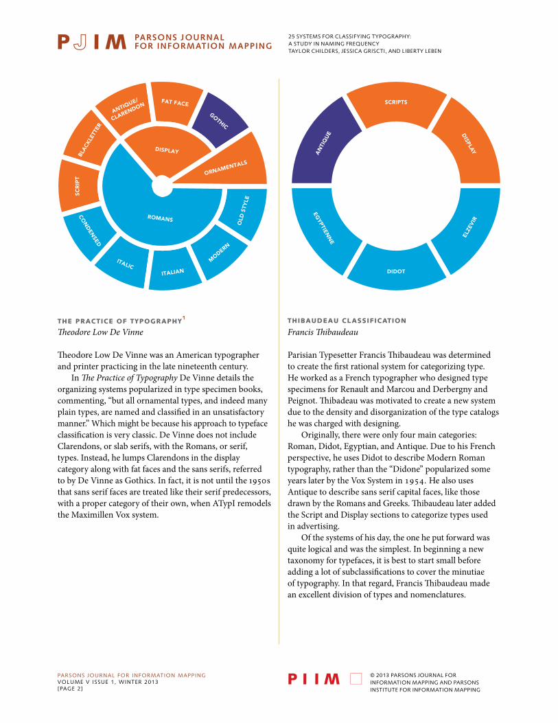
thE pRacticE Of tYpOgRaphY1
Theodore Low De Vinne
Theodore Low De Vinne was an American typographer and printer practicing in the late nineteenth century.
In The Practice of Typography De Vinne details the organizing systems popularized in type specimen books, commenting, “but all ornamental types, and indeed many plain types, are named and classified in an unsatisfactory manner.” Which might be because his approach to typeface classification is very classic. De Vinne does not include Clarendons, or slab serifs, with the Romans, or serif, types. Instead, he lumps Clarendons in the display category along with fat faces and the sans serifs, referred to by De Vinne as Gothics. In fact, it is not until the 1950s that sans serif faces are treated like their serif predecessors, with a proper category of their own, when ATypI remodels the Maximillen Vox system.
thibauDEau claSSificatiOn
Francis Thibaudeau
Parisian Typesetter Francis Thibaudeau was determined to create the first rational system for categorizing type. He worked as a French typographer who designed type specimens for Renault and Marcou and Derbergny and Peignot. Thibadeau was motivated to create a new system due to the density and disorganization of the type catalogs he was charged with designing.
Originally, there were only four main categories: Roman, Didot, Egyptian, and Antique. Due to his French perspective, he uses Didot to describe Modern Roman typography, rather than the “Didone” popularized some years later by the Vox System in 1954. He also uses Antique to describe sans serif capital faces, like those drawn by the Romans and Greeks. Thibaudeau later added the Script and Display sections to categorize types used in advertising.
Of the systems of his day, the one he put forward was quite logical and was the simplest. In beginning a new taxonomy for typefaces, it is best to start small before adding a lot of subclassifications to cover the minutiae of typography. In that regard, Francis Thibaudeau made an excellent division of types and nomenclatures.
FAT FACE
DISPLAY
ROMANS
ANTIQUE/
CLARENDON
BLA
CKLE
TTER
SCR
IPT
CON
DEN
SED
ITALICITALIAN
MODERN
OLD
STY
LE
ORNAMENTALS
GOTHIC
SCRIPTS
DIDOT
DISPLAY
EGYPTIEN
NE
AN
TIQ
UE
ELZE
VIR

25 systems for classifying typography:a study in naming frequencytaylor childers, jessica griscti, and liberty leben
PARSONS JOURNAL FOR INFORMATION MAPPINGvOLUME v ISSUE 1, wINTER 2013[PAGE 3]
© 2013 PARSONS JOURNAL FOR INFORMATION MAPPING AND PARSONS INSTITUTE FOR INFORMATION MAPPING
pRinting tYpES
Daniel Berkeley Updike
Daniel Berkeley Updike was an American printer and typographic historian. In 1893, he founded the Merry-mount Press in Providence, Rhode Island.
In Printing Types, Updike discusses 15th century serif printing types in Europe with astounding depth, far more depth, in fact, then we could capture within our accompa-nying pie chart system. (Instead we present a simplified version of his typeface classification system). To see the detailed version, one would have to imagine six of these charts-one each for Germany, Italy, France, The Netherlands, Spain and England). In addition, there would be differen-tiations in each of those charts.
Aside from it being clunky in that regard, it’s difficult to expect that a system that classifies type by the century would function when we have moved into an age of so many revivals. The specific year a typeface is created has less and less effect upon its ultimate classification. Of course, history applies to the form of serif families, but even this becomes suspect for many classifications. Additionally, the classification lacks hierarchies and sub-categories in most instances, and as such, it would be difficult for the general typeface-user population to remember the intricacies.
thE vOx SYStEm
Maximilien Vox
The closest to a broad consensus on typeface classification is the Vox System, created by Maximilien Vox in 1954. There are ten main categories, employing established terminology along with new terminology. As was vogue, he classifies the serif typefaces based upon their historical period and the remainder based on the visual appearance of the letter.
Vox invented the term Geralde, combining Garamond and Aldine. The term is far more specific than the previous Old Style, but for its newness it was criticized. Beinging at first unfamiliar to the professionals who would be using the system; those critics had a point, but ultimately, they were wrong. The term Geralde is still being used in subsequent type classification systems sixty years later. The same goes for his invention of the term Lineal, which carries the false assumption that sans serif typefaces are inherently monoline. However, that term remained popular for several decades before it was replaced by Sans Serif around the 1980s.
CLA
SSICA
L RO
MA
N
FORME
VERNACULAR
19TH CENTURY
18TH CENTURY
17TH CENTURYITALIC
BA
TAR
D
SOMME
GOTHIC / ANTIQUA
16TH
CEN
TURY
REALE
SCRIPT
GERALDE
LINEALE
INC
ISE
S
ME
CA
NE
S VEN
ETIA
N
FRA
CTU
RE
MANUAIRE
DIDONE
25 systems for classifying typography:a study in naming frequencytaylor childers, jessica griscti, and liberty leben
PARSONS JOURNAL FOR INFORMATION MAPPINGvOLUME v ISSUE 1, wINTER 2013[PAGE 4]
© 2013 PARSONS JOURNAL FOR INFORMATION MAPPING AND PARSONS INSTITUTE FOR INFORMATION MAPPING
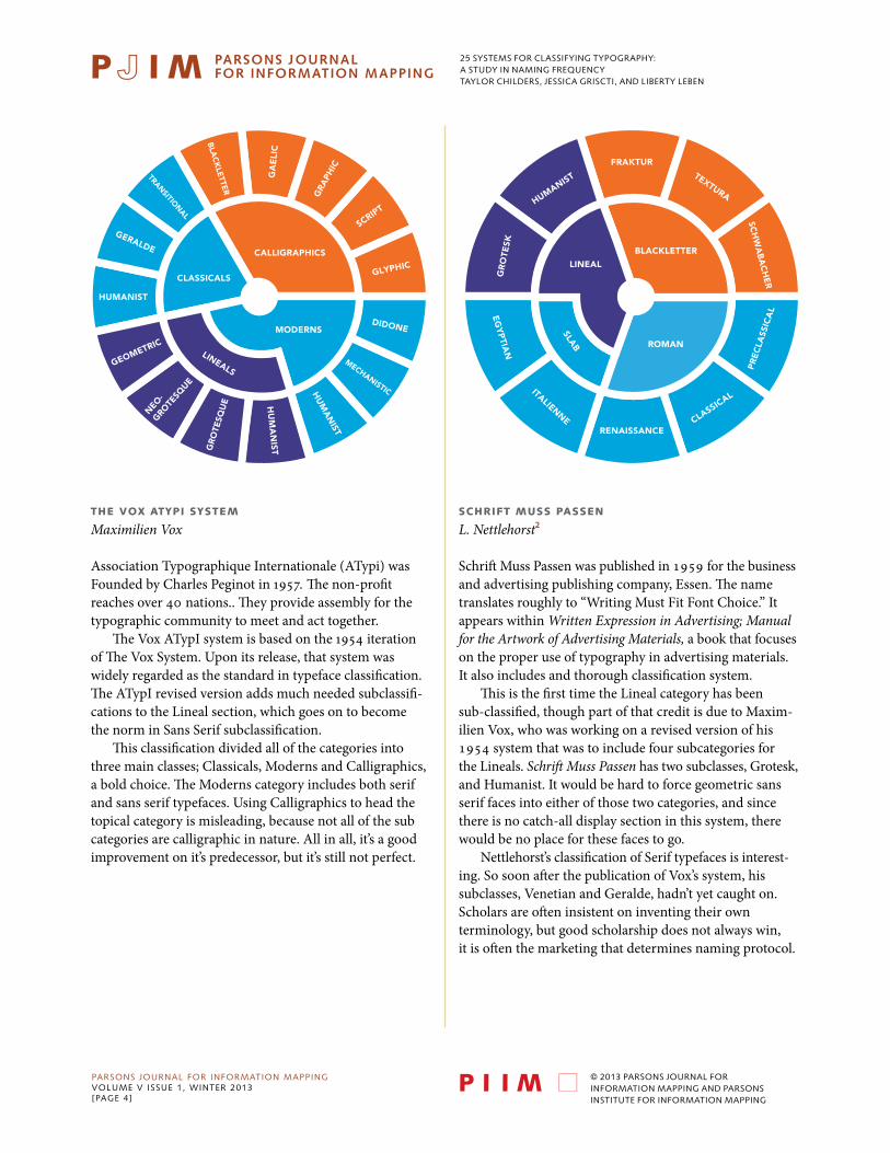
thE vOx atYpi SYStEm
Maximilien Vox
Association Typographique Internationale (ATypi) was Founded by Charles Peginot in 1957. The non-profit reaches over 40 nations.. They provide assembly for the typographic community to meet and act together.
The Vox ATypI system is based on the 1954 iteration of The Vox System. Upon its release, that system was widely regarded as the standard in typeface classification. The ATypI revised version adds much needed subclassifi-cations to the Lineal section, which goes on to become the norm in Sans Serif subclassification.
This classification divided all of the categories into three main classes; Classicals, Moderns and Calligraphics, a bold choice. The Moderns category includes both serif and sans serif typefaces. Using Calligraphics to head the topical category is misleading, because not all of the sub categories are calligraphic in nature. All in all, it’s a good improvement on it’s predecessor, but it’s still not perfect.
SchRift muSS paSSEn
L. Nettlehorst2
Schrift Muss Passen was published in 1959 for the business and advertising publishing company, Essen. The name translates roughly to “Writing Must Fit Font Choice.” It appears within Written Expression in Advertising; Manual for the Artwork of Advertising Materials, a book that focuses on the proper use of typography in advertising materials. It also includes and thorough classification system.
This is the first time the Lineal category has been sub-classified, though part of that credit is due to Maxim-ilien Vox, who was working on a revised version of his 1954 system that was to include four subcategories for the Lineals. Schrift Muss Passen has two subclasses, Grotesk, and Humanist. It would be hard to force geometric sans serif faces into either of those two categories, and since there is no catch-all display section in this system, there would be no place for these faces to go.
Nettlehorst’s classification of Serif typefaces is interest-ing. So soon after the publication of Vox’s system, his subclasses, Venetian and Geralde, hadn’t yet caught on. Scholars are often insistent on inventing their own terminology, but good scholarship does not always win, it is often the marketing that determines naming protocol.
MO
DE
RN
DIDONE
GLYPHIC
SCRIPT
GRA
PHIC
GA
ELI
C
HU
MA
NIST
HU
MA
NIST
MECHANISTIC
BLA
CK
LETTER
GERALDE
HUMANIST
CALLIGRAPHICS
CLASSICALS
GEOMETRIC
NEO
-GRO
TESQ
UE
GR
OTE
SQU
E
TRANSITIONAL
LINEALS
MODERNS
RENAISSANCE
FRAKTUR
CLASSICAL
HUMANIST
GR
OTE
SK
EG
YP
TIAN
PR
EC
LASS
ICA
L
SCH
WA
BA
CH
ER
TEXTURA
ITALIENNE
ROMAN
BLACKLETTER
LINEAL
SLAB

25 systems for classifying typography:a study in naming frequencytaylor childers, jessica griscti, and liberty leben
PARSONS JOURNAL FOR INFORMATION MAPPINGvOLUME v ISSUE 1, wINTER 2013[PAGE 5]
© 2013 PARSONS JOURNAL FOR INFORMATION MAPPING AND PARSONS INSTITUTE FOR INFORMATION MAPPING
thE hiStORY Of pRinting tYpES
Geoffrey Dowding
Dowding’s system continues the outdated trend of separating the Romans and the Italics—long after their contemporaries stopped regarding the two as separate typefaces, choosing instead to see a roman and its italic as two fonts within same type family. Of course the actual form of the Roman and Italic variants may differ, but placing them across categories is a production and organizational awkwardness.
Additionally, Dowding uses the term Old Style to categorize 19th century types when he’s already used Old Face to describe 15th century types. It’s cluttered, and there is little to no parallelism in his system. Some sections are named by historical period while others are named for style. Dowding’s attempt to quantify and classify display types is admirable in its sheer number of categories, but the Miscellaneous section undermines the whole exercise toward a comprehensive solution. There is no point in creating all of those categories if the author still needs to add a catch-all category.
Din 16518n
Germany3
In 1959, The Deustche Industrie Normung released a draft of a classification system that was related to Vox’s, but considerably more complicated. The later revised system, DIN 16518, is almost identical to the Vox system.
Being a German system, DIN established a standard in sub-classification of Blackletter typefaces, a sub-classifi-cation that is often referenced in subsequent taxonomies. After Vox, a standard in Old Style Serif classification is starting to develop that is exhibited in the DIN 16518 system: Venetian, for Humanist Serif types developed generally in the 15th century; French, otherwise known as Geralde, for faces that came in the next two centuries that have more contrast between the thickness and thinness of strokes; Transitionals for the period in the 18th century where the axis of curves was often vertical and serifs were unbracketed.
All sans serif faces are organized into a single category, Grotesk, even though sub-classifications to that category had already been made. The topical category leaves a little to be desired. Handwritten scripts are the only topical called out with their own section, and it seems that anything left that doesn’t fit the mold is dumped into Roman Variants.
TRA
NSISTIO
NA
LOLD
FA
CE
VEN
ETIAN
TEXT
URABAST
ARDAROTUNDA
ANTIQUA
RENAISSANCE
MO
DE
RN
FAC
E
OLD
STYLE
20TH CEN
T.
ALDINE
VINCENTIO
OLD FACE
MODERNISED
MICS.
OLD FACE
STENCILCALLIG
RAPHIC
CLA
REN
DO
N
OU
TLIN
E
ION
IC
RE
VE
RSE
D
SAN
S SER
IF
SHA
DO
WED
EGYPTIA
NFAT FACESHADED
DECORATED
GOTHIC SCRIPT
DISPLAY
ROMAN
ITA
LICG
OTH
IC
BOOKVENETIAN
HYBRIDA
TEXTURASCH
WA
BAC
HER
FR
AK
TUR
RO
TUN
DA
HANDWRITTEN
SCRIPT
ROMAN
VARIANTS
GROTESK
SLA
B SE
RIF
DID
ON
E
TRAN
SISION
AL
FRENCH
BLACKLETTER
SERIF
25 systems for classifying typography:a study in naming frequencytaylor childers, jessica griscti, and liberty leben
PARSONS JOURNAL FOR INFORMATION MAPPINGvOLUME v ISSUE 1, wINTER 2013[PAGE 6]
© 2013 PARSONS JOURNAL FOR INFORMATION MAPPING AND PARSONS INSTITUTE FOR INFORMATION MAPPING
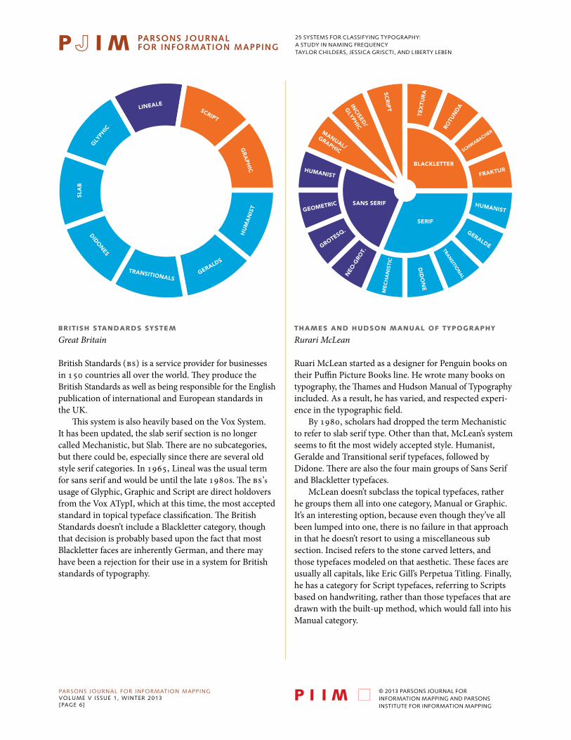
bRitiSh StanDaRDS SYStEm
Great Britain
British Standards (BS) is a service provider for businesses in 150 countries all over the world. They produce the British Standards as well as being responsible for the English publication of international and European standards in the UK.
This system is also heavily based on the Vox System. It has been updated, the slab serif section is no longer called Mechanistic, but Slab. There are no subcategories, but there could be, especially since there are several old style serif categories. In 1965, Lineal was the usual term for sans serif and would be until the late 1980s. The BS’s usage of Glyphic, Graphic and Script are direct holdovers from the Vox ATypI, which at this time, the most accepted standard in topical typeface classification. The British Standards doesn’t include a Blackletter category, though that decision is probably based upon the fact that most Blackletter faces are inherently German, and there may have been a rejection for their use in a system for British standards of typography.
thamES anD huDSOn manual Of tYpOgRaphY
Rurari McLean
Ruari McLean started as a designer for Penguin books on their Puffin Picture Books line. He wrote many books on typography, the Thames and Hudson Manual of Typography included. As a result, he has varied, and respected experi-ence in the typographic field.
By 1980, scholars had dropped the term Mechanistic to refer to slab serif type. Other than that, McLean’s system seems to fit the most widely accepted style. Humanist, Geralde and Transitional serif typefaces, followed by Didone. There are also the four main groups of Sans Serif and Blackletter typefaces.
McLean doesn’t subclass the topical typefaces, rather he groups them all into one category, Manual or Graphic. It’s an interesting option, because even though they’ve all been lumped into one, there is no failure in that approach in that he doesn’t resort to using a miscellaneous sub section. Incised refers to the stone carved letters, and those typefaces modeled on that aesthetic. These faces are usually all capitals, like Eric Gill’s Perpetua Titling. Finally, he has a category for Script typefaces, referring to Scripts based on handwriting, rather than those typefaces that are drawn with the built-up method, which would fall into his Manual category.
HU
MA
NIS
T
GR
AP
HIC
SCRIPT
LINEALE
GLY
PHIC
SLA
B
DIDON
ES
TRANSITIONALSGERALDS
HUMANIST
GEOMETRIC
GROTESQ.
NEO
-GRO
T.
ME
CH
AN
ISTI
C
DID
ON
E
TRAN
SITION
AL
GERALDE
HUMANIST
FRAKTUR
SCHWABACHER
ROTU
ND
A
TEX
TUR
ASCR
IPTINCISED
/
GLYPH
IC
MANUAL/
GRAPHIC
SERIF
BLACKLETTER
SANS SERIF
25 systems for classifying typography:a study in naming frequencytaylor childers, jessica griscti, and liberty leben
PARSONS JOURNAL FOR INFORMATION MAPPINGvOLUME v ISSUE 1, wINTER 2013[PAGE 7]
© 2013 PARSONS JOURNAL FOR INFORMATION MAPPING AND PARSONS INSTITUTE FOR INFORMATION MAPPING
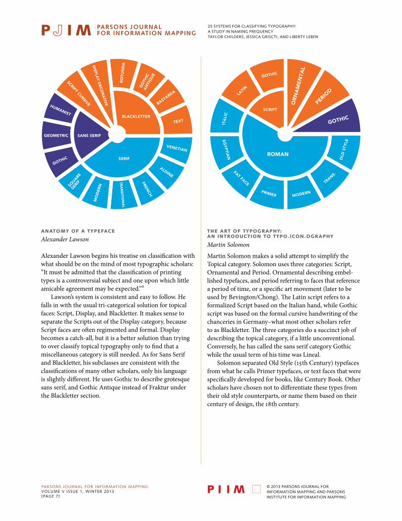
anatOmY Of a tYpEfacE
Alexander Lawson
Alexander Lawson begins his treatise on classification with what should be on the mind of most typographic scholars: “It must be admitted that the classification of printing types is a controversial subject and one upon which little amicable agreement may be expected.”4
Lawson’s system is consistent and easy to follow. He falls in with the usual tri-categorical solution for topical faces: Script, Display, and Blackletter. It makes sense to separate the Scripts out of the Display category, because Script faces are often regimented and formal. Display becomes a catch-all, but it is a better solution than trying to over classify topical typography only to find that a miscellaneous category is still needed. As for Sans Serif and Blackletter, his subclasses are consistent with the classifications of many other scholars, only his language is slightly different. He uses Gothic to describe grotesque sans serif, and Gothic Antique instead of Fraktur under the Blackletter section.
Martin Solomon makes a solid attempt to simplify the Topical category. Solomon uses three categories: Script, Ornamental and Period. Ornamental describing embel-lished typefaces, and period referring to faces that reference a period of time, or a specific art movement (later to be used by Bevington/Chong). The Latin script refers to a formalized Script based on the Italian hand, while Gothic script was based on the formal cursive handwriting of the chanceries in Germany–what most other scholars refer to as Blackletter. The three categories do a succinct job of describing the topical category, if a little unconventional. Conversely, he has called the sans serif category Gothic while the usual term of his time was Lineal.
Solomon separated Old Style (15th Century) typefaces from what he calls Primer typefaces, or text faces that were specifically developed for books, like Century Book. Other scholars have chosen not to differentiate these types from their old style counterparts, or name them based on their century of design, the 18th century.
thE aRt Of tYpOgRaphY:an intRODuctiOn tO tYpO.icOn.OgRaphY
Martin Solomon
TEXT
BASTARDA
GO
THIC
A
NTI
QU
E
RO
TUN
DA
TRA
NSITIO
NA
L
FRENC
H
ALDINE
VENETIAN
DISP
LAY
DE
CO
RA
TIVE
SCRIPT CURSIVEHUMANIST
GEOMETRIC
SERIF
BLACKLETTER
SANS SERIF
GOTHIC
SQUARE
SERIF
MO
DE
RN
OR
NA
ME
NTA
L
PERIOD
GOTHIC
SCRIPT
GOTHIC
LATI
N
ITA
LIC
EG
YP
TIAN
OLD
STY
LE
TRANS.
MODERNPRIMER
FAT FACE
ROMAN
25 systems for classifying typography:a study in naming frequencytaylor childers, jessica griscti, and liberty leben
PARSONS JOURNAL FOR INFORMATION MAPPINGvOLUME v ISSUE 1, wINTER 2013[PAGE 8]
© 2013 PARSONS JOURNAL FOR INFORMATION MAPPING AND PARSONS INSTITUTE FOR INFORMATION MAPPING
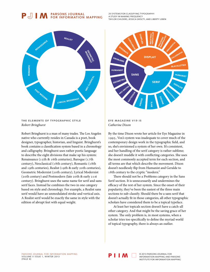
thE ElEmEntS Of tYpOgRaphic StYlE
Robert Bringhurst
Robert Bringhurst is a man of many trades. The Los Angeles native who currently resides in Canada is a poet, book designer, typographer, historian, and linguist. Bringhurst’s book contains a classification system based in a chronology and calligraphy. Bringhurst uses rather poetic language to describe the eight divisions that make up his system: Renaissance (15th & 16th centuries), Baroque (17th century), Neoclassical (18th century), Romantic (18th and 19th centuries), Realist (19th & early 20th centuries), Geometric Modernist (20th century), Lyrical Modernist (20th century) and Postmodern (late 20th & early 21st century). Bringhurst uses the same name for serif and sans serif faces. Instead he combines the two in one category based on style and chronology. For example, a Realist sans serif would have an unmodulated stroke and vertical axis. A Realist serif would be exactly the same in style with the edition of abrupt feet with equal weight.
EYE magazinE v19 i5
Catherine Dixon
By the time Dixon wrote her article for Eye Magazine in 1995, Vox’s system was inadequate to cover much of the contemporary design work in the typographic field, and so, she’s envisioned a system of her own. It’s consistent, and her handling of the serif category is rather sublime; she doesn’t muddle it with conflicting categories. She uses the most commonly accepted term for each section, and all terms are that which describe the movement. Dixon doesn’t needlessly flip from Humanist and Geralde to 18th century to the cryptic “modern.”
There should not be a Problems category in the Sans Serif section. It is unnecessarily and undermines the efficacy of the rest of her system. Since the onset of their popularity, they’ve been the easiest of the three main sections to sub-classify. Should there be a sans serif that doesn’t actually fit in those categories, all other typographic scholars have considered them to be a topical typeface.
At least her topicals section doesn’t have a catch-all other category. And that might be the saving grace of her system. The only problem is, in most systems, when a scholar tries too specifically to define the myriad world of topical typography, there is always an outlier.
REALIST
GEO
METRIC
MO
DERN
IST
NEO
CLA
SSIC
AL
LYRICAL MODERNIST
POST MODERN
CITN
AM
OR
RENAISSANCE
SAM
PLE
D
CURVILIN
EARDINGBATS
PROBLEMS
IND
UST
RIA
L/V
ER
NA
CU
LAR
TRANSITIONALS
DID
ON
E
PRO
CES
SED
MA
NIP
ULA
TED
ORN
AMEN
TAL
CALLIGRAPHIC
SLABW
ED
GE
NEO GROTES.
GRO
TESQ
UE
GEOMETRIC
HUMANIST
HUMANIST
GERALDE
BLACKLETTER
DISPLAY
SANS
SERIF

25 systems for classifying typography:a study in naming frequencytaylor childers, jessica griscti, and liberty leben
PARSONS JOURNAL FOR INFORMATION MAPPINGvOLUME v ISSUE 1, wINTER 2013[PAGE 9]
© 2013 PARSONS JOURNAL FOR INFORMATION MAPPING AND PARSONS INSTITUTE FOR INFORMATION MAPPING
alphabEt
Allan Haley
Former president of International Typeface Corporation, editor-in-chief of U&lc, typographer and author, Allen Haley wrote Alphabet: The History, Evolution and Design of the Letters We Use Today.
Haley’s typeface classification system is based on history and evolution. He uses the terms Old Style, Transitional, Modern, Clarendon, Slab Serif, Glyphic, Sans Serif, Scripts and Graphic. Through his system, Haley hopes to have found a compromise between using a simple sans versus serif system and a system based off of hundreds of classifications. It is a rich and fairly complex system benefiting for its increased specificity, but awkward perhaps because it has many classes within unequal categories and sub-categories. Haley acknowledges that there are few things in typography that can be certainly defined and hopes his system leaves more room for debate compared to the more standardized systems.5
thinKing With tYpE
Ellen Lupton
Ellen Lupton, a typography professor was inspired to write Thinking With Type: A Critical Guide For Designers, Writers, Editors & Students when she struggled to find a textbook for her type classes. Lupton published Thinking with Type in 2004. An enlarged, second edition, arrived in 2010.
In the book she portrays a classification system that has seven categories with corresponding exemplary typefaces: Humanist or Old Style (Sabon), Transitional (Baskerville), Modern (Bodoni), Egyptian or Slab Serif (Clarendon), Humanist Sans Serif (Gill Sans), Transitional Sans Serif (Helvetica) and Geometric Sans Serif (Futura). Lupton completely ignores display faces and calligraphics, that might be for the best. There is no better way to handle the oft-fought-over topical typefaces than to ignore them completely. As seen with other type classification systems, these often get lumped into an “other” category or they become part of a multilayer system with a too many terms. Subtle, yet important differences make subcategories almost impossible. Unlike Bringhurst, Lupton clearly separates serif and sans serif. She uses the same three terms to describe each (humanist, transitional and geometric), making her logic easy to follow.
OLD STYLE
CLARENDON
TRA
NSI
TIO
NA
LS MODERNS
SLAB SERIF
GLYPHIC
SCRIPTS
GRAPHIC
SANS SERIF
DID
ON
E
20
TH C
EN
T.
VENETIAN
ALDINE
DUTCH
REVIVAL
19TH C
EN
T
NEO
CLAR.
CLARENDON
GROTESQUE
NEO
GROTE
SQUE
GE
OM
ETR
IC
HU
MA
NIS
TSQU
AR
E
SANS
SERIF
SLA
B S
ERIF
MODERN
TRANSITIONAL
TRANSITIONAL
HU
MA
NIST
GEOMETRIC
OLD
STY
LE

25 systems for classifying typography:a study in naming frequencytaylor childers, jessica griscti, and liberty leben
PARSONS JOURNAL FOR INFORMATION MAPPINGvOLUME v ISSUE 1, wINTER 2013[PAGE 10]
© 2013 PARSONS JOURNAL FOR INFORMATION MAPPING AND PARSONS INSTITUTE FOR INFORMATION MAPPING
DESigning With tYpE
James Craig
Cooper Union professor James Craig wrote Designing with Type for his students. In 2005, Craig published the fifth edition of Designing with Type: The Essential Guide to Typography. The first edition of Designing With Type goes back to 1961. The book is probably the widest selling book through the decades on typography, in excess of 300,000 copies. Mr. Craig was frustrated by his experience when learning typography at Yale and set out to simplify the educational experience of learning about type. Interestingly, when the book was first published most typesetting was still hot metal; the book evolved along with technologies in phototypesetting, professional digital typesetting processes, “desktop publishing,” and contem-porary digital practice. He has remained loyal to his original, albeit oversimplified five categories. He refers to these as the five classical divisions and associates a representative typeface for each: Garamond (Old Style), Baskerville (Transitional), Bodoni (Modern), Century Expanded (Egyptian), and Helvetica (Sans Serif). He sometimes refers to Century Expanded as a “Modified Egyptian.” Over the years of Designing with Type contrib-uting authors (William Bevington and Irene Korol Scala) have contributed to up-to-date character of the book, but the classification system is still based on the initial concept for extreme simplification.
tYpE RulES!
Ilene Sritzver
Stritzver was most well known for her position as director of Typeface Development for International Typeface Corporation (ITC). Before that, she was the creative and production director of Upper & lowercase, the award-winning international journal for typography and typo-graphic design.
Aside from the cheeky title of her book, Stritzver’s classification system is rather clever. It is the most similar to the resolved version that the author’s presents at the end of this paper. She uses the most popular terms to describe her subcategories, including Old Style, Transitional and Modern as well as the subcategories of Sans Serif, Human-istic, Geometric and Grotesque. The only problem there is her peculiar use of 19th and 20th century Grotesque instead of the more popular grotesque and Neo-grotesque. As is common, the classification of the topical typefaces leaves something to be desired. It serves to cover all of the faces in the category, but the Decorative/Display section acts as the catch-all for everything that doesn’t fit everywhere else. It is effective, but sloppy and allows many forms to be jumbled together in this “catch-all” category.
SAN
S SERIF
EGYPTIAN
MO
DE
RN
TRANSITIONAL
OLD
STY
LE
DECORATIVE/
DISPLAY
TITLINGBLACKLE
TTER
HA
ND
WR
ITIN
G
CLA
RE
ND
ON
MO
DERN
TRANSITIONAL
OLD STYLE
CA
LLIGR
AP
HIC
CA
SUA
L
FORM
AL
HUMANISTIC
GEOMETRIC
20TH CENT.
GROTESQUE
19TH CENT.
GROTESQUE
GLY
PHIC
SLA
B/
SQU
AR
E
SERIF
SANS SERIF
SCRIPT

25 systems for classifying typography:a study in naming frequencytaylor childers, jessica griscti, and liberty leben
PARSONS JOURNAL FOR INFORMATION MAPPINGvOLUME v ISSUE 1, wINTER 2013[PAGE 11]
© 2013 PARSONS JOURNAL FOR INFORMATION MAPPING AND PARSONS INSTITUTE FOR INFORMATION MAPPING
tYpEfORmS: a hiStORY
Alan Bartram
Bartram’s serif classification is consistent; he uses the popular manner of classification for Old Face types: organizing them by country of origin. But the system is stuck in the past in that he’s still separating the italic faces from their roman counterparts.
Furthermore, his choice to separate the Grotesque faces from the Sans Serif umbrella that most scholars place them under, is rather peculiar. Of the choice, Bantram says, “Whereas sans serif types are generally more observant of the classic, traditional structure, grotesques have moved into a world of their own. Widths of letters have to some extent been made consistent with one another; shapes are often distorted, especially in the heavier weights (which can be extreme); early versions, those used for Victorian jobbing work, quite abandon accepted ideas of good letter design in their attempts to achieve impact...It is not named grotesque for nothing.”6 While his disdain for the class is obvious, what is not obvious are the characteristics that define a letter as Grotesque as a opposed to Sans Serif.. Therefore, the category has the feel of an ‘other’ category for the few sans serif faces that do not fit into his general Sans Serif category, which by his standards of classification, “Sanserifs are largely monoline, which distinguishes them from the more colorful and aggressive grotesques...this is really a classical type without serifs” would be called humanist sans serif by any other contemporary scholar.7
Bantram is the first person since Geoffrey Dowding to use the term 20th century to describe types made in digital printing age based on the model of the 15th century metal fonts. The only difference between the two is that Dowding’s category refers to photo type, just becoming popular at that time, where Bantram means, of course, digital type produced with open type technology.
SAN
S SERIF
EGYPTIAN
MO
DE
RN
TRANSITIONAL
OLD
STY
LE

25 systems for classifying typography:a study in naming frequencytaylor childers, jessica griscti, and liberty leben
PARSONS JOURNAL FOR INFORMATION MAPPINGvOLUME v ISSUE 1, wINTER 2013[PAGE 12]
© 2013 PARSONS JOURNAL FOR INFORMATION MAPPING AND PARSONS INSTITUTE FOR INFORMATION MAPPING
tYpOgRaphic SYStmES: pRacticE & pROcEDuRE
William Bevington and Siu Chong
For an upcoming publication, William Bevington and Siu Chong classify fonts through two organizational schemas. First, they wished to identify a numerically logical sequence of main divisions. These begin with two classes: Text and Display. These two major groups divide typefaces into equal fields. Each of these have three divisions: Sans Serif, Serif, and Slab Serif under the Text category; and Topical, Blackletter, and Freehand under the Display category. The logic continues to the next step with three categories under each of these groupings. (Serif having Old Style, Transitional, and Modern; Freehand having Cursive, Script, and Brush, for example). As the taxonomy is logically formed of two major groups with three divisions within each of these and three sub-divisions within each of these the eighteen final classes are generated in a symmetrical pattern which assists in the memorization of the classes.
The second schema is derived by arranging the typeface designs within a scatterplot field along two distinctive dimensions for each sub-category. For example, for the Sans Serif sub-classification the characters are compared against dimensions of stroke thickness variation and x-height value. This places some fonts at one extreme of “Humanist” and others at the extreme of “Geometric.” In another example, for the Blackletter classes, aspects of Gothic (angular) to Roman (roundness) form one
dimension, while compactness and obliqueness from another dimension.
The goal was also to deal with the greatly increased number of display and specialty faces, taxonomies, and naming protocols that have arisen in the last century, particularly so in the last several decades. This was to be done without using an “other” or catch-all category. The Bevington/Chong divisions constrain the taxonomy to an equal division between essentially text, versus non-text faces. To achieve this Topical Display faces are recognized through their “noun-value,” i.e., how they design-reference aspects of Place, Style, or Time (in the system called Place Referencing, Style Referencing, and Time Referencing). However brilliant, the drawback of this is another unfamiliar method that type-users might not recognize it at the outset. Still, here’s to hoping that it becomes a widely accepted practice, because it certainly is the only innovative, viable solution presented among all of the 25 analyzed systems.
CONTEMPO-
RARY
GEOMETRIC
HUMAN
IST
OLD
STYLE
TRA
NSITIO
NA
L
MO
DE
RN
HUMAN
IST
CONTEMP.
GEOMETRIC
TEXTURA
ROTUNDA
CURSIVE
PLA
CE-
REF
REN
CIN
G
TIM
E-
RE
FRE
NC
INGSTYLE-
REFRENC
ING
CURSIVE
SCRIPT
BRUSH
SERIF
TEXT
DISPLAY
SAN
S SERIF
BLA
CK
LETT
ER
TOPICAL
FREE HA
ND
SLA
B SE
RIF
25 systems for classifying typography:a study in naming frequencytaylor childers, jessica griscti, and liberty leben
PARSONS JOURNAL FOR INFORMATION MAPPINGvOLUME v ISSUE 1, wINTER 2013[PAGE 13]
© 2013 PARSONS JOURNAL FOR INFORMATION MAPPING AND PARSONS INSTITUTE FOR INFORMATION MAPPING
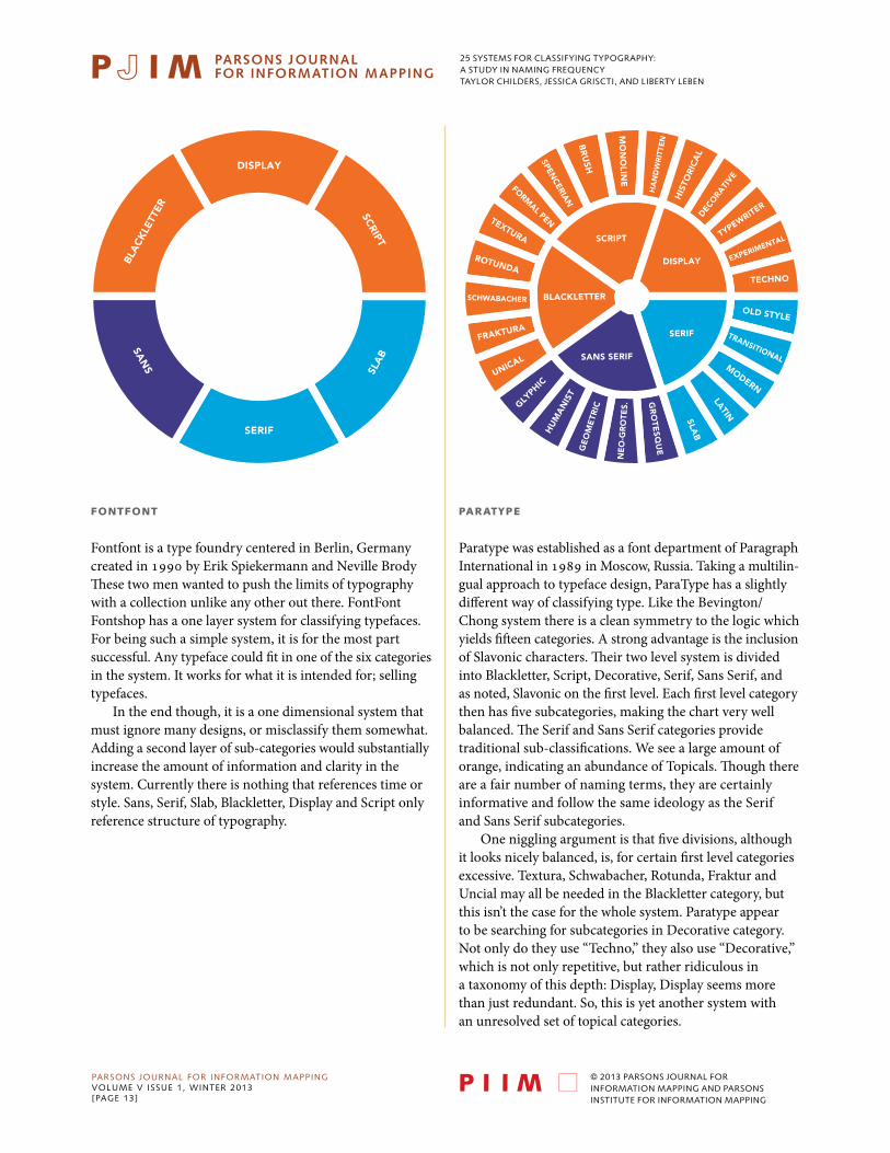
fOntfOnt
Fontfont is a type foundry centered in Berlin, Germany created in 1990 by Erik Spiekermann and Neville Brody These two men wanted to push the limits of typography with a collection unlike any other out there. FontFont Fontshop has a one layer system for classifying typefaces. For being such a simple system, it is for the most part successful. Any typeface could fit in one of the six categories in the system. It works for what it is intended for; selling typefaces.
In the end though, it is a one dimensional system that must ignore many designs, or misclassify them somewhat. Adding a second layer of sub-categories would substantially increase the amount of information and clarity in the system. Currently there is nothing that references time or style. Sans, Serif, Slab, Blackletter, Display and Script only reference structure of typography.
paRatYpE
Paratype was established as a font department of Paragraph International in 1989 in Moscow, Russia. Taking a multilin-gual approach to typeface design, ParaType has a slightly different way of classifying type. Like the Bevington/Chong system there is a clean symmetry to the logic which yields fifteen categories. A strong advantage is the inclusion of Slavonic characters. Their two level system is divided into Blackletter, Script, Decorative, Serif, Sans Serif, and as noted, Slavonic on the first level. Each first level category then has five subcategories, making the chart very well balanced. The Serif and Sans Serif categories provide traditional sub-classifications. We see a large amount of orange, indicating an abundance of Topicals. Though there are a fair number of naming terms, they are certainly informative and follow the same ideology as the Serif and Sans Serif subcategories.
One niggling argument is that five divisions, although it looks nicely balanced, is, for certain first level categories excessive. Textura, Schwabacher, Rotunda, Fraktur and Uncial may all be needed in the Blackletter category, but this isn’t the case for the whole system. Paratype appear to be searching for subcategories in Decorative category. Not only do they use “Techno,” they also use “Decorative,” which is not only repetitive, but rather ridiculous in a taxonomy of this depth: Display, Display seems more than just redundant. So, this is yet another system with an unresolved set of topical categories.
DISPLAY
SERIF
BLA
CK
LETT
ER
SLA
B
SCRIPT
SAN
S
OLD STYLE
TECHNO
EXPERIMENTALTYPEWRITER
DECO
RATI
VE
HIS
TOR
ICA
L
HA
ND
WR
ITTE
N
MO
NO
LINE
BR
USH
SPENCERIA
N
FORMAL PENTEXTURA
ROTUNDA
BLACKLETTER
SERIF
SANS SERIF
SCRIPT
DISPLAY
SCHWABACHER
FRAKTURA
UNICAL
GLYPHIC
HU
MA
NIS
TG
EO
ME
TRIC
NE
O-G
RO
TES.
GR
OTE
SQU
E
SLAB
LATIN
MODERN
TRANSITIONAL
25 systems for classifying typography:a study in naming frequencytaylor childers, jessica griscti, and liberty leben
PARSONS JOURNAL FOR INFORMATION MAPPINGvOLUME v ISSUE 1, wINTER 2013[PAGE 14]
© 2013 PARSONS JOURNAL FOR INFORMATION MAPPING AND PARSONS INSTITUTE FOR INFORMATION MAPPING
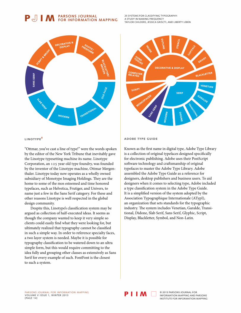
linOtYpE8
“Ottmar, you’ve cast a line of type!” were the words spoken by the editor of the New York Tribune that inevitably gave the Linotype typesetting machine its name. Linotype Corporation, an 125 year old type foundry, was founded by the inventor of the Linotype machine, Ottmar Mergen-thaler. Linotype today now operates as a wholly owned subsidiary of Monotype Imaging Holdings. They are the home to some of the mos esteemed and time honored typefaces, such as Helvetica, Frutiger, and Univers, to name just a few in the Sans Serif category. For these and other reasons Linotype is well respected in the global design community.
Despite this, Linotype’s classification system may be argued as collection of half-executed ideas. It seems as though the company wanted to keep it very simple so clients could easily find what they were looking for, but ultimately realized that typography cannot be classified in such a simple way. In order to reference specialty faces, a two layer system is needed. Maybe it is possible for typography classification to be watered down to an ultra simple form, but this would require committing to the idea fully and grouping other classes as extensively as Sans Serif for every example of such. FontFont is the closest to such a system.
aDObE tYpE guiDE
Known as the first name in digital type, Adobe Type Library is a collection of original typefaces designed specifically for electronic publishing. Adobe uses their PostScript software technology and craftsmanship of original typefaces to master the Adobe Type Library. Adobe assembled the Adobe Type Guide as a reference for designers, desktop publishers and business users. To aid designers when it comes to selecting type, Adobe included a type classification system in the Adobe Type Guide. It is a simplified version of the system adopted by the Association Typographique Internationale (ATypI), an organization that sets standards for the typographic industry. The system includes Venetian, Garalde, Transi-tional, Didone, Slab Serif, Sans Serif, Glyphic, Script, Display, Blackletter, Symbol, and Non-Latin.
SCRI
PT &
BRU
SH
SAN
S SE
RIF
SLAB SERIF
MODERN TRANSITIONAL
OLD
FA
CE
BLA
CK
LETTE
R/
BR
OK
EN
EXOTIC/FREEFORM
DECORATIVE &
DISPLAY
COMPUTERRELATED
SCRIPT
MONOSPACED
SAN
S SE
RIF
MO
DE
RN
DID
ON
E
TRAN
SITION
AL
GARALDE
VENETIAN
BLACKLETTER
SWASH
CAPI
TALSST
EN
CIL
OU
TLINE
INLIN
E
HANDTOOLED
SERIF
DECORATIVE & DISPLAY
25 systems for classifying typography:a study in naming frequencytaylor childers, jessica griscti, and liberty leben
PARSONS JOURNAL FOR INFORMATION MAPPINGvOLUME v ISSUE 1, wINTER 2013[PAGE 15]
© 2013 PARSONS JOURNAL FOR INFORMATION MAPPING AND PARSONS INSTITUTE FOR INFORMATION MAPPING
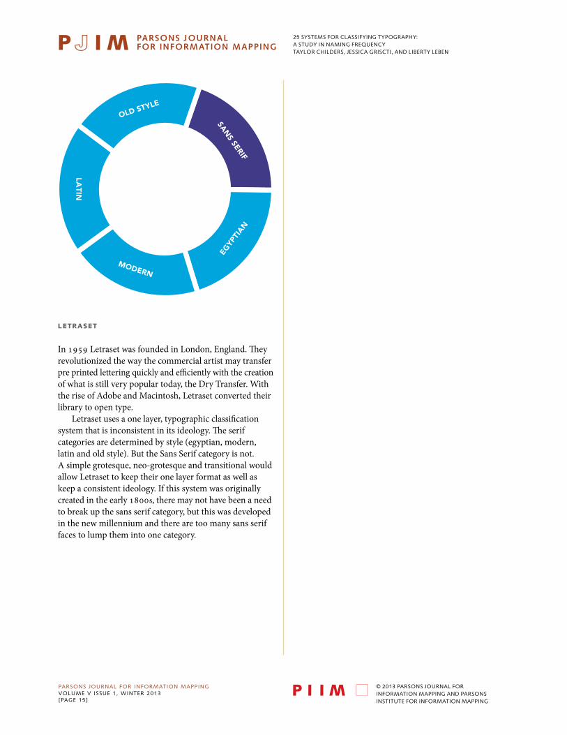
lEtRaSEt
In 1959 Letraset was founded in London, England. They revolutionized the way the commercial artist may transfer pre printed lettering quickly and efficiently with the creation of what is still very popular today, the Dry Transfer. With the rise of Adobe and Macintosh, Letraset converted their library to open type.
Letraset uses a one layer, typographic classification system that is inconsistent in its ideology. The serif categories are determined by style (egyptian, modern, latin and old style). But the Sans Serif category is not. A simple grotesque, neo-grotesque and transitional would allow Letraset to keep their one layer format as well as keep a consistent ideology. If this system was originally created in the early 1800s, there may not have been a need to break up the sans serif category, but this was developed in the new millennium and there are too many sans serif faces to lump them into one category.
SAN
S SERIF
OLD STYLE
LATIN
MODERN
EGYP
TIAN
25 systems for classifying typography:a study in naming frequencytaylor childers, jessica griscti, and liberty leben
PARSONS JOURNAL FOR INFORMATION MAPPINGvOLUME v ISSUE 1, wINTER 2013[PAGE 16]
© 2013 PARSONS JOURNAL FOR INFORMATION MAPPING AND PARSONS INSTITUTE FOR INFORMATION MAPPING
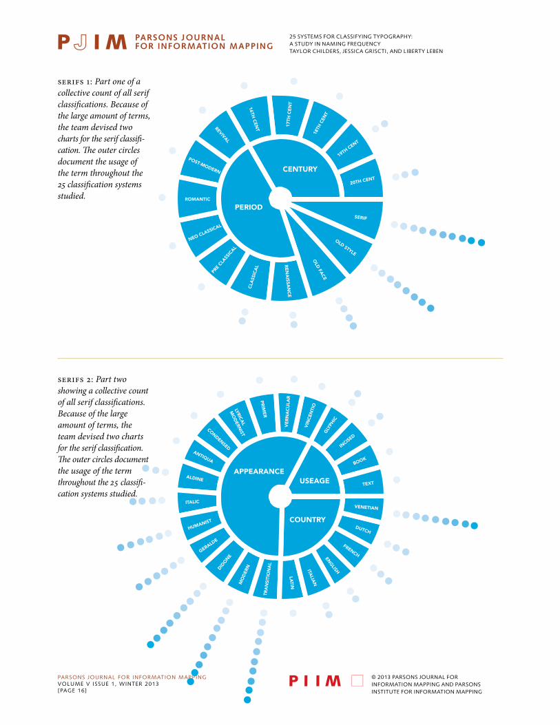
serifs 1: Part one of a collective count of all serif classifications. Because of the large amount of terms, the team devised two charts for the serif classifi-cation. The outer circles document the usage of the term throughout the 25 classification systems studied.
20TH CENT
19TH CENT
18TH
CEN
T
17TH
CE
NT
RE
NA
ISSAN
CE
16TH C
ENT
POST-MODERN
ROMANTIC
NEO CLASSICAL
PRE
CLASS
ICAL
CLA
SSIC
AL
REVIVAL
SERIF
OLD
FACE
OLD STYLE
PERIOD
CENTURY
TEXT
BOOK
INCISED
GLY
PHIC
VIN
CEN
TIO
VE
RN
AC
ULA
RPR
IME
R
LYRICA
L
MO
DERN
IST
CONDENSEDANTIQUA
ALDINE
ITALIC
HUMANIST
GERALDE
DIDO
NE
MO
DER
N
TRA
NSI
TIO
NA
LLA
TIN
ITALIA
N
ENG
LISH
FRENCH
DUTCH
VENETIAN
APPEARANCE
COUNTRY
USEAGE
serifs 2: Part two showing a collective count of all serif classifications. Because of the large amount of terms, the team devised two charts for the serif classification. The outer circles document the usage of the term throughout the 25 classifi-cation systems studied.

25 systems for classifying typography:a study in naming frequencytaylor childers, jessica griscti, and liberty leben
PARSONS JOURNAL FOR INFORMATION MAPPINGvOLUME v ISSUE 1, wINTER 2013[PAGE 17]
© 2013 PARSONS JOURNAL FOR INFORMATION MAPPING AND PARSONS INSTITUTE FOR INFORMATION MAPPING
slab serifs: A collective count of all slab serif classifications. The outer circles document the usage of the term throughout the 25 classification systems studied.
sans serifs: A collective count of all sans serif classifications. The outer circles document the usage of the term throughout the 25 classification systems studied.
EGY
PTIA
N
MEC
HA
NISTIC
WEDGE
ITALIENNE
CON
TEM
PORA
RY
SQU
AR
E
FAT FACE
MECHANISTICCLARENDON
19TH C
ENTU
RY
GO
THIC
20TH
CE
NTU
RY
GO
THIC
CON
TEM
PORA
RY
GEOMETRIC
GO
THIC
PROBLEMS
REALIST
SQUARE
TRANSITIONAL
HUMANIST
GROTESQUE
GEO
MET
RIC
M
OD
ERN
IST
GLY
PHIC
NEO-GROTESQUE
LINEA
L /
LINEA
LE

25 systems for classifying typography:a study in naming frequencytaylor childers, jessica griscti, and liberty leben
PARSONS JOURNAL FOR INFORMATION MAPPINGvOLUME v ISSUE 1, wINTER 2013[PAGE 18]
© 2013 PARSONS JOURNAL FOR INFORMATION MAPPING AND PARSONS INSTITUTE FOR INFORMATION MAPPING
display: A collective count of all display classifications. The outer circles document the usage of the term throughout the 25 classification systems studied.
script: A collective count of all script classifi-cations. The outer circles document the usage of the term throughout the 25 classification systems studied.
TYPEWRITER
IONIC
TOPICAL
INLINE
TIME-REFERENCE
INDUSTRIAL
TECHNO
EXPERIMENTA
L
STYL
E-RE
FERE
NCE
COM
P.-R
ELAT
ED
SHA
DO
WED
MA
NU
AL
SHA
DE
D
HIS
TOR
ICA
L
SAM
PLE
DH
AN
D-T
OO
LED
ORNAMENTAL
PERIOD
GRAPHIC
MONOSPACED
CALLIGRAPHIC
MISCELLANEOUS
DECORATED
MANIPULATED
CA
PITA
LS/TITLING
RO
MA
N-V
AR
IAN
TS
GRA
PHIC
/INC
ISED
REVERSED
OUTLIN
E/STENCIL
PLACE-REFERNCE
CURSIVE
SWASH
SPENCERIANM
ON
OLI
NE
LATI
N
GO
THIC
GAELIC
EXOTIC
CURVILINEAR
CASUAL
FREE
HA
ND
FOR
MA
L
BRUSH
HANDWRITTEN
25 systems for classifying typography:a study in naming frequencytaylor childers, jessica griscti, and liberty leben
PARSONS JOURNAL FOR INFORMATION MAPPINGvOLUME v ISSUE 1, wINTER 2013[PAGE 19]
© 2013 PARSONS JOURNAL FOR INFORMATION MAPPING AND PARSONS INSTITUTE FOR INFORMATION MAPPING
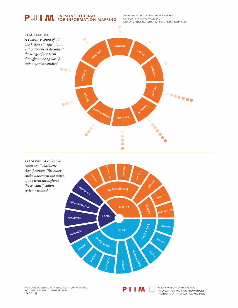
blackletter: A collective count of all blackletter classifications. The outer circles document the usage of the term throughout the 25 classifi-cation systems studied.
resolved: A collective count of all blackletter classifications. The outer circles document the usage of the term throughout the 25 classification systems studied.
BROKEN
SCHWABACHER
BASTARDA
HY
BR
IDA
UNICAL
FRAKTURA
AN
TIQ
UA
ROTUNDA
GO
THIC
TEX
TUR
A
HANDWRITTEN
FORMAL
GRAPH
IC
ROTU
ND
A
FRA
KTU
RA
SCH
WA
BA
CH
ER
TEXTURA
GROTESQUE
NEO-GROTESQUE
GEOMETRIC
HUMANIST
UNIFORM
ITA
LIEN
NE
CLA
RE
ND
ON M
OD
ER
N
TRAN
SISTION
AL
REVIVAL
GERALDE
VENETIAN
SLAB SERIF
OLD
ST
YLE
BLACKLETTER
SCR
IPT
SERIF
SANS
TOPICAL

25 systems for classifying typography:a study in naming frequencytaylor childers, jessica griscti, and liberty leben
PARSONS JOURNAL FOR INFORMATION MAPPINGvOLUME v ISSUE 1, wINTER 2013[PAGE 20]
© 2013 PARSONS JOURNAL FOR INFORMATION MAPPING AND PARSONS INSTITUTE FOR INFORMATION MAPPING
a RESOlvED SYStEm
We have chosen to divide our resolved Typeface Classifica-tion system into three parts; Serif, Sans Serif and Topical. In 1954, Maximilien Vox was the first typographic scholar to divide his system into a similar three categories. Rather than Classical and Moderns, which mix serif and sans-serif types between the two groups, we’ve chosen to divide our text faces based on the serifs. Instead of using the misleading header of Calligraphics, we’ve chosen to name our display faces Topical, because it clearly and accurately describes all of the types that would be listed underneath. After all, a Serif or a Sans Serif could surely be used as a display face, should the designer choose.
SERif
There are four main categories of serif typefaces: Old Style, Transitional, Modern, and Slab Serif. Our subclasses of Old Style faces, can be described as follows. Venetian types are humanist serif faces developed in the 15th century. These type are characterized by short, thick, bracketed serifs, and ascenders with slanted serifs. There is little contrast between horizontals and verticals, and the lowercase e often has a stylized slanted cross stroke. Examples are Bembo and Jenson. Gerald is a term coined by Maximilien Vox, a nod to Claude Garamond and Aldus Manutius, two prolific typographers who practiced in the fifteenth and sixteenth centuries. The category could also have been called French, but we felt that was too limiting to its intention. The section meant to hold typefaces made in the Gerald style, rather than only those that were cut in France. Geralde typefaces have more contrast between the thickness and thinness of strokes and more delicate proportions than the Venetian types. The axis of the curve in most letters is oblique as compared to the vertical axis of the next movement in old style typography, the Transitionals. Eighteenth century Transitional types like Deberny & Peignot’s Baskerville had an even stronger contrast between thick and thin strokes, so much so that the letters almost glitter on the page. These faces marked the difference between the Geralde and Modern didone typography. At the time that they were cutting types, typographers wouldn’t have considered themselves in a transitional period. The term was only given to those typefaces after the beginning of Modern typography. As such, many find issue with the name. However, the alternate name for these types, Realist, never caught on with the same fervor that Transitional did, and so here, we revert to the most popular name. We’ve also included a section for Revival Old Style faces, for those types designed post 19th century in the style of either Venetian,
Geralde, or Transitional typefaces. Modern typography started with typographers Giambattista Bodoni and Firmin Didot. Modern typography has almost become synonymous with Didone typography, which is of course takes its name from Didot and Bodoni. Modern types have the strongest contrast between thick and thin lines. The serifs are hairline thin and unbracketed.
The final category in serif typefaces is Slab Serifs. These faces grew out of Modern typefaces. Slab serifs are heavy, often rectilinear serifs a thick or thicker than the rest of the letter. Clarendon slabs are of similar or smaller size to the body of the letter, and they are bracketed. Italienne slabs are also bracketed, but thicker than the body of the letter. We created the category Uniform Slab Serifs to cover slab faces that are of similar weight to the body of the letter, but left unbracketed.
SanS
These four Sans Serif subcategories have been standard since the Vox ATypI system in 1961. Grotesques, like Berthold’s Azkidenz Grotesk were the first sans serif typeface. They originated in the nineteenth century, and therefore have some holdover from their predecessors; there is a degree of contrast between thick and thin strokes. From there, the Neo-Grotesque typefaces evolved in the 1950s. They were cleaner, and more mechanical than the Grotesques. The Neo-Grotesque was a large part of Swiss typography; in the beginning, they were used as display faces. Their stroke contrast was minimal, the letters were set wider and the x-height was raised. Many grotesque faces, like Helvetica, have been drawn with a great degree of varying weights and widths to accommo-date for their different uses in display design.
Geometric Sans Serifs left behind all of their historical connotations. They were the most mechanical of all of the sans serifs, made to look as if they were developed by machine. The body of the letters are constructed from simple geometric shapes, often they are monoline, and there is little differentiation between each letter. Whereas the geometric abandons all notion of being derived from earlier typography, the humanist sans serif draws from the classical manuscript hand. The design is often informed by the classical Roman letter, and informs the decisions the designer makes to his fresh, monoline letter. The most celebrated humanist sans serif is Eric Gill’s Gill Sans.
tOpicalS
While in the days of Johannes Gutenberg, the blackletter was the most common text face, now,as a modern civiliza-tion, we are no longer trained to read letters so dense and
25 systems for classifying typography:a study in naming frequencytaylor childers, jessica griscti, and liberty leben
PARSONS JOURNAL FOR INFORMATION MAPPINGvOLUME v ISSUE 1, wINTER 2013[PAGE 21]
© 2013 PARSONS JOURNAL FOR INFORMATION MAPPING AND PARSONS INSTITUTE FOR INFORMATION MAPPING
calligraphic. Therefore, blackletter faces are now regarded as decorative. Textura is the most calligraphic form of blackletter. The letters are tall, narrow, and drawn with sharp, angular lines. Textura was used in France, England, and parts of Germany. Schwabacher blackletters are the earliest German print typefaces. It is closer to the manu-script handwriting that the Textura face. By 1530, it was replaced by the Fraktur, as the most oft-used text face in Germany. Fraktur faces were so common that almost all German blackletters of the time carried Fraktur somewhere in their name. The capital letters are created from a rounded C-shape, and S-shaped strokes. Rotunda, also know as Cursiva, blackletters is much like modern script, there are no real standards except that the letters run together.
Scholars of all sorts have pulled the Script faces out of the general display sections because they can be qualified, classified and separated from display typography. Formal scripts are based on the writing of calligraphy masters. The letters are drawn either with a metal pen nib or quill. Handwritten scripts come from the more active modern hand. Strokes vary in width, and are generally not created with pen nib or quill. The most difficult task any typo-graphic scholar has set out to do is classify the display types, and every scholar fails, whether because he has chosen to attempt classification or ignore the types entirely. We felt that neither solution was acceptable. Display faces are becoming more and more popular, and as we march father into Open Type, only more are expected to appear. There are simply too many faces to qualify, and far too many faces to leave them absent from our system. So we’ve carved out a place for them in our Graphic category. Graphic, because Display is a tired term that has failed too many times before. These typefaces often reference the style of something else, they are bold, statement pieces that aren’t meant for paragraphs of text, and so they need a bold category.
acKnOWlEDgEmEnt
We would like to thank Professor Paul Shaw for acquainting us with so many typeface classifying systems and moving us deeply down the path of taxonomic typography.
biOgRaphY
Taylor Childers is currently a BFA in Communication Design at Parsons, The New School for Design, holds a design internship for the Indiana Department of Education. She has always had a particular fascination with the art of typography.
Jessica Griscti is currently pursuing dual degree, BFA and BA In Communication Design and Writing at Parsons The New School for Design, Jessica Griscti is a part time designer for C&G Partners LLC. She’s been nursing an unhealthy fondness for all things typography before she learned to read.
Liberty Leben is currently pursuing BFA in Communication Design at Parsons The New School for Design, Liberty Leben was born and raised in Wichita, KS, but spent her final years of high school living in Austin, TX. Liberty currently lives and studies in New York City.
nOtES
1 Theodore Low De Vinne, The Practice of Typography, (New York: The De Vinne Press, 1899), 183.
2 The system was published in German, so please allow for some slight inconsistencies with the translation.
3 The system was published in German, so please allow for some slight inconsistencies with the translation.
4 Alexander Lawson, Anatomy of a Typeface, (Boston: David R. Godine, 1990), 7–13.
5 Allen , Haley. Alphabet: The History, Evolution and Design of Letters We Use Today. (New York: Watson-Guptill Publications) 1995, 10–13.
6 Alan Bartram, Typeforms: a history, (London: The British Library & Oak Knoll Press, 2007). 84.
7 Bartram, Typeforms: A History, 77.
8 Linotype, “History.” Accessed January 7, 2013. http://www.linotype.com/49/history.html.

25 systems for classifying typography:a study in naming frequencytaylor childers, jessica griscti, and liberty leben
PARSONS JOURNAL FOR INFORMATION MAPPINGvOLUME v ISSUE 1, wINTER 2013[PAGE 22]
© 2013 PARSONS JOURNAL FOR INFORMATION MAPPING AND PARSONS INSTITUTE FOR INFORMATION MAPPING
bibliOgRaphY
Adobe Type Guide. Mountain View, CA: Adobe Systems, 1991. Print.
Allen, Haley. Alphabet: The History, Evolution and Design of Letters We Use Today. New York: Watson-Guptill Publications, 1995.
Bartram, Alan. Typeforms: a history. London: The British Library & Oak Knoll Press, 2007.
Bringhurst, Robert. The Elements of Typographic Style: Version 3.2. Roberts: Hartley & Marks, 2008.
Craig, James, and Irene Korol Scala. Designing with Type: The Essential Guide to Typography. New York: Watson-Guptill Publications, 2006.
De Vinne, Theodore Low. The Practice of Typography. New York: The De Vinne Press, 1899.
Dowding, Geoffrey. And Introduction to the History of Printing Tyes. London: Wace & Company Ltd., 1961.
FontFont, “About FontFont.” Accessed January 7, 2013. https://www.fontfont.com/about.
Headley, Gywn. The Encyclopaedia of Fonts. London: Cassell Illustrated, 2005.
Hill, Will. The Complete Typographer. Upper Saddle River: Pearson Prentice Hall, 1995.
Jaspert, W. Pincus, W. Turner Berry, and A.F. Johnson. The Encyclopaedia of Typefaces. London: Blandford Press, 1970.
Lawson, Alexander. Anatomy of a Typeface. Boston: David R. Godine, 1990.
Linotype, “History.” Accessed January 7, 2013. http://www.linotype.com/49/history.html.
Lupton, Ellen. Thinking With Type: A Critical Guide For Designers, Writers, Editors & Students. New Yok: Princeton Architectural, 2010.
McLean, Ruari. The Thames and Hudson Manual of Typography. London: Thames & Hudson Ltd., 1980.
My Fonts, “Letraset.” Accessed January 7, 2013. http://www.myfonts.com/foundry/Letraset/.
My Fonts, “ParaType.” Accessed January 7, 2013. http://www.myfonts.com/foundry/ParaType/.
My Fonts, “Robert Bringhurst.” Accessed December 29, 2012. http://www.myfonts.com/person/Robert_Brin-ghurst/.
Nettelhorst, Leopold. Schrift Muss Passen: Schriftwahl und Schriftausdruck in der Werbung Handbuch fur Gestalungsarbeit an Webemitteln. Essen: Wirtschaft und Werbung Verlagsgesellschaft mbH., 1959.
Solomon, Martin. The Art of Typography: And introduc-tion to Typo.icon.ography. New York: Watson-Guptill Publications, 1986.
Strizver, Ilene. Type Rules! The Designer’s Guide to Profes-sional Typography. Hoboken: John Wiley & Sons, Inc., 2006.
Typographie & Civilisation, “Classification Thibaudeau.” Last modified 2006. Accessed January 10, 2013. http://caracteres.typographie.org/classification/thibaudeau.html.
Updike, Daniel Berkeley. Printing Types: Their Histories, Forms, and Use. Boston: The Merrymount Press, 1937.