
25 Principles of Mobile Site Design - Google...
26
25 Principles of Mobile Site Design
Transcript of 25 Principles of Mobile Site Design - Google...

25 Principles of Mobile Site Design
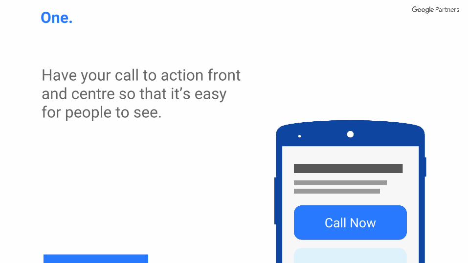
Have your call to action front and centre so that it’s easy for people to see.
One.
Call Now
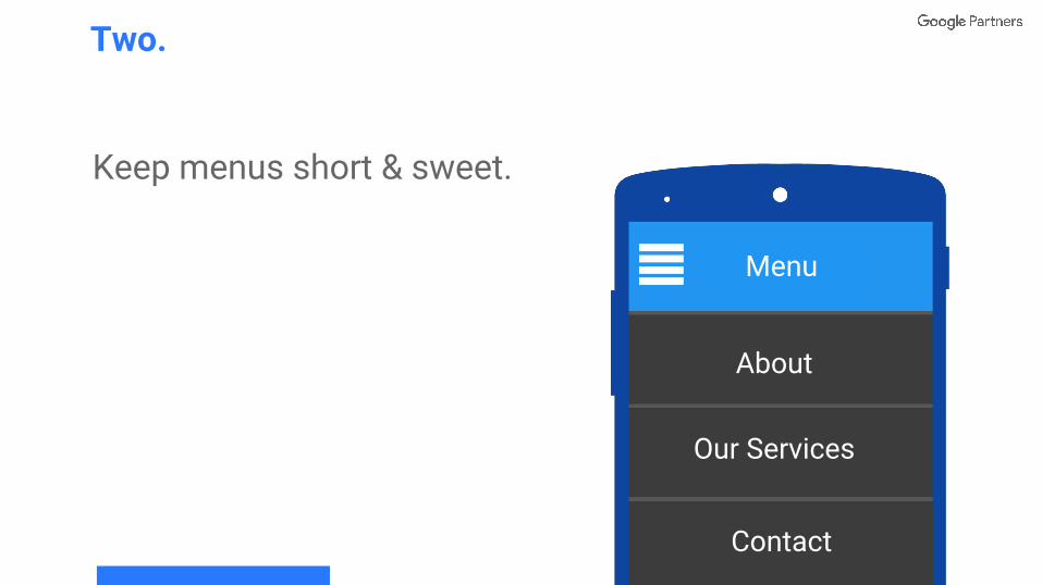
Keep menus short & sweet.
Two.
Menu
About
Our Services
Contact
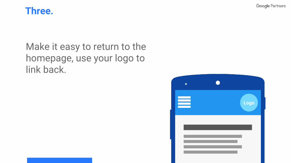
Make it easy to return to the homepage, use your logo to link back.
Three.
Logo
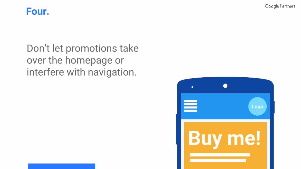
Don’t let promotions take over the homepage or interfere with navigation.
Four.
Logo
Buy me!
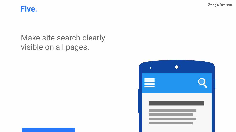
Make site search clearly visible on all pages.
Five.
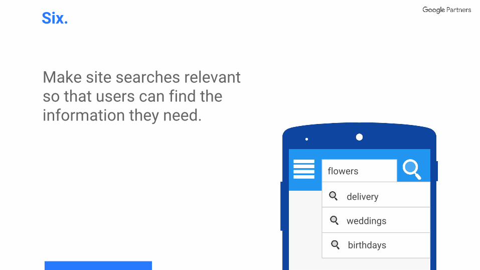
Make site searches relevant so that users can find the information they need.
Six.
flowers
weddings
delivery
birthdays
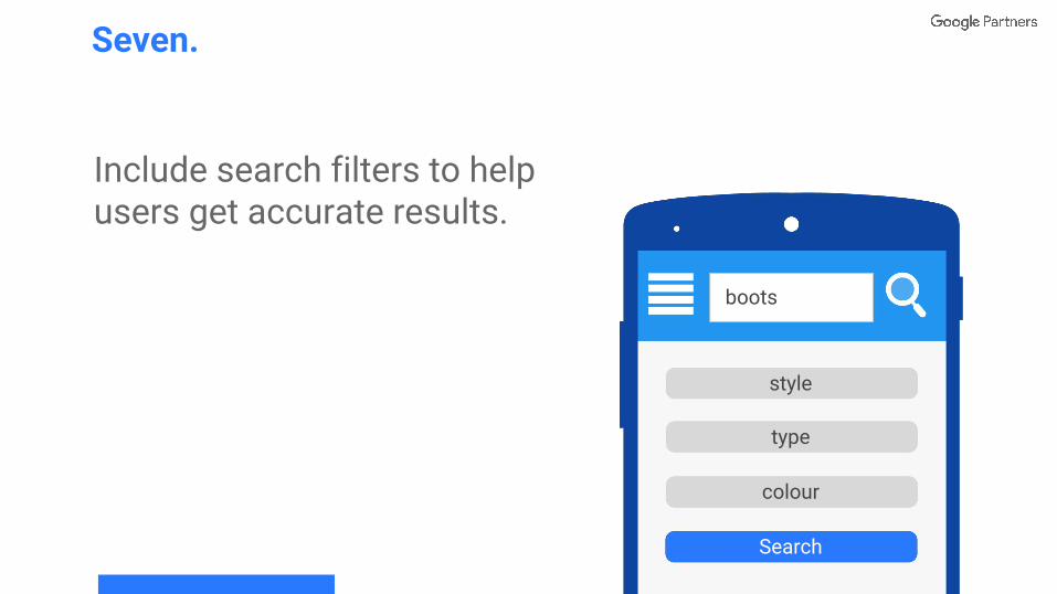
Include search filters to help users get accurate results.
Seven.
boots
style
type
Search
colour
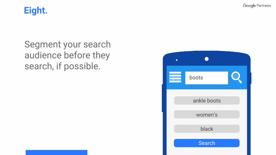
Segment your search audience before they search, if possible.
Eight.
ankle boots
women’s
Search
black
boots
ankle boots
women’s
black
Search
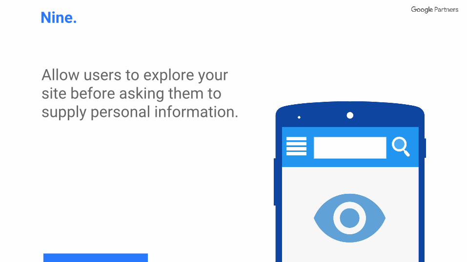
Allow users to explore your site before asking them to supply personal information.
Nine.
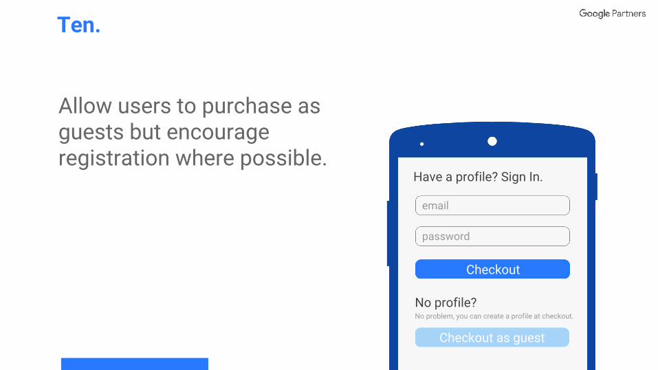
Allow users to purchase as guests but encourage registration where possible.
Ten.
Have a profile? Sign In.
password
Checkout as guest
Checkout
No profile? No problem, you can create a profile at checkout.
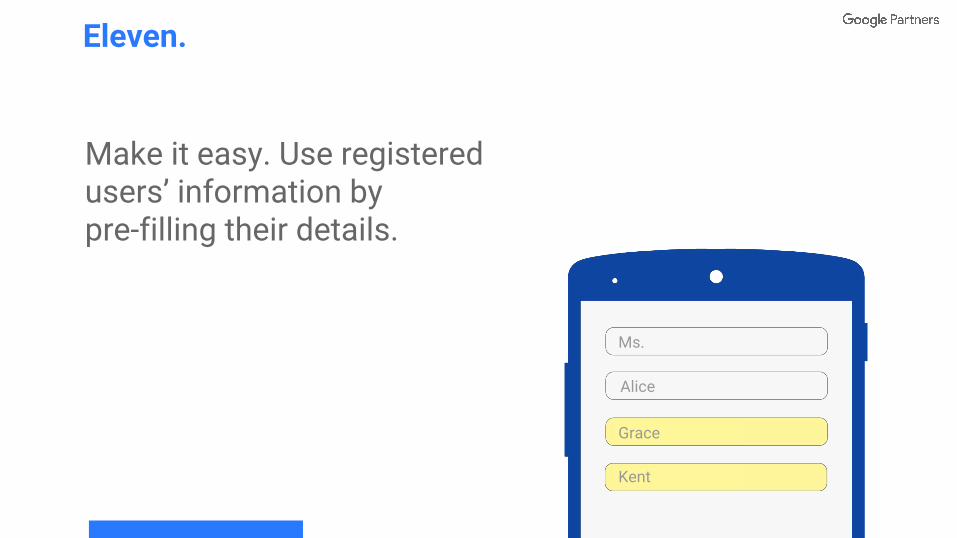
Make it easy. Use registered users’ information by pre-filling their details.
Eleven.
Ms.
Grace
Alice
Kent
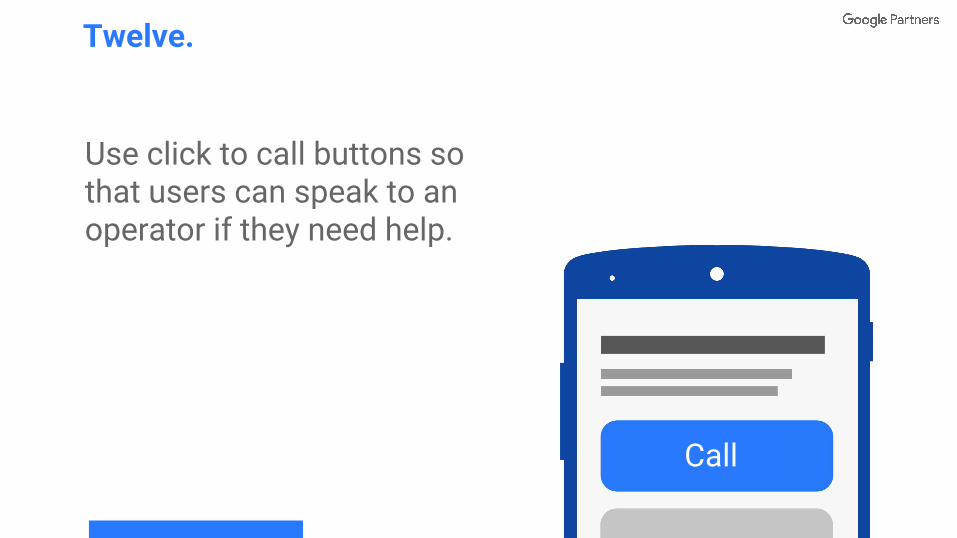
Use click to call buttons so that users can speak to an operator if they need help.
Twelve.
Call
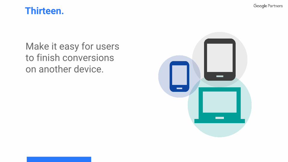
Make it easy for users to finish conversions on another device.
Thirteen.
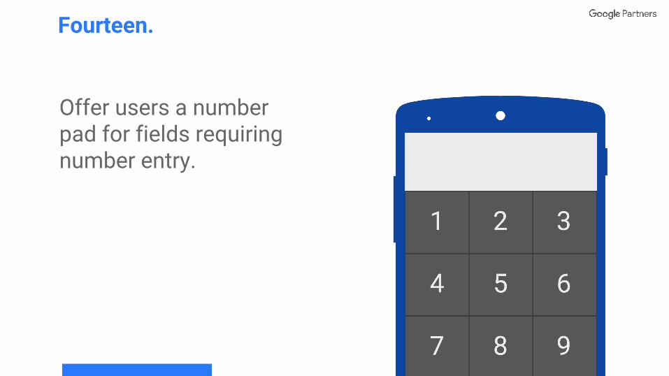
Offer users a number pad for fields requiring number entry.
Fourteen.
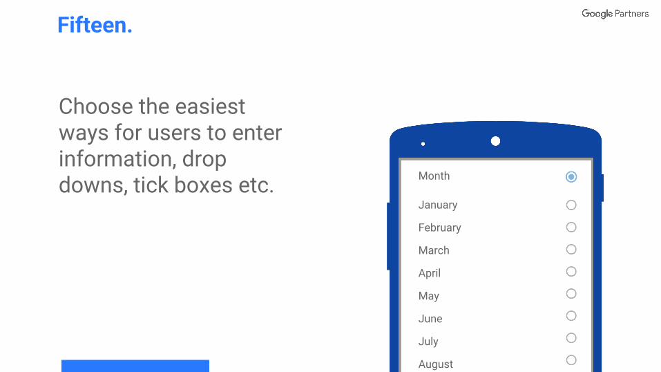
Choose the easiest ways for users to enter information, drop downs, tick boxes etc.
Fifteen.
Month
January
February
March
April
May
June
July
August
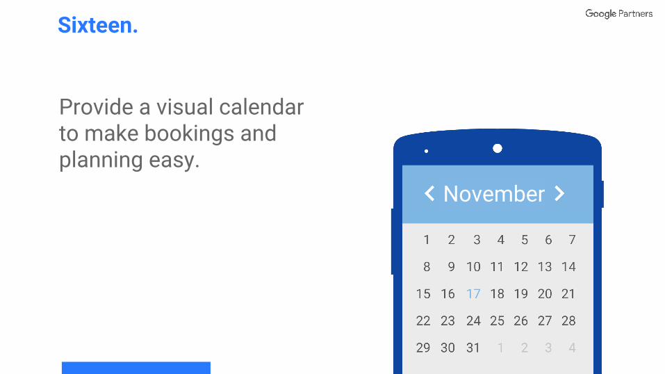
Provide a visual calendar to make bookings and planning easy.
Sixteen.
November
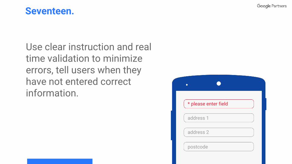
Use clear instruction and real time validation to minimize errors, tell users when they have not entered correct information.
Seventeen.
address 1
address 2
postcode
* please enter field
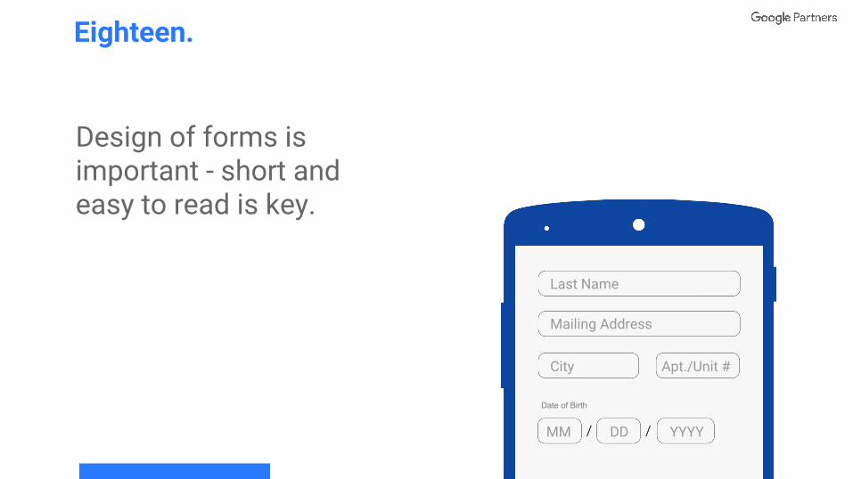
Design of forms is important - short and easy to read is key.
Eighteen.
Last Name
Mailing Address
City Apt./Unit #
MM DD YYYY
Date of Birth
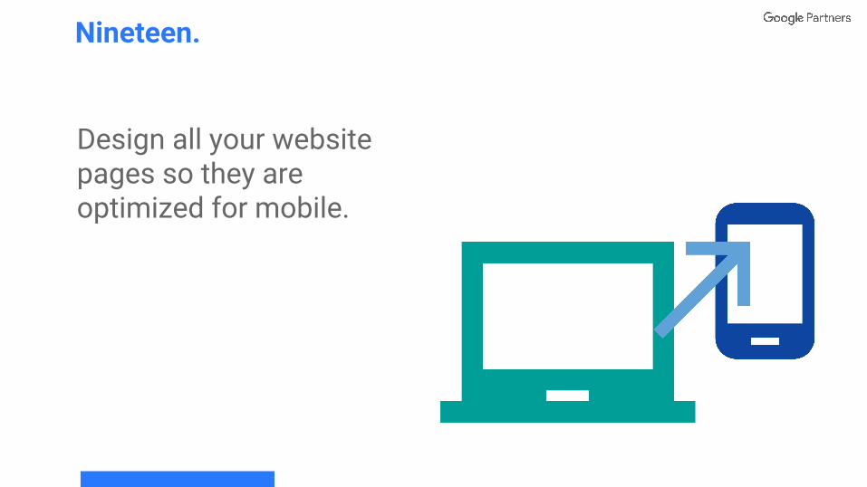
Design all your website pages so they are optimized for mobile.
Nineteen.
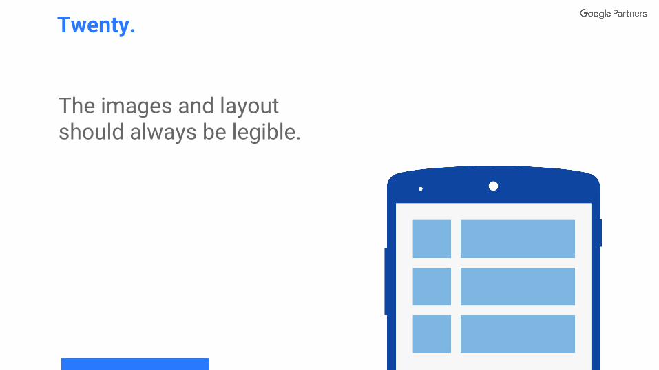
The images and layout should always be legible.
Twenty.
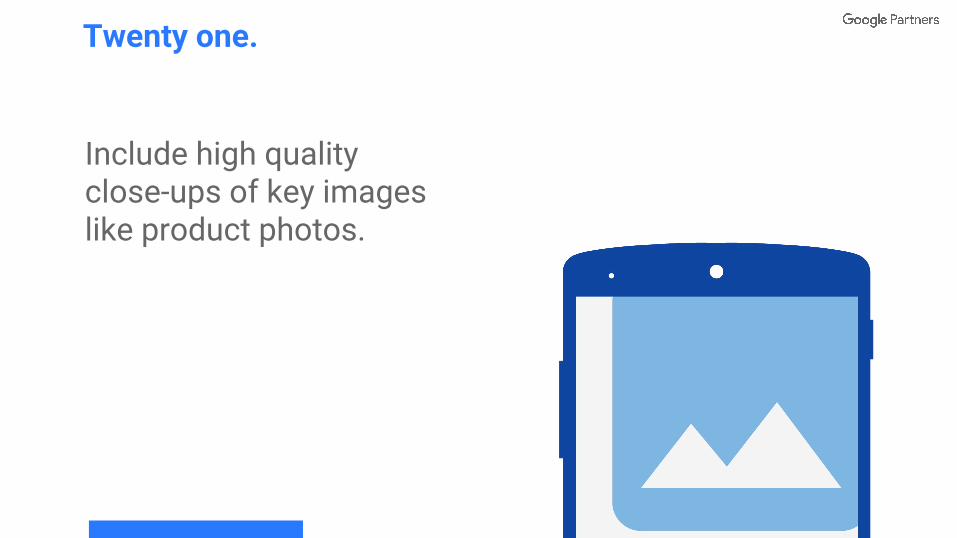
Include high quality close-ups of key images like product photos.
Twenty one.
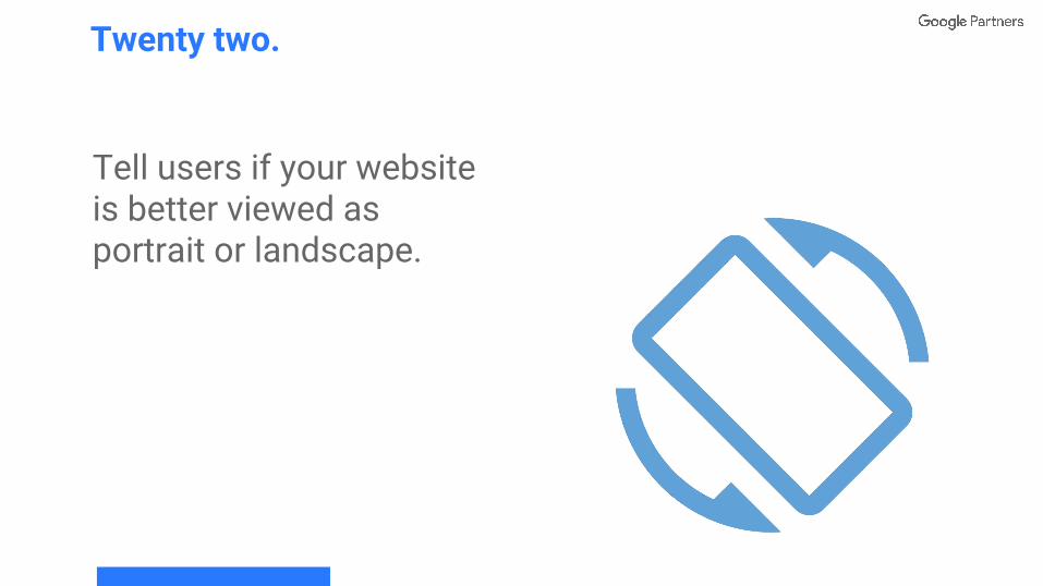
Tell users if your website is better viewed as portrait or landscape.
Twenty two.
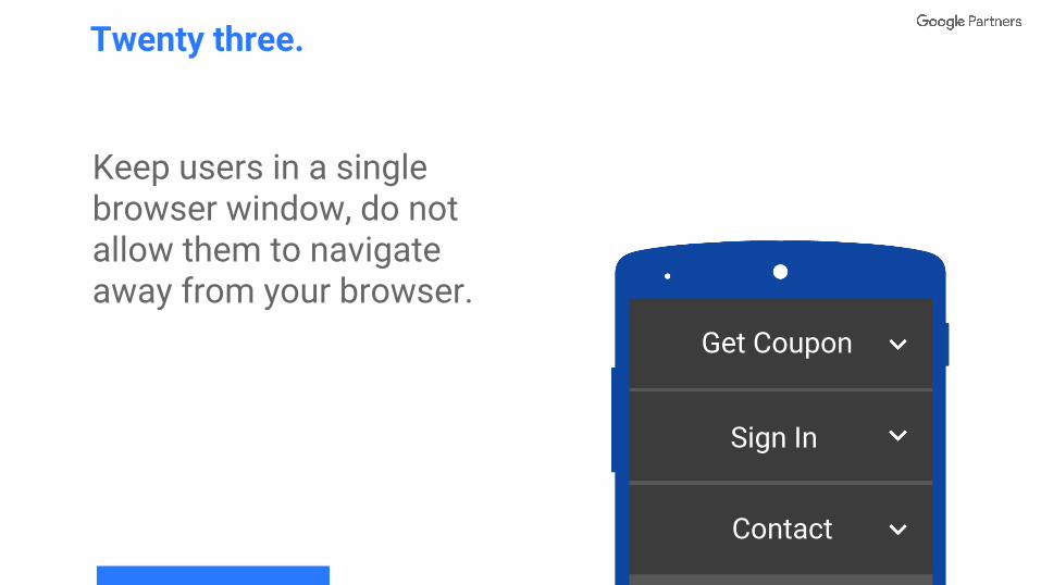
Keep users in a single browser window, do not allow them to navigate away from your browser.
Twenty three.
Get Coupon
Sign In
Contact
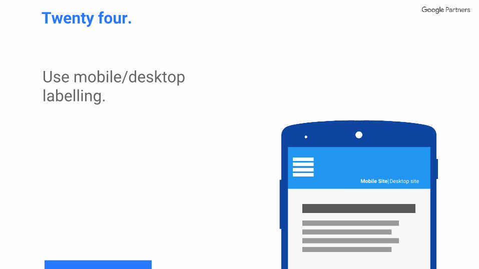
Use mobile/desktop labelling.
Twenty four.
Mobile Site⎢Desktop site
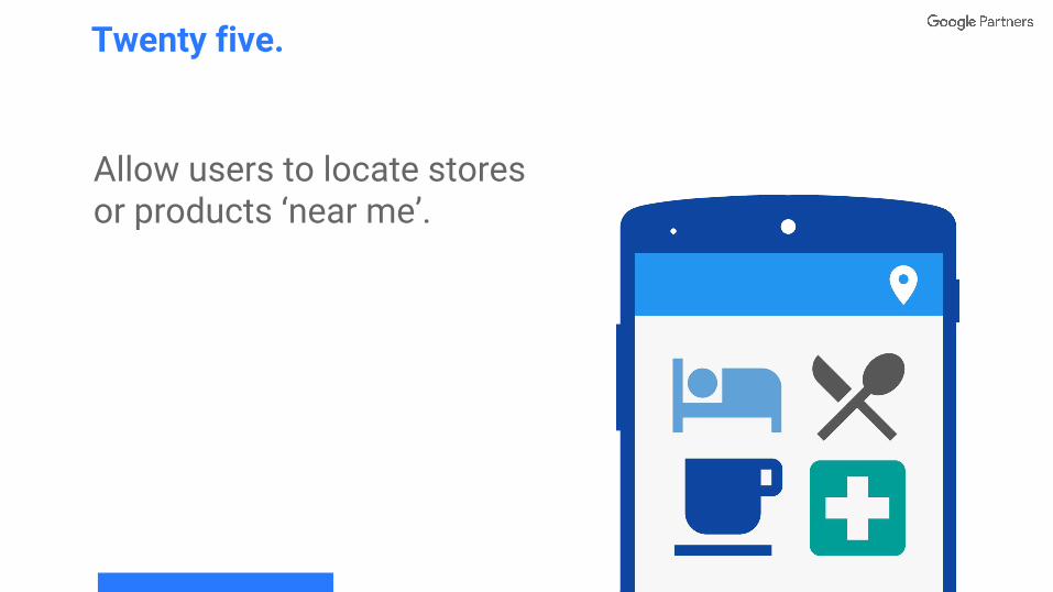
Allow users to locate stores or products ‘near me’.
Twenty five.