201412 Predictive Analytics Foundation course extract
18
1 Predictive Analytics: Extracts from Red Olive foundational course For more details or to speak about a tailored course for your organisation please contact: Jefferson Lynch: [email protected] +44 1256 831100 December 2014 Analytics and Data Management 1
-
Upload
jefferson-lynch -
Category
Documents
-
view
24 -
download
0
Transcript of 201412 Predictive Analytics Foundation course extract
1
Predictive Analytics: Extracts from Red Olive foundational course
For more details or to speak about a tailored course for your organisation please contact:
Jefferson Lynch: [email protected] +44 1256 831100
December 2014
Analytics and Data Management 1

Contents
What makes a great analysis?
Measuring relationships between variables
Profiling
What is data mining?
The data mining process
Data mining techniques
Discussion – next steps for data mining
Back-up slides
Introduction to descriptive statistics
Copyright © 2014 Red Olive Ltd, All Rights Reserved. 2

Some examples
Copyright © 2014 Red Olive Ltd, All Rights Reserved. 3
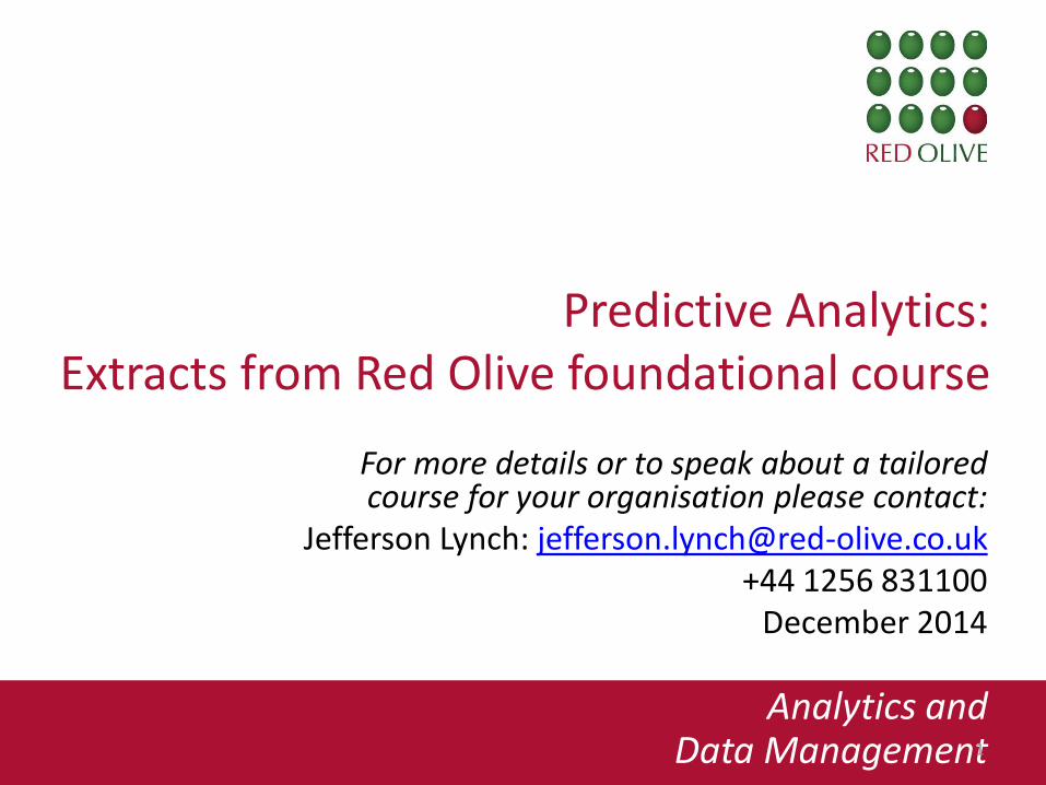
Christmas 2011
Queen’s Diamond Jubilee
Road works ban starts
(1st July 2012)
London 2012 Olympic and Paralympic
Games
Winter-time road works /
end FY
Monitoring Trends Traffic Disruption in London
Information from Transport for London
Oracle Day presentation, 6 Nov 2012 Copyright © 2014 Red Olive Ltd, All Rights Reserved. 4

Geographical Mash-ups
5
Visualising:
Connections between businesses in East London
Based on:
Streams of Twitter data, tracking relationships, mentions
and retweeets
Source: http://www.techcitymap.com/index.html#/
Copyright © 2014 Red Olive Ltd, All Rights Reserved.
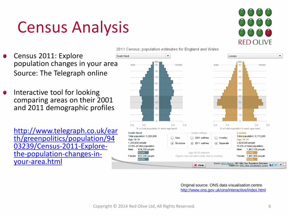
Census Analysis
Copyright © 2014 Red Olive Ltd, All Rights Reserved. 6
Original source: ONS data visualisation centre
http://www.ons.gov.uk/ons/interactive/index.html
Census 2011: Explore population changes in your area
Source: The Telegraph online Interactive tool for looking comparing areas on their 2001 and 2011 demographic profiles
http://www.telegraph.co.uk/ear
th/greenpolitics/population/9403239/Census-2011-Explore-the-population-changes-in-your-area.html
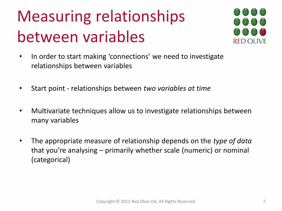
Measuring relationships between variables • In order to start making ‘connections’ we need to investigate
relationships between variables
• Start point - relationships between two variables at time
• Multivariate techniques allow us to investigate relationships between many variables
• The appropriate measure of relationship depends on the type of data that you’re analysing – primarily whether scale (numeric) or nominal (categorical)
Copyright © 2012 Red Olive Ltd, All Rights Reserved. 7
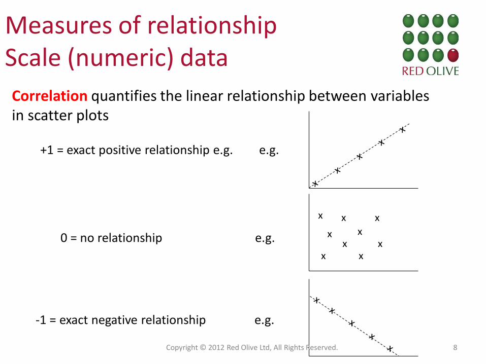
Measures of relationship Scale (numeric) data
Correlation quantifies the linear relationship between variables in scatter plots
+1 = exact positive relationship e.g. e.g.
0 = no relationship e.g.
x x x
x x
x
x x x
-1 = exact negative relationship e.g.
Copyright © 2012 Red Olive Ltd, All Rights Reserved. 8
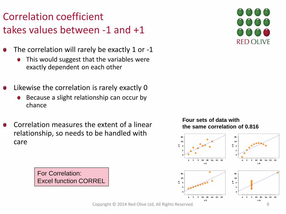
Correlation coefficient takes values between -1 and +1
The correlation will rarely be exactly 1 or -1 This would suggest that the variables were exactly dependent on each other
Likewise the correlation is rarely exactly 0 Because a slight relationship can occur by chance
Correlation measures the extent of a linear relationship, so needs to be handled with care
Four sets of data with
the same correlation of 0.816
For Correlation:
Excel function CORREL
Copyright © 2014 Red Olive Ltd, All Rights Reserved. 9
What is data mining?
Copyright © 2014 Red Olive Ltd, All Rights Reserved. 10
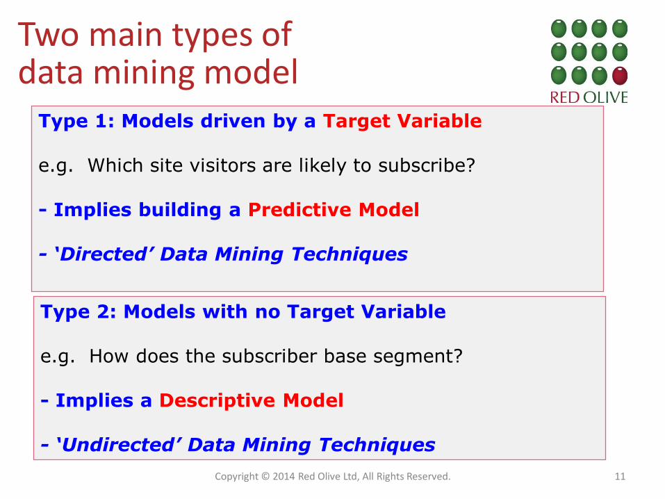
Two main types of data mining model
Type 1: Models driven by a Target Variable e.g. Which site visitors are likely to subscribe? - Implies building a Predictive Model - ‘Directed’ Data Mining Techniques
Type 2: Models with no Target Variable e.g. How does the subscriber base segment? - Implies a Descriptive Model - ‘Undirected’ Data Mining Techniques
Copyright © 2014 Red Olive Ltd, All Rights Reserved. 11
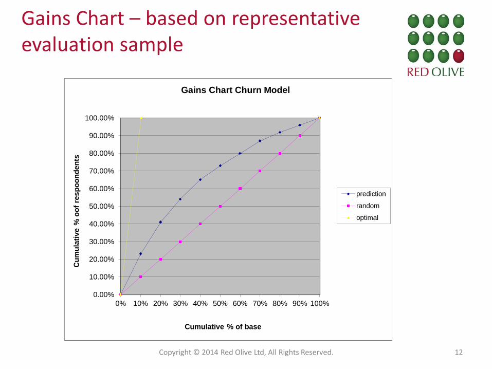
Gains Chart – based on representative evaluation sample
0.00%
10.00%
20.00%
30.00%
40.00%
50.00%
60.00%
70.00%
80.00%
90.00%
100.00%
0% 10% 20% 30% 40% 50% 60% 70% 80% 90% 100%
Cu
mu
lati
ve %
oo
f re
sp
oo
nd
en
ts
Cumulative % of base
Gains Chart Churn Model
prediction
random
optimal
Copyright © 2014 Red Olive Ltd, All Rights Reserved. 12
Data mining techniques and where they can be applied
Copyright © 2014 Red Olive Ltd, All Rights Reserved. 13
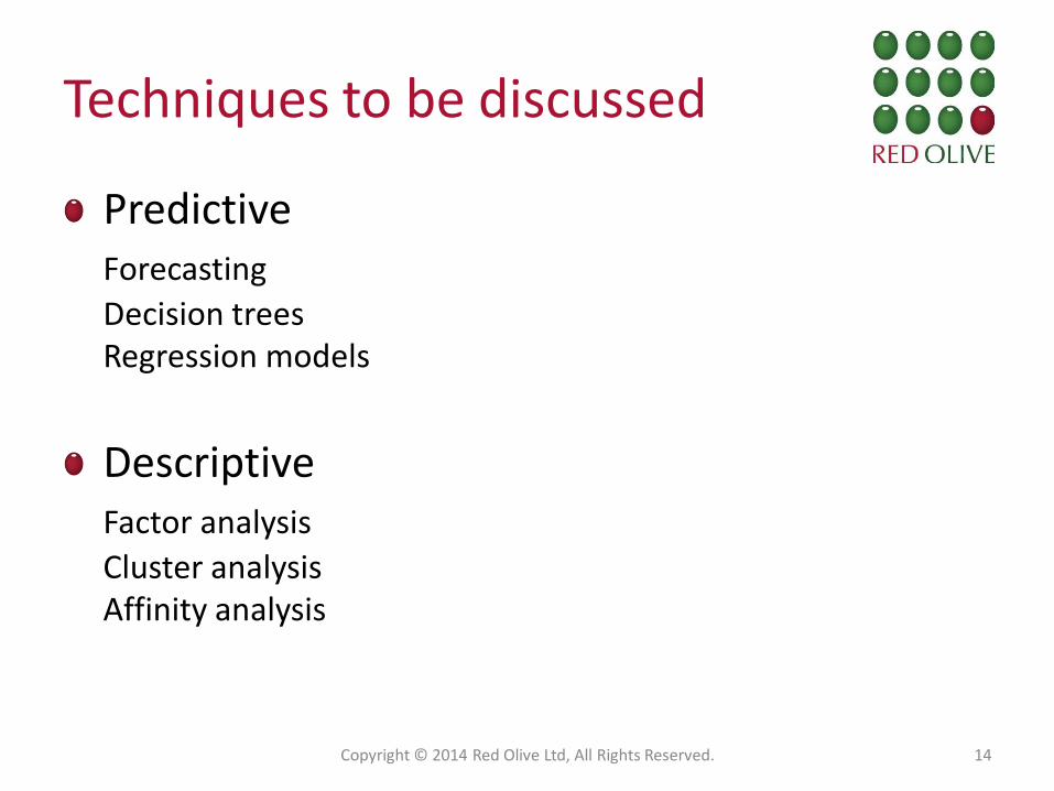
Techniques to be discussed
Predictive Forecasting
Decision trees Regression models
Descriptive
Factor analysis
Cluster analysis Affinity analysis
Copyright © 2014 Red Olive Ltd, All Rights Reserved. 14
Techniques on individual-level data Data mining methods
Copyright © 2014 Red Olive Ltd, All Rights Reserved. 15

16
Target Variable: Good/Bad Credit Rating
Best predictor: Income Level
2nd best predictor: Number of credit cards
End nodes: No further splits
Example Decision Tree
Final predictor: Age
Highly significant
Copyright © 2014 Red Olive Ltd, All
Rights Reserved. 16

Regression Example
Copyright © 2014 Red Olive Ltd, All Rights Reserved. 17 Source: The Times
24/11/2012
Regression
Model

The affinity tile map
Strengths of affinities are displayed using a ‘hot-cold’ colour palette By clicking on a tile, details of the pair of products and their affinity are revealed
Source: Teradata Copyright © 2014 Red Olive Ltd, All Rights Reserved. 18