2014 Conference Proceedings - MCRSA
212
Mid‐Continent Regional Science Association 45th Annual Conference IMPLAN National User's Conference 10th Biennial Conference 2014 Conference Proceedings June 3 ‐ June 5, 2014 The Madison Concourse Hotel Madison, Wisconsin
Transcript of 2014 Conference Proceedings - MCRSA

Mid‐Continent Regional Science
Association 45th
Annual Conference
IMPLAN National User's Conference
10th Biennial Conference
2014 Conference Proceedings
June 3 ‐ June 5, 2014
The Madison Concourse Hotel
Madison, Wisconsin


Mid‐Continent Regional Science Association
IMPLAN Group, LLC.
2014 Conference Proceedings
September 2014
John Leatherman, Compiler
with assistance from
Michael Porter, Research Assistant
Rebecca Bishop, Extension Associate
Department of Agricultural Economics
Kansas State University


Table of Contents Incorporating New U.S. and Canadian Transport Cost Data into IMPLAN’s Trade Flow Model Jennifer Thorvaldson and Doug Olson 1 2013 Economic Impact of Companies Funded and/or Assisted by the Northeast Ohio Entrepreneurial Signature Program Candice Clouse and Ziona Austrian 8 Cascade Locks Proposed Bottled Water Facility: An Economic Impact Analysis of Market Effects and Discussion of Potential Nonmarket Impacts Bruce Sorte and Joe Kerkvliet 16 Nebraska’s Animal Agriculture: Economic Impacts of Cattle, Hog, Dairy and Poultry Industry Changes Anil Giri, Bruce Johnson and Eric Thompson 36 The Economic Impact of a proposed Residential Housing Development on a County Economy Derek Bjonback 51 (see the companion PowerPoint presentation) Economic Impacts of the Eagle Ford Shale: Modeling and Data Issues Javier Oyakawa 59 Toward an Optimal Economic Development Strategy: Shannon Diversity Measures of Export Expansion and Import Substitution David Kay, Phil Watson and Stephen Cooke 77

An Examination of U.S. County‐Level Population Change from 2000 to 2010 Ronald J. Gunderson, Richard J. Szal and Eva Putzova 90 Determinants of Economic Success: Rural Tourism Aaron K. Lusby 109 Economic Impact Analysis of Motor Fuel Price Increase on Local Economies with Very Different Automobile Reliance Brian S. Park 115 General Equilibrium Frameworks for Climate Risk Assessment with IMPLAN Data Thomas F. Rutherford and Andrew Schreiber 127 Using IMPLAN to Estimate Impact of Medicaid Expansion on Missouri’s Economy Lanis Hicks, Sue Boren, Adam Bouras and Ashley Kimberling 139 A Policy Framework for the Use of Private Concessionaires in the National Parks Torrey Byles 149 Market and Trade as Drivers of Innovation Maria de Fátima Sales and Knut Ingar Westeren 156 Montague Airport Financial Analysis: Economic Impact of the Montague Airport Michael Suplita and Erika Ryan 166 Rural Revitalization Effects of Hydraulic Fracturing: An Initial Perspective from Texas Rebekka Dudensing 181

Estimated Economic Impacts of the IP Mill Closure in Courtland, Alabama: A Comparison of Two Methodologies Burton English, Jamey Menard, Kim Jensen, and Dayton Lambert 191

MID‐CONTINENT
REGIONAL
SCIENCE
2014 MCRSA/IMPLAN Conference Proceedings ASSOCIATION
1
INCORPORATING NEW U.S. AND CANADIAN TRANSPORT COST DATA INTO
IMPLAN’S TRADE FLOW MODEL
Jennifer Thorvaldson Doug Olson IMPLAN Group, Inc.
Abstract In 2005, IMPLAN developed a doubly-constrained gravity model to estimate trade flows
for 440 commodities between all counties in the U.S. This model uses supplies and demands of each commodity by county from the annual IMPLAN data sets together with the transport costs developed by the Center for Transportation Analysis at Oak Ridge National Laboratory (ORNL). The ORNL transportation network modeling system accounts for tolls, congestion, and other factors to derive travel ‘impedences’ between each county centroid to every other county centroid in the U.S. by mode of transportation (truck, rail, and water). These impedences are essentially an index of the difficulty and costliness of transportation between county pairs by each transportation mode.
In 2013, IMPLAN acquired updated county-to-county impedences from ORNL1, as well
as impedences for 13 Canadian provinces. The latter include impedences between the provinces themselves as well as between the provinces and U.S. counties. This paper discusses the incorporation of the updated U.S. county-to-county impedences into IMPLAN’s gravity model, as well as the application of IMPLAN’s gravity model to ORNL’s provincial impedences and IMPLAN’s provincial supply and demand data to generate inter-provincial trade flow estimates for 103 commodities. These tradeflow data provide greater commodity detail than the currently-available inter-province trade flow data from Statistics Canada, which only contain trade flows for roughly 35 commodities. They also provide a unique opportunity to assess the accuracy of the gravity model against real trade flow data by aggregating the 103-commodity IMPLAN trade flow estimates to the 38-commodity Statistics Canada trade data.
1.0 Background IMPLAN’s gravity model is based on
Newton’s Law of Gravity, whereby the force between two masses is a function of the size of the masses and the distance between them. In this case, the masses are places (e.g., counties) and the force is trade. The “size” of the masses is based on their domestic supply and demand, while “distance” is based on the cost of moving goods and services between them. Thus, the “size” of the masses and the “distance” between them will vary by commodity.
1 The previous set of ORNL impedences used in IMPLAN’s gravity model was from 2005. 2 Net of foreign exports. 3 Net of foreign imports.
For each commodity, trade between two
masses will then be proportional to the “mass” of the economies and inversely proportional to the “distance” between them:
Tij =
where Tij is the trade between county i and county j, Si is the net2 local supply of the commodity in county i, Di is the net3 local demand for the commodity in county j, and dij is the distance between counties i and j. Beta represents the importance of distance to the trade of a particular
dijbSiDj

MID‐CONTINENT
REGIONAL
SCIENCE
2014 MCRSA/IMPLAN Conference Proceedings ASSOCIATION
2
commodity. For shippable commodities, beta is adjusted until the average distance traveled by the commodity (between all county-county pairs) is within ten percent of the average miles moved as reported by the CFS. For most services, beta is adjusted until the average distance traveled by the commodity (between all county-county pairs) is within ten percent of the commuter-weighted average highway impedence, calculated using county-to-county commuter counts from the Census. For services that cater largely to tourists (lodging, car rental, etc.), beta is set to a fixed value between the relatively low values of most shippable commodities and the relatively high values for most other services. Local supplies and demands come from IMPLAN’s annual county-level data, while “distances” come from the Oak Ridge National Laboratory’s (ORNL) county-to-county impedences by mode of transportation. Beta is calculated iteratively by the gravity model. More information about the gravity model can be found in Lindall et al. (2005) and Thorvaldson and Olson (2013).
2.0 Methodology and Data
2.1 New U.S. ORNL Impedence Data The incorporation of the new ORNL
impedences had no effect on the formulation of the gravity model. However, it did require some investigation into the changed impedence values. The most important cases to investigate are those where a mode of transportation between two counties either a) became possible where before it was impossible or b) became impossible where before it was possible. An example of each is discussed briefly here. Highway
The only county for which highway transportation links were lost was Maui County, HI. While previously (i.e., in the first set of ORNL impedences), the highway impedence between Maui County and other counties was very high such that very little trade was likely to occur via highway, such highway trade was deemed possible, which in 4 AL, AK, AR, AZ, CA, CO, VA, WA, WV, WI, WY
reality is not the case; thus, the change is clearly an improvement. As for counties for which highway linkages remained possible but became more costly (i.e., the impedences increased), the largest increases were seen for Yukon-Koyukuk, AK and Yamhill County, OR – each of them with multiple other counties.
In the new ORNL dataset, highway trade between Worth County, GA and 463 other counties became possible where it was previously deemed impossible. Each of the paired counties was outside of Georgia and from a variety of states4, making it somewhat difficult to ascertain the reasons behind the change. Regardless, while highway transportation was deemed possible in the new ORNL dataset, the impedences are so high (> 9,000) as to deem highway transportation highly unlikely – thus, the change is unlikely to change IMPLAN’s trade flow estimates involving Worth County. As for counties for which highway linkages became less costly, the largest decreases were seen for North Slope, AK and Carson City, NV – each of them with multiple other counties. According to the Nevada Department of Transportation, there has been expansion of Interstate 580 around Carson City over the past decade, which could be part of the decreased impedences with that county. Railroad
There were 140 counties for which railroad transportation became possible where it was not previously possible. It would be impossible for us to ascertain for each of these cases whether the change involved railroad construction, expansion, decommission, or a corrected error in the original ORNL data because we cannot make the assumption that if two counties have employment in the Rail Transportation sector that rail transportation is necessarily feasible between them – in other words, a county may have rail lines but those rail lines may not connect to every other county that also has rail lines.

MID‐CONTINENT
REGIONAL
SCIENCE
2014 MCRSA/IMPLAN Conference Proceedings ASSOCIATION
3
However, there were also 159 counties where railroad transportation disappeared as an option and the case of Searcy County, AR stands out as a good case to examine further. In the original ORNL dataset, Searcy County had rail connections with over 3,000 other counties, while in the new ORNL dataset Searcy County did not have any rail connections to any other county. According to the Encyclopedia of Arkansas History and Culture (2013), there has not been a railroad in Searcy County since the 1970’s. This is corroborated by the Census Bureau’s Regional Economic Accounts data which show no Rail Transportation income for Searcy County for as long as IMPLAN has collected the data. Thus, this particular change is clearly an improvement in the ORNL dataset and we assume the other railroad impedence changes are likewise improvements. Water
There were 416 counties for which water transportation became possible whereas before it was not. Meanwhile, there were 429 counties where water transportation disappeared as an option. While it would be impractical to examine each of these cases, we examined a couple to determine the legitimacy of the changes.
One of the counties that lost water transportation was Searcy County, AR. While Searcy County does contain a river (Buffalo National River), the National River designation protects the river from industrial uses, impoundments and other obstructions that may change the natural character of the river or disrupt the natural habitat for the flora and fauna that live in or near the river (Casaletto, 2013). Thus, this clearly appears to be an improvement over the first set of ORNL impedences for this county. Another county that lost water transportation was Yuma County, CO. The Colorado Supreme Court has noted on two occasions that all streams in Colorado are non-navigable5 (American Whitewater Colorado Navigability Report,
5 The U.S. Army Corps of Engineers has deemed the Colorado River to be navigable along 39 miles
undated); thus, this appears to also be an improvement in the ORNL data. Indeed, the new ORNL data show no water transportation to or from any county in Colorado, as would be expected from the Supreme Court’s determination. Intra-County vs. Inter-County Highway Impedences
There are some cases where a county’s intra-county highway impedence was greater than its inter-county highway impedence with a neighboring county. These cases result in local households and businesses purchasing a larger proportion of their goods and services from that other county than from businesses in their own county (i.e., more inter-county trade than intra-county purchases). This is problematic for so-called “residentiary” services, which are expected to come from local providers. These include things like agriculture and forestry support services, water and sewage services, repair and maintenance construction services, personal care services, and the like. If these services exist in the local county, we presume that local households and businesses will buy from the local providers at a higher rate than from providers in neighboring counties. In order to ensure that is the case, the gravity model sets the intra-county highway impedence to eighty percent of the minimum inter-county highway impedence for residentiary services where necessitated.
The original set of ORNL impedences contained 134 such cases of intra-county highway impedences greater than that county’s minimum inter-county highway impedence. The new set of ORNL impedences contain just 55 such cases, thus requiring fewer “fixes”. The worst cases include Lake and Peninsula Borough, AK, whose intra-county highway impedence is greater than its highway impedence with Bristol Bay Borough, AK; Rockingham County, VA, whose intra-county impedence is higher than its impedence with
(http://www.spk.usace.army.mil/Missions/Regulatory/Jurisdiction/NavigableWatersoftheUS.aspx).

MID‐CONTINENT
REGIONAL
SCIENCE
2014 MCRSA/IMPLAN Conference Proceedings ASSOCIATION
4
Harrisonburg City, VA; Augusta County, VA, whose intra-county impedence is greater than its impedence with Staunton City, VA; Matanuska-Susitna Borough, AK, whose intra-county impedence is greater than its impedence with Anchorage Borough; Bedford County, VA, whose intra-county impedence is greater than its impedence with Bedford City, VA; Alleghany County, VA, whose intra-county impedence is greater than its impedence with Covington City, VA; and Alger County, MI, whose intra-county impedence is greater than its impedence with Schoolcraft County, MI.
2.2 Canadian ORNL Data Satisfied and pleased by the new U.S.
ORNL data, we now turn to the Canadian ORNL data. Because this was the first set of Canadian impedence data to IMPLAN Group’s knowledge, this is the first attempt by IMPLAN Group to build a Canadian provincial gravity model; therefore, there are no existing IMPLAN inter-provincial trade flows to which to compare the new trade flows. However, Statistics Canada does publish some known inter-provincial trade values at an aggregate level to which we can compare our gravity models estimates after aggregating them in a similar fashion – this provides a unique opportunity to test the quality of IMPLAN’s gravity model formulation.
While IMPLAN assumes a constant foreign import rate across provinces, Statistics Canada does not. While this makes it impossible to compare the values of the inter-provincial trades, the inter-provincial trade rates can still be compared. In other words, each province’s share of total foreign imports into Canada will differ between IMPLAN and Canada Statistics, which necessarily means that the domestic imports into each province will also differ. However, the proportion of those domestic imports that come from each other province and from within the province itself is what we currently want to optimize.
The ORNL impedences for Canada were for cities within the provinces only – in other words, there were no province-to-province impedences, only city-to-city impedences. Yet the Canadian IMPLAN data are at the provincial level. Thus, we needed to generate province-to-province impedences from the city impedences. To do this, we used the average of all city-to-city impedences between two provinces. For example, there are two city-to-city impedences between Saskatchewan province and Manitoba province – one between Saskatoon and Winnipeg and one between Regina and Winnipeg (Figure 1). The impedence between Saskatoon and Winnipeg is then the average of these two city-to-city impedences.

MID‐CONTINENT
REGIONAL
SCIENCE
2014 MCRSA/IMPLAN Conference Proceedings ASSOCIATION
5
Figure 1. The Impedence between Saskatoon and Winnipeg is the Average of Two Inter-city Impedences.
The intra-province impedences were calculated the same way for most provinces – that is, if there were three cities in the ORNL database for a province, then the intra-province impedence would be the average of the three impedences between those cities. For example the intra-
province impedence for the Northwest Territories would be the average of the impedences 1) between Inuvik and Yellowknife, 2) between Inuvik and Fort Smith, and 3) between Fort Smith and Yellowknife (Figure 2).
Figure 2. The Intra-province Impedence for the Northwest Territories is the Average of Three Inter-city Impedences.
Saskatoon
Regina Winnipeg
Inuvik
Yellowknife
Fort Smith

MID‐CONTINENT
REGIONAL
SCIENCE
2014 MCRSA/IMPLAN Conference Proceedings ASSOCIATION
6
However, five of the provinces had just one city in the ORNL database – therefore, an intra-province impedence calculated with this method would result in an intra-province impedence that really represents the intra-city impedence, which would understate the intra-province impedence. Thus, for these five provinces, we used the following special methods:
For Manitoba, we used Saskatchewan’s intra-province impedence as a proxy since the two provinces are of similar size and location.
For New Brunswick and Nova Scotia, we used 80% of the inter-county impedence between these two provinces.
For Prince Edward Island (PEI), we used 50% of the impedence between New Brunswick and Nova Scotia for the non-rail transportation modes, leaving the impedence for rail at 99999, indicating no rail transportation in PEI.
For Newfoundland and Labrador (NFL), we used the impedence between New Brunswick and Nova Scotia for the non-rail transportation modes, leaving the impedence for rail at 99999, indicating no rail transportation in NFL.
For these same five provinces, we calculated
the intra-province gross circle distance (GCD) based on the average of the other provinces’ intra-county GCD-to-highway impedence ratios6. GCD is used to calculate the average miles moved to be compared to the published data on average miles moved by commodity. IMPLAN Gravity Model
When running the gravity model on U.S. county data, commuter flow data from the Decennial Census are used as a calibrator for the trade of non-tourist services, much like average ton-miles moved from the Commodity Flow Survey are used as a calibrator for the trade of shippable commodities. In the absence of inter-provincial commuter flow data, there 6 This ratio was 0.6267.
was no calibrator for services when running the gravity model on the Canadian data.
3.0 Results
3.1 Trade Flows Using the New U.S. ORNL Data Number of Trades
Using the new ORNL data eliminates 341 trades. These are related to the loss of some transportation routes as described above. However, the new data had no effect on which county had the most or least domestic import transactions (Bexar County, TX and Niobrara County, WY, respectively). Nor did the new data have an effect on which counties had the most and least domestic export transactions (Los Angeles County, CA and Loving County, TX, respectively).
Trade Values There were 23 cases where the value in
trade fell by over $1 billion when using the new ORNL data. The largest was a decrease of -$3.37 billion worth of inter-county trade of Wholesale services from Orange County, CA to Los Angeles County, CA. There were 38 cases where the value in trade increased by over $1 billion after the changes. The largest was an increase of $4.68 billion worth of intra-county trade of Wholesale services for Los Angeles County. Clearly, much of this increase in intra-county trade was due to the decrease in imports from Orange County.
3.2 Trade Flows Using the Canadian ORNL Data
After aggregating IMPLAN’s Canadian trade flow estimates from 103 sectors to the Statistics Canada 58 sectors and calculating domestic trade rates for the 58 sectors, just 4.8 percent of the trade rates calculated by IMPLAN’s gravity model differed by more than 0.5 from the those published by Statistics

MID‐CONTINENT
REGIONAL
SCIENCE
2014 MCRSA/IMPLAN Conference Proceedings ASSOCIATION
7
Canada. There were no clear trends from the differences that might suggest a specific change to the gravity model other than the finding that intra-county trade were underestimated for several services7. Increasing beta for these commodities had no effect, which suggests that the trade values were being constrained by the average miles moved target – that is, no matter how important we made distance in the trade of a commodity, if that commodity is constrained to travel a particular distance, on average, then the commodity will have to move some distances large enough to meet that constraint. Changing GCD estimates – which affects the miles moved targets – had little effect.
Because the gravity model’s ultimate constraint is that it must meet all domestic demands with domestic supplies, it would improve results if we could specify the demands and supplies with greater accuracy. Thus, it may be that the assumption of the same foreign import rates across all provinces is not as innocuous as first thought. Likewise for the assumption of a single household spending pattern across all provinces. Also, Canadian provinces differ from the U.S. counties in that they contain very large swaths of sparsely populated land, which may simply make the province-level impedences and GCDs less informational than those at the county-level.
4.0 Conclusions and Suggestions for Further Research
We are very pleased to have the first inter-province trade flow estimates at the 103-sector level are pleased with the results of the gravity model comparison to the more aggregate published trade flows from Statistics Canada. A future goal for both the U.S. and Canadian gravity models is to do away with the assumption of constant foreign import rates
across counties and provinces, respectively. A second goal for the Canadian data is to develop province-specific household spending patterns.
5.0 References American Whitewater Colorado Navigability Report. Undated. http://www.americanwhitewater.org/content/Wiki/access:co. Casaletto, D. 2013. Concern over CAFO in Buffalo River Watershed. Ozarks Water Watch, Volume VII, Issue 10: March 11. http://archive.constantcontact.com/fs177/1102224436468/archive/1112697980826.html. Lindall, S., D. Olson, and G. Alward. 2005. Deriving Multi-Regional Models Using the IMPLAN National Trade Flows Model. Prepared for the MCRSA/SRSA Meetings, Arlington, VA: April 7-9. Nevada Department of Transportation. I-580 Extension Project: History & Overview. http://www.freewayextension.com/, retrieved September 11, 2008. The Encyclopedia of Arkansas History and Culture. 2013. Missouri and North Arkansas Railroad (M&NA). http://www.encyclopediaofarkansas.net/encyclopedia/entry-detail.aspx?entryID=5103. Last updated April 15, 2013. Thorvaldson, J. and D. Olson. 2013. Proposed Changes to IMPLAN’s Trade Flow Model. Prepared for the MCRSA 44th Annual Conference, Kansas City, MO: May 29-31. http://www.mcrsa.org/conferenceproceedings.html
7 Depository credit intermediation; Other finance and insurance; Real estate, rental and leasing and rights to non-financial intangible assets; Professional services (except software and research and development);
Software; Administrative and support, head office, waste management and remediation services; Health and social assistance services.


MID‐CONTINENT
REGIONAL
SCIENCE
2014 MCRSA/IMPLAN Conference Proceedings ASSOCIATION
8
2013 ECONOMIC IMPACT OF COMPANIES FUNDED AND/OR ASSISTED BY THE
NORTHEAST OHIO ENTREPRENEURIAL SIGNATURE PROGRAM Candice Clouse Ziona Austrian Cleveland State University
Abstract This report measures the economic impact of early-stage companies that have been
supported by JumpStart Inc. and its partners in the Northeast Ohio Entrepreneurial Signature Program (ESP). Companies included in this report have received significant technical assistance and/or direct investment funding from entrepreneurial support organizations in the ESP. It is important to note that North Coast Angel Fund invests in companies throughout Ohio and the economic outcomes generated by these firms are included in the statewide economic impact reported here; while the remainder of the ESP’s entrepreneurial acceleration activities are confined geographically to the 21 counties of Northeast Ohio.
The Center for Economic Development at Cleveland State University’s Levin College of Urban Affairs prepared this economic impact study for JumpStart. In total, 339 JumpStart and/or ESP companies were surveyed for this study. Of those 339, 94 were excluded because they reported no employment, payroll, or expenditures, suggesting that they do not yet create an economic impact, thus leaving 245 companies which were included in the impact analysis. Of these, 112 (portfolio companies) were funded and received significant business assistance from an ESP partner, 9 were funded by an ESP partner but received no business assistance, and 124 (client companies) received significant business assistance but no direct funding from an ESP partner.
Economic Impact on Northeast Ohio
The economic impact on Northeast Ohio by 236 companies funded and/or assisted by ESP partners includes the following impact measures:
Employment Impact: 1,843 jobs Labor Income Impact: $112.1 million Value Added Impact: $176.1 million Output Impact: $306.2 million Tax Impact: $35.9 million
o $13.1 million to the state and local governments
o $22.8 million to the federal government
Economic Impact on Ohio The economic impact on Ohio by 245
companies funded and/or assisted by ESP partners includes the following impact measures:
Employment Impact: 2,383 jobs Labor Income Impact: $142.0 million Value Added Impact: $230.2 million Output Impact: $423.9 million Tax Impact: $45.5 million
o $16.4 million to the state and local governments
o $29.1 million to the federal government

MID‐CONTINENT
REGIONAL
SCIENCE
2014 MCRSA/IMPLAN Conference Proceedings ASSOCIATION
9
1.0 Introduction This report measures the calendar year 2013
economic impact of companies that have been supported by JumpStart Inc. and/or its partners in the Entrepreneurial Signature Program (ESP).1 Companies included in this report have received significant technical assistance and/or direct investment funding from one or more of these sources. The ESP is a collaborative entrepreneurial support network funded in part by Ohio Third Frontier that includes accelerators, incubators, angel funds and other organizations dedicated to commercializing technologies and accelerating entrepreneurial successes in Northeast Ohio. The ESP service providers whose clients are included in this report are: Akron Global Business Accelerator, Austen BioInnovation Institute in Akron (ABIA), BioEnterprise, Bizdom, Braintree Business Development Center, Great Lakes Innovation and Development Enterprise (GLIDE), LaunchHouse, Manufacturing Advocacy & Growth Network (MAGNET), NorTech, North Coast Angel Fund (NCAF), Northeast Ohio Medical University, Ohio Aerospace Institute, Tech Belt Energy Innovation Center (TBEIC), University of Akron Research Foundation and Youngstown Business Incubator. It is important to note that companies could have received funding and/or support from more than one member, however, their impact is only counted once.
In total, 339 JumpStart and/or other ESP companies responded to the survey request from JumpStart. Of those 339, 94 were excluded from the impact analysis because they reported no employment, payroll, or expenditures, suggesting that they do not yet create an economic impact. The results described in this report are for calendar year 2013 and they report on the impact of 245 startup companies; of these, 112 (portfolio companies) were funded and received significant business assistance from an ESP partner, 9 were 1 As defined by its primary funder, Ohio Third Frontier, this ESP operates across 21 counties of Northeast Ohio. Its goal is to significantly increase tech-based entrepreneurial commercialization outcomes by focusing on sectors that offer exceptional economic development prospects for the
funded by an ESP partner but received no business assistance, and 124 (client companies) received significant business assistance but no direct funding from an ESP partner. The 121 companies that received funding are referred to as portfolio companies. The 124 companies that solely received business assistance are referred to as client companies.
In this report, Northeast Ohio is defined as a 21-county region. This region is comprised of six metropolitan statistical areas (MSAs)—Akron, Canton-Massillon, Cleveland-Elyria-Mentor, Mansfield, Sandusky, and Youngstown-Warren-Boardman—and eight non-metro counties. The MSAs are defined as follows:
Akron MSA: Portage and Summit counties
Canton-Massillon MSA: Carroll and Stark counties
Cleveland-Elyria-Mentor MSA: Cuyahoga, Geauga, Lake, Lorain, and Medina counties
Mansfield MSA: Richland County Sandusky MSA: Erie County Youngstown-Warren-Boardman MSA:
Mahoning and Trumbull counties The eight non-metro counties are Ashland, Ashtabula, Columbiana, Crawford, Holmes, Huron, Tuscarawas, and Wayne.
This report mirrors the methodology used in the 2011 Economic Impact of Jumpstart Inc. Portfolio and Client Companies and 2012 Economic Impact of Jumpstart Inc. Portfolio and Client Companies; reports also conducted by the Center for Economic Development. The Methodology section of this report provides details on how data were collected and other operational issues. The difference in this report, however, is that companies serviced and/or
region. Ohio ESPs represent a coordinated regional network of high-value service and assistance providers integrating sources of deal flow, entrepreneurial support and capital. JumpStart is the lead organization for the Northeast Ohio ESP.

MID‐CONTINENT
REGIONAL
SCIENCE
2014 MCRSA/IMPLAN Conference Proceedings ASSOCIATION
10
funded by JumpStart and its ESP partners are included in the analysis, while in previous years, the impact only included those serviced and/or funded by JumpStart and NCAF. 2.0 Methodology 2.1 Input-Output Method
Economic impact analysis is based on inter-industry relationships within an economy—that is, the buy-sell relationships that exist among industries, the household sector and government. These relationships largely determine how an economy responds to changes in economic activity. Input-output (I-O) models estimate inter-industry relationships in a region by measuring the industrial distribution of inputs purchased and outputs sold by each industry. Thus, by using I-O models, it is possible to estimate how the impact of one dollar or one job ripples through the local economy, creating additional expenditures jobs and income. This is the concept of an economic multiplier, which measures the ripple effect that an initial expenditure has on the local economy.2
The economic impact estimates presented in this report use the IMPLAN® Version 3.0 model and the 2012 data, which is the most recent economic impact assessment software system and data package released by IMPLAN Group LLC.3 The user can develop sophisticated models of local economies in order to estimate a wide range of economic impacts. The IMPLAN® impact model is used by more than 1,000 public and private institutions and the number of users, as well as their reputations, points to the high regard for the IMPLAN® model among researchers and consultants. The economic impact for Northeast Ohio was
2 For example, suppose that Company A reports sales of $10 million. From the revenues of the company, they pay suppliers and workers, cover production costs, and take a profit. Once the suppliers and employees receive their payments, they will spend a portion of their money in the local economy purchasing goods and services, while another portion of the money will be spent outside the local economy (leakage). By evaluating the chain of local purchases that result from the initial infusion of $10
estimated through an IMPLAN model built for the 21-county area. To estimate an economic impact for Ohio, a separate IMPLAN model was built for the remainder of Ohio (a 67-county region) and the impact estimates of the two regions were summed to estimate the impact on Ohio. The data provided by the client and portfolio companies assisted and/or funded by ESP partner organizations informed whether their employees and expenditures were located in Northeast Ohio; outside of Northeast Ohio, but within the state of Ohio; or outside Ohio. Companies located outside Ohio are excluded from these impact estimates. 2.2 Economic Impact Defined
Economic impact is an analytical approach used to estimate economic benefits produced in affected regions by projects, programs, or companies. Economic impact estimates the benefits for a specific region and time period. These economic benefits are estimated in terms of five different measures:
Employment impact measures the number of jobs created in the economy.
Labor income estimates the household earnings that are generated in the economy.
Value added impact estimates the value of goods and services produced in the economy less intermediary goods and services, such as materials, utilities, and other goods used in the production process. Value added impact is comparable to gross regional product.
Output impact measures the total value of goods and services produced in the economy.
million, it is possible to estimate a regional economic multiplier. 3 IMPLAN was originally developed by two federal agencies, the Department of Agriculture and the Department of the Interior, to assist in land and resource management planning. The model was later commercialized by the Minnesota IMPLAN Group, Inc. and is now owned by the IMPLAN Group LLC.

MID‐CONTINENT
REGIONAL
SCIENCE
2014 MCRSA/IMPLAN Conference Proceedings ASSOCIATION
11
Taxes include federal taxes as well as state and local taxes.
Each economic impact is a summation of three components: direct impact, indirect impact and induced impact. Direct impact refers to the initial value of goods and services, including labor, purchased by the startup companies affected by the ESP. These purchases are sometimes referred to as the first-round effect. Indirect impact measures the value of labor, capital, and other inputs of production needed to produce the goods and services required by the startup companies (second-round and additional-round effects). Induced impact measures the change in spending by local households as a result of increased earnings of employees working in the local companies.
2.3 Impact Study Data
JumpStart designed an online survey questionnaire with specific questions to distinguish a responding company’s activities in Northeast Ohio, the remainder of Ohio, and outside Ohio for calendar year 2013. The economic impact study presented in this report uses company data for Northeast Ohio and Ohio. All spending outside of Ohio is excluded from the study.
The companies that responded to the survey received a combined total of 27,867 hours of pro-bono technical assistance from the ESP in 2013 and at least 66,915 hours of pro-bono technical assistance since they started working with one of the organizations. On average, each company that responded to the survey received 82 hours of technical assistance in 2013 and 197 hours of technical assistance since their first engagement with an ESP partner.
Of the 245 young companies that responded to the survey and reported having staff, 83% had between one and ten employees and 17% had
4 The exact language as noted on the survey was “I hereby certify that I am authorized to provide the patent, employment, and financial information for my company and that the survey information reported herein is correct
over 11 employees. However, several of the companies are maturing and becoming larger employers: four companies employ more than 50 people and one other employees 150 people.
Following the collection of data from the survey, JumpStart collected additional data via telephone interviews pertaining to Cleveland State University’s follow-up questions on some companies’ employment, payroll, and expenditures. An official member of each company’s management team, legally allowed to verify the accuracy of company data, provided and confirmed the information.4 Cleveland State University also checked company-level data by ensuring consistency between the different variables and geographies.
In total, JumpStart collected complete survey data from 339 companies. Of these, 94 were excluded from the impact analysis because of lack of economic activity in Ohio. Of the 245 companies included in the impact analysis, 112 (portfolio companies) were funded and received significant business assistance from an ESP partner, 9 were funded by an ESP partner but received no business assistance, and 124 (client companies) received significant business assistance but no direct funding from an ESP partner.
Each of these 245 portfolio and client companies was assigned to one of the 440 sectors included in the IMPLAN® model. The IMPLAN® regional model and its data were edited to reflect each company’s information. These changes to the model result in better impact estimates because they are based on actual estimates of the specific startup companies, rather than on the average industry data provided by IMPLAN®.
for the period stated and is consistent with any information reported to government entities for payroll, tax, unemployment insurance, and workers compensation purposes.”

MID‐CONTINENT
REGIONAL
SCIENCE
2014 MCRSA/IMPLAN Conference Proceedings ASSOCIATION
12
3.0 Economic Impact Estimates 3.1 Economic Impact Estimates for Northeast Ohio
This study reports the economic impact of the companies funded and/or assisted by Northeast Ohio ESP partner organizations. Impact is estimated in terms of five measures: employment, labor income, value added, output and taxes. Hereafter, the supported portfolio and client
companies will be referred to collectively as “the companies.”
The direct economic impact of the companies on Northeast Ohio in 2013 included a total of 854 employees, payroll of $64.6 million, value added of $95.6 million, an output of $174.2 million, and tax impact of $18.9 million. Table 1 summarizes the impact results of the five measures for 2013 by direct, indirect, induced and total effects.
Table 1. Economic Impact in Northeast Ohio, 2013
Notes: The economic impact is presented in 2014 dollars. All numbers have been rounded to the nearest whole number. Employment Impact
The total employment impact in Northeast Ohio attributed to the companies amounted to 1,843 jobs (Figure 1). Of these, 854 (46%) were the result of direct impact – the employees of the companies. An additional 413 jobs (23%) were
created in industries supporting the companies, and 576 (31%) more jobs were created throughout the economy because of employees’ spending due to their increased earnings.
Figure 1. Employment in Northeast Ohio by Impact Measure, 2013
Direct Effect, 854, 46%
Indirect Effect, 413,
23%
Induced Effect, 576,
31%
Impact Type Employment Labor Income
Value Added
Output Tax
Direct Effect 854 $64,641,385 $95,634,264 $174,237,430 $18,863,272 Indirect Effect
413 $22,981,394 $36,081,998 $61,685,008 $7,292,669
Induced Effect
576 $24,486,073 $44,333,973 $70,229,936 $9,706,536
Total Effect 1,843 $112,108,852 $176,050,235 $306,152,374 $35,862,477

MID‐CONTINENT
REGIONAL
SCIENCE
2014 MCRSA/IMPLAN Conference Proceedings ASSOCIATION
13
Labor Income Impact
Every job created by the companies and their suppliers generates earnings for local households. In 2013, total household earnings in Northeast Ohio increased by $112.1 million. Of this impact, $64.6 million (58%) resulted from the direct effects of the companies’ payroll, and $23.0 million dollars (20%) resulted from increased earnings in other industries in the region that supply the companies. The induced income impact of $24.5 million (22%) was due to increased household spending throughout the economy because of their additional earnings. Figure 2 shows the breakdown of the labor income, value added, output and tax impacts by type of effect.
Value Added Impact
Value added impact measures the value of goods and services produced in the economy less intermediate goods and services; it is equivalent to the definition of gross regional product. In 2013, the value added impact from the companies was $176.1 million. Of that, $95.6 million (55%) was attributed to direct impact, $36.1 million (20%) to indirect impact, and $44.3 (25%) to induced impact.
Output Impact
Output measures the total value of goods and services produced in the region as a result of the spending of the companies. Output impact provides an estimate of the total change in output produced in Northeast Ohio because of the companies’ activities in 2013. Output impact amounted to $306.2 million. Of that, the direct production of goods and services by the companies accounted for $174.2 million (57%). An additional $61.7 million (20%) was indirect impact—goods and services produced regionally to support the activities of the companies. The induced impact of $70.2 million (23%) measures the value of goods and services produced in the region to satisfy the increased demand by households working for the companies and their suppliers.
Tax Impact
Based on the IMPLAN model, there was $35.9 million in tax revenue associated with the activity of the companies in 2013. Of the tax impact, $18.9 million (53%) was attributed to direct impact, $7.3 million (20%) to indirect impact, and $9.7 (27%) to induced impact. Thirty-seven percent ($13.1 million) of the tax impact was in state and local taxes. Sixty-three percent ($22.8 million) of the tax impact was in federal taxes. Figure 2. Labor Income, Value Added, Output and Tax Impact Measures for Northeast Ohio, 2013
3.2 Economic Impact Estimates for Ohio
The economic impact for Ohio is based on the summation of the impact in Northeast Ohio discussed earlier and an impact conducted on the companies’ activities in the remaining 67 counties in Ohio. The same five indicators of impact used to look at Northeast Ohio are summarized for the entire state of Ohio during 2013: employment, labor income, value added, output and taxes. The impact results are summarized in Table 2 by direct, indirect, induced and total effects.
$0.0
$20.0
$40.0
$60.0
$80.0
$100.0
$120.0
$140.0
$160.0
$180.0
LaborIncome
ValueAdded
Output Taxes
Millions of 2013 $
Direct Effect Indirect Effect Induced Effect

MID‐CONTINENT
REGIONAL
SCIENCE
2014 MCRSA/IMPLAN Conference Proceedings ASSOCIATION
14
Table 2. Economic Impact in Ohio, 2013
Impact Type Employment Labor Income
Value Added
Output Tax
Direct Effect 1,087 $77,809,795 $123,100,330 $248,224,308 $22,856,669Indirect Effect
571 $33,252,902 $51,073,132 $86,763,591 $10,373,704
Induced Effect
725 $30,898,038 $55,992,359 $88,934,330 $12,225,873
Total Effect 2,383 $141,960,735 $230,165,821 $423,922,229 $45,456,246Notes: The economic impact is presented in 2014 dollars. All numbers have been rounded to the nearest whole number. Employment Impact
The total employment impact in 2013 in Ohio attributed to the companies amounted to 2,383 jobs. Of these, 1,087 (46%) were the result of direct impact. An additional 571 jobs (24%) were
created in industries supporting the companies, and 725 (30%) more jobs were created throughout the economy due to increased employee earnings (Figure 3).
Figure 3. Employment in Ohio by Impact Measure, 2013
Labor Income Impact
The increase in household earnings created by the companies and their suppliers represents the labor income impact. In 2013, total household earnings in Ohio increased by $142.0 million. Of this impact, $77.8 million (55%) resulted from the direct effects of the companies’
payroll, and $33.3 million dollars (23%) resulted from increased earnings in other industries in the state that supply the companies. The induced income impact of $30.9 million (22%) was due to increased household earnings throughout the economy. Figure 4 shows the breakdown of the
Direct Effect, 1,087, 46%
Indirect Effect, 571,
24%
Induced Effect, 725,
30%

MID‐CONTINENT
REGIONAL
SCIENCE
2014 MCRSA/IMPLAN Conference Proceedings ASSOCIATION
15
labor income, value added, output and tax impacts by type of effect.
Value Added Impact
Value added impact corresponds to gross regional product. In 2013, the value added impact in the state from the companies was $230.2 million. Of that, $123.1 million (54%) was attributed to direct impact, $51.1 million (22%) to indirect impact, and $56.0 million (24%) to induced impact.
Output Impact
Output impact is an estimate of the total change in the value of goods and services produced in Ohio due to the activities of the companies. Output impact in 2013 amounted to $423.9 million. Of that, $248.2 million (59%) was accounted for by the direct production of goods and services by the companies. An additional $86.8 million (20%) was indirect impact—goods and services produced in the state to support the activities of the companies. The induced impact of $89.0 million (21%) measures the value of goods and services produced in the state to satisfy the increased demand by households.
Tax Impact
Based on the IMPLAN model, there was $45.5 million in tax revenue associated with the activity of the companies in 2013. Of the tax impact, $22.9 million (50%) was attributed to direct impact, $10.4 million (23%) to indirect impact, and $12.2 (27%) to induced impact. Thirty-six percent of the tax impact was in state and local taxes ($16.3 million) and 64% was in federal taxes ($29.1 million). 4.0 Years 2010 - 2013 Comparison 4.1 Growth Year over Year
While the pool of companies can change with each survey in both size and makeup, 44 ESP-serviced and/or -funded companies have responded consistently over the past four years.
Forty-two (42) of those have had an impact in Northeast Ohio. This group of companies increased their aggregated Northeast Ohio employment by 134, payroll by $14.7 million and expenditures by $33.8 million. These companies had a total impact in Northeast Ohio in 2013 of 1,087 jobs, $70.4 million in labor income, $112.1 million in value added impact, $175.8 million in output, and $22.6 million in taxes. Between 2010 and 2013, these companies have seen a 36% increase in employment impact, a 48% increase in labor income impact, a 53% increase in value added impact, a 46% increase in output impact, and a 53% increase in tax impact. Figure 4: Labor Income, Value Added, Output, and Tax Impact Measures for Ohio, 2013
All 44 regularly responding companies had Ohio activity. This group of companies increased their aggregated employment by 206, payroll by $21.6 million and expenditures by $36.5 million between 2010 and 2013. These 44 companies had a total impact in Ohio in 2013 of 1,280 jobs, $84.0 million in labor income, $135.4 million in value added impact, $211.6 million in output, and $26.7 million in taxes. Between 2010 and 2013, these companies have seen a 58% increase in employment impact, a 69% increase in labor income impact, a 78% increase in value added impact, a 70% increase in output impact, and a 75% increase in tax impact
$0.0
$50.0
$100.0
$150.0
$200.0
$250.0
LaborIncome
ValueAdded
Output Taxes
Millions of 2013 $
Direct Effect Indirect Effect Induced Effect

MID‐CONTINENT
REGIONAL
SCIENCE
2014 MCRSA/IMPLAN Conference Proceedings ASSOCIATION
16
CASCADE LOCKS PROPOSED BOTTLED WATER FACILITY: AN ECONOMIC
IMPACT ANALYSIS OF MARKET EFFECTS AND DISCUSSION OF POTENTIAL
NONMARKET IMPACTS
Bruce Sorte Joe Kerkvliet Oregon State University
Abstract
The City of Cascade Locks and a number of Oregon governmental agencies are evaluating a proposal by Nestle Waters North America Inc. (Nestle) to build and operate a bottled water facility in Cascade Locks. Cascade Locks, Oregon over the last three decades has undergone a number of challenging economic changes. It is working to develop manufacturing, tourism and lifestyle opportunities to address those changes and reinforce its economy. This report analyzes one option to develop a manufacturing facility for bottled water.
In this analysis, we provide historical background and a current description of the
Cascade Locks economy. We estimate the economic impacts of constructing and operating a bottled water facility. While we find that the proposed facility can significantly contribute to the local economy, there can be tradeoffs for those contributions. Exempted as a city yet located within the Columbia River National Scenic Area, the residents of Cascade Locks and many nonresidents are very concerned that any development avoid negative effects to this National Scenic Area and to the community. We recognize and provide some context and ideas for evaluating any potential negative non-market or environmental impacts from a proposed bottled water facility. A number of points are discussed that the City of Cascade Locks and Port of Cascade Locks may want to further analyze as they consider their options related to the proposed facility.
1.0 Introduction
The City of Cascade Locks City Council (City) and the Port of Cascade Locks Commissioners (Port) requested that Oregon State University Extension Service conduct an analysis of economic effects of the proposed construction and operation of a bottled water facility in Cascade Locks. Copies of the requests can be found in Appendix A. In addition, the City and Port asked for an overview of the nonmarket, including environmental, issues they needed to consider related to the proposed bottled water facility. This analysis estimates the market effects at the county and state levels for constructing and operating the proposed facility. It also describes many of the nonmarket issues related to the proposed construction and operation of a bottled water plant in Cascade Locks and provides some initial context for understanding those nonmarket
effects. To ensure the analysis is a “net analysis”, both the positive and the negative economic impacts for existing and likely future economic activities are considered.
The primary audience and study area for this analysis is the community of Cascade Locks. Since the data and modeling are typically more accurate at the county level than the zip code level, the estimates are made using the Hood River County model. In addition, we estimate the economic effects at the State level. This level of analysis includes activity from any place in the State, and thus the impacts will be greater. Suppliers and vendors are more numerous at the more aggregate State level. Therefore expenditures that might “leak” out of Hood River County may be captured elsewhere in the State. We also consider non-market impacts that extend

MID‐CONTINENT
REGIONAL
SCIENCE
2014 MCRSA/IMPLAN Conference Proceedings ASSOCIATION
17
beyond Oregon to the regional and even global levels. These impacts are offered only for discussion purposes and we make no attempt to estimate their magnitude.
Specifically, in this report we: Briefly discuss major economic events in
Cascade Locks over the last 30 years. Profile the economy of Cascade Locks
and contrast it with the larger Hood River County economy in which it functions
Describe the proposed Cascade Locks water bottling facility
Conduct an economic impact analysis of constructing and operating a water bottling facility in Cascade Locks and discuss the sensitivity of the projections
Discuss potential economic impacts of the water bottling facility that may not be reflected in the market analysis and the various stakeholders likely to be affected by these impacts
Consider potential social impacts of the water bottling facility
Summarize the findings 2.0 An Economic Profile of Cascade Locks,
Oregon Historically, the Cascade Locks area has
evolved from hunter-gatherer economies through river transportation to wood products manufacturing to the current period of economic stagnation and high unemployment. Economic conditions today are in stark contrast to those found when the timber industry was booming: As described by McLain and Zilverberg; “From the 1950s to the 1980s, Cascade Locks prospered economically. Following World War II, the Forest Service stepped up its timber sales program on the Mount Hood and Gifford Pinchot National Forests located within and near the
1McLain, Rebecca and Grace Zilverberg 2002.Northwest Economic Adjustment Initiative Assessment - Cascade Locks Case Study.http://www.sierrainstitute.us/neai/OR_case_studies/Cascade_Locks_OR.pdf 2 Ibid 3 Ibid
Gorge. Between logging and wood processing work, jobs were plentiful for male residents.”1
Led by a decline in the housing industry, the recession of the 1980s changed the economic prospects of the residents of Cascade Locks. This was exacerbated by2 1) completion of I-84 in 19753diverting most potential visitors and tourists around Cascade Locks; 2) completion in 19824 of the Bonneville Dam power house; 3) “An abrupt decline in the supply of timber available from local national forests as the federal government sought to comply with the provisions of the Endangered Species Act…The overall volume of timber harvested in Hood River County dropped dramatically from a high of 65,270 mmbf in 1989 to a low of 13,756 mmbf in 1994. The decline in the volume of timber harvested on federal lands was most dramatic, dropping from a high of 44,196 mmbf in 1988 to a low of 191 mmbf in 1995. Since 1995, the annual overall timber harvest has continued to remain substantially below the annual volumes harvested in the late 1980s. Although the volume harvested on Forest Service lands increased from 1996 onward, the amount cut annually is less than 10 percent of the annual cut of the late 1980s.“5
Taken together, Cascade Locks experienced a number of negative economic shocks. Over the past 20 years more than $10.8 million have been invested by the federal, State, and local agencies and foundations to help mitigate these negative economic shocks in Cascade Locks.6
For example, many public investments such
as waste water treatment facilities, have been put
4 Columbia Basin Research, University of Washington http://www.cbr.washington.edu/hydro/bonneville 5McLain, Rebecca and Grace Zilverberg 2002.Northwest Economic Adjustment Initiative Assessment - Cascade Locks Case pp 8-9. Study.http://www.sierrainstitute.us/neai/OR_case_studies/Cascade_Locks_OR.pdf 6 Ibid. pp 1-2.

MID‐CONTINENT
REGIONAL
SCIENCE
2014 MCRSA/IMPLAN Conference Proceedings ASSOCIATION
18
in place to upgrade infrastructure and create the capacity in Cascade Locks to recruit new industries The Cascade Locks portion of the McLain and Zilverberg report with a list of these public investments is included as Appendix B. In Oregon, the retraining efforts for the wood products industry workers to mitigate the loss of timber jobs were not as effective as many predicted. The economic profile for the wood products labor force in Cascade Locks may be represented by Helvoigt et al.’s less positive prospect as noted below.
“We are left with a fairly positive prospect if the bulk of this group (wood products industry workers) found covered employment in another state or became self-employed in Oregon at a reasonable wage. On the other hand, this group might also form the basis for a cadre of chronically underemployed rural residents, to the extent that they remained in their original employment locations and adopted a subsistence lifestyle.”7 -Ted L. Helvoigt, Darius M. Adams, and Art L. Ayre 2003
While Hood River County and the State of
Oregon have experienced population growth between 1990 and 2010 ( 28.4% and 32.4% respectively), Cascade Locks’ growth rate has been just 2.7%.8Infrastructure improvements such as the water treatment and collection systems, sewer treatment plant generator, marina project, and planning grants have been made in Cascade Locks to mitigate the loss of timber jobs, however, they have not been sufficient to recruit significant numbers of residents or businesses. This is additionally significant since the median
housing price in Cascade Locks is less than 60% of those in Hood River9.
Based on the percentages of employment shown in Table 1, tourism related business (Arts, Entertainment etc. and part of Retail Trade and Transport), government (portions of Education, Health and Social Services and all of Public Administration), and manufacturing are the three primary drivers of Cascade Locks’ economy.These are basic industries that export their products or services to consumers outside the community. They provide services to retirees and others receiving transfer payments, and they bring in new money and job opportunities for residents. As a result they form the foundation for the local economy. Census data for rural communities has always had considerable margins of error which should be considered when reflecting on the economy of Cascade Locks. The percentages in Table 1 would need to be explored through interviews, or ground-truthed, before making decisions that rely on those specific numbers. At the same time, it is reasonable to conclude that the Cascade Locks unemployment rate is at least twice as high as the unemployment rate in Hood River County. Also, both Cascade Locks and Hood River County have been experiencing a decline in manufacturing – Cascade Locks at a slightly higher rate of decline. And we can see that the proportion of employment in government services has increased in Hood River County, yet declined in Cascade Locks.
7Helvoigt, Ted L., Darius M. Adams, and Art L. Ayre 2003. Employment Transitions in Oregon’s Wood Products Sector during the 1990s. Journal of Forestry, Volume 101, Number 4, June 2003, pp. 42-46(5).Society of American Foresters, Bethesda, Maryland.
8 Oregon Rural Communities Explorer http://oregonexplorer.info/rural/ 9 Ibid

MID‐CONTINENT
REGIONAL
SCIENCE
2014 MCRSA/IMPLAN Conference Proceedings ASSOCIATION
19
Table 1. Unemployment and Percentage of Employment by Sector for Cascade Locks and Hood River County10
To estimate the percentage of employees that may live in Cascade Locks or nearby and more directly affect the local economy, we can use the current commuting patterns. Table 2 shows the estimated commute time for workers in Cascade Locks and Hood River County since 1990.11 As employment opportunities in Cascade Locks improve with a new bottled water plant, Cascade Locks’ travel times to work may modestly
10 Ibid 11 Ibid
decline towards the County average commute times. Currently, 48% of workers in Cascade Locks commute less than 30 minutes to work and 84% of Hood River County workers commute less than 30 minutes to work. We project that approximately 60% of the people who work in the bottled water plant would eventually live in Cascade Locks or nearby in the region with less than a 30 minute commute time.
1990 2006-10 1990 2006-10
Unemployment Rate 12.80% 16.63% 8.60% 5.94%
Percentage of Households with Self-Employment Income 10.96% 12.06% 20.92% 17.10%
Agriculture, Forestry, Fishing, Mining 4.35% 2.92% 20.40% 13.82%
Arts, Entertainment, Recreation, Accomodation 1.36% 13.45% 1.61% 11.49%
Construction 8.70% 10.31% 3.91% 5.58%
Education, Health, Social Services 14.40% 11.88% 15.80% 17.99%
FIRE: Finance, Insurance, Real Estate 0.00% 1.57% 2.99% 6.67%
Information N/A 0.67% N/A 2.98%
Manufacturing 16.03% 9.87% 14.16% 9.66%
Other Services 3.53% 5.16% 5.74% 4.54%Professional, Science,
Management, Administration 5.16% 8.30% 2.63% 7.23%
Public Administration 8.70% 6.28% 2.62% 3.24%
Retail Trade 25.00% 14.35% 15.16% 9.56%
Transport and Utilities 9.24% 10.31% 9.68% 4.57%
Wholesale Trade 3.53% 5.61% 5.31% 5.74%
Hood River County Cascade Locks

MID‐CONTINENT
REGIONAL
SCIENCE
2014 MCRSA/IMPLAN Conference Proceedings ASSOCIATION
20
Table 2. Commute time for workers in Cascade Locks and Hood River County
E.D. Hovee & Co. LLC, completed an
economic opportunities analysis for Cascade Locks in 2009 that provided detailed description of the economy. The report indicates that sixty percent of the land in Cascade Locks planned for commercial and industrial use is vacant and ready for development.12
3.0 Proposed Water Bottling Facility in Cascade Locks
In 2010, Nestle’ Corporation proposed building a facility to produce bottled water at Cascade Locks, Oregon. Plans currently site the bottling facility at the Cascade Locks Industrial Park (Industrial Park). The Industrial Park is an enterprise zone providing tax abatement typically ranging from three to five years and extendable to fifteen years. The facility at build-out is projected to have two production lines within enclosed
12Hovee 2009.City of Cascade Locks Economic Opportunity Analysis.http://www.oregon.gov/LCD/ECODEV/docs/sample_EOA_reports/cascade_locks_004-09.pdf?ga=t. 13Figures are from Nestle Waters North America Evaluates Potential Spring Water Plant in Pacific Northwest,
spaces totaling approximately 250,000 square feet. The proposed facility would cost approximately $50 million to construct.
Operating under a proposed exchange or trade of spring water from Oxbow Springs from the Oregon Department of Fish and Wildlife for well water from the City of Cascade Locks, the facility would bottle spring water under Nestlé’s Arrowhead brand. Nestle may also purchase well water from the City of Cascade Locks and bottle it under its Pure Life Brand. The proposed facility at full capacity would have two water bottling lines, and use approximately 108,000 gallons of water per day. Raw materials, notably plastic bottles, would be transported from outside the area into the facility by truck, and trucks would transport filled water bottles to Portland for regional distribution.13
December 2011 and Sheeran, K. and F. Zhou. October 2011. The Proposed Nestle Bottled Water Facility in Cascade Locks: A Preliminary Analysis of Economic Issues. Report prepared for Food and Water Watch. 22 pages.
Commute Time
1990 2000 2006-10 Avg. 1990 2000 2006-10 Avg.
<10 minutes 45.63% 31.30% 24.02% 39.00% 35.16% 34.74%
10-19 minutes 16.12% 13.48% 12.24% 31.60% 32.11% 33.79%
20-29 minutes 7.10% 7.83% 11.32% 12.36% 12.70% 15.26%
30-44 minutes 13.39% 18.91% 31.41% 5.99% 9.66% 8.64%
45-59 minutes 7.92% 18.48% 12.24% 2.30% 3.59% 2.35%
60+ minutes 4.92% 10.00% 8.78% 4.38% 6.78% 5.22%
Cascade Locks Hood River County

MID‐CONTINENT
REGIONAL
SCIENCE
2014 MCRSA/IMPLAN Conference Proceedings ASSOCIATION
21
3.1 Economic Impact Analysis of a Cascade Locks’ Water Bottling Facility
The economic impacts of the proposed facility were projected using an input-output economic model called IMpactPLANning (IMPLAN) produced by the Minnesota IMPLAN Group Inc. IMPLAN uses a system of linear structural input-output equations to describe the purchase and sales decisions of as many as 509 economic sectors, several representative consumers, and several types of federal, state and local governmental units. The basis of IMPLAN is that an increase in business sales (final demand) in one economic sector stimulates economic activity in other sectors. This is because one sector buys from other sectors in order to obtain the inputs needed to produce the goods and services it sells. These are called backward linkages. In addition, as purchases from backward linkages proceed, the incomes of owners and employees increase, and as this income is spent, further economic activity is stimulated. This economic activity can be explained as three types of effects including:
the direct effect, or the change in economic activity as final demand changes,
the indirect effect, which is the increased economic activity as the sector with the change in final demand makes purchases from other sectors or suppliers, and
the induced effect, which is the impact on all economic sectors caused by expenditures of new household income generated by the direct and indirect effects of the initial changes in final demand
All three effects will be larger as a higher
percentage of purchases are made within the economic area being studied.
IMPLAN is used extensively across the U.S. for making economic impact estimates. More than many other types of models, IMPLAN has
14 Crompton, J., S. Lee, T. Shuster. 2001. A guide to undertaking economic impact analysis: the Springfest example. Journal of Travel Research. 40(1): 79-87.
the advantage of being relatively easy to describe and can be adjusted to better reflect local conditions and projects. IMPLAN has developed an extensive group of public and private scientists that regularly make suggestions for improvement to the modeling system.
At the same time, models such as IMPLAN have limitations because they are static and use a snap shot in time for the structure of the economy. 14None-the-less, they do reflect changes in short term economic activity resulting from specific projects with well-known technologies. It is for this reason we find IMPLAN to be best suited to the Cascade Locks study.
For this project we express most of the IMPLAN estimates in terms of output or sales of goods and services, employment in full and part-time jobs, and value added or net income – that portion of sales that are uniquely created in the local economy. When reviewing these projections, remember they are different ways of describing facility construction and bottled water production. While they can be considered together, the individual metrics should not be added together.
The Hood River County economic effects are a subset of the State of Oregon’s effects, which are larger because it is likely that a larger percentage of suppliers can be found within the State-wide economy. While we would have preferred to also estimate the economic effects at the City or zip code level for Cascade Locks, we have found that the interpolation required to create zip code level models can lead to significantly less precise estimates than possible at higher levels of aggregation. We have estimated the economic activity derived from the proposed construction and operation of a bottled water facility over two study areas – Hood River County and the State of Oregon.

MID‐CONTINENT
REGIONAL
SCIENCE
2014 MCRSA/IMPLAN Conference Proceedings ASSOCIATION
22
3.2 Bottle Water Facility Construction To assess the economic impacts of
constructing a bottled water plant we use estimates that are based on a one-time snapshot of the entire construction period. The IMPLAN model that we use to make the estimates relies on 2010 data, adjusted to 2012 dollars.15 Table 3 shows the Hood River County economic activity that may result from constructing a $50 million dollar facility in Cascade Locks. For this analysis we use a conservative approach, estimating only $25 million in direct expenditure to cover the site improvements, structure, and basic systems. The production line and other specialized equipment are not likely to be available within Hood River County and may not be available in Oregon. To the extent that such equipment is purchased and/or installed by regional or Oregon businesses the listed amounts would increase.
Following from the general discussion above, the specific types of effects that we show are:
• Direct Effects - Changes in the industry that is primarily responsible for building the facility or producing the product;
• Indirect Effects - Changes in the intermediate industries which supply the directly affected industries;
• Induced Effects - Changes due to people/households spending the incomes they receive working in the directly or indirectly related industries.
These three types of effects are expressed in four economic metrics: Employment – Full and part-time, which
refers to jobs and includes a number of different types of jobs at varying levels of pay. One person might work more than one of these jobs.
Labor Income which includes payments to employees in the full and part-time jobs
Total Value Added – which encompasses income earned by employees (labor income), proprietor income, property income (rents and leases), and indirect business taxes.
Output – which is the value of sales. This includes the unique value added or contribution produced by a business and the cost of all the inputs or intermediate goods that are purchased by a business and produced by other businesses. There is a great deal of “double counting” in the sales figure. When a company sells aggregate or rock to a contractor who is doing the site work that sale is included as output. Then, when the contractor charges for the site work the cost of that gravel is included in the price of the work and counted again. Basic inputs can be counted many times. For example, total sales in Oregon are approximately, $300 billion, however the value added, or net state product that is uniquely produced in Oregon, is approximately $170 billion.
Table 3. Facility Construction Economic Impacts in Hood River County
15 This report has been through a peer review process that took over a year. The data we used was the most current
(2010) available when we conducted the analysis and we adjusted to the current dollars (2012) at that time.
TotalValue
Employment Labor Income Added Output
Type of Effect Full & Part‐Time ($) ($) ($)
Direct (General Contractor) 253 8,418,042 10,255,273 25,000,000
Indirect (Suppliers) 41 1,417,656 2,466,832 4,336,857
Induced (Household Spending) 63 1,812,976 3,619,735 5,960,649
Total Effect 365 11,648,674 16,341,841 35,297,506

MID‐CONTINENT
REGIONAL
SCIENCE
2014 MCRSA/IMPLAN Conference Proceedings ASSOCIATION
23
Table 4. Business Sectors Most Affected by Facility Construction in Hood River County
Table 4 shows the top ten industries that
would be impacted by this facility construction in Hood River County. Table 5. Facility Construction Economic Impacts, State-level
Table 5 extends the projection to estimate the
economic effects of constructing the facility, to include purchases made anywhere in the State. The effects are greater than those in Hood River County since there are many more suppliers and places to make household purchases in Oregon than there are in Hood River County.In economic impact analysis it can be difficult to determine whether the economic effects would have occurred without this project. At this time, we are not aware of projects or estimated incremental
16Annette Clauson and Leibtag, Ephraim 2012.Food CPI and Expenditures. USDA/Economic Research Service
growth of the economy that would create similar economic effects, as described below.
3.3 Bottled Water Facility Operation In 2010, 47.9% all U.S. expenditures for food
and beverages were for food prepared away from home.16Some of the prepared food and beverage expenditures can be considered luxuries and some are considered necessities. Bottled water is probably purchased for both reasons – to accompany a meal at a restaurant, to be more
http://www.ers.usda.gov/Briefing/CPIFoodAndExpenditures/
Description
Employment Full & Part-
TimeLabor Income
($)
Total Value Added
($)Output
($)Construction of new nonresidential manufacturing
structures 253 8,418,042 10,255,273 25,000,000
Architectural, engineering, and related services 10 536,618 546,603 978,844
Food services and drinking places 10 158,318 258,443 497,678
Wholesale trade businesses 7 266,682 675,157 940,348Offices of physicians, dentists, and other health
practitioners 5 245,258 256,771 455,962
Private hospitals 5 304,268 333,431 595,463
Real estate establishments 5 30,404 401,866 455,397
Services to buildings and dwellings 4 32,301 63,808 178,369
Legal services 4 156,307 284,917 361,828
Nursing and residential care facilities 3 79,789 93,245 143,441
Type of Effect
Employment Full & Part-
TimeLabor Income
($)
Total Value Added
($)Output
($)
Direct (General Contractor) 253 8,418,042 10,255,273 25,000,000
Indirect (Suppliers) 51 2,600,139 4,039,258 7,065,069
Induced (Household Spending) 115 4,317,468 7,769,047 12,676,793
Total Effect 419 15,335,649 22,063,578 44,741,862

MID‐CONTINENT
REGIONAL
SCIENCE
2014 MCRSA/IMPLAN Conference Proceedings ASSOCIATION
24
certain of the quality of the water in a strange place, or as an alternative for a beverage the consumer considers less healthy. While the bottled water market has been variable, it is unlikely demand will dramatically decline, and it could significantly increase if recyclable plastic bottles become competitive. There are currently 29 bottled water facilities in Oregon. As the bottled water industry sector grows it can attract and “spinoff” suppliers, and develop skilled employees and proprietors that will reinforce the economic impacts of the industry and contribute to its competitiveness.
For analysis, our jobs estimates are for annual impacts. Nestle estimates the new facility would create up to 50 jobs. We reduce the new jobs estimate to 30 for Cascade Locks/Hood River County (see Table 6) and 40 for Oregon (see Table 7) to capture only the impacts of jobs held by workers in the study areas. Nestle has not made any commitments related to hiring people who currently reside in the region or State. Therefore, the distribution of the economic impacts on current residents is uncertain. Instead we estimate how many workers might eventually reside in the region or State, yet we do not attempt to factor-in their prior residence.
Nestle provided estimates that we use to edit/create an IMPLAN production function for a
bottled water sector. The edits reduced the regional purchasing coefficients from the out-of-the-box IMPLAN model. We also remove the proprietor income, or profit, and its related impacts from both the local and statewide calculations. Note the $25 million in annual sales that we use for plant output is our estimate based on the number of employees, and determined to be reasonable by Nestle. These dollars are different than the construction dollars and just coincidentally total the same amount.
These adjustments reduce the economic
effects that we would have calculated if we had used the IMPLAN estimates alone. An example is the expenditure of shipping pallets. Nestle has a national contract for pallets and, initially at least, would be unlikely to purchase their pallets locally. While IMPLAN would not have estimated Nestle could satisfy all of its needs in Hood River County, IMPLAN would have estimated that 78% of the pallets could have been purchased within Oregon. Businesses regularly review their sources for inputs, and over time local entrepreneurs try to produce inputs that are being imported from other domestic or international sources. This is called import substitution, and pallets may be a candidate for that type of substitution.
Table 6.Annual Estimated Economic Impacts of Operating a Bottled Water Facility in Hood RiverCounty with 50 Employees/30 Residents
Type of Effect
Employment Full & Part-
Time
Labor Income
($)
Total Value Added
($)Output
($)
Direct (Nestle) 30 1,297,920 1,875,026 25,000,000
Indirect (Suppliers) 26 955,595 1,770,089 5,221,384
Induced (Household Spending) 18 539,961 1,076,827 1,756,913
Total Effect 74 2,793,476 4,721,942 31,978,297

MID‐CONTINENT
REGIONAL
SCIENCE
2014 MCRSA/IMPLAN Conference Proceedings ASSOCIATION
25
Table 7. Annual Estimated Economic Impacts of Operating a Bottled Water Facility in Oregon with 50 Employees/40 Residents
Again, to complete a net economic impact analysis, we need to subtract any measurable negative impacts or future opportunity costs of operating the bottled water facility, as well as add any positive impacts that the bottled water facility might have on indirectly related businesses or economic development strategies. Both the Port and City are working to increase tourism as an economic development strategy. We considered whether or not our analysis should reflect effects on tourism of the bottled water facility.
In the community of Hood River, Oregon, which is 20 miles to the east of Cascade Locks, a large brewery with a bottling facility is located three blocks from the primary tourism center of town. A number of other industrial facilities are located within a half mile of downtown Hood River. We were not able to find studies or popular articles that suggest the bottling facility at the brewery has any negative or positive effect on the tourism of the community of Hood River or on Hood River County. Therefore we have not attempted to reflect positive or negative effects on tourism of the proposed bottled water facility in Cascade Locks.
4.0 Beyond Economic Impact Analysis There are two reasons to look beyond the
Economic Impact Analysis (EIA) presented above. First, EIA focuses on economic activity, without assessing the merits of that activity – good or bad. EIA addresses the distribution of impacts among business sectors and geographic regions, but does not consider social impacts to different stakeholders.
Second, EIA does not consider potential
negative or positive non-market economic effects. If markets functioned perfectly, prices and quantities observed in the marketplace would reflect all costs and benefits. If this were true, profitable projects would be beneficial to society.
However, if markets do not function perfectly, some costs and benefits are not fully reflected in market prices and quantities. Market failure may result in projects being pursued that are profitable, but not necessarily socially desirable.
Below, we discuss some of the costs and
benefits of the Cascade Locks project that may not be fully reflected in the EIA provided above. Our discussion is often in general terms, but becomes more specific as we relate it to the bottled water industry and then the proposed Cascade Locks project. 4.1 External Costs and Benefits
Economic costs and benefits not reflected in the market place are called externalities. There can be both positive and negative externalities. Positive externalities are benefits that do not accrue to the producer or consumer of a good. For example, a consumer’s choice to purchase bottled water at a restaurant in lieu of alcohol may not only benefit the consumer, but may also benefit other drivers on the road as the consumer drives home more safely. Negative externalities are costs that do not accrue to the producer or consumer of the good. For example, a negative externality may exist if beverage containers are not recycled and consumers do not fully pay disposal costs through container deposits or
Type of Effect
Employment Full & Part-
Time
Labor Income
($)
Total Value Added
($)Output
($)
Direct (Nestle) 40 1,730,560 2,307,666 25,000,000
Indirect (Suppliers) 34 1,242,274 2,301,116 6,787,799
Induced (Household Spending) 23 701,949 1,399,875 2,283,987
Total Effect 97 3,674,783 6,008,657 34,071,786

MID‐CONTINENT
REGIONAL
SCIENCE
2014 MCRSA/IMPLAN Conference Proceedings ASSOCIATION
26
garbage fees. With negative externalities, people who do not receive the benefits of a good share in some of its costs.
Economists have expended great effort trying to estimate the value of positive and negative externalities, so they can be added to the private benefits and costs when evaluating the economic and social net benefits.17Three methods are used to estimate how society values externalities: revealed preference, stated preference, and avoided cost.
Revealed preference methods estimate the dollar values of externalities using information on what consumers and producers actually buy and sell. For example, a common revealed preference method is the well-known travel cost method which estimates the benefits of outdoor recreation by looking at how much money and time recreationists pay to travel to and participate in recreational activities. As another example, hedonic studies estimate the value of neighborhood amenities by statistically relating real property prices to the intrinsic property characteristics and the neighborhoods’ amenities or disamenities.18
Stated preference methods rely on peoples’ responses to hypothetical situations in various types of surveys. Because the responses people make usually do not have real financial consequences, many economists are skeptical of stated preference methods. Yet, the results of these methods have been used in litigation and, 17U.S. Environmental Protection Agency. 2000. “Guidelines for Preparing Economic Analyses.” EPA 240-R-00-003. Washington, DC: USEPA. 227p. http://yosemite.epa.gov/EE/epa/eerm.nsf/vwRepNumLookup/EE-0228C?OpenDocument). 18See, for example, Leggett, C., N. Bockstael. 2000. Evidence of the effects of water quality on residential land price. Journal of Environmental Economics and Management. 39(2):121-144. 19 24. Vossler, C. and J. Kerkvliet. 2003. A Nonexperimental Test of the Contingent Valuation Method: Comparing Hypothetical and Actual Voting Behavior. Journal of Environmental Economics and Management. 45: 631-649. 20 For a history of bottled water and account of the forces contributing to the recent rise of bottled water see Chapelle,
under some conditions, closely reflect actual consumer behavior.19
Finally, the avoided cost method uses the amount paid to neutralize an externality as an estimate of its cost. For example, if the truck traffic to the bottled water facility is projected to create a level of congestion beyond that which would be anticipated based on existing land use designations, the avoided cost method would estimate the additional cost of mitigating those effects by dispersing, slowing the traffic, and/or cushioning the traffic impacts.
4.2 Bottled Water – Global Market and Social Considerations
At the global level, bottled water has been long-consumed in Europe, but its expansion into the United States and other nations has been recent and rapid.20.
United States’ bottled water consumption has grown every year from 1976 to 2007. In these years, annual bottled water consumption in the United States grew from 354 million gallons (1.6 gallons per person) to 9,075 million gallons (30.2 gallons per person). From 2007 to 2010 annual bottled water consumption per capita has ranged from 27.6 to 29 gallons. The share of bottled water in United States beverage consumption has risen from 2 percent in 1980 to 14 percent in 2005, while the consumption shares of milk, alcoholic beverages, and coffee have fallen.21An alternative source
F. 2005. Well Springs: A Natural History of Bottled Spring Water. Piscatway, NY. Rutgers University Press. For two critical coverages of the bottled water industry in the United States, see Royte, E. 2008. Bottlemania: How Water Went on Sale and We Bought It. New York, NY. Bloomsbury and Gleick, P. 2010. Bottled and Sold: The Story Behind Our Obsession with Bottled Water. Washington, DC. Island Press. 21 The 1976 figures are derived from Earth Policy Institute, http://www.earth-policy.org/index.php?/data_center/C21/. The share of carbonated beverages also increased during the period, from 25 percent in 1980 to 29 percent in 2005. The 2007-2010 numbers are from “Bottled Water Sales Return to Growth in 2010”. June 2011. Vending Times. 51(6)

MID‐CONTINENT
REGIONAL
SCIENCE
2014 MCRSA/IMPLAN Conference Proceedings ASSOCIATION
27
estimates annual U.S. per capita consumption of water at 58 gallons, including 21 gallons of bottled water, compared to 44 gallons of soda.22Nestle bottled water production has increased 3.3 percent between 2007 and 2011.23
Bottled water is popular for a variety of reasons, including perceived better quality and taste, health benefits over higher caloric beverage options, lower levels of contaminants and other chemicals, convenience, and style.24Some question the rationality of bottled water consumers because it is substantially more expensive than alternatives, such as tap water. However, this criticism does not account for the different attributes of bottled water, including convenience, safety, or style, which consumer value.25
Increased bottled water consumption may have human health implications. First, bottled water consumption may provide a safer drinking water alternative to tap water when public water delivery systems or domestic ground water supplies are compromised. Studies have shown that safety and health-related concerns are among the primary reasons given by U.S. consumers for bottled water consumption.26Second, bottled water may serve as a healthier alternative to other bottled beverages, including sweetened sodas.
The consumption of sweetened sodas is linked to obesity, type-2 diabetes, and other
22 Choi, C, 2013. Water sales heat up, taste for soda fizzles. The Seattle Times. March 12. pp. A6-A7. 23 David Palais of Nestle Waters. Personal Communication. April 5, 2012. 24Ferrier, C. 2001. Bottled Water: Understanding a Social Phenomenon. AMBIO: A Journal of the Human Environment. 30(2):118-119. 25Jakus, P., Shaw, D., Nguyen, T., Walker, M. 2009.Risk perceptions of arsenic in tap water and consumption of bottled water. Water Resources Research. 45: 26Ferrier, C. 2001. Bottled Water: Understanding a Social Phenomenon. AMBIO: A Journal of the Human Environment. 30(2):118-119 and Jakus, P., Shaw, D., Nguyen, T., Walker, M. 2009. Risk perceptions of arsenic in tap water and consumption of bottled water. Water Resources Research. 45:
health problems.27Some evidence exists that consumers will substitute bottled water for other beverages under certain conditions.28A study conducted in a Canadian school cafeteria found that removing bottled water from the available choices resulted in substantive substitution toward sweetened beverages.29
To the extent that bottled water consumption can lead to better health outcomes, which in turn lead to lower public health expenditures, there could be positive externalities associated with increased bottled water consumption. However, we are not aware of any evidence that the Cascade Locks’ facility would increase bottled water consumption in the region.30
4.3 Environmental Concerns
At the global or market level beyond Cascade Locks and even Oregon, the production and consumption of bottled water and the disposal of its containers may also raise environmental concerns. Some of these concerns can be put in terms of negative and positive externalities. Fierrer (2001) discusses general environmental concerns related to bottled water, including impacts on surface and groundwater supplies and associated fisheries, increased litter and contamination from bottled water packaging, and
27Chaloupka, F., L. Powell, and J. Chirque. 2009. Sugar-sweetened Beverage Taxes and Public Health. Issue Brief. Robert Wood Johnson Foundation. July. Accessed June 12, 2012 at: http://www.rwjf.org/files/research/20090715beveragetaxresearchbrief.pdf 28Uri, N. 1986.The Demand for Beverages and Interbeverage Substitution in the United States. Bulletin of Economic Research. 31(1): 77-85 and Dori, M. 2006. Bottled Water Versus Tap Water: Understanding Consumers Preferences. Journal of Water and Health. 4(2): 271-276.. 29Toronto District School Board. 2009. Report No. 02-09-1388. RTS No. 401. Accessed at http://council.london.ca/meetings/CNC%20Reports/2011-02-15%20Report/Item%2020.pdf, June 12, 2012. 30 Dave Palais, Nestle Waters, does not expect an increase in bottled water consumption to result from the Cascade Lock’s project. Personal communication. April 5, 2012.

MID‐CONTINENT
REGIONAL
SCIENCE
2014 MCRSA/IMPLAN Conference Proceedings ASSOCIATION
28
increased transportation and associated pollution.31
Food and Water Watch (2009), Ball (2010), MIG, Inc. (2011), and Sheeran and Zhou (2011) present environmental and economic concerns specific to the Cascade Locks project.32The potential negative externalities suggested include a negative impact on groundwater and fisheries from withdrawing water from Oxbow Springs, increased traffic congestion on Interstate 84, community disruption and safety concerns from truck traffic through the city to the bottling plant, increased litter and contamination from bottled water containers, increased use of fossil fuels, negative impacts on Cascade Locks infrastructure, and a degradation of the scenic qualities of the Columbia River Gorge.33In the sections below, we specifically discuss environmental and economic concerns associated with the proposed Nestle Cascade Locks project. The discussion, though not providing specific economic impacts, can be used by the City and Port to guide additional research and weigh against the positive direct economic impacts discussed earlier, to approximate a net impact of the proposed bottled water plant.
4.4 Water, Fisheries, Hatchery Operations, and Wastewater
Integral to the proposed project is an exchange of water from Oxbow Springs to the City of Cascade Locks. 31Ferrier, C. 2001. Bottled Water: Understanding a Social Phenomenon. AMBIO: A Journal of the Human Environment. 30(2):118-119. 32Food and Water Watch. 2009. Help keep a Nestle’ water bottling plant out of the Columbia River Gorge. Fact Sheet. November ; Ball, D. 2010. Bottled water pits Nestle vs. greens. Wall Street Journal. May; Sheeran, K. and F. Zhou. October 2011. The Proposed Nestle Bottled Water Facility in Cascade Locks: A Preliminary Analysis of Economic Issues. Report prepared for Food and Water Watch. 22 pages; MIG, Inc. January 2011. Cascade Locks Public Forum, November 17, 2010, Meeting Summary. Berkeley, CA. 33Food and Water Watch. Help keep a Nestle’ water bottling plant out of the Columbia River Gorge. Fact Sheet. November 2009.
Oregon Department of Fish and Wildlife
(ODFW) now holds a water right to 10 cubic feet per second (cfs), or about 6.46 million gallons per day (gpd),“…from which it is considering dedicating five percent (.05 CFS) for the exchange.”34Oxbow Springs. OFDW uses some of this water for egg incubation and early rearing of Chinook, Coho, and sockeye salmon at its Oxbow Hatchery.35 “Under any agreement, ODFW would retain ownership of its water rights. The proposal is a water exchange; the water right holder in an exchange does not give up its control of the water right.”36 Nestle would purchase the Oxbow Springs water from the City and use the water for bottling. ODFW would receive replacement water from City groundwater wells, with Nestle paying for the infrastructure needed to transport City well water to the Oxbow hatchery. The additional infrastructure development could be used beyond the benefits to bottled water plant. Fuller use of the City’s excess water capacity could affect a transfer both in terms of capital improvements and operating revenue to the City from the State.
The City supplies domestic water from groundwater contained in the sandy gravels underlying Herman Creek under Water Permit G1266, which is for 3.5 cfs37 or approximately 2.262 million gpd of groundwater.
34Attachment 2 Background Report Proposed Water Exchange ODFW Oxbow Hatchery/City of Cascade Locks August 23, 2013. http://www.dfw.state.or.us/agency/commission/minutes/13/09_sept/ Exhibit%20B_Attachment%202_Background%20Report%20Proposed%20Water%20Exchange_082313.pdf 35Oregon Department of Fish and Wildlife, Oxbow Hatchery Operations Plan 2012. 36Attachment 2 Background Report Proposed Water Exchange ODFW Oxbow Hatchery/City of Cascade Locks August 23, 2013. http://www.dfw.state.or.us/agency/commission/minutes/13/09_sept/ Exhibit%20B_Attachment%202_Background%20Report%20Proposed%20Water%20Exchange_082313.pdf 37 Hood River County LINKS to Water Planning Group documents and data http://www.co.hood-river.or.us/index.asp?Type=B_BASIC&SEC={FE70

MID‐CONTINENT
REGIONAL
SCIENCE
2014 MCRSA/IMPLAN Conference Proceedings ASSOCIATION
29
The City uses two pumped wells to produce domestic water which have a combined capacity of 1.4million gpd. Currently, the city utilizes about 150,000 gpd during winter months and 300,000 during summer months.38
Nestle proposes to draw all of the .05 cfs from the Oxbow Spring exchange with the City for bottling. Nestle will also use water from the City’s wells for office use and production processes other than the water that is placed in the bottles. Current utilization rates compared to reported pumping capacity do not suggest that the Nestle facility would overtax the City’s water production capacity or its groundwater resources. Two studies have addressed the potential impacts on fisheries and hatchery operations. The first investigated the possibility that groundwater withdrawals would result in increased water temperatures at Herman Creek Cove on the Columbia River and adversely impact adult steelhead and Chinook salmon. The authors conclude:39
“[The] persistence of a large cool water pool at depth in Herman Creek Cove that is generally about 7 degrees F (4C) cooler than surface water and 11 degrees (6C) cooler than the Columbia River indicates that the predicted changes in temperatures of Herman Creek due to the water exchange would be far less than would be required to destabilize thermal stratification within the Cove (Executive Summary, p. 1)
783E-39E7-462A-B147-2F58DE75EC63}&DE={6C3794CA-57CB-427A-9C1E-338A744EAC1A} and the Oregon Water Resources Document Vault http://apps.wrd.state.or.us/apps/misc/vault/default.aspx 38Sheeran, K. and F. Zhou. 2011. The Proposed Bottled Water Facility in Cascade Locks: A Preliminary Analysis of Economic Issues. report prepared for Food and Water Watch. 39Dominguez, L., Cramer, S., Duery, S. 2010. Temperature characteristics of Herman Creek Cove and its function as a cool-water refuge of adult salmon and steelhead in the Columbia River. Cramer Fish Sciences. Report prepared for Nestle’ Water North America. December 20. 40 Otto, W. February 24, 2011. Letter to George Fisher, City of Cascade Locks.
The second study tested the appropriateness of using groundwater to raise fish in the Oxbow hatchery. Specifically, the study tested for pathogens and increased mortality in 713 rainbow trout raised in a tank containing water pumped from Cascade Locks’ wells. In a letter to the City of Cascade Locks40, ODFW reports that, “no pathogens or health issues were found either in the mortalities or the healthy fish in the test tank throughout the test period.” The letter also states that two other tests remain to be completed, yet we have not been able to determine the results of these tests.
The City’s wastewater treatment facility was built in 1998 and has a capacity of 480,000 gpd. It is currently operating at 20 percent capacity, processing 96,000 gpd. The Nestle plant will produce between 108,000 and 288,000 gpd of wastewater.41Cascade Locks’ wastewater treatment plant could process this volume and still be at between 42.5 and 80.0 percent capacity.
4.5 Traffic
A potential negative externality is the noise, community disruptions, and safety concerns resulting from an estimated 210 truck trips per day on I-84 and in the town of Cascade Locks.42At the City level, the greatest impacts will be a traffic increase that would occur on the Frontage Road between the weigh station and Forest Lane, with a minor increase on WaNaPa Street. Four factors could affect how these traffic
41Sheeran, K. and F. Zhou. October 2011. The Proposed Nestle Bottled Water Facility in Cascade Locks: A Preliminary Analysis of Economic Issues. Report prepared for Food and Water Watch. 22 pages 42Hedonic methods for measuring the value of traffic disamenities are well developed. For example, see Nelson, J. 2008. Hedonic property value studies of transportation noise, aircraft, and road traffic. Chapter 3 in A. Baranzini, et al. (eds) Hedonic Methods in Housing Markets. Springer-Business Media. Existing literature provides evidence that increased traffic could result in the loss of benefits for some residents. For example Kawamura, K. and Mahajah, S. 2005.Hedonic Analysis of Impacts of Traffic Volumes on Property Values. Transportation Research Record: Journal of the Transportation Research Board. 124:69-75.

MID‐CONTINENT
REGIONAL
SCIENCE
2014 MCRSA/IMPLAN Conference Proceedings ASSOCIATION
30
impacts are valued. First at the State level, because Nestle currently serves its Pacific Northwest customers from California bottling facilities, Cascade Locks production may reduce traffic associated with other bottling plants and reduce total truck miles for delivering bottled water to the Pacific Northwest. Second, the increased truck traffic on I-84 will represent a nine tenths of one percent increase over existing traffic volume. In 2010, average annual daily traffic at milepost 43.38 (near the West Cascade Locks interchange) was 22,400 vehicles, of which 77 percent were passenger cars and motorcycles and 23 percent were trucks. The 210 truck trips per day attributable to the Nestle facility represents nine tenths of one percent increase in total traffic over the 2010 levels and a 4 percent increase in truck traffic.43Third, some business owners express positive attitudes towards increased truck traffic in downtown Cascade Locks. Fourth, traffic in the center of the City could be entirely eliminated if trucks were directed to travel east on I-84 to the Wyeth interchange, reverse direction on I-84, and exit to the potential plant site on Herman Creek Road. A Nestle representative has indicated that this may be an option at some point.44
4.6 Litter
One potential negative effect is the increased litter and solid waste resulting from the project. If bottles are not recycled, and deposits and garbage fees do not fully cover the costs of disposing of bottles, increased bottled water consumption could create negative impacts that become a progressive concern if disposal sites and their capacities become more limited. However, there will only be a net negative impact specific to the 43 Average annual daily traffic data was obtained from Oregon Department of Transportation (http://highway.odot.state.or.us/cf/highwayreports/traffic_parms.cfm), accessed July 16, 2012. Vehicle classifications 5-13 were counted as trucks. 44 MIG, Inc. January 2011. Cascade Locks Public Forum, November 17, 2010, Meeting Summary. Berkeley, CA. 45 The 90 percent figure is from Oregon Bottle Bill, Wikipedia, accessed June 12, 2012 at http://en.wikipedia.org/wiki/Oregon_Bottle_Bill. The 70 percent figure is from Bottle Bill Resources Guide, accessed June 12, 2012 at http://www.bottlebill.org/about/benefits/waste.htm.
Cascade Locks plant if the plant results in increased bottled water production. We are not aware of any evidence that this will be the case.
Oregon’s 5 cent refundable deposit on bottled
water containers mitigates some potential litter costs. Estimated return rates on such containers are between 70 and 90 percent.45The costs of disposing of containers that are not recycled may be covered by waste disposal user fees. More research in this area is warranted. If the bottled water produced in Cascade Locks is sold in Washington State or any other state without a deposit system, it is likely that the bottles would create significant negative externalities.
Such negative externalities may only last a short time. Evidence suggests that citizens are addressing the negative externalities as seen in the recent efforts to ban single-use plastic bags, and there are regular analyses being conducted in Washington regarding implementing a bottle bill. 46Conversely, some citizens are acting on concerns about litter by banning the sale of bottled water.47
There is a potential for reduced litter and solid waste problems in lighter weight or compostable bottles. One study found that lighter weight bottles combined with 100 percent recycling could produce as little solid waste as tap water delivery systems.48
4.7 Tourism A final potential adverse impact of the
facility we considered is the loss of scenic values in the Columbia River Gorge National Scenic Area. This is an important concern in that the
46 For example, the City of Seattle instituted a ban on plastic shopping bags on July 1, 2012. 47 Concord, MA banned the sale of water bottles less than one liter in 2013. The University of Vermont banned the sale of bottled water in 2012. Choi, C. 2013. Water sales heat up, taste for soda fizzles. The Seattle Times, March 12. pp. A6-A7. 48State of Oregon. 2009. Life Cycle Assessment of Drinking Water Systems: Bottle Water, Tap Water, and Home/Office Delivery Water. Report prepared for Land Quality Division by Franking Associates.

MID‐CONTINENT
REGIONAL
SCIENCE
2014 MCRSA/IMPLAN Conference Proceedings ASSOCIATION
31
amenity-led development resulting from the Scenic Area has become an important driver of local economies, including tourism and in-migration.49However, the industrial site for the proposed bottled water plant is only partially visible from the Columbia River, I-84, or Highway 14 in Washington. In addition, the Industrial Park is within the City limits of Cascade Locks. The Scenic Area regulations recognize the need for development within city limits and exempt those developments. Cascade Locks is a small community of only 2 square miles, and is constrained by an existing Scenic and Wilderness Areas and the Columbia River. It would take an act of Congress to expand beyond the current urban growth boundary.50 As a result, any construction to support economic development would need to be placed within the currently available space.
5.0 Potential Positive Effects
There are three areas that may be positively impacted by the proposed project.
5.1 Hatchery
Currently, fish production at Oxbow Hatchery can be limited by low summer flows from Oxbow Springs. Using well-produced municipal water, as proposed in the bottled water plant design, more regular summer water flow can be assured and the hatchery may be able to increase the production of sockeye and Coho salmon.51
49Kraemer, N. 2009.Boardfeet to Boardheads: Natural Amenity-led Development in the Columbia River Gorge National Scenic Area. Terminal Project. School of Architecture and Allied Arts. University of Oregon. 50 E-mail communication from Chuck Daughtry, Port of Cascade Locks, April 12, 2012. 51Sheeran, K. and F. Zhou. October 2011. The Proposed Nestle Bottled Water Facility in Cascade Locks: A Preliminary Analysis of Economic Issues. Report prepared for Food and Water Watch. 22 pages; and personal communication with Oxbow Hatchery personnel. Attachment 2 Background Report Proposed Water Exchange ODFW Oxbow Hatchery/City of Cascade
5.2 Reduced fossil fuel use A positive impact of the project could be
reductions in diesel and gasoline used for transportation. The construction of a Nestle facility in Cascade Locks is likely to result in a decrease in fossil fuel consumption as the Cascade Locks plant is used instead of the existing Nestle plants in California, to produce and transport bottled water for the Pacific Northwest. Transport mileages from Cascade Locks to Pacific Northwest markets would be less than current ones, resulting in a savings of fossil fuel.
This positive impact could be offset if there
are additional energy requirements for the Cascade Locks facility while other Nestle facilities continue to produce at current levels. Total energy use will also be dependent on the extent to which bottled water containers are recycled. Using recycled material to create the plastic bottles consumes two thirds less energy than using raw feedstock for bottle making.52 A life cycle analysis commissioned by the State of Oregon Department of Environmental Quality concluded that energy used in bottle production accounts for the majority of energy use in bottled water delivery systems, except in long (cross country) transportation scenarios.53
5.3 Social Cascade Locks’ social structure has been
severely disrupted over the last few years. The mayor and the majority of the city council were recalled in 2011 and have been recently replaced.
Locks August 23, 2013. http://www.dfw.state.or.us/agency/commission/minutes/13/09_sept/ Exhibit%20B_Attachment%202_Background%20Report%20Proposed%20Water%20Exchange_082313.pdf 52Gleick, P., Cooley, H. 2009. Energy Implications of bottled water. Environmental Research Letters. 4(1): 53State of Oregon. 2009. Life Cycle Assessment of Drinking Water Systems: Bottle Water, Tap Water, and Home/Office Delivery Water. Report prepared for Land Quality Division by Franking Associates.

MID‐CONTINENT
REGIONAL
SCIENCE
2014 MCRSA/IMPLAN Conference Proceedings ASSOCIATION
32
The high school was closed and the students are being bused to Hood River. Local fire protection has been recently reinstated after reconciling financial problems.
It is difficult to imagine that a major portion of these problems is not caused by or at least exacerbated by the community’s economic distress. Even with all the help provided by federal, state, and local governments to overcome the loss of the jobs in the wood products industry, the community is experiencing significant stress. If the community expands or is successful in attracting basic industrial employers it is likely to experience increased economic and social resilience.
Communities that struggle economically also struggle to address the related social costs. Through this analysis, we are not making an attempt to quantify the social benefits of the bottled water plant, but suggest there may be significant impacts.
There may be a threshold effect in terms of the increased economic activity from a bottled water plant affecting the social vitality of the community. While it seems reasonable to anticipate positive effects from an incremental development of the bottled water facility (for example, starting with just one line of production), the relationship of economic and social impacts to the community may not be linear thereby less than half the effects with one line of production. At the same time, it may not be possible to justify two lines of production without an initial testing phase at 50% capacity.
6.0 Considerations A bottled water facility in Cascade Locks,
Oregon as described in this report, could contribute 356 full or part-time jobs and $16.3 million in one-time additions to the economy of Hood River County during construction, and 74 full or part-time jobs and $4.7 million in income annually during operation of the bottled water facility. The impacts are even larger on a statewide basis. We have discussed a variety of positive and negative impacts of such a project. In addition, there are always tradeoffs or opportunity costs for any decision. When one economic development initiative like a bottled water facility is created, some other type of development may be precluded or affected. Hopefully in this report we have provided useful ways to evaluate those opportunity costs and compare them to the additional economic activity that a new bottled water facility will contribute to the economy.
Acknowledgments The authors appreciate the reviews and suggestions provided by Dr. Bruce Weber, OSU Professor and Director of the OSU Rural Studies Program, Dr. William Todd Jarvis, Interim Director of the OSU Institute for Water and Watersheds, Dr. Susan Capalbo, Professor and Department Head of the OSU Applied Economics Department and Brigid Tuck, Analyst – Community Economics, University of Minnesota Extension Service. Their comments improved the theoretical integrity of the report. Joanne Sorte and Laurie Houston edited the report and we are grateful to them for the clarity of the discussion. This report was funded exclusively by the OSU Extension Service.

MID‐CONTINENT
REGIONAL
SCIENCE
2014 MCRSA/IMPLAN Conference Proceedings ASSOCIATION
33
APPENDIX A

MID‐CONTINENT
REGIONAL
SCIENCE
2014 MCRSA/IMPLAN Conference Proceedings ASSOCIATION
34

MID‐CONTINENT
REGIONAL
SCIENCE
2014 MCRSA/IMPLAN Conference Proceedings ASSOCIATION
35
APPENDIX B Please contact Bruce Sorte at [email protected] to receive this appendix as a separate
document.

MID‐CONTINENT
REGIONAL
SCIENCE
2014 MCRSA/IMPLAN Conference Proceedings ASSOCIATION
36
NEBRASKA’S ANIMAL AGRICULTURE: ECONOMIC IMPACTS OF CATTLE, HOG, DAIRY AND POULTRY INDUSTRY CHANGES
Anil Giri Bruce Johnson Eric Thompson University of Nebraska-Lincoln
Abstract Input- Output and similar types of studies have been conducted in various parts of this
country and around the globe to understand and estimate impact on regional economic variables (employment, tax, expenditures )due to an introduction of a policy and/or to describe the contribution of a certain sector to the state’s (regions) economy. Nebraska is one of the leading states in the country in terms of corn and soybean production. In fact recently Nebraska surpassed California to be the state with the largest number of irrigated acres in the country. In what could be called the Nebraska Advantage, there is in place an interrelated system of crop, livestock and biofuel production capacity that is unmatched anywhere else in the nation. Even after an increase of 38 % production in soybean only about 30 % is used as feed within the state for livestock industry and hence adding value to product. Shipment of 70% of the product as a commodity suggests the full potential value is not captured. This study was undertaken to look at four scenarios and associated economic impacts – 1) twenty five percent expansion of hog finishing volume in the state; 2) doubling the state’s current dairy herd numbers; 3) ten percent increase in fed cattle production within the state and 4) tripling of the poultry industry. Impact analysis for PLANning (IMPLAN) model with Nebraska data for 2010 was used to calculate the impacts for this study. The choice of IMPLAN model was due to its easy availability, simplicity, and giving the modelers a chance to see changes even at a county level.
1.0 Introduction
Nebraska is a major agricultural state. In 2012, its total value of agricultural production exceeded $25 billion, ranking it the fourth highest state, surpassed only by the levels of California, Iowa and Minnesota. The net value-added of that production in 2012 was $8.8 billion, and represented nearly ten percent of Nebraska’s total gross state product, third highest percentage of the 50 states.
When considering the total agricultural production complex, including the closely-related industries providing inputs as well as processing and other important services, the impact on the Nebraska economy becomes even more profound. In 2010, that complex represented 27 percent of the state’s gross state product, 24 percent of the total work force and 25 percent of the state labor income (Thompson, et
al., 2012). Moreover, in several of the sub-state regions, the agricultural production complex in that year accounted for essentially half or more of those regions’ value-added activity.
The state’s agricultural production complex is particularly important economically because it represents a rich combination of both crop and livestock sectors with associated processing. In what could be called the Nebraska Advantage, there is in place an interrelated system of crop, livestock and biofuel production capacity that is basically unmatched anywhere else in the nation. Besides being ranked #1 in irrigated acres with more than nine million acres, commercial red meat production, and tied for first place with Texas for cattle-on-feed numbers; the state ranks #2 in corn-based ethanol production, #3 in corn for grain production, #4 in soybean production.

MID‐CONTINENT
REGIONAL
SCIENCE
2014 MCRSA/IMPLAN Conference Proceedings ASSOCIATION
37
#5 in all hay production, #6 in all hogs and pigs, and #7 in commercial hog slaughtering.
Industry officials have branded this the Golden Triangle (Figure 1.1). It represents a symbiotic relationship of the major enterprises of corn, soybeans and biofuels production; with livestock production creating a critical interactive
role. It is a system in which the components are closely linked with one another through various feedback loops and flows leading to synergistic opportunities and outcomes. Because of this system, there is a much greater value-added economic activity playing out, particularly in the non-metropolitan economies of the state. (By value-added, we mean any activity or process that increases the market value or utility of a product or service to consumers.)
Currently, more than one-third of its annual corn crop, and more than half of the in-state production of distillers grains (DGs) is shipped out-of-state. Industry officials estimate that more than 80 percent of the state’s soybean meal output is exported out of Nebraska annually. This comes at a time when expanding irrigation development (an estimated 9.1 million acres under irrigation in
2013) has contributed to the state expanding its annual corn and soybean production dramatically over the past decade. This means even greater volumes being shipped out-of-state as commodities, rather than flowing into in-state value-added livestock production/processing and subsequent economic activity in the state’s non-metro economies. In the recent years Nebraska’s
hog and dairy production, has fallen behind at a time when those sectors are seeing increasing movement from coastal regions towards the central part of the U.S.
This report analyzes various livestock expansion scenarios that industry leaders consider quite possible under current conditions. The looked scenarios were:
A 25 percent expansion of hog finishing volume in Nebraska, scattered across three regions of the state and 15 counties. Some 270 on-farm units, each with 2,400 head capacity and a twice-per-year turnover rate added.
More than a doubling of the state’s current dairy herd numbers (60,000 additional head), divided across three regions of the state and 18 counties. A total of 24 new dairy operations, each with a 2,500 head capacity and two new milk processing facilities added.
A ten percent increase in fed cattle production in the state, with expansion distributed geographically in similar proportion to current patterns of production.
A tripling of poultry (egg-laying) production in the state.
Also, one contraction scenario was designed reflecting the closing of one of the state’s three hog processing facilities. This reflects some concern that the state’s current levels of market hog production may not be sufficient to maintain this processing volume indefinitely.

MID‐CONTINENT
REGIONAL
SCIENCE
2014 MCRSA/IMPLAN Conference Proceedings ASSOCIATION
38
2.0 Research Method, Data, and Current Scenario
The basic analysis framework used was the Impact Analysis for Planning (IMPLAN) model of the Nebraska Economy. IMPLAN is an input-output model and provides a quantitative approach to assessing economic impacts (Murthy and Cubbage, 2004).It is a widely used input-output analysis software package and database which can provide a detailed picture of the economy for any state and sub-state region in the nation. For this analysis, IMPLAN data for the year 2010 was used (2010 was deemed a fairly representative year for Nebraska’s agricultural production complex). Results were then compared with those of the recent report, The 2010 Economic Impact of the Nebraska Agricultural Production Complex (Thompson, et al., 2012). Key economic measures are estimated in the analysis, including job numbers, earnings, and value-added economic activity. Additionally, other components are also part of the impact assessment including: local tax revenue impacts, assessment of feed input availability with livestock production changes, and the fertilizer economics associated with the manure co-product.
The scenarios are generic in nature, without
specific counties designated. The analysis done to incorporate both the direct and indirect effects to
be estimated and is granulated down to county-level detail.
Data used in the analysis was collected from NASS.
2.1 Crop production In 2000, less than 7.4 million acres were
under irrigation. By 2013, irrigated cropland in Nebraska had grown to 9.1 million acres—a 23 percent increase! Not only has this represented conversion of dryland cropland to irrigated cropland with significant yield increases, but also new cropland development as grassland was brought into production (Jansen and Johnson, 2013). In most instances, newly-irrigated cropland has been allocated primarily to corn production. Since 2000, total corn production has risen 50 percent. That is quite a contrast relative to a rather modest 16 percent increase over the previous 15-year period (Peterson and Frederick, 2002). The other major crop produced in the state is soybeans.
By virtually any measure, the growth of Nebraska’s crop sector in recent times has been phenomenal. The total value of the state’s crop production rose from $2.79 billion in 2000 to $11.42 billion in 2012, a 309 percent increase. This totally eclipsed the U.S. crop sector increase of just 128 percent over the same time period. Figure 1 gives a summary of the growth and trend associated with the growth.
800
1,000
1,200
1,400
1,600
1,800
2000
2001
2002
2003
2004
2005
2006
2007
2008
2009
2010
2011
2012
2013
2014
2015
Total Production/ Millions of Bushels
Year
Figure 1. Nebraska Annual Corn Production: Actual and Trend from 2000 to 2015
Actual Production ‐ Total Bushels Trend Production ‐ Total Bushels

MID‐CONTINENT
REGIONAL
SCIENCE
2014 MCRSA/IMPLAN Conference Proceedings ASSOCIATION
39
2.2 Animal Production Compared with several of the major
livestock producing states, Nebraska’s livestock sector has not grown as fast over the past decade (Table 1).
When the above livestock expansion metric is compared against changes in net farm income in the respective states between 2003 and 2012, an interesting pattern emerges (Figure 3.1). For Iowa and Minnesota, their 2012 net farm income was more than 350 percent higher than that of 2003. For Nebraska, the period 2003 to 2012 saw the state move into the #2 ranking of ethanol production, as well as into the #1 ranking in irrigated crop acres. So the fact that the state’s 2012 net farm income was 120 percent higher than ten years previous comes as
no surprise. But what is remarkable, is that livestock expansion that was basically par with the U.S. average could have been far greater than it was, given the resources available. And in turn recent farm income levels may well have been significantly higher than they were.
Total value of livestock (including poultry) production in 2012 was $11.6 billion, representing a 96 percent growth in nominal dollars over the 2000 level—less than a third of the growth rate registered by the crop sector. Whereas the value of Nebraska livestock production was more than twice the value of the state’s crop output in 2000, the two sectors are now essentially even in annual value of production output (Economic Research Service, USDA, 11/26/2013).
Table 1. Dollar Value of Livestock Production for the U.S., Nebraska and the Other Top Ten Producing States, 2003 – 2012
Area
Value of Livestock Production 2003 – 2012 Change
2003 2012 Dollar Amount Percent Increase
---------------------------- Million Dollars ------------------------------- --------% --------
U.S. 104,995 170,425 65,430 62
Nebraska 6,909 11,572 4,663 67
Texas 10,276 14,479 4,203 41
Iowa 6,026 13,141 7,115 118
California 6,942 12,113 5,171 74
Kansas 6,429 8,856 2,427 38
North Carolina 4,195 7,377 3,182 76
Minnesota 4,090 7,442 3,352 82
Oklahoma 3,316 5,215 1,899 57
Colorado 3,256 4,550 1,294 40
Idaho 2,185 4,184 1,999 91
Missouri 2,585 4,167 1,582 61
Rest of States 48,786 77,329 28,543 59
Source: Economic Research Service, USDA, U.S. Net Farm Income and Wealth Statistics, Updated 11/26/2013.

MID‐CONTINENT
REGIONAL
SCIENCE
2014 MCRSA/IMPLAN Conference Proceedings ASSOCIATION
40
Fed Cattle Nebraska’s fed cattle production, which
constitutes about 80 percent of its livestock sector production value, has tended to remain relatively strong in recent years, even showing a greater prominence compared with the major cattle producing states of Texas, Kansas and Oklahoma (Brooks, et al., 12/2013). For the period 2010 through 2012, annual cattle and calves receipts rose 44 percent in Nebraska, compared with the U.S. increases of 32 percent. If recent trends continue for the next five to seven years, Nebraska will become the solid leader for U.S. cattle on feed numbers.
Hogs Nebraska’s annual pig crop over the most
recent decade grew 14 percent, which was the national average (Jansen, et al., 2013). During the same time period in neighboring states, pig crop numbers grew by more than 53 percent in South Dakota, 30 percent in Iowa, 25 percent in Minnesota and 22 percent in Missouri. Ironically, Nebraska does not even “feed out” all of its’ annual pig crop to market weight levels. Presently, about one third of its pig crop is shipped out-of-state to be fed out, only to then be shipped back to Nebraska for processing—a situation which may eventually jeopardize maintaining the state’s current level of pork processing.
Dairy Dairy cow numbers in Nebraska have
declined nearly 17 percent over the past decade to a January 1, 2013 inventory of 55,000 head. This reflects a continuing trend of phasing out of smaller dairies, and very limited entry of larger dairy operations into the state (Jansen, et al., 2013). Over the same time period, several of the states surrounding Nebraska have seen expanded dairy cow numbers—Colorado growing by 37,000 head to 135,000; Kansas by 20,000 head to 132,000; and South Dakota by 8,000 head to 92,000. Iowa, which already had more than 200,000 head of dairy cows, maintained that level over the decade. Nebraska currently accounts for less than one percent of the nation’s milk production value, showing little sign of reversing the multi-year phasing out of its dairy sector—even though both domestic and global demand for dairy-based protein products is on the rise. In fact, unless there is some reversal in milk production, the state’s remaining processers may also soon depart, as evidenced by the most recent closing of the dairy processing plant in Ravenna, Nebraska, due to insufficient milk supplies (Lincoln Journal Star, 11/11/2013).
Poultry From 2000 to 2012, Nebraska’s annual value
of egg production rose 93 percent ($94 million to $181 million), while the U.S. growth rate was 82 percent (Economic Research Service, USDA,

MID‐CONTINENT
REGIONAL
SCIENCE
2014 MCRSA/IMPLAN Conference Proceedings ASSOCIATION
41
11/26/2013). Meanwhile, over the same time period, some nearby states experienced more robust growth rates: Iowa, 311 percent ($241 million to $990 million); Missouri, 144 percent ($70 million to $171 million); and South Dakota, 159 percent ($17 million to $44 million). The point is that egg production has expanded in the region. While a relatively very small contributor to Nebraska’s animal industry, poultry production in the state has historically had a presence.
3.0 Results In this section results for the above stated
scenarios will be provided.
3.1 Economic Impact of a Twenty-five Percent Increase of Hog Finishing Production in Nebraska
Twenty- five percent increase of hog-finishing production scenario would essentially mean half of the state’s annual pig crop currently being shipped to other states for finishing would remain in Nebraska to be fed out to slaughter weight. Specifically, the scenario example would accommodate hog-finishing production expansion of 1.3 million head per year (25 percent increase over 2012 market hog volume). This would require a 648,000 head expansion of facilities, given a facility production turnover rate of twice per year (typical turnover rate of a wean-to-finish operation).
The scenario of a 648,000 facility space expansion is assumed to occur across three multi-county Nebraska regions. Each of these regions would experience a 216,000 head increase of facility spaces, for the production of 432,000 head of market-weight hogs annually. The expansion in each region would be done with 90 units of hog finishing of 2,400 head capacity, evenly distributed across five counties (18 finishing units per county). In total, the summation of the three regions would be some 270 on-farm units added to the state’s production capacity.
In this scenario we assume that there would also be an expansion of Nebraska hogs at existing Nebraska processing facilities of 650,000 head
per year. In other words, there would be a net increase in pork processing in Nebraska equivalent to 50 percent of the additional market hog expansion increase occurring in hog finishing within the state.
Estimates of direct annual wage and value-added in each hog finishing facility are based on a report by Lemke (2013), and discussions with industry representatives. That report considered the cost for a hog finishing facility of 4,400 head—generally considered in the industry to be the optimum size for greatest efficiency. But, in light of potentially greater ease of adapting to current farming operations and local community preferences, our model examined hog finishing facilities of 2,400 head capacity—essentially half the size of what is deemed quite efficient by the industry. In turn, we therefore assume that construction costs would fall at the mid-point of the cost per hog capacity range ($275 per head), leading to a total cost of $660,000 per finishing facility. Labor to operate the facility, whether it is the facility owner or hired labor, is assumed to be a one-fifth job (.2 FTE or 365 hours per year). At $20 per hour, the annual wage is $7,300.
Following the current pattern of the larger hog finishing units being built across the country, this analysis assumes that the facility’s owner would contract with an integrator for finishing the hogs owned by the integrator, and be paid an annual fee per head of capacity. Currently, this rate for a wean-to-finish operation runs about $38 per head of capacity. This is to cover the labor provided, as well as ownership costs of utilities, building upkeep and property taxes, as well as a return on owner’s investment. Annual utility costs were assumed to average $12,000, building upkeep of one percent of new cost or $6,600 and property taxes of $6,685 per year. When these are subtracted from the 2,400 head integrator fee of $91,200, the dollar net to the facility owner is $65,915 (an annual amount that would cover the mortgage payments for the full amount of the facility in 14 years at a four percent interest rate).
In addition to the above, the facility owner would have the manure co-product which substitutes for commercial crop fertilizer. Using

MID‐CONTINENT
REGIONAL
SCIENCE
2014 MCRSA/IMPLAN Conference Proceedings ASSOCIATION
42
the industry rule of thumb of 80 acres of cropland nutrients per 1,000 head capacity, the 2,400 head unit would serve to fertilize 192 acres of corn annually. At current budgeted costs of commercial fertilizer of $125 per acre, this represents a value of $24,000 annually. With an assumed cost of application of ten percent, the net to the facility owner—either sold or used—is valued at $21,600 annually.
So the combined net return from the contract, plus the value of the manure co-product leaves the facility owner with a total annual net return of $87,515 (an annual amount that would pay off a 100 percent mortgage of the facility in ten years, at a five percent rate of interest). It is assumed the
facility would continue to be contracted for the remaining 15 years of its useful life. In terms of dollar output from the hog finishing expansion, the annual sales from each finishing facility would average $842,400. This assumes 4,800 head of 270 pound market hogs, sold for $65/cwt.
Table 4.1 shows the total direct economic impact of the pig finishing facilities and expanded hog processing facilities across the 15 counties. The direct economic impact is $487.9 million. The direct economic impact in terms of value-added is $52.7 million. The employee compensation impact is $24.8 million in labor income and $23.2 million in proprietor’s income.
Table 4.1. Total Direct Economic Impact of the Hog Industry Expansion
Jobs Labor
Income Proprietor
Income Value-Added
Output
Total Direct Impact Statewide 635 $24,844,905 $23,212,364 $52,650,381 $487,891,765
Source: Authors’ calculations using IMPLAN model.
The total multiplier impact is shown in Table 4.2. The total multiplier impact is $312.4 million in output and over 2,040 new jobs. These
economic multiplier impacts reflect the additional robustness which value-added activity brings to an economy.
Table 4.2. Total Multiplier Economic Impact of the Hog Industry Expansion
Jobs Labor Income Value-Added Output
Total Multiplier Impact Statewide 2,041 $67,549,834 $131,921,080 $312,351,628
Source: Authors’ calculations using IMPLAN model.
The total economic impact of the new hog finishing facilities and the expanded hog processing facilities on the State of Nebraska is $800.2 million (Table 4.3). The total economic
impact in terms of value-added is $184.6 million. The total proprietor and labor income impact is $115.6 million, spread over 2,676 jobs added to the state’s employment role.
Table 4.3. Total Economic Impact of the Hog Industry Expansion by County Type
Jobs Proprietor and Labor Income
Value-Added Output
Total Economic Impact Statewide 2,676 $115,607,102 $184,571,461 $800,243,393
Source: Authors’ calculations using IMPLAN model.
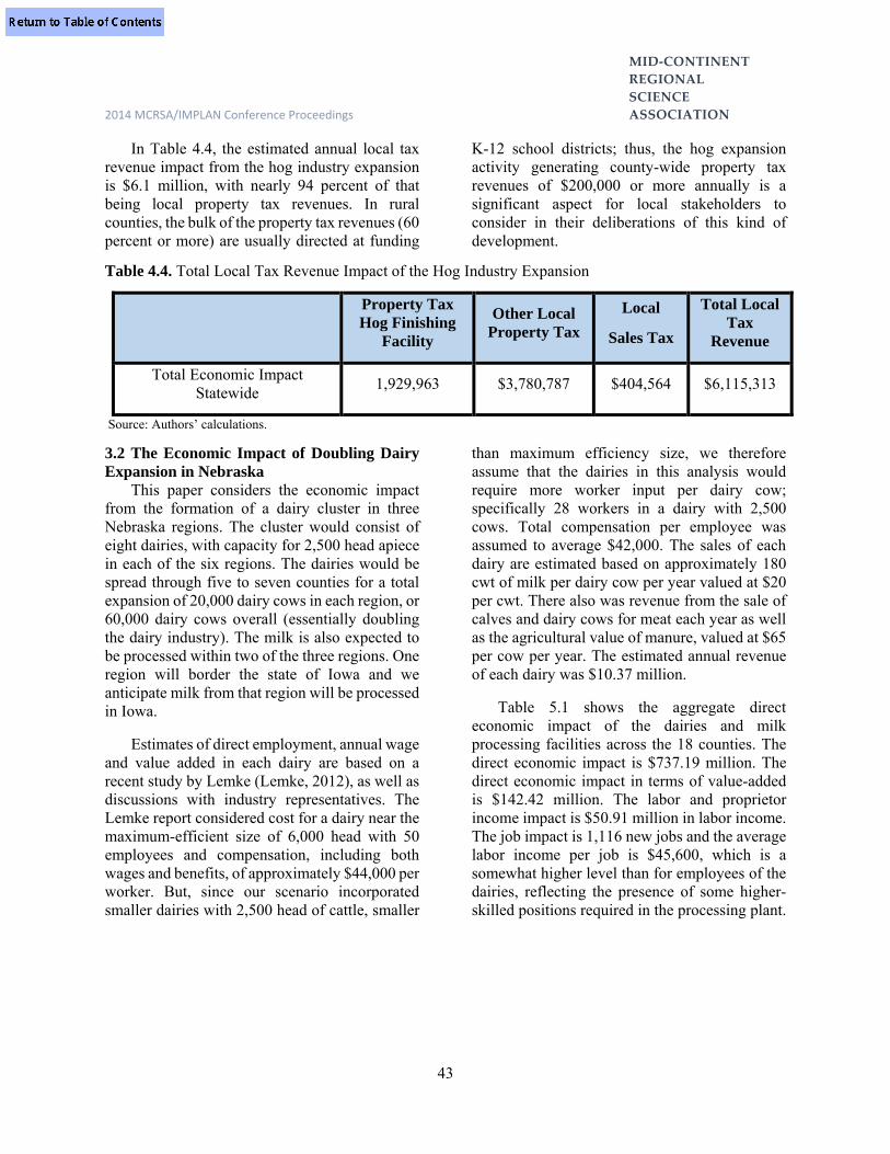
MID‐CONTINENT
REGIONAL
SCIENCE
2014 MCRSA/IMPLAN Conference Proceedings ASSOCIATION
43
In Table 4.4, the estimated annual local tax revenue impact from the hog industry expansion is $6.1 million, with nearly 94 percent of that being local property tax revenues. In rural counties, the bulk of the property tax revenues (60 percent or more) are usually directed at funding
K-12 school districts; thus, the hog expansion activity generating county-wide property tax revenues of $200,000 or more annually is a significant aspect for local stakeholders to consider in their deliberations of this kind of development.
Table 4.4. Total Local Tax Revenue Impact of the Hog Industry Expansion
Property Tax Hog Finishing
Facility
Other Local Property Tax
Local
Sales Tax
Total Local Tax
Revenue
Total Economic Impact Statewide 1,929,963 $3,780,787 $404,564 $6,115,313
Source: Authors’ calculations.
3.2 The Economic Impact of Doubling Dairy Expansion in Nebraska
This paper considers the economic impact from the formation of a dairy cluster in three Nebraska regions. The cluster would consist of eight dairies, with capacity for 2,500 head apiece in each of the six regions. The dairies would be spread through five to seven counties for a total expansion of 20,000 dairy cows in each region, or 60,000 dairy cows overall (essentially doubling the dairy industry). The milk is also expected to be processed within two of the three regions. One region will border the state of Iowa and we anticipate milk from that region will be processed in Iowa.
Estimates of direct employment, annual wage and value added in each dairy are based on a recent study by Lemke (Lemke, 2012), as well as discussions with industry representatives. The Lemke report considered cost for a dairy near the maximum-efficient size of 6,000 head with 50 employees and compensation, including both wages and benefits, of approximately $44,000 per worker. But, since our scenario incorporated smaller dairies with 2,500 head of cattle, smaller
than maximum efficiency size, we therefore assume that the dairies in this analysis would require more worker input per dairy cow; specifically 28 workers in a dairy with 2,500 cows. Total compensation per employee was assumed to average $42,000. The sales of each dairy are estimated based on approximately 180 cwt of milk per dairy cow per year valued at $20 per cwt. There also was revenue from the sale of calves and dairy cows for meat each year as well as the agricultural value of manure, valued at $65 per cow per year. The estimated annual revenue of each dairy was $10.37 million.
Table 5.1 shows the aggregate direct economic impact of the dairies and milk processing facilities across the 18 counties. The direct economic impact is $737.19 million. The direct economic impact in terms of value-added is $142.42 million. The labor and proprietor income impact is $50.91 million in labor income. The job impact is 1,116 new jobs and the average labor income per job is $45,600, which is a somewhat higher level than for employees of the dairies, reflecting the presence of some higher-skilled positions required in the processing plant.

MID‐CONTINENT
REGIONAL
SCIENCE
2014 MCRSA/IMPLAN Conference Proceedings ASSOCIATION
44
Table 5.1. Total Direct Economic Impact of the Dairy Industry Expansion
Jobs Labor and
Proprietor Income Value-Added Output
Total Direct Impact Statewide 1,116 $50,910,995 $142,421,851 $737,185,590
Source: Authors’ calculations using IMPLAN model
The total multiplier impact is $369.43 million in output and over 2,012 jobs.
The total economic impact of the dairy industry expansion on the state of Nebraska is $1,106.61 million (Table 5.2). The total
economic impact in terms of value-added is $301.3 million, and the total proprietor and labor income impact is $129.4 million, spread over 3,128 new jobs added to the state’s employment role. This is an average annual compensation of $41,400 per job, including wages and benefits.
Table 5.2. Total Multiplier Economic Impact of the Dairy Industry Expansion
Jobs Labor and
Proprietor Income Value-Added Output
Total Economic Impact Statewide
3,128 $129,433,527 $301,300,802 $1,106,614,627
Source: Authors’ calculations using IMPLAN model
Table 5.3 shows the total annual local tax revenue impact is $6.19 million. The largest source is other property tax revenue generated due to the multiplier effect. The property tax
revenue from the dairy facilities is the second largest revenue source. Sales taxes account for a fairly small share of local tax revenues.
Table 5.3: Total Local Tax Revenue Impact of the Dairy Industry Expansion
Property Tax Dairy Facility
Other Local Property Tax
Local
Sales Tax
Total Local Tax
Revenue
Total Tax Impact Statewide $1,451,169 $4,233,271 $501,427 $6,185,867
Source: Authors’ calculations
3.3 Economic Impact of Ten Percent Increase in Fed Cattle Production in Nebraska
We calculated the ongoing annual economic impact of the ten percent increase in fed cattle production and processing throughout Nebraska. We assumed that both production and processing can be accommodated in existing feedlots and the three major existing processing facilities in the
state. Roughly one-third of new processing is projected to occur at each of the three plants.
Table 6.1 shows the aggregate direct economic impact of expanded cattle production and beef processing across Nebraska. The direct economic impact is $2,145.78 million; the direct economic impact in terms of value-added is $281.68 million; the labor income impact is

MID‐CONTINENT
REGIONAL
SCIENCE
2014 MCRSA/IMPLAN Conference Proceedings ASSOCIATION
45
$172.51 million; and the jobs impact is 4,362 positions, with the average labor income per job of $39,500.
Table 6.1 Total Direct Economic Impact of the Cattle Industry Expansion
Jobs Labor Income Value-Added Output
Direct Economic Impact Statewide 4,362 $172,513,639 $281,682,547 $2,145,780,495
Source: Authors’ calculations using IMPLAN model
The total economic impact of cattle industry expansion on the state of Nebraska is $3,421.1 million of output (Table 6.2). The total economic impact in terms of value-added is $776.2 million, and the total labor income impact (including
proprietor income) is $447 million; spread over 11,661 jobs added to the state’s employment role. This is an average annual compensation $38,300 per job, including wages and benefits.
Table 6.2 Total Multiplier Economic Impact of the Cattle Industry Expansion
Jobs Labor Income Value-Added Output
Total Economic Impact Statewide 11,661 $446,990,074 $776,198,943 $3,421,064,874
Source: Authors’ calculations using IMPLAN model
Table 6.3 shows the total annual local tax revenue impact to be $16.12 million. The largest source is other property tax revenue generated
due to the multiplier effect. Sales taxes account for a fairly small share of local tax revenues.
Table 6.3 Total Local Tax Revenue Impact of Cattle Production and Beef Processing Counties
Other Local
Property Tax
Local
Sales Tax
Total Local Tax Revenue
Total Tax Impact Statewide $14,573,034 $1,545,490 $16,118,524
Source: Authors’ calculations
3.4 Economic Impact of Poultry Expansion The scenario assumed an expansion of 20
million layers in the state, located in the two regions where most egg production is currently — the northeast and the southeast regions of the state.
As seen in Table 7.1, when direct and multiplier impacts are combined, the total economic impact of this expansion would create
1,640 jobs, of which 67 percent would be located in the two regions with the remainder in the rest of the state. Labor income from the expansion would exceed $92 million annually, with 72 percent of those earnings accruing in the two regions. The contribution to the state’s economy in terms of value-added would be nearly $153 million, of which about 71 percent would be located in the economies of the two regions. The annual economic impact would be $606 million.
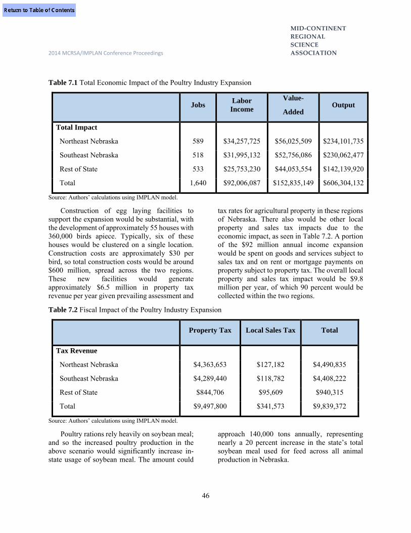
MID‐CONTINENT
REGIONAL
SCIENCE
2014 MCRSA/IMPLAN Conference Proceedings ASSOCIATION
46
Table 7.1 Total Economic Impact of the Poultry Industry Expansion
Jobs Labor
Income
Value-
Added Output
Total Impact
Northeast Nebraska 589 $34,257,725 $56,025,509 $234,101,735
Southeast Nebraska 518 $31,995,132 $52,756,086 $230,062,477
Rest of State 533 $25,753,230 $44,053,554 $142,139,920
Total 1,640 $92,006,087 $152,835,149 $606,304,132
Source: Authors’ calculations using IMPLAN model.
Construction of egg laying facilities to support the expansion would be substantial, with the development of approximately 55 houses with 360,000 birds apiece. Typically, six of these houses would be clustered on a single location. Construction costs are approximately $30 per bird, so total construction costs would be around $600 million, spread across the two regions. These new facilities would generate approximately $6.5 million in property tax revenue per year given prevailing assessment and
tax rates for agricultural property in these regions of Nebraska. There also would be other local property and sales tax impacts due to the economic impact, as seen in Table 7.2. A portion of the $92 million annual income expansion would be spent on goods and services subject to sales tax and on rent or mortgage payments on property subject to property tax. The overall local property and sales tax impact would be $9.8 million per year, of which 90 percent would be collected within the two regions.
Table 7.2 Fiscal Impact of the Poultry Industry Expansion
Property Tax Local Sales Tax Total
Tax Revenue
Northeast Nebraska $4,363,653 $127,182 $4,490,835
Southeast Nebraska $4,289,440 $118,782 $4,408,222
Rest of State $844,706 $95,609 $940,315
Total $9,497,800 $341,573 $9,839,372
Source: Authors’ calculations using IMPLAN model.
Poultry rations rely heavily on soybean meal; and so the increased poultry production in the above scenario would significantly increase in-state usage of soybean meal. The amount could
approach 140,000 tons annually, representing nearly a 20 percent increase in the state’s total soybean meal used for feed across all animal production in Nebraska.

MID‐CONTINENT
REGIONAL
SCIENCE
2014 MCRSA/IMPLAN Conference Proceedings ASSOCIATION
47
3.5 Economic Impact of a Pork Plant Closure in Nebraska
Table 8.1 below shows the direct economic impact from the loss of a hypothetical Nebraska pork processing plant. The direct impacts are substantial. The decline in economic output would be $635.39 million on an annual basis, including $71.90 million in value-added. There would be a loss of $61.50 million each year in
labor income, spread over an estimated 1,426 jobs. Essentially all of these impacts would be occurring in non-metropolitan Nebraska. And while the brunt of the impacts would occur within the economy of the county where the plant closing occurs, there would inevitably be negative economic spillovers into surrounding counties where the commuter portion of the workforce reside.
Table 8.1 Direct, Multiplier and Total Economic Impact from Loss of Pork Processing Facility in Nebraska
Jobs Labor Income Value-Added Output
Direct Impact -1,426 -$61,502,955 -$71,897,539 -$635,385,834
Multiplier Impact -578 -$38,553,636 -$19,476,750 -$208,510,283
Total Impact -2,004 -$100,056,591 -$91,374,289 -$843,896,116
Source: Authors’ calculations using IMPLAN model
4.0 Conclusion
Table 9 summarizes the four expansion scenarios and the various impact metrics. In terms of the economic impacts of these various expansions relative to the total Nebraska economy, the impact may seem relatively modest. As of 2010, the state’s animal industry generated 106,000 jobs (8.7 percent of total state employment), $4.2 billion of labor income (7.9 percent of total labor earnings in the state), and $7.7 billion of gross state product (8.7 percent of
Nebraska’s total GDP). Even the combined effect of all the expansion scenarios occurring would total 19,040 jobs (18 percent increase in job numbers of the animal industry and a 1.5 percent increase of total state employment numbers); $784 million of additional labor income (19 percent increase for the animal industry and a 1.5 percent increase for the state economy); and $1.4 billion of gross state product (6.3 percent increase for the animal industry resulting in a 1.7 percent increase to Nebraska’s total economy).

MID‐CONTINENT
REGIONAL
SCIENCE
2014 MCRSA/IMPLAN Conference Proceedings ASSOCIATION
48
Table 9 Summary of Livestock Expansion Impacts
IMPACTS
LIVESTOCK EXPANSION SCENARIOS
25% Increase in Market-
Weight Hogs
Doubling of State Dairy
Cow Numbers
10% Increase in Fed Cattle Production
Tripling of Egg
Production
Annual Livestock Number Increase
1,300,000 hd. 60,000 hd. 560,000 hd. 20 mi. layers
Economic Impacts (Annual): Employment Numbers 2,700 3,100 11,600 1,640 Labor Income $116 mi. $129 mi. $447 mi. $90 mi. Value-Added Activity $185 mi. $301 mi. $776 mi. $153 mi. Local Tax Impacts (Annual): Property Tax (Facilities) $1,930,000 $1,451,000 $250,000 $6,500,000 Property Tax (Other) $3,781,000 $4,233,000 $14,573,000 $2,958,400 Local Sales Tax $405,000 $501,000 $1,545,000 $341,600 Total Local Tax Revenue $6,116,000 $6,186,000 $16,118,000 $9,800,000
Revenue Value of Manure (Annual)
$6,180,000 $1,200,000 $8,400,000 a. a. Not available
However, as previously noted, the economic
impacts of livestock expansion occur almost entirely in non-metropolitan Nebraska and often are widely distributed across rural counties. Here is where the “economic footprint” can be, and is, particularly significant. For example, in a typical rural county the addition of 50 to 75 jobs with wage levels above county averages would be quite beneficial to that county’s economy. In many instances, this converts to young people having the opportunity for returning to the rural community and joining an existing family farm or starting a new business.
More employment opportunities mean a growing work force and income earnings to sustain more households in the community. Moreover, 500 or more jobs added from a new or expanded processing facility represents a powerful economic expansion that spills across the entire multi-county regional economy. Bottom line: few—if any—other economic development alternatives could boast of comparable job and income outcomes for the
rural agricultural-based economy. But in addition, these value-added effects of further livestock development essentially can provide greater economic diversity and resiliency to those rural economies that embrace it. To a large extent, the crop and livestock sectors tend to counter-balance one another in terms of profitability from year to year; which in turn can provide more stable economic conditions for rural main-street.
References Barkema, Alan, M. Drabenstott and J. Stanley. “Processing Food in Farm States: An Economic Development Strategy for the 1990s.” Economic Review, Federal Reserve Bank of Kansas City, July-August 1990. Brooks, K. and B. Lubben, (Forthcoming). Nebraska Livestock Industry White Paper. Lincoln, Nebraska, Department of Agricultural Economics, University of Nebraska-Lincoln.

MID‐CONTINENT
REGIONAL
SCIENCE
2014 MCRSA/IMPLAN Conference Proceedings ASSOCIATION
49
Conley D., (September 23, 2013). Personal Interview, Department of Agricultural Economics, University of Nebraska-Lincoln. Economic Research Service, USDA, (November 26, 2013).”U.S. and State-Level Farm Income and Wealth Statistics.” Retrieved from http://www.ers.usda.gov/data-products/farm-income-wealth. Jansen, J., K. Brooks and B. Johnson, (2013, July). “U.S. Livestock Industry Trends and Nebraska’s Role.” Report EC863 Lincoln, Nebraska, University of Nebraska Extension. Jansen, J. and B. Johnson, (2013, November). “Nebraska’s Irrigated Acreage Continues to Grow.” Cornhusker Economics, 11/20/2013, Lincoln, Nebraska, Department of Agricultural Economics, University of Nebraska-Lincoln. Lempke, K. (2012). “Estimated Effects of a Model Dairy Operated in Northeast Nebraska.”
Economic Development Department, Nebraska Public Power District. Lemke, Kenneth M., 2013. “Economic Impact Assessment for a 4,400-Pig, Wean to Finish Facility in Non-Metropolitan, Nebraska.” Economic Development Department, Nebraska Public Power District. Murthy, A., and F.W. Cubbage .2004. An Economic Analysis of Forest Products and Nature-Based Tourism Sectors in North Carolina. Southern Rural Sociology, 20(1). Peterson, D. and R. Frederick, (November, 2002). “Agriculture, Livestock Production and the Nebraska Economy.” The Nebraska Agricultural Industry Partnership. Thompson, Eric, B. Johnson and A. Giri, (2012). “The 2010 Economic Impact of the Nebraska Agricultural Production Complex,” Report No. 192, Department of Agricultural Economics, University of Nebraska-Lincoln.

MID‐CONTINENT
REGIONAL
SCIENCE
2014 MCRSA Conference Proceedings ASSOCIATION
50
THE ECONOMIC IMPACT OF A PROPOSED RESIDENTIAL HOUSING DEVELOPMENT
ON A COUNTY ECONOMY
Derek Bjonback Purdue University North Central
Abstract This is a summary of a consulting report prepared for a client, a single family residential property developer located in Porter County, in northwest Indiana. The report applies the IMPLAN input-output model to data provided by the client estimate the economic impact of the ten-year construction phase of the project, and long term economic effects of the project on the Porter County economy.
1.0 Introduction
Grand Oaks LLC is planning to construct 460 single family residential units over a ten year period in Porter County, Indiana. This study documents the economic impact of this project and related infrastructure developments, and the long term economic impact of the attraction of new in-migrating households upon the Porter County economy.
This study was completed during 2010. Grand Oaks LLC is still in the process (as of May 2014) of seeking governmental approvals to proceed with the project.
Porter County is located in the northwest corner of Indiana, and is part of the Chicago-Naperville-Elgin IL-IN-WI Metropolitan Statistical Area. Downtown Chicago is about 50 miles, or about a one hour commute away. The county has benefited from close proximity to Chicago in terms of in-migration of households that work in Chicago, utilizing convenient commuter rail connections. Population of the county, estimated for 2013 is 166,557. (Stats Indiana).
Three of the largest integrated steel mills in the nation are located in Porter County and adjacent Lake County, Indiana. These mills provide high income job opportunities. With access to Chicago, and local labor market conditions, the per capita income in 2012 of
Porter County is $46,907, which exceeds both the nation at $43,735, and Indiana at $38,119. (Stats Indiana)
Population growth for Porter County has also exceeded national benchmarks. Indiana in general is a low population growth state. From 2000 to 2013, population grew 13.5% in Porter County, which exceeded the national rate of 12.3%. For the state of Indiana, population grew 8.1% for this period. (Stats Indiana). Porter County is a relatively attractive location for new residential property developments. 2.0 Overall Project Effects
The Grand Oaks project will directly inject $129.4 million of new spending into the Porter County economy during the ten-year build out of the initial development. An input-output model for Porter County, obtained from the Minnesota IMPLAN Group Inc. is used to estimate the indirect and induced impacts for output, income and employment for the project. The base year of the model is 2008. All dollar values are expressed as 2008 dollars. Considering indirect impacts on activities that supply products and services to the project, and the induced impacts of increased consumer expenditures, this impact is increased to $202.3 million of new spending. Over the ten-year construction phase, the direct, indirect, and induced effects of the project will result in the creation of 156 jobs annually.

MID‐CONTINENT
REGIONAL
SCIENCE
2014 MCRSA Conference Proceedings ASSOCIATION
51
Cumulatively over ten years, the project is estimated to increase in labor income by $76.4 million and to increase total income in the county by $98.9 million, which includes labor and business income, and taxes paid.
After the construction phase is completed, there are long term economic impacts that will remain in perpetuity. It is forecast (by Grand Oaks LLC) that 300 out of the 460 new homes will be occupied by new residents to Porter County. The new residents will generate an expenditure stream of $14.9 million per year, which will support 139 jobs over the long term. They will also contribute directly annually $978,000 in local property taxes after year 10. The impact of new resident spending will generate annually $1,190,000 in state and local taxes paid.
Summary Tables 1 to 3 below provide a broad overview of the results of the impact study. The detailed technical report following the tables provides the details on the study methods and analytical procedures.
The first two summary tables refer to impacts on the Porter County economy during the construction phase of the project. This phase includes the year-by-year construction of new homes, and the installation of infrastructure to support the development. This includes streets, sewer and water, electric, and natural gas utilities. A detailed annual report is found in Table 1.
After year ten, the impacts of the construction phase will cease. However, there will be some longer term, sustaining economic impacts that are important. Summary Table 3 indicates that average annual consumer spending will be $14.9 million per year higher, and the employment base will be 139 jobs larger, due to the project. This is a consequence of the in migration of 300 households to Porter County, who now reside in the project area. This new spending will create a long term increase in economic activity, employment, and tax base for the county.
Summary Table 1. Grand Oaks Project: Direct Project Impacts on the Porter County Economy (millions of 2008 dollars, except for jobs)
Average Annual
Spending
Ten Year Total
Spending
Ten Year Labor Income
Ten Year
Total Income
Annual
Jobs New Home Construction
11.9 119.4 48.3 49.2 82
Infrastructure 1.0 10.0 3.4 6.1 5 Total Direct Impacts
12.9 129.4 51.7 55.3 87
Summary Table 2. Grand Oaks Project: Direct, Indirect, and Induced Project Impacts on the Porter County Economy (in millions of 2008 dollars, except for jobs).
Average Annual
Spending
Ten Year Total
Spending
Ten Year Labor Income
Ten Year Total Income
Annual Jobs
Total Direct, Indirect, and Induced Impacts
20.2
202.3
76.4
98.9
156

MID‐CONTINENT
REGIONAL
SCIENCE
2014 MCRSA Conference Proceedings ASSOCIATION
52
Summary Table 3. Grand Oaks Project: Households that have moved to Porter County- Economic Impacts of Expenditures and Impacts on Property Taxes (Annually, after the ten year construction cycle) (millions of 2008 dollars, except for jobs)
Household
Expenditures
Jobs Related to Expenditures
State and Local Taxes Related to
Expenditures
Local Property
Taxes Paid 14.9 139 1,191,000 978,000
3.0 Detailed Report and Tables Table 1 provides the year-by-year detail for the flow of investment in housing and infrastructure. Infrastructure investments are concentrated during the early phase, as water, sewer, electric, and natural gas service, and road access are required before construction can begin. There is a
gradual ramping up of home construction over the period. It is expected that about 300 out of the 460 homes that are built will be purchased and occupied by an in migrating household to Porter County. These in migrating households constitute a new stream of spending to the county economy.
The data in Table 1 are used as the drivers for the economic impact analysis.
The IMPLAN model calculates the direct, indirect, and induced impacts of the construction expenditures for housing and infrastructure, and the new household expenditures from in
migrating households. Direct impacts include the actual construction impacts on directly supplying industries, such as the residential construction industry and building materials retailers. Indirect impacts include for example the subsequent impacts on spending by the residential construction building materials retailers in order
Table 1 GRAND OAKS PROJECT: ECONOMIC IMPACT STUDY
Project Specifications
Units Dollar
Dollar Value Occupied Value
New Home Units by Households Infrastructure
Year Construction Built Moving to County Investment
1 8,750,000 34 22 2,400,000
2 10,465,000 40 26 1,900,000
3 11,935,000 46 30 1,500,000
4 11,935,000 46 30 1,200,000
5 12,390,000 48 31 1,000,000
6 12,390,000 48 31 400,000
7 12,390,000 48 31 400,000
8 12,950,000 50 33 400,000
9 12,950,000 50 33 400,000
10 13,195,000 50 33 400,000
Total 119,350,000 460 300 10,000,000
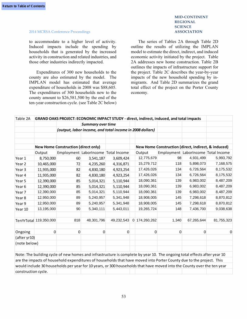
MID‐CONTINENT
REGIONAL
SCIENCE
2014 MCRSA Conference Proceedings ASSOCIATION
53
to accommodate to a higher level of activity. Induced impacts include the spending by households that is generated by the increased activity in construction and related industries, and those other industries indirectly impacted.
Expenditures of 300 new households to the county are also estimated by the model. The IMPLAN model has estimated that average expenditure of households in 2008 was $88,605. The expenditures of 300 households new to the county amount to $26,581,500 by the end of the ten-year construction cycle. (see Table 2C below)
The series of Tables 2A through Table 2D outline the results of utilizing the IMPLAN model to estimate the direct, indirect, and induced economic activity initiated by the project. Table 2A addresses new home construction. Table 2B outlines the impacts of infrastructure support for the project. Table 2C describes the year-by-year impacts of the new household spending by in-migrants. And Table 2D summarizes the grand total effect of the project on the Porter County economy.
Table 2A GRAND OAKS PROJECT: ECONOMIC IMPACT STUDY ‐ direct, indirect, induced, and total impacts
Summary over time
(output, labor income, and total income in 2008 dollars)
New Home Construction (direct only) New Home Construction (direct, indirect, & induced)
Output Employment LaborIncome Total Income Output Employment LaborIncome Total Income
Year 1 8,750,000 60 3,541,187 3,609,424 12,775,679 98 4,931,499 5,993,792
Year 2 10,465,000 72 4,235,260 4,316,871 15,279,712 118 5,898,073 7,168,575
Year 3 11,935,000 82 4,830,180 4,923,254 17,426,026 134 6,726,564 8,175,532
Year 4 11,935,000 82 4,830,180 4,923,254 17,426,026 134 6,726,564 8,175,532
Year 5 12,390,000 85 5,014,321 5,110,944 18,090,361 139 6,983,002 8,487,209
Year 6 12,390,000 85 5,014,321 5,110,944 18,090,361 139 6,983,002 8,487,209
Year 7 12,390,000 85 5,014,321 5,110,944 18,090,361 139 6,983,002 8,487,209
Year 8 12,950,000 89 5,240,957 5,341,948 18,908,005 145 7,298,618 8,870,812
Year 9 12,950,000 89 5,240,957 5,341,948 18,908,005 145 7,298,618 8,870,812
Year 10 13,195,000 90 5,340,111 5,443,011 19,265,724 148 7,436,700 9,038,638
TenYrTotal 119,350,000 818 48,301,796 49,232,543 0 174,260,262 1,340 67,265,644 81,755,323
Ongoing 0 0 0 0 0 0 0 0
(after yr10)
(note below)
Note: The building cycle of new homes and infrastructure is complete by year 10. The ongoing total effects after year 10
are the impacts of household expenditures of households that have moved into Porter County due to the project. This
would include 30 households per year for 10 years, or 300 households that have moved into the County over the ten year
construction cycle.

MID‐CONTINENT
REGIONAL
SCIENCE
2014 MCRSA Conference Proceedings ASSOCIATION
54
Table 2B GRAND OAKS PROJECT: ECONOMIC IMPACT STUDY ‐ direct, indirect, induced, and total impacts
Summary over time
(output, labor income, and total income in 2008 dollars)
Infrastructure Support for Infrastructure Support for
New Home Construction (direct only) New Home Construction (direct, indirect, & induced)
Output Employment LaborIncome Total Income Output Employment LaborIncome Total Income
Year 1 2,400,000 13 847,878 1,521,447 3,215,456 20 1,146,789 2,010,662
Year 2 1,900,000 9 638,018 1,161,031 2,509,852 15 860,038 1,526,176
Year 3 1,500,000 7 505,563 919,043 1,983,468 12 681,663 1,208,558
Year 4 1,200,000 6 397,364 725,965 1,579,155 9 535,125 952,852
Year 5 1,000,000 5 331,137 604,971 1,315,962 8 445,938 794,043
Year 6 400,000 2 132,455 241,988 526,385 3 178,375 317,617
Year 7 400,000 2 132,455 241,988 526,385 3 178,375 317,617
Year 8 400,000 2 132,455 241,988 526,385 3 178,375 317,617
Year 9 400,000 2 132,455 241,988 526,385 3 178,375 317,617
Year 10 400,000 2 132,455 241,988 526,385 3 178,375 317,617
TenYrTotal 10,000,000 49 3,382,232 6,142,399 13,235,815 78 4,561,428 8,080,378
Ongoing 0 0 0 0 0 0 0 0
(after yr10)
(note below)
Note: The building cycle of new homes and infrastructure is complete by year 10. The ongoing total effects after year 10
are the impacts of household expenditures of households that have moved into Porter County due to the project. This
would include 30 households per year for 10 years, or 300 households that have moved into the County over the ten year
construction cycle.

MID‐CONTINENT
REGIONAL
SCIENCE
2014 MCRSA Conference Proceedings ASSOCIATION
55
Table 2C GRAND OAKS PROJECT: ECONOMIC IMPACT STUDY ‐ direct, indirect, induced, and total impacts
Summary over time
(output, labor income, and total income in 2008 dollars)
New Household Expenditure (direct only) New Household Expenditure (direct, indirect, & induced)
Output Employment LaborIncome Total Income
Year 1 1,949,310 1,088,642 10 337,935 666,472
Year 2 2,303,730 1,286,577 12 399,378 787,649
Year 3 2,658,150 1,484,512 14 460,821 908,826
Year 4 2,658,150 1,484,512 14 460,821 908,826
Year 5 2,746,755 1,533,996 14 476,181 939,120
Year 6 2,746,755 1,533,996 14 476,181 939,120
Year 7 2,746,755 1,533,996 14 476,181 939,120
Year 8 2,923,965 1,632,963 15 506,903 999,709
Year 9 2,923,965 1,632,963 15 506,903 999,709
Year 10 2,923,965 1,632,963 15 506,903 999,709
TenYrTotal 26,581,500 14,845,121 139 4,608,208 9,088,260
Ongoing 26,581,500 14,845,121 139 4,608,208 9,088,260
(after yr10)
(note below)
Note: The building cycle of new homes and infrastructure is complete by year 10. The ongoing total effects after year 10
are the impacts of household expenditures of households that have moved into Porter County due to the project. This
would include 30 households per year for 10 years, or 300 households that have moved into the County over the ten year
construction cycle.

MID‐CONTINENT
REGIONAL
SCIENCE
2014 MCRSA Conference Proceedings ASSOCIATION
56
Table 3 describes the impact of the project on state and local government taxes. Column 1, “New Homes, Property Taxes” is estimated using the sales price of homes built and sold each year, and a 1 percent property tax rate. The three following columns to the right document the direct, indirect, and induced impact of the project on tax receipts. This includes the impact on taxes of the construction of new homes, new infrastructure, and the introduction of new households to the county. Total tax receipts are about $1 million annually for 10 years.
After the construction phase is completed,
Table 3 demonstrates that $978,260 in property taxes annually will be paid by households that in migrated to Porter County during the construction phase. Also, these re-located households by the presence in the County will be generating economic activity, through retail and service businesses for example, that will be paying $1,190,710 in state and local taxes.
Table 2D GRAND OAKS PROJECT: ECONOMIC IMPACT STUDY ‐ direct, indirect, induced, and total impacts
Grand Total Summary over time
(output, labor income, and total income in 2008 dollars)
New Home Construction and Infrastructure New Home Construction, Infrastructure Support, and
Support (direct only). Not including new househ. Exp. New Household Expenditure (direct, indirect, & induced)
Output Employment LaborIncome Total Income Output Employment LaborIncome Total Income
Year 1 11,150,000 73 4,389,065 5,130,871 17,079,777 128 6,416,223 8,670,926
Year 2 12,365,000 81 4,873,278 5,477,902 19,076,142 144 7,157,489 9,482,400
Year 3 13,435,000 89 5,335,743 5,842,297 20,894,006 160 7,869,048 10,292,917
Year 4 13,135,000 88 5,227,544 5,649,219 20,489,693 157 7,722,511 10,037,211
Year 5 13,390,000 90 5,345,458 5,715,915 20,940,319 161 7,905,121 10,220,373
Year 6 12,790,000 87 5,146,776 5,352,933 20,150,742 156 7,637,559 9,743,947
Year 7 12,790,000 87 5,146,776 5,352,933 20,150,742 156 7,637,559 9,743,947
Year 8 13,350,000 91 5,373,412 5,583,936 21,067,353 164 7,983,896 10,188,138
Year 9 13,350,000 91 5,373,412 5,583,936 21,067,353 164 7,983,896 10,188,138
Year 10 13,595,000 92 5,472,565 5,685,000 21,425,072 166 8,121,978 10,355,964
TenYrTotal 129,350,000 868 51,684,028 55,374,943 202,341,198 1,557 76,435,280 98,923,961
Ongoing 0 0 0 0 14,845,121 139 4,608,208 9,088,260
(after yr10)
(note below)
Note: The building cycle of new homes and infrastructure is complete by year 10. The ongoing total effects after year 10
are the impacts of household expenditures of households that have moved into Porter County due to the project. This
would include 30 households per year for 10 years, or 300 households that have moved into the County over the ten year
construction cycle.

MID‐CONTINENT
REGIONAL
SCIENCE
2014 MCRSA Conference Proceedings ASSOCIATION
57
4.0 Conclusions
The Grand Oaks project will generate
substantial economic impacts within the county during the construction phase. These benefits will continue over the long run after the project is completed. Long term economic benefits include the increase in the property tax base, and positive effects on state and local government revenues, as well as continuing economic activity generated by the 300 new households attracted to the county. New economic activity will be generated
related to providing goods and services for these households, which amount to 139 jobs and $4.6 million in labor income over the long term (Table 2C).
References Minnesota IMPLAN Group Inc. (2010) IMPLAN Software and Data, 2008. Stats Indiana (2014) Official digital data center for the State of Indiana, www.statsindiana.edu.
Table 3 GRAND OAKS PROJECT: ECONOMIC IMPACT STUDY ‐
direct, indirect, induced, and total impacts
Summary over time: Implications for State and Local Taxes (in 2008 dollars)
New Homes State&Local State&Local State&Local Total
Property Taxes, new Taxes, new Taxes, new State&Local
Taxes construction infrastructure households Taxes
Year 1 110,000 579,560 198,221 87,319 975,100
Year 2 131,500 642,714 156,093 103,195 1,033,501
Year 3 150,000 698,331 123,278 119,071 1,090,680
Year 4 150,000 682,737 98,445 119,071 1,050,253
Year 5 155,750 695,992 82,037 123,040 1,056,819
Year 6 155,750 664,805 32,815 123,040 976,409
Year 7 155,750 664,805 32,815 123,040 976,409
Year 8 162,750 693,913 32,815 130,978 1,020,455
Year 9 162,750 693,913 32,815 130,978 1,020,455
Year 10 165,750 706,647 32,815 130,978 1,036,190
TenYearTotal 1,500,000 6,723,415 822,148 1,190,710 10,236,272
Annual net 978,260 0 0 1,190,710 2,168,970
addition to
tax revenues
after year ten
Note: Ongoing property taxes of $1,500,000 per year are paid by households that
purchased and occupied the 460 homes in the development over the ten
year construction period. It is estimated that 300 homes are occupied by
in migrating households from outside the county. The ongoing property tax of
$978,000 is paid by these new households on an ongoing basis. This constitutes a
net addition to the property tax base, rather than a shift of property tax among
existing residents of Porter County.

MID‐CONTINENT
REGIONAL
SCIENCE
2014 MCRSA/IMPLAN Conference Proceedings ASSOCIATION
58
ECONOMIC IMPACTS OF THE EAGLE FORD SHALE: MODELING AND DATA ISSUES Javier Oyakawa University of Texas at San Antonio
Abstract Counties in South Texas involved in the development of the Eagle Ford Shale (EFS) have experienced an explosive increase in the demand and supply of EFS-related jobs. Traditional population and housing analyses are unable to use timely and accurate data to address these changes. The study provides a framework for a comprehensive understanding and forecasting of short- and medium-term changes in labor force, employment, population, migration and commuting activity in these areas that can help local, state and federal agencies develop appropriate policy actions to address those challenges not only in South Texas but also all over the country.
1.0 Introduction1,2
Initially named for its origins in the town of Eagle Ford, west of Dallas, Texas, the shale became the most important oil and gas field in the world. The number of drilling permits went from 26 in 2008 to more than 4,400 in 2013. This unprecedented growth took by surprise all experts, federal and state agencies.
The combination of horizontal drilling with hydraulic fracturing, favorable prices, existing infrastructure, and ready access to the Gulf Coast refining and petrochemical complex, has created the Eagle Ford Shale boom. “While the price of natural gas declined steadily after 2008, oil markets took a different path. Rising oil prices are attributed to a variety of causes, including low interest rates and a weaker dollar, but the primary factor is the growth of emerging markets such as Brazil, China, and India. When these nations recovered from global recession, oil demand increased and its price returned to high levels, while at the same time natural gas demand
1 The paper is a short version of the study presented at the Mid-Continent Regional Science Association/IMPLAN, Conference, on June 3-5, 2014, in Madison, Wisconsin. The title of that paper is: A Framework for the Study and Forecast of Labor Force, Employment, Population, Migration, and Commute Changes in the Eagle Ford Shale. Available in PDF format upon request. 2 Thanks to Robert McKinley, Dominique Halaby, Thomas Tunstall, and Mark Hager for their support at the Institute for Economic Development. The author also thanks
remained at low levels, and its price decreased dramatically. Then, natural gas producers moved to the Eagle Ford Shale quickly and easily, and they began to develop oil and condensate wells” (Gilmer, Hernandez, and Phillips, 2012).
Since 2011, the Center for Community and
Business Research (CCBR) from the Institute for Economic Development at the University of Texas at San Antonio (UTSA) has produced economic impact studies of the EFS. In the last two studies, 2012 and 2013, the main area of analysis was limited to 14 counties with active drilling and six surrounding counties. 3
With the exception of Webb, all counties
have populations below 60,000. The smallest is McMullen with a population of 726 followed by La Salle with 7,109. In almost all of the 14 counties, growth had been very slow or even negative between 2001 and 2010. With the exception of Webb and Wilson, all counties had average annual growth rates below the state rate
comments by Michael Cline and Rebekka Dudensing on an earlier version of this paper; however, any possible error in the study is the exclusive responsibility of the author. 3 The project was funded by the American Natural Gas Alliance; the alliance focused its attention on these 14 counties. In the first study of the series (Halaby, Oyakawa, and Shayne, 2011), there were 24 active counties included in the study according to the Texas Railroad Commission’s definition of the area.

MID‐CONTINENT
REGIONAL
SCIENCE
2014 MCRSA/IMPLAN Conference Proceedings ASSOCIATION
59
of 1.5 percent. After 2010, all counties showed positive growth with Dimmit (2.1 percent) having a higher annual growth than the state (1.6 percent). Karnes, McMullen, and Live Oak were
recovering from negative growth, but according to the official statistics, their average annual growth was still lower than the state.
Table 1
Source: Bureau of Economic Analysis regional accounts
Apparently, according to the official data, there were no population “booms” in these counties. Annual rates of growth below two percent seem to be within the boundaries of a “normal” growth. Our study discusses some of the limitations of these numbers. 1.1 Employment Data and Employment Impacts
A comparison of the differences between official employment data and estimates from economic impact studies uncovers the problems associated with the lack of appropriate official information for the region. As reported by the Texas Workforce Commission (TWC) a small
county as McMullen had a total non-farm employment of 136 in 2009 that grew up to 436 in 2011, most of the growth occurred in two super sectors: trade, transportation and utilities; and natural resources and mining. The majority of jobs in the latter sector is oil and gas related. Transportation jobs can be associated with the need of truck drivers to move water, sand, and equipment to where the wells were located.
In contrast, the following table shows the
Eagle Ford Shale impacts on production and employment in McMullen County in 2011, according to the CCBR study (Oyakawa et al., 2012a):

MID‐CONTINENT
REGIONAL
SCIENCE
2014 MCRSA/IMPLAN Conference Proceedings ASSOCIATION
60
Table 2
Estimated Impacts 2011
McMullen County
Direct Indirect Induced Total
Output (millions of $) $1,151 $30 $18 $1,200
Employment 1,335 277 320 1,932 Source: Oyakawa et al. (2012a)
For the 2011 impact study, the Eagle Ford Shale directly supported close to 1,300 jobs in McMullen County and a total of 1,900 jobs when considering indirect and induced impacts. There are clear differences with respect to the official data showing only 123 people working in the natural resources and mining (NRM) super sector. The economic impact study based its results on production values from the Texas Railroad Commission, and from private data providers. It also used results from previous economic impact studies in order to estimate the number of direct jobs needed per well. Given the amount of oil produced in McMullen County, the number of jobs related to the oil and gas industry has to be more than the 123 jobs shown in the official statistics, as it is explained in the next tables.
Table 3 shows the monthly oil production
estimates for November 2013 per county. It also shows the ranking of the top ten oil producing counties in Texas. The ranking shows McMullen County in sixth place with a production close to 2.3 million of barrels (bbls) of oil. De Witt County is in fifth place with little more than 2.3
million bbls of oil. La Salle County is in second place with close 3.5 million bbls, almost 50 percent more than McMullen. Table 3
Source: Texas RRC, Texas Monthly Oil and Gas Statistics, January 29, 2014
On the other hand, the next table shows employment data from the TWC (second quarter of 2013) for De Witt, McMullen, and La Salle.

MID‐CONTINENT
REGIONAL
SCIENCE
2014 MCRSA/IMPLAN Conference Proceedings ASSOCIATION
61
Table 4
Employment by Super Sector De Witt Mc Mullen La Salle
Industry Sector 2013 Q2 2013 Q2 2013 Q2
Total, All Industries 7,430 579 3,200
Natural Resources and Mining 620 200 1,423 Construction 553 0 193 Manufacturing 1,090 0 0 Trade, Transportation and Utilities 1,094 189 308 Information 26 0 0 Financial Activities 569 15 47 Professional and Business Services 241 5 125 Education and Health Services 1,897 0 335 Leisure and Hospitality 579 16 317 Other Services 157 4 24 Public Administration 601 65 427
Source: Texas Workforce Commission, QCEW data
De Witt’s employment in the NRM super sector was more than three times McMullen’s, despite their similar oil productions. Also in the table, employment in La Salle in the NRM super sector was more than seven times the NRM employment in McMullen, even though it only produced 50 percent more oil. These large differences in employment cannot be explained by productivity variations among the neighboring counties. When considering the amount of oil produced in McMullen, it is clear that its employment could not be as low as the TWC data shows. Even more, in the case of DeWitt and La Salle, official employment numbers do not include the numbers of self-employed or those living in RV parks and man camps, making those numbers underestimates of actual employment in the two counties. 1.2 Changes in Taxable Sales and in Employment
Changes in taxable sales and in employment also show important differences. The Federal
4 Taken from http://www.dallasfed.org/research/econdata/eagleford.cfm
Reserve Bank of Dallas shows both changes. 4 For the Eagle Ford area, taxable sales have increased annually at a rate of 14.8 percent. Some of the individual counties have had impressive growth in those years; for example, McMullen annual growth was 137.0 percent, Dimmit annual growth was 51.6 percent, and La Salle annual growth was 44.7 percent. These percentages are a lot higher than the employment changes. For the rest of Texas, taxable sales grew at an annual rate of 9.1 percent.
Employment changes were also relatively large in the Eagle Ford area but not as dramatic as the taxable sales changes. The whole area grew at an annual rate of 3.1 percent. Employment in McMullen grew at an annual rate of 27.6 percent, in Dimmit at 21.8 percent, and in La Salle grew at 20.7 percent. These rates are noticeable lower than the taxable sales rates of growth. The rest of Texas grew at an annual rate of 2.8 percent.

MID‐CONTINENT
REGIONAL
SCIENCE
2014 MCRSA/IMPLAN Conference Proceedings ASSOCIATION
62
While in the rest of Texas the difference between the growth rate of taxable sales and employment is 6.3 (the result of 9.1 minus 2.8), in the Eagle Ford area is 11.7 (the result of 14.8 minus 3.1). For McMullen this difference is 109.4, for Dimmit the difference is 29.8, and for La Salle is 24.0. These differences mean that on average every year in the last three years, taxable sales per employee increased 109. 4 percent in McMullen, 29.8 percent in Dimmit, and 24.0 percent in La Salle; while in the rest of Texas the increase was 6.3 percent every year.
The changes in taxable sales per employee seem to be too large in the case of the individual Eagle Ford counties, and they may indicate some issues with the employment data.
1.3 The Self-employed
As mentioned before, employment data from the BLS does not include the self-employed; even though there has been a dramatic increase in the number of this type of workers in recent years. Particularly, the oil and gas industries have seen a large increase in the numbers of self-employed.
The database provider Economic Modeling Specialists Intl. (EMSI), estimated the numbers of self-employed by industries for several states; they found in the mining sector “that the share of 1099 workers in this sector increased from 33% in 2005 to 53% in 2010, the biggest percentage jump among the 20 broadest-level sectors” (Wright, 2011). The mining, quarrying, and oil and gas extraction sector now has the third-highest share of contract workers, behind real estate (74 percent) and agriculture, forestry, fishing and hunting (68 percent). In the mining, quarrying, and oil and gas extraction sector the majority of the workers is self-employed. 1.4 Discrepancy between Production and Employment Data
In a related issue, Phillips et al. (2013) showed that current Bureau of Economic Analysis (BEA) values of Texas real gross domestic product in the oil and gas extraction sector do not correlate appropriately with employment and energy production in the state.
After analyzing the accounts, Phillips concludes, to simplify a solution, that in order to reestablish a correlation between the Texas real gross domestic product in the oil and gas extraction sector with employment data, it is necessary to use real BTU production values to estimate real gross domestic product for the oil and gas industries. This is another discrepancy between employment and the dollar value of production in national and regional accounts.
1.5 Hotels and the Oil and Gas Industries
The growing activities in oil and gas affect hotel revenues, room availability, and vacancy rates (Office of the Governor, 2014). Between 2012 and 2013, the counties with active drilling show notable increases due to the construction of new hotels in the areas. La Salle County shows an increase of more than 125 percent, while Dimmit shows an increase of more than 93 percent. Of some interest is the case of McMullen showing 57 rooms available in 2013 when it had zero rooms in 2012 (as in all previous years).
In contrast, counties like Dallas, Harris
(Houston), and Bexar showed reductions in the number of rooms available for the same years; this means that the increase in the number of rooms in the Eagle Ford area is not a State trend but a specific trend in the oil and gas impacted counties.
1.6 RV Parks and Man Camps
In Karnes County, the amount of RV parks has grown tremendously; the majority of them serving the oil and gas industry workers. “By rough count, Lonesome Creek is one of about 90 RV parks and man camps, which have cabins or larger mobile homes, scattered around Karnes county. More are being built all the time, and no one has a good count.” The County Judge estimated an increase in population close to 70 percent because of the Eagle Ford Shale (McCormack, 2013).
Anecdotal information indicates that
population numbers are very different from official statistics, and one of the main reasons explaining this difference is the proliferation of

MID‐CONTINENT
REGIONAL
SCIENCE
2014 MCRSA/IMPLAN Conference Proceedings ASSOCIATION
63
RV parks and man camps that are not accounted for in the Census data.
The city of Cotulla “has seen its population more than triple in the past two years, to ten thousand people; no fewer than thirteen new hotels have opened,” (Mealer, 2013).
1.7 Commuting
The Census Bureau produces information of workers’ commute from county to county. This information is published with some lag time; the most current data is for the year 2011. 5
In the case of Karnes County, the top oil producer in Texas, between 2007 and 2011, the county had an important increase in the number of workers living in the area, close to a 40 percent increase. The number of people living and employed in Karnes decreased from 1,343 to 1,113. Between 2007 and 2011, the percentages of people living in Karnes but worked outside the county grew from 3,135 to 5,184, a 65.4 percent increase.
On the other hand, the amount of people employed in Karnes, but living outside, increased from 999 to 1,580, this represents a 58 percent increase. In Karnes the inflow and outflow of workers have increased during the 2007-2011 period. Not only the percentage of people living and working in the county has decreased, from 30.0 to 17.7 percent but also the actual number of people has decreased from l, 343 to 1,113 people.
2.0 Employment, Population, and the “Boomtown Model”
The number of studies on rural areas impacted by natural resources is abundant, and in recent years it has increased even more due to shale gas and oil developments in new areas, like in the Bakken area and the Eagle Ford shale. During the 70s and the 80s, several studies on rural development depending on natural resources researched the problems of this type of growth, and as a result of those studies a framework of what is called “the boomtown
5 From Census site at: http://onthemap.ces.census.gov/
model” (Gilmore, 1976) emerged. The model shows that, on the one hand, the boom phase produces rapid and large increases in employment and population and, on the other hand, also brings negative effects in housing, social services, school population, crimes, and community life; even more, this development produces inflationary and income distribution issues together with environmental concerns.
The “boomtown model” has received some
criticism; and the effects of this type of growth are more likely to be determined by a larger number of factors than initially thought, like community size and its relative isolation. These factors will likely play a role in the communities affected by the Eagle Ford. Larger, more established and diversified communities will attract the largest population influx (as could happen in San Antonio and Bexar County) even when rural and isolated areas (like McMullen) are closer to the wells. Some studies have shown that construction workers related to the initial stages of these projects (like drilling and completion of wells) are more likely to take longer commutes than the more long-term type production workers. These long-term workers are more likely to take residency in the communities closer to the active wells (Jacquet, 2011).
Another line of research, also emphasizing
the negative impacts of the boomtown growth, is the so-called “resource curse” model. A study argues (Kay, 2011) that the literature on “resource curse” is mostly related to countries and not to regional economies within the United States; only some of the causes explaining the “curse” can be applied to communities in the U.S. For example, a case that does not apply to county areas is the so-called "Dutch disease" which affects terms-of-trade and relative prices through the exchange rate. The consensus is that the “resource curse” is not an inevitable path and that government policies could reduce its negative impacts. A different point of view, (Partridge and Weinstein, 2011), emphasized the crowding-out

MID‐CONTINENT
REGIONAL
SCIENCE
2014 MCRSA/IMPLAN Conference Proceedings ASSOCIATION
64
effects on industries losing workers to the high-paying jobs in the energy industries.
Jeffrey Frankel (2010) reviewed the literature on the “resource curse” at the country level and concluded that the “Natural Resource Curse should not be interpreted as a rule that resource rich countries are doomed to failure. The question is, what policies to adopt to increase the chances of prospering? It is safe to say that destruction or renunciation of resource endowments, to avoid dangers such as the corruption of leaders, will not be one of these policies.” It is likely that at the regional level it would be very difficult for local governments to stop these developments, unless there are serious damages to the environment or the well-being of the communities.
There are many different channels through which natural resources can have a negative impact on growth. A research by Koren and Tenreyro (2007) found that the excessive price volatility of natural resources leads to excessive volatility of the gross domestic product (GDP) growth rate in countries dependent on natural resources. They also established a channel by which overinvestment in natural resources crowds out other industries. Thus, when the price of whatever natural resource a country is dependent on falls, overall revenues fall and the state is unable to shift resources to other industries to make up for the shortfall. Therefore, GDP per capita would fluctuate with the price of the natural resource, which tends to be very volatile. This volatility in turn is responsible for the drop in GDP per capita. Another study (Ramey and Ramey, 2004) showed strong support for the idea that high volatility in GDP per capita leads to a sharp decrease in growth rates. They showed that volatility leads to uncertainty, which tends to depress factors like investment that lead to high growth.
A study found that the natural resource industries have positive impacts on per capita income but have small to no impact on employment growth (Deller and Shcreiber, 2012). This study also suggested that non-oil and gas mining activity is associated with slower
population growth. These results differ from the traditional “boomtown model” where employment and population growth are explosive. It is possible that their reliance on official employment data explains the small or negative results on employment and population growth in the short run. 3.0 Methodology Issues for the Eagle Ford Shale
It is necessary to address some methodological issues dealing with the modeling of impacts from the energy industry. Due to the absence of timely and accurate official data, economic impact studies have been providing, with different success, employment growth estimates in the areas impacted by the energy developments. These economic impact studies can be used in economic-demographic type of models for population projection and detailed employment forecasts. 3.1 The Number of Direct Jobs per Well
In a Pennsylvania study, Considine et al. (2009), presented an economic impact study of the Marcellus Shale. The authors used the well-known input-output software and database, IMPLAN, and estimated the direct, indirect, and induced impacts using expenditures information from oil and gas companies. The study assumed lease and royalty payments as direct impacts; these impacts played a very important role in their estimation of the jobs impacted by the natural gas industry; almost 69 percent of the direct expenditures corresponds to those payments. To forecast future production they used a regression with drilling activity as a function of the Henry Hub (gas) price.
A critical study of Considine et al., (Food & Water Watch, 2011), indicated that their study overestimated the number of direct jobs per well (calculated at around 31 direct jobs). The Food & Water Watch study estimated 13.9 direct jobs per well were needed after payments to landowners were excluded from the direct impacts.
A North Dakota study (Bangsund and Hodur, 2013) used an input-output model to estimate the

MID‐CONTINENT
REGIONAL
SCIENCE
2014 MCRSA/IMPLAN Conference Proceedings ASSOCIATION
65
contributions of the oil and gas industry in the state. This study assumes that the amount of lease and royalty received by landowners (deducting public land areas) are completely spent the same year they are received, even more, the study assumed these expenditures as direct impacts that generate secondary effects. Direct and indirect employment impacts are calculated in a different way and because of this methodology change, employment estimates are independent of the direct and indirect dollar impacts. The study discussed employment statistics from different sources: survey of oil and gas firms, Job Service of North Dakota, North Dakota Safety and Insurance, and employment coefficients from the Oil and Gas Division of the North Dakota Department of Mineral Resources. They combined these different sources to estimate secondary employment.
The North Dakota Department of Mineral Resources (Strom Center, n.d.) estimated the amount of jobs needed by oil wells with horizontal drilling; and found that “direct and indirect jobs” needed amount to 13 to 15 full-time-equivalent (FTE) jobs. Their definitions of direct and indirect jobs are different from the usual input-output modeling definitions and must be taken carefully for economic impact studies. The research also indicated that up to three FTE are needed for a new well in the Bakken Shale (this means that one job can take care of only 0.33 wells).
Another critical study of the Marcellus
economic impact studies found that natural gas firms created 3.7 “new jobs” per well (Fauro et al., 2013). They estimated a baseline of oil and gas activities from historic data, and then they obtained the additional jobs created by the Marcellus shale.
A study by Brundage et al. (2011) calculated the number of direct jobs in the natural gas industry when using horizontal drilling and fracturing stimulation. The study showed that a large proportion of the total industry workforce in the shale will be required during the well drilling phase, while a small proportion will be required during the production phase. As the amount of producing wells increases over time, the relative importance of production jobs increases as well.
Based on interviews and analysis of data from different sources, Brundage et al. (2011) found that in the Marcellus Shale, in multi-well pads, an initial well could require close to 13 FTE jobs. Additional wells in the same pad did not require as many jobs; they needed only close to 10 FTE because the site is already prepared, short pipelines for gas transportation to storage facilities on site are already in place, and the rigs are already working in the pad, among other savings in expenditures.
Table 5
Activity Single well
Additional
well
Pre‐drilling 2.41 0.65
Drilling 10.49 8.81
Production 0.19 0.19
Nat gas processing 0.2 0.2
13.29 9.85
Pennsylvania State wide workforce assessment
Source: Brundage et al. (2011b)
In the EFS study of May 2013 the author
calculated the number of FTE jobs to be within
the parameters of the Marcellus study (Brundage et al., 2011): between 9 and 13 FTE jobs for the wells. In this EFS study, these jobs were allocated to three different sectors: oil and gas extraction, drilling activities, and support for oil and gas activities.
3.2 Economic Impact versus Economic Contributions
Figures included in an economic impact study should be limited to cases that constitute new dollars being brought into the region, or dollars kept in the regional economy that would otherwise leak out. On the contrary, “economic contribution analysis” shows how money circulates in the economy due to the presence of

MID‐CONTINENT
REGIONAL
SCIENCE
2014 MCRSA/IMPLAN Conference Proceedings ASSOCIATION
66
the industry (or firm) under study. In this sense, economic contribution analyses are always positive. Even more, these studies do not discriminate between “local” and “non-local” expenditures.
Despite criticism, it should be pointed out
that input-output models can be used to obtain crowding-out effects. 6 In the end a net gain or net loss of employment can be estimated. A different line of research deals with net economic benefits and usually it is confused with the term economic impacts. But the term “economic benefit” should be used for another type of studies like Cost-Benefit analysis, which measures changes in economic efficiency and social welfare using metrics like consumer surplus, equivalent variation, or compensating variation, among others (Watson, et al., 2007).
3.3 Direct Impacts by Industry
To estimate the economic impacts of the Eagle Ford Shale, it is important to clearly define the direct impacts to be included. It is necessary to understand how and which industries enter in the direct impacts.
For a particular well, activities like
construction, drilling, fracking, and completion only occur once before oil or gas production can take place. On the contrary, extraction (production) represents the regular operations of the well, and, therefore, it is a recurring activity for years to come. To estimate the direct impacts, it is necessary to have an understanding of how many jobs are needed per well, which is not an easy task. Combining the costs of drilling and completion per well with the values of output per worker translates into the number of workers needed per well. In the case of extraction, the value of one year of oil production and the output per worker in this industry translates into the number of workers supported per well.
For the 2013 CCBR study, for the three
relevant industries, values of output per worker
6 When incumbent industries lose workers to the high-paying jobs in the energy industries.
were based on historic data from Harris County, where Houston is located, and then calibrated in order to keep the total number of workers per well within a reasonable range of the Marcellus study (Brundage, 2011). These values correspond to the year 2008, and they were chosen because output per worker for these industries is significantly higher there than in South Texas.
3.4 Final Demand and Industry Output
When estimating the impacts of the three industries (oil and gas extraction, drilling for oil and gas, and support activities for oil and gas operations) in the Eagle Ford Shale, it is necessary to measure changes in output. In input-output models there is a subtle but important distinction between changes in output and changes in final demand (Steinback, 2004).
Usually, economic impact studies use changes in final demand as opposed to changes in total demand to avoid counting the output produced but used by other local companies avoiding double counting the intermediate demand of the good or service under study. In the case of oil and gas output in rural areas, all the production is for export to other areas, therefore, the use of changes in the industry output is justified because all of its production is for non-local companies. For these purposes, input-output settings have to be modified in order to have zero intermediate sales of the good under study in the local area. The IMPLAN Group uses a specific methodology for this purpose, where intermediate sales are excluded.
To obtain the quantity of oil and gas
produced, it is necessary to estimate the number of wells involved, those that were drilled, completed, and are active producing wells. The number of new wells is used to estimate the total number of jobs supported by the shale for a particular year; because the number of jobs per well times the number of wells results in the total amount of jobs involved. Private data providers help in identifying and counting these wells

MID‐CONTINENT
REGIONAL
SCIENCE
2014 MCRSA/IMPLAN Conference Proceedings ASSOCIATION
67
together with the data from the Texas RRC. The number of wells that have been completed in a particular year times the cost of drilling and completing a well results in the amount of capital expenditures specific for the Eagle Ford Shale. Drilling and completion expenditures data can be obtained from oil and gas firms or from specialized reports providing estimates for different companies in the area.
Based on estimates of well productivity over time, a decline curve shows future production for a typical well (for oil or gas). The CCBR economic impact studies for the EFS modified an equation used in Considine (2009) for the decline curves of the Marcellus Shale. The parameters in the formula are calibrated to correspond to initial production (IP) values from oil or gas wells in the EFS. These productivities were multiplied by the number of wells to obtain production over the years during the lifespan of the wells. Information about the EFS by private providers is helpful to uncover the characteristics of several wells developed by different companies. 3.5 Differences in Vertical and Horizontal Wells
Even though a horizontal well could cost more than three times a vertical well, productivity per well is at least as three times higher, making it profitable to develop it despite high capital costs (The Shale Extraction Process, 2014 ). Most horizontal shale gas wells have steep production decline curves, meaning that over time wells become less productive. Accordingly, companies must drill additional wells each year to maintain or increase production. Because input-output tables at the national level have been using historical data that was dominated by vertical drilling, these tables have to be re-calibrated to show changes in productivity; where horizontal wells show significantly higher output per worker than the historic output per worker assumed in the input-output tables.
3.6 Royalties, Lease Bonuses and the “Wealth Effect”
In the CCBR studies on the EFS, only five to ten percent of the lease and royalty payments are new spending in the input-output model for the year under analysis. These payments are treated as payments to households; not to firms and, therefore, they generate induced impacts; they do not generate direct impacts.
3.7 Induced Impacts
Even though they are very difficult to gauge, induced impacts help to depict a better picture of the total effects of the event under study. The CCBR’s 2011 study showed the occupational impacts of the Eagle Ford Shale for 14-counties with active drilling. When including the induced impacts, a group of occupations that is not usually associated with oil and gas activities, but generally associated with household expenditures, shows up in the list of the top 35 occupations; they include occupations like retail sales persons, cashiers, food workers, waiters and waitresses, registered nurses, among others.
For the induced impacts in the 2012 study,
the author used only a percentage of the wages earned by workers when drilling (25 percent) and when supporting oil and gas activities (50 percent) to be spent locally; this procedure takes into account the fact that the majority of these workers are non-locals and they have a “transient” status. The percentages correspond to the share of “permanent” workers from the TWC data (plus an additional number of workers based on recent official employment growth) with respect to the totals calculated using FTE per well for that year.
By the year 2022, the total amount of wages
earned is assumed to be spent in the local economy as over time more local workers get to work in these industries. 3.8 Multiregional Impacts
In traditional economic impact studies, only one region can be studied at a time, but with a new feature in IMPLAN it is possible to use multiregional analyses for the EFS and its

MID‐CONTINENT
REGIONAL
SCIENCE
2014 MCRSA/IMPLAN Conference Proceedings ASSOCIATION
68
surrounding areas. This is important for Bexar County, for example, that without active drilling is benefiting from the EFS and becoming a regional headquarter for several firms operating in the EFS area.7 The development of multi-regional input-output analysis has always been hindered by the lack of good estimates of the flows of goods and services between regions.
3.9 Forecast Methodology
To forecast the future impacts of the Eagle Ford Shale, the author, in the last two impact studies, developed a methodology to project future production of oil and gas as function of the number of rigs. This provides the basis for forecasting future rig activity in the 14 counties under study as a function of price forecasts made by the Energy Information Agency (EIA).
The study used a time series model to estimate the effects of the prices of oil and gas in drilling activity in the EFS area. Prices for three different scenarios (moderate price, low price, and high price) were obtained from the EIA. For each scenario, the study forecasted the number of rigs and assumed different number of wells per rig for each scenario to take account of changes in productivity. For the moderate scenario, based
on 2011 data, 14 wells per rig were used. For the low and high price scenarios, 10 and 18 wells per rig were used for each case, respectively, based on experts’ opinions and on other studies.
Structural change tests (CUSUM and CUSUMSQ) were implemented to find out whether there were structural breaks in the time series. These tests helped determine the existence of structural changes from March 2009 through February 2011. This result highlighted the different effects that the price of gas has had in the gas and oil drilling activity in the Eagle Ford Shale. For some time when the price of gas had decreased, drilling activity in the Eagle Ford had increased. They also showed that when the price of oil increased, drilling activity also increased.
To avoid a spurious regression problem, it
was necessary to find out whether the variables followed a stationary process. Standard Augmented Dickey-Fuller (ADF) tests were used to find out whether the variables have unit roots. The results indicated that the variables were integrated of order one. Because the order of the integration was the same for all variables, the author implemented some cointegration tests.
7 This feature is also important when estimating the individual impacts for the active drilling counties. For the individual counties, the impacts not only calculate the
activity within the boundaries of the county but also the impacts from the rest of the active drilling counties in the EFS on the individual counties, as a multiregional analysis.

MID‐CONTINENT
REGIONAL
SCIENCE
2014 MCRSA/IMPLAN Conference Proceedings ASSOCIATION
69
Figure 1
Dickey-Fuller Unit Root Tests
Variable Type Rho Pr < Rho Tau Pr < Tau
DiffRig Zero Mean -18.01 0.0019 -3.04 0.0029
Single Mean -22.26 0.0032 -3.25 0.0219
Trend -25.19 0.0114 -3.43 0.0575
DiffPoil Zero Mean -24.21 0.0002 -3.47 0.0008
Single Mean -24.21 0.0017 -3.45 0.0131
Trend -24.46 0.0140 -3.44 0.0561
DiffPgas Zero Mean -42.28 <.0001 -4.61 <.0001
Single Mean -44.07 0.0005 -4.68 0.0004
Trend -45.05 0.0001 -4.76 0.0016
The Johansen cointegration test, using the
trace statistics and the maximum eigenvalue, showed one cointegrating relationship among the variables.
Figure 2
Cointegration Rank Test Using Trace
H0: Rank=r
H1: Rank>r Eigenvalue Trace
5% Critical Value
Drift in ECM
Drift in Process
0 0 0.3599 31.2382 29.38 Constant Linear
1 1 0.0790 5.3657 15.34
2 2 0.0102 0.5950 3.84
The final estimate included the price of oil, the price of gas, and a dummy variable (D):
∗
∗ ∗ ∗

MID‐CONTINENT
REGIONAL
SCIENCE
2014 MCRSA/IMPLAN Conference Proceedings ASSOCIATION
70
Figure 3
Parameters Estimates
Parameter DF EstimateStandard
Error t ValueApprox Pr > |t|
1 2.1049 0.8011 2.63 0.0116
1 3.5380 0.5635 6.28 <.0001
1 0.1295 0.0748 1.73 0.0902
1 0.5469 0.1415 3.87 0.0003
1 -0.8401 0.1345 -6.24 <.0001
All the parameter estimates were significant at the one percent level with the exception of β₁, this parameter was significant at the ten percent level.
4.0 Estimated Impacts Table 6 shows the economic impacts for the
14 producing counties, the 2012 economic impact was estimated to be over $46 billion, supported 86,000 jobs, and a payroll over $3 billion.
Table 6
Estimated Impacts for 14-county area (2012)
Economic Impacts Direct Indirect Induced Total
Output (million $) $40,516 $4,065 $1,974 $46,555 Employment Full-Time
42,263 27,849 16,219 86,331
Payroll (million $) $1,931 $877 $445 $3,253 Source: Oyakawa et al. (2012a).
4.1 Future impacts
Because of the uncertain nature of future drilling activity in oil and gas industries due to changes in commodity prices, the appearance of new technologies, and the discovery of new fields, among other variables, predicting future effects is very difficult. Nevertheless, most experts agree that it is likely that oil, natural gas liquids, and natural gas developments in the Eagle Ford Shale will continue for many years.
These issues raise the question of how to
forecast the future impacts of the oil and gas industries in South Texas (and in surrounding counties) when even current conditions in the area are not well identified. These forecasts can help in the design and implementation of policies dealing with population, migration, and commuter changes in the future.

MID‐CONTINENT
REGIONAL
SCIENCE
2014 MCRSA/IMPLAN Conference Proceedings ASSOCIATION
71
Table 7
Low Estimate Moderate Estimate
High Estimate
Output $15,882 $61,096 $112,519
Employment 24,962 89,803 146,000
Payroll $1,518 $4,623 $5,071
Gross Regional Product $8,168 $32,896 $63,404
Estimated Local Government Revenues $367 $1,824 $4,187
Estimated State Revenue, incl. severance taxes $385 $1,928 $4,450
* 2012 dollars
Estimated Impacts for Eagle Ford Shaleat the Regional Level 2022 in millions of dollars *
Total Impacst Three Scenarios
Sources: Tunstall et al. (2013a).
5.0 Future Research Issues There are different methodologies to estimate
and to project employment and population at the regional level. Murdock and Ellis (1991) indicated five major categories of population projections: extrapolative, ratio-based, land-use, economic-based, and cohort-component methodologies.
Combinations of these models are applied in
several reports by federal and state agencies. Usually, these agencies use large-scale multi-sector models which generate projections of population, economic growth, energy use, transport demand, labor force change, among other variables. In the case of small rural communities, where the natural resource sector plays a very important role, economic-based studies may be more helpful in forecasting future employment and population changes than any of the other methodologies.
For rural areas where mining and oil and gas
industries activities play a central role, models with exogenous shocks to the labor market have been suggested. In the United States, during the 1970s, a study (Markusen, 1978) reviewed three models related to natural resources in rural areas. A related research program was the North Dakota
Economic-Demographic Assessment Model (NEDAM) by Leistritz et al. (1982); this tool modeled the impacts of large resource projects in rural areas. By estimating the supply of labor (using a cohort-component model) and the demand for labor (using an economic input-output model) they developed a matching algorithm for supply and demand, and they assumed the existence of in-migration when there is a shortage of jobs or out-migration when there is a surplus of jobs. This model can be useful for the analysis and projection of future population and employment changes in the EFS area.
5.1 Public Use Microdata Sample data on migration and population
The American Community Survey’s (ACS) Public Use Microdata Sample (PUMS) data is a set of un-tabulated records about individual people or housing units. The Census Bureau produces the PUMS files so that data users can create custom tables that are not available through pre-tabulated (or summary) ACS data products. PUMS files, in contrast, include population and housing unit records with individual responses information, such as gender, educational attainment, or employment status.
The Census Bureau produces 1-year, 3-year, and 5-year ACS PUMS files. The 3-year and 5-

MID‐CONTINENT
REGIONAL
SCIENCE
2014 MCRSA/IMPLAN Conference Proceedings ASSOCIATION
72
year PUMS files are multiyear combinations of the 1-year PUMS file with appropriate adjustments to the weights and inflation adjustment factors that collect information for small areas. These areas are grouped in what are called PUMAs.
The Public Use Microdata Areas (PUMAs) for the 14 counties within the EFS, make it possible to obtain demographic information on in-migration by industrial super sector. The following table shows an example for two super sectors in-migration data:
Table 8
Total Count Percentage Count Percentage
Natural Resources and Mining 139 16 11.51 123 88.49
NAICS 1133—Logging 2 0 0 2 100
Sector 21—Mining 137 16 11.68 121 88.32
Construction 409 77 18.83 332 81.17
Sector 23—Construction 409 77 18.83 332 81.17
Immigrate Non‐Immigrate
Sources: Census PUMS data. Elaboration by author. Also, from the PUMS data, it is possible to
obtain the number of potential jobholders per industrial super sector. These numbers, as in the NEDAM model (Leistritz et.al, 1982), can be used to estimate a supply of labor for each super sector. These supplies can be compared to the demand for labor obtained from two sources: the TWC forecasts employment, and from the
economic impact simulations for the EFS. This is a variant with respect to the NEDAM methodology, but is consistent with the idea of having an employment baseline projection, on the one hand, and a project estimation of direct, indirect, and induced employment, on the other hand.
Table 9
Age Potential Potential
Cohort Male Female Jobholders Male Female Jobholders
0‐14 100 100 0 0 0 0 0 0
15‐24 100 100 0.018 0.007 2 0.107 0 11
25‐34 100 100 0.054 0.007 6 0.166 0.005 17
Whole 35‐44 100 100 0.069 0.011 8 0.178 0.011 19
Populatio 45‐54 100 100 0.081 0.002 8 0.202 0.017 22
55‐64 100 100 0.034 0.003 4 0.124 0.005 13
65‐74 100 100 0.025 0.006 3 0.074 0 7
74+ 100 100 0.020 0 2 0.080 0 8
Total 800 800 33 97
PopulationNatural Resources and Mining
JobsConstruction Jobs
Male FemaleParticipation Participation
Sources: Census PUMS. Elaboration by author.
5.2 Projected Baseline Population and Labor Force
The projections of the population of Texas and each county are prepared by Texas State Data
Center and Office of the State Demographer staff members.
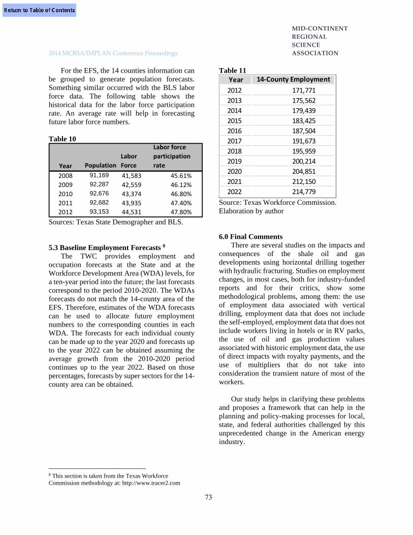
MID‐CONTINENT
REGIONAL
SCIENCE
2014 MCRSA/IMPLAN Conference Proceedings ASSOCIATION
73
For the EFS, the 14 counties information can be grouped to generate population forecasts. Something similar occurred with the BLS labor force data. The following table shows the historical data for the labor force participation rate. An average rate will help in forecasting future labor force numbers.
Table 10
Year Population
Labor
Force
Labor force
participation
rate
2008 91,169 41,583 45.61%
2009 92,287 42,559 46.12%
2010 92,676 43,374 46.80%
2011 92,682 43,935 47.40%
2012 93,153 44,531 47.80%
Sources: Texas State Demographer and BLS. 5.3 Baseline Employment Forecasts 8
The TWC provides employment and occupation forecasts at the State and at the Workforce Development Area (WDA) levels, for a ten-year period into the future; the last forecasts correspond to the period 2010-2020. The WDAs forecasts do not match the 14-county area of the EFS. Therefore, estimates of the WDA forecasts can be used to allocate future employment numbers to the corresponding counties in each WDA. The forecasts for each individual county can be made up to the year 2020 and forecasts up to the year 2022 can be obtained assuming the average growth from the 2010-2020 period continues up to the year 2022. Based on those percentages, forecasts by super sectors for the 14-county area can be obtained.
8 This section is taken from the Texas Workforce Commission methodology at: http://www.tracer2.com
Table 11
Source: Texas Workforce Commission. Elaboration by author
6.0 Final Comments There are several studies on the impacts and
consequences of the shale oil and gas developments using horizontal drilling together with hydraulic fracturing. Studies on employment changes, in most cases, both for industry-funded reports and for their critics, show some methodological problems, among them: the use of employment data associated with vertical drilling, employment data that does not include the self-employed, employment data that does not include workers living in hotels or in RV parks, the use of oil and gas production values associated with historic employment data, the use of direct impacts with royalty payments, and the use of multipliers that do not take into consideration the transient nature of most of the workers.
Our study helps in clarifying these problems
and proposes a framework that can help in the planning and policy-making processes for local, state, and federal authorities challenged by this unprecedented change in the American energy industry.
Year 14‐County Employment
2012 171,771
2013 175,562
2014 179,439
2015 183,425
2016 187,504
2017 191,673
2018 195,959
2019 200,214
2020 204,851
2021 212,150
2022 214,779

MID‐CONTINENT
REGIONAL
SCIENCE
2014 MCRSA/IMPLAN Conference Proceedings ASSOCIATION
74
References Bangsund, D. A., N. M. Hodur. 2013. Petroleum Industry’s Contribution to North Dakota in 2011. Agribusiness and Applied Economics Report 710, March 2013. North Dakota State University. Brundage, Tracy L., T.W. Kelsey, J. Lobdell, L. L. Michael, J. Jacquet, J. R. Ladlee, T. B.Murphy. 2011. Pennsylvania Statewide Marcellus Shale Workforce Needs Assessment June 2011, prepared by the Marcellus Shale Education & Training Center MSETC. Considine, T. J., R. Watson, R. Entler, J. Sparks. 2009. An Emerging Giant Prospects and Economic Impacts of Developing the Marcellus Shale Natural Gas Play. Penn State University. College of Earth and Mineral Sciences. Department of Energy and Mineral Sciences. Deller, S. C., A. Shreiber. 2012. Mining and Community Economic Growth. The Review of Regional Studies 2012 42, 121–141. Food & Water Watch. 2011. Exposing the Oil and Gas Industry’s False Jobs Promise for Shale Gas Development: how methodological flaws grossly exaggerate jobs projections. November 2011. Available at www.foodandwaterwatch.org Frankel, J. 2010. The Natural Resource Curse: A Survey. Discussion Paper 2010-21, Cambridge, Mass.: Harvard Environmental Economics Program, September, 2010. Gilmer, R.W., R. Hernandez, and K.R. Phillips. 2012. Oil boom in Eagle Ford Shale brings new wealth to South Texas. Southwest Economy, Q2, 3-7. Available at http://www.dallasfed.org/assets/documents/research/swe/2012/swe1202.pdf Gilmore, J. S. 1976. Boom Towns may hinder energy resource development: Isolated rural communities cannot handle sudden
industrialization and growth without help. Science 191:535-540. Halaby, D., J. Oyakawa, C. Shayne. 2011. Economic impact of the EagleFord Shale. Available at ccbr.iedtexas.org/index.php/Download-document/47-Economic-Impactof-the-Eagle-Ford-Shale.html Jacquet, J. 2011. Workforce Development challenges in the natural gas industry. In Working Papers Series. A comprehensive economic impact analysis of natural gas extraction in the Marcellus Shale. Cornell Workforce Development Challenges Feb 2011. Koren, M., S. Tenreyro. 2007. Volatility and Development. The Quarterly Journal of Economics 2007 122 1: 243-287. Leistritz, L.F., W. Ransom-Nelson, R.W. Rathge, R.C. Coon, R.A. Chase, T.A. Hertsgaard, S.H. Murdock,…, P.S. Yang. 1982. North Dakota economic-demographic assessment model NEDAM. Agricultural Economics Report #151. Markusen, A. R. 1978. Socioeconomic Impact Models for Boomtown Planning and Policy Evaluation. Working paper Department of City and Regional Planning. University of California at Berkeley. Mauro, F., M. Wood, M. Mattingly, M. Price, S. Herzenberg, S. Ward. 2013. Exaggerating the Employment Impacts of Shale Drilling: How and Why. Multi-State Shale Research Collaborative. November 2013. Retrieved from: http://www.multistateshale.org/shale-employment-report McCormack, J. 2013. Life often is lonely in the Eagle Ford ‘trailerhood'. San Antonio Express News. Retrieved from: http://www.mysanantonio.com/news/local_news/article/Life-often-is-lonely-in-the-trailerhood-4379846.php

MID‐CONTINENT
REGIONAL
SCIENCE
2014 MCRSA/IMPLAN Conference Proceedings ASSOCIATION
75
Mealer, B. 2013, November. Y’all Smell That? That’s the Smell of Money. Texas Monthly November 2013. Taken on January 22, 2014 from: http://www.texasmonthly.com/story/the-oil-boom-of-south-texas/page/0/3 Minnesota IMPLAN Group. 2014. Taken from web site on January 15, at https://implan.com/v4/index.php?option=com_multicategories&view=article&id=660:660&Itemid=14 2014. Taken from web site on January 16, at: http://implan.com/index.php?option= com_multicategoriesview=article&id=669:669&Itemid=71 Murdock S.H. and D.R. Ellis. 1991. Applied Demography. An Introduction to Basic Concepts, Methods, and Data. Westview Press 1991. Oyakawa, J., H. Eid, J. Castillo, E. Tomes, S. Wald, I. Sanchez, R. Rivera, D. Morua, T. Tunstall. 2012a. Eagle Ford Shale economic impact for counties with active drilling. Available at ccbr.iedtexas.org/index.php/Download-document/57-Eagle-Ford-Shale-Economic-Impact-for-Counties-with-Active-Drilling-Full-Report.html _________2012b. Workforce analysis for the Eagle Ford Shale. Available at ccbr.iedtexas.org/index.php/Download-document/55-Workforce-Analysis-for-the-Eagle- Ford-Shale-Final-Full-Report.html Partridge, M.D., and A.L. Weinstein. 2011. The Economic Value of Shale Natural Gas in Ohio. Swank Program in Rural-Urban Policy Studies. The Ohio State University. Phillips, K., R. Hernandez, B. Scheiner. 2013. A Closer Look at Potential Distortions in RGDP: The Case of the Texas Energy Sector. Federal Reserve Bank of Dallas Research Department, Working Paper 1308 October 2013. Steinback, S. R. 2004. Using ready-made input-output models to estimate backward linkages effects of exogenous output shocks. The Review
of Regional Studies Vol 34, number 1 2004 pp. 57-71 Strom Center for Entrepreneurship and Innovation. n.d.. Shale Projections Webinar Series. Dickinson State University. Retrieved from: http://www.visionwestnd.com/documents/DivideCountyWebinar.pdf The Shale Extraction Process. 2014. From the Dart Energy site. Retrieved from: http://www.dartgas.com/page/Community/The_Shale_Process/ Tunstall, T., J. Oyakawa, S.R. Roberts, R., H. Eid, R. Abalos, T. Wang, T., E. Calderon, and K. Melara. 2013a. Economic impact of the Eagle Ford Shale. Available at ccbr.iedtexas.org/index.php/ Downloaddocument/60-EFS-Economic-Impact-2013.html 93 Tunstall, T., J. Oyakawa, H. Eid, R. Abalos, T. Wang, E. Calderon, and K. Melara. 2013b. Economic impact of the Eagle Ford Shale appendix. Available at ccbr.iedtexas.org/index.php/Download-document/61-EFS-Economic-Impact-Appendix-2013.html Watson, P., J. Wilson, D. Thilmany, S. Winter. 2007. Determining Economic Contributions and Impacts: What is the difference and why do we care? NOAA Fisheries, USDA Forest Service, and Colorado State University. Pedagogy in Regional Studies, JRAP 372:140-146. Wright, J. 2014. The Explosion of Oil and Gas Extraction Jobs. EMSI Taken on Jan 22 2014 from: http://www.newgeography.com/content/002280-the-explosion-oil-and-gas-extraction-jobs

MID‐CONTINENT
REGIONAL
SCIENCE
2014 MCRSA/IMPLAN Conference Proceedings ASSOCIATION
76
TOWARD AN OPTIMAL ECONOMIC DEVELOPMENT STRATEGY: SHANNON
DIVERSITY MEASURES OF EXPORT EXPANSION AND IMPORT SUBSTITUTION David Kay IMPLAN Group LLC Phil Watson University of Idaho Stephen Cooke IMPLAN Group LLC
Abstract Two important strategies of local economic development include export expansion and
import substitution. We assume that the former causes the latter until there is an optimal combination of both. A social accounting model of an economy represented as the product of a Leontief inverse closed to include households and a diagonalized vector of final demand generates measures of both export base output by sectors summed down the column and gross output added along the rows. We assume that gross output reflect a measure, in part, of the size of import substitution while export base output reflects the quantity of export expansion.
With this data we can address the following questions. What is the difference in sector diversity between production for local consumption and for exports as the diversity of export production increases in a region? Is there a range in this difference in sector diversity that corresponds to the greatest positive effect in per capita income? To measure sector diversity, we applied a Shannon entropy index to the base and gross measures of output across twenty sectors for all the counties in North Carolina, USA (n=100). We checked for spatial dependency using a spatial error model and a Moran’s I-test.
For North Carolina, the standard interaction between base diversity and the range of income per capita observed in counties across the state reveals that income increases when a normalized Shannon measure of export sector diversity ranges approximately from 50 to 54 percent and import substitution sector diversity leads by about an additional seven percent. Beyond this range, ceteris paribus, the greater the export sector diversity the greater the income per capita.
Our interpretation of these measures suggests that the optimal range of export expansion and import substitution lies between company town with high import substitution diversity and low export diversity, on the one hand, and transfer-dependent towns where the diversity in sectors producing for local and export consumption is nearly equal, on the other. This result is consistent with the common sense notion that company towns need to increase export diversity to add stability to their economy, while transfer dependent regions need to increase their production for local consumption through import substitution to increase income. Now with parameters applied to common sense notion of economic development, not only can a community measure their progress but also knows when they have reached an optimal range of export and import substitution diversity to maximize stability and income.

MID‐CONTINENT
REGIONAL
SCIENCE
2014 MCRSA/IMPLAN Conference Proceedings ASSOCIATION
77
1.0 The Problem: A Proper Mix of Economic Development Strategies
There are three broad strategies for economic development: export enhancement, import substitution, and increasing productivity—whether technological, biological, or institutional. Cooke & Watson show that when competitive advantage is equal for either export enhancement or import substitution activity, the economic impact would be about the same for marginal changes. However import substitution has a better claim as a long run strategy, because it deepens the inter-industry trade and associated multipliers. “Thus, a discrete unit of import substitution creates unambiguously more economic activity in the local economy than a discrete unit of export enhancement, assuming the identical comparative advantage of both strategies” (2011).
On another front, economists have worked
unsuccessfully to find a strong connection between economic diversity and income and employments. For example, Attaran states: “The results suggest that no strict assumptions should be made regarding a clear relationship between economic diversity and growth and stability of unemployment, and per capita income-based measure of economic performance” (1986).
Measures of economic diversity have
depended on the standard measures of output, employment, wages and value added by industry such as those reported by the US Bureau of Economic Analysis (USDC. BEA, 2014a, 2014b, 2014c, 2014d). We referred to this set of four measures collectively as gross contributions or gross measures—defined as each sectors’ observed portion of economic activity used, directed or generated in the process of meeting both foreign and domestic exports as well as local demand.
Waters, Weber and Holland demonstrated an
approach that measures economic activity in relation to its support of the export base or simply “base” contributions of each sector (1999). Base contributions to economic activity are defined as both the observed and unobserved portion of
economic output across all sectors—including indirect and induced effects—needed to produce a given sector’s direct effect of domestic and foreign exports. The Waters et al. approach consists of multiplying the Leontief inverse with a diagonalized matrix of exogenous final demand to estimate base output—from which employment, wages and value added can be determined as a proportion of output. The history of economic thought regarding base output derived from the relationship between the multiplier and exogenous final demand extends at least as far back as Keynes (Dimand, 1988).
We argue that part of the difficulty in finding
a relationship between diversity and income and employment or economic development more generally hinges on the absence of base measures of economic activity with which to derive this relationship. In addition, we argue that the interaction of gross and base measures with each other and with income can lead to a better understanding of the development process associated with the broad strategies of export expansion and import substitution as outlined by the seminal works in the literature (Heckscher, 1955; Krugman, 1991; Myrdal, 1957; Ohlin, 1967; Romer, 1986; Rostow, 1962; Solow, 1956). Both export expansion and import substitution strategies depend on productivity as the source of competitive advantage as a prerequisite before either strategy will succeed. For reasons we describe below in more detail but largely definitional in nature, we believe that the gross measure of economic activity provide a means to assess the role of import substitution. Conversely, base measures can be used to represent the extent to which export expansion drives an economy. Together export expansion and import substitution work in concert to produce a synergy called economic development. We will use Shannon diversity indexes of gross and base measures of economic activity across the 100 counties of North Carolina’s heterogeneous economic landscape in an attempt to find a combination that is most conductive to increasing income, employment and stability.

MID‐CONTINENT
REGIONAL
SCIENCE
2014 MCRSA/IMPLAN Conference Proceedings ASSOCIATION
78
2.0 Theory: Shannon Index of Gross & Base Economic Diversity Measures
Diversity contains two elements: type and abundance—regardless of whether the diversity under consideration involves biology, information or physics. In economics, for example, the sectors of an economy represent an array of types such as the one through four digit NAICS codes associated with ever greater disaggregation of sectors into subsectors. Measures of output, employment, wage bill or value added denotes a sector’s abundance.
A confusing number of diversity indexes
exist. However, Jost provides an insightful discussion of the unifying characteristics of several widely used diversity indexes including: species richness, Shannon entropy index, Simpson concentration index, Gini-Simpson index, HCDT entropy index and the Renyi entropy index (2006). Jost describes the Shannon entropy index as “the most profound and useful of all the diversity indices (p. 364), in part because it weights each type in proportion to its abundance and because it can be derived from a generalized model of diversity (Shannon, 1948). Though often confused, the Shannon entropy index of diversity differs from the Shannon measure of diversity. The Shannon entropy index of diversity, when expressed in logarithms of base two, represents the average number of yes/no guesses needed to determine, for example, the sector in which a random worker works or output’s produced. See equations (1) and (2). The problem with using these entropy indices of diversity relates to the problem that similar entropy indices when the true diversity between regions is nearly identical “may mean they are moderately similar or may mean they are completely different” (Jost, 2006, p. 366).
The Shannon measure of diversity, when expressed in antilogarithms of indices in the base e, signifies the effective number of equivalents types relative to a maximum of N possible types. See equations (3) and (4). The effective number refers to abundance-corrected equivalent types expressed as the number of types (same or different) with equally common abundance (Jost, 2006, p. 364). For example, the concept of full-time equivalent employment (FTE) is the effective number of part-time employees after correcting for an equivalent forty hour work week over a year as expected from full-time employees—making possible a comparison, through equivalents, two different types of employment. In the case of a two-digit 20-sector economy the diversity measure will be expressed a number between 1 and 20. In this economic context, an effective number of one implies these regions have an equal (or equally unequal) abundance of output (employment, income, value added) in one sector (same or different) relative to the other nineteen. Conversely, an effective number of twenty suggests that regions with this number have an equally equal distribution of output across all twenty sectors. Effective numbers on a continuum between one and twenty represent similar regions with unique combinations of equal distribution of output among the twenty sectors (same or different) and parts thereof.
Because the base measures in this study
includes nine types of households by income, the number of base “sectors” (N=29) is always greater than that for the gross (M=20). Therefore we need a way to compare diversity measures that accounts for the differences in the number of types. Jost suggest a linear transformation that provides a measure of diversity that is always between zero and one. See equations (5) and (6).

MID‐CONTINENT
REGIONAL
SCIENCE
2014 MCRSA/IMPLAN Conference Proceedings ASSOCIATION
79
2.1 Shannon Entropy Index and Diversity Measure HB: Shannon Entropy Index of Base or Export Base Diversity
niQ
Q
Q
QH
ii
i
Bi
ii
BiB 1sector ,log2
. (1)
HG: Shannon Entropy Index of Gross or Import Substitution Diversity
mjQ
Q
Q
QH
jj
j
Gj
jj
GjG 1sector ,log2
, (2)
(Shannon, 1948, p. 394).
D(HB): Shannon Measure of Base Diversity
i
ii
Bi
ii
BiB Q
Q
Q
QHD 2ln*logexp 2
. (3)
D(HG): Shannon Measure of Gross Diversity
j
jj
Gj
jj
GjG Q
Q
Q
QHD 2ln*logexp 2
, (4)
(Jost, 2006, p. 365).
SB: Normalized Shannon Measure of Base Diversity [0,1]
NNNHDS BB 111 . (5)
SG: Normalized Shannon Measure of Gross Diversity [0, 1]
MMMHDS GG 111 , (6)
(Jost, 2006, p. 367).
3.0 Data: Base and Gross Measures of Output A region’s firms use intermediate inputs
(other sectors’ goods and services to produce their own) as well as labor, capital, government services and imports to supply their goods and services. Regional production goes to meet the
consumption demands of local, domestic and foreign institutions including households, investors, governments, and for export. In addition, economic data shows the transfer of payments made from the value added by labor, capital and taxes among households, investors, and governments. This comprehensive accounting approach of production, consumption plus transfers represents a social accounting matrix (SAM) of the local economy.
The (I-A) SAM matrix for a region’s
economy is shown in eq. 7, where a is the factor share, x is total output, and d is exogenous final demand across sectors 1 through n.
nnnnnn
n
n
d
d
d
x
x
x
aaa
aaa
aaa
2
1
2
1
21
22221
11211
1
11
(7)
Representing the matrix format with single terms in which matrices are expressed in compact notation as capital letters and vectors are in lower case.
dxAI
Solving the vector of output (x) in terms of the matrix of coefficients (I-A) and final demand (d):
dAIx 1* (8)
Equation (8) shows that the output for each sector equals the final demand for that sector multiplied by the inverse of the coefficient matrix (I-A)-1. Output by sector in eq. 8 (x*), we have defined as gross output. A sector’s gross output equals intermediate demand for itself and by other sectors, local final demand—typically by households—domestic and foreign final demand by governments, investors and exports.
Alternatively, an avenue of insight into the export base of an economy comes from diagonalizing the vector of exogenous final demand (d). To diagonalize means to place these values of final demand along the major diagonal
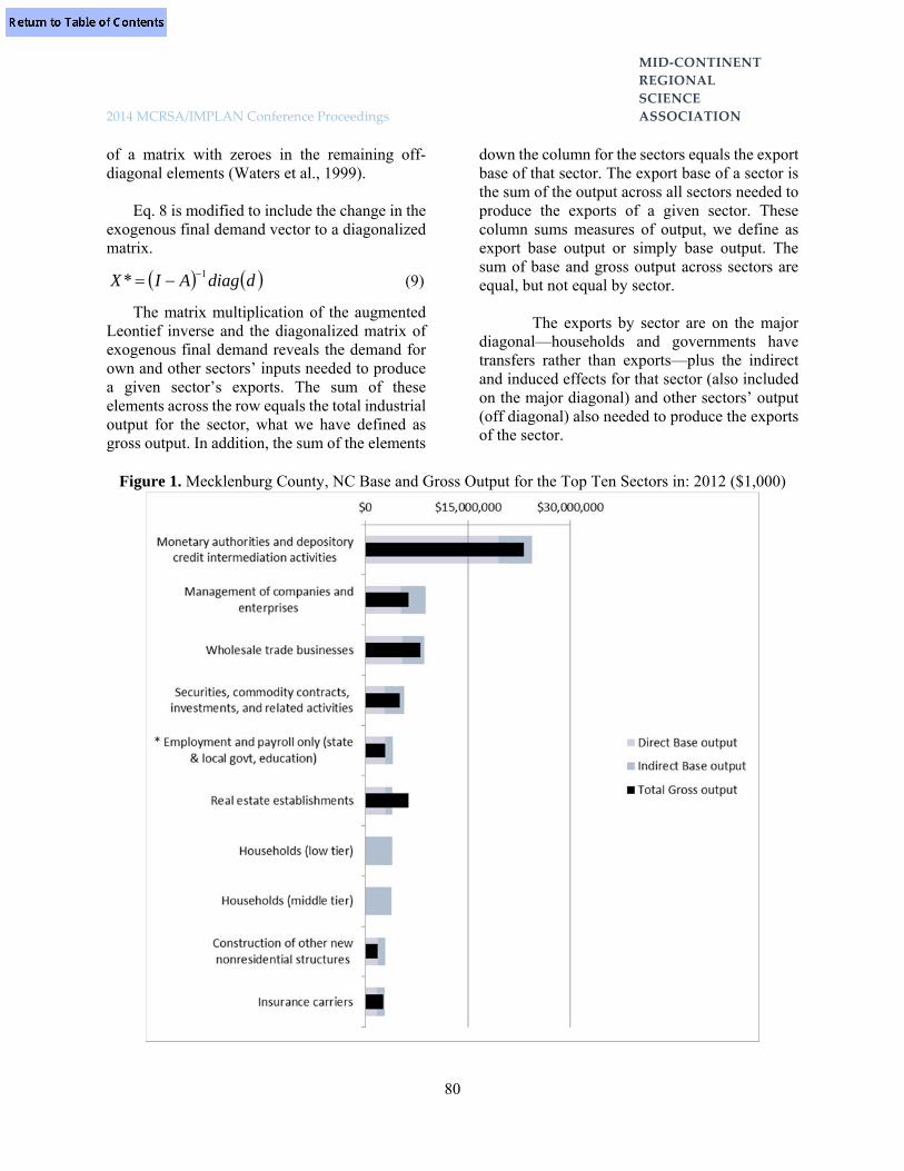
MID‐CONTINENT
REGIONAL
SCIENCE
2014 MCRSA/IMPLAN Conference Proceedings ASSOCIATION
80
of a matrix with zeroes in the remaining off-diagonal elements (Waters et al., 1999).
Eq. 8 is modified to include the change in the
exogenous final demand vector to a diagonalized matrix.
ddiagAIX 1* (9)
The matrix multiplication of the augmented Leontief inverse and the diagonalized matrix of exogenous final demand reveals the demand for own and other sectors’ inputs needed to produce a given sector’s exports. The sum of these elements across the row equals the total industrial output for the sector, what we have defined as gross output. In addition, the sum of the elements
down the column for the sectors equals the export base of that sector. The export base of a sector is the sum of the output across all sectors needed to produce the exports of a given sector. These column sums measures of output, we define as export base output or simply base output. The sum of base and gross output across sectors are equal, but not equal by sector.
The exports by sector are on the major
diagonal—households and governments have transfers rather than exports—plus the indirect and induced effects for that sector (also included on the major diagonal) and other sectors’ output (off diagonal) also needed to produce the exports of the sector.
Figure 1. Mecklenburg County, NC Base and Gross Output for the Top Ten Sectors in: 2012 ($1,000)

MID‐CONTINENT
REGIONAL
SCIENCE
2014 MCRSA/IMPLAN Conference Proceedings ASSOCIATION
81
The data for this study includes the gross and base output data at the 20-sector level of aggregation for each of the one hundred counties in North Carolina, USA in 2012. For example, Fig. 1 shows the difference between gross and base output for the top ten sectors in Mecklenburg County, North Carolina. These are the data to which we derive the Shannon diversity measure to determine base and gross sector diversity by county.
3.1 Functional Form of Gross and Base Economic Diversity
Assume the demand for exports creates a derived demand for locally produced inputs, through import substitution. In particular, assume that the normalized diversity of exports D(HB) drives the diversity of import substitution D(HG) at rate r over time t.
tBG rSS 1 (10)
Let t = 1 and solve eq. 10 for r,
rS
SS
B
BG
(11)
Let the difference in normalized gross and
base diversity in a region be a function of normalized base diversity, holding the per capita income constant.
YSfSS BBG , (12) Interpretation
To understand these results, let’s examine the elements of gross and base output. Gross output for any sector equals the sum of intermediate demand plus endogenous and exogenous final demand.
... ExogEndog FDFDIntermedG QQQQ
Both intermediate and endogenous final demand represents a given sector’s supply use to support local production and consumption by other sectors and institutions. Without this local
supply or locally-provided close substitutes, local producers and consumers are forced to meet their demand by substituting foreign or domestic imports. For this reason, we consider the intermediate and endogenous final demand portions of output of a sector to be a measure of import substitution.
Base output of a sector equals the sum of its
direct, indirect and induces output:
InducedIndirectDirectB QQQQ .
The indirect and induced output represents
the additional sales generated across the economy from the exogenous sales from a sector. Because exogenous final demand from domestic and foreign exports creates this additional economic activity, we consider the indirect and induced effects measures of output due to export expansion.
The difference between gross and base output
equals the difference between their respective elements:
InducedIndirectDirectFD
FDIntermedBG
QQQQ
QQQQ
Exog
Endog
.
... (13)
By definition and from eq. 7, we know that the exogenous final demand in the gross measure of output equals the direct output in the base measure such that:
DirectFD QQExog
.
.
By substitution, eq. (13) reduces to:
InducedIndirectFD
IntermedBG
QQQ
QQQ
Endog
.
.

MID‐CONTINENT
REGIONAL
SCIENCE
2014 MCRSA/IMPLAN Conference Proceedings ASSOCIATION
82
We know from eq. (9) that:
iInducediIndirecti
iiFDiIntermed
QQEndog ..
.
Equal output does not imply equal diversity. There are sectors producing primarily either for export or for the local market, base or non-base, through export expansion or import substitution. A company town represents an extreme example of the difference between measures of output and diversity. As a base measure, a single sector in a company town generates all the output. However, as a gross measure, many sectors contribute to the indirect and induced effect of the single exporting sector. Gross and base output is equal, while gross and base diversity is unequal.
The work of Cooke and Watson suggest that
the diversity of production for the local markets through import substitution may be preferred over diversity of production for exports such that:
InducedIndirectB
FDIntermedG
QQS
QQSEndog
,
,..
. (14)
When eq. (14) holds, we can assume that the
diversity of sectors involved in import substitution exceeds that of sectors focused primarily on export expansion.
When the difference between gross and base
diversity is positive, it reveals the additional effective number of sectors more involved in import substitution than export expansion as their primary focus.
0,
,..
InducedIndirectB
FDIntermedG
QQS
QQSEndog
3.2 Statistical Measures of Shannon Index of Economic Diversity—Base & Gross
An econometric estimation of eq. 12, gives the following result:
2.38,53.
00000156.23.172.
2
000000829.164.
2
110.
FadjR
YSSSS BBBG (15)
The Base Shannon Index ( BS ) and Base
Shannon Squared Index ( 2BS ) are both significant
at the 0.001 level and Per Capita Income (Y ) is significant at the 0.1 level. Jarque-Bera’s test on the normality of errors does not exceed a critical value. Therefore we do not reject the null hypothesis that the residuals are normally distributed:
Jarque-Bera Value: 1.069375 Probability: 0.5858522
White’s test did reveal the presence of
heteroskedasticity. Consequently, equation 15 has been corrected for this by using a robust standard error. We also checked for spatial dependency using a Moran’s I test, which did not suggest the presence of spatial autocorrelation:
Moran’s I Value: 0.774704 Probability: 0.438515
Eq. (15) shows that proportion of effective
number of sectors more involved in import substitution than export expansion as their primary focus. The proportion of sectors in North Carolina counties focused on local production increases until the ratio of local production to export diversity is forty-two to thirty percent. This ratio decreases to one when about sixty five percent of the sectors are focused primarily on local production, exports or both. See Figures 2 and 3.
The difference between effective gross and
base diversity increases (.25 to .75%) with an increase in Income. See eq. (15) and Fig. 4. Perhaps as income increases households put

MID‐CONTINENT
REGIONAL
SCIENCE
2014 MCRSA/IMPLAN Conference Proceedings ASSOCIATION
83
pressure on sectors to increase local production through endogenous final demand—production that is somewhat less likely to also be exported thereby increasing import substitution diversity.
Solving eq. (15) for income provides insight
into the effect of diversity on income.
B
BGBB
S
SSSSY
10001229720641 2
(16)
Solving eq. (16) with the range of SB and SG-SB that includes the current range of Y found across the counties in North Carolina. See Fig. 5. When diversity progressed from fifty to fifty-five
percent of the sectors focused on exports and from fifty-seven to sixty percent of the sectors produced primarily for local production, with some overlap for production in both, then per capita income increased most quickly on average in the counties of North Carolina in 2012.
Counties to the left of the (50-54/.07-.074)
window of base diversity to difference in diversity base from gross, tend to have too many sectors focused on import substitution relative to those focused on export expansions. See window in Figures 2 and 4. For counties to the right of the window, the opposite situation holds.
4.0 Stages of Development: a Visualization
Figure 2. Gross and Base Diversity Function across 20 to 29 Sectors for the 100 North Carolina Counties, US: 2012

MID‐CONTINENT
REGIONAL
SCIENCE
2014 MCRSA/IMPLAN Conference Proceedings ASSOCIATION
84
Figure 3. The Functional Form Relating Gross and Base Diversity with Income
Figure 4. The Effect of Income on Diversity

MID‐CONTINENT
REGIONAL
SCIENCE
2014 MCRSA/IMPLAN Conference Proceedings ASSOCIATION
85
Figure 5. The Range within the Diversity Function Most Closely Associated with the Range in Personal Income
5.0 Summary The resulting coefficients reveal a
predominantly negative and non-linear relationship between the difference in gross and base diversity and increasing base diversity—base diversity converges toward gross diversity as base diversity increases such that, when both are highly diverse, the difference between them approaches zero. For North Carolina, the standard interaction between base diversity and the range of income per capita observed in counties across the state reveals that income increases when a normalized Shannon measures of export sector diversity ranges approximately from fifty to fifty-four percent of the sectors and import substitution sector diversity leads by about seven to seven and one-half percent. Beyond this range, ceteris paribus, the greater the export sector diversity the greater the income per capita.
Our interpretation of these measures suggests
that the optimal range of export expansion and
import substitution lies between company town with high import substitution diversity and low export diversity, on the one hand, and transfer-dependent towns where the diversity in sectors producing for local and export consumption is nearly equal, on the other. These normalized Shannon diversity measures of gross and base sector diversity of output suggest that, if communities in North Carolina wish to increase per capita income, they are well advised to achieve or exceed an export sector diversity of about fifty percent or more with an import substitution sector diversity of around seven percent or greater than export diversity. This result is consistent with the common sense notion that company towns need to increase export diversity to add stability to their economy, while transfer dependent regions need to increase their production for local consumption through import substitution to increase income.
Now with parameters applied to common sense notion of economic development, not only

MID‐CONTINENT
REGIONAL
SCIENCE
2014 MCRSA/IMPLAN Conference Proceedings ASSOCIATION
86
can a community measure their progress but also knows when they have reached an optimal range of export and import substitution diversity to maximize stability and income. In addition, national and state level policy makers can better focus support to the specific needs of a region to help it achieve its goals. An understanding of these relations suggests that import substitution becomes a viable development strategy when tied to the price signal provided by export expansion and knowledge of the interrelationship of the two.
References Attaran, M. (1986). INDUSTRIAL DIVERSITY AND ECONOMIC PERFORMANCE IN U.S. AREAS. Annals of Regional Science, 20(2), 44. Cooke, S., & Watson, P. (2011). A Comparison of Regional Export Enhancement and Import Substitution Economic Development Strategies. Journal of Regional Analysis and Policy, 41(1), 1-15. Dimand, R. W. (1988). The origins of the Keynesian revolution : the development of Keynes' theory of employment and output. Stanford, Calif.: Stanford University Press. Heckscher, E. F. (1955). Mercantilism (Rev. [2d] ed.). New York,: Macmillan Co. Jost, L. (2006). Entropy and Diversity. Oikos, 113(2), 363-375. doi: 10.2307/40234813 Krugman, P. R. (1991). Increasing Returns and Economic-Geography Journal of Political Economy, 99(3), 483-499. Myrdal, G. (1957). Economic theory and under-developed regions. London,: G. Duckworth. Ohlin, B. G. (1967). Interregional and international trade (Rev. ed.). Cambridge: Harvard University Press. Romer, P. M. (1986). Increasing Returns and Long-Run Growth. The Journal of Political Economy, 94(5), 1002-1037.
Rostow, W. W. (1962). The process of economic growth (2nd ed.). New York: Norton. Shannon, C. E. (1948). A Mathematical Theory of Communications. The Bell System technical journal, 27(3), 379-423 and 623-656. Solow, R. M. (1956). A Contribution to the Theory of Economic Growth. The Quarterly Journal of Economics, 70(1), 65-94. USDC. BEA. (2014a). Industry Accounts Data: GDP by Industry. from U.S. Dept. of Commerce, Economics and Statistics Administration, Bureau of Economic Analysis http://www.bea.gov/iTable/iTable.cfm?ReqID=51&step=1#reqid=51&step=51&isuri=1&5102=15&5114=a USDC. BEA. (2014b). Industry Economic Accounts Data: Input-Output: The Make of Commodities by Industry, Before Redefinitions. from U.S. Dept. of Commerce, Economics and Statistics Administration, Bureau of Economic Analysis http://www.bea.gov/iTable/iTable.cfm?ReqID=51&step=1#reqid=51&step=51&isuri=1&5102=15&5114=a USDC. BEA. (2014c). SA07 - Wage and salary disbursements by industry -- United States (thousands of dollars): since 1958. from U.S. Dept. of Commerce, Economics and Statistics Administration, Bureau of Economic Analysis http://www.bea.gov/iTable/iTable.cfm?reqid=70&step=1 USDC. BEA. (2014d). SA27 - Full-time and part-time wage and salary employment by industry -- United States (number of jobs): since 1958. from U.S. Dept. of Commerce, Economics and Statistics Administration, Bureau of Economic Analysis http://www.bea.gov/iTable/iTable.cfm?reqid=70&step=1 Waters, E. C., Weber, B. A., & Holland, D. W. (1999). The Role of Agriculture in Oregon's Economic Base: Findings from a Social Accounting Matrix. Journal of Agricultural and

MID‐CONTINENT
REGIONAL
SCIENCE
2014 MCRSA/IMPLAN Conference Proceedings ASSOCIATION
87
Resource Economics, 24(1), 266-280. doi: 10.2307/40987021
Appendix: Gross Output Interpretation
XEGICXX
MNLMNLMNLMNL
XEGICzz
XEGICzz
EGIC
21
21
222221
111211
Let d = C+I+G+E-M V = L+N
xdxx
vdvv
xdzz
xdzz
v
OutputDFDI
........ 2.1.
2.1.
222221
1
..
1
..
1211
Let: a = z/x down the column
nnnnnnn
nn
OutputTdFdemandeIntemediat
nn
xdxaxaxa
xdxaxaxa
xdxaxaxa
2211
222222121
.
1
.
11212111
xdxA dxAI
ddiagAIX GB
1

MID‐CONTINENT
REGIONAL
SCIENCE
2014 MCRSA/IMPLAN Conference Proceedings ASSOCIATION
88
2221
12111
AI
ddiagX GB
2221
1211
2
1
2221
1211
00d
dX G
B
222121
212111
dd
ddX G
B
22221
11211
2
1
22
12
21
11
dzz
dzz
d
d
z
z
z
zxG
222121
212111
22221
11211
dd
dd
dzz
dzzxG
222121222212
212111112111
dddzzx
dddzzx
222121222122
212111121111
11
ddzzdx
ddzzdx


MID‐CONTINENT
REGIONAL
SCIENCE
2014 MCRSA/IMPLAN Conference Proceedings ASSOCIATION
89
AN EXAMINATION OF U.S. COUNTY-LEVEL POPULATION CHANGE FROM 2000
TO 2010
Ronald J. Gunderson Richard J. Szal Eva Putzova Northern Arizona University
Abstract County-to-county net-migration flows provide an opportunity to identify and contrast the differing motives and resulting outcomes of population movement at the county level. We employ Ordinary Least Squares Regression to examine factors that contribute to the explanation of human migration from 2000 to 2010, for all counties in the forty-eight contiguous states. A variety of demographic, economic and amenity-based variables explain a significant amount of the variation in migration flows, and thus population change, over this timeframe. We extend the analysis using K-Means clustering as a technique for assigning counties into groups which share common properties with other counties in the same cluster. Based upon the results of our study we conclude that the sets of economic and demographic variables were relatively more important in explaining the variation in population change as compared to the explanatory effects associated with the noneconomic variables in our model. However, this outcome may have, in part, been influenced by the economic recession in the latter years of the decade.
1.0 Introduction
Changes in population, and in particular, changes in the patterns of human migration have generated interest among social scientists at least since the period when Ernest Ravenstein (1885) published his Laws of Migration in the late 1800’s. Ravenstein concluded, among other things, that most migrants move only short distances, while those who do move longer distances tend to migrate to large cities whose growth is largely due to migration rather than to natural increase. Several of his conclusions appear to have been confirmed by later researchers, and his works continue to serve an important function of population migration today.
Our objective is to enhance the stream of
research in this field to examine various demographic trends in the U.S. during the first decade of the twenty-first century. The 2010 Census of Population, confirms that the average age of U.S. residents continues to rise, and that
the population center continues to shift to the South and the West while the nation is becoming more urbanized than in the past.
Increases and decreases in population due to
changing migration patterns generate powerful impacts on local counties, and pose new challenges for both growing and declining regions. These impacts range from the provision of adequate health care and shifting requirements for the physical infrastructure to impacts on state and local revenue collections and changes in occupational skills required of a local workforce.
Population change results from a combination of variations in the natural rate of increase (births over deaths) as well as from fluctuations in domestic and international migration streams when persons move across political jurisdictions. Therefore, governmental officials and community leaders who are charged with examining the impacts of population change

MID‐CONTINENT
REGIONAL
SCIENCE
2014 MCRSA/IMPLAN Conference Proceedings ASSOCIATION
90
in a local area need to understand the factors which underlie the overall change in population which are often driven by changes in the patterns and amount of migration.
In this study we examine numerous
influences on changes in county-level populations over the period covered by the 2000 and 2010 Censuses of Population in order to identify sources of changes in local populations. Over this ten year period, the Bureau of the Census reported that overall population in the U.S. increased by 9.7 percent. However, the change in the population ages 18 to 44 increased by a much smaller 0.6 percent, while the population of the largely-baby boomer cohort between the ages 45 to 64 increased 31.5 percent, and the population 65 and older increased by 15.1 percent. (2010 Census Summary File 1)
During this decade, all states increased in population except for Michigan; however only about two-thirds of the nation’s 3,143 counties gained in overall population over the ten years while the remaining third are shrinking as younger adults are moving out to seek jobs in other locations, and the number of deaths in many of these counties exceeds the number of births. Our analysis is confined to 3,107 counties within the 48 contiguous states, and is designed to identify characteristics that separate the rapidly-growing counties from those which did not grow as quickly and those counties which actually lost population over this ten-year period. In addition, we extend the analysis by introducing cluster-based techniques as a means of increasing our understanding of the effects of the predictor variables on population change. Through cluster analysis we were able to classify these counties into six broad groups as a means of categorizing and summarizing our findings.
2.0 Literature Review
In an analysis of the ten years preceding the time frame for this study, McGranahan and Beale (2002) identified three characteristics that distinguished population-losing counties from those gaining in population. The counties where population growth lagged were located further
away from metro regions, had low-population densities and contained few natural amenities such as favorable climate, water or topography. Although economic models have postulated that locations with high poverty rates should also be associated with population-losing regions, McGranahan and Beale did not find that to be the case between 1990 and 2000. The results of our analysis for the subsequent decade from 2000 to 2010 are consistent with their findings. Therefore, while numerous economic variables and the proximity to metro areas continue to serve as favorable indicators of population growth, the relative poverty level within each county was not significant in our original analysis, and was subsequently dropped from our model.
Traditionally, we could assume that
migration flows, and thus also population change, are influenced by a combination of economic advantages including high levels of employment in the extractive industries, manufacturing, or government (including military bases and universities) along with a favorable climate and high levels of natural amenities. Ullman (1954) was an early pioneer in establishing the role of amenities in the migration decision when he noted that “pleasant living conditions …are becoming the sparks that generate significant population increase.” The elevation of the role of the environment in the migration decision has become more persistent as changes in demographic and income levels have heightened the interest in recreational tourism, and have afforded increased opportunities for more persons to purchase retirement and second homes in desirable locations.
A lengthy and expanding list of publications
confirms the increasing importance of natural amenities and population change. Brown, et al. (2011) employed a path-dependent process to examine the variability in net in-migration rates of persons between the ages of 60 and 74 in the non-metro counties of the U.S. They conclude that counties with high levels of natural amenities that develop recreation and tourism infrastructure are enhancing their ability to serve as prime destination areas, and once the migration streams

MID‐CONTINENT
REGIONAL
SCIENCE
2014 MCRSA/IMPLAN Conference Proceedings ASSOCIATION
91
become established they become self-perpetuating. Ulrich (1986) found evidence that American and European populations preferred open spaces in a nature-based environment, especially when a variety of topographic features and trees and other vegetation exist. This was later confirmed in a simultaneous equation model by McGranahan (2008) who found that landscape features exerted a direct influence on migration.
Poudyal et al. (2008) documented the substantial impacts of “rural and biologically rich counties....and other man-modified natural and recreational attractions” to explain an increase in the number of retirees into an area. In addition, Gude et al. (2006) examined the conversion of the natural ecosystem as a result of the rapid growth in rural home construction in the Greater Yellowstone region, and Waltert and Schläpfer (2010) found that migrants are as attracted by the existence of amenities as they are by low taxes.
Although amenity-based migration has been
observed in numerous locations across the U.S., the shift in trends within the Mountain West region of the country appears to be more pronounced than in many other areas. Vias (1999) and Shumway and Otterstrom (2001) have specifically pointed to the evolving nature of the regional economy in these mountain states where dependence on the extractive sectors – mining, logging, ranching and farming – has been partly replaced by a dependence on environmental amenities as well as the growth of service industries to support the new lifestyle that has emerged.
Vias (1999) also attributes migration patterns
to changing residential preferences which place increased emphasis on ‘environmental amenities and rural lifestyles’ in the decision to relocate as opposed to merely looking at economic opportunities in these localities.
In addition, numerous studies confirm that
location-specific amenities will influence the migration decision as well (McGranahan 1999; Deller et al., 2001; Green 2001; Gunderson and Ng 2006.)
While amenity factors have become increasingly important, economic opportunity has long been the dominant force behind changes in the movement of population. A lengthy history of articles points to favorable economic conditions as an indicator which attracts new residents into local areas (Muth 1971; Greenwood 1975, 1985; Partridge and Rickman 2006).
Urban proximity may also play an important
role in migration flows. Johnson and Stewart (2005) found that second-home owners from nearby metropolitan areas who were attracted to areas in southeastern Wisconsin which contain high levels of recreation-based amenities were motivated to permanently move to these locations later in life.
Furthermore, the combination of economic
and amenity-based considerations which might be captured in variables designed to measure the overall quality-of-life in a region, has been confirmed in many studies including Cushing 1987; Cebula and Payne 2005, and Roback 1982. In a follow-up to Roback’s work, Blanchflower and Oswald (1994) also found that migrants are sometimes willing to forego better employment opportunities in exchange for higher-amenity conditions. Subsequently, Cebula and Alexander (2006) found that out-migration is in part a result of negative environments in an area, specifically, the presence of hazardous waste sites or toxic chemical releases.
Finally, Plane and others (Plane and
Jurjevich, 2009; Plane, Henrie and Perry, 2005) use age-articulated migration as means to tie migration flows to movement within the urban hierarchy over the course of the life cycle.
Our research employs a combination of
regression and cluster-based techniques to explore changes in the populations of the 3,107 counties in the forty-eight contiguous states based on releases from the 2010 Census of Population. Initially, we considered a large number of economic and amenity-based items along with climate, topographic and rural-urban variables as

MID‐CONTINENT
REGIONAL
SCIENCE
2014 MCRSA/IMPLAN Conference Proceedings ASSOCIATION
92
a means to identify the factors which influenced population change at the county level over past decade. In contrast with conclusions from migration-related research performed for previous decades, we did not find the USDA Economic Research Service (ERS) Natural Amenities Index to be statistically significant for the period between 2000 and 2010 and we dropped this variable from our model. This unexpected finding may have been in part due to the severe downturn in the U.S. economy over the later years of the decade which slowed the overall rates of population movement for several years. Once the results from the regression analysis were finalized, we employed K-means clustering to use an iterative fitting-process as a means to partition the objects into clusters designed to group together counties with similar characteristics within each cluster, while emphasizing the dissimilarities among counties appearing across clusters. 3.0 Description of the Variables
Our criterion or dependent variable identifies the overall percentage change in county population from 2000 to 2010 in each of 3107 counties in the 48 contiguous states. Initially, we selected a large number of predictor variables, and eventually reduced this number to ten based upon preliminary regression tests. Only the variables which were significant in the initial analysis were retained in the final regression model.1 The list of variables included in the final regression as well as the variable descriptions and the expected signs on the coefficients appear in Table 1.
The first three variables in the table capture
the relative cohort shares pertaining to the demographics of the adult population in each county. These variables reflect the overall percentage shares of persons in each county in the age ranges 18-44, 45-64, and 65 and older as
1 A partial list of the variables which were not significant includes the percent of persons below poverty level, percentage completing a bachelor’s degree, amount of federal expenditures, number of hospital beds, per capita expenditures for food and accommodation, median home
reported in the 2000 and 2010 U.S. Censuses of Population.
The signs on these three coefficients were not
predicted in advance; however, a positive sign indicates a direct relationship between the initial share of the cohort and the percentage change in the overall population. According to Census numbers for the ten year period, the relative sizes of the cohorts underwent significant change. Nationwide, the percentage of population in the 18 to 44 year group declined from 39.9 to 36.5 percent, while the 45 to 64 year old cohort increased its share of the total population from 22.0 to 26.4 percent, and the 65 and over group increased slightly from 12.4 to 13.0 percent of total population. However, careful interpretation is required when we examine these changes at the county-level. As an example, a positive coefficient on the age 65-and-over category is likely to mean that the overall population of the county is increasing if this situation occurs in a high-retirement area. However, the sign on the number of persons age 65-and-over in a county will be negative if the county has experienced a high out-migration in the number of persons in the younger age categories moving to locations outside the county. As a result, the county may have lost population, and is left with a mostly older population, thus generating an inverse relationship between this variable and the rate of change in overall population in the county.
The sign of the coefficient on the Rural-
Urban Continuum Code (Beale Code) was expected to be negative to indicate that rural, nonadjacent counties are anticipated to experience less growth than counties in the urban/metro regions.
The percentage of surface area covered by
water might be expected to produce a positive relationship with population growth if it is viewed as a desirable amenity; however, this is
values, the ERS Natural Amenities Index, and the percentage change in county population during the decade preceding the time period used in the current paper.

MID‐CONTINENT
REGIONAL
SCIENCE
2014 MCRSA/IMPLAN Conference Proceedings ASSOCIATION
93
countered by a negative relationship when population growth occurs in largely urban areas which are devoid of lakes and streams. Thus, the
sign on this coefficient was not predicted in advance.
Table 1. Variable Definitions and Expected Signs on the Coefficients.
Variable Variable Description Interpretation of the Sign on Coefficient
Expected Sign on Coefficient
Percent Change in Overall Population (Dependent)
Percentage change in overall county population from 2000 to 2010
Increase in population = + Decrease in population = -
n/a
Percentage Share of County Population between the ages of 18-44
Percentage of individuals in the county between the ages of 18-44 in 2000
Increase in cohort share = + Decrease in cohort share = -
Not Predicted
Percentage Share of County Population between the ages of 45-64
Percentage of individuals in the county between the ages of 45-64 in 2000
Increase in cohort share = + Decrease in cohort share = -
Not Predicted
Percentage Share of County Population age 65 & older
Percentage of individuals in the county who were 65 years or older in 2000
Increase in cohort share = + Decrease in cohort share = -
Not Predicted
Rural-Urban Index, Beale Codes, (RUCC)
Rural-urban continuum code 0-9 as of 2003; 0 = central counties, 9 = completely rural
Less urban = + More urban = -
Negative
Percent Water Percent water area within county
Higher % water = + Lower % water = -
Not Predicted
Mean January Temperature
Average January temperatures, 1941-1970
Higher temperatures = + Lower temperatures = -
Positive
Median Household Income
Median Household income, 2006-2010
Higher incomes = + Lower incomes = -
Positive
Percent Non-Farm Change in Employment
Percentage change in private, non-farm employment, 2000-2009
Increase in employment = + Decrease in employment = -
Positive
Percent change in number of Social
Indicator of change in the percentage of
Higher % change = + Lower % change = -
Positive

MID‐CONTINENT
REGIONAL
SCIENCE
2014 MCRSA/IMPLAN Conference Proceedings ASSOCIATION
94
Security Recipients 2000-2005
persons in the age 65 and over category
Natural Increase in County Population as a Percentage of 2000 County Population
Relative Importance of the natural increase in county populations compared to county size in 2000
Higher % change = + Lower % change = -
Positive
The climate effect was captured by the mean
January temperature from 1941-1970 in each county. A positive sign indicates a direct correlation between higher winter temperatures and population growth, and is consistent with the trend of the population movements to the South and West regions of the U.S.
The household income and non-farm
employment growth variables are proxies for the economic conditions existing in the counties. Larger median income levels and faster employment growth in a county are generally predicted to stimulate higher levels of population growth; thus we expect positive coefficients on these variables.
The sign on the percentage change in the
number of Social Security recipients in the county in the initial half of the decade is a potential indicator of whether or not that county is undergoing population growth. A positive sign is expected since an increase in the percentage of Social Security recipients in an area could suggest a higher level of overall population in the county as the number of elderly persons increases; although a negative coefficient could indicate a large number of people aging-in-place even though the overall population in a county may be declining.
The change in the natural rate of population compared to the percentage change in county populations between 2000 and 2010, provides a measure of the relative importance of the natural increase in county populations over this period. A positive sign on this variable suggests that the natural increase in county population, in tandem with the population change due to migration, are complementary variables used to explain the variance in population change.
4.0 Regression Analysis
The final set of predictor variables used in the equation was selected based upon the outcomes from stepwise regression procedures. Variables were included so long as they increased the contribution to the coefficient of multiple-determination.
The F statistic for the final equation was
616.2 and is significant at less than 0.001. The adjusted R Square was 0.665. The regression results appear in Table 2. Each of the regression coefficients used in the final equation is significantly different from zero at the 0.01 level or less. The standardized coefficients are also included in the table to indicate the relative importance of the variables with respect to their impacts on the criterion variable. The explanatory variables appear in Table 2 in order of their importance using the standardized coefficients.

MID‐CONTINENT
REGIONAL
SCIENCE
2014 MCRSA/IMPLAN Conference Proceedings ASSOCIATION
95
Table 2. Stepwise Regression Results. R Square = 0.666. Adjusted R Square = 0.665. n = 3107 F-Statistic = 616.2. Sig: <.001.
Explanatory Variable CoefficientsStandardized
Coefficients t Stat P-value VIF
Intercept -98.245 --- -20.142 *** ---Relative Natural Increase in Population 174.390 .617 24.895 *** 5.681Share of the Age 65 & Older Cohort 1.821 .569 21.049 *** 6.775Percent Δ Social Security Recipients .649 .450 32.386 *** 1.787Share of the Age 18-44 Cohort .886 .337 15.231 *** 4.527Share of the Age 45-64 Cohort 1.160 .238 12.298 *** 3.457Percent Non-Farm Δ Employment .099 .177 15.703 *** 1.174Median Household Income .000 .126 8.788 *** 1.904Mean January Temperature .126 .115 9.827 *** 1.274Percent Water Area in County -.076 -.065 -6.030 *** 1.079RUCC (Beale Codes) -.369 -.075 -5.219 *** 1.923
*** p < .001 (two-tailed tests)
Pallant (2010) and also Tabachnick and Fidell (2007) discuss an alternative approach to determine how much of the total variance in the dependent variable (population change) is uniquely explained by each explanatory variable. Under this approach, the ‘part’ or semi-partial correlation coefficients are each squared to generate the contribution of each variable to the R square. Since these values represent only the unique contribution of each variable, Pallant points out that the sum of the squares of these coefficients will not equal the R square since R square includes the unique variance attributed to each variable as well as the shared or overlapping variance due to the presence of all of the variables.
The unique contributions of each of the variables using the part correlation coefficients appear Table 3.
Using this approach, the percentage change
in Social Security recipients uniquely explains about 11.4 percent of the variance in county population change, followed by the Relative values of the Natural Increase in Population which account just under seven percent of the variance in the population change. The explanatory variables in Table 3 appear in the order of their importance using the part correlation coefficients. This approach led to a slightly different ranking in the importance of the variables.

MID‐CONTINENT
REGIONAL
SCIENCE
2014 MCRSA/IMPLAN Conference Proceedings ASSOCIATION
96
Table 3. Total Variance in Population Change Uniquely Associated with each Variable (Square of Part Correlation Coefficients).
5.0 Discussion of the Regression Results
Based upon the results in Table 3, the percentage change in the number of Social Security recipients in each county was responsible for the largest amount of the predictive power generated by the variables in the equation. The positive sign on the coefficient suggests that counties with large percentage increases in Social Security recipients were highly likely to have experienced the greatest amount population growth from 2000 to 2010.
The natural increase in population as a
percentage of the 2000 county populations was the second most valuable contributor to the equation. This variable also has a positive sign confirming that the change in population as a result of natural forces (births over deaths) is also significant in explaining population change when this is tied to the initial size of each county population at the beginning of the period of analysis. Initially, this might appear obvious; however, it is theoretically possible that
migration flows could overwhelm the natural rate of change in several counties.
The three demographic cohorts are the third,
fifth and sixth most important variables when ranked by their unique contribution to the total variance in the population change. The signs on all three of these variables were positive. This suggests that an increase in population at the county level cannot be attributed to growth in just one or two of the age groups, but that all three cohorts contributed to population growth. However, the unique contribution of the 65 and over cohort was larger than the sum of the contributions of the 18-44 and 45-64 cohorts which suggests that the faster- growing counties are more likely to be aligned with the retirement-oriented locations.
The percentage change in non-farm
employment between 2000 and 2010 was the fourth most important variable, and it is also aligned with the economic-oriented variables in this study. The positive sign on this coefficient
Explanatory Variable
Percent of Total Variance in Population Change Uniquely explained by each Variable
Percent Δ Social Security Recipients 11.36%
Relative Natural Increase in Population 6.71%
Share of the Age 65 & Older Cohort 4.80%
Percent Non-Farm Δ Employment 2.66%
Share of the Age 18-44 Cohort 2.50%
Share of the Age 45-64 Cohort 1.64%
Mean January Temperature 1.04%
Median Household Income 0.83%
Percent Water Area in County 0.40%
RUCC (Beale Codes) 0.29%

MID‐CONTINENT
REGIONAL
SCIENCE
2014 MCRSA/IMPLAN Conference Proceedings ASSOCIATION
97
was expected, and confirms that growth in employment levels is still very much in tandem with the growth in population.
Winter temperature as measured by the Mean
January temperature over a 30-year period was the next most important contributor. We use this temperature measure as a proxy for climate conditions across the counties. This variable had a positive sign which is consistent with our expectations, and intimates that counties with higher winter temperatures are more likely to experience higher population growth. This corresponds with the movement of persons to the warmer climates in the southern regions of the U.S. which have experienced more rapid population growth.
Median household income closely follows
the climate or temperature variable in importance. The positive sign on the coefficient suggests that counties with higher levels of household income were most likely to have experienced greater population growth from 2000 to 2010. This is evident from our data since many of the high-growth counties are found in the high-income counties in Maryland and Virginia near Washington, D.C. as well as in parts of New Jersey along with many counties surrounding San Francisco.
The signs on the remaining variables were
negative, and their unique contributions to the total variance in population change while quite small, were still significant. Although the percent of the county surface area covered by water (lakes, rivers and streams) has a negative coefficient, we did not predict the sign of this variable because the relationship with population growth could occur in either direction. The negative sign on this coefficient indicates that counties with less water were more likely to grow the most rapidly. This is consistent with the high-levels of growth inside many of the nation’s metropolitan counties which grew as a result of strong economic factors, but where we find smaller amounts water including fewer lakes and ponds. Alternatively, it could be argued that more water in a region constitutes a positive
natural amenity and should stimulate more population growth instead of less. This would certainly be true in some counties; however, the overall population growth was highly skewed to the urban rather than rural regions, and indicates that while more water may be a positive factor behind population growth in a specific county, it is outweighed by the larger numbers of people moving into the urban areas as opposed to smaller numbers relocating to the rural locations.
The sign on the RUCC or Beale Codes also
was negative. This was expected and indicates that counties located in the largest metropolitan areas are growing the most rapidly, followed by other metro counties and counties adjacent to metropolitan counties, while rural counties, particularly those not adjacent to metro counties, experienced the least amount of population growth.
6.0 Testing the Assumptions of the Model
Variance inflation factors (VIF) were used to test for multicollinearity in the model. The values for the VIF provide a measure of the severity of multicollinearity in ordinary least squares regression models. The VIF uses an index to measure how much the variance of an estimated regression coefficient increases as a result of collinearity among the variables. Researchers often assume the presence of significant amounts of multicollinearity exists when a value for the VIF for a coefficient exceeds five, while other researchers suggest that VIFs with values exceeding ten indicate the presence of multicollinearity.
No correlation is assumed to exist when the
individual VIFs equal one. As shown in Table 2 earlier in this paper, the individual VIF values for each variable in our analysis were generally less than five, although the VIF’s for the natural increase in population and for the Age 65 and over cohort were slightly over five, which indicates the potential for some amount of multicollinearity in the model, although not overly significant.

MID‐CONTINENT
REGIONAL
SCIENCE
2014 MCRSA/IMPLAN Conference Proceedings ASSOCIATION
98
In addition, a test for heteroscedasticity in the model was conducted using scatter plots of the variance in each. An analysis of these plots indicated no evidence of heteroscedasticity is evident.
7.0 Cluster Analysis Following the regression analysis, we
utilized cluster analysis in order to obtain a better-defined picture of the changes in population over this period. K-Means cluster analysis was used to assign each of the 3,107 counties into groups or clusters of counties which share similar characteristics across the set of the explanatory variables in the regression model. The output from the K-Means approach is designed to show that counties within the same cluster will exhibit similar profiles, while counties not grouped within the same cluster as others will contain contrasting profiles from those in the other clusters.
The decision regarding the number of
clusters to employ is often based on researcher
judgment. This decision either can be determined in advance of performing the analysis, or it can be made in the post-analysis period based upon interpretation of the results. In this study, we reviewed the results of the cluster technique for five, six, seven and eight clusters. Based upon our findings and understanding of the results, we proceeded with six clusters for this analysis.
Figure 1 contains a map of all U.S. counties
in the 48 contiguous states broken out by their classification into clusters. The clusters are numbered from one to six based upon the mean values of the population changes between 2000 and 2010. The mean level of population change in the counties in Cluster 1 was 20.5 percent. Counties in Clusters 2 through 5 had positive but lower mean values in population change. Counties in Cluster 6 experienced a mean value of negative 0.9 percent change in population, resulting in the only cluster where the mean level of population actually declined over the 2000-2010 period.
Figure 1. U.S. Map with Counties Contained in All Clusters.

MID‐CONTINENT
REGIONAL
SCIENCE
2014 MCRSA/IMPLAN Conference Proceedings ASSOCIATION
99
The cluster means showing the percentage changes in population are presented in Table 4 along with the cluster means for each of the 11 explanatory variables in our model. A clear and consistent picture emerges from this cluster
procedure. Maps which show the counties that make up the six individual clusters appear in Appendix A. A description of each of the clusters follows.
Table 4. Mean Rates of Change of County Populations and for the Ten Explanatory Variables for each Cluster.
Cluster 1 (n=80)
Cluster 2 (n=196)
Cluster 3 (n=503)
Cluster 4 (n=917)
Cluster 5 (n=928)
Cluster 6 (n=483)
%Change in Population 20.5 19.3 11.0 4.2 2.1 -0.9% Δ Social Security Recipients 16.08 14.77 9.12 5.25 4.95 3.99% Non-Farm Δ Employment 16.83 13.63 6.54 1.67 -4.09 -7.44Median Household Income 84209.53 64819.18 52960.53 44728.15 38073.91 30228.10
Mean January Temperature 31.79 32.59 30.34 29.61 34.29 39.52Share of Ages 45-64 23.87 23.29 23.20 23.13 23.70 23.36Share of ages 65 & Older 9.95 10.75 13.22 15.46 16.07 15.27Share of ages 18-44 39.65 39.53 37.59 36.03 35.33 35.59RUCC (Beale Codes) 1.55 2.33 3.67 5.07 5.91 6.87%Water Area in County 12.09 7.96 6.60 4.55 3.75 1.98Relative Natural Increase in Population
0.08 0.07 0.05 0.02 0.01 0.02
7.1. Cluster 1: High Growth, High Income, Urban Counties
Cluster 1 is the smallest cluster, containing only 80 counties. These counties are primarily located in regions near and surrounding Washington D.C. along with many of the suburban San Francisco counties, others in the Chicago area, and a few additional counties scattered about the country.
Counties in the first cluster experienced the
highest mean level of population growth over the past decade. The primary characteristics defining this cluster are:
The most urban cluster according to the Beale Codes
The highest percentage increase in Social Security recipients
The highest level of median income The highest percentage change in non-
farm employment The highest percentage of water area
contained within its counties
The highest shares in the age groups for both the 18-44 and 45-64 populations
The highest rate of natural increase in population as a percent of 2000 populations
Based upon a review of these characteristics,
it is evident that the most rapidly growing counties in the U.S. over the first decade of this century are primarily found in the most urban regions, and are also the most-wealthy counties in the nation. These counties also demonstrated the most desirable performances on most of the economic-related dimensions. Given this combination of favorable features in these counties it should not be surprising that these locations experienced the highest levels of overall population change.

MID‐CONTINENT
REGIONAL
SCIENCE
2014 MCRSA/IMPLAN Conference Proceedings ASSOCIATION
100
7.2. Cluster 2: High Growth, High Income and Employment Growth
Cluster 2 is similar to Cluster 1 on many dimensions. This cluster experienced almost as much population growth as the counties in Cluster 1 (19.3% vs. 20.5%). However, this cluster contains over twice as many counties (196 vs. 80 counties). Cluster 2 membership is primarily drawn from counties located in the Seattle, Portland, Southern California and Minneapolis-St. Paul urban areas as well as amenity-rich counties in Colorado, Utah, Wyoming, Virginia and areas along the New England coast.
Counties in Cluster 2 are identified by the
following characteristics: The second highest score on the rate of
natural increase in population The second most urban cluster according
to the Beale Codes The second highest percentage change in
Social Security recipients The second highest percentage of water
area contained within its counties The second highest level of median
income The second highest percentage change in
non-farm employment
This cluster is similar to Cluster 1 in that it experienced high population growth and shares many of the same characteristics, and although median incomes are well above the U.S. average, these counties are not nearly as wealthy as those in Cluster 1. Based upon these variables, it should not be surprising that Cluster 2 counties also experienced high levels of population growth over the decade.
7.3. Cluster 3: Medium Growth, Attractive Places to Live
Cluster 3 represents a middle-of-the-road cluster since these counties performed near the middle on most of the dimensions. This cluster contains 503 counties, making it substantially larger than the first two clusters; however, it is only about one-half the size of some of the low-
growth clusters in the model. This cluster draws its members from 46 of the 48 states included in the study, and no single state or region appears to dominate in terms of geographic measures. Population change in these counties increased by a respectable 11 percent over the decade, and is clearly in the middle range among the clusters, lagging far behind the growth in the first two clusters, while at the same time growing by three to six times the rate of change experienced in the lagging clusters.
Cluster 3 is identified by the following
characteristics: Relatively low Mean January
temperatures The third most urban cluster according to
the Beale Codes Ranked 3 out of 6 on the percentage
increase in Social Security recipients Ranked 3 out of 6 on the percentage of
water area contained within its counties Ranked 3 out of 6 on the median level of
incomes Ranked 3 out of 6 on the percentage
change in non-farm employment Ranked 3 out of 6 on the natural rate of
population growth Counties in this cluster increased in
population at a healthy rate and are drawn from many attractive regions including the coastal regions in Florida and the Great Lakes along with many large and medium-sized population centers in the West in and around Phoenix, Denver, Salt Lake City, Las Vegas, Reno, Albuquerque and Boise.
7.4. Cluster 4: Low Growth, Low Temperature, Low Employment Growth Areas
Cluster 4 is the first of the low-growth groupings of counties when compared to the numbers in the first three clusters. Population change in these counties averaged 4.2 percent over the decade which is only a fraction of the average growth in the clusters discussed above. This cluster contains 917 of the 3,107 counties, or

MID‐CONTINENT
REGIONAL
SCIENCE
2014 MCRSA/IMPLAN Conference Proceedings ASSOCIATION
101
almost 30 percent of the total counties. The cluster draws its membership from counties in 45 states, with a large number located near the Great Lakes, and others from the Midwest and Great Plains states. Many of these counties are located in the low-temperature, colder regions of the nation. Furthermore, these counties are substantially more rural when compared to the earlier clusters, and are often found in areas not adjacent to metropolitan counties. This is evident from the mean score on the Beale Codes of 5.07 in contrast with the much lower Beale scores in the earlier clusters.
Counties in Cluster 4 typically contain the
following characteristics: Lowest Mean January Temperatures of
all the clusters Not adjacent to metropolitan regions
according to the Beale Codes Lower levels of income, ranking 4th out
of the 6 clusters on median incomes Small change in non-farm employment,
averaging only 1.67 percentage growth over the entire decade
Very low rate of natural increase in population compared with the first three clusters
Second highest share of the population ages 65 and older among all the clusters
Lowest share of population in the 45-64 age cohort
These counties also are often agriculture or manufacturing-based, which experienced positive but generally slow growth over the decade. The relatively large size of the 65 and older age cohort is likely attributed to an out-migration of many individuals and families in the 45-64 age group since that cohort’s share of county population was the lowest of all the clusters. 7.5 Cluster 5: Minimal Growth, Declining Employment, Low Rate of Natural Increase
Population growth rates in this cluster averaged slightly over two percent for the decade, or only about one-half the increase in Cluster 4.
This cluster contains the largest number of counties of all the clusters – 928 counties – or just slightly above the number in Cluster 4. Incomes in these counties were substantially less than those in Cluster 4, and non-farm employment declined by more than four percent over the course of the decade.
The defining characteristics in Cluster 5
include: The second most rural of all the clusters The largest increase in the population
share of persons age 65 and older The second lowest level of median
income found in the clusters A decline of over 4 percent in non-farm
employment over the decade The lowest rate of natural increase in
population among the six clusters
Therefore, it is likely many counties in this cluster are struggling with trying to retain their population base in an environment with declining employment opportunities. The natural increase in the counties as a percent of the 2000 population was a barely perceptible 0.01 percent. The almost stagnant population problem in this cluster is widespread with counties in this group emerging from 41 states. Only portions of the Mid-Atlantic region and much of New England are not represented in this cluster.
7.6 Cluster 6: Negative Growth, Declining Employment, Rural, Low Income Areas
Counties in Cluster 6 were the only ones as a group to experience an average decrease in population levels over the decade from 2000-2010. The rate of change in population in these counties declined by an average of 0.9 percent during this period, while the change in non-farm employment in these counties decreased by 7.44 percent. This represents the weakest performance among all the clusters as measured by most of the variables in our study.
The defining characteristics in Cluster 6
include: The only cluster to lose population

MID‐CONTINENT
REGIONAL
SCIENCE
2014 MCRSA/IMPLAN Conference Proceedings ASSOCIATION
102
One of two clusters to experience declines in employment, averaging over a seven percent loss
The most rural of all the clusters The highest average January
temperatures of all the clusters Minimal amount of water-based areas The lowest level of median income in the
clusters by a large margin, with incomes averaging only 35 percent of the income levels in the highest-ranking cluster
A relatively small rate of natural increase in population
Cluster 6 contains 483 counties, but these are
not as widespread as in many of the other clusters. These counties are drawn from only 22 states, primarily from the Southeast and Deep South regions along with scattered counties in New Mexico, west and south Texas, as well as portions of western South Dakota and Nebraska. January temperatures were substantially higher than in any other cluster, in large part reflecting the southern counties where the vast majority of this cluster’s counties are found
. 8.0 Discussion
In summary, we identified six clusters. Three of these represent healthy high-growth regions with above average incomes and employment. Furthermore, most counties in these clusters are primarily urban in nature and generally have more favorable amounts of amenities than counties in the remaining clusters. On the other hand, the other three clusters contain many conditions which are the exact opposite on most dimensions. The low levels of population growth (and the actual decline in population in Cluster 6) strongly contrast with the experiences of the first three clusters, and these counties are primarily drawn from locations which exhibit weak economic conditions, fewer amenities, and increased isolation due to the more rural nature of the counties in these clusters.
The results tell a story of a nation that may be
moving in two different directions as population is increasing more rapidly in high-income, high-
employment, urban regions, leaving the low income, more rural and economically depressed areas further behind, not just for the short term, but potentially for the long-term as well. This outcome also could contribute to the explanation of the growing divergence in political and social viewpoints in the U.S. which have increased in the early 21st century. This conclusion is troubling if the nation is moving toward a geographical split of the “have's and have not's” among counties based upon increasing levels of income inequality that exist across the clusters. Based upon the relative contribution of the variables in the regression, the primary determinants of population change during this period were comprised of changing demographics and a divergence in economic conditions as opposed to the influence of non-economic variables although all were significant. Further research is necessary to determine how the major recession which occurred late in the decade influenced both migration activity as well as birth rates, and the natural increase in population. However, from our research, it appears that a select few counties as represented by the relatively small sizes of Clusters 1 and 2, captured a substantial amount of the overall growth in population, and these counties also experienced the highest increases in the natural rate of population increases along with the highest rates of change in overall employment growth as well.
The large diversity in population growth rates
and the side effects associated with these changes can be attributed to both economic and noneconomic factors, but they also hint at the emergence of a two-tiered level of economic welfare in the nation accompanied by increasing divergence in the quality of life found in the different clusters across the nation. This in turn may spawn increased levels of social unrest in future decades and is worthy of further research to examine whether or not these numbers support the thesis that the nation is becoming increasingly polarized not only economically, but also geographically.

MID‐CONTINENT
REGIONAL
SCIENCE
2014 MCRSA/IMPLAN Conference Proceedings ASSOCIATION
103
References
Barkley, D., M. Henry, and S. Bao. 1998. The Role of Local School Quality in Rural Employment and Population Growth. The Review of Regional Studies 28: 81-102. Blanchflower, D., and A. Oswald. 1994. The Wage Curve. Cambridge, MA: MIT Press. Brown, D., B. Bolender, L. Kulcsar, N. Glasgow, & S. Sanders. 2011. Intercounty Variability of Net Migration at Older Ages as a Path-Dependent Process. Rural Sociology 76(1): 44-73. Deller, S., T.Tsai, D. Marcouiller, and D. English. 2001. The Roles of Amenities and Quality-of-Life in Rural Economic Growth. American Journal of Agricultural Economics 83: 352-365. Cebula, R., and J. Payne. 2005. Net Migration, Economic Opportunity and the Quality of Life, 1999-2000. International Review of Economics and Business 52: 245-254. Cebula, R., and G. Alexander. 2006. Determinants of Net Interstate Migration, 2000-2004. Journal of Regional Analysis and Policy 36(2): 116-123. Conway, K., and A. Houtenville. 1998. Do the Elderly “Vote with Their Feet?” Public Choice 97: 663-685. Cushing, B. 1987. Location-Specific Amenities Topography, and Population Migration. Annals of Regional Science 21: 74-85. Dorf, R., and M. Emerson. 1978. Determinants of Manufacturing Plant Location for Nonmetropolitan Communities in the West North Central Region of the U.S. Journal of Regional Science 18: 109-120. Green, G. 2001. Amenities and Community Development. Journal of Regional Analysis and Policy 31(2): 61-76.
Greenwood, M. 1975. A Simultaneous-Equations Model of Urban Growth and Migration. Journal of the American Statistical Association 70: 797-810. Greenwood, M. 1985. Human Migration: Theory Models, and Empirical Studies. Journal of Regional Science 25: 521-544. Gude, P., A. Hansen, R. Rasker, and B. Maxwell. 2006. Rates and Drivers of rural Residential Development in the Greater Yellowstone. Landscape and Urban Planning 77: 131-151. Gunderson, R., and P. Ng. 2005. Analyzing the Effects of Amenities, Quality of Life Attributes and Tourism on Regional Economic Performance Using Regression Quantiles. Journal of Regional Analysis and Policy 35(1): 1-22. Johnson, K., and S. Stewart. 2005. Recreation, Amenity Migration and Urban Proximity. In G. Green, S. Deller, and D. Marcouiller, (eds.) Amenities and Rural Development. Northampton, MA: Edward Elgar Publishing. McGranahan, D. 1999. Natural Amenities Drive Rural Population Change. Agricultural Economic Report Number 781. Washington, DC: Economic Research Service, United States Department of Agriculture. McGranahan, D., and C. Beale. 2002. Understanding Rural Population Loss. Rural America 17(4): 2-11. McGranahan, D. 2008. Landscape Influence on Recent Rural Migration in the U.S. Landscape and Urban Planning 85: 228-240. Muth, R. 1971. Migration: Chicken or Egg? Southern Economic Journal 57: 295-306. Pallant, J. 2010. SPSS Survival Manual. Berkshire: McGraw-Hill Companies.

MID‐CONTINENT
REGIONAL
SCIENCE
2014 MCRSA/IMPLAN Conference Proceedings ASSOCIATION
104
Partridge, M., and D. Rickman. 2006. An SVAR Model of Fluctuations in U.S. Migration Flows and State Labor Market Dynamics. Southern Economic Journal 72: 958-980. Plane, D., C. Henrie, and M. Perry. 2005. Migration Up and Down the Urban Hierarchy and Across the Life Course. Proceedings of the National Academy of Sciences – PNAS 102(43): 15313-15318. Plane, D., and J. Jurjevich. 2009. Ties That No Longer Bind? The Patterns and Repercussions of Age-Articulated Migration. The Professional Geographer 61(1): 4-20. Porell, F. 1982. Intermetropolitan Migration and Quality of Life. Journal of Regional Science (22): 137-158. Poudyal, N., D. Hodges, and H. Cordell. 2008. The Role of Natural resource Amenities in Attracting Retirees: Implications for Economic Growth Policy. Ecological Economic 68: 240-248. Ravenstein, E. 1885. The Laws of Migration. Journal of the Statistical Society of London 48(2): 167-235.
Roback, J. 1982. Wages, Rents and Quality of Life. Journal of Political Economy 90: 1257-1277. Tabachnick, B. and L. Fidell. 2007. Using Multivariate Statistics. Boston: Pearson Education. Ullman, E. 1954. Amenities as a Factor in Regional Growth. Geographical Review 44(1): 119-132. Ulrich, R. 1986. Human Responses to Vegetation and Landscapes. Landscape and Urban Planning 13: 29-44. U.S. Bureau of the Census. 2010. “Census Summary File 1.” http://factfinder2.census.gov/main.html. Vias, A. 1999. Jobs Follow People in the Rural Rocky Mountain West. Rural Development Perspectives 14(2): 14-23. Waltert F., and F. Schläpfer. 2010. Landscape Amenities and Local Development: A Review of Migration, Regional Economic and Hedonic Pricing Studies. Ecological Economics 70: 141-152.

MID‐CONTINENT
REGIONAL
SCIENCE
2014 MCRSA/IMPLAN Conference Proceedings ASSOCIATION
105
Appendix A: Maps of Counties Contained in each Cluster
Figure A-1: Counties in Cluster 1.
Figure A-2: Counties in Cluster 2.

MID‐CONTINENT
REGIONAL
SCIENCE
2014 MCRSA/IMPLAN Conference Proceedings ASSOCIATION
106
Figure A-3: Counties in Cluster 3.

MID‐CONTINENT
REGIONAL
SCIENCE
2014 MCRSA/IMPLAN Conference Proceedings ASSOCIATION
107
Figure A-4: Counties in Cluster 4.
Figure A-5: Counties in Cluster 5.
Figure A-6: Counties in Cluster 6.


MID‐CONTINENT
REGIONAL
SCIENCE
2014 MCRSA/IMPLAN Conference Proceedings ASSOCIATION
108
DETERMINANTS OF ECONOMIC SUCCESS: RURAL TOURISM Aaron K. Lusby Louisiana Tech University
1.0 Introduction Rural economic development represents
more than “smokestack chasing.” It includes health care, amenities and quality of life, in addition to jobs and income. But what is necessary for economic growth and wealth generation in rural areas? As many of the younger generation move toward more urbanized areas to find economic opportunities, it becomes important to identify what factors contribute to economic growth in rural areas. Is it workforce development so that a desirable population of trained workers exists before a manufacturer moves in? Is available land area? Amenities that attract tourism? A network of social and cultural capital that attracts new people to rural towns? The identification of factors that determine successful rural economies (those with sustainable businesses, low unemployment, livable incomes) is crucial to creating policy and strategies for economic success in rural areas.
Pender, Weber and Fawbush (2012) explain
that research on rural wealth creation is limited, including areas such as how to measure rural wealth and what impact different types of capital investment have on rural development. As described in Drabenstott (2006), identifying regional competitive advantage will be the key to economic success in the near future. This means that economic development practitioners in their respective regions will need to identify what economic assets are available, who their partners in economic development should be, and how to form a strategy that exploits those assets and partnerships. This project aims to fill some of that gap.
By identifying rural areas around the United
States that have sustained economic growth over time, it may be possible to compile a list of
necessary and/or sufficient conditions and factors for economic growth in rural areas. From this list, strategies and policies for successful rural economic development can be constructed. One popular economic development strategy for rural areas is rural tourism. Brown (2002) provides a review of rural tourism studies through 2001, with the studies are divided into three major groups: heritage tourism, nature-based/eco-tourism, and agri-tourism. The report shows that rural tourism has expanded beyond its initial focus on natural parks into a broader industry. This paper looks at some of the latest studies in rural tourism and looks for commonalities in determinants of successful economic development.
2.0 Benefits and Costs of Rural Tourism
With rural tourism a popular tool for economic development, many practitioners point toward the benefits that come with developing a rural region as a tourist destination. Additionally, tourism is seen as a new driver of growth because of associated entrepreneurship opportunities; the Great Recession created a desire among travelers to vacation closer to home, which has increased interest in rural tourism (Hurst and Neihm 2010). Documented impacts from Brown include:
Rapid growth Increased tax revenues Restoration of historic sites The fostering of conservation efforts Entrepreneurial opportunities Increased employment opportunities
(Frankel and Walton 2001)
Input/output models find large, positive impacts on communities with comparative advantage recreational amenities (Keith, Fawson, and Chang 1996). In communities with natural capital, that asset contributes to growth in non-

MID‐CONTINENT
REGIONAL
SCIENCE
2014 MCRSA/IMPLAN Conference Proceedings ASSOCIATION
109
metro counties that also have high levels of creative capital and entrepreneurship. Entrepreneurs may be attracted to regions high in natural capital – especially if those areas have investments in other forms of capital. Policies that protect and remediate natural assets could enhance entrepreneurship development (Markley and Low 2012). Indeed, the key to recent economic growth in coastal US states has been travel and tourism, so much so that many coastal counties are now tourism-dependent (Klein, Osleeb, and Viola 2004).
While tourism as a growth engine for rural areas has many appealing benefits, it does come with some risk. Dependence on tourism may come with costly infrastructure and employment transitions equal to boom/bust cycles of extractive industry-based communities. Employment cycles in tourism-dependent counties may be difficult to deal with in terms of annual planning because of a high degree of short-term variation (Keith, Fawson, and Chang). Rapid growth brings changes, unevenly distributed benefits, influences on cultural life and traditions, and environmental impacts (Kaltenborn et al 2008). Furthermore, a tourism-heavy economy is inherently susceptible to environmental calamity; requires repair of physical damage to infrastructure, repopulation by employers/employees, and image restoration in the minds of visitors (Schumann 2013).
Rapid growth may also bring to a rural area a
degree of urbanization, which has been associated with an increase in rural crime. This may be due to increased anonymity in rural areas as populations grow; it may stem from the lower density of acquaintanceship among individuals as population increases – especially a potentially transient, migratory population that flows with the tourist season (Rephann 1998; Matarrita-Cascante 2010).
Among other potential costs of tourism
development: cites: impacts on the composition of
flora and fauna, for communities emphasizing natural capital, pollution,
erosion, natural resource composition, visual impacts
New jobs created are low wage, low mobility, low/no benefits, and seasonal (Matarrita-Cascante; Frankel and Walton)
Inflation, high land prices, and pushed out locals (Matarrita-Cascante)
Clearly, when weighing benefits and costs of
tourism, careful strategy and planning become important. Communities should be aware of the link between rapid growth/decline and rising crime rates (Rephann). When cluster strategies are employed, there may be negative spatial impacts for areas that aren’t part of what is identified as the core cluster (Danson 2009). For communities susceptible to natural disasters, barriers to disaster recovery include physical damage, zoning/permitting restrictions, financial assistance with the process, getting financing for rebuilding; recovery efforts also may have social, racial, gender impacts (Schumann).
2.1 Locals versus Tourists
A recurring theme in the literature seems to be a conflict between the needs of local residents and tourists in communities that emphasize tourism. In Johannisson (2007), the exchange between firms and local stakeholders is more intense in small communities. Hurst and Niehm found that, with tourism shopping, locals may limit shopping during peak tourist season and sometimes feel overlooked or mistreated; survey results indicated that local customers were much less satisfied than tourists with service and shopping experience. Local retailers were perceived to cater to the wants and needs of tourists over locals. In the Frankel and Walton study, a town reinvented itself as a tourist destination “theme town.” The locals there felt that they competed with tourists for local resources on a daily basis, and when resident interests conflicted tourism interests, local residents usually lost.

MID‐CONTINENT
REGIONAL
SCIENCE
2014 MCRSA/IMPLAN Conference Proceedings ASSOCIATION
110
3.0 Strategies for Addressing Rural Tourism Challenges Marketing and Image
Beyond careful planning to deal with rapid growth, an important challenge for rural tourism-driven growth may be resolving the differences between locals and tourism interests. That divide may boil down to a problem with marketing and customer relations.
In their rural Iowa study, Hurst and Niehm
found that local residents may present an untapped market for local retailers. Community businesses could focus on creating a local, year-round customer base by emphasizing customer service strategies – special promotions, products – that can develop loyalty from both tourists and locals. This would increase a retail business’ sustainability by recognizing local customer needs and generating business during off-season as well as peak season.
Schumann looked at tourism recovery from
disaster. Part of the challenge in regenerating the tourism industry comes from overcoming the perception that the area is no longer a good travel destination: image restoration is a key element in recovery. Schumann suggests place branding, which differentiates one tourism spot from similar tourism experiences in other locales. Furthermore, place branding promotes cultural distinctiveness and uniqueness of experience. Beyond place branding, accurate official information, positive word of mouth from visitors and customers, and documented positive first-hand accounts of experience can combat poor image (Schumann). These approaches may also help bridge the divide between local interests and tourism interests: involve the local community in developing place branding, and encourage local businesses to document and communicate positive customer service interactions experienced by local residents. Image and trust communicate to both local and tourist customers through service interactions with retailers, and service quality is the primary way for rural retailers to differentiate from competitors (Hurst and Niehm).
In some communities, it may be difficult to convince local residents that financial commitment to developing the tourism industry is a worthy use of taxpayer funds. Kaltenborn et al found that community attachment is positively associated with economic benefits but negatively associated with sociocultural and environmental benefits; economic benefits may be easier for residents to see and connect with economic development than sociocultural benefits. In a study of a community’s willingness to pay for paddle trail development, Kline et al (2012) concluded that users who could appreciate the paddle trails as an economic development tool were more likely to support funding mechanisms; thus, the creation of educational materials that marketed trail development as an economic development tool could lead to optimal funding collection.
Financial, Technological and Physical Infrastructure
In Markley and Low, rural communities without natural capital may have difficulty using entrepreneurship to drive growth; therefore, physical and financial capital have great importance in those communities for fostering entrepreneurship. Infrastructure capital, especially broadband, can make it easier for rural entrepreneurs to reach non-local markets – important for long term sustainability – and access to financial capital, including timing and form, is critical (Markley and Low). Fortunately, access to financial capital may not be as difficult as it seems on the surface. Briggeman and Akers (2010) indicate that rural small businesses may have an advantage in accessing capital: credit is available to rural business from multiple sources such as agricultural and regional community banks, Farm Credit Service, Farm Service Agency as well as supported by government programs like the USDA Guaranteed Loan Program.
Finally, while Hurst and Niehm emphasizes
the importance of customer service and image, the study also discovered that ease of getting through town and accessing stores are as important to both locals and tourists as selection

MID‐CONTINENT
REGIONAL
SCIENCE
2014 MCRSA/IMPLAN Conference Proceedings ASSOCIATION
111
of retail shops and restaurants and availability of recreational facilities.
Human Capital and Social Capital
Markley and Low also address human capital’s importance in rural wealth creation. Human capital is positively related to entrepreneurship; more educated individuals may start businesses due to perceived market opportunities. Johannisson also states that financial capital has less impact on growth than human and social capital. Matarrita-Cascante cited past research that indicated a positive relationship between community services and conditions and community satisfaction and quality of life. Networked efforts among retailers can appeal to local customers better than a single shop, which may have a limited selection (Hurt and Niehm). Kesky and Smutko (2010) examined community preferences for sustainable tourism and found that community public hearings often have only one-way communication, with citizens
unable to engage each other or officials in dialogue to reach understanding. These represent a necessity for creating social capital in order to facilitate planning and development of tourism for rural development.
4.0 Conclusions
The impact of tourism depends on the context and form. Nature tourism is common in rural areas which often lack economic diversity and infrastructure; they have less educated, less healthy population; they have limited industries (Matarrita-Cascante). Wilson et al (2001) list criteria for successful rural tourism: attractions, promotion, tourism infrastructure, services, hospitality. To this we might add human capital, active social capital networks. The figure below connects the concepts in this article in an attempt to frame a holistic strategy for utilizing rural tourism to develop a rural economy.
Human Capital Social Capital Infrastructure Capital
Locals vs. Tourists Rapid Growth
Marketing Planning
Entrepreneurship

MID‐CONTINENT
REGIONAL
SCIENCE
2014 MCRSA/IMPLAN Conference Proceedings ASSOCIATION
112
The major issues seem to be tension between local resident interests and perceptions and the complexities that accompany rapid economic growth. In looking through the selected literature, communities can overcome the disconnect between local and tourism interests by developing human and social capital: educate local residents on the economic impacts and benefits of developing their available tourism resources and involve them in the development process. This could be achieved by creating promotional and illustrative materials that explain in plain terms what a thriving tourism industry can provide to local residents.
In terms of social capital, including local
residents in the planning process could foster a sense of ownership in the process and engender interest in the industry’s success; an active dialog may also provide planners with insights into local residents’ reservations. This would require strong social capital that provides citizens a way in to the planning process. Additionally, among retailers, a social network that pools the human capital provided by firm managers can help create linkages that can better tap both tourist and local resident markets.
Effective marketing will lead to a good
entrepreneurial environment in rural tourism economies by 1) helping local residents “buy in” to tourism development and encouraging their participation in the planning process and 2) creating a retail environment that appreciates and targets local residents as well as tourists – a peak-season/off-season approach that will lead to more sustainable growth.
On the other side, the challenges of rapid
growth – traffic and congestion, rising crime, housing and land price inflation – may be overcome by development and maintenance of physical and infrastructure capital. If local and tourist residents perceive ease of access to attractions, shopping and restaurants, then good, long-term planning for community expansion is critical. For sustainability, broadband and technological infrastructure will help local business reach potential customers beyond the
local and seasonal market. In terms of social capital, communities could explore ways to include transient populations and local residents to interact – this would overcome the acquaintance density issues that come with rapid growth. Furthermore, pleasant interaction between locals and tourists – whether through retail experiences, community events, or shared use of natural capital – may also increase the attractiveness of the community to tourists, and may lead to their return as permanent residents. The strength of physical, technical, and social infrastructure can create a healthy entrepreneurial environment.
A healthy entrepreneurial environment can
lead to more permanent, higher wage jobs and community sustainability. Suggestions for further research include documentation of more case studies across communities and regions. It is not possible for a one-size-fits-all strategy of rural tourism economic development because of regional differences in natural capital stock, social capital stock, and human capital stock. However, it may be possible to identify through-lines that are generalizable and useful across regions – marketing strategies, social networking strategies, planning strategies.
References Briggeman, B.C. and M.M. Akers (2010). The credit advantage of farm and rural small business ownership.” Agricultural Finance Review. 70(3):353-364. Brown, D.M. (2002). “Rural Tourism: An Annotated Bibliography.” Economic Research Service, U.S. Department of Agriculture. Available at: http://www.nal.usda.gov/ric/ricpubs/rural_tourism.html . Accessed May 27, 2014. Danson, M. (2009). “New regions and regionalization through clusters: City-regions and new problems for the periphery.” International Journal of Public Sector Management. 22(3):260-271.

MID‐CONTINENT
REGIONAL
SCIENCE
2014 MCRSA/IMPLAN Conference Proceedings ASSOCIATION
113
Drabenstott, M. 2006. “Rethinking Federal Policy for Regional Economic Development.” Economic Review. Federal Reserve Bank of Kansas City. Frenkel, S. and J. Walton. (2001) “Bavarian Leavenworth and the Symbolic Economy of a Theme Town.” The Geographical Review 90 (4):559-584. Hurst, J.L. and L.S. Niehm. (2012). “Tourism shopping in rural markets: a case study in rural Iowa.” International Journal of Culture, Tourism and Hospitality Research. 6(3):194-208. Johannisson, B. (2007). “Enacting local economic development – theoretical and methodological challenges.” Journal of Enterprising Communities: People and Places in the Global Economy. 1(1):7-26. Kaltenborn, B.P., O. Andersen, C. Nelleman, T. Bjerke, and C. Thrane. (2008) Journal of Sustainable Tourism 16(6):664-680. Keith, J., C. Fawson, and T. Chang. (1996). “Recreation as an economic development strategy: Some evidence from Utah.” Journal of Leisure Research. 28(2):96-107. Kesky, C. and S. Smutko. (2010). “Consulting communities: using audience response system (ARS) technology to assess community preferences for sustainable recreation and tourism development.” Journal of Sustainable Tourism 18(8):951-970. Klein, Y., J.P. Osleeb, and M.R. Viola. (2004). “Tourism-Generated Earnings in the Coastal Zone; A Regional Analysis.” Journal of Coastal Research. 20(4):1080-1088. Kline, C., D. Cardenas, L. Duffy, J.R. Swanson. (2012) “Funding sustainable paddle trail development: paddler perspectives, willingness to pay and management implications.” Journal of Sustainable Tourism 20(2):235-256.
Markley, D.M. and S. A. Low. (2012) “Wealth, Entrepreneurship, and Rural Livelihoods.” Choices. 1st Quarter 2012. Matarrita-Cascante, D. “Changing Communities, Community Satisfaction, and Quality of Life: A View of Multiple Perceived Indicators” Soc Indic Res 98(105) Pender, J., B. Weber, and W. Fawbush (2012) “Theme Overview: Rural Wealth Creation.” Choices: The Magazine of Food, Farm and Resource Issues 27(1) Rephann, T.J. (1998). “Links between rural development and crime.” Papers in Regional Science, Vol. 78:365-386. Rosenfeld, S. (2010) “Sustainable Food Systems Cluster, Vermont Style” European Planning Studies Vol. 18(11) Schumann, R.L. (2013). “Recovering Destination from Devastation: Tourism, Image, and Economy Along the Hurricane Coasts.” Southeastern Geographer. 53(2):136-156. Wilson, S., Fesenmaier, D.R., Fesenmaier, J., and J.C. Van Es. (2001). “ Factors for Success in Rural Tourism Development.” Journal of Travel Research. 40(2):132-138.

MID‐CONTINENT
REGIONAL
SCIENCE
2014 MCRSA/IMPLAN Conference Proceedings ASSOCIATION
114
ECONOMIC IMPACT ANALYSIS OF MOTOR FUEL PRICE INCREASE ON LOCAL
ECONOMIES WITH VERY DIFFERENT AUTOMOBILE RELIANCE Brian S. Park HDR, INC
Abstract This paper summarizes the economic impact analysis results from a gasoline price increase in two counties with very different vehicle usage. Multnomah County in Oregon and Marion County in Indiana are chosen to analyze the difference in economic impact from a motor fuel price increase on each local economy. The initial hypothesis is that economic impacts will be higher in counties where people rely more on cars for transportation.
1.0 Introduction Local economies that provide more diverse
transportation choices (e.g. pedestrian friendly environments, with good access to transit and bicycle networks) tend to have lower vehicle miles travelled (VMT) per capita. In their case, lower transportation costs can increase expenditures in local restaurants, on homes or other goods and services, which in turn have a multiplier effect in the local economy. In contrast, in local economies that provide limited transportation options, people would need to spend more on transportation-related expenses, a significant portion of which is gasoline expenditure. Because petroleum refineries tend to be located outside of the boundary of local economies, fuel expenditure has little effect on the local economy. It is hypothesized that counties with lower VMT per capita may have higher economic multipliers for household expenditures because the economic structure is more integrated.
This paper summarizes the results of economic impact analysis from a gasoline price increase in two counties with very different vehicle usage. Multnomah County in Oregon and Marion County in Indiana are chosen to analyze the difference in impacts of gasoline price increase on each local economy. The initial hypothesis is that economic impacts of motor fuel increases will be higher in counties where people rely more on cars for transportation as indicated by higher VMT per capita.
Several questions arise from this hypothesis: What are the key socio-economic
characteristics of counties with lower vehicle usage vs. those with higher vehicle usage?
How do these counties differ in terms of susceptibility and resiliency of an economy to changes?
What effect does the change in gasoline price have on household expenditures?
An input-output based economic impact
model is an effective method to answer these questions. As a demonstration, an economic shock of higher gasoline prices is imposed on two counties that have a significant difference in the degree of people’s reliance on automobile for transportation. The question assessed in this research is whether economic impacts of fuel increases will be stronger in counties with higher VMT per capita.
The paper proceeds as follows. Chapter 2 provides an overview of economic impact analysis. In Chapter 3, the comparisons and contrasts between two selected counties are presented. An analytical methodology is provided in Chapter 4. The results from the economic impact analysis are provided in Chapter 5. Chapter 6 concludes and introduces a few potential next steps.

MID‐CONTINENT
REGIONAL
SCIENCE
2014 MCRSA/IMPLAN Conference Proceedings ASSOCIATION
115
2.0 Economic Impact Analysis Overview Economic impacts from an increase in motor
fuel price can be measured with the IMPLAN® system, developed and maintained by IMPLAN Group, LLC.1 The IMPLAN® system consists of a software package 2 and data files that are updated regularly. The IMPLAN data files include transaction information (intra-regional and import/export) on 440 distinct industrial sectors (corresponding to four- and five-digit North American Industry Classification System [NAICS] codes) and data on 21 economic variables, including employment, output, and value added.
Economic impacts account for several types of outcomes from a change in economic conditions in a given area. Three types of outcomes include direct, indirect, and induced effects:
Direct effect: Refers to the economic activity occurring as a result of direct spending by businesses or agencies located in the study area (e.g., An increase in gasoline price will have a direct impact on retail gasoline stations);
Indirect effect: Refers to the economic activity resulting from employment gains or losses by local firms who are the suppliers to the directly affected businesses or agencies (e.g., a gaining of some employees in retail gasoline station result in combined additional employment of its supplier businesses, such as real estate establishments, advertising and related services, and etc.); and
Induced effect: Represents the increase/decrease in economic activity, over and above the direct and indirect effects, associated with increased/ decreased labor income that accrue to workers (of the contractor and all suppliers, in our example) and is spent on household goods and services purchased from businesses within the study area (e.g.
1 For more information on the IMPLAN® system, visit http://www.implan.com/. 2 IMPLAN Version 3.0 is used for this study.
a decrease in household spending is an induced effect to the local economy).
The indirect and induced effects are
sometimes referred to as multiplier effects because they can make the total economic impact substantially larger than the direct effect alone. In theory, the larger the multiplier, the larger the overall response (total economic impact) to the initial expenditure (direct effect). The total economic impact is the sum of these direct, indirect and induced effects for the project being evaluated.
Typically, economic impacts are measured in terms of industry output, value added, and tax revenue (at the federal and state/local levels). While output refers to the total volume of sales, value added refers to the value a company adds to a product or service. It is measured as the difference between the amount a company (or State government) spends to acquire it and its value at the time it is sold to other users. Thus, value added can be thought of as a measure of the contribution to the gross domestic product (GDP) made by an establishment or an industry. The total value added within a region is equivalent to the gross regional product and includes employee compensation, proprietary income, other property type income (e.g., rents), and indirect business taxes (e.g., excise taxes).
With respect to employment, typically two impact metrics are calculated: jobs and labor income. The job impact measures the number of jobs created for a full year. These impacts should not be interpreted as full-time equivalent (FTE) as they reflect the mix of full- and part-time jobs typical for each sector. And, strictly speaking, they should not be interpreted as permanent jobs either, but rather as job-years. A job-year can be defined as one person employed for one year, whether part-time or full-time. Labor income includes employee compensation and proprietary income. Employee compensation, in turn, consists of wage and salary payments as well as benefits (health, retirement, etc.) and employer paid payroll taxes (employer side of social security, unemployment taxes, etc.). Proprietary income

MID‐CONTINENT
REGIONAL
SCIENCE
2014 MCRSA/IMPLAN Conference Proceedings ASSOCIATION
116
consists of payments received by self-employed individuals (such as doctors and lawyers) and unincorporated business owners. In this paper, only employment changes are shown in the economic impact analysis results. 3.0 Study Area Overview
In order to analyze the differences in economic impact from a gasoline price shock, two local economies are needed that share similar economic structural attributes, but shows a significant difference in dependency on automobile for transportation.
Two counties were chosen for the analysis.
Multnomah County, which contains Portland, a large urbanized area, has pursued policies that restrained suburban sprawl and provided more transportation alternatives by channeling development into compact neighborhoods that use infrastructure more efficiently. 3 According to Smart Growth America, Portland is one of the least sprawled urban areas, ranked 76th most sprawling of 83 metro areas measured.4
In contrast, Marion County, which share similar economic, population, and employment size as Multnomah County, has not actively implemented policies that promote the development of compact communities. Compared with Multnomah County, Marion County’s urban area is less cohesive. Indianapolis, a major urbanized area in the county, is ranked 33rd most sprawling of 83 metro measured by Smart Growth America.5
3 Northwest Environment Watch. SPRAWL AND SMART GROWTH IN METROPOLITAN PORTLAND: Comparing Portland, Oregon, with Vancouver, Washington, during the 1990s. May 2002 4 Smart Growth America, Making Neighborhoods Great Together – Portland 5 Smart Growth America, Making Neighborhoods Great Together – Indianapolis
This chapter provides a detailed overview of two chosen counties. The first section presents a comparison of vehicle usage and demographic characteristics of automobile use between the two counties. The second section shows a comparison of economic structure, the overall consumption by major category, and the multipliers by industry between the two counties.
3.1 Demographics and Automobile Use
Multnomah and Marion counties have similar population, population density, employment, and large urbanized areas (Portland for Multnomah and Indianapolis for Marion), yet differ significantly in VMT per capita (Table 1). On average, a Multnomah resident drove 4,500 miles per year while a resident in Marion County drove three times as much at approximately 14,000 miles. As a result, expenditures on gasoline in Marion County amounted to approximately $1.49 billion while expenditure in Multnomah County was only about $373 million.

MID‐CONTINENT
REGIONAL
SCIENCE
2014 MCRSA/IMPLAN Conference Proceedings ASSOCIATION
117
Table 1: Vehicle Usage and Demographic Information in Multnomah and Marion Counties in 2006 Variable Multnomah County Marion County Population 681,454 865,504 Employment 591,120 729,475 Persons per square mile 1,705 2,280 Vehicle Miles Traveled (VMT) per Capita* 4,495 14,152 Average Gasoline Price ($/Gallon) ** $2.74 $2.61 Total Gasoline Sales ($ million) $373 $1,485 *Source: Oregon Department of Transportation and Indiana Department of Transportation **Source: Energy Information Administration 3.2 Industry and Consumption Overview
Household expenditures per capita across five broad consumption categories are similar in each county, as shown in Table 2. These categories include non-durables, services, motor vehicles,
other durables, and government. Except for gasoline expenditure, all other expenditures per capita by consumption are similar in both counties.
Table 2: Expenditures per Capita in Multnomah and Marion Counties in 2006
Consumption Category Multnomah County, Oregon
(Expenditure per Capita, % of Total)
Marion County, Indiana (Expenditure per Capita, % of
Total) Gasoline $546 (2%) $1,718 (5%) Non-durables $2,399 (7%) $2,348 (7%) Services $18,893 (54%) $18,375 (54%) *Other Durables $11,856 (31%) $10,343 (31%) Motor Vehicles $861 (3%) $835 (3%) Government $213 (1%) $206 (1%) Total $34,768 $33,825 Source: 2006 IMPLAN Data, Household Demand. *Note: Other Durables category excludes gasoline consumption
A snapshot of the overall economic structure of two counties is presented in Table 3. In both cases, the manufacturing sector is the highest contributor to total output, followed by government services. Five of the top six industries are shared by both counties. Similar to the consumption categories, the industrial structures are similar in both counties.
Marion and Multnomah counties can be further compared by using employment multipliers. Employment multipliers are defined as the total number of additional jobs generated from a single direct job in a given industry. For example, one job in the Professional, Scientific and Technology Service (Sector 54) in Multnomah County generates 0.99 additional job
across all other sectors (Table 4). A higher multiplier in a given industry suggests that that industry has a larger contribution to the regional economy.
In general, employment multipliers are higher in Multnomah than in Marion Counties, as shown in Table 4. For industries such as professional scientific and technology services, management of companies, finance and life insurance, Multnomah tends to generate 3 to 21 percent more indirect and induced jobs than in Marion Counties. This suggests that the regional economy in Multnomah County possesses a more diverse structure – with a more intertwined network of local suppliers and producers.

MID‐CONTINENT
REGIONAL
SCIENCE
2014 MCRSA/IMPLAN Conference Proceedings ASSOCIATION
118
In summary, although population, employment, population density, gross county product and expenditure per capita by consumption category are similar, the employment multipliers and the magnitude of vehicle usage are very different between Multnomah and Marion Counties. Multnomah County is one of the least sprawled counties among the 83 metro areas and has a lower VMT
per capita. In contrast, Marion County has a higher VMT per capita and ranks relatively high at the 33rd most sprawled area. Thus, conducting economic impact analysis on these two counties could provide useful insights on understanding the resiliency and susceptibility of similar local economies with different degree of automobile dependency.
Table 3: Top Six Industries and Total Economic Output in Multnomah and Marion Counties in 2006 (in $ million)
Multnomah County (% of Total Industry) Marion County (% of Total Industry) 31-33 Manufacturing 17.3% 31-33 Manufacturing 31.5% 92 Government & non NAICs 11.3% 92 Government & non NAICs 8.0% 54 Professional- scientific & tech services 8.8% 52 Finance & insurance 7.3%
52 Finance & insurance 8.0% 62 Health & social services 6.7% 62 Health & social services 6.5% 53 Real estate & rental 6.2%
44-45,72 Retail Trade, Accommodation& food services*
7.3% 44-45,72 Retail Trade, Accommodation& food services*
6.8%
Other 13 Industries 40.8% Other 13 Industries 33.4% Total ( in $ Million) $79,740 Total ( in $ Million) $108,344 Source: 2006 IMPLAN Data *Note: Retail Trade and Accommodation & food services as defined under 2-digit NAICS codes are combined. Table 4: Employment Multipliers by Selected Industry Sector in Multnomah and Marion Counties in 2006
Selected Major Industry Sectors by 2 Digit NAICS Code
Multnomah County, Oregon
Marion County, Indiana
% Difference
44-45 Retail trade 0.39 0.35 11% 51 Information 1.38 1.30 6% 52 Finance & insurance 1.12 1.08 3% 53 Real estate & rental 0.84 0.70 20% 54 Professional- scientific & technical services 0.99 0.82 21%
55 Management of companies 1.27 1.16 9% 72 Accommodation & food services 0.32 0.30 5%
81 Other services 0.44 0.42 5% 92 Government & non NAICs 0.57 0.44 30%
Source: 2006 IMPLAN Data Note: This table excludes direct number of job. The multiplier here indicates the total number indirect and induced jobs per single, direct job generated in a given industry.

MID‐CONTINENT
REGIONAL
SCIENCE
2014 MCRSA/IMPLAN Conference Proceedings ASSOCIATION
119
4.0 Analytical Methodology An analytical methodology was developed to
assess the impact of the gasoline price shock on Multnomah and Marion Counties. As depicted in
Figure 1, a structure and logic diagram, the economic impact analysis was conducted on separately on gasoline expenditure and household expenditure, and their results were combined to compute the total impact.
The economic impact due to changes in
gasoline consumption is computed in the following way. The expected changes in gasoline sale are estimated by using a current level of gasoline sale, own-price elasticity of demand for gasoline, and change in real gasoline price. The estimated changes in gasoline sales are recorded into Petroleum refineries sector (sector 142), and subsequently IMPLAN is run to produce net changes in employment.
In a similar way, the economic impact due to
changes in household expenditure is computed.
The expected changes in household expenditure are estimated by using the current level of household expenditure by category, cross-price elasticity of demand for gasoline by category, and change in real gasoline price. The estimated changes in household expenditure category are recorded into Household Income Category section in IMPLAN, and the software produces net changes in employment.
The economic impact results from the
changes in gasoline sale and in household expenditure are combined to produce the total impact on each county. The five sections outlined in this chapter provide detail descriptions on the assumed real gasoline price shock, own- and cross-price elasticity of demand for gasoline, computation of changes in gasoline sale, and household expenditure, and the usage of IMPLAN software to compute the overall economic impact analysis.
Figure 1. Structure and Logic Diagram for Economic Impact Analysis
Marion County
Marion CountyMultnomah County
Household Expenditure by
Category($/year)
Multnomah County
Gasoline Consumption
($/year)
Own-price elasticity of demand for
gasoline
Change in Real Gasoline Price (%)
Marion County
Multnomah County
Change in Gasoline Consumption
($/year)
Cross-price elasticity of demand for
gasoline
Change in Real Gasoline Price (%)
Marion County
Multnomah County
Change in Household Expenditure by
Category($/year)
IMPLAN V3
142 SectorMargin
Analysis
IMPLAN V3Change in
Spending by Household
Income Category
Marion County
Multnomah County
Change in Employment, Output, Labor Incomes
Due to Change in Gasoline Consumption
Marion County
Multnomah County
Change in Employment, Output, Labor IncomesDue to Change in HH
spending
Marion County
Multnomah County
Total Change in Employment, Output,
Labor Incomes
Legend
Calculation
Raw Data
IMPLAN Software
EIA Results

MID‐CONTINENT
REGIONAL
SCIENCE
2014 MCRSA/IMPLAN Conference Proceedings ASSOCIATION
120
4.1 Baseline of Fuel Increase
A series of annual percent change in real gasoline price from 1975 to 2011 is shown in
Figure 2 below. In the past 36 years, there were four instances in which the real gasoline prices have increased by more than 20 percent. A majority of the annual changes has been between -10 and 10 percent in real gasoline price.
An impact of 9.2 percent increase in real gasoline price is evaluated for the IMPLAN data year 2006 in each county. A 9.2 percent increase is chosen as a baseline economic price shock
because this was the actual real change in gasoline price from 2005 to 2006 (shown in
Figure 22). A pre-financial crisis data set of 2006 is used instead of the most recent data set of 2011. The impact of the financial crisis from 2008 to 2011 could have affected each county’s economy very differently. An economic impact analysis on a data set of 2011 may reflect results that are heavily influenced by the financial crisis instead of differences in vehicle usage. Thus, the data set in year 2006 was chosen for the analysis.
Figure 2: Annual Percentage Change in Real National Gasoline Price from 1975 to 2012
Source: Regular Gasoline Retail Prices at Energy Information Administration (http://www.eia.gov/forecasts/steo/realprices/) 4.2 Elasticities
A key part of the assessing economic impacts is the responsiveness (or ‘elasticity’) of consumer consumption patterns to changes in fuel prices. This analysis relies on own- and cross-price elasticities for gasoline prices from existing
literature.6 These elasticities are used to assess the change in consumption patterns from gasoline
6 Edelstein, P., Kilian, L. (2009) How Sensitive are Consumer Expenditures to Retail Energy Prices? Journal of Monetary Economics, 56(6), 766-779

MID‐CONTINENT
REGIONAL
SCIENCE
2014 MCRSA/IMPLAN Conference Proceedings ASSOCIATION
121
expenditures and other major consumption categories. The analysis also accounts for differences in household expenditures by categorizing them into income group.
Table 5 shows that the elasticity of motor
fuel consumption is -0.45, which indicates that when fuel price increases by 1 percent, the quantity of gasoline consumption would go down by 0.45 percent. The table also shows that increases in gasoline price are associated with decreases in consumption activities of other goods. When motor fuel prices go up, people have less discretionary income to spend on other goods. Furthermore, an increase in energy price is accompanied by inflation on other consumptions, resulting in purchasing power losses for consumers. For example, the most impacted category is motor vehicle purchase, which would go down by 0.84 percent in the case of 1 percent increase in motor fuel price. The elasticities presented in Table 5 are applied to both Multnomah and Marion Counties. Table 5: One-Year Energy Price Elasticities: U.S. Real Consumer Expenditures Consumption Category Elasticity*
Motor Fuel Consumption -0.45
Nondurables -0.11 Services -0.10 Other Durables -0.19 Motor Vehicles -0.84
Source: How Sensitive are Consumer Expenditures to Retail Energy Prices? April, 2009 Note: Elasticities were measured by analyzing data from February 1970 to July 2006 4.3 Direct Impact on Gasoline Consumption
An increase in gasoline price would decrease the consumption of gasoline quantities. The decrease in consumption quantity does not offset the price increase, however. As a result, total gasoline expenditure (sale) is higher than before. Table 6 shows the estimated change in gasoline sales in Multnomah County. Using an elasticity of -0.45, an increase of gasoline prices of 9.2 percent would prompt a decrease in gasoline
quantity consumption by 4.1 percent. Assuming the change in gasoline quantity consumption is perfectly correlated to vehicle usage, VMT would also decrease by 4.1 percent. This would result in a decrease of VMT per capita to drop to 4,309 from 4,495. However, the total expenditure of gasoline would go up by $18 million because of the gasoline price per gallon would be higher at $2.99 instead of $2.74.
Similarly, the same 9.2 percent increase of
gasoline price is assumed for Marion County. The total change in gasoline expenditure would increase by $70 million in Marion County, a significantly larger impact than that in Multnomah County.

MID‐CONTINENT
REGIONAL
SCIENCE
2014 MCRSA/IMPLAN Conference Proceedings ASSOCIATION
122
Table 6: Measuring Change in Retail Gasoline Expenditure, Multnomah and Marion County ($ million)
Multnomah County Base Gasoline Price Increase by
9.2% VMT per Capita* 4,495 4,309 Gasoline Price ($/Gallon)** $2.74 $2.99 Total Gasoline Sales $373 million $390 million Change in Gasoline Sales ($ million) +$18 million
Marion County Base Gasoline Price Increase by
9.2% VMT per Capita* 14,152 13,566 Gasoline Price ($/Gallon)** $2.61 $2.85 Total Gasoline Sales $1,485 million $1,554 million Change in Gasoline Sales ($ million) +$70 million
*VMT per capita was collected from Oregon Department of Transportation and Indiana Department of Transportation. We do not assume any change in population and fuel efficiency in motor vehicle in order to isolate impact of gasoline price on local economy. **Note: Population and motor mileage per gallon of gasoline are assumed to be constant. Populations in Multnomah and Marion Counties in 2006 were 682,732 and 865,504 respectively. Mileage per gallon of gasoline was 22.5 (Bureau of Transportation Statistics, Table 4-23) 4.4 Changes in Household Spending
The increase in gasoline consumption would cause households to lose its purchasing power, resulting in less real expenditure on other household goods and services. It is assumed that the level of decrease in spending can be predicted
by the cross-price elasticities shown in Table 5 in section 4.2. Table 7 provides estimated changes in real consumption in both Multnomah and Marion Counties, due to a 9.2 percent increase in gasoline prices.
Table 7: Measuring Changes in Real Household Spending Impact on Other Consumption Goods (in $ million)
Consumption Category Change in % Change in Multnomah
County, Oregon ($ million)
Change in Marion County, Oregon
($ million) Nondurables -1.0% -$16.5 -$20.6 Services -0.9% -$118.4 -$146.3 Other Durables -1.7% -$141.2 -$153.5 Motor Vehicles -7.7% -$45.4 -$55.9
Total Change in Household Expenditure -$321.6 -$376.2 Source: How Sensitive are Consumer Expenditures to Retail Energy Prices? April, 2009. Multnomah and Marion 2006 IMPLAN County Data, Household Demand data .

MID‐CONTINENT
REGIONAL
SCIENCE
2014 MCRSA/IMPLAN Conference Proceedings ASSOCIATION
123
4.5 IMPLAN Modeling The estimated changes in gasoline
expenditure and household spending are key inputs for IMPLAN. The increase in gasoline consumption is a direct change in IMPLAN’s industry account. The only directly impacted sector is Retail Gasoline stations sector through a change in Petroleum refineries, defined as Sector 142 in IMPLAN activity.7 Retail Gasoline sector was not chosen to run the analysis because retail gasoline store sell goods other than gasoline. Thus, running an analysis on retail gasoline sector would be misleading. Sector Petroleum Refineries was chosen to run a Margin Analysis to isolate the impact of increase in gasoline sales.8
The decrease in household spending does not pertain to any particular industry. In IMPLAN analysis, the change in household spending can be specified by income groups. The total changes in expenditures are distributed to each house category based on the portion of their demand in the local economy. Because of the change in retail gasoline consumption, households in the regions are expected to spend less on other consumer goods or services.
5.0 Model Results and Discussion
This chapter presents the expected change in employment from the economic impact analysis for both Multnomah and Marion Counties, followed by the steps outlined in
Figure 1. The expected change in employment for
Multnomah and Marion Counties are shown in Table 8. The total economic impact from the gasoline price increase in Marion County, which has a higher vehicle usage per capita, is larger than that in Multnomah County. However, the difference in net employment loss, however, is small at 212 jobs. This job loss is relatively
7 Sector 142 in 2001 IMPLAN sector list. Sector 115 in 2007 IMPLAN sector list. 8 A margin analysis was conducted based on consultation with IMPLAN developers.
minor compared to the total level of employment in the county.
Table 8 also provides detail results by expenditure and impact type. Although the real gasoline expenditure would increase in both counties (Table 6), there would be no change in employment because no petroleum refineries are located within the boundary of these two local economies.
Because of the decrease in real house spending, net negative changes in employment are expected. The direct effect on employment from decrease in non-fuel expenditure results in a larger loss in jobs in county with a higher vehicle uses – Marion County would lose 2,244 job while only 1,988 jobs would be lost in Multnomah County. However, Multnomah County would lose more jobs from indirect impact (501) than in Marion County (463) because of its more integrated local economy.

MID‐CONTINENT
REGIONAL
SCIENCE
2014 MCRSA/IMPLAN Conference Proceedings ASSOCIATION
124
Table 8: Employment Impact from 9.2 Percent Increase in Gasoline Price on Multnomah and Marion Counties, in job-years
Expenditure / Impact Type
Multnomah County Marion County Difference
(Multnomah – Marion)
Fuel Expenditures - - - Direct Effect - - - Indirect Effect - - - Induced Effect - - -
Non-fuel expenditures -2,943 -3,155 +212 Direct Effect -1,988 -2,244 +256 Indirect Effect -501 -463 -38 Induced Effect -454 -448 -6
Total Effect -2,943 -3,155 +212 Direct Effect -1,988 -2,244 +256 Indirect Effect -501 -463 -38 Induced Effect -454 -448 -6
Overall, these results lead to the conclusion
that economic losses are smaller in the county with lower VMT per capita, which is Multnomah County. However, the implications to external economic shocks, such as a fuel price increase, are complex. For example, comparison and contrast between Multnomah and Marion County results are listed in the followings:
Multnomah has higher local multipliers compared to Marion. This means more employments are generated in Multnomah from internal economic activity (e.g. services)
When prices rise on fuel, Multnomah residents are affected less than in Marion because they drive less.
But, fuel expenditures rise overall and this leads to declines in consumption of other goods. In Marion County, this direct effect in reduced household expenditures is higher.
However, in Multnomah, because the local indirect and induced local multipliers are higher, multiplier-based losses in jobs in non-fuel sector are higher.
In conclusion, the implication on resiliency is
somewhat mixed. The higher fuel prices have smaller direct effects on employment reduction in Multnomah but the higher multipliers generate larger reductions in jobs effects there compared to the counties with higher vehicle usage.
6.0 Conclusion
Two local economies of Multnomah County in Oregon and Marion County in Indiana possess similar demographic, industry structure, and economic size, but show a very different VMT per capita. Economic impact analysis of fuel price was conducted on both counties to examine the difference in employment change. The results indicate that Multnomah County, which has a lower average vehicle usage would experience a fewer employment losses than in Marion County. Yet, the implications to external economic shocks, such as a fuel price increase, are complex. Thus, economic impact analysis should continue to be conducted to evaluate differences among counties to reveal more information about their responses to economic shocks. New research can be focused in the following areas for the next steps.
First, an evaluation of alternative set of elasticities can be researched further. The paper

MID‐CONTINENT
REGIONAL
SCIENCE
2014 MCRSA/IMPLAN Conference Proceedings ASSOCIATION
125
currently uses a single set of own-price and cross-price gasoline elasticities regardless of the county’s driving characteristics. It is possible that the magnitude of elasticities could vary widely from country to county.
Second, a new study can be conducted to attribute the change in employment separately to VMT effect and economic structure effect. The presented difference of 212 employments between Multnomah and Marion County is a result of combined differences in VMT and economic structures between two counties.
Third, alternative economic regions can be analyzed. For example, economic impact analysis can be performed at a smaller area (i.e. zip code levels) or regional levels (multi-county region) to assess narrow and wider economic impacts. Fourth, additional counties can be analyzed. The
current analysis evaluated two counties that were similar to demographic size and economic structure, but differed significantly in terms of VMT per capita. A wide array of communities with different characteristics could reveal additional information about the local economic resiliency under economic shocks.
References 2006 IMPLAN County data: Multnomah County, Oregon, and Marion County, Indiana Edelstein, P., & Kilian, L. (2009). How sensitive are consumer expenditures to retail energy prices?. Journal of Monetary Economics, 56(6), 766-779. Northwest Environment Watch. SPRAWL AND SMART GROWTH IN METROPOLITAN PORTLAND: Comparing Portland, Oregon, with Vancouver, Washington, during the 1990s. May 2002 Motor Gasoline by Grade, from 1949 to 2011. http://www.eia.gov/totalenergy/data/annual/pdf/sec5_59.pdf. Accessed December 15, 2013
Indiana Department of Transportation. Mileage and DVMT by County http://www.in.gov/indot/files/TrafficStastics_HistoricINVMTByCounty(1992_-_2012).pdf. Accessed January 7, 2014. Oregon Department of Transportation. Oregon State Highway VMT by County. www.oregon.gov/ODOT/TD/TDATA/tsm/docs/VMTCounty.xlsCached. Accessed January 7, 2014 Smart Growth America, Making Neighborhoods Great Together – Portland Smart Growth America, Making Neighborhoods Great Together – Indianapolis

MID‐CONTINENT
REGIONAL
SCIENCE
2014 MCRSA/IMPLAN Conference Proceedings ASSOCIATION
126
GENERAL EQUILIBRIUM FRAMEWORKS FOR CLIMATE RISK ASSESSMENT
WITH IMPLAN DATA Thomas F. Rutherford Andrew Schreiber University of Wisconsin-Madison
Abstract Climate change induced flooding and coastal inundation produce episodic losses of
capital. How costly are these events for the overall economy? Economic equilibrium models provide a means of quantifying these impacts. In this paper, we frame the issues and present both a graphical analysis and a small numerical model which illustrates the challenges presented by such calculation. In conclusion we discuss how an empirical analysis of the issues could be implemented using IMPLAN regional data.
1.0 Introduction
Since the 1980s there has been increasing interest in the use of computable general equilibrium (CGE) models for analyzing economic policy. CGE models represent a convenient method for analyzing local price effects of a given economic shock to the regional economy, and are rooted in a theoretical framework consistent with neoclassical economics. Despite the large number of policy applications which have been provided in the literature, the framing of a policy issue and the development of an empirical approach to quantify policy alternatives remains challenging.
In this paper, we begin by presenting an overview of the conceptual challenges involved in thinking about modeling the impacts of climate change. Following this brief discussion, we construct a stylized economic model in which a progression of added complexities outlines how one might begin to formulate an approach to study the issue. We start by presenting a visual two sector model, based on textbook trade theory. Following, we show how such a model can be extended into a multi-sector model with the introduction of factor markets. Finally, we explore some possible calculations in a dynamic general equilibrium model that illustrates spatial impacts due to climate change. Following this entire discussion, a brief
summary of the types of tools available for incorporating regionally specific IMPLAN social accounting matrices into an applied general equilibrium model is given to provide a starting point for the prospective modeler. It is not the intention of the authors to present robust results from a detailed model but rather to inform readers on the necessary tools and building blocks in performing a general equilibrium analysis. 2.0 Climate Change Impacts
The interaction between climate change and the economy has been a widely documented phenomenon. A variety of techniques have been used to understand the complexities involved in this process. The literature begins with Nordhaus [1977] as the first study that even begins to consider climate change as an important issue. Later papers by Nordhaus, such as Nordhaus [1991, 1993] begin to incorporate geophysical models with economic optimization models to quantify predicted impacts of climate change in models like DICE (Dynamic Integrated Climate Economy). Perhaps the most widely known study in the public realm using similar methods is Stern, Britain, and Treasury [2006]. Other papers attempted econometric methods as opposed to using calibrated models to understand the impact of climate change such as Mendelsohn, Nordhaus, and Shaw [1994];

MID‐CONTINENT
REGIONAL
SCIENCE
2014 MCRSA/IMPLAN Conference Proceedings ASSOCIATION
127
Deschenes and Greenstone [2007]. More recent studies offer advice concerning international cooperation in emissions markets, particularly the tension between developing and developed economies [Barrett, 2006; Pizer, 2006; Olmstead and Stavins, 2006].
Most computable general equilibrium models applied to climate policy issues have traditionally focused on mitigation costs. That is, models are formulated with explicit focus on assessing the economy wide negative implications of implementing restrictive strategies such as carbon taxes or cap and trade policies for combatting the likely effects of climate change. This is indeed the case because one can approximate long run economic costs of a given mitigation strategy using current year data. Models focusing on the benefits of mitigation are necessarily based on a forward calibration, meaning one must attempt to forecast what the economy may look like decades into the future in addition to added benefit to our atmosphere’s vitality. The political debate demands both types of analyses. However, communication concerning the introduction of uncertainty into a model pertaining to forecasting future states of the world remains a challenging task. One such high profile example for these types of calculations is the Risky Business project chaired and funded by philanthropists Michael Bloomberg, Hank Paulson and Tom Steyer [Business, 2014]. Such project aggregates regions within the United States and analyzes likely climate impact scenarios using a dynamic framework.
Considering the work done by Delgado and Mohan [2014], the technical appendix of the Risky Business report, we can begin to think about the types of impacts climate change may have on a macro version of the economy. First, it is necessary to distinguish between direct and indirect effects. Direct effects of climate change would be productive activities with immediate consequences due to things like varying global average temperatures and coastal inundation damages. For instance, this might be the destruction of coastal capital due to flooding.
Conversely, indirect effects describe changes in the benchmark equilibrium that don’t have a tangible connection to climate change, but rather are propagated by changes in say the supply chain, which will vary both temporally and spatially.
The direct impacts of climate change can be
summarized by the following effects. Agricultural production will likely suffer from productivity losses due to changing temperatures, precipitation and thus crop yields. Notably, it is possible to model agricultural production by disaggregating crop types into separate commodities and allowing substitutability between crops in the event of climate change (i.e. substituting to a more resilient crop type in the event of a harsher planting environment). Changes in labor productivity will likely arise from altering climatic conditions and will depend on the type of industry of interest (whether it be a high or low risk industry type) and the degree to which temperature fluctuates. The coastal impacts of climate change are propagated via the regions geographical structure, industry types in the region and frequency of events experienced. It should be noted that the concern for coastal flooding not only resides in sea level rise, but also the enhanced likeliness for large weather events like hurricanes. Specifically, as Delgado and Mohan [2014] point out, coastal direct impacts are attributable to three separate mechanisms. First, regional sea level rise will result in some inundation damages to oceanfront property. However, sea level rise also contributes to the increases in storm surge which potentially expands local floodplains. Finally, climate experts predict heightened volatility in large weather events like hurricanes with obvious implications like destruction of capital due to flooding, wind damage, etc. Energy consumption, whether it be for heating or cooling needs depending on the region, will also be in flux for both commercial and household demand.
Aside from impacts on landscape and
industry, one must also concern themselves with

MID‐CONTINENT
REGIONAL
SCIENCE
2014 MCRSA/IMPLAN Conference Proceedings ASSOCIATION
128
mortality prospects in the event of a changing climate. The health effects of temperature can be quite large. A recent report from the National Weather Service suggests that heat induced weather fatalities was the single largest contributor in 2013 as well as in the 10 year average [Service, 2014]. Mortality will largely depend on the region of study as well as such region’s wet bulb temperature. According to Sherwood and Huber [2010], the web bulb temperature corresponds to the measured temperature with a normal thermometer when covering the bulb with a damp cloth. Such measurements will always be lower than the dry bulb temperature, but the magnitude of the difference will largely depend on the level of
humidity in the surrounding atmosphere. This measure is correlated with the dew-point. The most extreme values of web bulb temperature are roughly 30◦ − 31◦C during dangerously hot and humid events in places like India or the Amazon. While wet bulb temperature does not give a good indication of what temperature actually feels like, it can be used to determine an absolute limit on survivable climates around the world. Indeed, Sherwood and Huber [2010] show that, in many parts of the world inhabited by large numbers of people, a few degrees of global working can produce unsurvivable summertime heat stress. From their paper, consider first a global map of the wet bulb temperature extremes in 2014 in Figure 1.
Figure 1: Annual Wetbulb Temperatures
Source: Sherwood and Huber [2010]
Correspondingly, consider the same map in the event of a 10◦C change in global mean temperatures in Figure 2.

MID‐CONTINENT
REGIONAL
SCIENCE
2014 MCRSA/IMPLAN Conference Proceedings ASSOCIATION
129
Figure 2: Wetbulb Temperatures: 10°C Change in Mean Global Temperatures
Source: Sherwood and Huber [2010]
Clearly, given the change in both graphs, a
large shift in mean annual temperatures will correspond to enormous mortality risks in certain parts of the world. That being said, there are a variety of ways to incorporate mortality into an economic model. For instance, Delgado and Mohan [2014] chose to estimate reductions in sectoral output as a consequence of lost productive labor.
While the direct effects of climate change
are often the focus in the public arena, indirect effects will likely be sizable. Indirect effects can be modeled and calculated in a variety of ways, hinging on crucial assumptions one makes on the structure of the economy. The two most popular frameworks are input-output (IO) and computable general equilibrium (CGE) models. The latter will be the focus here due to its flexibility and consistency with neoclassical economic theory, though for a commentary on conceptual differences, see Rose [1995].
3.0 Building Blocks of CGE As John Whalley has noted, in order to
construct a meaningful analysis using computable general equilibrium models, “...one has to be familiar with general equilibrium theory, to be able to program, to be familiar with data and be able to manipulate and convert it into a model admissible form, to be conversant with literature estimates of key parameters, to have a clear sense of policy issues and institutional structure, and to be able to interpret results” [Whalley, 1986]. However, the advent of certain tools have made this modeling framework more accessible than in the past. In this section, we demonstrate how one might go about understanding the impacts from climate change in a general equilibrium framework by building up a model sequentially. In later sections, practical tools are described for implementing this framework.
Supposing we would like to assess the
economic costs of climate-induced adverse

MID‐CONTINENT
REGIONAL
SCIENCE
2014 MCRSA/IMPLAN Conference Proceedings ASSOCIATION
130
productivity shocks, the challenge remains to integrate partial equilibrium estimates into a general equilibrium framework. In order to introduce this idea, consider a two commodity closed economy model firmly rooted as a textbook example of trade theory. Initially, we work with a production possibility frontier (PPF) to characterize the allocation of resources between sector x and sector y. Furthermore,
suppose sector x is adversely affected by climate change, and let sector y represent the rest of the economy (an aggregate good). For instance, x could represent the goods produced in coastal regions of the country in the event of coastal flooding. Visually, in the context of a generated PPF and parameterized indifference curves, consider Figure 3 for an example of the productivity impacts due to say coastal flooding.
Figure 3: Productivity Impacts of Coastal Flooding: 2 Good Case
Figure 3 represents the short and long run effects of a 40% reduction in the availability of good x. Following such reduction, the production possibilities frontier shifts to the left. The red point on the short run indifference curve represents the short run impact. Indeed, in the short run, we restrict output for good x by 40%, leaving benchmark levels of output of good y as fixed. This represents the assumption that following an economic shock, factors are fixed in the short run. However, in the long-run, with mobile factors of production, factors are
reallocated across sectors and the relative allocation between the two sectors is re-optimized (represented by the solid blue indifference curve and consumption point). That is, production responds to an increase in the price of x and the production locus moves along the production possibility frontier (where relative prices can be assessed as a tangent line to the indifference curve at the production point). The long run implications of the 40% reduction in x results in an absolute reduction in y. This is telling of future descriptions on

MID‐CONTINENT
REGIONAL
SCIENCE
2014 MCRSA/IMPLAN Conference Proceedings ASSOCIATION
131
indirect effects induced by climate change shocks.
We can also use this type of framework to
assess economic costs as opposed to accounting costs (where economic costs factor in opportunity costs). Consider Figure 4 for a visualization. Following the shift of the PPF, economic costs can be assessed using Hicksian equivalent variation in income. Such measure allows us to assess the welfare implications following a shift in production. In Figure 4, the dotted line corresponds to the benchmark level
price ratio between sector y and sector x, and devoid of a shock, is tangent both to the initial indifference curve (marked in red) and the initial PPF. Following the shift in PPF, the short run production point is located at b. The accounting cost of the shock corresponds to the difference in budget between the budget at a and the budget at b. The Hicksian equivalent variation in income in the short run relates to the shift in the budget between points a and c. Convexity in preferences (i.e. downward sloping demand curves) assures that economic costs exceeds accounting costs.
Figure 4: Economic Costs vs. Accounting Costs
This two sector model can be readily extended to a multi-sector framework by introducing factor markets. In order to do so in a calibrated manner (see Rutherford [2002]), we
must replace the unit production possibilities frontier where θ denotes value shares and δ the economic shock or destruction of some of the benchmark amount of good x, and γ determined

MID‐CONTINENT
REGIONAL
SCIENCE
2014 MCRSA/IMPLAN Conference Proceedings ASSOCIATION
132
by the elasticity of transformation η, as γ = 1 + 1/η:
, 1 ̅
1 1
with a set of production functions that use capital, k, and labor, l, to produce goods x and y. Note, we assume Cobb-Douglas technologies and fixed capital for exposition purposes:
,
,
In a multi-sector framework with intermediate demand for commodity j in sector i, denoted as mij, the production function of i is as follows. Note, a standard assumption in the literature concerns using a nested production function where the outer layer is assumed to be Leontief (fixed proportions) between intermediate inputs and factors, while factors are substitutable with each other.
, , min ,
where aij denotes the input requirement for commodity j in sector i. In a simple closed economy model, the market clearance condition for commodity j could then be written:
, ,
where fdj denotes final demand for commodity j, derived by using prices, wage rate and the rental rate of capital. This equation simply says the amount supplied must equal the amount demanded in this closed economy. The labor market constraint, then, is:
Note, we don’t need a capital market constraint as it was assumed fixed.
The point of this exposition was to show, conceptually, how we might extend a simple two good case which offers excellent economic intuitions, to a more accurate picture of the economy that exposes the inter-connectedness between sectors. We can think of the regional economy as a circular flow of goods where for instance, the output of industry A will be used as inputs to the production process for industry B (represented above by mBA) or sold to consumers for final demand. In the above model, consumers derive income from supplied labor and capital to the production of goods, and subsequently spend such income on industry outputs. Here, we can begin to understand the types of indirect effects that result from say capital destruction due to coastal flooding. An easy way to think about these changes concerns the notion of a supply chain. Suppose for instance that in a closed economy, steering wheel factories are destroyed in the flooding events along the coast. Other industries, such as car manufacturers needing such steering wheels to construct automobiles no longer have the inputs necessary needed. Therefore, because a car can’t be driven without a steering wheel, the auto manufacturer can’t supply output. This is indeed an indirect effect because the auto manufacturer wasn’t explicitly impacted by flooding, but economic costs are incurred.
Note, the above example represents an extremely simple case of the types of indirect impacts that can result due to the interconnectedness of closed economy. If we were to allow for trade between regions, the auto manufacturer above could substitute local production of steering wheels for imported steering wheels to complete the production of their automobiles. By incorporating trade flows into the model linking spatial economies, we can produce spatial impacts as well (which can be positive or negative). Moreover, in order to deal with the intricacies involved in climate change modeling, we must now add additional dynamic complexities to the model to understand capital adjustment paths following a shock.

MID‐CONTINENT
REGIONAL
SCIENCE
2014 MCRSA/IMPLAN Conference Proceedings ASSOCIATION
133
4.0 Stylized Model Closure of a CGE model refers to
assumptions regarding savings, investment, technology, and labor markets to changes in rates of return, costs of capital formation, wages and unemployment rates. There are three approaches to dynamic evolution in applied general equilibrium models. The first being recursive models where investors are assumed to be myopic in nature, optimizing within each particular time window without anticipation of the future. Alternatively, another model specification, intertemporal models, involve opposite assumptions to the recursive framework allowing for clairvoyant investors meaning investors are perfectly able to anticipate changes to the economy across time periods. Finally, the last type of model specification is deemed stochastic with hyper rational investors.
Dynamic models with recursive expectations can be calibrated on the basis of assumptions regarding the elasticity of domestic and foreign savings with respect to Tobins Q (ratio of the rate of return to replace costs). Unemployment can be calibrated on the basis of a wage curve [Blanchflower, 1994]:
where η denotes the elasticity of the real wage rate with respect to unemployment. Typically, this parameter is assigned the value of -0.1 in accordance with econometric literature. Putty-clay provides a compelling representation of adjustment costs.
Applying this type of framework to a stylized model representing an example coastal disaster in 2017, we can track the adjust paths for several economic indicators. In general, when construction of a dynamic general equilibrium model is of interest, one needs to be careful when incorporating assumptions on how economic agents anticipate changes in the future. The trick lies in finding the fine line where agents are allowed some notion on future
prospects but are largely uncertain about future random events. For instance, if thinking about coastal flooding, sea level rise exposes many areas as potential floodplains and thus propagates uncertainty concerning flood events in previously unaffected areas.
The key ideas of a recursive dynamic model pertaining to storm surge are as follows. Catastrophic storm surge poses a risk to capital in coastal counties. In the short run, a catastrophic event reduces consumption in the region, but increases investment. The cost of replacing lost or damaged capital eventually reduces consumption and GDP in the medium run. Moreover, adverse shocks with short-run capital shortages induce transitional unemployment which may be offset in the short term through increased investment. The long term impact diminishes the marginal product of labor and thus increases unemployment. Capital adjustments are “smooth” and can be described empirically by reference growth rates of return, upper and lower bounds on capital growth rates, and the elasticity of the rate of return to investment with respect to the capital growth (see Dixon and Rimmer [2002]).
Consider results for GDP (gross domestic product) losses and subsequent recovery over the course of 15 years for four separate scenarios (based on different magnitudes of impacts of extant coastal capital). The model is broken into two separate regions, coastal and inland. See Figure 5 for its representation. In such results, the coastal disaster has differing spatial implications for both coastal and inland regions. However, in both, we see a decrease in regional GDP in the year 2017 and the time path to recover in subsequent years. Importantly, we must emphasize the spatial differences here. Indeed, by breaking the model into two regions, indirect implications of coastal storm surge are present in non-coastal communities due to trade flows. The interconnectedness of the modern economy requires explicit attention with regards to linking spatial units in the analysis.

MID‐CONTINENT
REGIONAL
SCIENCE
2014 MCRSA/IMPLAN Conference Proceedings ASSOCIATION
134
Figure 5: GDP Impacts of Coastal Damage in 2017
Similar diagrams can be created for other
indicators as well. Note that equilibrium unemployment can be characterized by a wage curve as described above. This approach provides a convenient formulation with some empirical basis. Consider Figure 6 for impacts to unemployment rates. Such figure represents the unemployment impacts based in different
regions. The disaster causes a spike in the unemployment rate in 2017 of varying magnitudes depending on the region of interest due to capital destruction on the coast. Following such episode, investment and capital readjustment in the region subsequently lowers the unemployment rate back to rates similar, though slightly higher than initial levels.

MID‐CONTINENT
REGIONAL
SCIENCE
2014 MCRSA/IMPLAN Conference Proceedings ASSOCIATION
135
Figure 6: Unemployment Impacts of Coastal Damage in 2017
5.0 IMPLAN Data Early in the 1980s, computational
technology reached a level where smaller tractable general equilibrium models could be formulated and solved within a reasonable time frame. However, this required an enormous amount of knowledge concerning mathematical programming languages and optimization theory. Stemming from work done at the World Bank, GAMS (General Algebraic Modeling System) was conceived as a convenient high level programming language that mitigated many of the intricacies involved in formulating models. Conveniently, such language separates model formulation and optimization type solvers. State of the art solvers, developed at excellent institutions all over the world, are used “behind the scenes” within GAMS. Since its initial stages, GAMS has developed into a widely used and documented system for computing a variety of model types that are rooted in optimization.
IMPLAN (IMpact analysis for PLANning) derives regionally specific social accounting matrices for the United States from national tables down to the zip code level. The most recent implementation of the IMPLAN software can be used to summarize social accounts and compute input-output effects of impact scenarios for the regional economy. Moreover, regional county/state level trade flows are available and computed via a gravity model calibrated to ton miles shipped data from ORNL Laboratories. Such data provides the spatial linkages necessary to analyze inter-regional effects in the context of a multi-regional economic framework. IMPLAN provides such data in a GAMS readable format for county level computable general equilibrium models. However, as in the case of GTAP, tools have been created to make incorporating this data into a CGE model more accessible. The so called IMPLANinGAMS [Rausch and Rutherford, 2009; Rutherford and Schreiber, 2014] converts the core IMPLAN data for a given region into GAMS parameters necessary

MID‐CONTINENT
REGIONAL
SCIENCE
2014 MCRSA/IMPLAN Conference Proceedings ASSOCIATION
136
for constructing and calibrating a CGE model. Specifically, three dimensional IMPLAN data is read into a build stream, calibrated by enforcing micro-consistency identities within the input output accounting framework using a least squares matrix balancing routine, and converted into a two dimensional social accounting array consistent with a macro model of the economy.
Using this translation process, modeling the economic implications of phenomena like climate change can be done without explicit knowledge of particular databases. IMPLAN in GAMS formulates the necessary GAMS parameters needed in order to construct a computable general equilibrium model relieving the modeler of attention needed to understand the intricacies of the calibration process. References Barrett, S. (2006): “Climate treaties and “breakthrough” technologies,” The American Economic Review, pp. 22–25. Blanchflower, D. G. (1994): The wage curve. MIT press.Business, R. (2014): “A Climate Risk Assessment for the United States,” Discussion paper, Risky Business: The Economic Risks of Climate Change in the United States. Delgado, M., and S. Mohan (2014): “Technical appendix: Integrated Economic Impact Assessment,” Unpublished manuscript. Deschenes, O., and M. Greenstone (2007): “The economic impacts of climate change: evidence from agricultural output and random fluctuations in weather,” The American Economic Review, pp. 354–385. Dixon, P., and M. Rimmer (2002): “Dynamic general equilibrium modelling for forecasting and policy. A practical guide and documentation of MONASH.”
Mendelsohn, R., W. D. Nordhaus, and D. Shaw (1994): “The impact of global warming on agriculture: a Ricardian analysis,” The American Economic Review, pp. 753–771. Nordhaus, W. D. (1977): “Economic growth and climate: the carbon dioxide problem,” The American Economic Review, pp. 341–346. Nordhaus, W. D. (1991): “To slow or not to slow: the economics of the greenhouse effect,” The economic journal, pp. 920–937. Nordhaus, W. D. (1993): “Rolling the ’DICE’: an optimal transition path for controlling greenhouse gases,” Resource and Energy Economics, 15(1), 27–50. Olmstead, S. M., and R. N. Stavins (2006): “An international policy architecture for the post-Kyoto era,” The American economic review, pp. 35–38. Pizer, W. A. (2006): “The evolution of a global climate change agreement,” The American economic review, pp. 26–30. Rausch, S., and T. F. Rutherford (2009): “Tools for building national economic models usingstate-level implan social accounts,” Unpublished manuscript. Rose, A. (1995): “Input-output economics and computable general equilibrium models,” Structural Change and Economic Dynamics, 6(3), 295–304. Rutherford, T. (2002): “Lecture notes on constant elasticity functions,” Unpublished manuscript. Rutherford, T. F., and A. Schreiber (2014): “Using IMPLAN Social Accounts for Applied General Equilibrium Modeling,” Unpublished manuscript. Service, N. W. (2014): “Weather Fatalities,” http://www.nws.noaa.gov/os/hazstats.shtml.

MID‐CONTINENT
REGIONAL
SCIENCE
2014 MCRSA/IMPLAN Conference Proceedings ASSOCIATION
137
Sherwood, S. C., and M. Huber (2010): “An adaptability limit to climate change due to heatstress,” Proceedings of the National Academy of Sciences, 107(21), 9552–9555. Stern, N. H., G. Britain, and H. Treasury (2006): Stern Review: The economics of climate change, vol. 30. HM treasury London. Whalley, J. (1986): Hidden challenges in recent applied general equilibrium exercises. of Western Ontario.

MID‐CONTINENT
REGIONAL
SCIENCE
2014 MCRSA/IMPLAN Conference Proceedings ASSOCIATION
138
USING IMPLAN TO ESTIMATE IMPACT OF MEDICAID EXPANSION ON
MISSOURI’S ECONOMY Lanis Hicks Sue Boren Adam Bouras Ashley Kimberling University of Missouri-Columbia
Abstract
With Medicaid expansion, millions of uninsured Americans will gain access to healthcare services, and they will have a significant impact on a state’s economy. This study investigates the economic impact on Missouri’s economy, had Missouri legislature decided to implement Medicaid expansion in 2014. We used county census data to project the number of uninsured during 2014 to 2020; at the same time, we used the Medicaid spending by county to estimate the cost of the expansion. We used IMPLAN to estimate the economic impact of the Medicaid expansion, and the results show that Medicaid expansion will have a significant impact on local and state economies, by generating thousands of jobs and increasing the state domestic product significantly.
1.0 Introduction
The goal of this study was to determine the potential Medicaid enrollment, economic, and tax impacts on Missouri, if the state participates in the Medicaid expansion created under the Patient Protection and Affordable Care Act, more commonly known just as the Affordable Care Act (ACA). The ACA was enacted in March 2010. A significant feature of the health care reform law is an expansion of Medicaid to cover a larger number of low-income individuals, beginning January 1, 2014. Since each state administers its own Medicaid program in partnership with the federal government, the ACA Medicaid expansion will affect each state differently.
Under Medicaid expansion, coverage would
expand to all non-Medicare eligible individuals under age 65 whose incomes are up to 133% of the federal poverty level (FPL), effectively including incomes up to 138% of the FPL, since the regulations disregard 5% of incomes within the FPL.1 Modified adjusted gross income will
be used to determine the eligibility of individuals under Medicaid expansion.
With the expansion, newly eligible adults
will receive a benefit package meeting federal requirements and benchmarks, and have the same essential health benefits offered to individuals currently on Medicaid.2 In Missouri, children will continue to be covered up to 300% of FPL under the current Medicaid program. The expanded coverage applies to uninsured adults, as long as they meet citizenship requirements, are not incarcerated, are not entitled to Medicare, and were not eligible to participate in the current Medicaid program.3
Medicaid (Title XIX of the federal Social
Security Act) plays a major role in the US health care delivery system, currently accounting for about 1/6 of all health care spending. In addition, Medicaid, a jointly administered and funded state and federal health insurance program, represents the largest source of federal revenue for most states (through federal matching payments). In 2011, Missouri’s

MID‐CONTINENT
REGIONAL
SCIENCE
2014 MCRSA/IMPLAN Conference Proceedings ASSOCIATION
139
Medicaid program covered about one out of every seven Missourians. Medicaid state expenditures account for about 28% of the total state budget, with over 60% of the funding coming from the federal government.4
Originally, the ACA required all states to
expand eligibility criteria in their Medicaid programs, warning that if states refused to participate all federal dollars from their current Medicaid programs would be withheld. However, 26 states filed a joint lawsuit and two states (Missouri and Virginia) filed individual lawsuits against the federal government, claiming the ACA was unconstitutional.5 On June 28, 2012, the U.S. Supreme Court ruled that while the ACA was constitutional, the federal government could not withhold federal dollars from the Medicaid program if a state chose not to participate in the Medicaid expansion. Therefore, the decision is now up to the individual state as to whether and when it would opt in or opt out of participating in the Medicaid expansion.
For states that choose to opt in to the
Medicaid expansion, 100% of newly eligible enrollees’ health care costs will be covered by the federal government from 2014 to 2016. Beginning in 2017, the federal government will continue to pay for 95% of the new enrollees’ costs, with participating state governments having to cover the remaining 5%. The federal government will then continue to assume a progressively smaller portion of total costs each subsequent year, paying 94% in 2018, 93% in 2019, and 90% in 2020. For all subsequent years following 2020, the federal government will continue to pay 90% of new enrollees’ costs.6 Also, states have the ability to opt out of the Medicaid expansion program at any time.
2.0 Methods
2.1 Input-output Model
In order to conduct the analysis, we used an input-output model, a model frequently used to assess the economic impact of different projects within a defined regional economy. The input-
output model tracks the flow of the dollar expenditures among industries and between industries and final demand, which can be from households, different industries, or government (state and federal). In an open economy, these models include the dollar value exchanged with outside economies, either through exports (selling to outside economies), or through imports (buying from outside economies) 7. In an import-based economy, the multiplier effect, which indicates how many times an initial dollar will be spent within a local economy before it “leaks” to an outside economy, tends to be smaller because of this leakage.7
Several software applications based on
input-output models, such as Impact Analysis for Planning (IMPLAN), Regional Input-Output Modeling System (RIMS, and REMI II), are available to conduct impact analysis. IMPLAN was first developed by the U.S. Forest Service to assist in land and resource management planning, and the Minnesota Implan Group, Inc (MIG) bought the license to use and develop IMPLAN.7 The first version of REMI was developed by Bureau of Economic Analysis based on the work of Garnick and Dracke;8–10 the software was later upgraded to become REMI II.10 Rickman and Schwer compared the difference between REMI, REMI II, and IMPLAN, and found no significance difference among these three software applications.11,12
We used IMPLAN software for its higher
flexibility in defining the impact location, and its wide use by researchers and consultants to conduct different economic impact analyses. Examples of economic impact assessments in healthcare using IMPLAN are found in Hjerp and Kim’s investigation of the economic impact of outdoor recreation in the Grand Canyon region of northern Arizona 13 and the investigation of the economic impact of obesity on the New Mexico economy.14 Rutsohn and Kent used IMPLAN to look at the economic impact of Local Boards of Health (LBH) on West Virginia, and found the LBH to have a positive impact on the regional economy.15 Similar studies that have investigated the

MID‐CONTINENT
REGIONAL
SCIENCE
2014 MCRSA/IMPLAN Conference Proceedings ASSOCIATION
140
economic impact of Medicaid on a state’s economy; Dumas el al. conducted an economic impact study of Medicaid on North Carolina’s economy and also provided a comprehensive literature review of different Medicaid impact analysis studies.16
2.2 Assumptions and Data Sources
In assessing the potential economic impact of Medicaid expansion on the state of Missouri, it was necessary to make certain assumptions during the development of the economic impact models. In future years, as decisions solidify and data become more current and available, the economic impact models can be updated accordingly, potentially improving the accuracy of the projected impact.
In performing the study, we used the 3.0
version of the IMPLAN model to generate the potential impact of Medicaid expansion on Medicaid enrollment, Medicaid expenditures, jobs created, labor income, and taxes generated. As decisions were made about the Missouri-specific data to include in the model, the approach was to select and use the most conservative set of data. As a result, the findings in this report should be viewed as representing a very conservative estimate of the potential impact of Medicaid expansion on Missouri.
ACA’s Medicaid expansion provision
excludes individuals covered under Medicare. Also, since the Medicaid expansion only covers individuals up to and including 138% of the FPL, individuals under the age of 19 were also excluded, since Missouri already covers this <19 age cohort up to 300% of poverty. Therefore, the population included in the analysis only included individuals ages 19-64. We obtained population data from the Missouri Office of Administration, Bureau of Planning by age cohort and projections from 2010 to 2020.17
To project the number of uninsured for
2013-2020, we first computed the percentage of individuals by age cohort at or below 138% of the FPL for 2011.18 Second, we assumed that this percentage will remain constant over 2013-
2020, and we multiplied this percentage by the population cohort ages 19-64.
We assume that there will be no crowd-out
from private health insurance plans to Medicaid. According to the Kaiser Family Foundation.19 approximately 23% of individuals in Missouri under age 65 and at or below 138% of the FPL have employer-based or individual private health insurance. While it is possible some of these individuals will switch to Medicaid once they become eligible, information needed to make a credible projection regarding the actual number switching insurance plans is not available, and so this factor was not incorporated into the calculations in this report.
A study by Holahan and Garrett found a
positive relationship between the number of uninsured and the unemployment rate,20 and how this relationship can affect the number of Medicaid enrollees. However, the study did not investigate the impact of unemployment on the number of uninsured at the county level. Alternatively, a study that investigated the adjustment of unemployment at the county level found that the unemployment rates change slowly over time.21 We assume that the rate of unemployment by county in Missouri will parallel the rate of population growth; therefore, population growth will produce no net effect on the number of individuals unemployed.
Once the number of newly eligible
individuals was estimated, the percent of those eligible who would actually enroll in Medicaid was selected. Based on current Medicaid enrollment data for Missouri, and information from the Congressional Budget Office, the Urban Institute, and the Kaiser Family Foundation, we assumed that 73% of these newly eligible would enroll in Medicaid over the study period.19,22,23 Much of the pent-up demand for services that will be delivered to newly enrolled individuals when they receive a Medicaid card will occur during the initial three years of the Medicaid expansion, and the federal government will pay 100% of the costs.

MID‐CONTINENT
REGIONAL
SCIENCE
2014 MCRSA/IMPLAN Conference Proceedings ASSOCIATION
141
In establishing the projected cost per new Medicaid recipient to be included in the model, we summed 2011 monthly Medicaid data obtained from Missouri HealthNet on expenditures and enrollees per category of services to obtain weighted annual estimates and their annual costs.18,24 We excluded categories covering payment for nursing facilities and Part D premiums; also excluded were categories predominantly covering individuals 18 years of age and under (e.g., foster care, child welfare services, MAF children, HDN, etc.), since these individual are currently eligible for coverage under Missouri Medicaid. The total expenditures associated with the selected categories were divided by the total number of enrollees in those categories to obtain an average cost per enrollee.
The administrative costs of the Medicaid
program are assumed to be 5% of total Medicaid expenditures. This administrative cost assumption is based on current Medicaid administrative costs in the Missouri Medicaid fee-for-service program.25
This 2011 cost period forms the basis for the
cost, but adjusted for projected inflation for the period 2014 – 2020, based on the average rate of increase in Medicaid during the past five years; this rate is held constant over time. Several studies formed the foundation for the assumptions behind establishing the base rate for the newly enrolled population.26–28 3.0 Results
3.1 Economic Impact on Missouri Medicaid expansion in Missouri will add
159,260 beneficiaries to the system, and the federal government will cover the entire cost of the expansion, which is estimated to be $1,132 billion for 2014 (Table 1). The impact analysis shows that a total of 24,008 full-time and part-time jobs will be created for 2014. The figures show that 15,868 will be directly supported in 2014, which is two times higher than the indirect and induced impact, and this figure presents 4% of the 2010 healthcare work force, estimated at 392,709 (Table 1, Table 2). At the same time,
Medicaid expansion value-added direct impact will increase the state value-added or Gross State Product (GSP) by $640 million in 2014 (Table 2). Adding value-added generated both from indirect and induced effect to direct value added does not impact significantly the type II multiplier (computed to be 1.81), when compared to the type I value added multiplier (computed to be 1.24). This suggests that Medicaid expansion has a strong multiplier effect on the economy, which implies that healthcare organizations will benefit more from Medicaid than other businesses.
The impact of Medicaid expansion on labor
income is substantial. This impact amounts to $977 million in 2014, of which $640 million is the direct labor income, with only $336 million generated through the indirect and induced impact. It is well known that the healthcare industry is a labor-intensive industry with high wages, and this fact could explain the substantial difference among direct, indirect, and induced impacts.
Table 3 shows the Workforce Investment
Areas (WIAs) that will benefit most from Medicaid expansion, which include mostly urban counties. For instance, the St. Louis and Kansas City regions will generate and sustain a yearly average of 5,025 and 4,063 jobs (these include full-time and part-time), respectively, for the period spanning 2014 to 2020 (Table 3). At the same time, the respective labor income created in these regions amounts to $3.5 billion and $2.8 billion. However, the absolute economic impact of the expansion is less substantial in the WIAs that include mostly rural counties, although the impact is still substantial on their smaller economies. The value added multipliers in these more rural regions range from 1.43 in the northeast region and 1.59 in the central region of the state. In these regions, the average jobs created and sustained is 828 in the northeast region and 2325 in the central region, respectively. The respective labor income in these regions ranges from $414 million and $1.4 billion.

MID‐CONTINENT
REGIONAL
SCIENCE
2014 MCRSA/IMPLAN Conference Proceedings ASSOCIATION
142
Table 1. Medicaid Expansion’s Economic Impact on Missouri for 2014
Economic Impact of Medicaid Expansion
Number of Newly Insured 159,260 Total Cost of Medicaid Expansion Federal Contribution $1,132,043,771 State Contribution* $0 Employment Direct Impacts 15,868 Indirect Impacts 2,285 Induced Impacts 5,856 Total Impacts 24,009 Labor Income Direct Impacts $640,236,318 Indirect Impacts $101,390,218 Induced Impacts $235,478,593 Total Impacts $977,105,129 Value Added Direct Impacts $736,724,580 Indirect Impacts $180,884,833 Induced Impacts $421,374,612 Total Impacts $1,338,984,025 Total Tax Impact Federal $202,727,715 State/Local $119,247,565 (*) the state share for the first three years of Medicaid expansion is 0%.
Table 2. Medicaid Expansion in the Missouri Context
Employment Labor Income Value Added a. Missouri* 3,510,755 $221,465 million $251,629 millionb. Value Added to Health Expenditures* 392,709 $20,094 million $22,047 million c. Direct Impact of Medicaid Expansion for
2014 15,868 $640 million $737 million Direct as a Percent of State GSP (c/a) 0.42% 0.29% 0.29% Direct as a Percent of Value Added to Health Expenditures (c/b) 4.04% 3.19% 3.34% d. Total Impact of Medicaid Expansion for 2014 24,008 $977 million $1,339 million Total as a Percent of State GSP (d/a) 0.68% 0.44% 0.53% Total as a Percent of Value Added to Health Expenditures (d/b) 6.11% 4.86% 6.07% Multiplier 1.51 1.52 1.81 Note: (*) the figures are based on 2010 dollars retrieved from IMPLAN Database.
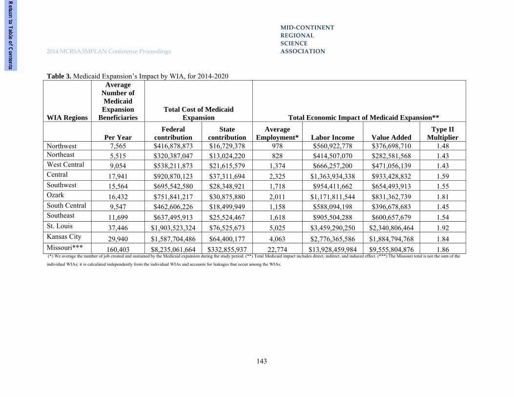
MID‐CONTINENT
REGIONAL
SCIENCE
2014 MCRSA/IMPLAN Conference Proceedings ASSOCIATION
143
Table 3. Medicaid Expansion’s Impact by WIA, for 2014-2020
WIA Regions
Average Number of Medicaid
Expansion Beneficiaries
Total Cost of Medicaid Expansion Total Economic Impact of Medicaid Expansion**
Per Year Federal
contribution State
contribution Average
Employment* Labor Income Value Added Type II
Multiplier Northwest 7,565 $416,878,873 $16,729,378 978 $560,922,778 $376,698,710 1.48 Northeast 5,515 $320,387,047 $13,024,220 828 $414,507,070 $282,581,568 1.43 West Central 9,054 $538,211,873 $21,615,579 1,374 $666,257,200 $471,056,139 1.43 Central 17,941 $920,870,123 $37,311,694 2,325 $1,363,934,338 $933,428,832 1.59 Southwest 15,564 $695,542,580 $28,348,921 1,718 $954,411,662 $654,493,913 1.55 Ozark 16,432 $751,841,217 $30,875,880 2,011 $1,171,811,544 $831,362,739 1.81 South Central 9,547 $462,606,226 $18,499,949 1,158 $588,094,198 $396,678,683 1.45 Southeast 11,699 $637,495,913 $25,524,467 1,618 $905,504,288 $600,657,679 1.54 St. Louis 37,446 $1,903,523,324 $76,525,673 5,025 $3,459,290,250 $2,340,806,464 1.92 Kansas City 29,940 $1,587,704,486 $64,400,177 4,063 $2,776,365,586 $1,884,794,768 1.84 Missouri*** 160,403 $8,235,061,664 $332,855,937 22,774 $13,928,459,984 $9,555,804,876 1.86 (*) We average the number of job created and sustained by the Medicaid expansion during the study period. (**) Total Medicaid impact includes direct, indirect, and induced effect. (***) The Missouri total is not the sum of the
individual WIAs; it is calculated independently from the individual WIAs and accounts for leakages that occur among the WIAs.

MID‐CONTINENT
REGIONAL
SCIENCE
2014 MCRSA/IMPLAN Conference Proceedings ASSOCIATION
144
3.2 Tax Impact on Missouri Figure 1 depicts the distribution of taxes
generated through Medicaid expansion during the period 2014-2020. The pie chart in the middle shows the distribution of taxes collected by state and local governments ($856 million) and the federal government ($1.4 billion). The federal tax represents about 62.4% of the total taxes collected ($2.2 billion) during the Medicaid expansion period of 2014-2020. The state and local governments account for the balance of the total taxes. The side graphs in Figure 1 provide additional information about the sources of the taxes that would be generated
with the Medicaid expansion. As the graph indicates, there are five main sources of taxes: employee compensation, proprietor, indirect business, households, and corporations.
Comparing information in the two side
graphs, the findings show that the indirect business tax contributes substantially (77.2%) to the state and local taxes generated, but employee compensation contributes the most to federal taxes generated (53.0%). Household tax is the second component that drives both federal (27.4%) and state and local taxes (19.4%) generated.
Figure 1. Tax Generated with Medicaid Expansion, 2014-2020
Table 4 provides information about the total taxes generated for the first year of the Medicaid expansion (2014), whether federal or state, and for the entire period 2014 to 2020. As the data indicate, an additional $2.3 billion will be generated in taxes from the Medicaid expansion, with 62.4% of it being federal taxes.
The estimates provided throughout this report reflect a base multiplier effect, estimating the impact of the direct, indirect, and induced effects of activities within the state. However, because Medicaid expansion involves the infusion of federal dollars into the Medicaid program in the state, the application of a “super multiplier” for the impact would result in even larger effects.

MID‐CONTINENT
REGIONAL
SCIENCE
2014 MCRSA/IMPLAN Conference Proceedings ASSOCIATION
145
Table 4. Total Tax Generated. Federal State and Local Total
One Year: 2014 $202,727,715 $119,247,565 $321,975,280 2014 to 2020 $1,423,863,355 $855,653,365 $2,279,516,720 4.0 Discussion and Conclusion
Missouri’s decision to opt in or opt out of the ACA’s opportunity for Medicaid expansion will have a significant impact on the state’s economy, and on the health insurance coverage and health status of its residents. If Missouri decides to participate in Medicaid Expansion, over 200,000 individuals will be newly eligible to participate in the program each year between 2014 and 2020. Of these individuals, it is estimated that approximately 160,000 will participate in Medicaid each year. Because the federal government will cover 100% of the costs of expansion for years 2014-2016, Missouri will experience no direct financial burden for the individuals participating during these years. Much of the pent-up demand for services that will be delivered when the patient receives a Medicaid card will be paid by the full federal funding in the first three years of implementation.
For the period 2017-2020, during which
time Missouri gradually contributes to the capped state-share of 10%, total state expenditures for Medicaid expansion would be approximately $333 million. During this seven-year period, there would be an infusion of approximately $8.2 billion federal dollars to support the Medicaid expansion, and Missouri’s contribution combined with the federal contribution would total approximately $8.6 billion. The creation of approximately 22,000 sustainable new jobs in the economy over the period 2014-2020 due to Medicaid expansion will significantly impact each WIA in the state in terms of ability to reduce unemployment.
In addition to the additional individuals
provided with health insurance, and the impact on their improved health status, the economic value-added output produced through direct, indirect, and induced effects of the $8.6 billion
Medicaid expansion infusion totals approximately $9.6 billion added to the gross state product. The Medicaid expansion will generate nearly $856 million in additional state and local taxes from 2014 to 2020 and over $1.4 billion in federal taxes. These increased tax revenues are due to the increase in jobs and economic activities within the state. References
1. Center of Medicare and Medicaid Services. The Patient Affordable Care Act. 2013. Available at: http://www.medicaid.gov/AffordableCareAct/Provisions/Provisions.html.
2. Kaiser Commission on Medicaid and the Uninsured. Key facts: the Medicaid program at a glance. Kaiser Family Foundation website; 2012. Available at: http://www.kff.org/medicaid/upload/7235-05.pdf. Accessed January 18, 2013.
3. Sommers BD, Epstein AM. Medicaid expansion—the soft underbelly of health care reform? New England Journal of Medicine. 2010;363(22):2085–2087.
4. Missouri Foundation for Health. The Significance of Missouri’s Uninsured.; 2011. Available at: http://covermissouri.org/docs/SignificanceMOUninsured2011.pdf.
5. National Conference of State Legislatures. State Legislation and Actions Challenging Certain Health Reforms.; 2011. Available at: http://www.ncsl.org/issues-research/health/state-laws-and-actions-challenging-aca.aspx. Accessed September 13, 2012.
6. Kaiser Family Foundation. Report and Briefing on Medicaid Coverage and Spending in Health Reform: National and State-By-State Results for Low-Income

MID‐CONTINENT
REGIONAL
SCIENCE
2014 MCRSA/IMPLAN Conference Proceedings ASSOCIATION
146
Adults.; 2010. Available at: http://www.kff.org/healthreform/8076.cfm. Accessed September 20, 2012.
7. MIG Inc. Implan Professional Version 2.0. 2nd Edition. Stillwater, Minnesota; 2000.
8. Drake RL. A short-cut to estimates of regional input-output multipliers: methodology and evaluation. International Regional Science Review. 1976;1(2):1–17.
9. Garnick DH. Differential Regional Multiplier Models. Journal of Regional Science. 1970;10(1):35.
10. Beemiller RM, Friedenberg HL. Regional multipliers: A user handbook for the regional input-output modeling system (RIMS II). Bureau of Economic Analysis, Washington, DC (United States). Regional Economic Analysis Div.; 1992. Available at: http://www.osti.gov/energycitations/product.biblio.jsp?osti_id=7281092. Accessed April 10, 2013.
11. Rickman DS, Schwer RK. A comparison of the multipliers of IMPLAN, REMI, and RIMS II: Benchmarking ready-made models for comparison. The Annals of Regional Science. 1995;29(4):363–374.
12. Rickman DS, Schwer RK. Multiplier comparisons of the IMPLAN and REMI models across versions: illuminating black boxes. Environment and Planning A. 1995;27(1):143 – 151.
13. Hjerpe EE, Kim Y-S. Regional economic impacts of Grand Canyon river runners. J Environ Manage. 2007;85(1):137-149.
14. Frezza EE, Wachtel MS, Ewing BT. The impact of morbid obesity on the state economy: an initial evaluation. Surg Obes Relat Dis. 2006;2(5):504-508.
15. Rutsohn P, Kent C. An assessment of the economic impact of Local Boards of Health on West Virginia’s economy. Hosp Top. 2010;88(3):67-74.
16. Dumas C, Hall W, Garrett P. Economic impacts of Medicaid in North Carolina. N C Med J. 2008;69(2):78-87.
17. Division of Budget and Planning, Missouri Office of Administration. Missouri Population Projections - by County, Age, and Sex: 2000 to 2030. 2012. Available at: http://content.oa.mo.gov/budget-planning/demographic-information/population-projections/2000-2030-projections.
18. Ruth, P Mitch. e-mail communication. 2012. Available at: [email protected].
19. Kaiser Family Foundation. Health Coverage & Uninsured. StateHealthFacts. 2012. Available at: http://statehealthfacts.org/comparecat.jsp?cat=3&rgn=6&rgn=1.
20. Holahan J. Rising unemployment, Medicaid and the uninsured. 2009. Available at: http://www.urban.org/url.cfm?ID=1001241. Accessed April 11, 2013.
21. Moomaw RL. Adjustment to Equilibrium Unemployment in Local Labor Markets. The Journal of Economics, 21 (1), 25. 1995;31.
22. Congressional Budget Office. CBO | Updated Estimates for the Insurance Coverage Provisions of the Affordable Care Act. 2012. Available at: http://www.cbo.gov/publication/43076. Accessed September 20, 2012.
23. Blumberg LJ. The Health Insurance Reform Simulation Model (HIRSM): Methodological Detail and Prototypical Simulation Results. 2003. Available at: http://www.urban.org/publications/410867.html. Accessed September 20, 2012.
24. Missouri Department of Health and Senior Services. Community Data Profiles. Available at: http://health.mo.gov/data/CommunityDataProfiles/index.html.

MID‐CONTINENT
REGIONAL
SCIENCE
2014 MCRSA/IMPLAN Conference Proceedings ASSOCIATION
147
25. Milliman. Patient Protection and Affordable Care Act with House Reconciliation – Financial Analysis.; 2010.
26. Gulley SP, Rasch EK, Chan L. Ongoing coverage for ongoing care: access, utilization, and out-of-pocket spending among uninsured working-aged adults with chronic health care needs. Am J Public Health. 2011;101(2):368-375.
27. Glied S, Little SE. The Uninsured And The Benefits Of Medical Progress. Health Aff. 2003;22(4):210-219.
28. John Billings, Nina Parikh, Tod Mijanovich. Emergency Room Use: The New York Story. The Commonwealth Fund; 2000.

MID‐
CONTINENT
REGIONAL
SCIENCE
2014 MCRSA/IMPLAN Conference Proceedings ASSOCIATION
148
A POLICY FRAMEWORK FOR THE USE OF PRIVATE CONCESSIONAIRES IN
THE NATIONAL PARKS Torrey Byles Granada Research 1.0 Introduction
Over the past 20 years, the National Park Service and other Federal and State land management agencies (BLM, National Forest Service, Dept of Fish and Game, and related State agencies) have increasingly contracted with private-sector firms to operate public-park facilities such as campgrounds, lodging and restaurant facilities and other recreational attractions. There is a growing consensus that reduced costs and efficiencies can be gained through this process (see Fretwell, Holly; and Recreational Resource Management). While this is generally a good approach that can make for judicious use of public funds and potentially effective management of public lands, there can be a further refinement to the policy of using private concessionaires.
Using private concessionaires can, in addition to being efficient from a public finance standpoint, also serve to help develop the economies of communities in the localities of the public lands and parks. Essential to this objective is that no profit remittance from park operations should travel beyond an identifiable perimeter of the Park. All revenues generated from a Park concession should remunerate those households, involved in operating and maintaining the concession, and that are typically adjacent to the park to some degree or intensity. Alternatively phrased, this guideline can be worded as: keep the money flow of the human community involved in Park operations close to the natural trophic
flow of the biotic community that the human community serves.
Furthermore, localizing economic impacts from Park operations can be made greater if the procurement of supplies, services and merchandise by concessionaires is also directed toward nearest available sources for items. In other words, concessionaires and their supply chains could both be stipulated by contracting agencies to be of local origin. The Park Service could mandate this in its RFPs and, where needed, provide training assistance to concessionaires. Modern-day supply-chain management techniques, including the use of extensive inter-company communications and reporting technologies, by the concessionaire and its suppliers, would augment the regional focus of park operations. Accounts payable files of the concessionaire and analytical tools such as IMPLAN would be employed to assess regional potentials and actual impacts.
In addition to economic development for regions of public lands, the “localization policy” sets up a virtuous cycle of land stewardship. Not only would regions be economically served by such a policy approach, but the potential to achieve best practices management of parks would be strong as well as the potential to cultivate in the communities adjacent to the park the preservationist values that are the reason the parks were established in the first place.

MID‐
CONTINENT
REGIONAL
SCIENCE
2014 MCRSA/IMPLAN Conference Proceedings ASSOCIATION
149
2.0 The Risk of Corporate Concentration in the Concessionaire Business of the National Parks
This recommended policy approach attempts to block the operation of concessions at National Parks by large multinational and/or private-equity corporations such as Aramark, Sodexo, Anschutz Entertainment Group, Forever Resorts and the Carlisle Group who are already in this business and are ramping up to dominate this business (see: NPS webpage of concessionaires; Blevins, 2012; Bruck, 2012).
The concessionaire business with the US National Park Service (NPS) is potentially one of the more lucrative ‘rent-seeking’ businesses1, similar to “privatized prisons,” healthcare, military-industrial complex, and financial services where one-thousand-and-one laws are created that favor unbreakable, monopolistic niches for large corporations and lead to their dominance of the sector. The corporate and private-equity world has recognized “park hospitality services” as the rent-seeking opportunity that it is (before the general public, I will add) and is mobilizing its resources to take advantage of it, for example, through acquisitions of small, family-owned concessionaires who have served typically one park for generations (see Xanterra website on its acquisition of Fred Harvey; and, Aramark 2012 10-K, discussion of acquisition history, p.2).
A consolidation of the Park business is taking place by, in some instances, non-US companies (e.g. Sodexo of France, Compass Group LLC of the U.K.), and in many others, non-publicly traded (i.e. private equity) companies (Carlyle Group) that have zero oversight by the public, and are run as private fiefdoms. The possibility of a
1 Rent seeking are those activities of a firm directed at increasing its share of the economic pie rather than increasing the size of the pie itself. (Stiglitz, 2012)
complete subversion of public values due to private, “black-box” control is very real and stark. Using the Parks to generate profits that are sent to a remote, non-local corporate headquarters is the root cause of subverting the preservation values of the Parks. Remote ownership and profit from Park lands perpetuates the economic and instrumental valuation of land as the sole criterion of its use, as opposed to an intrinsic-aesthetic valuation. Furthermore, distant owners who are interested only in profit, will not develop sustainable nor socially just practices of land stewardship.
The NPS concessionaire business is becoming big business due to three factors: (1) the NPS is a big client with the world’s biggest taxpaying public “guaranteeing” contract payment; (2) the NPS foolishly and without compensation provides easy contracting terms to concessionaires2; and, (3) there are massive opportunities to create no-risk commercial deals through lobbying efforts at the Congressional level, which only large corporations and private equity groups have the wherewithal to do. 3.0 Public/Private Partnerships, Old and New
If conducted under the appropriate institutional arrangements, the use of local private concessionaires can be a good thing. It can bring greater efficiency and effectiveness than attained by national bureaucracies. And it can achieve social and ecological objectives as well.
Use of private concessionaires does not necessarily mean a wholesale turning over to private interests the full right of ownership and control. Evolution in the understanding of institutional principles in managing public goods over the past 50 years have
2 See, for example, the Oregon Caves RFP now open for bid. Dept. of Interior Business Opportunity CC-ORCA001-15.

MID‐
CONTINENT
REGIONAL
SCIENCE
2014 MCRSA/IMPLAN Conference Proceedings ASSOCIATION
150
delivered a wealth of distinctions, arrangements, and governance structures that don’t involve a wholesale abdication on the part of government or private enterprise. And these can be applied here.
The fact is that in the NPS, there is a shortfall of money (see Exhibit 1).
Exhibit 1
Source: NPS Budget Document 2011 .
Three salient points are important to observe in the chart. First, there is a shortfall of $2.3 billion between the cost incurred by the NPS in running the parks, and the revenues that the NPS receives from the parks.
Second, the vast majority of the costs of running the parks is in the category, Park Management and Operation, which – I am fairly certain – is entirely wages and salaries of NPS personnel.
Third, in the revenue column, the revenues derived from Concessions and
Rents are actually approximately two percent (2%) of the gross concessionaire revenues. In the text that accompanies this budget document, it is explained that the concessionaire payments to the NPS average 2% of their gross sales (NPS 2011, p. ONPS-50). In other words, approximately $1 billion in gross revenues could be added back into the revenue side of the chart. The shortfall here would be reduced to only $1.3 billion, instead of $2.3 billion.
Still, there is a case that the private sector could operate concessions and possibly more of Park “management and operations” more cost-effectively than NPS
$360 million
$2.6 billion
$2.3 billion shortfall

MID‐
CONTINENT
REGIONAL
SCIENCE
2014 MCRSA/IMPLAN Conference Proceedings ASSOCIATION
151
staff. The compelling reasons are twofold: (1) Park visitations are highly cyclical and NPS convention of hiring full time, year round employees poorly suits this; (2) many park management functions, such as fee taking and building maintenance, do not require advanced degrees, whereas NPS staff is heavily weighted to personnel with advanced degrees. (see RRM website)
Thus, there is a case to be made that private concessionaires can help close the budgetary shortfall in the NPS. But the institutional framework has to be carefully circumscribed. The rest of my essay describes three important guidelines, to be used in conjunction with my main thesis of keeping concessionaire profits local to the general area of the Park itself. 4.0 Mandate Corporate Responsibility, Transparency and Open Governance Measures in Concessionaire Businesses and their Suppliers
Rules and selection criteria for NPS contracting, procurement and supplier relations are all important in our policy for using private concessionaires. Procurement and supplier relations is one of the chief areas that economies of scale (in production of a good or service) is obtained, whether the buyer is a public or private entity. It is also a focal point for implementing socially responsible and ecologically sustainable corporate practices.
For this domain, new principles of “corporate responsibility,” “shared value,” supply-chain management and “open-books management” (and other transparency measures) are highly relevant and should be adopted (Mohin, 2012; Porter, 2011; Stack, 2002). Especially important are transparency and communication issues where large buying entities, whether they are public or private, actively dictate and monitor the quality and performance of their suppliers (Mohin, 2012). Massive channels of
communication inside and between firms are key components in this.
Supplier compliance represents a new style of inter-enterprise governance which, in the case of the Park System, will be critical to bringing about necessary changes in perspective especially around ecological principles including the place of humans in the environment. Corporate responsibility in Park contracting based on massive communication practices, when coupled with private profits distributed locally (not concentrated in the hands of a few, huge global corporations) can become a new force by which the more broadly diversified public informs itself of the value of ecology – what Aldo Leopold called “the land ethic.” The public governance concerning Parks and wilderness areas that is lost when public agencies turn control over to private firms, can be maintained if and only if these private firms create cultures of democratic communications, transparency and openness. Privatization with the stipulations of (1) keeping profits regional and (2) open, democratic operations of the various private concessionaires is a new form of public governance to the NPS.
Corporate responsibility and supplier compliance are trends that the private sector, in some industries, are already adopting for improved social and ecological outcomes (Mohin, 2012). Such measures should be stipulated for NPS concessionaires, as one guideline. This style of corporate responsibility and openness should span the entire supply chain (food chain !!) of the concessionaire network. In other words, while the NPS must carefully monitor its concessionaire suppliers; the concessionaires themselves must have tight connections with their suppliers, and the suppliers with their suppliers, and so on. Up and down the Park supply chain of private enterprise that is in the hands of diverse, local companies, will the greater perception

MID‐
CONTINENT
REGIONAL
SCIENCE
2014 MCRSA/IMPLAN Conference Proceedings ASSOCIATION
152
of a land ethic be spread and become pervasive in the country. Such a land ethic will not arise nor become pervasive if the concessionaire business becomes yet another military-industrial style complex dominated by a few rich plutocrats such as oil and entertainment magnate, Philip Anschutz or the Bush-Carlyle syndicate. 4.1 Yellowstone National Park Gift Shops
The concessionaire in Yellowstone National Park has taken a local sourcing focus in its operations, particularly giftshops and foodservice supplies. It attempts to source goods and services from local providers. For gift merchandise coming from within a 500-mile radius, it highlights the merchandise with small signs on giftshop shelves. The concessionaire admits that not much of the usual merchandise of a giftshop can be sourced locally (such as binoculars and cameras), yet the signage program has been a strong draw among visitors. 5.0 Avoid Ideology, Focus on Institutional Arrangements, Rights and Obligations
God is in the details when spelling out economic actions, rights and obligations. Terms such as “private sector,” “public sector,” private property, public property, owner, and many others, are often too vague to be meaningful in a practical, i.e. actionable way. The discussions concerning arrangements for operating the parks will need a much richer vocabulary or, alternatively, we have to view these vague terms in precise entitlements and obligations. General categories and terms don’t apply and are misleading.
After spending a lifetime of studying tragedy-of-the-commons situations, Elinor Ostrom, the Nobel economist, makes the strong point that you must avoid sweeping generalities. She warns,
“Dichotomizing the institutional world into “the market” as contrasted to “the state” is so grossly inadequate and barren that it is surprising how the dichotomy survives as a basic way of organizing academic studies and policy advice. Oversimplification of our design options is dangerous since it hides more of the working parts needed to design effective, sustainable institutions than it reveals. And, it reduces our awareness of the need to monitor outcomes and improve them over time through better processes of learning and adaptation.” (Ostrom 2005, 256)
Ostrom’s entire institutional approach
relies on the power inherent to human promises, commitments and obligations, codified in rules and contracts, designed to perform specific collective actions. (This is otherwise known as a “deontology.”3)
The focus on “institutional” roles and a deontology of formal agreements, is an alternative to assigning monetary values on parks, natural wilderness areas and other environmental objects and services. This second approach, often referred to as “getting the prices right,” is the mainstream economics approach. It may have some usefulness, but I am proposing here for the National Parks, to focus on carefully crafted obligations and entitlements for and by agents involved in the operating of Park services. This can be seen as substituting general market and economics terms (such as public, private, owner, and so forth) with rights, entitlements, obligations and responsibilities. A strong recognition and public outreach concerning vocabulary can
3 Deontology = a system of obligations. For deontology and economic institutions, see Ostrom, 2005; and Searle, 2010.

MID‐
CONTINENT
REGIONAL
SCIENCE
2014 MCRSA/IMPLAN Conference Proceedings ASSOCIATION
153
do much to forestall emotional reactions when people, such as Ms. Fretwell make sweeping, ideological declarations such as “privatize the National Parks.” 6.0 Recognize yet Transcend Economic Value by Cultivating Participatory Ethics
Finally, as a result of keeping concessionaires (and profits) local, mandating transparency, and specifying roles and obligations, we hope to see a flowering of the land ethic in the people, including “private owners.” This is in line with what Aldo Leopold, as far back as the 1930s foresaw as the only possible way forward to avoid “economic determinism” becoming the only guiding principle in land management and stewardship (Leopold, 1948, p. 213).
Leopold recognized two important points that are relevant to our discussion of the management of wilderness and parks: (1) the government can’t do everything to protect and steward the land; private owners of land must do their part as well (Leopold, 1933, pp. 395-405; 420-423; and Leopold, 1948, pp. 213-214); and (2) ultimately, the motivation to steward the land in a more ecologically friendly way, and not opting for the economic use only, comes from the right perception of the land and one’s place in it (Leopold, 1948, pp. 173-176). This perception is akin to seeing oneself as a participating member of a community of other animal and inanimate, natural things, and thereby acting according to an ethic such as the golden rule. It involves recognizing that these other things help constitute oneself – they are part of ones own being. This perception can only come about through participation in the land.
These two principles -- that private owners have a responsibility and that they must cultivate within themselves an ethic of stewardship above and beyond economic gain -- have far reaching implications, the
least of which concerns the economics and efficiencies of preservation. When the management of concessionaires are done at a small, local scale; when their supply chains and enterprise management is highly transparent and engaging those workers – including entrepreneurs, managers, or staff workers – throughout a single enterprise and up and down the supplier network of the concessionaire; when all people involved in the servicing of those national parks and forest campgrounds have hands on contact with the land and are compensated at the full value of their effort (and not given a fraction, where the remaining fraction is siphoned out of the region to some corporate headquarters and beyond), then the seeds are planted, so to speak, for a land ethic to grow up and grow widely.
Theoretical ecologist Robert Ulanowicz’ has developed a method for assessing the health, resilience and efficiency of ecosystems (Ulanowicz, 1997). The method turns on the degree to which all constituent species of an ecosystem participate in the trophic feeding of the energy throughput of the entire ecosystem. My recommendation concerning engaging home-grown concessionaires -- and keeping out global corporate concessionaires -- adapts Ulanowicz’ notion. Incorporating the human economy as if it were part of the larger trophic throughput of the entire biotic community, will help not only social justice by more evenly distributing incomes (part of the extended trophic flow of the bio-community), but it will also better adapt the human operations of Park use with its surrounding ecological processes. It will create a virtuous, self amplifying circle that will instill land ethic values that, in turn, will supercede, but not eliminate, economic values. Better distribution of money incomes and less inequality, helps all members of the human community to focus on the ends of money, not the means to it. The ultimate result is greater ecological resilience

MID‐
CONTINENT
REGIONAL
SCIENCE
2014 MCRSA/IMPLAN Conference Proceedings ASSOCIATION
154
coupled with equitable distributions of income to households. References Aramark Corporation, Corporate 10-K, 2012. Blevins, Jason. Feb. 28, 2012. Private operators of Forest Service recreation sites spurs lawsuit. The Denver Post. http://www.denverpost.com/ci_21649079/private-operators-forest-service-recreation-sites-spurs-lawsuit Bruck, Connie. The Man Who Owns L.A.: A Secretive Mogul’s Entertainment Kingdom. The New Yorker. January 16, 2012. http://www.newyorker.com/reporting/2012/01/16/120116fa_fact_bruck?currentPage=all Dept. of Interior Business Opportunity CC-ORCA001-15. Accessed on the web, November 10, 2013. http://www.concessions.nps.gov/docs/Prospectus/ORCA001-15/Prospectus%20Files/ORCA001-15_Business_Opp.pdf Fretwell, Holly. Youtube Video. Accessed November 10, 2013. http://www.youtube.com/watch?v=Vd6VXp6hanA. Leopold, A., & Brooks, A. (1933). Game management. New York: C. Scribner's Sons. Leopold, A., & Schwartz, C. W. (1987). A Sand County almanac, and sketches here and there. New York: Oxford University Press. Mohin, T. J. (2012). Changing business from the inside out: A treehugger's guide to working in corporations. Sheffield, U.K: Greenleaf Pub.
NPS website, page of concessionaires. Accessed November 10, 2013. http://www.concessions.nps.gov/concessioners.htm NPS 2011 Budget. http://www.nps.gov/aboutus/upload/FY_2011_greenbook.pdf Ostrom, Elinor. Understanding Institutional Diversity. Princeton: Princeton University Press, 2005. Print. Porter, M. E., & Kramer, M. R. (2011). CREATING SHARED VALUE. Harvard Business Review, 89(1/2), 62-77. Recreational Resource Management website. Accessed November 10, 2012. http://camprrm.com/our-recreation-management-services/ Searle, J. R. (2010). Making the social world: The structure of human civilization. Oxford: Oxford University Press. Stack, J., & Burlingham, B. (2002). A stake in the outcome: Building a culture of ownership for the long-term success of your business. New York: Currency. Stiglitz, Joseph. America’s Prosperity Requires a Level Playing Field. The Los Angeles Times. July 22, 2012. Ulanowicz, R. E. (1997). Ecology, the ascendent perspective. New York: Columbia University Press. Xanterra Website, Page on Fred Harvey legacy. Accessed Nov. 12, 2013. http://www.xanterra.com/who-we-are/our-fred-harvey-legacy/.


MID‐CONTINENT
REGIONAL
SCIENCE
2014 MCRSA/IMPLAN Conference Proceedings ASSOCIATION
155
MARKET AND TRADE AS DRIVERS OF INNOVATION Maria de Fátima Sales Universidade Estadual de Londrina
Knut Ingar Westeren Nord-Trøndelag University College
Abstract Developments of trade theory after the turn of the century have put focus on firm level micro data which allowed researchers to study in detail how exports can be linked to productivity developments and innovations. This paper first gives a discussion of the self-selection hypothesis – in what way can we interpret a possible connection between exports and productivity? The main focus of the article is to go one step further and analyze how innovations fit into the picture. We do this by first giving a discussion of the innovation concept. Then we look at how three firms producing white meat in three different countries (Denmark, Brasil and Sri Lanka) can link innovation and export activities. Results suggest that it is possible to identify connections between exports and innovation. In general the findings from these three companies support the self-selection theory but it also supports the point of view that innovative behavior in companies must be seen from a total managerial perspective. It is too easy to say that export activities here explain all the innovative behavior; rather market signals in general play a more important role. Keywords: Export, innovation, the self-selection hypothesis
1.0 Introduction
Exports have been looked at as a key variable in growth policies for many years because exporting firms bring foreign money into the country and because they show competitive strength. The link between exports and economic performance up to the turn of the century was mainly based on aggregate data. Studies based on microeconomic data by Bernard and Jensen (1995, 1999) were the introduction to the more firm based analysis. This shift in focus highlighted the fact that economic theory is to a large extent dependent on the assumptions that are made when you do the analysis and interpret the results. This is especially a factor when we look at theories about the behavior of firms. One crucial choice for the kind of assumptions that shall be made is whether we assume homogeneous or heterogeneous firms.
The New Trade theory, Krugman (1985), and Helpman and Krugman (1985) contributed to explain some of the problematic features of
standard classical trade theory, like the large volumes of intra-industry trade. One central argument to explain this is product differentiation by firms operating under monopolistic or oligopolistic competition and facing increasing returns to scale, together with consumers preference for differentiated products within the same main category. New Trade theory is also looking at differences between firms but testing this theory has been done by using a representative firm that had the average characteristics of the firms in that sector, Baldwin (2005). Also for practical purposes the unit of analysis in the application of New Trade theory has many times been the industry. Much of the policy advice given by new trade theory is linked to sectoral developments, which also fits into the analysis of competition that started up with Porter (1985/2008, 1986, 1998).
One new step in the development of trade theory is what is called new New Trade theory, starting with, among others, Melitz (2003).

MID‐CONTINENT
REGIONAL
SCIENCE
2014 MCRSA/IMPLAN Conference Proceedings ASSOCIATION
156
This framework had focus on firm level micro data which allowed the researchers to study in detail industrial organizations, innovation systems and to combine gain from trade with the structure of the actual firm and the market characteristics that the firms are exposed to. These challenges linked trade theory and theory of the firm because now the focus is on the firm’s level looking at productivity, capital intensity and whether firms can produce more or less the same product but with varying quality and compete in the same markets. This framework also allowed the study of entry and exit of firms in both similar and different markets like the regional market, the national market and export markets. Another important characteristic of the firm that now was able to be studied was the size of the sunk cost that firms could meet in introducing their products into foreign markets. These sunk costs could consist of obtaining general information about market structure, identifying foreign partners, dealing with foreign regulatory requirements and how to set up distribution channels and service networks.
Since the 1990s there have been several attempts to explain the globalization of trade mainly based on two models; the OLI model by Dunning and Lundan (2008) and the Uppsala model of Johanson and Vahlne (1990). The OLI model by Dunning was based on eclectic reasoning and identified ownership, location and internationalization as the most important factors for businesses to succeed in globalization attempts. The Uppsala model focused more on learning, knowledge transfer and management.
What is often called the new New Trade theory is frequently linked to Melitz (2003) and this theory also takes the New Trade theory by Krugman as its point of departure. What is often called the sunk cost theory lies at the bottom of the new New Trade theory and some of the results of this theory are:
It is the most productive firms that are able to enter export markets
Export firms are normally larger than the industry average
Sunk cost firms that have started to export are likely to continue at least for some time
2.0 Export, productivity and innovations
Building on work by Jensen and Melitz we can say that most of the research based on individual data for firms shows the existence of a positive relationship between export and productivity, see Mayer and Octaviano (2007). There have been several attempts to explain this and the first explanation is that firms enter export markets by self-selection. Firms that have greater productivity before starting to export can overcome the extra cost to enter export markets and are more robust to build up resources and to establish themselves as an exporter over a longer time period, Melitz (2003), Bernhard et al. (2003). Another explanation is found by looking at the relationship the other way, meaning that we analyze to what extent export enhances productivity. The logic here is that firms when they have established themselves in export markets learn from this market and use this knowledge to strengthen their position and increase productivity. This theory introduces the effect that export can influence the innovating activities of the firm. This leads to the conclusion that we have at least three ways to look at the links between innovation and export.
1. The self-selection effect as the start of the process; here the firm is innovative at the start in the established market and takes this innovativeness with it to export market. It is the innovativeness of the firm that is the important contributor to high productivity so that the firm can have financial resources to survive as an exporter. 2. The second link between innovation and export suggests that firms are able to absorb signals from the export market and other complementing institutions so the firm can use the signals as a starting point for innovations. 3. A third way of looking at these links is sometimes called the specialization effect which means that the firm initially learns from the export market where it participates.

MID‐CONTINENT
REGIONAL
SCIENCE
2014 MCRSA/IMPLAN Conference Proceedings ASSOCIATION
157
Specialized products often form a niche strategy so the firm is more protected from price competition both in the home market and in the export market.
Up to 2007 the most common point of departure was to look at the self-selection effect and a review of the literature describing this in many countries are given by Wagner (2007). From the point of view of economic policy the effects of innovation on the firm’s ability to export and thereby increase productivity is important.
Learning by exporting means that exporters better than other companies producing the same products are able to utilize technology and management practices used by other companies in the international market where they participate. The results from empirical studies are rather mixed concerning the hypotheses of learning by exporting and the direct effect this export has on productivity, see Greenway and Kneller (2007). One of the reasons for these results is that it is difficult to isolate the impact that exporters get from learning compared to other effects of productivity development in the firm. Another problem is also how to define and analyze the innovation process. Some of the discussions here relate to what kind of innovation takes place and what kind of abilities and absorption capacity the firm has for innovative behavior. One interesting part of the discussion has been whether firms are more stimulated by product innovations compared to process innovations when it comes to learning from signals from export markets.
Work by Constantini and Melitz (2008) has provided the opportunity to analyze more dynamic situations with firm level data where the objective is to find out what kind of links we can have between innovations and export decisions. In the model framework by Constantini and Melits it is possible to analyze if an innovation is like an adaptation of a new technology or a new major product which can be a completely new product, quality upgrade or new design. This can be a crucial factor to explain productivity and the firm’s decision to enter export markets and be able to sustain in
the market. Other models for analyzing the relationships between innovation and export come from Aw et al. (2008).
After 2007 there have been several empirical studies of possible links between innovation and export and one common feature for these studies is that they are focused on heterogeneous firms. One problem with many of these studies is the possible endogeneity between innovation and export decisions.
What makes it problematic is deciding
when the innovation activity started that resulted in increased exports for the company. Often it is a several efforts based on a combination of market signals and technological developments that ends up with a prototype which is tried out on the market. Then the product is improved and tested out on the export market again. Later we can have a mix of product, process and market innovative initiatives which make it difficult to analyze at what point the innovation started and when the success came in the export market.
We have also seen studies that look at which type is more important for success in the export market, product or process innovations. The most common answer is that product innovations play a major role but we also see that when product and process innovations are necessary, together the process innovation becomes increasingly important, see Becker and Egger (2013), Cassiman and Golovko (2011), Gunday et al. (2011), Higón and Driffield (2011) and Damijan et al. (2010).
There are several reasons why we can expect variety in the results when we are analyzing the link between innovation and export. One reason is that innovations always are context specific and the way we measure innovations and the indicators we use may not be as well defined and appropriate as they should. Several of the studies use indicators like research and development spending and numbers of patents. None of these indicators are directly pointing at the innovation process. Several of the other studies use data from the European Union where the firm identifies

MID‐CONTINENT
REGIONAL
SCIENCE
2014 MCRSA/IMPLAN Conference Proceedings ASSOCIATION
158
when they do an innovation and what kind of innovation this is. Here there may be quite big differences in the criteria that each firm uses, even in the same industry, see Wagner (2007). 3.0 A closer look at innovations
In this article the innovation concept and innovative activities are central for a better understanding of the empirical part where we look at relationships between innovation, trade and exports. Innovation has taken a central place in economic analysis from the work of Joseph A. Schumpeter, Schumpeter (1934, 1939, 1942/1950) and has focused on dynamic aspects of the economic development. In recent years innovation analysis has been linked to theories of endogenous growth starting with Romer (1990). From a firm perspective it is difficult to link innovation to the neoclassical analysis, on the other hand it fits well into the school of evolutionary economics, Nelson and Winter (1994). Further developments of links between innovation and the theory of the firm are found by looking at resource based theories and dynamic capabilities of the firm, Teece (2007).
There have been many attempts to widen and develop further the innovation theory starting with Schumpeter and two lines of thoughts are often mentioned. The first is the systems of innovation concept that has been applied on the national level and on the regional level, Lundvall (2010). The second development is linked to the concept of open innovations, Chesbrough (2003). In short, one can say that the open innovation school emphasizes that firms shall use external ideas and contacts as well as internal to advance their technology and market contacts as a stimulus for innovations. This is not fundamentally new to the start of the innovation theory from Schumpeter, but in line with development of the theory of firms and organizations and the general development into more openness when it comes to trade and globalization.
The innovation concept starting with Schumpeter has been looked at as a process which is closely linked to the context and environment in which the firm operates. In this
context the innovation process is often analyzed by looking at four relationships.
1. Innovation opportunities 2. Incentives to exploit these
opportunities 3. The capacity and resources of the firm
to implement and conduct the innovation
4. Institutional settings and external sources (like customers, suppliers, universities and other R&D institutions, government agencies, consultants etc.) which mentor and influence the results and efforts of the firm
Also looking back to Schumpeter it is
important to stress that the innovation concept is linked to the firm’s ability to produce a net surplus for society. Often this is operationalized to include the fact that the innovation shall produce net profits for the firm, at least after a few years. Of course an innovation process can be costly for a firm and for the society during the first short time period but the innovation must create a net surplus for society in the medium or longer run. The spread effects from an innovation are often also assumed to contribute to other parts of society so they also can create a surplus – but this is often difficult to measure.
The analysis of innovation has developed after the founding works of Schumpeter and we are now analyzing concepts like creativity, invention, innovation and the dissemination of the changes that take place. One central concept from Schumpeter, the process of creative distraction, is still in place as an influential factor in understanding what the innovation process is about. One example to shed light on this is the following. In the early 1970’s two companies were competing quite intensely in the market of reel-to-reel tape recorders, Sony from Japan and Tandberg from Norway. The Sony firm was at that time also an important international player in the consumer electronics market and had reasonably good technology and a well-established distribution system. The Norwegian firm Tandberg had developed a

MID‐CONTINENT
REGIONAL
SCIENCE
2014 MCRSA/IMPLAN Conference Proceedings ASSOCIATION
159
leading edge technology with limited resources, high quality and a high technological level as their main competitive argument. In the middle of the 1970’s the market saw a new standard for tape recorders, the cassette, which from a market and consumer point of view was a much easier and more convenient technology to handle. The Sony firm quickly saw the new market possibility for the cassette while the response from the Tandberg firm was to develop the technology and quality of the sound of the reel-to-reel recorder to an even higher level. At the end of the 1970s the Tandberg firm went bankrupt while the cassette standard took over as the leading format. In short, the problem for the Norwegian firm was that it was unable to do creative destruction of old ideas and understand the new.
Schumpeter distinguishes between five types of innovations:
The introduction of new products The introductions of new methods The opening of new markets Development of new sources of raw
material supply and or new other inputs
The creations of new organizational structures (linked to markets)
In recent years we have seen many
attempts to give a more precise definition of the innovation concept, but there seems to be no common agreement. Most of the literature refers to the five types of innovation by Schumpeter and adds that it should be possible to find some kind of process of creative destruction and new products or processes must have a novelty linked to it. Many studies, books and articles refer to the Oslo Manual, OECD (2005), as the most used reference for the definition of innovation. The Oslo Manual again builds on Schumpeter and also has the same limitation that the definition lacks precision. It is interesting to note the point of view from Professor Karen R. Polenske, Polenske (2007), at MIT:
“I am struck by the many different interpretations of innovation, the lack
of consensus on a framework both to define the theory of innovation and the way to measure it, and by the vast number of empirical studies that are done, but using relatively simplistic measures.”
This statement is easy to interpret by the
fact that innovation is a process and clearly context dependent.
The Oslo Manual was first published by OECD in 1992 and has been revised several times. The version used in this paper was released jointly by OECD and the Europe Commission, OECD (2005). The Oslo manual states that a product innovation is normally introduced via a market as a need to customers either as a completely new offer or improved or changed in a significant way compared to what earlier was available in the market. The use of the word product has the interpretation that it either can be a good or a service and it is not necessary that the product is delivered through normal market channels. For example we have new products in the public sector which are offered to the public at a zero price or included in other payments. For a product innovation it is normally necessary that the firm is able to interpret market signals and develop the new product.
A process innovation concerns essentially the implementation of a new production or new distribution method or one substantially improved. This normally requires new or improved technology at some stage of the production process. It does not necessarily need to be a change in the actual manufacturing process but can be at the stage of distribution or quality control. Quite often product and process innovations are linked together and we have seen many examples where new products require new production and or distribution processes.
Normally product and process innovations have new knowledge or skills linked to the development. There have been many studies focusing on knowledge development and how new skills and knowledge components are

MID‐CONTINENT
REGIONAL
SCIENCE
2014 MCRSA/IMPLAN Conference Proceedings ASSOCIATION
160
introduced into the innovation process, see Westeren (2012).
We have not so far seen one study that actually gives a complete picture explaining the innovation process. One study by Becheikh et al. (2006) gives a systematic account of the factors that affect product and process innovations. In this article we find a breakdown of what is called internal factors and contextual factors to explain innovation in firms. Among the most important internal factors are the firm’s general characteristics, the market strategies and the production structure including control activities. Among the contextual factors that influence the innovations are the firm’s industry, region, networking and the ability to acquire knowledge and combine this with technology. The important feature is how the firm is able to organize the activities so they meet the market either with a new product or with a new cost saving process that contributes to the competitiveness of the firm.
Recently we have seen development of knowledge acquisition and knowledge management and how this influences innovation, see Westeren (2012). How the knowledge management process contributes to innovations can be looked at in three stages. The first stage is identification and here the firm must look at the knowledge it possesses in relation to what are central procedures for value creation in the firm. Then the firm must be able in some way to measure and be aware of what the knowledge capital actually consists of, often based on an operational set of indicators. The third important stage is that the firm must have a management system that takes care of the knowledge capital and optimize the use for innovative purposes.
From another point of view the firm also needs to develop skills to have a successful innovation process. The first step is that they have to have some kind of inventor abilities inside the firm or access from outside. This is quite often a process which is difficult to control especially when it comes to the process of transforming tacit to explicit knowledge. Many companies use lot of resources for
"planned inventions" and the research literature here shows a very large variation in the results, from a lot of wasted money to successful idea generation. The next step is that the firm needs to have a system for the innovator or the entrepreneur who develops the idea to get their product to the market. Schumpeter was very clear on this point that the market was the most important selection instrument for innovations. Then the firm also needs a manager and a firm organization design which makes the firm able to run the business and at the same time make profits based on the innovation. The final, but also the crucial point, is that the firm needs financial resources and skills so the capital flow is managed in the best possible way. In the empirical part of this paper we will comment on how three companies have managed the innovation process with emphasis on market relations. 4.0 Case Studies
In this part of the paper we will analyze the situation for three companies:
Danpo A/S in Denmark LAR in Brazil Crysbro in Sri Lanka.
All three companies are chicken slaughters
and the main product is white meat from chicken. 4.1 About Danpo A/S in Denmark
Danpo is a Danish firm producing white meat from chicken and the situation in this market in Denmark is that there are two quite big companies, Danpo and Rose Poultry A/S. The production capacity in Danpo is about 190 000 slaughtered chickens per day and they have about 300 persons employed in the production system. The market situation is that they deliver about 50 % of the production in volume to the national Danish market and 50 % for export that goes mainly to Germany. Compared to the other two companies, Danpo has high labor costs and a high level of technology in production. The production is highly automated and as one of the first companies, Danpo also has a system of quality control based on new technology. This system

MID‐CONTINENT
REGIONAL
SCIENCE
2014 MCRSA/IMPLAN Conference Proceedings ASSOCIATION
161
is based on a digital video image analysis of every chicken that is produced. The firm has leading edge equipment in production and also in distribution and follow up of orders.
The market strategy for the firm is focused on the national market in Denmark and it is from this market the firm makes most of its profits. There are quite big fluctuations in demand from the national market from week to week and month to month. The firm produces a much higher volume than is needed for the national market which the firm exports mainly to Germany. The firm takes into consideration that the price for exports is considerably lower than the price for deliveries to the national market, so one can say that the firm uses exports as a strategy to even out the fluctuations in the national market. 4.2 LAR in Brazil
LAR is a Brazilian firm situated in Parana, Brazil. The firm produces about 300 000 chickens a day and has about 3000 employees. Compared to European production one can say that LAR has lower labor costs and a medium degree of technology. When we compare the number of employees to total production, the numbers reveal the fact that LAR has a more labor intensive production than for example, Danpo. The main innovative side of the firm is how it does vertical integration. The firm has an integrated system from the production of eggs, to chicken, to the slaughter and the firm is able to have high quality production of the meat with relatively low costs for the feed. The market strategy for the firm is that for 2013 and 2014 it seems to have an export share of about 50 %. The strategy of the firm is to increase the export share and use exports as the main factor contributing to the profits of the firm. The main export markets are China, Europe, Japan and Russia. 4.3 Crysbro in Sri Lanka
Crysbro is a firm situated in Kandy, Sri Lanka. Compared to the other firms this firm has low labor costs and a low to medium degree of technology. The production capacity is about 50000 chickens per day. The firm has the home market as the main strategy and a low export share of about 5-10 % of total
production. One interesting innovation strategy of the firm is to integrate production with local home kitchens/local based home restaurants. This means that the firm is building a net of receivers of chicken meat and the receivers work much like a franchising company which means that they look like a home kitchen system. These home kitchens are serving readymade chicken meat for lunch or dinner in a faster way than a normal restaurant but not as a fast food chain like Mc Donalds. 5.0 Looking at theory and the case studies together
In the theoretical part of the paper we discussed how we could define the innovation concept and then more in detail about how signals from the market could be taken back to firms and contribute to innovative behavior and actual innovations. All three firms that we analyzed produce the same product, mainly white meat from chicken but under quite different technological and market circumstances. When we look at the Danish firm the innovative behavior emerges through the new IT-based quality control and production management system.
Two important characteristics of the Danish market for white meat are tough price competition and the quality of the product. There are also quite big fluctuations in the demand so for the firm to be able to make profits on the whole domestic market, it must be able to deliver different quantities every week. A consequence of this is innovating equipment consisting of a technologically advanced quality control system which both allows a high speed and works together with a high level of mechanization of production. This innovation, the vision classification system, also makes it possible to identify the producer if there is any complaint about quality. The system is built on the foundation that it takes two pictures of every chicken and then one can trace which producer actually delivered the chicken.
One other innovative behavior of the Danish firm is the IT based ordering system. This system integrates production, sales and storage. As stated in the theoretical part it is

MID‐CONTINENT
REGIONAL
SCIENCE
2014 MCRSA/IMPLAN Conference Proceedings ASSOCIATION
162
important to manage knowledge flows in an effective way. This is done because the system takes care of the core competences of the firm which is high quality production and also finds the right indicators for knowledge transfers and at the same time builds the whole system into the managerial part of the firm.
The lesson from LAR, the Brazilian firm, is that they want to have success with bulk production of white meat on the international market. The firm has focused on two key items, quality control and low cost in all parts of the production chain. The LAR firm has well-built testing facilities for quality control of the meat but this is more a strategy of integrating this activity into the production processes than an actual innovation. The innovative behavior is how the firm constructs and manages the vertical chain of production. Here the firm is able to take care of the low cost of producing ingredients for feed for the chicken. The important point here is the low cost of using soya beans. On the other hand, it is important for the firm to have strict quality control in every part of the production chain and the transfer of knowledge from the firm organization to the different breeders of the chicken production process. With this strategy the firm tries to find the right niches for the different parts of the chicken products in the different export markets. The firm, at least to a certain degree, uses the home market to straighten out the fluctuations that come from the export activities.
For the Crysbro firm in Sri Lanka the regional market and cultural information are central to innovative behavior. The firm will continue to sell white meat more or less as a bulk product to the national market but has now started a process of linking together a net of home kitchens that receives semi- processed meat from the company and sells this through contracting restaurants like kitchens in the regional market. The export strategy of the firm has not been a main strategy so far but it is interesting to see that they try to export to countries in the Arabic world that has cultural similarities to Sri Lanka.
6.0 Conclusions From the theoretical perspective it is
interesting to see how export and other market strategies can contribute to innovations in the firm. It is the LAR firm that most adequately fulfills the self-selection hypothesis in that it has the financial muscles and high productivity to be an exporter. For the Danish firm, its export comes as a derived strategy from the home market. For the Sri Lankan firm it looks like an expansion on the home market paves the way for some preliminary attempt to export. This also looks like some kind of self-selection procedure. In general, the findings from these three companies support the self-selection theory but it also supports the point of view that innovative behavior in companies must be seen from a total managerial point of view. It is too easy to say that export activities here explain all the innovative behavior but market signals in general play an important role. References Aw, B.Y., M. J. Roberts and D.Y. Xu (2008), "R&D investments, exporting, and the evolution of firm productivity", American Economic Review, 98 (2), 451-456. Baldwin, R. (2005), ”Heterogeneous firms and trade: testable and untestable properties of the Melitz Model”, NBER Working Paper 11471. Becheikh, N., R. Landry and N. Amara (2006), “Lessons from innovation empirical studies in the manufacturing sector: a systematic review of the literature from 1993–2003”, Technovation 26 (4–5), 644–664. Becker, S. O. and P. H. Egger. (2013), "Endogenous product versus process innovation and a firm’s propensity to export." Empirical Economics 44.1, 329-354. Bernard A. B. and J.B. Jensen (1995), "Exporters, jobs, and wages in U.S. manufacturing: 1976-1987", Brookings Papers on Economic Activity: Microeconomics, 67-112

MID‐CONTINENT
REGIONAL
SCIENCE
2014 MCRSA/IMPLAN Conference Proceedings ASSOCIATION
163
Bernard A. B. and J.B. Jensen (1999), "Exceptional export performance: cause, effect, or both?", Journal of International Economics, 47 (1), 1-25. Bernard A. B., J. Eaton, J. Jensen and S. Kortum (2003), "Plants and productivity in international trade", American Economic Review, 93 (4), 1268 – 90. Cassiman, B., and E. Golovko (2011), "Innovation and internationalization through exports." Journal of International Business Studies, 42.1, 56-75. Chesbrough, H. W. (2003), Open innovation: The new imperative for creating and profiting from technology, Cambridge, MA: Harvard Business Press. Costantini J. and M.J. Melitz (2008), "The dynamics of firm-level adjustments to trade liberalization", in E. Helpman, D. Marin and T. Verdier (Eds), The Organization of Firms in a Global Economy, Cambridge, MA: Harvard University Press. Damijan, J. P., Č. Kostevc and S. Polanec, (2010) "From innovation to exporting or vice versa?." The World Economy 33.3, 374-398. Dunning, J. H., and S.M. Lundan (2008), Multinational enterprises and the global economy, 2nd Edition. Cheltenham: Edward Elgar. Greenaway, D. and R. Kneller (2007),” Firm heterogeneity, exporting and foreign direct investment”, Economic Journal, 117, 134-161. Gunday, G., et al. (2011), "Effects of innovation types on firm performance." International Journal of Production Economics 133.2, 662-676. Helpman, E. and P. R. Krugman (1985), Market Structure and Foreign Trade: Increasing Returns, Imperfect Competition and the International Economy, Cambridge, Mass: MIT Press.
Higón, D. A. and N. Driffield (2011): "Exporting and innovation performance: analysis of the annual small business survey in the UK." International Small Business Journal 29.1, 4-24. Johanson, J. and J. E. Vahlne (1990), “The mechanism of internationalization”, International Marketing Review, 7, 4. Krugman, P. R. (1985),Increasing Returns, Imperfect Competition and the Positive Theory of International Trade, Chapter 24 in G. Grossman and K. Rogoff (eds.), Handbook of International Economics, Vol. III. Amsterdam: Elsevier Science B.V. Lundvall, B. Å. (ed.) (2010), National systems of innovation: Toward a theory of innovation and interactive learning, (Vol. 2). London: Anthem Press. Mayer, T. and G.I. Ottaviano (2007), The Happy Few: The Internationalisation of European Firms, Brussels: Bruegel. Melitz, M. J. (2003),”The impact of trade on intra-industry reallocations and aggregate industry productivity”, Econometrica, 71(6), 1695-1725. Nelson, R. R. and S.G. Winter(1982), An Evolutionary Theory of Economic Change, Cambridge, Mass. and London: Harvard University Press. OECD (2005), Proposed guidelines for collecting and interpreting technological innovation data, Oslo Manual, third (revised) edition. Paris: OECD. Polenske, K. R. (ed.) (2007), The Economic Geography of Innovation, Cambridge MA: Cambridge University Press. Porter, M. E. (1985/2008), On competition, Cambridge, MA: Harvard Business Press. Porter, M. E. (ed.) (1986), Competition in global industries. Cambrige, MA: Harvard Business Press.

MID‐CONTINENT
REGIONAL
SCIENCE
2014 MCRSA/IMPLAN Conference Proceedings ASSOCIATION
164
Porter, M. E. (1998). “Clusters and the new economics of competition”, Harvard Business Review, 76 (6), 77-90. Romer, P. M. (1990), "Endogenous technological change", Journal of Political Economy, S71-S102. Schumpeter, J.A. (1934), The Theory of Economic Development: An Inquiry into Profits, Capital, Credit, Interest and the Business Cycle, London: Oxford University Press. Schumpeter, J.A. (1939), Business Cycles: A Theoretical, Historical, and Statistical Analysis of the Capitalist Process, New York and London: McGraw-Hill. Schumpeter, J.A. (1942/1950), Capitalism,
Socialism and Democracy, 3rd
ed. New York: Harper-Collins, 1950. Teece, David J. (2007), "Explicating dynamic capabilities: the nature and microfoundations of (sustainable) enterprise performance." Strategic management journal 28.13, 1319-1350. Wagner J. (2007), "Exports and productivity: A survey of the evidence from firm-level data.” The World Economy, 30 (1), 60-82. Westeren, K. I. (ed.) (2012), Foundations of the knowledge economy: innovation, learning and clusters, Cheltenham: Edward Elgar Publishing.

MID‐
CONTINENT
REGIONAL
SCIENCE
2014 MCRSA/IMPLAN Conference Proceedings ASSOCIATION
165
MONTAGUE AIRPORT FINANCIAL ANALYSIS: ECONOMIC IMPACT OF THE
MONTAGUE AIRPORT
Michael Suplita Erika Ryan California State University, Chico
Abstract Montague-Yreka Rohrer Field (Montague Airport) is a public, city owned airport located
one mile west of Montague, CA. The airport covers 90 acres which contains one asphalt paved runway and one dirt runway. The asphalt runway is in fair condition and measures 3,360ft by 50ft with a weight capacity of 10,000-12,000lbs. In 2012 the number of total operations on site was 3,800. Of that 3,800: 2,500 were general aviation itinerant (non-local flights) and 1,300 were general local aviation. Fuel service and tie down and hangar fees are controlled by the fixed base operator (FBO), Montague Soaring Center and currently there are no landing fees.
The Center for Economic Development (CED) at California State University, Chico was contracted by the Siskiyou County Economic Development Council (Siskiyou EDC) to determine the financial viability of the Montague Airport. Included in this analysis is a brief overview of the direct financial analysis of the airport, as well as a detailed look at the economic and tax impacts of the facility. After accounting for the local tax impacts an adjustment was made to determine the true local public cost of maintaining the airport. Lastly, an asset inventory of all public and private airports in Siskiyou County was taken, as well as potential substitutes in Oregon that are located within eighty miles of Montague. There are seven publicly owned airports in Siskiyou County, including three within twenty-five miles of Montague (Montague, Weed, and Siskiyou County airports). While the county is one of the largest in the state, the population density is low, leaving demand for each individual airport low.
Currently the Montague Airport is running at a $2,876.56 deficit. The deficit is compounded by the mandatory grant match of $5,000 from both the cities of Yreka and Montage. After adjusting the budget to account for the $10,000 state subsidy it was determined that the airport has a local public cost of $5,360 annually. After adjusting the local public cost by including the Yreka and Montague tax impacts, it was determined that the true local (Yreka and Montague) public cost of maintaining and operating the airport is approximately $4,023 per year.
The economic impact of the Montague Airport on Siskiyou County and on the cities of Yreka and Montague are nominal. After conducting surveys with pilots, glider competition participants, the two onsite businesses, and running the multipliers, CED was able to determine the total impact of the airport on business revenues in Siskiyou County is $74,100. CED estimated that the total business revenue benefit in the cities of Yreka and Montague is $21,668

MID‐
CONTINENT
REGIONAL
SCIENCE
2014 MCRSA/IMPLAN Conference Proceedings ASSOCIATION
166
Under current conditions, continuing airport operations is costing local tax payers $4,023 per year, but it is believed that the small subsidy is easily justified. The economic impact to Yreka and Montague businesses is 5.4 times greater than the local public investment. Should the state subsidy stop, or operating conditions change, it is important to monitor the gap between the local impact and the public cost. With such small numbers there is a slim margin for change in either the cost or benefit. While this project does not examine other public investments, it is likely that if the multiplier fell to 2 to 1 or 3 to 1 the local subsidization may have a greater local economic impact elsewhere.
1. Introduction
Montague-Yreka Rohrer Field (Montague Airport) is a public, city owned airport located one mile west of Montague, CA. The City of Montague is located approximately six miles east of Interstate-5 (I-5) at Yreka and is approximately twenty miles south of the Oregon border. The airport covers 90 acres which contains one asphalt paved runway in fair condition measuring 3,360ft by 50ft with a weight capacity of 10,000-12,000lbs. According to the FAA, in 2012 the number of total operations on site was 3,800. Of that 3,800: 2,500 were general aviation itinerant (non-local flights) and 1,300 were general local aviation. Montague-Yreka Rohrer Field Airport does offer ‘stop and go’ fuel (low lead only) and does not charge a takeoff or landing fee. Fuel service and tie down and hangar fees are controlled by the fixed base operator (FBO), Montague Soaring Center.
Currently there are seven publicly owned airports in Siskiyou County, including three within twenty-five miles of Montague (Montague, Weed, and Siskiyou County airports). While the county is one of the largest in the state, the population density is low, leaving demand for each individual airport low. 1.1 Project Purpose
The Center for Economic Development (CED) at California State University, Chico was contracted by the Siskiyou County Economic Development Council (Siskiyou EDC) to determine the financial viability of the Montague Airport. Included in this analysis is a
brief overview of the direct financial analysis of the airport, as well as a detailed look at the economic and tax impacts of the facility. After accounting for the local tax impacts an adjustment was made to determine the true local public cost of maintaining the airport. Lastly, an asset inventory of all public and private airports in Siskiyou County was taken, as well as potential substitutes in Oregon that are located within eighty miles of Montague. The inventory was done to show that while no other local airports are perfect substitutes for Montague, there are considerable similarities between several facilities under public subsidization. 2. Methodology and Data
In an effort to determine the financial viability of the Montague Airport, the Center compared the direct business revenue to the annual cost of maintaining and operating the airport. In addition to the direct cost benefit analysis of operating the airport, the Center also explored the economic impact of the airport on Siskiyou County, and the sales tax impacts to the County, and the cities of Montague and Yreka. The economic impact examined in this analysis includes airport operations, the visitors attracted to the County as a result of the airport, and the businesses operating at the airport. The methodology for determining the economic impact of the airport can be seen in greater detail below. 2.1 The California Department of Transportation Model
In 1996 the California Department of Transportation (CDOT) published a model

MID‐CONTINENT
REGIONAL
SCIENCE
2014 MCRSA/IMPLAN Conference Proceedings ASSOCIATION
167
designed to estimate the impact of airports on local economies (CDOT 1996). The model uses survey data to calculate the impacts of visitor spending, the operation of aircraft related businesses, and other businesses specifically choosing to locate near the airport. The visitor surveys request information on the length of time visitors plan to stay and the amount they expect to spend locally on four categories of goods and services: food, lodging, transportation, and other. The two types of business surveys generally elicit information on annual revenues, local materials purchases, and employment. The direct spending of visitors (who would not otherwise have visited the area) and local purchases by businesses (dependent on the airport for their existence) constitutes the direct spending induced by the presence of the airport. The total impact of the airport is then the direct spending component times the local impact multiplier. 2.2 Modifications to the California Department of Transportation Model
The most significant deviation from the CDOT model is in areas where the model uses coefficients derived from state averages. The income and employment multipliers used here are taken directly from the IMPLAN model (described below) for Siskiyou County. 2.3 Visitor and Business Surveys
Pilots landing or taking off from Rohrer Field Airport in Montague were surveyed in October 2013 for a total of 5 days by CED staff. Throughout October, the onsite airport manager passed out surveys to pilots on days CED staff was not present. The information requested included the length of stay, the type of lodging, the amount spent in the local area, and whether the person would have visited the area if Montague Airport were not available. It was important to elaborate whether or not the visitors would still come to Siskiyou County if Montague Airport were not available as many of the visitors may be willing to utilize one of the other public airports in the County as a direct substitute. The purpose of the data accumulated
from the surveys is to permit calculation of direct spending per flight operation.
Aircraft related businesses were surveyed via face to face conversation and phone conversations. Currently there are only two businesses located at the airport, Montague Soaring Center (fixed base operator or FBO), and Steelman Aviation. At this time, Montague Soaring Center is under direct control of Williams Soaring Center, in Colusa County, California, and therefore all of the FBO’s business revenues are leaking directly out of the Siskiyou County economy and cannot be included in this analysis. 3. Impacts Assessed 3.1 Visitor Spending
Income and employment impacts of visitor spending are calculated from the spending amounts listed on completed surveys. Spending is categorized by lodging, food, ground transportation, and other. The direct visitor spending impact due to the presence of a particular airport is specified in terms of visitor spending per flight operation. This amount is calculated by taking total survey expenditures by category, multiplied by the percentage of the respondents stating they would not make the trip in the absence of the airport, and dividing by the number of flight operations the collected surveys represent. The annual direct economic impact on local output is then the impact per surveyed flight operation times the number of annual flight operations. The direct output impact is entered into the appropriate sector of the IMPLAN model in order to generate estimates of the annual effect on total local income and employment. Those claiming their travel is business related are separated according to whether they indicate that the trip would have been made with or without the airport. There is no reliable method to quantify this impact in terms of income or employment; however, it is possible that the presence of the airport is a factor in determining business location.

MID‐CONTINENT
REGIONAL
SCIENCE
2014 MCRSA/IMPLAN Conference Proceedings ASSOCIATION
168
3.2 Sales by Aircraft-Related Businesses Aircraft related businesses include fuel
sales, aircraft repair, instruction, charter service, aircraft rental and sales, and a number of other businesses that directly utilize or service aircraft in some manner. Currently there are two such businesses located at the airport. The first business is Montague Soaring Center and the second is Steelman Aviation. Montague Soaring Center offers fuel sales, glider tows, glider lessons, glider rentals, and glider maintenance. Steelman Aviation is an aircraft mechanic and a non-employer. 3.3 Sales by Businesses using the Airport but not Aircraft Related
Another category of businesses that might be added to the impact assessment, and is included in the CDOT model, is those businesses that use the airport for transportation of materials or finished goods. However, other than using Montague Airport as a landing spot for UPS deliveries, there are no such businesses located at the Montague Airport. 3.4 Other Non-Quantifiable Impacts
Visitor spending and aircraft related businesses are quantifiable with some degree of reliability. However, there may be additional impacts that cannot be quantified. One of those impacts was discussed under the heading of businesses that are not aircraft related. The impact occurs if businesses choose to locate in an area because it has an adequate airport. Another potential, non-quantifiable effect on the local economy is due to individuals choosing an area for purchasing a second home or even as a primary residential location based on the existence of quality airport facilities. In that case the impact is through the increase in local real estate activity. Other impacts of improving the quality of airport facilities include the value of the resulting increase in safety and the availability of medical evacuation services using fixed-wing aircraft. Discussion of the non-quantifiable impacts is qualitative only.
4.0 The IMPLAN Model 4.1 General Description
In order to determine the total impact on county income and employment, the direct payments and expenditures are entered into the appropriate sector of the IMPLAN model for the Siskiyou County economy. IMPLAN is an input-output model (I-O) that separates the economy into 440 industrial sectors, classifying each according to the primary product or service it provides.1 The transaction matrix is the model that estimates impacts. The transaction matrix contains the purchases and sales that occur among the various sectors. The column entries are the purchases made by a particular sector from all other sectors included in the model. The row elements are the industry destinations of the sector’s sales. The I-O model permits assessment of the total impact of an initial change in income or expenditures.
The total income or employment impact is the sum of the direct, indirect, and induced impacts. The indirect impacts are the result of purchases (by the sectors directly affected) from local industries supplying inputs. The induced effects are due to the spending of additional income earned through the enhanced business activity generated by the direct impacts. 4.2 The Use of IMPLAN in this Study
The IMPLAN model is used to estimate total impacts on income and employment from the direct spending of visitors and aircraft related businesses. Entering direct visitor spending for lodging, food, ground transportation, and other retail enables estimation of total business revenue and employment impacts of visiting pilots and their passengers on Siskiyou County. Using the local spending component of direct purchases by aircraft related businesses and entering that
1 See http://www.mig-inc.com/about_us/clients.htm for a list of state and federal government agencies, academic institutions, and private organizations using IMPLAN for impact assessment.

MID‐CONTINENT
REGIONAL
SCIENCE
2014 MCRSA/IMPLAN Conference Proceedings ASSOCIATION
169
amount into the appropriate sector determines the impacts of that category of spending. 5.0 Results 5.1 Direct Financial Viability
For the purposes of this study it is unnecessary to examine the financials of Williams Soaring Center (or its subsidiary Montague Soaring Center) because it is located in Colusa County, and therefore only the public costs and revenues are shown below. It is believed that the revenues and expenditures of the Montague Airport in FY 2012/13 are representative of what is expected to be a normal year going forward. The direct operating budget for FY12/13 is shown below.
Table 1: FY 2012/13 Revenue Expenses Rent & Leases $3,027 Tie Down & Hangar Fees
$2,250
Fuel Flowage $871 Administrative Support
$500
Investment Earnings
$140
Professional Services
$506
Maintenance $3,064 Utilities $4,691 Supplies $688 Admin $500 License & Permits $121 Miscellaneous $115 Totals $6,788 $9,665 Net Income - $2,877
As illustrated above, the airport is currently running at a $2,873 deficit annually. Fortunately, the airport receives a $10,000 per year grant from the state to subsidize facility maintenance and upgrades. The grant requires a one to one match meaning both Yreka and Montague are each contributing $5,000 to the match account. In the last fiscal year, Montague was able to put $7,658 of the $20,000 subsidization fund budget
towards the $9,665 in expenses allowing for an airport operation budget surplus of $4,782. Because $10,000 of the subsidization was local and the local portion of investment income on the subsidization account is worth approximately $140 annually, the total local, current (and assumed future), public cost of the airport is $5,360. Table 2: FY 2012/13 Revenue Expenses Net Income -$2,873 Cost Incurred by the Subsidization Account
$7,658
Adjusted Net Income of the Airport
$4,782
Local Annual Subsidization
$10,000
Investment Earnings (Local portion)
$141
Total Local Public Costs
$5,360
5.2 Economic Impact of Visitor Spending and Aircraft Related Businesses 5.2.1 Pilot Survey Results
The economic impact of visitor spending is derived from the survey administered to those utilizing the Montague Airport. A total of 17 pilots were surveyed or observed representing 51 airport operations. Of those surveyed nine were visitors (one of which is the UPS delivery pilot who has been excluded from this analysis) and 63 percent of those visiting reported that they would not have made the trip to Siskiyou County if the airport had not been there. Of the surveyed pilots who were also permanent residents, three claim they would have been unlikely to have chosen the area if Montague Airport were not available.2
2 There is no way to determine the economic impact of these three pilots potential leaving the area as none they

MID‐CONTINENT
REGIONAL
SCIENCE
2014 MCRSA/IMPLAN Conference Proceedings ASSOCIATION
170
Flights numbers are currently tracked at the
airport by motion cameras on the runways, operated by the City. From April 2012-March 2013 3,250 operations were observed by the cameras.3 In addition to those operations thirteen balloon launches and a weeklong glider competition took place. Of the 3,250 operations, it is estimated that 416 were UPS deliveries (a number of flights that could easily be diverted to one of the competing airports discussed later), 18 were flights by local pilots participating in the Young Eagles event, and 320 were glider tows (not including the competition). While glider operators may be coming from out of the area, the tow plane pilots are local and cannot be counted in this analysis. After adjusting the flight operations down (excluding the events discussed above and including balloon launches) to 2,509 CED assumed 50 percent of the remaining flights were by local pilots and 50 percent were by visitors. This number was based on the surveys conducted at the airport (excluding the UPS pilot).4 Also assuming 63 percent of visitors would not come to Siskiyou County if Montague Airport were not available (as discussed above) CED estimates 784 pilots visit Siskiyou County each year as a direct result of the airport.
Based on the survey responses, of the eight nonresident pilots surveyed, none spent the night in Siskiyou County, three were in town for business, and four were only stop and go (fuel, rest, or both). Not including airplane fuel, average spending by the visitors during their stay in Siskiyou County was $7.50. All of the
were going to sell their homes or quite their jobs should the airport close. 3 According to the FAA there were 3,800 flight operations at the airport in 2012 but in an effort to make a conservative impact estimate the CED is utilizing the numbers reported to us by the City. As a result, economic impacts may be slightly understated. 4 The FAA estimates that 66 percent of flights at Montague Airport are by nonlocal pilots. However, based on CED’s observations at the airport it is believed that using the more conservative estimate is best. As a result, economic impacts may be slightly understated.
money spent by the surveyed pilots was spent on food or beverages. Utilizing the $7.50 average spending per visiting pilot, CED was able to determine that the expected annual visitor spending, by pilots and their guests, as a direct result of the airport is $5,880.47. 5 5.2.2 Aircraft Related Businesses
Currently there are only two businesses being operated at the airport. The first business is Montague Soaring Center (the FBO) which is a subsidiary of Williams Soaring Center. While the FBO does sell fuel, provide glider lessons, rent gliders, provide glider tows, and rent hangar space, all of the money leaks directly out of the area. Agreements between the onsite manager and contractors that provide services such as tows and lessons are based on a goods exchange system. Namely, the local service providers get the fuel for their private planes at a discounted rate from the FBO in lieu of income. As a result, there is no economic impact on Siskiyou County of the FBO’s operations. The current lease agreement between the City of Montague and the FBO calls for the FBO to provide the city with fuel flow fees and a percentage of the hangar rental fees. This revenue staying in the county is already included in the budget discussed above and does not have any additional economic impact.
The second business located at the airport is Steelman Aviation. Bob Steelman is a part-time aircraft mechanic that performs as needed and annual maintenance for several local and nonresident pilots. For privacy purposes Steelman Aviation’s revenues are not described explicitly in this document however, his 2013 revenue is included in the aggregate economic impact numbers. Based on the interview with
5 The survey form includes a question (Number 6) asking whether the visitor would have made the trip without the airport. If they responded with a “definitely yes” or “probably yes” the model assumes that the reported spending is not attributable to the presence of the airport. If they answered “probably not” or “definitely not” then all visitor spending is attributed to the airport’s existence.

MID‐CONTINENT
REGIONAL
SCIENCE
2014 MCRSA/IMPLAN Conference Proceedings ASSOCIATION
171
Bob, he projects his 2014 revenue will level off after a multi-year decline and stay steady at 2013 levels. Steelamn Aviation has direct competitors throughout the county, most notably Cowling Air, at the Siskiyou County Airport, located six miles to the northeast. While Steelman would close, and not relocate, if Montague Airport were to shut down, there is no way to guarantee that some of his customers, especially the local ones, would not go to another mechanic in the county. That being said, it is just as likely that the pilots will have their planes worked on in Oregon or another California county, therefore all of Steelman’s business revenues are included in this analysis.6 5.2.3 Glider Competition Visitors
In 2013, Montague Soaring Center hosted a week long glider competition. Current plans are for the event to take place annually, therefore it is important to examine the economic impact of visitor spending by the participants. In 2013 20 glider pilots participated in the competition. 19 of the 20 participants were sent survey forms via email and nine provided responses in time to be included in this analysis. All 20 participants came from out of town for the competition, with some staying in the area as long as 11 days.
Based on the survey responses, the average competitor stayed in Siskiyou County for 9.33 nights. Not including contest entry fees average spending by the competitors during their stay was $1,167. Utilizing the $1,167 average spending per competitor, CED was able to determine that the expected annual competitor spending is $23,346. A breakdown of all competitor spending in Siskiyou County can be seen in Table 3.
6 This could slightly overstate economic impact because of the possibility of Steelman’s clients going to Cowling Air, also located in Montague.
Table 3: Direct Glider Competition Competitor Spending Category Average Total
(est) Lodging $581 $11,616 Food and Beverages
$293 $5,867
Ground Transportation
$81 $1,620
Miscellaneous Retail
$212 $4,244
Total $1,161 $23,347
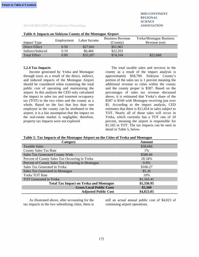
MID‐CONTINENT
REGIONAL
SCIENCE
2014 MCRSA/IMPLAN Conference Proceedings ASSOCIATION
172
Table 4: Impacts on Siskiyou County of the Montague Airport
Impact Type Employment Labor Income
Business Revenue (County)
Yreka/Montague Business Revenue (est)
Direct Effect 0.50 $27,041 $51,901 Indirect/Induced 0.19 $6,466 $22,203 Total Effect 0.69 $33,507 $74,104 $21,668 5.2.4 Tax Impacts
Income generated by Yreka and Montague through taxes as a result of the direct, indirect, and induced impacts of the Montague Airport should be considered when examining the total public cost of operating and maintaining the airport. In this analysis the CED only calculated the impact to sales tax and transient occupancy tax (TOT) to the two cities and the county as a whole. Based on the fact that less than one employee in the county can be attributed to the airport, it is a fair assumption that the impact on the real-estate market is negligible; therefore, property tax impacts were not explored.
The total taxable sales and services in the county as a result of the impact analysis is approximately $58,700. Siskiyou County’s portion of the sales tax is 1 percent meaning the additional revenue to cities within the county and the county proper is $587. Based on the percentages of sales tax revenue discussed above, it is estimated that Yreka’s share of the $587 is $166 with Montague receiving just over $5. According to the impact analysis, CED estimates that there is $11,654 in sales subject to TOT. Nearly all of those sales will occur in Yreka, which currently has a TOT rate of 10 percent, meaning the airport is responsible for $1,165 in TOT. The tax impacts can be seen in detail in Table 5, below.
Table 5: Tax Impacts of the Montague Airport on the Cities of Yreka and Montague
Category Amount Taxable Sales $58,666 County Sales Tax Rate 1% Sales Tax Generated County Wide $586.66 Percent of County Sales Tax Occurring in Yreka 28.34% Percent of County Sales Tax Occurring in Montague 0.9% Sales Tax Generated in Yreka $166.27 Sales Tax Generated in Montague $5.26 Yreka TOT Rate 10% TOT Generated in Yreka $1,165.41
Total Tax Impact on Yreka and Montague $1,336.95 Gross Local Public Costs $5,360
Adjusted Public Cost $4,023.05
As illustrated above, after accounting for the tax impacts in the two subsidizing cities, there is
still an actual annual public cost of $4,023 of continuing airport operations.

MID‐CONTINENT
REGIONAL
SCIENCE
2014 MCRSA/IMPLAN Conference Proceedings ASSOCIATION
173
5.3 Impacts of Potential Revenue Generating Activities 5.3.1. Proposed Camping Facility
One potential revenue generating scenario is the construction of a camping facility at the airport. To estimate the potential impact of a campground CED utilized demand estimates made by the Siskiyou County Economic Development Council (Siskiyou EDC). Siskiyou EDC has estimated a campground would but utilized for ten “camp nights” each month at $3 per night. This would equate to a direct benefit to the airport of $360 per year. To estimate the economic impact and tax impacts, the CED used the estimated visitor spending from the California Domestic Travel Report7 Because lodging is calculated as a direct impact and transportation by campers is usually done with private vehicles, horses, or bicycles both of those spending categories were removed from the model leaving an estimated average spending per “camper night” of $68.60. Assuming 120 “camper nights” per year CED estimates direct spending of $8,232 in the county. As much of that spending would be retail food, fuel or miscellaneous, little would stay in the county. CED estimates the campground would cause $8,600 in business revenue growth countywide, with only $2,526 in business revenue growth in Yreka and Montague. The estimated tax impact is negligible with no TOT increase and only $24.08 in annual sales tax increases for Yreka and Montague combined. The estimated impact of the campground can be seen in detail below.
7 D.K. Shifflet & Associates Ltd. California Domestic Travel Report, 2009 - PUBLIC VERSION: From the DESTINATION PERFORMANCE/Monitor SM.

MID‐CONTINENT
REGIONAL
SCIENCE
2014 MCRSA/IMPLAN Conference Proceedings ASSOCIATION
174
Table 6: Impacts of a Proposed Campground on Siskiyou County
Impact Type Employment Labor
Income
Business Revenue (County)
Yreka/Montague Business Revenue
(est)
Yreka/Montague Sales Tax
Increase (est) Direct Effect 0.10 $2,169 $6,399 $1,871 Indirect/Induced 0.00 $589 $2,239 $655 Total Effect 0.10 $2,758 $8,638 $2,526 $24.08 5.3.2 Other Potential Revenue Streams
Outside of promoting business development at the airport, there is likely not a suitable answer to increase airport revenues beyond the breakeven point. Implementing landing and takeoff fees is not viable as it is believed that pilots would forgo the airport for one of its many competitors outlined below. While there are runway fees at the other public airports the fees only apply to planes over 10,000 pounds, a threshold Montague cannot handle at this point.
Anything over a ten percent increase in lease or hangar fees in a given year would be steep in any given year. Using ten percent as the threshold, CED explored the impact to the airports revenue should both lease and hangar fees increase next year. It is estimated that total public cost would decrease from $4,023 to $3,495. Details can be seen in the table below. Table 7: Potential Fee Increase Revenue Expenses Lease Increase $302.71 Hangar Fee Increase
$225.00
Adjusted Public Cost
$4,023.05
Total Increase $527.71 New Adjusted Public Cost
$3,495.34
It seems unlikely that this scenario would
happen exactly as shown. CED is unaware of the terms of the lease agreement between the City and its tenants (including the FBO) but a ten percent cost increase seems unlikely. However, the FBO and Montague might be able to raise hangar and tie down prices. Currently hangar fees are on par with those of the other public
airports in the county but demand is currently high for hangar space and due to the expensive nature of the activity, pilots are generally not price sensitive. As noted below, all of the hangars at all of the public Airports in Siskiyou County are currently rented. That being said, it is doubtful that demand for Montague Airport hangars would decrease if the price were to increase from $40 per month to $44 per month. It should be noted that the CED is not recommending this price increase at this time. Without knowing more about the political environment surrounding the hangar tenants, it may or may not be worth the additional revenue of $225 per year. 5.4 Substitute Airports 5.4.1 Siskiyou County Public Airports
There are seven public airports located in Siskiyou County that cater to the local region as well as communities outside the county boundaries. Airport procedures consist of three general operations: general local aviation, general itinerant aviation, and air taxi services. General aviation consists of takeoff and landings of all civil aircraft, except those classified as air carriers or air taxis. Local operations are those performed by aircraft that remain in the local traffic pattern, execute simulated instrument approaches or low passes at the airport, and the operations to or from the airport and a designated practice area within a 20−mile radius of the tower. Itinerant operations are operations performed by an aircraft, either IFR, SVFR, or VFR, that lands at an airport, arriving from outside the airport area, or departs an airport and leaves the airport area. Air taxis are aircraft designed to have a maximum seating capacity of 60 seats or less or a maximum payload capacity

MID‐CONTINENT
REGIONAL
SCIENCE
2014 MCRSA/IMPLAN Conference Proceedings ASSOCIATION
175
of 18,000 pounds or less carrying passengers or cargo for hire or compensation.
On average the public airports in Siskiyou County conduct a significant amount of operations, both local and itinerant, and in 2012 the total number of collective operations was 46,254.8 Of that 46,254; 18,350 operations were general local aviation, 27,450 were general itinerant aviation and the remaining 454 operations were air taxi services. The military holds landing right to all airports except for Montague Airport. Runway conditions across all airports were reported in either fair or good condition, several airports were recently renovated and a limited number of airports have scheduled maintenance in the coming year. Each airport contains asphalt runways measuring on average, 4,221ft by 69ft. Runway size ranges from 7,490ft by 150ft at Siskiyou County Airport to 2,700ft by 60ft at Dunsmuir Muni-Mott Airport. The average weight capacity of runways is approximately 28,750lbs which is sustainable for large aircraft. Across the seven airports, weight capacity ranges from 60,000lbs at Siskiyou County Airport to 10,000lbs at Montague-Yreka Rohrer Field Airport. The majority of these airport facilities have fuelling capabilities on site for aircrafts, and two have jet fuel as well as low lead. All airports in the county are open to the public and operate year round with hours that tend to be continuous and responsive to the needs of their customers. Montague is the only airport that does not charge any takeoff or landing fee although none of the airports charge a landing fee to planes weighing less than 10,000 pounds. All of the airports require a tie down or parking fee that averaged seven dollars a day or forty dollars a month. All county owned airports charge the same takeoff/landing fees based off of the pre-takeoff weight of the respective aircraft. Aircraft weighing between 10,000-12,499lbs are charged $100, those weighing between 12,500-14,499lbs are charged $130, and aircrafts weighing 15,000lbs and over are charged $160. Hanger
8 All flight log numbers were retrieved from AirNav.com
space is generally available at the majority of airports but currently entirely rented out at each location. In addition to hangar space there are additional individual tie down spaces on paved aprons at each airport. Airport facilities generally do not offer plane tours and only a few airports have facilities that are used for gliders. Businesses located on site vary across location and include air medical services, fueling operations, air service helicopter instruction, charters, car rentals, and aircraft maintenance. For further in depth information on the public airports in Siskiyou County please see below. The airports are listed in order of increasing distance from Montague, CA.
In addition to the seven public airport facilities in Siskiyou County there are also six private airports and three airports located in Oregon within 80 miles of Montague, CA. The information for these respective airports can be found below. A detailed map of all airports in Siskiyou County can be seen on the next page.

MID‐CONTINENT
REGIONAL
SCIENCE
2014 MCRSA/IMPLAN Conference Proceedings ASSOCIATION
176
5.5 Public Airports 5.5.1 Siskiyou County Airport
Siskiyou County Airport is a county owned airport located four miles northeast of Montague, CA. The airport covers 1080 acres which contains one asphalt paved runway in good condition measuring 7,490 by 150ft with a weight capacity of 60,000lbs. In 2012 the number of total operations on site was 13,650. Of that 13,650: 6,000 were general aviation itinerant, 7,500 were general local aviation, and 150 were air taxi. Siskiyou County Airport does offer ‘stop and go’ fuel (including low lead and jet fuel) and charges a takeoff and landing fee for aircrafts if pre takeoff weight is over 10,000 pounds. Aircrafts weighing between 10,000-12,499lbs are charged $100, those weighing
between 12,500-14,499lbs are charged $130, and aircrafts weighing over 15,000lbs are charged $160. In addition to takeoff and landing fees Siskiyou County Airport charges tie down fees. The airport does not have a military/civil joint use agreement but there are military landing rights. On site there are hangar spaces for 25 aircrafts and approximately 20 tie down spaces. The airport is open all year round and several businesses are located on site. These businesses include helicopter instruction, charters, car rentals, lodging, and aircraft maintenance. Cowling Air, the FBO, offers several amenities such as aircraft maintenance, instructional flight, scenic flights, hangar rentals, and fuel.

MID‐CONTINENT
REGIONAL
SCIENCE
2014 MCRSA/IMPLAN Conference Proceedings ASSOCIATION
177
5.5.2 Weed Airport Weed Airport is a county owned airport
located four miles northwest of Weed, CA. The airport covers 344 acres which contains two asphalt paved runways in good condition measuring 5,000 by 60ft with a weight capacity of 12,500lbs. In 2012 the number of total operations on site was 16,200. Of that 16,200: 10,000 were general aviation itinerant, 6,000 were general local aviation, and 200 were air taxi. Weed Airport does offer ‘stop and go’ fuel (including low lead and jet fuel) and charges a takeoff and landing fee for aircrafts if pre takeoff weight is over 10,000 pounds. Aircrafts weighing between 10,000-12,499lbs are charged $100, those weighing between 12,500-14,499lbs are charged $130, and aircrafts weighing over 15,000lbs are charged $160. In addition to takeoff and landing fees Weed Airport charges tie down fees. The airport does not have a military/civil joint use agreement but there are military landing rights. There are 15 individual hangar units and 34 marked tie down spots on paved apron. The airport is open all year round and hours of operation are continuous. Onsite there is a single air medical business. Airport facilities do not offer plane tours nor are facilities used for gliders. 5.5.3 Scott Valley Airport
Scott Valley Airport is a county owned airport located three miles south of the central business district of Fort Jones, CA. The airport covers 53 acres which contains one asphalt paved runway in good condition measuring 3,700 by 50ft with a weight capacity of 30,000lbs. In 2012 the number of total operations on site was 8,104. Of that 8,104: 5,000 were general aviation itinerant, 3,000 were general local aviation, and 104 were air taxi. Scott Valley Airport does offer ‘stop and go’ fuel (low lead only) and charges a takeoff and landing fee for aircrafts if pre takeoff weight is over 10,000 pounds. Aircrafts weighing between 10,000-12,499lbs are charged $100, those weighing between 12,500-14,499lbs are charged $130, and aircrafts weighing over 15,000lbs are charged $160. In addition to takeoff and landing fees Scott Valley Airport charges tie down fees.
The airport does not have a military/civil joint use agreement but there are military landing rights. There are 17 hangars on site that are currently occupied. The airport is open year round and hours of operation are continuous. Major facilities include a U.S. Forest Service Helitack Base. And there is a single business, Siskiyou Air Service, which is a fuel provider. Airport facilities do not offer plane tours or glider tows. 5.5.4 Dunsmuir Muni-Mott Airport
Dunsmuir Muni-Mott Airport is a city-owned public-use airport located three miles north of the central business district of Dunsmuir, California. Dunsmuir Municipal-Mott Airport covers an area of 126 which contains one asphalt paved runway in good condition measuring 2,700 by 60ft with a weight capacity of 12,500lbs. In 2012 the number of total operations on site was 2,200. Of that 2,200: 1,700 were general aviation itinerant and 500 were general local aviation. The airport charges a takeoff and landing fee for aircrafts if pre takeoff weight is over 10,000 pounds. Aircrafts weighing between 10,000-12,499lbs are charged $100, those weighing between 12,500-14,499lbs are charged $130, and aircrafts weighing over 15,000lbs are charged $160. The airport does not have a military/civil joint use agreement but there are military landing rights and there is no non-commercial landing fee. 5.5.5 Butte Valley Airport
Butte Valley Airport is a county-owned public-use airport located five miles southwest of the central business district of Dorris, California. Butte Valley Airport covers an area of 234 acres which contains one asphalt paved runway in good condition measuring 4,300 by 60ft with a weight capacity of 30,000lbs. In 2012 the number of total operations on site was 2,050. Of that 2,050: 2000 were general aviation itinerant and 50 were general local aviation. Butte Valley Airport does not offer ‘stop and go” fuel on site and charges a takeoff and landing fee for aircrafts if pre takeoff weight is over 10,000 pounds. Aircrafts weighing between 10,000-12,499lbs are charged

MID‐CONTINENT
REGIONAL
SCIENCE
2014 MCRSA/IMPLAN Conference Proceedings ASSOCIATION
178
$100, those weighing between 12,500-14,499lbs are charged $130, and aircrafts weighing over 15,000lbs are charged $160. In addition to takeoff and landing fees Butte Valley Airport charges tie down fees. The airport does not have a military/civil joint use agreement but there are military landing rights. There are no hangar spaces available on site but there are six tie down spaces available on apron. The airport is open all year round and there are no additional services or business on site. 5.5.6 Happy Camp Airport
Happy Camp Airport is a public airport owned by the US Forest Service and operated by Siskiyou County. The airport covers 64 acres which contains one asphalt paved runway in fair condition measuring 3,000 by 50ft with a weight capacity of 30,000lbs. In 2012 the number of total operations on site was 250. The entirety of that 250 was general aviation itinerant. Happy Camp Airport does not offer ‘stop and go’ fuel and charges a takeoff and landing fee for aircrafts if pre takeoff weight is over 10,000 pounds. There are three small conventional hangar buildings and eight unmarked tie down spaces on paved apron. The airport is open all year round and there are no additional businesses located at the airport though there are major facilities used for a U.S. Forest Service Helitack Base. 5.6 Private Airports 5.6.1 Lefko Airport
Lefko Airport is a privately owned airport located four miles northeast of Fort Jones in the Scott Valley area of Siskiyou County. The airport contains one turf runway measuring 2,800ft by 60ft. 5.6.2 Round Mountain Airport Round Mountain Airport is a privately owned airport located two miles northwest of Klamath River, CA. The airport contains a dirt runway measuring 1,500ft by 50ft.
5.6.3 Coonrod Ranch Airport Coonrod Ranch Airport is a privately owned
airport six miles southeast of Little Shasta, CA. The airport contains a dirt runway measuring 3,000ft by 100ft. 5.6.4 Triple R Ranch Airport
Triple R Ranch Airport is a privately owned airport located eight miles southeast of Macdoel, CA. The airport contains a turf runway measuring 2,300ft by 40ft. 5.6.5 McCloud Airstrip
McCloud Airstrip is a privately owned airport located one mile northeast of McCloud, CA.The airport contains a turf runway measuring 2,080ft by 100ft. 5.6.6 Longbell Ranch Airport
Longbell Ranch Airport is a privately owned airport located four miles north of Tennant, CA. The airport contains one turf runway measuring 5,000ft by 60ft. 5.7 Oregon Airports near Montague 5.7.1 Rogue Valley International-Medford Airport
Rogue Valley International–Medford Airport is a public airport three miles north of downtown Medford, in Jackson County, Oregon. Jackson County's Aviation Authority owns and operates it. The airport contains an asphalt runway measuring 8,800ft by 150ft. 5.7.2 Klamath Falls Airport
Crater Lake- Klamath Regional Airport is a public and military airport located five miles southeast of Klamath Falls, in Klamath County, Oregon. Owned by the City of Klamath Falls, it is used by general aviation, military aviation and a few airline flights. The airport contains an asphalt runway measuring 5,258ft by 100ft. 5.7.3 Ashland Muni-Sumner Parker Airport
Ashland Muni-Sumner Parker Airport is located in Ashland, Oregon and owned by the city. The airport contains an asphalt runway measuring 3,603ft by 75ft.

MID‐CONTINENT
REGIONAL
SCIENCE
2014 MCRSA/IMPLAN Conference Proceedings ASSOCIATION
179
6.0 Conclusions and Recommendations 6.1 Conclusions
Currently the Montague Airport is running at a $2,876.56 deficit. The deficit is compounded by the mandatory grant match of $5,000 from both the cities of Yreka and Montage. After adjusting the budget to account for the $10,000 state subsidy it was determined that the airport has a local public cost of $5,360 annually.
After determining the economic impact of the airport, CED estimates that there is a local (Siskiyou County) tax impact of $1,752 per year with $1,337 occurring in either Yreka or Montague. Nearly all of the tax impact is felt in Yreka ($1,332), as many of the services, especially accommodation services, take place there. After adjusting the local public cost by including the Yreka and Montague tax impacts it was determined that the true local (Yreka and Montague) public cost of maintaining and operating the airport is approximately $4,023 per year.
The economic impact of the Montague Airport on Siskiyou County and on the cities of Yreka and Montague are nominal. After conducting surveys with pilots, glider competition participants and the two onsite businesses, CED entered their reported expenditures into the IMPLAN input-output model and determined the impacts on county business revenue, employment, and labor income. The total impact of the airport on business revenues in Siskiyou County is $74,100 which generates 0.7 of a FTE job producing labor income of $33,500. Using percent of taxable sales by city, CED was able to estimate that the total impact to the cities of Yreka and Montague is $21,668. 6.2 Recommendations
Under current conditions continuing airport operations is costing local tax payers $4,023 per year, but it is believed that the small subsidy is easily justified. The economic impact to Yreka and Montague businesses is 5.4 times greater
than the local public investment. A public investment multiplier over five should be considered quite positive. Should the state subsidy stop, or operating conditions change, it is important to monitor the gap between the local impact and the public cost. With such small numbers there is a slim margin for change in either the cost or benefit. For example, should demand for the facility Steelman Aviation, or the glider competition be canceled the economic impact of the airport to Yreka or Montague could easily fall to $10,000 a year or lower. Should that happen the tax impact would decrease and the multiplier would fall to 2 to 1 instead of 5 to 1. While this project does not examine other public investments, it is likely that the local subsidization would have a greater impact elsewhere. Similarly, if the airport requires significant upgrades and the annual public cost goes up due to loan amortization, the cities of Yreka and Montague may be better off subsidizing other projects.
It should also be taken into consideration that if the state subsidy continues to build in a roll over investment account, collecting interest, there may come a point where a serious facility investment can be made, adding a non-locally subsidized, tangible asset to a region that is currently trying to attract industry.


MID‐CONTINENT
REGIONAL
SCIENCE
2014 MCRSA/IMPLAN Conference Proceedings ASSOCIATION
180
RURAL REVITALIZATION EFFECTS OF HYDRAULIC FRACTURING: AN INITIAL
PERSPECTIVE FROM TEXAS Rebekka Dudensing Texas A&M AgriLife Extension Service
Abstract As hydraulic fracturing opens new possibilities for recovering shale gases, rural
communities are looking to the oil and gas industry to stimulate economic growth and reverse decades of decline. Stories of boom towns saved from imminent doom fuel the hopes of rural residents on the fringes of drilling activity. This paper analyzes economic data from six Texas shales, corroborating findings of increased earnings and population in rural counties within shale boundaries and suggesting a more nuanced pattern of pockets of activity within each shale. Focusing on six Texas shales (Barnett, Cline, Eagle Ford, Grant Wash, Haynesville/Bossier, and Permian Basin), hydraulic fracturing has disproportionately benefited rural and micropolitan counties in terms of income and, to a lesser extent, population growth. The oil and gas share of some rural economies has increased more than tenfold in five years, resulting in dramatic increases in personal income. Population gains have been modest in most rural counties because many workers are not permanent residents. However, rural counties have experienced significant growth in establishments, employment, and gross sales—the focus of this paper. Not only have rural growth rates general outpaced metropolitan and micropolitan rates, some rural economies are beginning to converge with micropolitan sales levels. Core counties tend to experience greater growth than non-core shale counties, but all counties vary dramatically in their growth patterns.
1.0 Introduction A number of studies consider the economic
impact of the oil and gas industry on regions and even individual towns. These studies tend to either note the magnitude of growth or look at the positive multiplier effects of increased spending in the region. Some studies and popular press articles note the tax placed on infrastructure, increased traffic congestion, and higher wages faced by local industries. Fewer studies consider economic trade-offs from energy activity, using, for example computable general equilibrium models. To date, the literature largely ignores the impact of the energy boom on the rural-urban hierarchy.
The paper has two principal aims. First it
explores the benefits to rural counties and communities during the labor-intensive exploration and drilling. Energy industry
employment will generate demand for services and lodging. Royalty holders will induce demand for goods and services among local businesses. In the exploration and drilling phase, it is expected that:
1. Rural counties more proximate to a
shale’s epicenter receive a greater boost in both income and employment.
2. Oil and gas exploration increases the number of businesses and the sales volume in small rural communities during the drilling phase, particularly food and beverage establishments and lodging establishments.
Second, the paper considers the possible
effects of oil and gas drilling and extraction on the long-term consolidation of the rural-urban

MID‐CONTINENT
REGIONAL
SCIENCE
2014 MCRSA/IMPLAN Conference Proceedings ASSOCIATION
181
hierarchy. Decades of rural decline, especially in the remote rural areas experiencing much of the recent energy production activity, are unlikely to be reversed by increased incomes. Demand by local households and non-local energy sector employees is best served in regional trade centers with existing clusters, economies of scope, and established infrastructure. As energy sector employment declines, the non-resident workforce will leave the area, putting additional pressure on businesses with small service areas and their communities. At this point, the long-standing trend of converging economic activity in micropolitan and rural retail trade centers seems likely to continue, despite increased income in rural communities. Specifically, it is expected that
3. Overall economic growth, during
drilling and subsequent phases, favors regional trade centers that provide higher-ordered goods and services.
4. An energy boom does not reverse the consolidation of rural economic activity into rural regional trade centers and micropolitan cities because trade centers continue to serve larger trade areas.
2.0 Data 2.1 An overview of economic change
More than 40 percent of Texas’ 254 counties are part of major oil and gas plays in the state. Figure 1 shows the locations of oil and gas wells in the state, and the shales are easily seen within that context (adapted from TCEQ 2014). The 30-county Eagle Ford in South Texas receives the lion’s share of media attention and is often compared to the Bakken formation in the northern plains (Table 1). The Eagle Ford opened in 2008, around the same time as the Bakken was found to have greater reserves than formerly estimated. The Barnett shale in the Dallas-Forth Worth area encompasses 25 counties. Hydraulic fracturing has revived the 38-county Permian Basin in West Texas. The Cline shale includes 13 counties, 11 of which are part of the Permian Basic; however, the Cline shale has contributed five additional core counties to that region. The Railroad Commission of Texas makes note of two additional oil producing regions, the Haynesville/Bossier shale in northeast Texas and the Granite Wash which contains a tight cluster of wells in the Panhandle (Texas Railroad Commission 2014).
More than half of the counties in the Texas
shales are rural (Table 2). Indeed, the energy boom is often portrayed as a rural phenomenon with boom towns arising in the formerly bucolic countryside. Still, a significant share of activity occurs within metropolitan and micropolitan areas (OMB 2012, Texas Railroad Commission 2014).

MID‐CONTINENT
REGIONAL
SCIENCE
2014 MCRSA/IMPLAN Conference Proceedings ASSOCIATION
182
Figure 1. Well and shale locations within Texas, map from Texas Commission for Environmental Quality
Table 1. Texas Shale Counties.
6 Shales Eagle Ford Barnett
Permian Basin Cline1
Haynesville/ Bossier
Granite Wash
Shale Counties
108 30 25 38 13 10 3
Core Counties
46 15 4 15 7 4 3
1Eleven Cline Shale counties are in the Permian Basin, including two overlapping core counties.
Permian Basin
Granite Wash
Barnett
ClineHaynesville/ Bossier
Eagle Ford

MID‐CONTINENT
REGIONAL
SCIENCE
2014 MCRSA/IMPLAN Conference Proceedings ASSOCIATION
183
Table 2. Metropolitan Status of Shale Counties. Metro Micro Rural Shale 27 20 61 Core 9 10 27 Eagle Ford 9 3 18 Barnett 10 5 10 Permian Basin 6 8 24 Cline 2 3 8 Haynesville/ Bossier 2 3 5 Granite Wash 0 1 2
All data used in this analysis are publically available. Growth in employment and number of establishments from 2008 to 2012 is based upon County Business Patterns data. 2008 was selected because it marks the entry of the Eagle Ford shale, which facilitates further analysis of this large shale. 2008 is also the last year before Texas entered the Great Recession.
Employment grew faster on average in shale
counties than in non-shale counties, with 2008-2012 growth being 2.6% for shale counties but negative for non-shale counties (Table 3). The range of growth is larger for the shale counties and includes larger job losses as well as substantially larger gains. Of course, many rural shale counties have very small economies (small denominators), which results in large percentage changes from relatively small changes in the number of jobs. Despite positive average employment gains, more than half of shale counties lost jobs between 2008 and 2012. Again, Texas was hit by the great recession in 2009 but had largely recovered by 2012; the
energy sector appears not to have offset job losses in other industries during that time period. Also, while there is evidence that rural counties may have been less affected by the recession, rural farming regions, especially in the western part of the state, faced significant droughts in 2011 and 2012.
The core counties experienced greater
employment growth at 8.3% versus -1.2% in non-core shale counties. Only 37.0% of core counties experienced employment losses between 2008 and 2012 while almost 70% of the shale counties outside the core areas experienced job losses (Table 3). Within the core counties, metropolitan and micropolitan counties averaged almost no growth with fully half reporting job losses while rural counties averaged 15.3% growth, and only 7 of 27 reporting core counties had employment losses (Table 4). Employment growth was stronger in core than non-core shale counties. Rural counties within the core, in particular, had stronger employment outcomes.
Table 3. Employment Growth in Shale and Non-Shale Counties. Shale Non-Shale Core Non-Core Average Growth 2.6% -2.4% 8.3% -1.2% Minimum -45.3% -38.7% -43.4% -45.3% Maximum 190.2% 49.5% 146.8% 190.2% % Neg Growth1 55.6% 61.6% 37.0% 69.4%
1Share of counties with negative growth is based on shale v. non-shale and core v. non-core shale counties.

MID‐CONTINENT
REGIONAL
SCIENCE
2014 MCRSA/IMPLAN Conference Proceedings ASSOCIATION
184
Table 4. County Employment Growth and Count of Counties with Employment Losses by Metropolitan Status. Shale
Employment Growth
Shale County Job Loss Count
Core Employment
Growth
Core County Job Loss Count
Metropolitan -0.2% 16 of 27 -0.9% 5 of 9 Micropolitan -0.9% 12 of 19 -1.1% 5 of 10 Rural 5.1% 32 of 58 15.3% 7 of 24
Patterns of establishment growth were similar to those for employment growth, although the ranges were smaller for the shale and core counties. Shale counties averaged slightly positive employment growth while, on average, non-shale counties experienced establishment losses (Table 5). Interestingly, while core counties had the highest growth (3.6%) in the number of establishments, non-core shale counties had greater average establishment losses than did non-shale counties (-2.2% v. -1.1%), and a greater share of non-
core counties had a net loss of establishments than did the non-shale counties (74% v. 70%).
Rural counties, particularly rural core
counties, continued to outperform metropolitan and micropolitan counties in establishment growth. At 7.2%, growth in the number of establishments in rural core counties far exceeded growth in other counties, and rural core counties were less likely to experience net establishment losses (Table 6).
Table 5. Establishment Growth in Shale and Non-Shale Counties (Change in Number of Establishments). Shale Non-Shale Core Non-Core Average Growth 0.2% -1.1% 3.6% -2.2% Minimum -23.5% -25.0% -23.5% -19.6% Maximum 55.6% 225.0% 26.9% 55.6% % Neg Growth1 54.6% 69.2% 28.3% 74.2%
1Share of counties with negative growth is based on shale v. non-shale and core v. non-core shale counties.
Table 6. Average County Establishment Growth and Count of Counties with Establishment Losses by Metropolitan Status. Shale
Employment Growth
Shale County Job
Loss Count
Core Employment
Growth
Core County Job
Loss Count Metropolitan -0.6% 15 of 27 0.2% 5 of 9 Micropolitan -2.3% 14 of 20 -2.9% 6 of 10 Rural -0.2% 31 of 61 7.2% 2 of 26

MID‐CONTINENT
REGIONAL
SCIENCE
2014 MCRSA/IMPLAN Conference Proceedings ASSOCIATION
185
While more hotels, motels, and similar establishments were opened in non-shale counties, employment increased more within shale counties (Table 7). Unlike general employment and establishment growth, non-core counties had greater growth in the accommodation sector than did core counties. Shale counties, and especially core counties, saw greater growth in food service employment and establishments between 2008 and 2012. While workers need to be fed near where they work, they may be able to commute longer distances to hotels.
Many regions with active energy drilling
report that other local industries are facing pressure from high oilfield wages. If high labor prices cannot be passed on to consumers, export-oriented businesses may struggle to remain profitable. If prices can be passed on, high labor
costs are a less important issue, at least to firms. On average, shale and core counties saw significant growth in the number of manufacturing establishments. Again, it is important to note that many counties had few manufacturing establishments in 2008 (small denominator) so gaining a few businesses resulted in a large relative change. However, manufacturing employment on averaged decreased more in shale and especially core counties than in non-shale or non-core counties. This may be evidence that workers are migrating to the energy sector. Without further exploration (which difficult in rural counties due to data disclosure issues), it cannot be established whether new manufacturing establishments are serving the energy sector, although evidence from those counties suggests this is often the case.
Table 7. Employment and Establishment Growth in Accommodation and Food Service, 2008-2012.
Accommodation
Employment Accommodation Establishments
Food Service Employment
Food Service Establishments
Shale 44.5% 20.4% 0.3% 4.9% Non-Shale 15.4% 48.8% -1.2% 2.0% Core 41.8% 13.4% 2.7% 8.0% Non-Core 46.2% 25.1% -1.4% 2.6% Table 8. Employment and Establishment Growth in Accommodation and Food Service, 2008-2012.
Manufacturing
Employment Manufacturing Establishments
Shale -14.2% 54.9% Non-Shale -5.4% 0.1% Core -22.2% 139.9% Non-Core -8.9% -8.8%
2.2 A look at the Eagle Ford
Growth in employment and the number of establishments varies greatly between shales (Table 7). Overall, the Eagle Ford tended to have consistently larger employment and establishment growth. The three-county Granite Wash saw two-digit employment growth but a decline in the number of establishments between 2008 and 2012. The Permian Basin averaged 4.5% employment growth across the shale, which was higher than core growth. The highest
growth within the Permian Basin occurred along its eastern edge overlapping the Cline shale, where three counties had greater than 25% employment growth.
Sales data from the Texas Comptroller of
Public Accounts indicates that gross sales, a measure of basic economic activity, grew much faster in core counties than in non-core counties, although core sales growth dropped in 2013 (Figure 2). Further, sales in rural counties grew

MID‐CONTINENT
REGIONAL
SCIENCE
2014 MCRSA/IMPLAN Conference Proceedings ASSOCIATION
186
faster than metropolitan or micropolitan county sales both in dollars and as a percent of prior year sales (Figure 3), and rural counties within the core grew fastest (Figure 4). Growth of micropolitan areas lagged. County growth rates varied greatly. Even amid Eagle Ford rural core counties, growth patterns exhibited a range of activity since 2008 (Figure 5); in fact Live Oak and Gonzales counties were excluded from the figure because their growth and magnitudes
dwarfed the other counties, distorting the figure. Of course, the economic outcomes of cities within a county can vary greatly. County level data are used in this analysis to facilitate data analysis across several states and to conform to national definitions of metropolitan, micropolitan, and rural areas. Case studies of the economic performance of individual communities within county groupings will be explored in related research.
Table 7. Average County Growth in Employment and Number of Establishments by Shale, 2008-2012. Shale
Shale County Average
Employment Growth
Shale Core Average
Employment Growth
Shale County Average
Establishment Growth
Shale Core Average
Establishment Growth
Eagle Ford 8.1% 18.9% 1.9% 5.2% Barnett -4.2% -3.7% -4.3% -0.9% Permian Basin 4.5% 1.7% 0.0% -1.9% Cline 17.3%1 4.8% 7.4% 6.3% Haynesville/ Bossier -2.3% -0.3% 0.6% 1.4% Granite Wash 12.9% n/a -5.8% n/a
1If Kent County with 190% growth is excluded, average growth for the Cline shale is 2.7%.
Figure 2. Eagle Ford gross sales by core/con-core status.
0
5,000,000,000
10,000,000,000
15,000,000,000
20,000,000,000
25,000,000,000
30,000,000,000
35,000,000,000
40,000,000,000
45,000,000,000
50,000,000,000
2002
2003
2004
2005
2006
2007
2008
2009
2010
2011
2012
2013
Gross Sales, $
Eagle Ford
Core
Non‐core

MID‐CONTINENT
REGIONAL
SCIENCE
2014 MCRSA/IMPLAN Conference Proceedings ASSOCIATION
187
Figure 3. Eagle Ford gross sales by metro status.
Figure 4. Gross sales by metro status of Eagle Ford core counties.
0
5,000,000,000
10,000,000,000
15,000,000,000
20,000,000,000
25,000,000,000
30,000,000,000
35,000,000,000
40,000,000,000
45,000,000,000
50,000,000,000
2002
2003
2004
2005
2006
2007
2008
2009
2010
2011
2012
2013
Gross Sales, $
Eagle Ford
Metro
Micro
Rural
0
5,000,000,000
10,000,000,000
15,000,000,000
20,000,000,000
25,000,000,000
2002
2003
2004
2005
2006
2007
2008
2009
2010
2011
2012
2013
Gross Sales, $
Core
Core Metro
Core Micro
Core Rural

MID‐CONTINENT
REGIONAL
SCIENCE
2014 MCRSA/IMPLAN Conference Proceedings ASSOCIATION
188
Figure 5. Gross sales for Eagle Ford rural core counties, except Live Oak and Gonzales.
3.0 Discussion This paper considers some economic effects
of oil and gas drilling on counties within six Texas shales, with additional focus on the Eagle Ford shale in South Texas. While the project is still in the very early stages, patterns of development are evident, at least for Texas and its Eagle Ford shale. Nascent results related to the project hypotheses are noted below.
1. Rural counties more proximate to a
shale’s epicenter receive a greater boost in both income and employment. Across Texas shales, core counties experienced greater growth in jobs and number of establishments. Core counties of the Eagle Ford also had higher growth in gross sales than did non-core counties, although core gross sales dropped in 2013.
2. Oil and gas exploration increases the number of businesses and the sales
volume in rural counties during the drilling phase. Although causality is not explored in this paper, rural counties outperformed metropolitan and micropolitan counties in terms of employment and establishment growth rates across the six shales. Rural gross sales also grew faster than did sales in more urban counties. Sales growth in rural core counties was even larger. A future component of this research will consider gross sales and establishment effects on individual communities within rural counties. Community-level effects are expected to be even more variable than county effects.
3. The results regarding food and beverage establishments and lodging establishments were mixed for the Eagle Ford. Food needs seem to be served within the core counties, while accommodations may be located further
0
100,000,000
200,000,000
300,000,000
400,000,000
500,000,000
600,000,000
700,000,000
800,000,000
900,000,000
1,000,000,000
2002 2003 2004 2005 2006 2007 2008 2009 2010 2011 2012 2013
Gross Sales, $
DeWitt, TX
Dimmit, TX
Duval, TX
Frio, TX
Karnes, TX
La Salle, TX
McMullen, TX
Zavala, TX

MID‐CONTINENT
REGIONAL
SCIENCE
2014 MCRSA/IMPLAN Conference Proceedings ASSOCIATION
189
from drilling sites. Shale and core counties experienced faster growth in the number of manufacturing establishments than did non-core or non-shale counties. At the same time, these shale and core counties also lost manufacturing employment at a greater rate, suggesting a migration of labor to energy services among persons with appropriate skills and qualifications.
4. Contrary to expectations, overall
economic growth, during drilling and subsequent phases, did not favor regional trade centers providing higher-ordered goods and services. In fact, rural areas consistently outperformed micropolitan and metropolitan counties in growth in employment and establishments. Exploration of Eagle Ford data showed the rural areas also outperformed their more urban counterparts in terms of sales growth. While rural economies with smaller bases can demonstrate larger relative changes due to small denominators, the Eagle Ford data showed strong absolute growth among rural counties. However, county level data ignores the different economic responses of cities within counties, a topic that will be explored through case studies in related research.
5. The Texas energy boom may not reverse the consolidation of rural economic activity into rural regional trade centers. However, Eagle Ford data do show some convergence of rural and micropolitan counties.
A good deal of work remains for this
project. The study is currently being expanded to include six Great Plains states: Texas, Oklahoma, Kansas, Nebraska, South Dakota, and North Dakota. At the same time, case studies are underway for individual communities within the Eagle Ford and Cline shales. Additional case studies will be identified for the northern states. While differences in the economic effects shales were evident within
Texas and are likely to be even more pronounced across state lines, the larger data set will provide a richer analysis. In addition to growth in employment, establishments, and sales, the project will consider expanded tax bases. The results of the study will help rural communities and counties to plan within the context of current changes and historic energy industry cycles and changes in the rural-urban relationship. References
Texas Commission on Environmental Quality. 2014. Texas Active Oil and Gas Wells, January 2014. Austin, TX, January. http://www.tceq.state.tx.us/assets/public/implementation/barnett_shale/bs_images/txOilGasWells.png Texas Comptroller of Public Accounts. 2014. Quarterly Sales Tax Sales Tax. https://mycpa.cpa.state.tx.us/allocation/HistSales.jsp. Texas Railroad Commission. 2014. Barnett Shale Information. Accessed 5/29/14. http://www.old.rrc.state.tx.us/barnettshale/index.php. Texas Railroad Commission. 2014. Eagle Ford Shale Information. Accessed 5/29/14. http://www.old.rrc.state.tx.us/eagleford/index.php. Texas Railroad Commission. 2014. Granite Wash Information. Accessed 5/29/14. http://www.old.rrc.state.tx.us/granitewash/index.php. Texas Railroad Commission. 2014. Haynesville/Bossier Shale Information. Accessed 5/29/14. http://www.old.rrc.state.tx.us/bossierplay/index.php. Texas Railroad Commission. 2014. Permian Basin Shale Information. Accessed 5/29/14. http://www.old.rrc.state.tx.us/permianbasin/index.php.

MID‐CONTINENT
REGIONAL
SCIENCE
2014 MCRSA/IMPLAN Conference Proceedings ASSOCIATION
190
U.S. Department of Commerce. 2014. County Business Patterns, 2008 and 2012 data. Bureau of the Census. Washington, DC. http://www.census.gov/econ/cbp/ U.S. Office of Management and Budget. 2003. “Metropolitan and Micropolitan Statistical Areas.” OMB Bulletin 13-01. Washington, DC: U.S. Census Bureau, February.

MID‐CONTINENT
REGIONAL
SCIENCE
2014 MCRSA/IMPLAN Conference Proceedings ASSOCIATION
191
Estimated Economic Impacts of the IP Mill Closure in Courtland, Alabama: A Comparison of Two Methodologies Burton English, Jamey Menard, Kim Jensen, and Dayton Lambert University of Tennessee
1.0 Introduction On September 11, 2013, International
Paper announced the closure of the paper mill in Lawrence County Alabama in the town of Courtland. The mill produced approximately 950 thousand tons of paper per year of which 765 thousand tons was uncoated freesheet paper. In addition to freesheet paper, the mill produces paper for forms, envelopes, labels, copiers, printers and magazines. Since 1999, the decline in demand for uncoated freesheet paper is attributed to consumers switching to electronic alternatives. The mill employed over 1,100 individuals. Closure of a mill of this magnitude has impacts, both economically and socially, to local and regional economies. The “wood supply chain,” as it is known, consists of loggers and wood dealers that supply wood to the mill, the truckers that deliver the wood, and the landowners who grow the timber. In addition to the wood supply chain and other industries supplying inputs, service industry entries are affected by the closure. Much of the hardwood fiber supply for the mill originates from southern Middle Tennessee (Todd, 2013; Tita, 2013) (Table 1).
Based on information from the Pulp and
Paperworkers Resource Council (2014), since 2011, 121 mills that produce pulp or some type of paper product have closed. In fact, twenty-four mills closed in the past year. Over time, market forces combined with environmental concerns and consumers switch to electronic alternatives have reduced pulp and paper mills profits (Cody, 2012).
The objectives of this analysis are to estimate the economic impacts of the Courtland mill closure to the Tennessee economy using two different methodologies – Method 1: Analysis by Parts, and Method 2: Multi-Regional Analysis and compare the estimated impacts derived from these two methodologies. The impacts will be generated through an input-output model, IMPLAN, and will use 2010 IMPLAN data. (Minnesota IMPLAN Group, 2012). Analysis by Parts is conducted by breaking the impact into parts or sectors of the economy and shocking the model with each part or sectorial shock.
A multi-regional analysis allows the user to track an impact on any sector in a study area region and its impacts on the production in any other region in the US (for example, county to county, county to multi-county, county to state, etc.). The IMPLAN software has the ability to examine economic impacts through a multi-region model (Alward, 2014). The results are reported as they affect each region and allows an analysis of how each region is affected by the impacts through estimates of changes in employment, value added, and total output. The multi‐regional analysis function allows examination of how closure of the Courtland paper mill in Northern Alabama affects industries/commodities in surrounding regions such as Alabama (except Lawrence County), Tennessee, and Mississippi. It is assumed that the multi-regional model will provide larger estimates of the economic

MID‐CONTINENT
REGIONAL
SCIENCE
2014 MCRSA/IMPLAN Conference Proceedings ASSOCIATION
192
impacts than the analysis by part method; since input purchases by the plant will exceed those made for Tennessee timber, its wood
supply chain, and plant employees residing in Tennessee.
Table 1. Information Provided by the Division of Forestry, Tennessee Department of Agriculture on the Courtland Plant Closure, 2013. Tennessee County
Material Hardwood Softwood
Tons Benton Mixed Hardwood 4,707 25 Carroll Mixed Hardwood 1,840 Chester Mixed Hardwood 1,022 10,821 Decatur Mixed Hardwood 13,041 Dickson Mixed Hardwood 1,684 Franklin Mixed Hardwood 371 30 Gibson Mixed Hardwood 1,521 Giles Mixed Hardwood 34,762 14,157 Grundy Mixed Hardwood 2,678 Hardeman Mixed Hardwood 46,947 211 Hardin Mixed Hardwood 37,383 21,174 Henderson Mixed Hardwood 2,429 Henry Mixed Hardwood 8,623 Hickman Mixed Hardwood 71,192 9,563 Humphreys Mixed Hardwood 38,296 Lawrence Hardwood Chips 43,296 34,626 Lewis Mixed Hardwood 11,672 11,838 Lincoln Hardwood Chips 6,944 125 Marion Mixed Hardwood 494 Marshall Mixed Hardwood 18,835 105 Maury Hardwood Chips 12,071 61 McNairy Mixed Hardwood 3,028 4,151 Perry Hardwood Chips 68,499 273 Rutherford Hardwood Chips 2,123 Wayne Hardwood Chips 103,141 128,556 Williamson Mixed Hardwood 6,130
Number of Employees in Courtland plant State/County Number of workers Lawrence 318 Rest of Alabama 787 Mississippi 1 Tennessee 8

MID‐CONTINENT
REGIONAL
SCIENCE
2014 MCRSA/IMPLAN Conference Proceedings ASSOCIATION
193
Figure 1. Courtland Study Area
2.0 Available Data The closing of the Courtland Mill will
impact 1,114 direct jobs (2013 estimate) and will impact the wood supply chain. Information on wood use and employees affected were provided from Tennessee’s Department of Agriculture’s Division of Forestry (Table 1). Wood demand for Tennessee totaled over 778 thousand tons from 26 counties (Figure 2). In addition, information from Timbermart South for stumpage fees, logging and transportation costs were used. In the first quarter of 2014, the stumpage fee for both planted and natural pulpwood in Tennessee was listed as $16.33
1 The range for all reported values to Timbermart was $7.00 to 19.50/ton to harvest and load the timber.
per ton. Final harvest costs were estimated at the mean value for the Piedmont at $12.63/ton1, and hauling costs were based on the minimum of $0.14/ton-mile for the first 39 miles and $0.13/ton-mile for any additional miles (Hodges, 2014). Finally, 8 individuals residing in Tennessee worked for Courtland.
!Courtland
Baldwin
Clarke
Mobile
Lee
Pike
Yazoo
Hinds Dallas
Jackson
Hale
Clay
Bibb
Perry
Wilcox
Lee
JonesMonroe
Giles
Butler
Sumter
Bolivar
AmitePerry
Tuscaloosa
Dale
Shelby
Attala
Pickens
Jefferson
Scott
Shelby
Walker
Copiah
Rankin
Coosa
Wayne
Dyer
Clarke
Barbour
JasperSmith
DeKalb
Choctaw
Knox
Scott
Wayne
Covington
Marengo
Coffee
Panola
Holmes
Polk
Escambia
Blount
LeakeChilton
Marion
Sevier
Pike
Kemper
Henry
Monroe
Conecuh
Clay
Greene
Lamar
Tate
Russell
Greene
Fayette
Henry
Cullman
Obion
Jackson
Maury
Carroll
Elmore
Washington
Carroll
Macon
Leflore
Gibson
Hardin
Bullock
Blount
Colbert
Greene
St. Clair
Madison
Lowndes
Monroe
Wilson
Lincoln
Fayette
Lincoln
Stone
Marshall
Noxubee
Cocke
Geneva
Lamar
Perry
Franklin
Pearl River
WinstonEtowah
Lawrence
Winston
Houston
Morgan
Calhoun
Marion
Lafayette
Sumner
Calhoun
Newton
Tunica
Simpson
Union
Marion
Wilkinson
Hickman
Franklin
DeSoto
Autauga
Franklin
Marshall
Harrison
Tipton
Adams
Coffee
Tippah
Weakley
Lauderdale
Neshoba
McNairy
Madison
Morgan
Alcorn
George
Stewart
Dickson
Lauderdale
WhiteRoane
Chambers
Clay
Bedford
Fentress
Warren
Jefferson
Carter
Lowndes
Benton
Hawkins
Davidson
Pontotoc
Smith
Sullivan
Tallahatchie
Overton
Prentiss
Grenada
Williamson
McMinn
Webster
Putnam
Lewis
Claiborne
Grundy
Robertson
Choctaw
Claiborne
DeKalb
Macon
Jackson Union
Madison
Warren
Talladega
Tallapoosa
Sunflower
Forrest
Rhea
Lawrence
Cherokee
Hamilton
Cleburne
Hardeman
Crenshaw
Washington
Coahoma
Montgomery
Randolph
Limestone
Benton
Haywood
Sharkey
Hancock
Cumberland
Rutherford
Campbell
Itawamba
Bledsoe
Yalobusha
Humphreys
Chickasaw
Henderson
Walthall
Quitman
Lawrence
Lauderdale
Decatur
Oktibbeha
Bradley
Issaquena
Lake
Montgomery
Marshall
Covington
Chester
Humphreys
Johnson
Tishomingo
Anderson
Meigs
Jefferson
Grainger
LoudonCannon
Unicoi
Crockett
Montgomery
Cheatham
Jefferson Davis
Washington
Pickett Hancock
Houston
Van Buren
Sequatchie
Moore
HamblenTrousdale
Georgia
Alabama
Mississippi
Tennessee
Arkansas
Florida
Kentucky
Louisiana
South Carolina
Missouri
North Carolina
VirginiaIllinois
Copyright:© 2013 Esri
Forest Types (NASS 2012 CDL)
Deciduous
Evergreen
Mixed

MID‐CONTINENT
REGIONAL
SCIENCE
2014 MCRSA/IMPLAN Conference Proceedings ASSOCIATION
194
Figure 1. Tons of Wood Supplied from Tennessee Counties to the Paper Mill in Courtland, Alabama, 2013.
3.0 Methods Two methods are used to estimate the
economic impacts of a mill closure. For each of the methods, changes in projected TIO, value added, employment, and state/local taxes are provided. 3.1 Method 1: Analysis by Parts
Three components – landowner payments (LP), logging costs (LC), and wood transportation (WT) – of the wood supply chain were estimated based on the data reported above through equations 1-3.
1. ∑ ∗ 2. ∑ ∗ 3. ∗ 39 ∗
39 ∗ where LP, LC, and WT have been previously defined; HWQi is the quantity of hardwood harvested for Courtland measured in green tons in county i; SWQi is the quantity of softwood harvested for Courtland measured
in green tons in county i; SF is the stumpage cost for a green ton of pulpwood ($16.33/green ton); CL is the cost of logging per green ton ($12.63/green ton); tc is the minimum cost per ton mile for hauling wood ($0.14/ton-mile); tcm is the marginal cost for hauling pulpwood ($0.13/ton-mile); and d is the distance pulpwood is hauled from county i to Courtland (Table 2). HWQ and SWQ were supplied by the Tennessee Division of Forestry (Dave, 2014). SF, CL, tc, and tcm were provided by TimberMart South (TimberMart South, 2014).
The impacts from these components were assigned in the Tennessee IMPLAN model to proprietors income for the LP, commercial logging (sector 16) for LC, and transportation by truck (sector 335) for WT. The direct values assigned were $16,798,744 to LP, , $9,831,754 to LC, and $7,716,572 to WT. In addition, impact estimates resulting from the reduced compensation of eight employees that worked for the Courtland Mill are incorporated. These reduced employee

MID‐CONTINENT
REGIONAL
SCIENCE
2014 MCRSA/IMPLAN Conference Proceedings ASSOCIATION
195
estimates were determined by impacting employee compensation by the amount of lost wages.
3.2 Method 2: Multi-Regional Analysis
For the Multi-Regional Analysis, four different models were created. These models were linked with Courtland, located in Lawrence County, Alabama, serving as the “parent” model and three state models – Alabama (except Lawrence County), Mississippi, and Tennessee – were linked to the parent model.
To calculate the estimated economic impacts, “Paper Mills”, or IMPLAN sector 105, was impacted by the estimated loss of 1,114 direct jobs (2013 estimate) due to the mill closing. Based on this loss in direct jobs, the value of direct economic activity for the multi‐region was estimated at ‐$877.2 million. Information on where the mill employees resided indicate that 318.0 employees lived in Lawrence County Alabama, 787 employees lived in the remaining counties in Alabama except Lawrence County, eight employees lived in Tennessee, and one lived in Mississippi.
4.0 Results 4.1 Analysis by Parts
Based on the analysis by parts, the estimated total economic impacts from closing the Courtland plant is $50.6 million in total industry output, over 400 jobs, and a reduction in value added of $29.5 million as a result of a decrease in the harvest, transportation, and landowner payments from the logging supply chain (Table 3) and the reduced consumption of the employees no longer receiving wages and living in Tennessee (Table 4).
Table 2. Distance from Selected Tennessee Counties and the Estimated Transportation Costs for hauling logs to Courtland.
County Distance
(d) Transportation
Costs miles $/ton-tripBenton 114.5 15.27Carroll 119.3 15.90Chester 97.7 13.09Decatur 87.2 11.73Dickson 113 15.08Franklin 82.5 11.12Gibson 137.5 18.26Giles 50.1 6.90Grundy 108.1 14.44Hardeman 107.8 14.40Hardin 69.3 9.40Henderson 99.8 13.36Henry 137.6 18.28Hickman 89.6 12.04Humphreys 108.5 14.50Lawrence 49.2 6.79Lewis 70.4 9.54Lincoln 59.5 8.12Marion 104.4 13.96Marshall 72.4 9.80Maury 77.3 10.44McNairy 84.9 11.43Perry 84.4 11.36Rutherford 104.4 13.96Wayne 57.5 7.86Williamson 98.7 13.22
Individual impacts by sector indicate an
$18 million decrease from logging activity, $16.5 million decrease in stumpage payments to the landowner, $14.9 million decrease in transportation, and a $1.2 million loss as a result of reduced employment (Figure 3). Not only are eight jobs lost by

MID‐CONTINENT
REGIONAL
SCIENCE
2014 MCRSA/IMPLAN Conference Proceedings ASSOCIATION
196
Tennessee residents, but an additional 133 jobs are directly lost in the logging and transportation sectors. The loss in economic activity cause estimated total job loss to equal 406 jobs (Figure 4). The top 3 sectors where jobs are lost include commercial logging (80 jobs), Truck Transportation (64 jobs), and Food Services and drinking places (24 jobs).
Another indicator in evaluating impacts incorporates the changes in Gross Domestic Product (GDP) or value added in IMPLAN. In the analysis by parts methodology, GDP is reduced by $29.6 million with slightly more than one-third resulting from a decline in landowner payments.
Figure 2. Economic Activity Losses by Sector.
Figure 3. Estimated jobs Lost in Tennessee as a Result of the Courtland Closing
TN Employees Laid Off,
$1,238,621
Transportation, $14,926,988
Logging, $18,001,624
Landowner, $16,515,377
0
50
100
150
Transportation
Logging Landowner PlantEmployee
Induced Effect 37.2 48.4 134.4 10
Indirect Effect 22.2 20.9 0 0
Direct Effect 59.1 74 0 0
Missing Jobs

MID‐CONTINENT
REGIONAL
SCIENCE
2014 MCRSA/IMPLAN Conference Proceedings ASSOCIATION
197
4.2 Multi-Regional Analysis Based on the multi-regional analysis
methodology, closing the mill impacted an estimated 1,114 direct jobs (2013 estimate). In IMPLAN, this loss equates to an estimated $877.2 million. This impact level is responsible for a loss of 318.0 direct jobs in the Lawrence County region, 787.0 direct jobs in Alabama (except Lawrence County),
8.0 direct jobs in Tennessee, and 1.0 direct job in Mississippi (1,114 total). The direct loss in labor income for the multi‐region is $139.5 million. The loss in direct value added is $311.8 million. The indirect impact on the output of all local suppliers supporting the paper mill is a loss of $435.6 million (Table 5)
Table 3. Estimated Reduction in the Economy as a Result of Reduced Logging in Tennessee Resulting from the Courtland Mill Shutdown; Analysis by Parts: Method One.
Sector and Impact Type Employment Labor Income
Value Added Output
Number of
Jobs 2013 $
Transportation: Direct Effect 59.1 $3,376,202 $4,070,221 $7,536,281 Indirect Effect 22.2 $1,189,398 $1,712,773 $2,779,197 Induced Effect 37.2 $1,625,137 $2,859,041 $4,611,510 Total Effect 118.5 $6,190,737 $8,642,035 $14,926,988 Logging: Direct Effect 74 $4,937,898 $4,837,935 $9,651,063 Indirect Effect 20.9 $994,905 $1,341,872 $2,389,272 Induced Effect 48.4 $2,100,092 $3,706,017 $5,961,289 Total Effect 143.2 $8,032,895 $9,885,824 $18,001,624 Prop Income: Direct Effect 0 $0 $0 $0 Indirect Effect 0 $0 $0 $0 Induced Effect 134.4 $5,817,528 $10,276,403 $16,515,377 Total Effect 134.4 $5,817,528 $10,276,403 $16,515,377 Combined: Direct Effect 133.1 $8,314,100 $8,908,156 $17,187,344 Indirect Effect 43.1 $2,184,303 $3,054,645 $5,168,469 Induced Effect 220 $9,542,757 $16,841,461 $27,088,176 Total Effect 396.1 $20,041,160 $28,804,262 $49,443,989

MID‐CONTINENT
REGIONAL
SCIENCE
2014 MCRSA/IMPLAN Conference Proceedings ASSOCIATION
198
Table 4. Estimated Reduction in Tennessee’s Economy as a Result a Decrease in Consumption Due Decreased Employment in the Courtland Mill.
Impact Type
EmploymentLabor
Income Value Added
Output
Number of
Jobs 2013 $
Direct Effect
0 0 0 0
Indirect Effect
0 0 0 0
Induced Effect
10 $436,551 $767,218 $1,238,621
Total Effect 10 $436,551 $767,218 $1,238,621
The induced output impact, the impact of the wages being spent by workers producing the direct and indirect effect, is a loss of $185.3 million. The estimated total output impact due to the mill closure is $1.5 billion. Total employment impact is ‐5,244 jobs. For labor income, the total effect is ‐$331.3 million. For value added and state/local taxes, the total estimated impacts are ‐$628.3 million and ‐$46.6 million, respectively. The reader should note that the estimated total economic impact for total industry output to the Lawrence County region is over $1.0 billion. This estimate represents 57.8 percent of that county’s total economy (Table 3).
For the multi‐region economic impacts,
the total industrial output multiplier is estimated at ‐1.71. In other words, for every dollar lost due to the paper mill closure, an additional $0.71 in economic activity is lost throughout the study region. The employment multiplier is 4.71; for every job lost from the mills closure, an additional 3.71 jobs are lost in other industries throughout the region. In the absence of paper mill expenditures in the study region, the top five industries impacted for total industry output
are paper mills; natural gas distribution; inputed rental activity for owner-occupied dwellings; electric power generation, transmission, and distribution; and maintenance and repair construction of nonresidential structures. These top five industries impacted for total industry output for employment are paper mills, maintenance and repair construction of nonresidential structures, food services and drinking establishments, truck transportation, and services to buildings and dwellings.
The closure of the paper mill in Courtland, Alabama is estimated to eliminate 654.1 jobs in Tennessee. Of that number, 395.4 are input supplier (indirect) jobs and 250.7 are induced employment. The total loss in economic activity is estimated at $126.3 million, which represents 0.03 percent of Tennessee’s total economy (0.16 percent for the counties shaded in Figure 2). Total value added and labor income losses are estimated at $56.9 million and $36.0 million, respectively. The loss in state/local taxes is estimated at $3.8 million. The top five input supplier industries impacted based on output are all other basic inorganic chemical manufacturing, synthetic dye and pigment

MID‐CONTINENT
REGIONAL
SCIENCE
2014 MCRSA/IMPLAN Conference Proceedings ASSOCIATION
199
manufacturing, paperboard container manufacturing, truck transportation, and paper mills. The top five input supplier industries impacted based on employment are truck transportation, commercial logging, all other basic inorganic chemical manufacturing, employment services, and wholesale trade businesses. 4.3 Analysis by Parts of Multi-Regional Analysis: A Comparison
It can be readily seen that the impacts are different between the two analysis methods. To compare the two methods, TIO, employment, and value added will used as the economic impact indicators. In the Analysis by Parts, the impact to the economy’s total industry output was $50.6 million. This resulted in employment decreases of 406 jobs and a decrease in valu-added of $29.6 million (Table 6). The Multi-regional Analysis method estimated that the
total industry output in Tennessee would decline by $126.3 million. This projected decrease is nearly a 1.5 fold difference in estimates. However, the number of Tennessee jobs lost (654 provided by the multi-regional analysis and 406 provided by the Analysis by Parts) is not as large a difference when comparing the 2 methods. Value-added even changed less going from $29.5 million when Analysis by Parts is used to $36.0 million in the Multi-regional Analysis.
The top input supplier industries impacted under the Multi-regional Analysis based on employment are truck transportation, commercial logging, all other basic inorganic chemical manufacturing. In the Analysis by Parts method, commercial logging, truck transportation, and food services and drinking places are the top sectors impacted.
Table 6. A Comparison of the Economic Indicator Estimates from Two Analytical Techniques: Analysis By Parts and Multiregional Analysis. Economic Indicator
Analysis by Parts
Multi-regional Analysis Difference
TIO $50,682,610 $126,290,971 249% Employment 406.1 654.1 161% Value Added $29,571,480 $35,965,514 122%
5.0 Conclusions Two different methodologies – Analysis
by Parts and Multi-regional Analysis were used to estimate the economic impacts to Tennessee’s economy of a paper mill closure in Alabama. These impacts were then compared. The impacts were generated through an input-output model, IMPLAN, and used 2010 IMPLAN data. Economic impacts were measured using changes in total industry output (sales), employment (jobs),
and value added. The operating hypothesis in this manuscript was that incorporating trade flows through the Multi regional Analysis method will increase the estimated impacts of all three indicators.
The economic impacts of the mill shutdown are noteworthy under both methods of analysis. Under the Multi-regional Analysis, we can estimate the impacts for the county, the rest of Alabama,

MID‐CONTINENT
REGIONAL
SCIENCE
2014 MCRSA/IMPLAN Conference Proceedings ASSOCIATION
200
Mississippi, and Tennessee. Using the Multi-regional Analysis, the county impact is 57% or $1 billion of the economic activity that took place prior to the shutdown. The tax base will be impacted and the ability to provide services to the communities within the county border will be a struggle. For the region, the economic impacts are 0.09%, 0.03% and 0.02% of Alabama’s, Tennessee’s, and Mississippi’s economy, respectively. Using Analysis by Parts, the estimated impact for Tennessee is smaller than the estimate supplied under the Multi-regional Analysis.
The impact analysis conducted in this paper assumes that when a resource (timber) is released from its current use, an economic loss occurs. It also assumes there is no impact on the resource market. Of course there are several things that could happen that violate this. The stumpage price within the region could decrease reducing landowner consumption. The now surplus resource could be used by current industries that now have a perhaps more economical (reduced transportation costs) supply of timber. Additional production might be attracted into the area because of the quantity of resource available. Tennessee instead of shipping their timber over the border to Alabama might add value through manufacturing to the hardwood and softwood resource currently growing within its borders. Analysis of these potential outcomes is left to a later paper.
As always with IO, we have a static model and anticipation of what might occur is at times an art.
References Alward, A. 2014. “Getting Started with MRIO.” Minnesota IMPLAN Group. Available at http://implan.com/index.php?option=com_content&view=article&id=549:549&catid=235:KB18. Cody, H. 2012. “Shrinking Unocated Freesheet Demand Continues to Pose a Key Challenge.” Paper Age, March/April. Available at http://www.paperage.com/issues/march_april2012/ 03_2012marketgrade.pdf Minnesota IMPLAN Group, Inc. IMPLAN System (2010 data and software), 502 2nd Street, Suite 301, Hudson, WI 54016. Available at http://www.implan.com. Pulp and Paperworkers Resource Council. 2014. “2011-2013 Mill Closures.” Available at http://www.pprc.info/html/millclosures.htm. Sims, C. 2013. “Alabama Leaders Respond to Massive Mill Closing While Workers Search for Hope.” Yellowhammer. Available at http://yellowhammernews.com/statepolitics/alabama-leaders-respond-ip-mill-closing-workers-search-hope/. Tita, Bob. 2013. “International Paper to Close Alabama Mill”. The Wall Street Journal. Available at http://online.wsj.com/news/ar�cles/SB100014241278873235950045790689 02452270572. Todd, D. Personal Correspondence. Tennessee Division of Forestry, 2014.