

10 Killer Tips for an Amazing Presentation - Way Before You Actually Give One
111
An Amazing Presentation 10 Killer Tips for (Way Before You Actually Give One)
-
Upload
slide-studio -
Category
Presentations & Public Speaking
-
view
871 -
download
0
Transcript of 10 Killer Tips for an Amazing Presentation - Way Before You Actually Give One
An AmazingPresentation
10 Killer Tips for
(Way Before You Actually Give One)
Being effective as a presenter is really difficult, and you have to
think about many things even before giving your actual presentation.
Things like the light of
the room
The amount of people in the audience
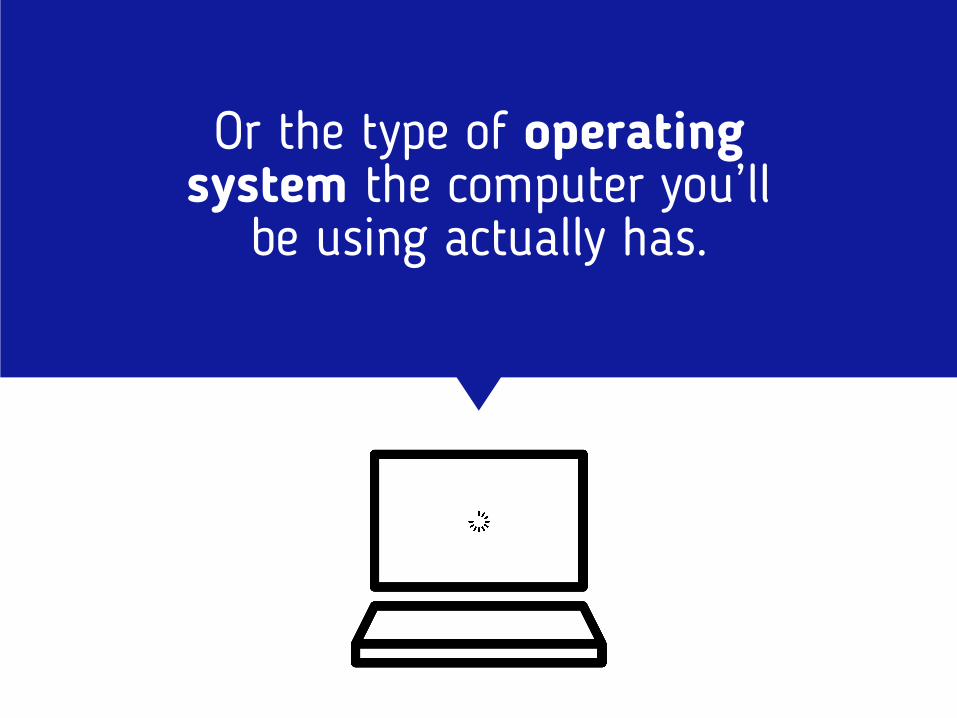
Or the type of operating system the computer you’ll
be using actually has.
Because let’s face it, sometimes things don’t come out as you planned them.
And it’s exactly when those things happen, that you have to be one step ahead and adapt
to the new situation.
With that in mind, we’ve decided to give you 10 tips to read before you prepare your next big presentation.
10

Are you ready?
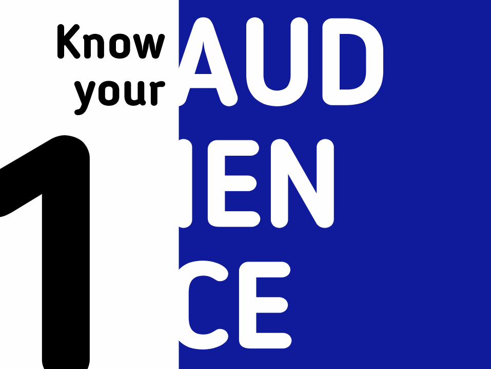
1Know yourAUD
IEN CE
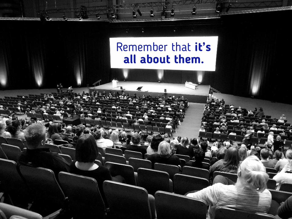
Remember that it’s all about them.

Not you, but them.

You’ve been chosen to teach your audience something that
will benefit them
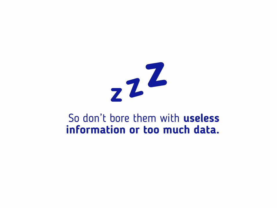
So don’t bore them with useless information or too much data.
z zz
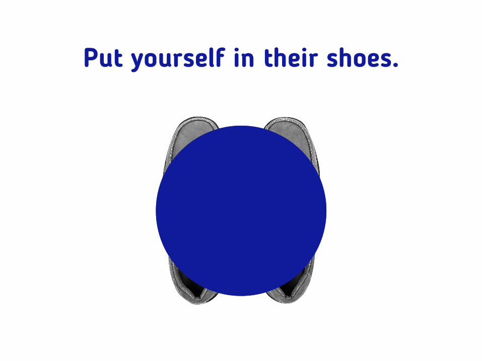
Put yourself in their shoes.
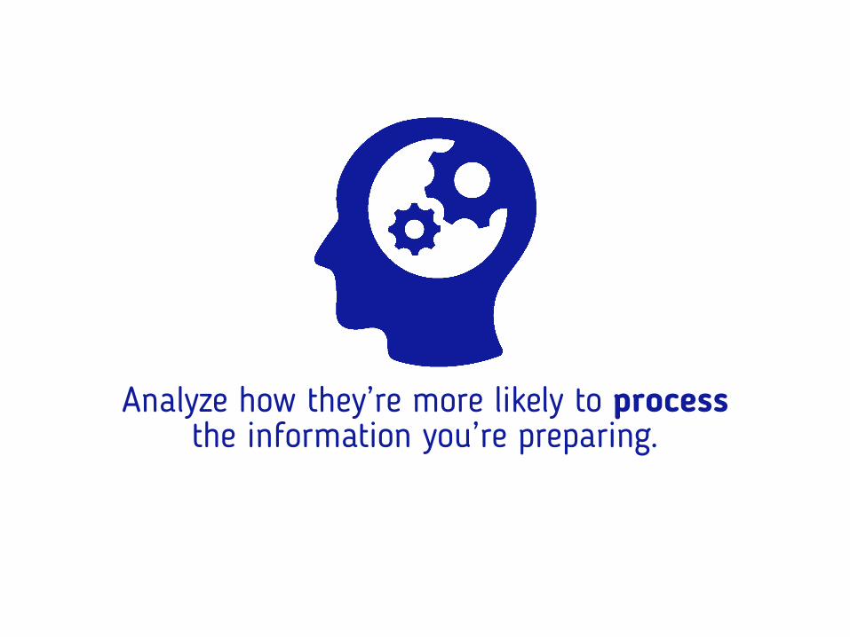
Analyze how they’re more likely to process the information you’re preparing.

Are they teenagers? Include images, and videos, popular references and talk to them casually.

Are they your
financial team waiting for the past
semester reports? Share the best results first, ask them questions,
use graphics instead of tables, prepare handouts.
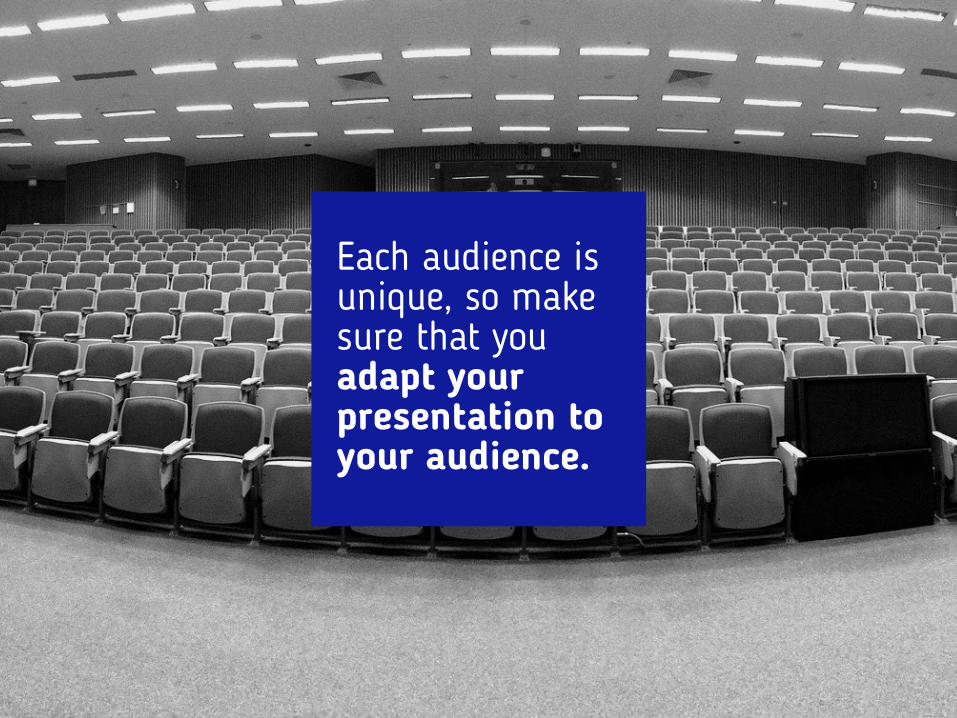
Each audience is unique, so make sure that you adapt your presentation to your audience.

2Know yourPUR
POSE
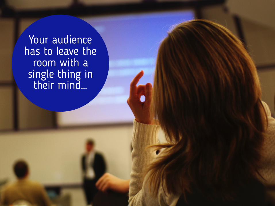
Your audience has to leave the
room with a single thing in their mind…
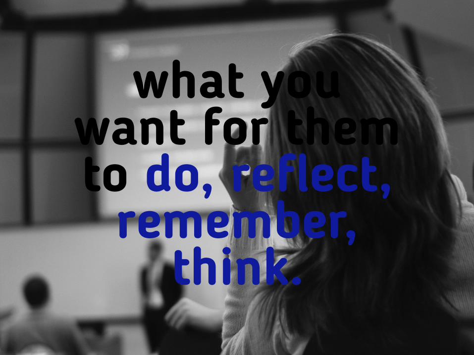
what you want for them to do, reflect,
remember, think.
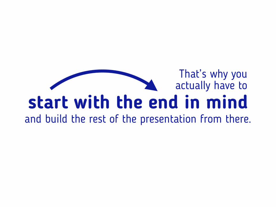
That’s why you actually have to
and build the rest of the presentation from there.start with the end in mind
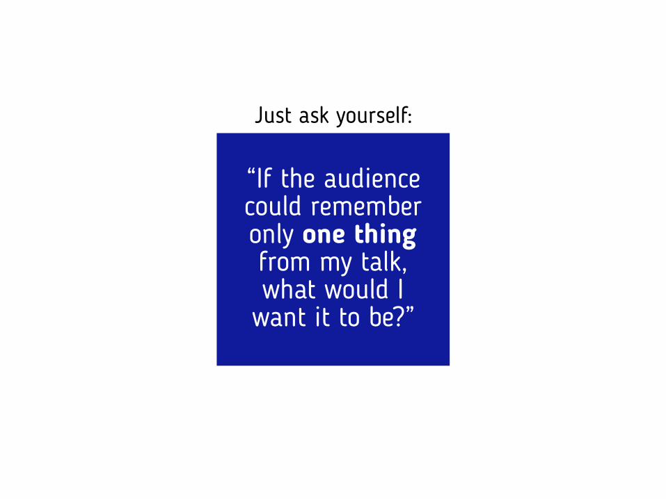
Just ask yourself:
“If the audience could remember only one thing from my talk, what would I
want it to be?”
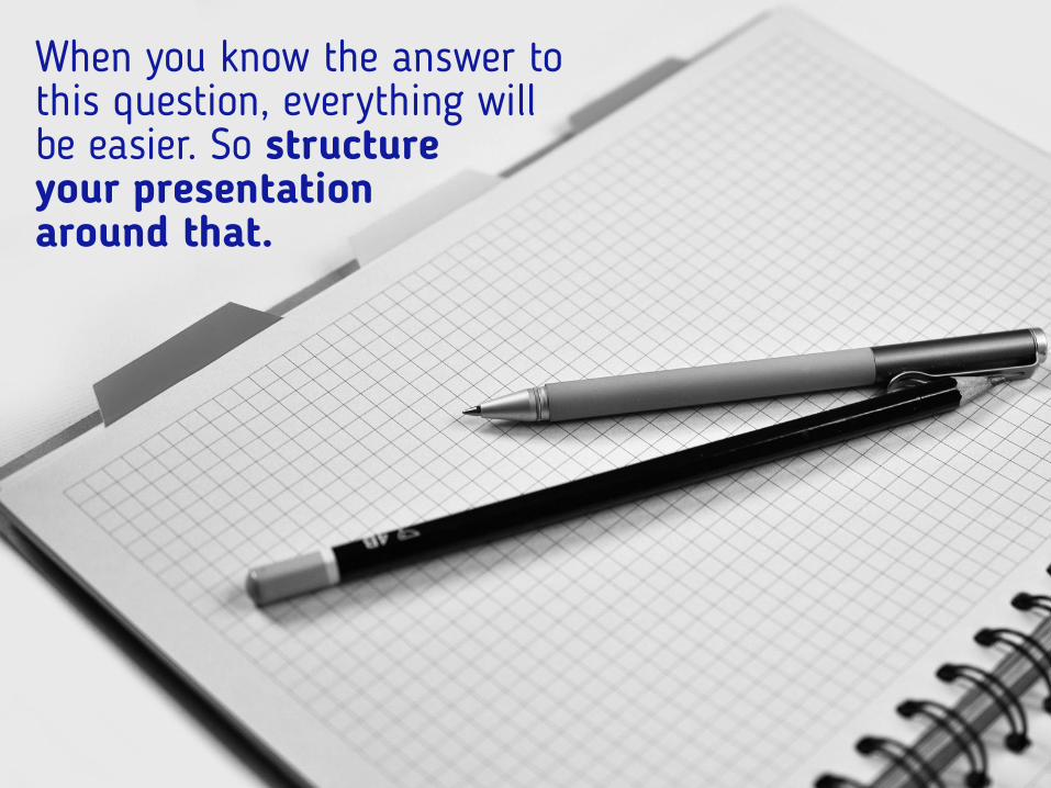
When you know the answer to this question, everything will be easier. So structure your presentation around that.

3Know yourCO
NTENT
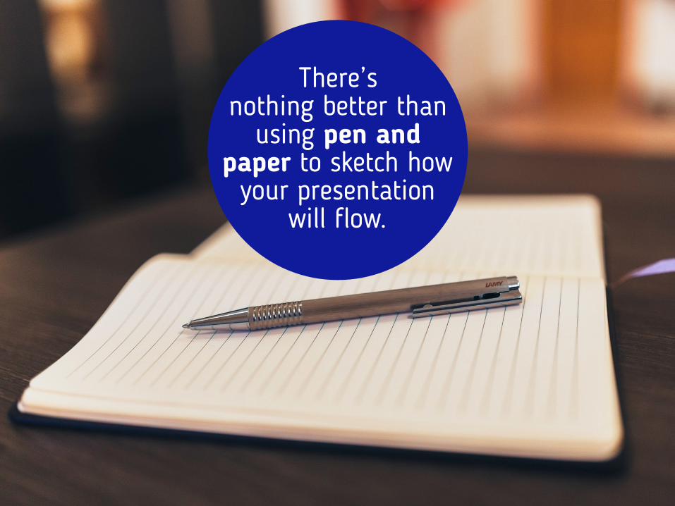
There’s nothing better than
using pen and paper to sketch how
your presentation will flow.
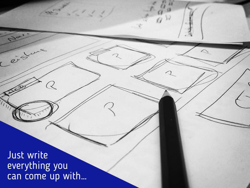
Just write everything you can come up with…
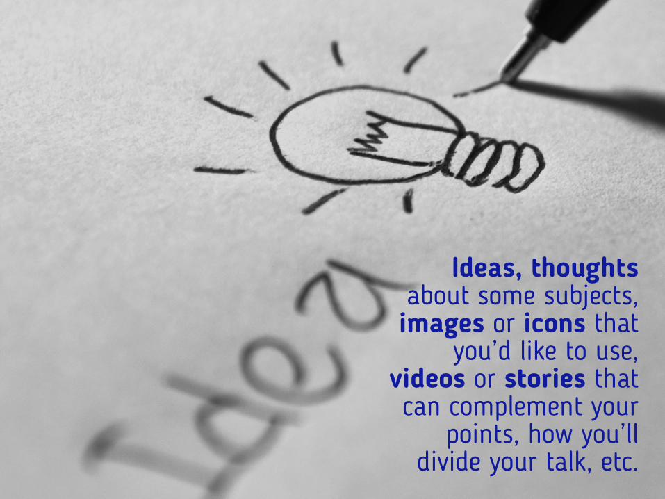
Ideas, thoughts about some subjects, images or icons that
you’d like to use, videos or stories that can complement your
points, how you’ll divide your talk, etc.
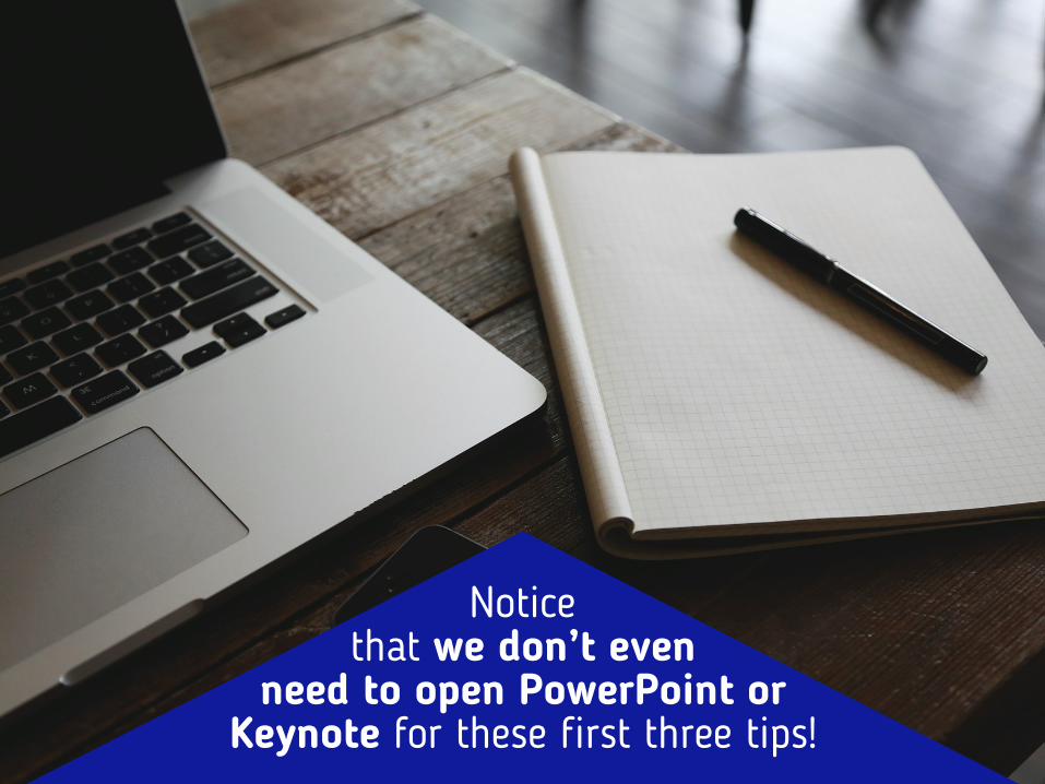
Notice that we don’t even
need to open PowerPoint or Keynote for these first three tips!
Which is actually an important point!
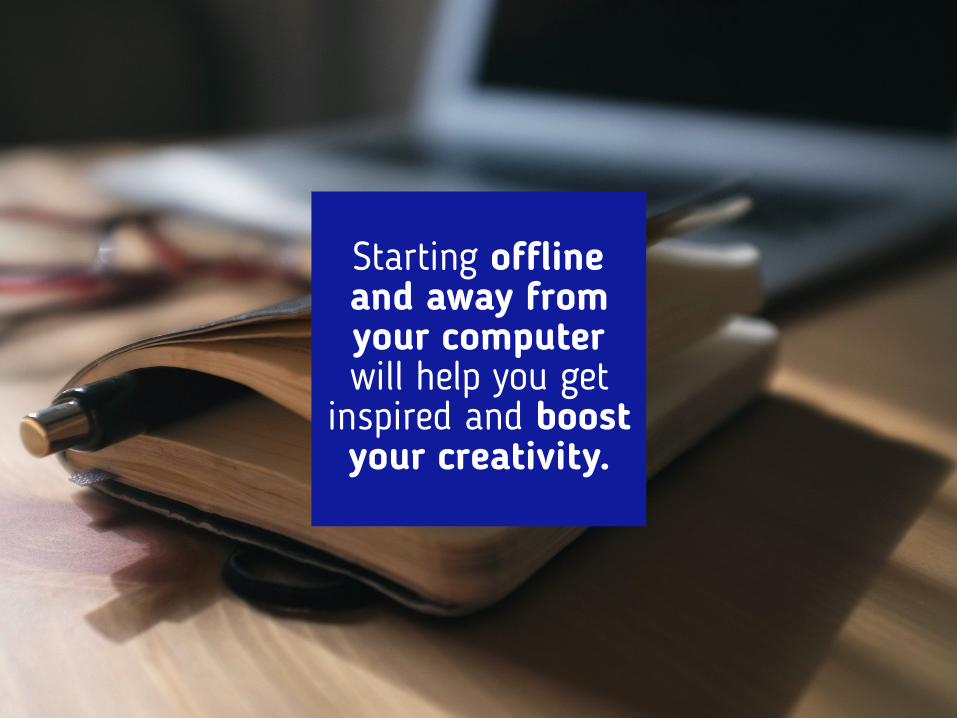
Starting offline and away from your computer will help you get
inspired and boost your creativity.

4AvoidTEM
PLA TES
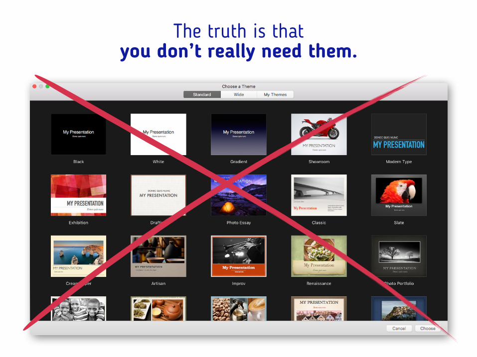
The truth is that you don’t really need them.
Click to add Title
Notes No.Date
Logo
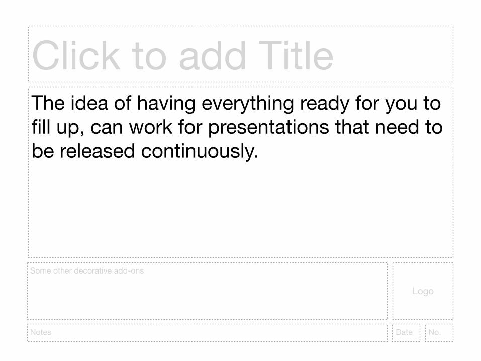
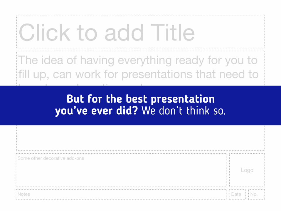
The idea of having everything ready for you to fill up, can work for presentations that need to be released continuously.
Some other decorative add-ons
Click to add Title
Notes No.Date
Logo
The idea of having everything ready for you to fill up, can work for presentations that need to be released continuously.
Some other decorative add-ons
But for the best presentation you’ve ever did? We don’t think so.
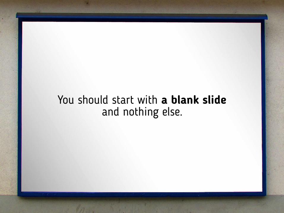
You should start with a blank slide and nothing else.
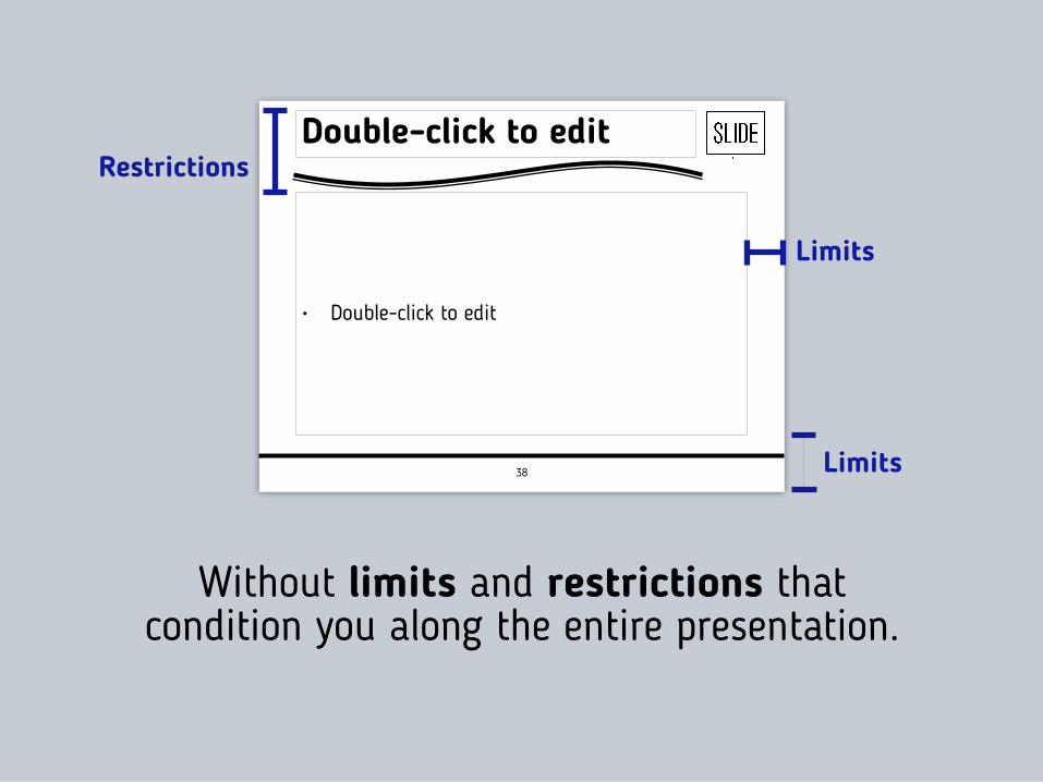
Without limits and restrictions that condition you along the entire presentation.
Limits
Restrictions
38
Double-click to edit
• Double-click to edit
Limits
Just a blank slide in front of you.

And you start to see all the amazing possibilities that come with that…

Full-screen images and
videos

A text-box with a single message on
it.TOGETHER WE CREATE.
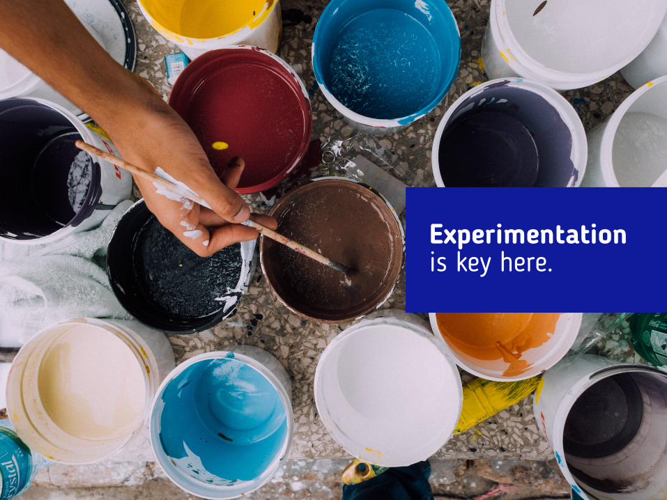
Experimentation is key here.
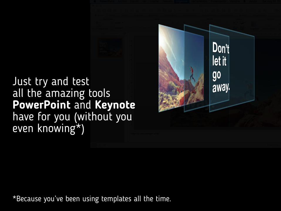
Just try and test all the amazing tools PowerPoint and Keynote have for you (without you even knowing*)
*Because you’ve been using templates all the time.
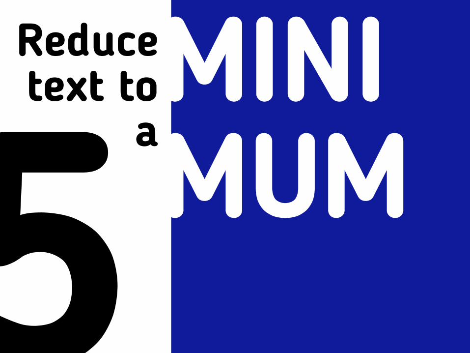
5Reduce text to
aMINI MUM
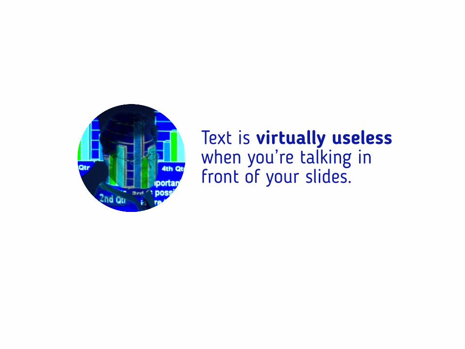
Text is virtually useless when you’re talking in front of your slides.
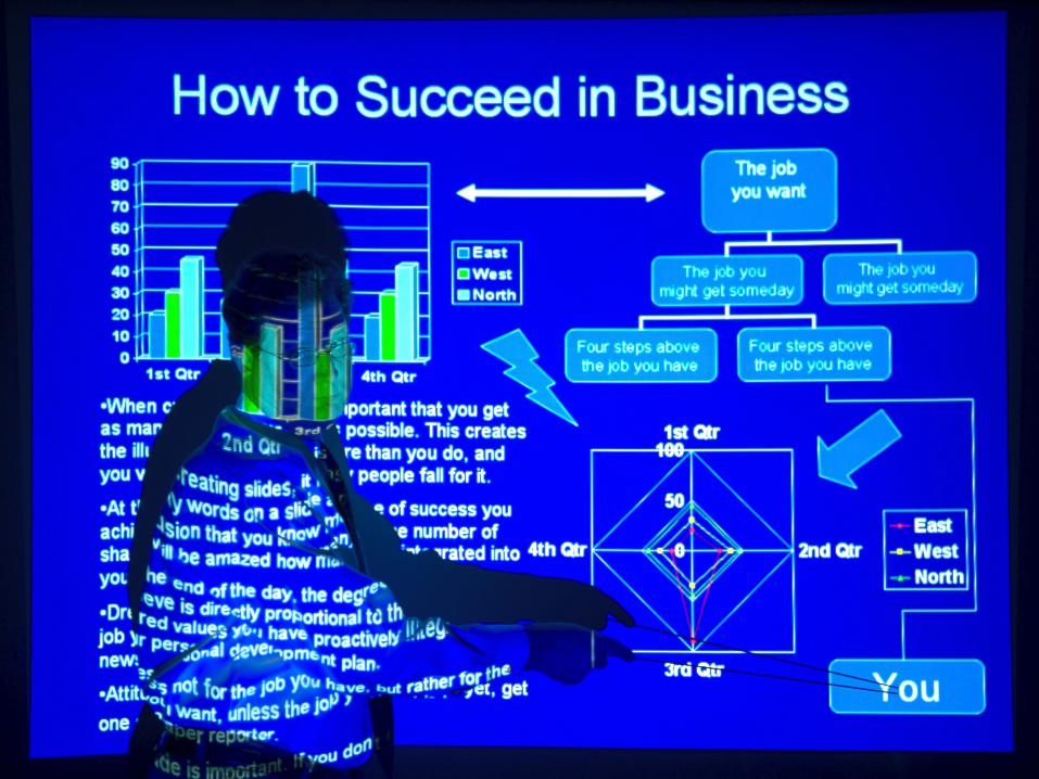

Actually, the best slides are the ones with no
text at all.
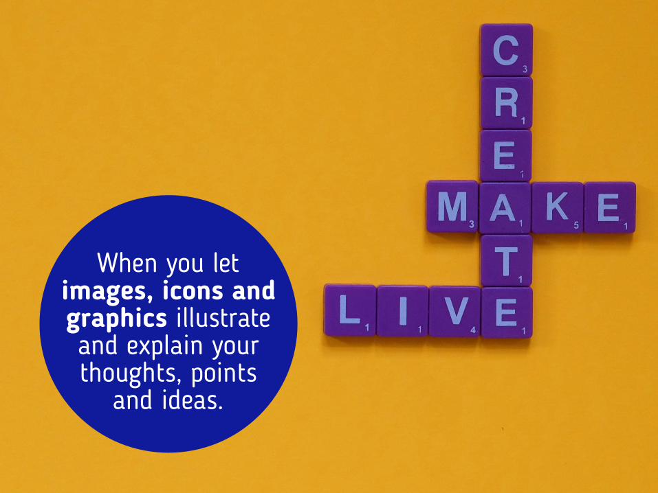
When you let images, icons and graphics illustrate and explain your thoughts, points
and ideas.
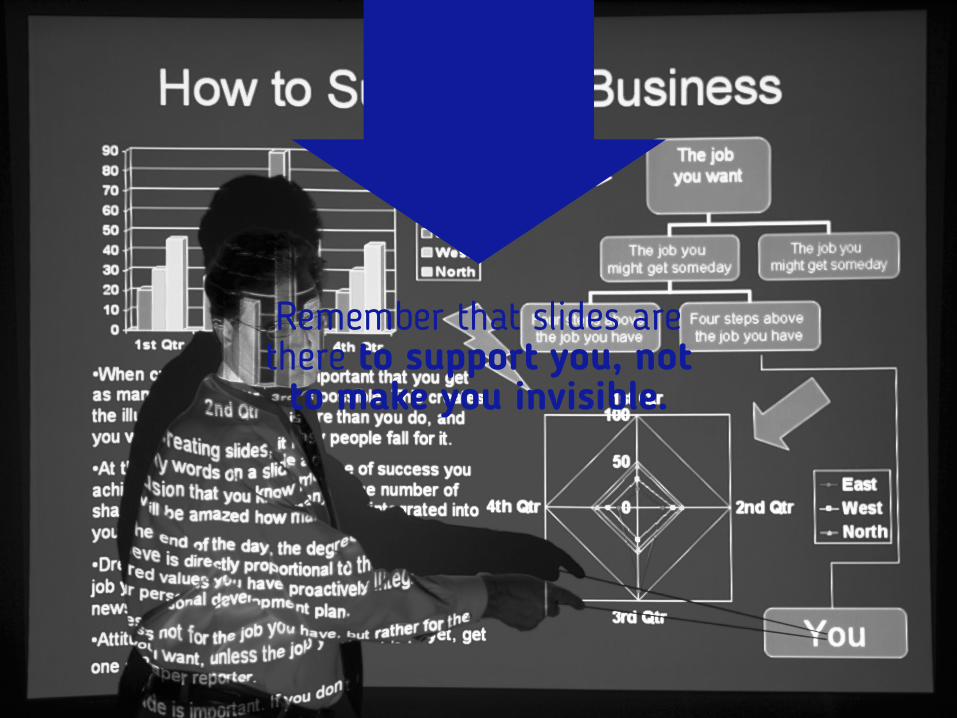
Remember that slides are there to support you, not to make you invisible.
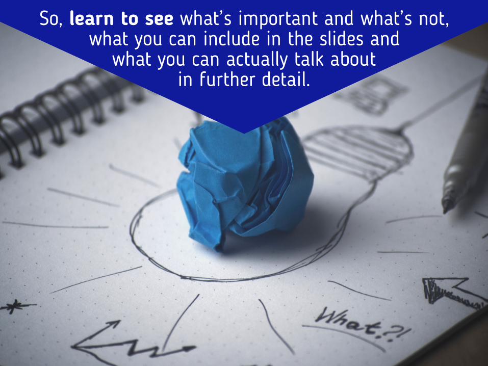
So, learn to see what’s important and what’s not, what you can include in the slides and
what you can actually talk about in further detail.
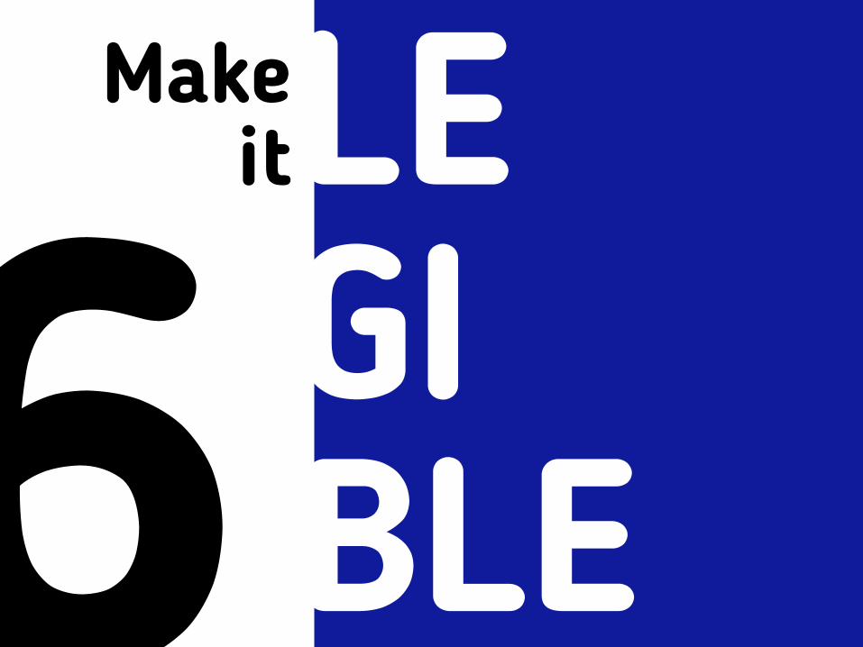
6Make
itLE GI BLE
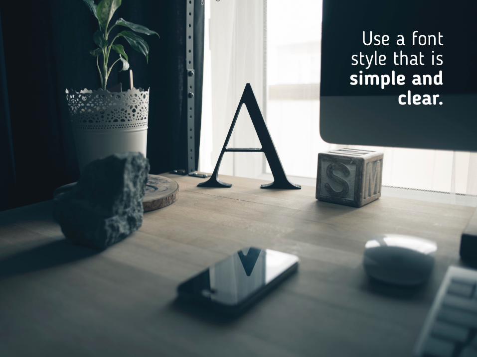
Use a font style that is simple and
clear.
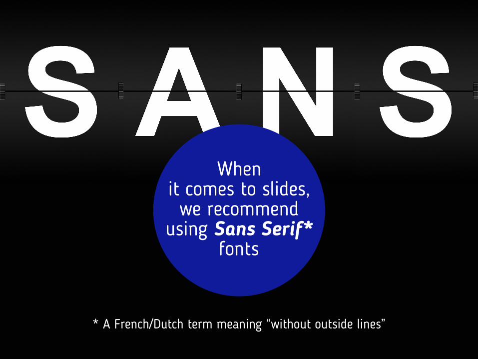
* A French/Dutch term meaning “without outside lines”
When it comes to slides, we recommend
using Sans Serif* fonts

Arial, Futura, Century Gothic Calibri.or
Like
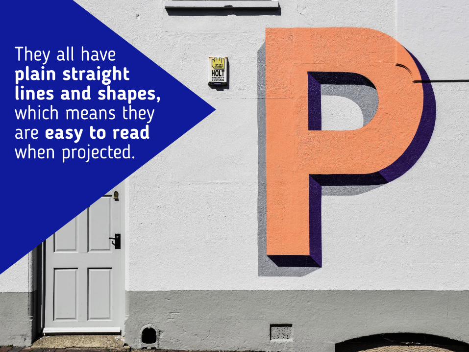
They all have plain straight lines and shapes, which means they are easy to read when projected.
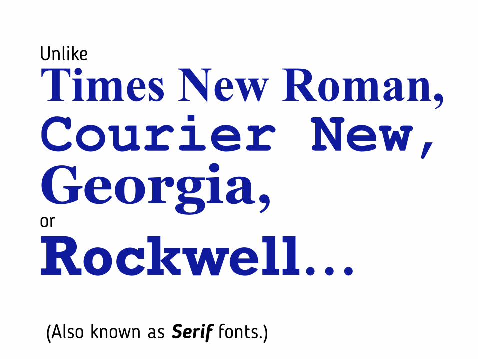
(Also known as Serif fonts.)
Times New Roman, Courier New, Georgia, Rockwell…or
Unlike

… that have extra decorative details outside their letter lines.
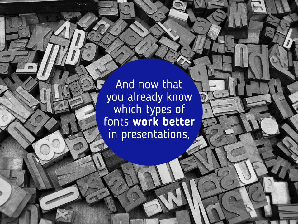
And now that you already know which types of
fonts work better in presentations,
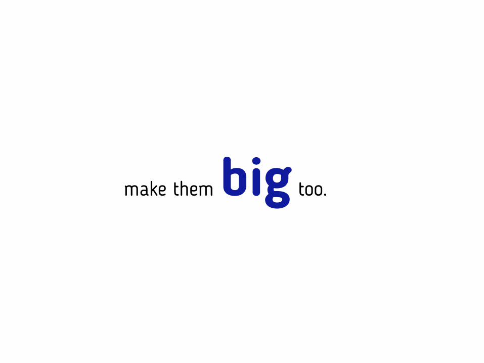
make them big too.

BIGReally
Like…
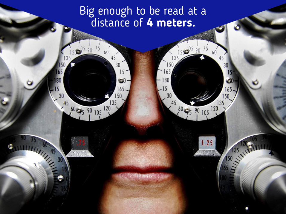
Big enough to be read at a distance of 4 meters.
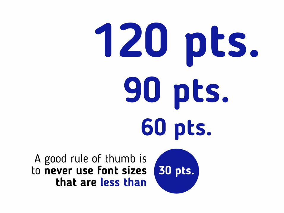
60 pts.90 pts.
120 pts.
30 pts.A good rule of thumb is to never use font sizes
that are less than
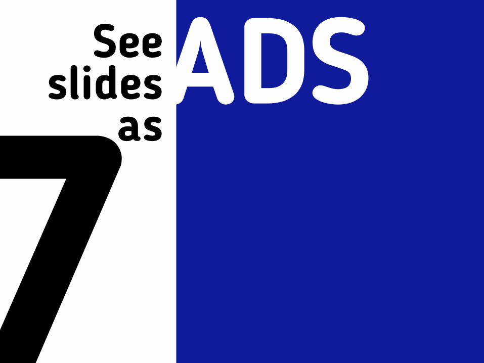
7See
slides asADS
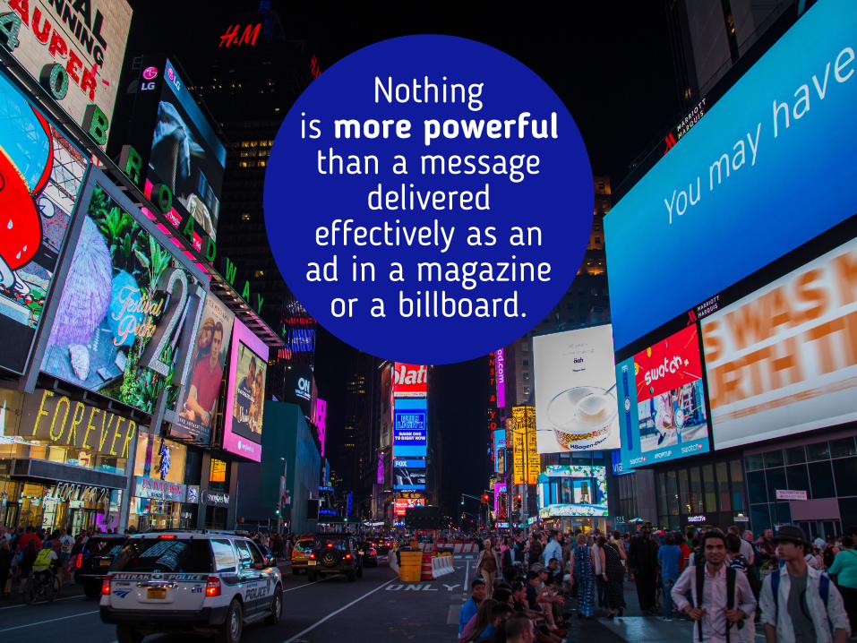
Nothing is more powerful than a message
delivered effectively as an ad in a magazine
or a billboard.

A powerful image
and just the right amount of information.

1That’s why you need to
limit your ideas to
per slide1
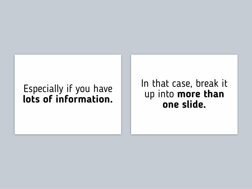
Especially if you have lots of information.
In that case, break it up into more than
one slide.
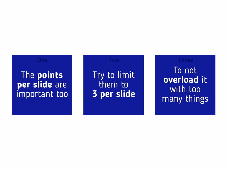
The points per slide are important too
Try to limit them to
3 per slide
To not overload it
with too many things
One Two Three
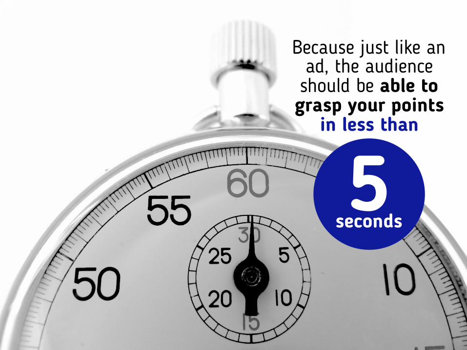
Because just like an ad, the audience should be able to grasp your points
in less than
5seconds
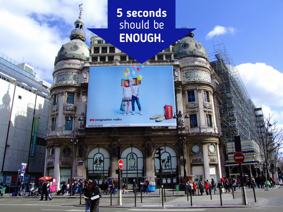
5 seconds should beENOUGH.

So your audience can actually listen to what you have to say instead of
reading what’s on your slides.
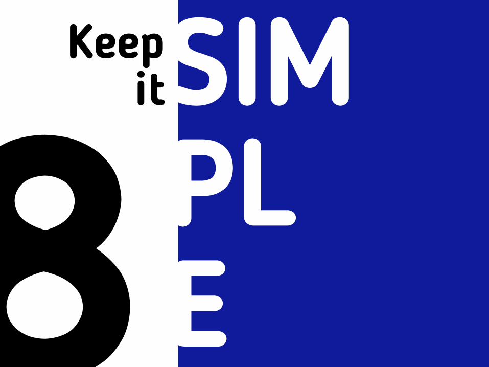
8Keep
itSIM PL E
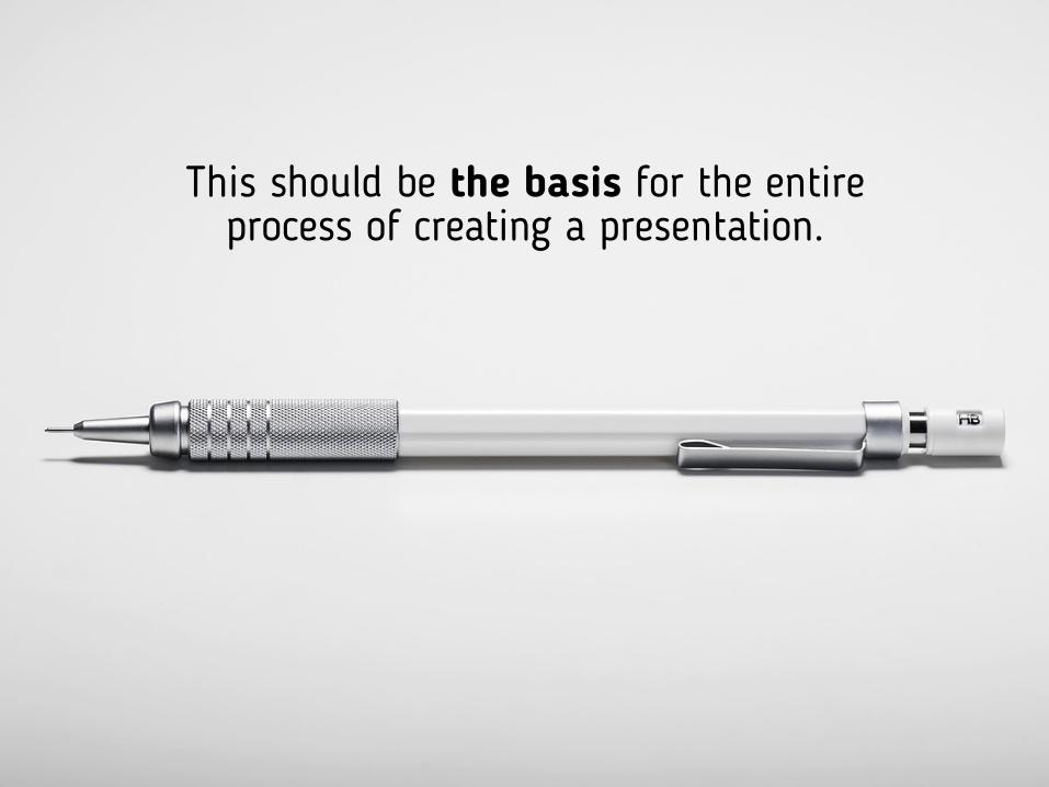
This should be the basis for the entire process of creating a presentation.
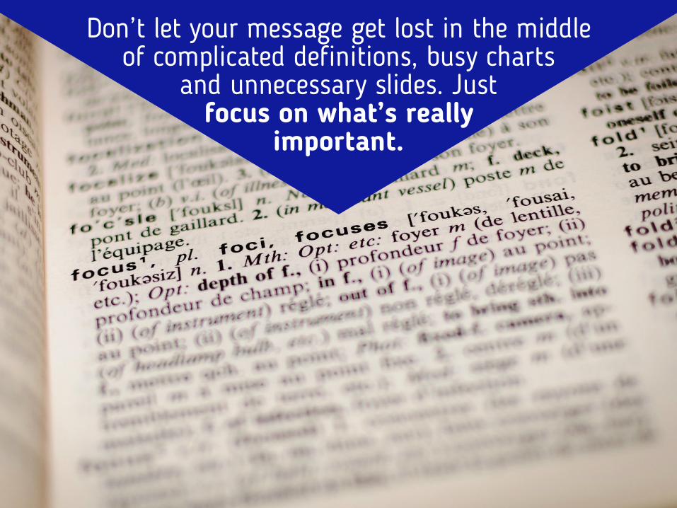
Don’t let your message get lost in the middle of complicated definitions, busy charts
and unnecessary slides. Just focus on what’s really
important.
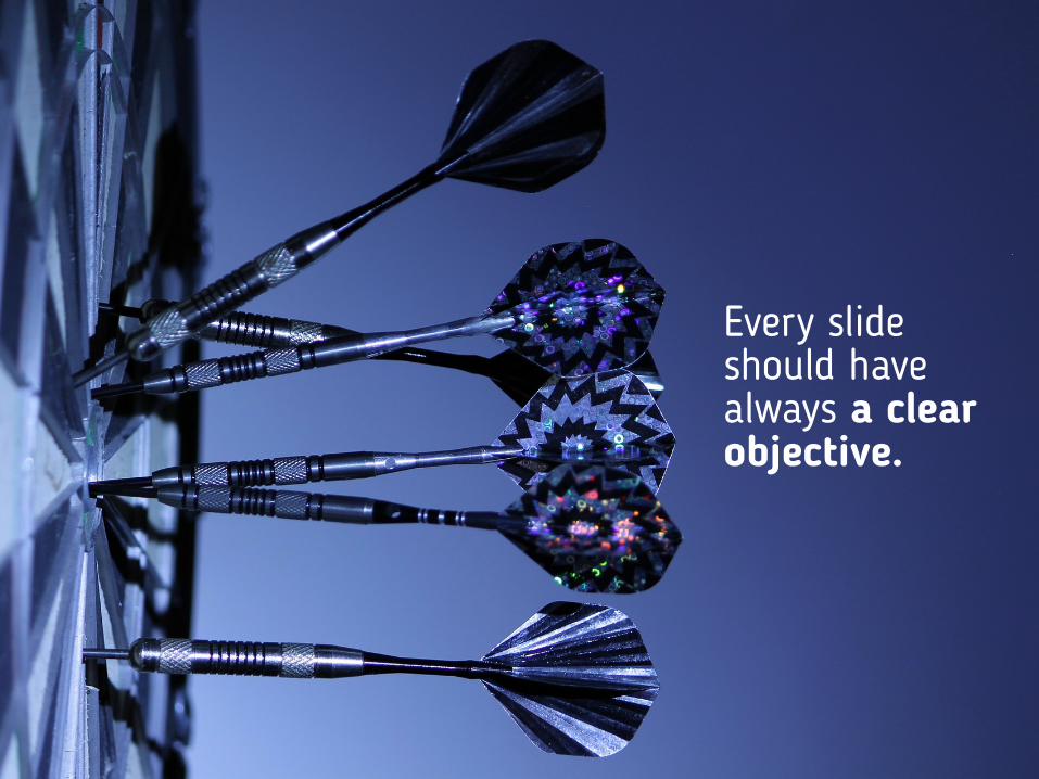
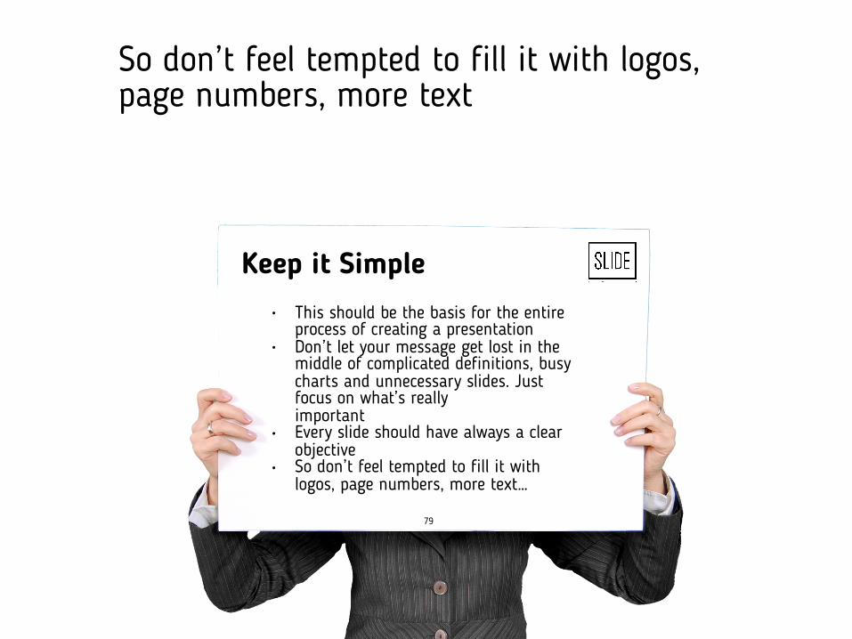
Every slide should have always a clear objective.

So don’t feel tempted to fill it with
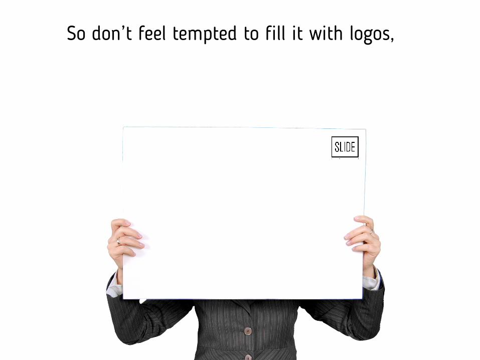
So don’t feel tempted to fill it with logos,
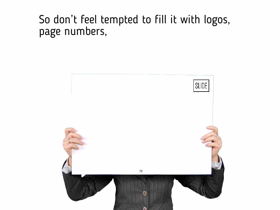
So don’t feel tempted to fill it with logos, page numbers,
79
79
Keep it Simple
• This should be the basis for the entire process of creating a presentation
• Don’t let your message get lost in the middle of complicated definitions, busy charts and unnecessary slides. Just focus on what’s really important
• Every slide should have always a clear objective
• So don’t feel tempted to fill it with logos, page numbers, more text…
So don’t feel tempted to fill it with logos, page numbers, more text
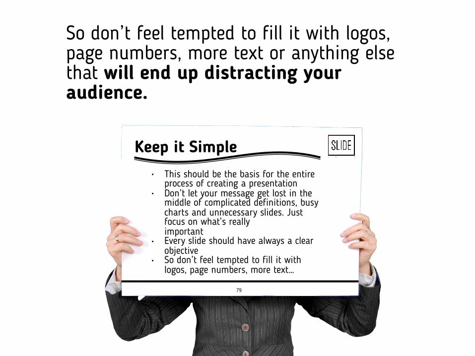
So don’t feel tempted to fill it with logos, page numbers, more text or anything else that will end up distracting your audience.
79
Keep it Simple
• This should be the basis for the entire process of creating a presentation
• Don’t let your message get lost in the middle of complicated definitions, busy charts and unnecessary slides. Just focus on what’s really important
• Every slide should have always a clear objective
• So don’t feel tempted to fill it with logos, page numbers, more text…
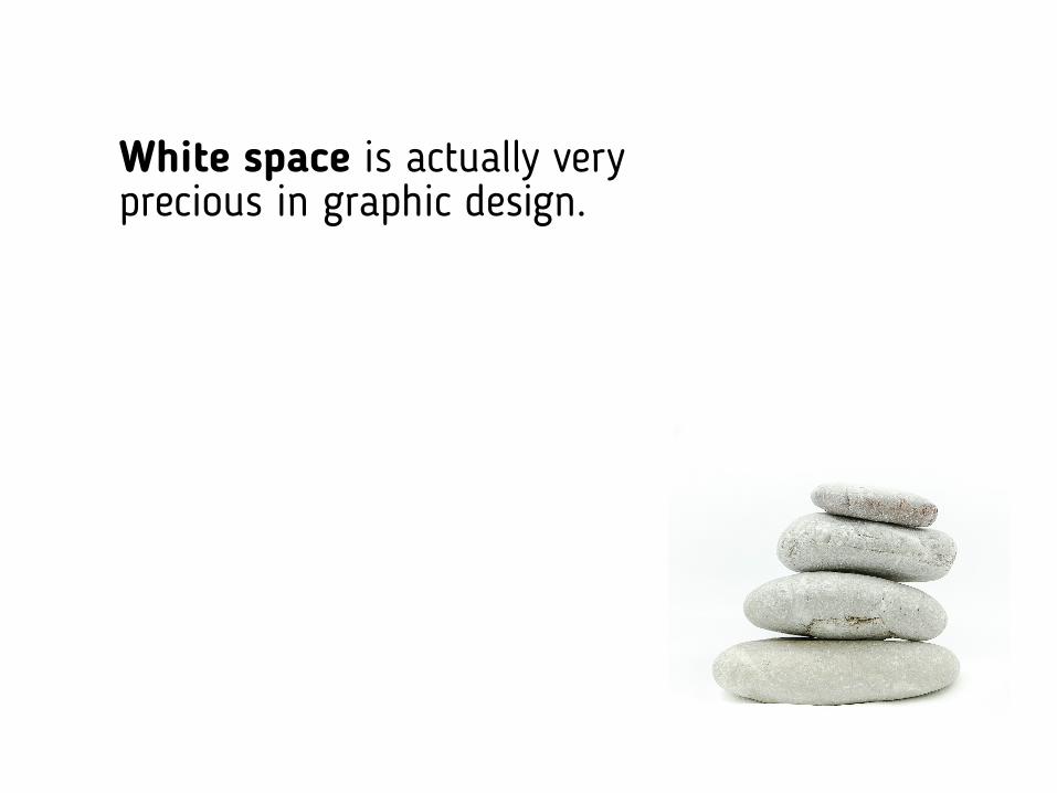
White space is actually very precious in graphic design.
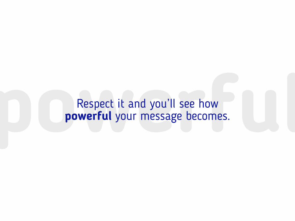
powerfulRespect it and you’ll see how powerful your message becomes.
9Be
aware ofEVERYTHING
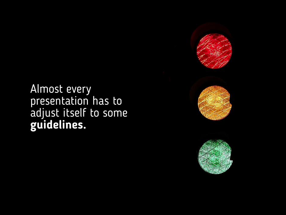
Almost every presentation has to adjust itself to some guidelines.
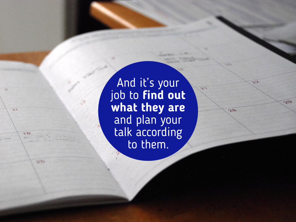
And it’s your job to find out what they are and plan your talk according
to them.
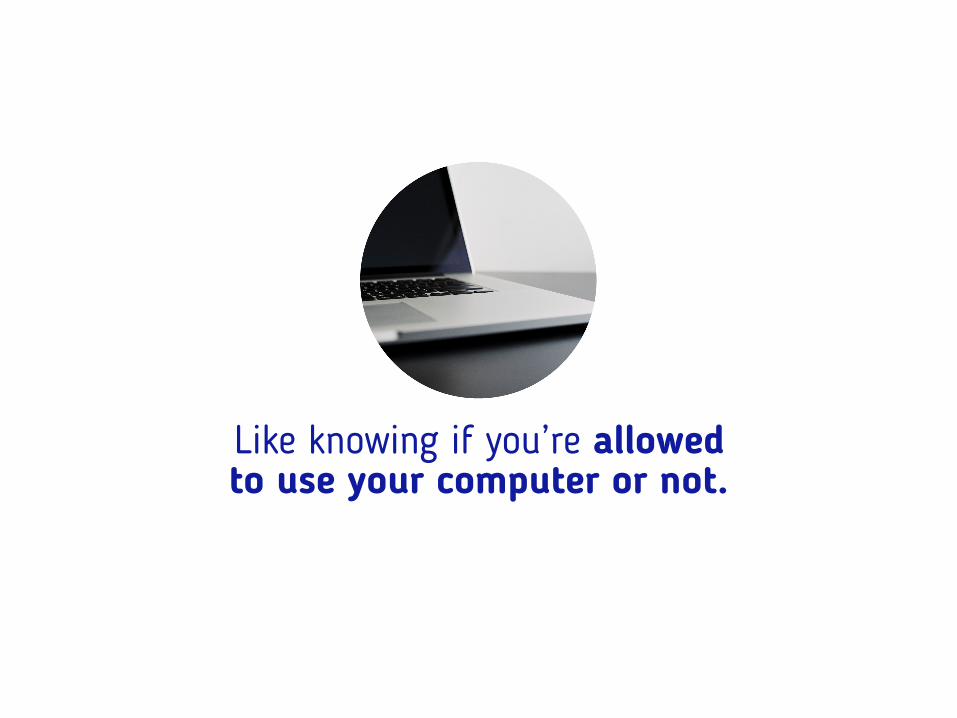
Like knowing if you’re allowed to use your computer or not.
If your version of Microsoft Office is supported.
!
If the operating system is either Microsoft or Apple.

4:3 Standard
If slides need to be widescreen or standard.
16:9 Widescreen
If you need to install other fonts or just use the ones that comes with Office.
Aa
If you’re allowed to use a pointer.
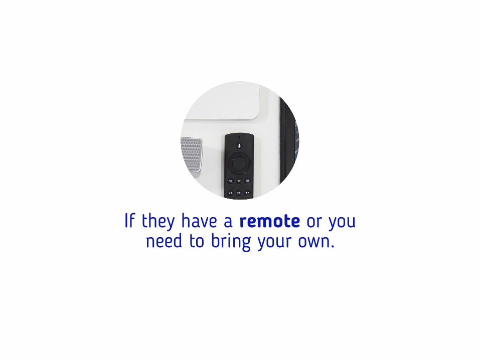
If they have a remote or you need to bring your own.

You can’t leave anything by chance!
Because the real success of your presentation depends even of the things
you can’t completely control.
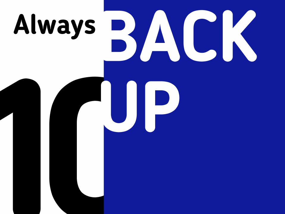
10AlwaysBACK
UP
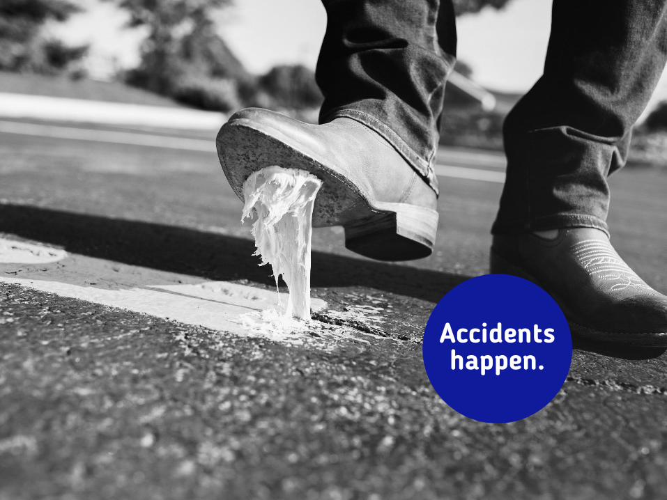
Accidents happen.
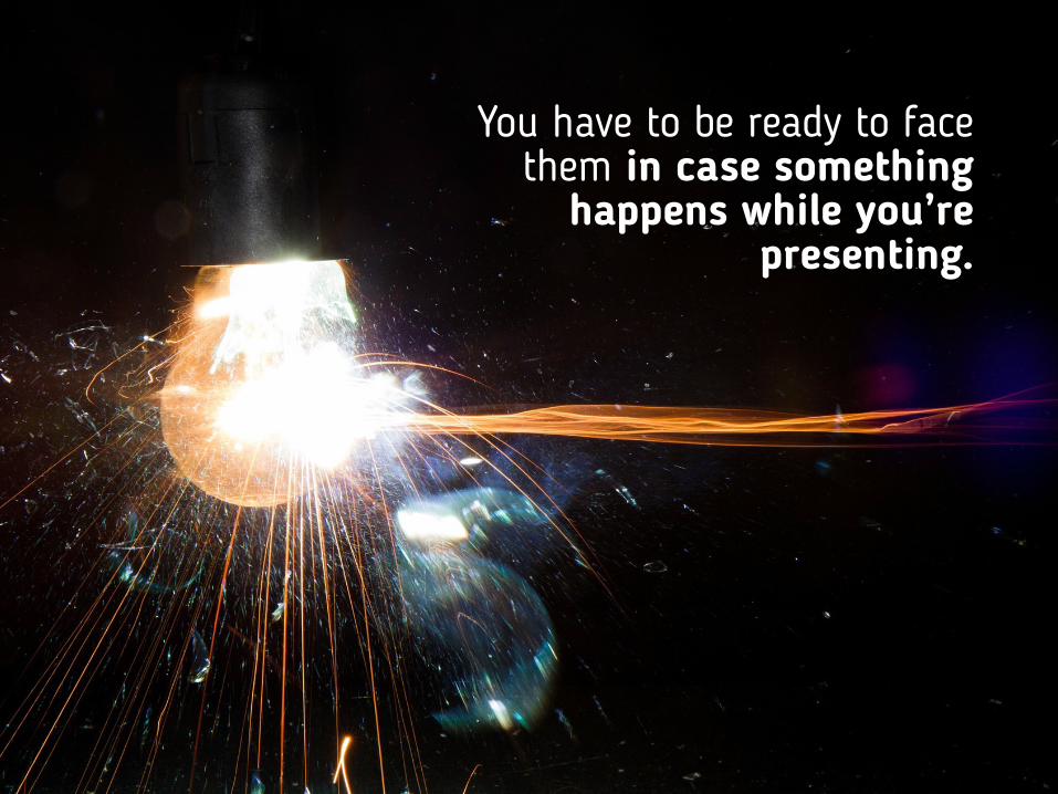
You have to be ready to face them in case something
happens while you’re presenting.
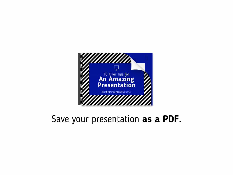
Save your presentation as a PDF.
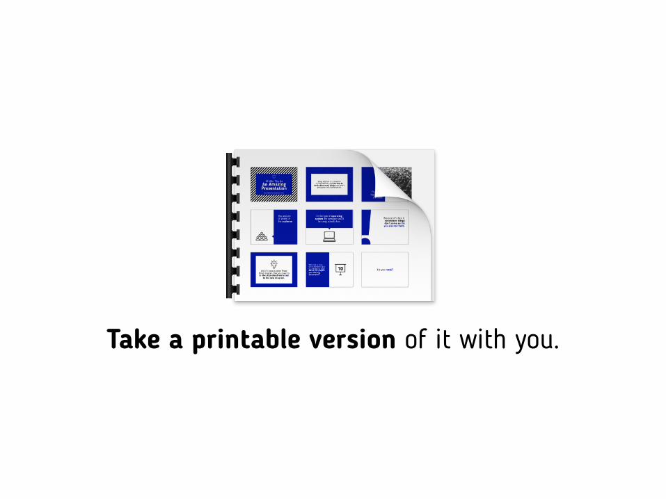
Take a printable version of it with you.
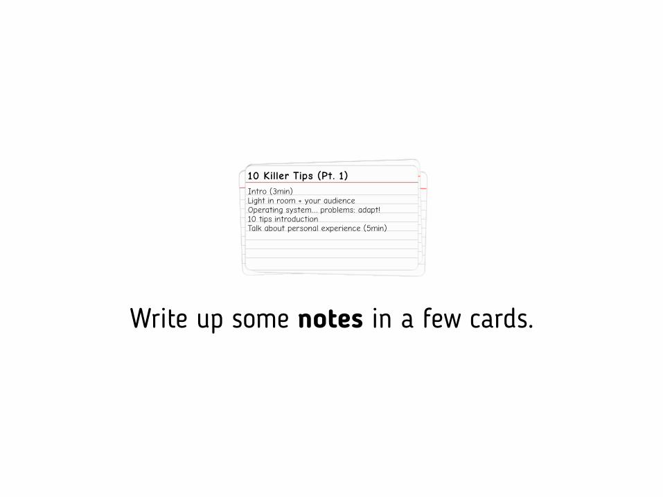
Write up some notes in a few cards.
10 Killer Tips (Pt. 1)
Light in room + your audienceIntro (3min)
Operating system… problems: adapt!10 tips introductionTalk about personal experience (5min)
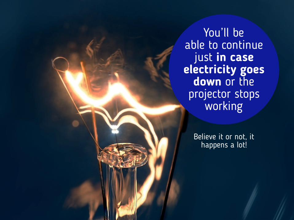
You’ll be able to continue
just in case electricity goes
down or the projector stops
working
Believe it or not, it happens a lot!
But technical
issues don’t have to limit
you!
If you follow these tips carefully, you’ll be ready to continue and deliver an amazing
presentation with or without slides.
The stage is all yours now.

But before we go...
We have
3 more thingsto tell you.
If you liked the presentation
Download it!

If you think we can help you with your next presentation
Let us know!

www.slidestudio.co