1 The Curse of Knowledge in Visual Data Communication
12
1 The Curse of Knowledge in Visual Data Communication Abstract—A viewer can extract many potential patterns from any set of visualized data values. But that means that two people can see different patterns in the same visualization, potentially leading to miscommunication. Here, we show that when people are primed to see one pattern in the data as visually salient, they believe that naïve viewers will experience the same visual salience. Participants were told one of multiple backstories about political events that affected public polling data, before viewing a graph that depicted those data. One pattern in the data was particularly visually salient to them given the backstory that they heard. They then predicted what naïve viewers would most visually salient on the visualization. They were strongly influenced by their own knowledge, despite explicit instructions to ignore it, predicting that others would find the same patterns to be most visually salient. This result reflects a psychological phenomenon known as the curse of knowledge, where an expert struggles to re-create the state of mind of a novice. The present findings show that the curse of knowledge also plagues the visual perception of data, explaining why people can fail to connect with audiences when they communicate patterns in data. Index Terms—Cognitive biases, data communication, expertise, information visualization, perception and cognition. ✦ 1 I NTRODUCTION Imagine a scientist showing experimental results at a con- ference or colloquium, or a data analyst updating the company leadership on recent customer feedback with a dashboard. These people are experts in their respective fields, yet they overwhelm their audiences with overly complex visualizations, delivered too quickly, oblivious to the fact that others do not see what they see. We replicated this phenomenon in the lab, providing empirical evidence for a ‘curse of knowledge’ in data visualization â once an expert recognizes a given pattern in data as visually salient, the expert assumes that it is also visually salient to naïve observers. This ‘curse of knowledge’ is a well-studied psychological phe- nomenon that appears in many domains. Well-informed decision makers fail to predict the judgments of less-informed decision makers, implicitly allowing their own knowledge to guide those predictions [9]. People given disambiguating information about ambiguous sentences, like “the daughter of the man and the woman arrived,” assume that the sentence would no longer be ambiguous to other naïve listeners [25]. When people have access to additional information, e.g. that a message is sarcastic, they tend to perceive ambiguous messages such as “that restaurant was marvelous, just marvelous” as sarcastic – but they also predict that other people would read the same tone [16]. In one particularly powerful demonstration, people were asked to tap the rhythm of a set of well-known songs, such as “Happy Birthday,” on a desk, and listeners guessed the songs based on the recorded rhythm of the tappers [33]. Tappers estimated that listeners would identify around 50% of the songs, but in reality, listeners could only identify around 3%, revealing a vast overconfidence in how much information they communicated. The tappers ‘filled in’ missing information in their own heads, such as the pitches of the ‘notes’, and it appears impossible to turn off this filling-in process to simulate the experience of others. Taking a naïve perspective can be literally inconceivable [37]. This curse of knowledge has powerful consequences for com- munication, because people generally do not convey information to others if they assume that it is already shared [17]. Presenters must therefore have an accurate idea of what their audiences know and do not know, so that they can include only the information the audiences still need [19]. Unfortunately, this knowledge is too often not present or not leveraged. Even teachers misjudge their students’ abilities and understanding, hindering effective instruction [1], [25], [42]. While the curse of knowledge is well-studied in the psychol- ogy of language, decision making and reasoning, there is less direct research on potential consequences for communication with data visualizations. Compared to numerical and textual formats, data visualizations are effective in highlighting the relationships and patterns in data to facilitate understanding [10]. But at the same time, understanding complex visualizations can be similar in time and effort to reading a paragraph [20], [26]. Critically, just as one can read many possible sentences from the paragraph, providing multiple perspectives on a topic, a graph or figure can be seen and interpreted in multiple ways depending on the how they select and interpret visual information over time [31], [39]. The present experiment demonstrates that different experience with a dataset can cause people to adopt a particular perspective, which can substantially change their predictions about what naïve viewers will find salient in a visualization. Given the primary role visualizations play in the communica- tion of analytic data across science, education and industry [27], [30], focusing on different patterns in the same dataset harbors the potential for miscommunications between the presenters and their audiences [16], [39], [43]. We suspect that the inability to separate one’s own knowledge and expertise from that of their audience can make visual data communication more difficult and less clear than presenters realize. This means that among the many features and patterns within a visualization, graph viewers could selectively focus on some while ignoring others, and in turn predict that naïve viewers would focus on the same feature and patterns. Across four experiments, we demonstrate that the ‘curse of knowledge’ indeed extends to data visualizations. Knowledge, specifically, makes an expert recognize a given pattern in data as more visually salient, and the expert assumes that it is also visually salient to observers that they know to be naïve.
Transcript of 1 The Curse of Knowledge in Visual Data Communication

1
The Curse of Knowledge in Visual DataCommunication
Abstract—A viewer can extract many potential patterns from any set of visualized data values. But that means that two people can seedifferent patterns in the same visualization, potentially leading to miscommunication. Here, we show that when people are primed tosee one pattern in the data as visually salient, they believe that naïve viewers will experience the same visual salience. Participantswere told one of multiple backstories about political events that affected public polling data, before viewing a graph that depicted thosedata. One pattern in the data was particularly visually salient to them given the backstory that they heard. They then predicted whatnaïve viewers would most visually salient on the visualization. They were strongly influenced by their own knowledge, despite explicitinstructions to ignore it, predicting that others would find the same patterns to be most visually salient. This result reflects apsychological phenomenon known as the curse of knowledge, where an expert struggles to re-create the state of mind of a novice. Thepresent findings show that the curse of knowledge also plagues the visual perception of data, explaining why people can fail to connectwith audiences when they communicate patterns in data.
Index Terms—Cognitive biases, data communication, expertise, information visualization, perception and cognition.
F
1 INTRODUCTION
Imagine a scientist showing experimental results at a con-ference or colloquium, or a data analyst updating the companyleadership on recent customer feedback with a dashboard. Thesepeople are experts in their respective fields, yet they overwhelmtheir audiences with overly complex visualizations, delivered tooquickly, oblivious to the fact that others do not see what they see.We replicated this phenomenon in the lab, providing empiricalevidence for a ‘curse of knowledge’ in data visualization â oncean expert recognizes a given pattern in data as visually salient, theexpert assumes that it is also visually salient to naïve observers.
This ‘curse of knowledge’ is a well-studied psychological phe-nomenon that appears in many domains. Well-informed decisionmakers fail to predict the judgments of less-informed decisionmakers, implicitly allowing their own knowledge to guide thosepredictions [9]. People given disambiguating information aboutambiguous sentences, like “the daughter of the man and thewoman arrived,” assume that the sentence would no longer beambiguous to other naïve listeners [25]. When people have accessto additional information, e.g. that a message is sarcastic, theytend to perceive ambiguous messages such as “that restaurant wasmarvelous, just marvelous” as sarcastic – but they also predict thatother people would read the same tone [16].
In one particularly powerful demonstration, people were askedto tap the rhythm of a set of well-known songs, such as “HappyBirthday,” on a desk, and listeners guessed the songs basedon the recorded rhythm of the tappers [33]. Tappers estimatedthat listeners would identify around 50% of the songs, but inreality, listeners could only identify around 3%, revealing a vastoverconfidence in how much information they communicated. Thetappers ‘filled in’ missing information in their own heads, such asthe pitches of the ‘notes’, and it appears impossible to turn off thisfilling-in process to simulate the experience of others. Taking anaïve perspective can be literally inconceivable [37].
This curse of knowledge has powerful consequences for com-munication, because people generally do not convey informationto others if they assume that it is already shared [17]. Presentersmust therefore have an accurate idea of what their audiences knowand do not know, so that they can include only the information
the audiences still need [19]. Unfortunately, this knowledge istoo often not present or not leveraged. Even teachers misjudgetheir students’ abilities and understanding, hindering effectiveinstruction [1], [25], [42].
While the curse of knowledge is well-studied in the psychol-ogy of language, decision making and reasoning, there is lessdirect research on potential consequences for communication withdata visualizations. Compared to numerical and textual formats,data visualizations are effective in highlighting the relationshipsand patterns in data to facilitate understanding [10]. But at thesame time, understanding complex visualizations can be similarin time and effort to reading a paragraph [20], [26]. Critically,just as one can read many possible sentences from the paragraph,providing multiple perspectives on a topic, a graph or figure canbe seen and interpreted in multiple ways depending on the howthey select and interpret visual information over time [31], [39].The present experiment demonstrates that different experiencewith a dataset can cause people to adopt a particular perspective,which can substantially change their predictions about what naïveviewers will find salient in a visualization.
Given the primary role visualizations play in the communica-tion of analytic data across science, education and industry [27],[30], focusing on different patterns in the same dataset harbors thepotential for miscommunications between the presenters and theiraudiences [16], [39], [43]. We suspect that the inability to separateone’s own knowledge and expertise from that of their audiencecan make visual data communication more difficult and less clearthan presenters realize. This means that among the many featuresand patterns within a visualization, graph viewers could selectivelyfocus on some while ignoring others, and in turn predict that naïveviewers would focus on the same feature and patterns.
Across four experiments, we demonstrate that the ‘curse ofknowledge’ indeed extends to data visualizations. Knowledge,specifically, makes an expert recognize a given pattern in dataas more visually salient, and the expert assumes that it is alsovisually salient to observers that they know to be naïve.

2
2 RELATED WORK
Existing work in cognitive psychology shows that the curse ofknowledge bias can impact interpersonal communication [17]. Thecurse of knowledge can have particularly strong effects in children,who have more trouble inhibiting their own knowledge. In the’Sally-Ann’ task, children hear a story about Sally, who put hercandy in a box before leaving the room. While she was gone, Annremoved the candy from the box and put it in a basket. Wherewill Sally look for the candy when she returns? Unable to inhibittheir own knowledge of the illicit swap, most 4-year old childrenwill assume that Sally will look in the basket [3], [35]. A modified‘Sally-Ann Task’ targeting adults introducing several “boxes” and“baskets,” demonstrated that adults also make this error with amore complex scenario and a subtler measure [4].
The curse of knowledge can also occur within a single per-son [29], in the form of ‘hindsight bias’. This bias, studied inbusiness decision making, political strategizing and marketing, isthe irrational belief that an outcome was more predictable afterit becomes known [37]. People seem unable to recreate the noveland uncertain feelings from their own mind prior to the revelationof the outcome [5], [11], [45].
Visualization researchers have recently become interested indecision biases, for example, the ’attraction effect’, which is acognitive bias where irrelevant information can influence decisionsabout otherwise equal alternatives, can influence decision makingin visualized data [13], [21]. While a perfectly rational memorysystem should process or remember different types of informationequally well, data visualizations can be more engaging and betterremembered if they are distinctive, concrete, or look more likereal-world objects [2], [6], [7], [8], [18]. Storytelling techniquesadapted from journalism can influence the way people extract datafrom visualizations [22], [23], [32], [34], [38]. Still more work hassought evidence for whether a viewer’s history of previously seendata visualizations can sway their perception of a subsequent, butunrelated, visualization [12], [41].
To our knowledge, the present paper provides the first exam-ination of the curse of expertise in data visualization: whether aviewer’s background knowledge will affect their predictions aboutwhat naïve others will see in a visualization.
3 GENERAL METHOD
Participants completed a Qualtrics [36] survey in which they reada story that conveyed background knowledge about a graph depict-ing political polling data. They were told that the experimenterswill show the same graph they saw to 100 people, along withonly the following short description – “in the months beforethe elections of 2014 in a small European country, a pollingorganization asked citizens about their voting intentions on a dailybasis.” They were then asked to predict what uninformed viewers(with no knowledge of the story) would find to be the most visuallysalient features or patterns in the graph. The participants thenpredicted a second most salient feature, up to a fifth most salientfeature. We intentionally did not specify what types of “features orpatterns” the participants should predict, and did not provide themwith examples. We defined “saliency” as “the most noticeableand important feature” for our participants. After writing downeach feature they predicted, the participants also circled regionson the graph corresponding to each feature on a paper copy ofthe graph. They then reported how salient (1 = not at all salient,5 = very salient) they thought their five predicted features were to
themselves. Finally, they matched their five predictions as best aspossible with five pre-determined features, as shown in Figure 1.
3.1 Design
This within-subject experiment compares individual participant’ssaliency ratings of primed features (a subset of five criticalgraph features that were highlighted with a particular story) vs.unprimed features. We introduced three stories to counterbalancethe possible primed or unprimed features, and randomly assignedparticipants to read one of those stories. The critical comparisonin this experiment is between the salience ratings that participantsassign for primed features vs. unprimed features. The independentvariable is therefore whether a feature was primed or not, andthe dependent variable the salience ratings for those features. Wealso measured a second dependent variable of how visually salienteach participant rated their predicted features to themselves, on acontinuous scale from one (very salient) to five (not at all salient).
Labour
Conservatives
United
Alliance
Labour
United
Alliance
[A]Labour lostgroundtotheConservatives aroundApril21
[B]Labour regainedthestrongleadfrom Conservatives aroundMay20
[C]AlliancedroppedbelowUnitedaroundMay25
[E]LabourandAlliance seemtobeverticalmirror-imagesofeachother.
[D]UnitedswappedpositionwithAlliance,aroundJune17
Pleaserankthefollowingstatements(A,B,C,D,andE)tomatchyourwrittenrankingpredictions,asbestasyoucan.Ifyoudidn’twritesomethingdown,selectN/A.
Fig. 1. Matching five pre-determined features in Experiment 1.
3.2 Hypothesis
We hypothesized that participants would:1) Identify different features to be visually salient.2) Among the five pre-determined features, they would predict
the features that were highlighted in the story version theyread to be more visually salient to uninformed viewers thanthe ones that were not highlighted in the story.
3) Rate the features predicted to be the most/least visuallysalient to an uninformed viewer to also be the most/leastvisually salient to themselves.
3.3 Experiments
We tested the hypotheses across four experiments. Experiment1a provided participants with background knowledge as well asa summarizing graph with visual annotation to emphasize theprimed graph features. Experiment 1b tested whether the effectswould hold when visual annotations were omitted. Experiment 1cinstructionally isolated participant predictions to only certain typesof graph features. Finally, Experiment 2 tested the generalizabilityof this effect with a different type of graph and a different set ofstories.
4 EXPERIMENT 1A
4.1 Participants
Eighteen students (10 women) participated in this experiment inexchange for course credits in an introductory psychology class.All participants were asked to bring corrective eye wear if needed.

3
4.2 Story
The participants read a story highlighting a competition betweentwo out of four political parties, illustrating how citizen votingintentions fluctuated with current events. Figure 2 shows a sampledisplay of the story highlighting the Labour and Alliance party.
According to the story, initially, between the two highlightedparties, one had a healthy lead in the polls. During an initialdebate, the leading party lost voters to the less popular party andeventually lost the lead. In a later debate, the originally leadingparty was able to take back the votes the candidate lost andtake the lead back again after a bad debate performance by hisopponent. The three versions of the story all describe this samecompetition over time, but ascribing it to the top two parties (Top-Prime Story), the top and third party (Middle-Prime Story) orthe bottom two parties (Bottom-Prime Story), highlighting thecorresponding fluctuations. As shown in Figure 3, participantswere randomly assigned to read a version of the story and wereshown polling data after reading the story. In each pair of lines, theparty with the higher line cedes votes to the party with the lowerline (initial debate), and then the higher line gains back that ground(later debate). The stories, experimental materials, and results areaccessible at: (website link omitted for review)
Fig. 2. Snapshot of the story participants read.
Labour
Conservatives
United
Alliance
Labour
Alliance
Labour
Conservatives
United
Alliance
United
Alliance
United
Alliance
initial debatelater
debate
Top-Prime Story
initial debatelater
debate Bottom-Prime Story
Labour
United
Alliance
Conservatives
United
Alliance
initial debate laterdebate
Middle-Prime Story
A B
E
C D
Fig. 3. Three stories highlighting different features in Experiment 1.
4.3 Graph
When participants predicted what an uninformed graph viewerwould see as the most visually salient feature on the graph, theywere shown an unannotated version of the line graph, depictedin Figure 4. They were told that this unannotated graph (with
no story), was all that the uninformed graph viewers would see.Paper copies of this non-highlighted graph were provided to theparticipants to mark down their five predictions separately. Weattempted to construct this graph in a way that balanced therelative salience of several critical features. The bottom two lineswere made darker in color to balance the top two lines, which weexpected to be more salient as a baseline [30]. We further addedtwo intersections to the bottom two lines to counter the top twolines’ natural visual saliency for just being on the top. We worriedthat the green ‘mirror image’ lines would form a less salientpattern, so we aligned their major change points to maximize thesalience of that pattern. We also conducted several pilot versionsof this experiment where we tracked the most salience featuresregardless of what was primed, and adjusted its appearance toequate those salience values (e.g., by making a peak less sharp, ora color difference stronger).
Fig. 4. The unannotated graph of the line graph experiment.
4.4 Matching FeaturesThe participants then matched their own predictions to the fivepre-determined features, referring to their markings on the papercopies of the unannotated graph, shown in Figure 4. A subsetof the five pre-determined features are highlighted in each ofthe three stories, as shown in Figure 3. The top-prime versionof the story highlighted features A and B on top (describing thetwo almost-intersections of the top two lines). The middle-primeversion of the story highlighted features C and D in the bottomright corner (describing the two intersections of the bottom twolines). The middle-prime version of the story highlighted featureE pointing towards the center section of the graph (describing themirroring trend of the two green lines). Participants’ referred totheir freely identified salient feature drawings and matched themwith the five features mentioned above. If the feature they drewdid not match any of the five, they indicated it as “N/A.” Thesubsequent quantitative data analysis of the saliency predictionsand rankings were done on the rankings of the five pre-determinedfeatures. Among the five pre-determined features, 48% matchedwith the participants’ freely identified salient feature drawings,and 56% matched if we only look at the participant’s top threepredictions. We discuss potential limitations of this approach atthe end of this paper. We include the actual freely identified salientfeature drawings of the predicted top three salient features inthe qualitative results section to provide a fuller picture of theparticipants’ responses in addition to our quantitative analysis.
4.5 Qualitative ResultsExamining what the participants marked down on their physicalcopies of the unannotated graph, we find qualitatively observabledifferences among the three story versions. Figure 5 shows whatthe 18 participants who read different versions of the story (6 for

4
each top, middle and bottom-prime story) marked on paper as theirpredictions of the most, 2nd most and 3rd most salient features toan uninformed viewer.
The top and bottom rows of Figure 5 directly compares thestory versions and the respectively highlighted features to theoverall predictions participants made. We see that dependingon what version of the story participants read, free predictionsreflected that they thought other uninformed viewers would seethe features highlighted in their particular story as visually salient,even though participants were explicitly told to ignore the storywhen making their predictions. For example, looking at the bottomrow of Figure 5, participants who read the top story identifiedfeatures highlighting the top two lines to be salient more often thanparticipants who read the bottom prime story and middle primestory. The participants who read the middle-prime story identifiedglobal and mirroring features to be salient to other viewers (noticehow participants often circled pairs of features spanning a largerarea), as opposed to local features identified by participants whoread the top and bottom prime story.
Middle-Prime Story
Most Salient
2nd Most Salient
3rd Most Salient
Most Salient
2nd Most Salient
3rd Most Salient
Top-Prime Story Bottom-Prime Story
pair
pair
same color
3rd Most Salient
Most Salient
2nd Most Salient
Labour
United
Alliance
initial debatelater
debate
Conservatives
Labour
United
Conservatives
Alliance
initial debate laterdebate
Labour
United
Allianceinitial debate
laterdebateConservatives
Labour
United
Alliance
Conservatives
Top 3 Collapsed
Labour
United
Alliance
Conservatives
Labour
United
Alliance
Conservatives
Top 3 Collapsed Top 3 Collapsed
A B
E C D
Fig. 5. Summary of Qualitative Results. Each column represents onestory version, read by 6 participants who marked their most, 2nd mostand 3rd most salient feature predictions.
4.6 Quantitative Results4.6.1 Feature Ranking by Story VersionsUsing the data from the feature matching section of the experi-ment, rankings were assigned to the five pre-determined features(ABCDE). The results are shown in Figure 6. For example,if a participant matched their most visually salient feature touninformed viewer prediction to feature C (which is a bottomfeature), feature C would receive a rank of ‘1’ for this participant.The rank ‘1’ would be entered in R for statistical calculations.
We reverse coded the rank in Figure 6, renaming it “saliencyprediction,” to be more intuitive (e.g. a feature ranked ‘1’ willhave a saliency prediction of ‘5’). For example, if a participantmatched their predicted fourth-most feature to feature B (which isa top feature), feature B would receive a rank of ‘4’ and reverselycoded as ‘2’ on the ‘saliency prediction’ axis in Figure 6.
If a participant matched pre-determined features to multiplepredictions, then the feature would receive the ranking of thehighest rank. For example, if a participant matched their predictedsecond and third salient features to feature A, then feature A wouldreceive a ranking of two.
If a participant did not think any of the five pre-determined fea-tures matched to one of their predictions, that specific predictionwould be matched to “N/A.” The ranking spot of this predictionwould be counted as taken. For example, if a participant matchedthe predicted second most visually salient feature to feature E,the fourth most visually salient feature to feature D, and everyother prediction they made did not match to any of the fivepre-determined features, feature E would receive a rank of ‘2’and feature D would receive a rank of ‘4.’ Remaining unrankedfeatures (ABC) would take on a rank of ‘6,’ which translate to“saliency predictions” of ‘0.’
If participants matched two features to a predicted feature,the two features would receive the same rank (e.g., if a participantwrote down a feature to be the second most visually salient featureto an uninformed viewer and matched both feature A and B to it,then both feature A and B would receive a rank of ‘2.’)
4.6.2 Wilcoxon Signed-Ranked TestWe conducted a non-parametric Wilcoxon Signed-Rank Testcomparing the participants’ saliency rankings of primed and notprimed features [24]. Primed feature rankings are rankings offeatures highlighted in the story the participant read. For exam-ple, the middle feature (E) rankings ranked by participants whoread the middle-prime version of the story are primed featurerankings. Non-primed feature rankings are rankings of featuresnot highlighted in the story the participant read. For example, top(AB) and bottom (CD) feature rankings ranked by participantswho read the middle-prime version of the story are non-primedfeature rankings.
The Wilcoxon Signed-Rank test indicates that the overallprimed feature rankings, Wilcoxon mean score = 59.77, rankmean = 2.63, were significantly higher compared to the overall notprimed feature ranks, Wilcoxon mean score = 38.37, rank mean= 0.87, Z = 4.03, p < 0.01. Primed features were given highersaliency rankings and thus were predicted to be more visuallysalient to other uninformed viewers than not primed features.
4.6.3 Descriptive StatisticsIn order to more clearly illustrate the differences in saliencyrankings, we visualized their descriptive statistics. Since thereare two pre-determined features highlighted in the top-primeand bottom-prime stories, and only one pre-determined featureis highlighted in the middle-prime story, the rankings of the topfeatures (A and B) were averaged to generate a top feature averageranking. Similarly, the rankings of the bottom features (C and D)were averaged. The left column of Figure 6 shows the participantprediction rankings of the top features (AB), middle feature (E)and bottom feature (CD) for the three story versions (no standarddeviation is shown because ranking data is nonparametric). Theright column of Figure 6 shows saliency ratings of primed andnot primed features (e.g. in Top Prime, top is primed; middle andbottom are not primed), across the three stories.
Overall, most participants rated features that were highlightedin the story (primed), as more visually salient than other featuresthat were not highlighted in the story (not primed). This supportsthe results of our Wilcoxon Signed-Rank Test. Inspecting the grey

5
Saliency Prediction
Bottom
Top
MiddleTopPrime
MiddlePrime
BottomPrime
Bottom
Top
Middle
Bottom
Top
Middle
Everyone
M =1.67
M =0.33
M =0.75
M =0.83
M =2.83
M =0.58
M =2.92
M =0
M =2.25
Bottom
Top
MiddleM =1.42
M =0.89
M =1.83
PrimedNot Primed
Primed
Saliency Prediction
Not Primed
Primed
Not Primed
Primed
Not Primed
Primed
M =1.50
M =2.92
M =0.46
M =1.67
M =0.78
M =2.83
M =0.87
M =2.63
*
0 1 2 3 4 50 1 2 3 4 5
Fig. 6. Ranking details for each story version. The grey oriented linesrepresent individual participant ratings. The right column shows saliencyratings of primed and not primed features (e.g. in Top Prime, top isprimed; middle and bottom are not primed), across the three stories.
lines in the right column of Figure 6, we also see that someparticipants did not rate the primed features as more visuallysalient. This might mean that these participants were relativelyimmune to the curse of knowledge, though the present designcannot distinguish robust individual differences from measurement(or other sources of) noise.
4.6.4 Salience Prediction Ranking
After participants marked down a feature that they predicted otheruninformed graph viewers would find visually salient, participantsalso rated how visually salient that predicted feature was tothemselves. We see from Figure 6 that not everyone predictedthe story-primed features to be visually salient to others. In thepresent analysis, we take a different approach here by looking atwhether the participants would find features they predicted to besalient to other people also salient to themselves, regardless ofwhether they were primed features or not.
In Figure 7, ‘Saliency to Self’ is how salient each participant’spredictions were to themselves on a continuous scale, where onemeans not at all visually salient, and five means very visuallysalient. Feature Rank is the order of the predictions. For example, 1corresponds to the feature the participant predicted to be the mostsalient and 5 corresponds to the feature the participant predictedto be the 5th most salient, to a naïve viewer. Each dot representsone rating from one participant and the three lines are regressionlines based on the scattered points.
There was a negative correlation between the Feature Rank andSaliency to Self, showing that regardless of whether the featureswere primed or not, participants rated the features predicted tobe the most/least visually salient to a naïve viewer also to be themost/least visually salient to themselves, suggesting a curse ofknowledge where they could not separate their own perspectivesfrom that of another person. Using Spearman’s Correlation, wefound a moderately strong association (rs = 0.55, p < 0.001)between the self-rated salience of a feature, and the predictedsalience rating for other naïve observers.
1 2 3 4 5
5
4
3
2
Feature Rank
Salie
ncy
to S
elf
Saliency Rating for Each Predicted Feature
MiddleTop
Bottom
Fig. 7. Regression of predicted saliency and saliency to self in Experi-ment 1a.
4.7 Discussion
The knowledge the participants obtained by reading the storybiased their predictions such that, in general, they saw the fea-tures depicted in the story as more visually salient than featuresnot depicted in the story. More importantly, after acquiring thisbackground knowledge, participants were biased to predict thatother uninformed graph viewers would rate those features as morevisually salient as well.
Both qualitative and quantitative statistical analyses for thisexperiment were done post-hoc. To ensure the validity of ourfindings, we conducted two follow up experiments with slightmodifications with a new set of participants, and analyzed thedata following similar procedures and an identical data analysis.
5 EXPERIMENT 1B (NO ANNOTATIONS)
In Experiment 1a, participants were told the story and then showna graph visually highlighting the story content before they madetheir predictions. Experiment 1b hoped to tease apart the primingeffect of the visual annotations and that of the story by onlyincluding the story and removing the graph visual highlighting thestory. The procedures and data analyses of Experiment 1b wereidentical to that of Experiment 1a, except we removed the featurecue after viewing the story (see Figure 8). The participants readthe story and were presented the same unannotated line graph todraw and predict what other uninformed viewers would see.
We hypothesize that even without the visual cue the partici-pants would be just as biased in predicting what other uninformedviewers would see, thinking they would see the same features asvisually salient.
Twenty-nine students (23 women) participated in this experi-ment in exchange for course credits in an introductory psychologyclass or monetary payment. All participants were asked to bringcorrective eyewear if needed.
Participants again referred to their freely identified salient fea-ture drawings and matched them with the five features mentionedabove. Among the five pre-determined features, 66% matched withparticipants’ freely identified salient feature drawings, and 78%matched if we only look at the top three predictions.

6
ButonJune17th,youcanseetheUnitedPartyCandidateattempttobringuptheissueagainresultedinalossofvoters,bringingtheAlliancePartyintheleadagain.
Labour
Conservatives
United
Alliance
ButonJune17th,youcanseetheUnitedPartyCandidateattempttobringuptheissueagainresultedinalossofvoters,bringingtheAlliancePartyintheleadagain.
Labour
Conservatives
United
Alliance
Experiment 1a
Experiment 1b (no annotation)
Fig. 8. Comparison between Experiment 1a and 1b annotations.
5.1 Quantitative Results5.1.1 Wilcoxon Signed-Rank TestThe Wilcoxon Signed-Rank Test [24] indicates that the overallprimed feature ranks, Wilcoxon mean score = 83.15, rank mean =2.48, were significantly higher compared to the overall not primedfeature ranks, Wilcoxon mean score = 67.98, rank mean = 1.79,Z = 2.13, p = 0.035. Primed features were given higher saliencyrankings and were predicted to be more visually salient to otherviewers than not primed features, even without visual annotations.
Inspecting the grey lines in the right column of Figure 9, weagain see that some participants did not rate the primed featuresas more visually salient. This might mean that these participantswere relatively immune to the curse of knowledge. Compared toExperiment 1a, we see that by taking away the visual annotations,the curse of knowledge effect weakened and the number of peoplemight be immune to the curse of knowledge increased.
We also observed an interesting change in the middle primesaliency prediction from Experiment 1a to 1b, such that theparticipants in 1a who were primed with the middle feature ratedit slightly more visually salient than participants in 1b. The middlefeature â- the mirroring pattern of the two green lines, are morespatially separated than the top and bottom features. Since theparticipants in 1b only received a story prime without the visualannotation, the more spatially separated middle feature may havebecome harder for them to see compared to the participants in 1awho were shown clear visual annotations of this spatially sepa-rated middle feature. We speculate that while background storyand visual annotation both contribute to the curse of knowledge,as shown in Experiment 1a and 1b, for spatially separated features,the visual annotation may play a more influential role in creatinga curse of knowledge effect.
5.1.2 Salience Prediction RankingWe found a significant relation (rs = 0.31, p < 0.01) usingSpearman’s Correlation between the predicted salience rankingof features for other naïve observers and the self-rated salience ofthese features, see Figure 10. This indicates that even withoutthe visual annotation cue, the more visually salient a feature
Saliency Prediction
Bottom
Top
MiddleTopPrime
MiddlePrime
BottomPrime
Bottom
Top
Middle
Bottom
Top
Middle
Everyone
M =2.00
M =1.65
M =2.50
M =0.40
M =2.95
M =2.45
M =2.50
M =0.00
M =2.22
Bottom
Top
MiddleM =2.48
M =0.83
M =2.28
0 1 2 3 4 5
Not Primed
Primed
Saliency Prediction
Not Primed
Primed
Not Primed
Primed
Not Primed
Primed
M =1.48
M =2.50
M =2.05
M =2.00
M =1.80
M =2.95
M =1.79
M =2.48
*
0 1 2 3 4 5
Fig. 9. Saliency prediction ranking for Experiment 1b.
participants rated to themselves, the more visually salient theythink the features were to a naïve viewer.
1 2 3 4 5
5
4
3
2
Feature Rank
Salie
ncy
to S
elf
Saliency Rating for Each Predicted Feature
Middle
TopBottom
Fig. 10. Regression of predicted saliency and saliency to self 1b.
5.2 Discussion
We observed a statistically weaker curse of knowledge effectwithout the visual annotations in the present experiment. However,most participants nonetheless reported features primed by the storyto be more visually salient than features not primed by the story,even without visual annotations. This suggests that only havingthe background knowledge, without any visual annotation cues, isstill enough to bias people to predict that other naïve graph viewerswould see features primed by the story as more visually salient.
6 EXPERIMENT 1C (INSTRUCTION CHANGE)We conducted a third follow up experiment on a new set ofparticipants and analyzed the data following the same proceduresand data analysis method. Since Experiment 1a and 1b did not

7
specify in the instructions what types of features the participantsshould be predicting or drawing, we designed Experiment 1c withmore specific instructions to maximize the amount of matching be-tween freely identified salient features and the five pre-determinedfeatures. This experiment 1c also serves as a conceptual replicationof Experiment 1a and 1b.
6.1 ModificationPreviously, participants predicted features with no specific restric-tions or requirements, leading some to pick out features irrelevantto the study (e.g., one participant circled the entire graph asbeing visually salient, another circled the y-axis, see Figure 5).To decrease such uninterpretable responses in the feature free-identification stage, participants were instructed to only describefeatures that involved two or more parties.
Twenty-one students (10 women) participated in this experi-ment in exchange for course credits in an introductory psychologyclass. All participants were asked to bring corrective eyewear ifneeded.
Among the five pre-determined features, 64% matched withparticipants’ freely identified salient feature drawings, which isa 16% increase from Experiment 1a. When we look at the topthree predictions, 83% matched in Experiment 1c, which is a 27%increase compared to Experiment 1a and a 5% increase comparedto Experiment 1b.
6.2 Quantitative Results6.2.1 Wilcoxon Signed-Rank TestThe Wilcoxon Signed-Rank test indicated that the overall primedfeature ranks, Wilcoxon mean score = 65.93, rank mean = 3.26,were statistically significantly higher than the overall not primedfeature ranks, Wilcoxon mean score = 46.54, rank mean = 1.80,Z = 3.17, p < 0.01. The descriptive statistics are shown in Figure11. This result is consistent with the Experiment 1a and 1b suchthat the primed features were given higher saliency rankings andwere predicted to be more visually salient to other naïve viewersthan unprimed features.
Saliency Prediction
Bottom
Top
MiddleTopPrime
MiddlePrime
BottomPrime
Bottom
Top
Middle
Bottom
Top
Middle
Everyone
M =3.43
M =1.43
M =2.29
M =0.71
M =3.64
M =2.36
M =2.79
M =0.71
M =2.21
Bottom
Top
MiddleM =2.48
M =1.62
M =2.43
0 1 2 3 4 5
Not Primed
Primed
Saliency Prediction
Not Primed
Primed
Not Primed
Primed
Not Primed
Primed
M =1.71
M =2.79
M =1.89
M =3.43
M =1.76
M =3.64
M =1.80
M =3.26
*
0 1 2 3 4 5
Fig. 11. Saliency prediction ranking for Experiment 1c.
6.2.2 Salience Prediction RankingSpearman’s Correlation again showed a moderately strong rela-tionship (rs = 0.43, p < 0.001) between the self-rated salience ofa feature, and the predicted salience rating for other uninformedgraph viewers, shown in Figure 12.
Feature Rank1 2 3 4 5
5
4
3
2
Salie
ncy
to S
elf
Saliency Rating for Each Predicted Feature
MiddleTop
Bottom
Fig. 12. Regression of predicted saliency and saliency to self 1c.
6.3 DiscussionBoth Experiment 1a, where we primed participants with both astory and visual annotations, and Experiment 1b, where we tookaway the visual annotations, show a curse of knowledge effectwhere people predict features they themselves see as visuallysalient to also be salient to naïve viewers. This effect decreased byhalf in Experiment 1b when we took away the visual annotations,suggesting that both background story and visual annotationscontributed to this effect, as shown in Figure 13.
Comparing Experiment 1a and 1c (where we gave the partic-ipants more specific instructions on what types of features andpatterns to identify), we observed a higher number of matchesbetween the freely identified features and the pre-determinedfeatures. We also see that overall feature saliency for primedand not primed features increased from Experiment 1a to 1c.This instruction phrasing seems to have strengthened the curse ofknowledge effect. There was also a decrease in effect size fromExperiment 1a to 1c, though not statistically robust. But it isalso possible that, by asking participants to predict features thatinclude two or more parties in Experiment 1c, participants wereable to match more of their own predictions to the pre-determinedfeatures (which involves two parties). This may have increased thelikelihood of unprimed features to be included in the participants’predictions, which in turn increased the saliency rating of notprimed features and decreased the differences between primed andnot primed feature saliency ratings, resulting in a smaller effectsize for Experiment 1c.
A comparison of the “Everyone” row across Figure 6, 9 and 11shows that people gave similar saliency ratings to top and bottomfeatures overall, but slightly lower ratings for the middle features.We speculate this to be due to the middle feature â the mirroringof the two green lines being more spatially separated than thetop and bottom features, which makes the middle feature a moredifficult feature to see without annotation. Participants still ratedthis less salient middle feature as the most visually salient to both

8
themselves and other people when they read a story highlightingthis feature, supporting the hypothesis that participants predictfeatures they see as more visually salient also visually salient toan uninformed viewer, and that they rated the feature predicted tobe the most/least visually salient to an uninformed viewer to alsobe the most/least visually salient to themselves.
# % Matching
% Matching (Top 3 Features)
WilcoxonZ-score
Effect Size (r)
Saliency (spearman’s)
Sample Size
Primed Feature Saliency
Not Primed Feature Saliency
Differencebetween Primed and Not Primed
1a 48% 56% 4.03 0.95 0.55 18 2.75 0.81 1.94
1b 66% 78% 2.13 0.40 0.31 29 2.48 1.79 0.69
1c 64% 83% 3.17 0.69 0.43 21 3.29 1.62 1.67
Fig. 13. Comparison across all three Line Graph Experiments.
7 EXPERIMENT 2 (BAR GRAPH)To evaluate the generalizability of this specific curse of knowledgeeffect, we replicated our findings using a novel type of graph, anda new story.
Seventeen students (9 women) participated in this experimentin exchange for course credits in an introductory psychology class.All participants were asked to bring corrective eyewear if needed.
7.1 Design and ProceduresThis bar graph experiment followed the same within-subjectdesign and experimental procedures as the line graph experiments.Participants were randomly assigned to read one of three differentbackstories describing events leading to a presidential electionbetween the Liberal and the Conservative parties.
After reading the story, they were shown public polling datahighlighting a key aspect of public opinion that eventually led tothe victory of the winning candidate. They were asked to freelyidentify top five features they predict to be visually salient to anaïve graph viewer on an unannotated graph (Figure 14), rankthe saliency of these predicted features to themselves, and matchthe freely identified predictions to five pre-determined features, asshown in Figure 15.
Undecided
Liberal
Conservative
Education
Defense
Immigration
Crime
Fig. 14. Unannotated bar graph in bar graph experiment.
7.2 Materials7.2.1 GraphFigure 14 shows an unannotated version of the bar graph theparticipants freely drew their predictions on. The stacked barrepresents how people with different political stances (e.g., Liberalvs Conservative) view the topics listed, such as education. Thelength of the bars represents the number of voters.
We pre-determined five features on this graph, as shown inFigure 15. The graph and the features are balanced such that from
A.VotersfeltparticularlyLiberal ontheissueofCrime
Undecided
Liberal
Conservative
B.VotersfeltparticularlyConservative ontheissueofImmigration
C.VotersfeltparticularlyUndecided ontheissueofEducation
D.VotersfeltsimilarlyUndecided forDefense,Immigration,andCrime
E.VotersfeltmostbalancedbetweenLiberal andConservativeforDefense
Pleaserankthefollowingstatements(A,B,C,D,andE)tomatchyourwrittenrankingpredictions,asbestasyoucan.Ifyoudidn’twritesomethingdown,selectN/A.
Fig. 15. Matching five pre-determined features.
the top to bottom, the four issues the public polls demonstratecorrespond to education, defense, immigration, and crime issues.In the top two bars, the areas of purple and orange bars arethe same. Between the bottom two bars, the area of the orangebar on the immigration issues equals the area of the purple baron the crime issue. Similarly, the area of the purple bar on theimmigration equals the area of the orange bar on the crime issue.Additionally, the area of the two undecided bars are equal. Overall,the total area of purple bars equals the total area of the orange bars.
Critically, they were told that this unannotated graph (Figure14) was all that the uninformed graph viewers had access to, andthat there was no background story provided for the uninformedgraph viewers. Also, paper copies of this unannotated graph wereprovided to the participants to mark down their predictions, priorto matching their predicted features to the five pre-determinedfeatures, as shown in Figure 15.
7.2.2 Story
There are three versions of the story in this experiment: crime,immigration and education, Figure 16 shows a snapshot of thestories. The crime story was a story about police brutality towardspecific minority groups. The Conservative Party leader supportedthe police, brazenly stating that people in the minority groupdeserved such punishment, which was an unpopular positionto take. Meanwhile, the Liberal Party advocated for reform inpolice departments and better treatment of suspected criminals.Participants saw graphs that highlighted the majority’s Liberalpublic opinion of crime, explaining it as the reason behind theLiberal Party’s victory, as shown in left most column in Figure 17.
The immigration story described a terrorist attack on thecountry’s bus system two weeks before the election. The Conser-vative candidate had predicted in the past that immigrants posed athreat to the country’s citizens. There was no information whetherterrorists were immigrants, but the public was too frightened tocare. While the Liberal candidate had laughed at his opponentfor being too overly paranoid, the frightened public supported theConservative view on immigration, leading to the victory of theConservative candidate at the election. The graph the participantssaw corresponded to the story highlighting the majority’s Conser-vative public opinion on immigration, explaining it as the reasonbehind the Conservative Party’s victory, shown in the right-mostcolumn in Figure 17.
The education story described a debate between the Liberaland Conservative Parties on the country’s education system. They

9
were told that the country had not been performing well comparedto other EU countries academically. Neither candidate could comeup with a clear vision on how to solve this, and the publicwas shocked at their incompetence. This opened an opportunityfor a third candidate, who was an expert on education (as wellas being female, a salient characteristic), in the election. Thegraph corresponded to the story by highlighting the fact that mostpeople in the country had been undecided (neither Liberal norConservatives) on the issue of education, opening the opportunityfor the third candidate, shown in the middle column in Figure 17.
Fig. 16. Snap-shot of bar graph experiment story.
Fig. 17. Highlighted feature for three story versions.
7.2.3 Matching FeaturesThe participants referred to their paper copies of the unannotatedgraph and matched their own predictions to five pre-determinedfeatures, shown Figure 15.
Feature A corresponds to the feature reflected in the crimestory, highlighting the purple section in the bottom bar repre-senting public opinion on crime issues. Feature B correspondsto the feature reflected in the immigration story, highlighting theorange section in the second to bottom bar representing publicopinion on immigration issues. Feature C corresponds to thefeature reflected in the education story, highlighting the greensection in the top bar on public opinion on education issues.These remaining features (DE) were not directly reflected in anystories, serving as “fillers”. Feature D highlighted how the publicwas equally undecided on the issue of defense, immigration, andcrime. Feature E highlighted how the defense issue had equalConservative and Liberal support.
Among the five pre-determined features, 82% matched withparticipants’ freely identified salient feature drawings, and 94%matched if we only look at the top two predictions.
8 QUALITATIVE RESULTS
Examining what the participants marked down on their physicalcopies of the unannotated graph, we find observable differences inthe order of feature predictions for the three story versions.
In Figure 18, each column represents the responses of par-ticipants who read that version of the story. The top row showsthe highlighted feature in that story version. Underneath, the firstand second rows show the most and second most visually salientpredicted features. There are participants who indicated multiplefeatures to be salient for each of the five predictions, thereforethe numbers on the graph represent the number of times thehighlighted feature was chosen to be visually salient to a naïveviewer. Because the predictions can be overlapped visually acrossall participants, the darker the shading of a highlighted feature,the more frequently it was chosen to be visually salient to a naïveviewer.
Overall, the participants generally indicated features primedby the story version they read as what others would see as visuallysalient. Figure 18 compares the story versions and their respec-tively highlighted features to the overall predictions participantsmade, supporting our hypothesis.
Fig. 18. Qualitative result of bar graph experiment. Heat map showsparticipants indicated the primed features to be more visually salient tonaïve viewers than other features.
8.1 Quantitative ResultsWe analyzed our data using the same method and criteria as theline graph experiments 1a, 1b and 1c.
8.1.1 Wilcoxon Signed-Rank TestComparing the feature highlighted in the story (primed feature)with the average rankings of all the features not explicitly high-lighted in the story (unprimed features) as shown in Figure 19,across all three stories, descriptive statistics show that participantspredicted primed features to be more visually salient than notprimed features to naïve viewers. For example, for participantswho read the crime story, feature A (the crime feature) was rankedto be more visually salient to naïve viewers than not primedfeatures BCDE.
The non-parametric Wilcoxon Signed-Rank Test indicated thatthe overall primed feature ranks, Wilcoxon score mean = 34.74,rank mean = 4.29, were statistically significantly higher than theoverall not primed feature ranks, Wilcoxon score man = 21.63,rank mean = 3.38, Z = 3.09, p < 0.01. This result adds to the lineexperiments 1a, 1b and 1c, supporting that the features depicted in
10
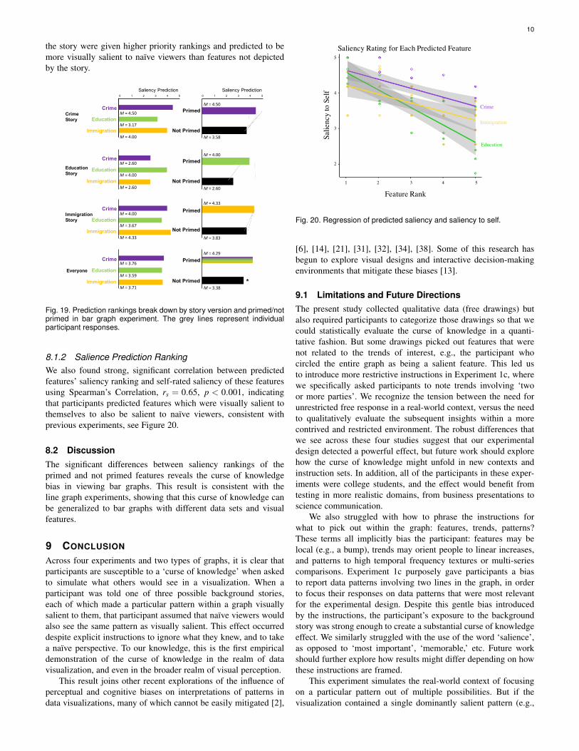
the story were given higher priority rankings and predicted to bemore visually salient to naïve viewers than features not depictedby the story.
Saliency Prediction
Immigration
Crime
EducationCrimeStory
EducationStory
ImmigrationStory
Everyone
M =4.00
M =2.60
M =4.00
M =3.67
M =4.33
M =2.60
M =4.50
M =3.17
M =4.00
M =3.76
M =3.59
M =3.71
0 1 2 3 4 5
Immigration
Crime
Education
Immigration
Crime
Education
Immigration
Crime
Education
Not Primed
Primed
Saliency Prediction
Not Primed
Primed
Not Primed
Primed
Not Primed
Primed
M =3.58
M =4.50
M =2.60
M =4.00
M =3.83
M =4.33
M =3.38
M =4.29
*
0 1 2 3 4 5
Fig. 19. Prediction rankings break down by story version and primed/notprimed in bar graph experiment. The grey lines represent individualparticipant responses.
8.1.2 Salience Prediction RankingWe also found strong, significant correlation between predictedfeatures’ saliency ranking and self-rated saliency of these featuresusing Spearman’s Correlation, rs = 0.65, p < 0.001, indicatingthat participants predicted features which were visually salient tothemselves to also be salient to naïve viewers, consistent withprevious experiments, see Figure 20.
8.2 DiscussionThe significant differences between saliency rankings of theprimed and not primed features reveals the curse of knowledgebias in viewing bar graphs. This result is consistent with theline graph experiments, showing that this curse of knowledge canbe generalized to bar graphs with different data sets and visualfeatures.
9 CONCLUSION
Across four experiments and two types of graphs, it is clear thatparticipants are susceptible to a ‘curse of knowledge’ when askedto simulate what others would see in a visualization. When aparticipant was told one of three possible background stories,each of which made a particular pattern within a graph visuallysalient to them, that participant assumed that naïve viewers wouldalso see the same pattern as visually salient. This effect occurreddespite explicit instructions to ignore what they knew, and to takea naïve perspective. To our knowledge, this is the first empiricaldemonstration of the curse of knowledge in the realm of datavisualization, and even in the broader realm of visual perception.
This result joins other recent explorations of the influence ofperceptual and cognitive biases on interpretations of patterns indata visualizations, many of which cannot be easily mitigated [2],
1 2 3 4 5
5
4
3
2
Feature Rank
Salie
ncy
to S
elf
Saliency Rating for Each Predicted Feature
Education
Immigration
Crime
Fig. 20. Regression of predicted saliency and saliency to self.
[6], [14], [21], [31], [32], [34], [38]. Some of this research hasbegun to explore visual designs and interactive decision-makingenvironments that mitigate these biases [13].
9.1 Limitations and Future DirectionsThe present study collected qualitative data (free drawings) butalso required participants to categorize those drawings so that wecould statistically evaluate the curse of knowledge in a quanti-tative fashion. But some drawings picked out features that werenot related to the trends of interest, e.g., the participant whocircled the entire graph as being a salient feature. This led usto introduce more restrictive instructions in Experiment 1c, wherewe specifically asked participants to note trends involving ‘twoor more parties’. We recognize the tension between the need forunrestricted free response in a real-world context, versus the needto qualitatively evaluate the subsequent insights within a morecontrived and restricted environment. The robust differences thatwe see across these four studies suggest that our experimentaldesign detected a powerful effect, but future work should explorehow the curse of knowledge might unfold in new contexts andinstruction sets. In addition, all of the participants in these exper-iments were college students, and the effect would benefit fromtesting in more realistic domains, from business presentations toscience communication.
We also struggled with how to phrase the instructions forwhat to pick out within the graph: features, trends, patterns?These terms all implicitly bias the participant: features may belocal (e.g., a bump), trends may orient people to linear increases,and patterns to high temporal frequency textures or multi-seriescomparisons. Experiment 1c purposely gave participants a biasto report data patterns involving two lines in the graph, in orderto focus their responses on data patterns that were most relevantfor the experimental design. Despite this gentle bias introducedby the instructions, the participant’s exposure to the backgroundstory was strong enough to create a substantial curse of knowledgeeffect. We similarly struggled with the use of the word ‘salience’,as opposed to ‘most important’, ‘memorable,’ etc. Future workshould further explore how results might differ depending on howthese instructions are framed.
This experiment simulates the real-world context of focusingon a particular pattern out of multiple possibilities. But if thevisualization contained a single dominantly salient pattern (e.g.,

11
a downward trend among upward trends), the dominance of thatpattern could hide any effect of the curse of knowledge. Weattempted to balance the salience of the alternative patterns and thedata suggests that these patterns were roughly balanced, accordingto the ‘Everyone’ section of Figure 6, 9, and 11, which collapseover the instructional primes (though there is a trend in Experiment1a for ‘bottom’ to be more salient). Similarly, we used a set ofstories, party names, and pictures, that we hoped would maintaina balance across the experiments. For example, we picked a salientfemale candidate, and a top position in the visualization, to balanceout the presumed lower salience of the green ‘Education’ bar,which was in the horizontal-center of the graph. Such balancing iscritical for finding any experimental effect of a single factor amongmultiple other factors that potentially compete. However, we havenot tested the baseline saliency of the graph in the absence ofstory primes. Future research could test the robustness of this biaswith less balanced visualizations, or more complex visualizations,to more closely emulate real world situations and further explorehow stronger baseline salience differences might prevent the curseof knowledge bias.
We recognize that there are many kinds of visual data com-munication across many types of conversation partners. Commu-nication could be between the creator of the visualization and anaudience listening to the creator’s story, or between people whodid not create a visualization, but are sharing their interpretationswith each other. This experiment focused on the later situationwhere the experts did not create the visualizations themselves.Future research could investigate if the curse of knowledge persistsif the communication is between the visualization designer and anaïve audience, perhaps even in more realistic situations insteadof lab simulations. We predict the curse to be stronger in theseconditions as visualization creators would have richer expertiseand deeper understanding of the data pattern and trends, making iteven more difficult for them to separate their knowledge with thatof their audience.
While most participants predicted primed features to be morevisually salient to uninformed others, some participants did not.Why are some people immune to the curse of knowledge, at leastfor this case study? Are some people simply better at simulatingthe thoughts of others, or do they use different strategies? Thecurse of knowledge can manifest not just from differences inperceived salience, as tested here, but by memorability, context,or impact of the data. Future research could investigate otherconsequences of the curse and evaluate different methods todiscover the manifestation of the curse of knowledge. Whilethese question veers more closely toward the psychology literature(see [15], [44] on discussions of strategy differences in inferringand simulating the perspectives of others), understanding theunderlying difference could lead to prescriptions for mitigatingthe bias.
9.2 Potential Mitigation Strategies
The curse of knowledge may be largely to blame when presenters,paper authors, data analysts or other experts fail to connect withtheir audiences when they communicate patterns in data. While thefollowing guidelines require empirical testing, we make severalspeculative suggestions for decreasing its impact.
View data from new angles: Because the design of a visu-alization influences what comparisons are made (e.g., people aremore likely to compare proximal values [39]), so depicting data
in a new way may help designers or analysts see patterns withfresh eyes. The change could be as simple as a rearrangement ofvalues in the same visualization (e.g., hitting the ‘swap rows andcolumns’ button for a 2D bar graph arrangement in Tableau), oras involved as viewing the data in completely different formats.
Critique is critical: The curse of knowledge is tough todetect and inhibit. Critique provides a feedback loop for whatis communicated, and what is not. In a strong case of a curseof knowledge, a set of visualization researchers designed a busschedule visualization in the style of Mondrian painting, and hungit in a school cafeteria. Only after feedback did they realize thatmany viewers didn’t realize that it was a bus schedule visualizationat all, instead assuming that it was artwork [28], [40].
Rely on the wisdom of the crowd: This curse of knowledgebias shows there could be many different percepts for one personlooking at one visualization. If multiple people merge differentpercepts and subsequent interpretations of the same visualizeddata, they can gain a more complete understanding of patternsin the data.
REFERENCES[1] D. W. Allbritton, G. McKoon, and R. Ratcliff, “Reliability of prosodic
cues for resolving syntactic ambiguity.” Journal of Experimental Psy-chology: Learning, Memory, and Cognition, vol. 22, no. 3, p. 714, 1996.
[2] S. Bateman, R. L. Mandryk, C. Gutwin, A. Genest, D. McDine, andC. Brooks, “Useful junk?: the effects of visual embellishment on com-prehension and memorability of charts,” in Proceedings of the SIGCHIConference on Human Factors in Computing Systems. ACM, 2010, pp.2573–2582.
[3] D. M. Bernstein, C. Atance, G. R. Loftus, and A. Meltzoff, “We sawit all along: Visual hindsight bias in children and adults,” PsychologicalScience, vol. 15, no. 4, pp. 264–267, 2004.
[4] S. A. Birch and P. Bloom, “The curse of knowledge in reasoning aboutfalse beliefs,” Psychological Science, vol. 18, no. 5, pp. 382–386, 2007.
[5] H. Blank, V. Fischer, and E. Erdfelder, “Hindsight bias in politicalelections,” Memory, vol. 11, no. 4-5, pp. 491–504, 2003.
[6] R. Borgo, A. Abdul-Rahman, F. Mohamed, P. W. Grant, I. Reppa,L. Floridi, and M. Chen, “An empirical study on using visual em-bellishments in visualization,” IEEE Transactions on Visualization andComputer Graphics, vol. 18, no. 12, pp. 2759–2768, 2012.
[7] M. A. Borkin, Z. Bylinskii, N. W. Kim, C. M. Bainbridge, C. S. Yeh,D. Borkin, H. Pfister, and A. Oliva, “Beyond memorability: Visualizationrecognition and recall,” IEEE transactions on visualization and computergraphics, vol. 22, no. 1, pp. 519–528, 2016.
[8] M. A. Borkin, A. A. Vo, Z. Bylinskii, P. Isola, S. Sunkavalli, A. Oliva, andH. Pfister, “What makes a visualization memorable?” IEEE Transactionson Visualization and Computer Graphics, vol. 19, no. 12, pp. 2306–2315,2013.
[9] C. Camerer, G. Loewenstein, and M. Weber, “The curse of knowledgein economic settings: An experimental analysis,” Journal of politicalEconomy, vol. 97, no. 5, pp. 1232–1254, 1989.
[10] M. Card, Readings in information visualization: using vision to think.Morgan Kaufmann, 1999.
[11] G. Cassar and J. Craig, “An investigation of hindsight bias in nascentventure activity,” Journal of Business Venturing, vol. 24, no. 2, pp. 149–164, 2009.
[12] I. Cho, R. Wesslen, A. Karduni, S. Santhanam, S. Shaikh, and W. Dou,“The anchoring effect in decision-making with visual analytics,” in 2017IEEE Conference on Visual Analytics Science and Technology (VAST).IEEE, 2017, pp. 116–126.
[13] E. Dimara, G. Bailly, A. Bezerianos, and S. Franconeri, “Mitigating theattraction effect with visualizations,” IEEE transactions on visualizationand computer graphics, vol. 25, no. 1, pp. 850–860, 2019.
[14] E. Dimara, A. Bezerianos, and P. Dragicevic, “The attraction effectin information visualization,” IEEE transactions on visualization andcomputer graphics, vol. 23, no. 1, pp. 471–480, 2017.
[15] N. Epley and A. Waytz, “Mind perception,” Handbook of social psychol-ogy, 2010.
[16] T. Gilovich, K. Savitsky, and V. H. Medvec, “The illusion of trans-parency: Biased assessments of others’ ability to read one’s emotionalstates.” Journal of personality and social psychology, vol. 75, no. 2, p.332, 1998.

12
[17] H. P. Grice, P. Cole, J. L. Morgan et al., “Logic and conversation,” 1975,pp. 41–58, 1975.
[18] S. Haroz, R. Kosara, and S. L. Franconeri, “Isotype visualization:Working memory, performance, and engagement with pictographs,” inProceedings of the 33rd annual ACM conference on human factors incomputing systems. ACM, 2015, pp. 1191–1200.
[19] G. Hart, “The five w’s: An old tool for the new task of task analysis,”Technical communication, vol. 43, no. 2, pp. 139–145, 1996.
[20] M. Hegarty, “Multimedia learning about physical systems,” The Cam-bridge handbook of multimedia learning, pp. 447–465, 2005.
[21] I. Herman, G. Melançon, and M. S. Marshall, “Graph visualization andnavigation in information visualization: A survey,” IEEE Transactions onvisualization and computer graphics, vol. 6, no. 1, pp. 24–43, 2000.
[22] J. Hullman, E. Adar, and P. Shah, “Benefitting infovis with visual dif-ficulties,” IEEE Transactions on Visualization and Computer Graphics,vol. 17, no. 12, pp. 2213–2222, 2011.
[23] J. Hullman and N. Diakopoulos, “Visualization rhetoric: Framing effectsin narrative visualization,” IEEE transactions on visualization and com-puter graphics, vol. 17, no. 12, pp. 2231–2240, 2011.
[24] D. S. Kerby, “The simple difference formula: An approach to teachingnonparametric correlation,” Comprehensive Psychology, vol. 3, pp. 11–IT, 2014.
[25] B. Keysar and A. S. Henly, “Speakers’ overestimation of their effective-ness,” Psychological Science, vol. 13, no. 3, pp. 207–212, 2002.
[26] M. Khan and S. S. Khan, “Data and information visualization methods,and interactive mechanisms: A survey,” International Journal of Com-puter Applications, vol. 34, no. 1, pp. 1–14, 2011.
[27] C. N. Knaflic, Storytelling with data: A data visualization guide forbusiness professionals. John Wiley & Sons, 2015.
[28] R. Kosara, F. Drury, L. E. Holmquist, and D. H. Laidlaw, “Visualizationcriticism,” IEEE Computer Graphics and Applications, vol. 28, no. 3, pp.13–15, 2008.
[29] M. R. Leary, The curse of the self: Self-awareness, egotism, and thequality of human life. Oxford University Press, 2007.
[30] G. McKenzie, M. Hegarty, T. Barrett, and M. Goodchild, “Assessingthe effectiveness of different visualizations for judgments of positionaluncertainty,” International Journal of Geographical Information Science,vol. 30, no. 2, pp. 221–239, 2016.
[31] A. L. Michal and S. L. Franconeri, “Visual routines are associatedwith specific graph interpretations,” Cognitive Research: Principles andImplications, vol. 2, no. 1, p. 20, 2017.
[32] A. V. Moere, M. Tomitsch, C. Wimmer, B. Christoph, and T. Grechenig,“Evaluating the effect of style in information visualization,” IEEE trans-actions on visualization and computer graphics, vol. 18, no. 12, pp.2739–2748, 2012.
[33] E. Newton, “Overconfidence in the communication of intent: Heardand unheard melodies,” Ph.D. dissertation, Department of Psychology,Stanford University, Stanford, CA, 1990.
[34] A. V. Pandey, A. Manivannan, O. Nov, M. Satterthwaite, and E. Bertini,“The persuasive power of data visualization,” IEEE transactions onvisualization and computer graphics, vol. 20, no. 12, pp. 2211–2220,2014.
[35] R. Pohl and I. Haracic, “Der rückschaufehler bei kindern und erwach-senen,” Zeitschrift für Entwicklungspsychologie und Pädagogische Psy-chologie, vol. 37, no. 1, pp. 46–55, 2005.
[36] I. Qualtrics, Qualtrics, 2013 (accessed 2017-2019), https://www.qualtrics.com/.
[37] N. J. Roese and K. D. Vohs, “Hindsight bias,” Perspectives on psycho-logical science, vol. 7, no. 5, pp. 411–426, 2012.
[38] E. Segel and J. Heer, “Narrative visualization: Telling stories with data,”IEEE transactions on visualization and computer graphics, vol. 16, no. 6,pp. 1139–1148, 2010.
[39] P. Shah and E. G. Freedman, “Bar and line graph comprehension: Aninteraction of top-down and bottom-up processes,” Topics in cognitivescience, vol. 3, no. 3, pp. 560–578, 2011.
[40] T. Skog, S. Ljungblad, and L. E. Holmquist, “Between aesthetics and util-ity: designing ambient information visualizations,” in IEEE Symposiumon Information Visualization 2003 (IEEE Cat. No. 03TH8714). IEEE,2003, pp. 233–240.
[41] A. C. Valdez, M. Ziefle, and M. Sedlmair, “Priming and anchoring ef-fects in visualization,” IEEE transactions on visualization and computergraphics, vol. 24, no. 1, pp. 584–594, 2018.
[42] A. Ward, L. Ross, E. Reed, E. Turiel, and T. Brown, Naive realismin everyday life: Implications for social conflict and misunderstanding.Lawrence Erlbaum Association Hillsdale, NJ, 1997.
[43] A. L. Yarbus, “Eye movements during perception of complex objects,”in Eye movements and vision. Springer, 1967, pp. 171–211.
[44] H. Zhou, E. A. Majka, and N. Epley, “Inferring perspective versus gettingperspective: Underestimating the value of being in another personâsshoes,” Psychological science, vol. 28, no. 4, pp. 482–493, 2017.
[45] R. Zwick, R. Pieters, and H. Baumgartner, “On the practical significanceof hindsight bias: The case of the expectancy-disconfirmation modelof consumer satisfaction,” Organizational behavior and human decisionprocesses, vol. 64, no. 1, pp. 103–117, 1995.