1) In what ways does your media product use, develop or challenge forms and conventions of real...
11
1) IN WHAT WAYS DOES YOUR MEDIA PRODUCT USE, D EVELOP OR CHALLENG E FORMS AND CON V ENTIONS OF REAL MED IA PRODUCTS?
-
Upload
beth-hitchen -
Category
Education
-
view
45 -
download
0
Transcript of 1) In what ways does your media product use, develop or challenge forms and conventions of real...

1) IN W
HAT W
AYS D
OES YOUR M
EDIA
PRODUCT
USE, DEVEL
OP OR C
HALLEN
GE
FORMS A
ND CONVENTI
ONS OF
REAL MED
IA
PRODUCTS
?
As I’m no expert in making and producing magazines and I haven’t had any previous experience working in a media institution so I used other magazines to help give me ideas and inspiration as to what I wanted my magazine to look like. One example of a magazine I used for this was ‘Q’ magazine. This firstly helped me get a sense of consistent house style as ‘Q’ magazine have the bright red colour running throughout the magazine.
Although I was creating a music magazine I decided to look at other magazines that are also aimed at my target audience, the magazine I took most inspiration from was ‘Miss Vogue’. I really liked how the contents page was set out and I decided that I particularly wanted to use this as my inspiration to create the basis of the design for my magazines contents page
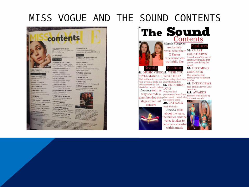
MISS VOGUE AND THE SOUND CONTENTS
As you can see, I took a lot of little things from this and put them together to create my final contents page. I added some more images to my final page as it suited the target audience and I also made the text slightly bigger to yet again, tailor the needs of my target audience. Although ‘Miss Vogue’ is a fashion magazine I really liked the layout of the page and I especially liked the way that the contents was separated into categories, I also did this on my contents page however I made the writing specific to my magazine and made the text bigger.

SEPARATING INTO CATEGORIES

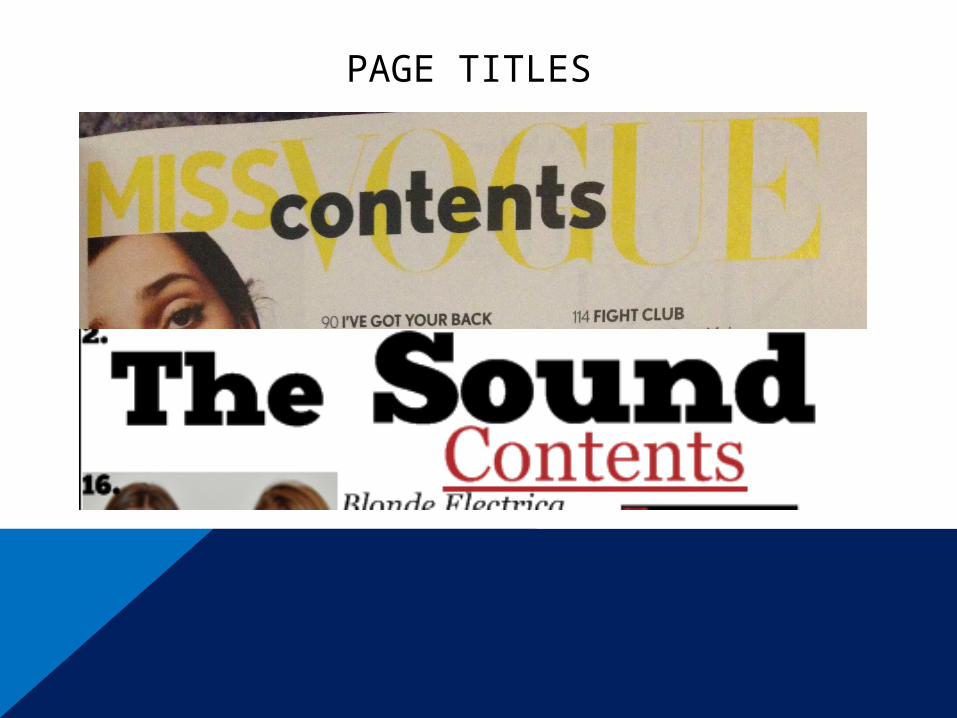
Something that I wanted to recreate was the way that the ‘Miss Vogue Contents’ was written on the top of the page. I thought it gave the page a good look and that it was really suited for the type of magazine. However I tried to make this work for my contents page but somehow it didn’t look right no matter what I did or how big/small the text was, I decided to settle for something that was similar but not quite how the ‘Miss Vogue’ magazine had it. For my magazine I made the word ‘The’ smaller in size like the Miss Vogue magazine the word ‘Miss’ is slightly smaller than the word ‘Vogue’.
PAGE TITLES

The columns and the way the page was set out was yet another thing that I decided to imitate from ‘Miss Vogue’ magazine. I didn’t want my contents page to end up looking that similar to the ‘Miss Vogue’ one as I knew it wouldn’t completely suit the genre of my magazine. With this in mind I decided to split the page into 3 equal sections and then used this as a guidance as to where to put my textboxes. This helped my because it made it easier for me to determine whether or not all of the writing is in line with each other going right the way across the page.

COLUMN LAYOUTS

The contents page was the only page that I looked at other magazines to gain inspiration from, this is because I wanted the magazine to have as new look and be as original as possible so that the magazine will appeal to my target audience. I decided that I didn’t want to copy everything from the other pre-existing magazines as I wanted mine to still have a sense of originality to it meaning that it might fill a gap in the market that has yet to be explored.