Coca Cola Summer Internship Report " Retailers Satisfaction With Coca Cola"
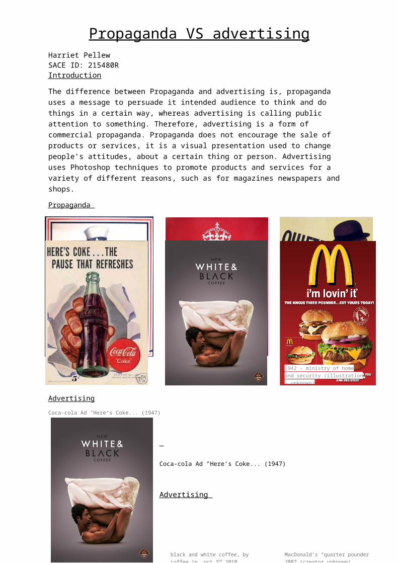
Propaganda VS advertisingHarriet PellewSACE ID: 215480R IntroductionThe difference between Propaganda and advertising is, propaganda uses a message to persuade it intended audience to think and do things in a certain way, whereas advertising is calling public attention to something. Therefore, advertising is a form of commercial propaganda. Propaganda does not encourage the sale of products or services, it is a visual presentation used to change people’s attitudes, about a certain thing or person. Advertising uses Photoshop techniques to promote products and services for a variety of different reasons, such as for magazines newspapers and shops. Propaganda
Advertising
Coca-cola Ad "Here’s Coke... (1947)
Coca-cola Ad "Here’s Coke... (1947)
Advertising This coffee advertisement uses positive and negative space to display the difference of their adverted coffee. The negative space uses a gradient effect, darker on the corners and lighter in the inside, which
Keep Calm and Carry On ( and On and On and On) Illustration: Peskimo at Synergyart.co.uk
James Montgomery Flagg (1877-1960)I Want You for theU.S. ArmyLithograph, 1917
1942 - ministry of home and security (illustration – unknown)
black and white coffee, by coffee in, oct 3rd 2010.
MacDonald’s “quarter pounder” 2007 (creator unknown)
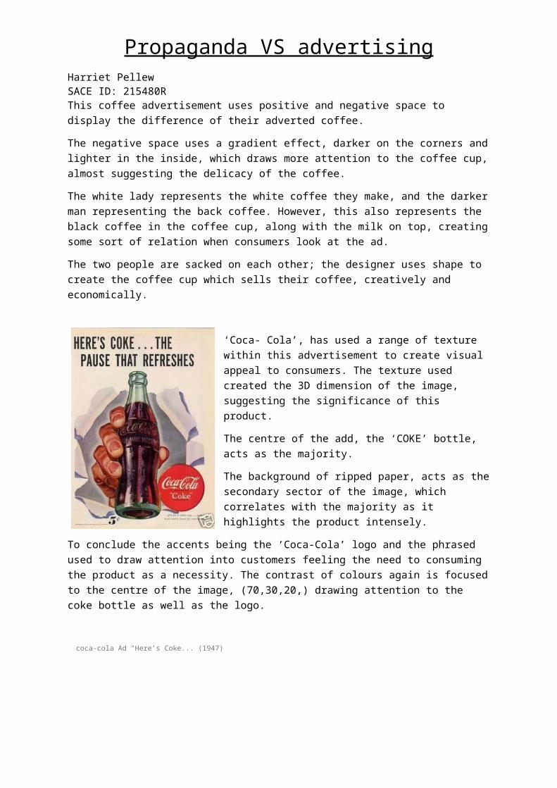
Propaganda VS advertisingHarriet PellewSACE ID: 215480R draws more attention to the coffee cup, almost suggesting the delicacy of the coffee. The white lady represents the white coffee they make, and the darker man representing the back coffee. However, this also represents the black coffee in the coffee cup, along with the milk on top, creating some sort of relation when consumers look at the ad.The two people are sacked on each other; the designer uses shape to create the coffee cup which sells their coffee, creatively and economically.
‘Coca- Cola’, has used a range of texture within this advertisement to create visual appeal to consumers. The texture used created the 3D dimension of the image, suggesting the significance of this product. The centre of the add, the ‘COKE’ bottle, acts as the majority. The background of ripped paper, acts as the secondary sector of the image, which correlates with the majority as it highlights the product intensely.To conclude the accents being the ‘Coca-Cola’ logo and the phrased used to draw attention into customers feeling the need to consuming the
product as a necessity. The contrast of colours again is focused to the centre of the image, (70,30,20,) drawing attention to the coke bottle as well as the logo. coca-cola Ad "Here’s Coke... (1947)
Propaganda

Propaganda VS advertisingHarriet PellewSACE ID: 215480R Regarded as one of the most famous propaganda posters, ‘Keep Calm and Carry On’, uses a range of space as well as negative space to emphasise the purpose of the poster. The designer used bold letters and bold colours to catch the eye of the public. The negative space of the poster is red, which again draws the eye making the boldness and significance of the poster stand out. The negative space uses a slight highlight behind the ‘quote’ which again draws attention to the meaning of the poster. The crown at the top of the posters acts as an accent, representing the British Roil crown of the country, this made the public relate to the poster, especially if you were of British decent.
‘I want you for U.S army’, a propaganda poster used to recruit people to joining the army during war times. The significance of this poster is highlighted thought ‘Uncle Sam’ pointing out of the poster which creates 3 dimensions. The poster uses negative space with a white cloudy background which imposes’ emphasis on the purpose of the message. “YOU” stands out dramatically as the colour contrasts are significantly different compared to the rest of the text. The clothing he wears is 85 blue, 10 white and 5 red. The reason being, to relate back to the American country as these are the colours of America.
The whole poster uses American colours, which highlights America wanting to recruit Americans
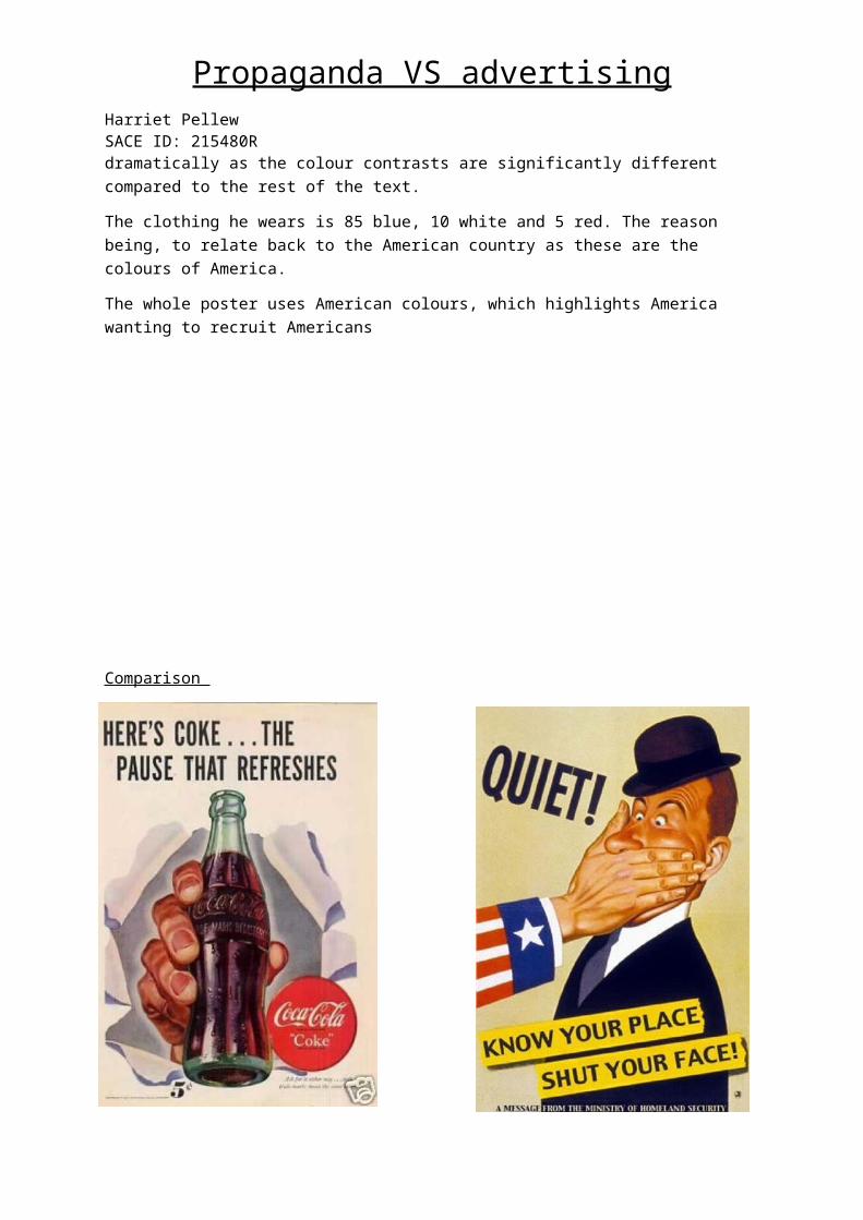
Propaganda VS advertisingHarriet PellewSACE ID: 215480R Comparison
Comparing propaganda and advertising can be challenging at times, as both can be very similar. However, when comparing these two posters (left- advertising, right propaganda) it is quite apparent to recognising what’s what. The Coca- Cola add is advertising in such a way where the product is being forced into your face, as shown someone breaking through the paper pushing the bottle out to ‘You’. This makes consumers feel as if they need to buy the product, as if it is a necessity.The propaganda poster shows, someone forcing a hand on to someone’s face to stop them blurting out information during war times. Due to the sleeve being American, it suggests that it could possibly be the whole of America, counting on you to keep information protected. In comparison to the propaganda, although similar in the fact the image is making you do something, they show two different sides to throwing a message out. Unlike the Coca-Cola add the Propaganda poster is telling people to keep their mouth shut, to not leak a thing, and to stay true to your country. Whereas the Coca-Cola add is making people do something they may not need to do, in this case buy coke, “The Pause that Refreshes” in times of stress or in general everyday activities when a ‘Pause’ is required.

Propaganda VS advertisingHarriet PellewSACE ID: 215480R The design of this thumbnail uses negative space in the back, this created dimension to the main focus of the poster.
The colours used in the negative space are both red and white and grey and white, the reason behind this is to keep it simple, however still appealing. The read beams symbolise the propaganda behind the poster, as red beams where commonly used. The grey and white beams highlight the modern take into the poster, whilst still giving the propaganda feel.
The use of the two colours in the background emphasise the ‘Darth Vader’ character, as they point inwards to him.
The colour of ‘Darth Vader’ has a red undertone which symbolised the evilness or the significance of ‘Joining the Force’, used to somewhat scare the audience to go watch the movie ‘Star Wars’.
The bold heading in black is purposely placed this way and used in the font to draw attention, however due to it seeming to be hidden behind ‘Darth Vader’s’ head doesn’t take the significance away from the character.
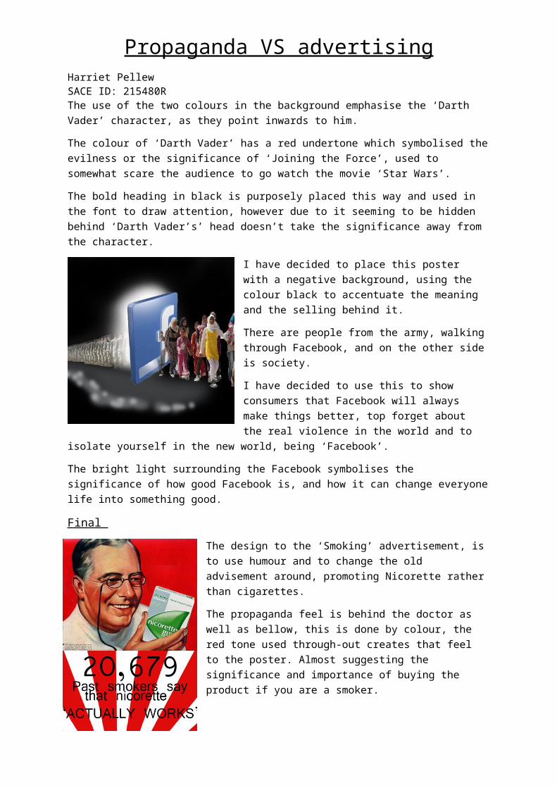
I have decided to place this poster with a negative background, using the colour black to accentuate the meaning and the selling behind it.
There are people from the army, walking through Facebook, and on the other side is society.
I have decided to use this to show consumers that Facebook will always make things better, top forget about the real violence in the world and to isolate yourself in the new world, being ‘Facebook’.
The bright light surrounding the Facebook symbolises the significance of how good Facebook is, and how it can
change everyone life into something good.
Final
The design to the ‘Smoking’ advertisement, is to use humour and to change the old advisement around, promoting Nicorette rather than cigarettes.
The propaganda feel is behind the doctor as well as bellow, this is done by colour, the red tone used through-out creates that feel to the poster. Almost suggesting the significance and importance of buying the product if you are a smoker.
The rays don’t do much for the text, however the black text was used to emphasise the quote, as well as relating back t the original poster.
The number of smokers is purposely larger than the rest of the text to emphasise the significance of benefits the Nicorette has on people who smoke.
Propaganda VS advertisingHarriet PellewSACE ID: 215480R The large and capitated letters bellow the text is purposely used for that reasoning to, to make it stand out and to hopefully stick in people’s brains that “IT ACTUALLY WORKS’.
The reason why I have decided this to be my final poster, is purely because of all the things I stated up top. Over all I like the design behind the poster, and I find the creativity is cleaver. It is humours, but also states a fact and sells the product.
Conclusion
After researching and studying this topic, propaganda and advertising has taught a clear understanding on what the difference is on the topic of Propaganda and Advertising.
Advertising is something that sells a product, this can be done with humour, or threats to sell their product, a lot of the time advertising uses manipulation to make consumers buy products they may not need but feel they do.
Propaganda is something that is used to somewhat tick or force people into doing something they may not want to do, however are forced into thinking it is something they must partake in. Propaganda can be a way of promoting an organisation, this can be fundraisers ect.

Propaganda VS advertisingHarriet PellewSACE ID: 215480R
Bibliography http://www.businessdictionary.com/definition/propaganda.htmlhttp://study.com/academy/lesson/what-is-advertising-definition-lesson-examples.htmlhttp://smallbusiness.chron.com/advertising-vs-propaganda-24409.htmlhttps://www.creativefan.com/war-propaganda-posters/ https://www.theguardian.com/books/2016/jan/08/keep-calm-and-carry-on-posters-austerity-ubiquity-sinister-implications http://www.vintageadbrowser.com/coke-ads-1940s https://www.awesomestories.com/asset/view/Keep-Calm-and-Carry-On-World-War-II-Words-and-Love http://bizcovering.com/marketing-and-advertising/advertisement-vs-propaganda/http://articles.riderdownload.com/difference-between-advertising-and-propaganda/